3.1 The Histogram
3.1: The Histogram
3.1.1: Cross Tabulation
Cross tabulation (or crosstabs for short) is a statistical process that summarizes categorical data to create a contingency table.
Learning Objective
Demonstrate how cross tabulation provides a basic picture of the interrelation between two variables and helps to find interactions between them.
Key Takeaways
Key Points
- Crosstabs are heavily used in survey research, business intelligence, engineering, and scientific research.
- Crosstabs provide a basic picture of the interrelation between two variables and can help find interactions between them.
- Most general-purpose statistical software programs are able to produce simple crosstabs.
Key Term
- cross tabulation
- a presentation of data in a tabular form to aid in identifying a relationship between variables
Cross tabulation (or crosstabs for short) is a statistical process that summarizes categorical data to create a contingency table. It is used heavily in survey research, business intelligence, engineering, and scientific research. Moreover, it provides a basic picture of the interrelation between two variables and can help find interactions between them.
In survey research (e.g., polling, market research), a “crosstab” is any table showing summary statistics. Commonly, crosstabs in survey research are combinations of multiple different tables. For example, combines multiple contingency tables and tables of averages.

Crosstab of Cola Preference by Age and Gender
A crosstab is a combination of various tables showing summary statistics.
Contingency Tables
A contingency table is a type of table in a matrix format that displays the (multivariate) frequency distribution of the variables. A crucial problem of multivariate statistics is finding the direct dependence structure underlying the variables contained in high dimensional contingency tables. If some of the conditional independences are revealed, then even the storage of the data can be done in a smarter way. In order to do this, one can use information theory concepts, which gain the information only from the distribution of probability. Probability can be expressed easily from the contingency table by the relative frequencies.
As an example, suppose that we have two variables, sex (male or female) and handedness (right- or left-handed). Further suppose that 100 individuals are randomly sampled from a very large population as part of a study of sex differences in handedness. A contingency table can be created to display the numbers of individuals who are male and right-handed, male and left-handed, female and right-handed, and female and left-handed .
The numbers of the males, females, and right-and-left-handed individuals are called marginal totals. The grand total–i.e., the total number of individuals represented in the contingency table– is the number in the bottom right corner.
The table allows us to see at a glance that the proportion of men who are right-handed is about the same as the proportion of women who are right-handed, although the proportions are not identical. If the proportions of individuals in the different columns vary significantly between rows (or vice versa), we say that there is a contingency between the two variables. In other words, the two variables are not independent. If there is no contingency, we say that the two variables are independent.
Standard Components of a Crosstab
- Multiple columns – each column refers to a specific sub-group in the population (e.g., men). The columns are sometimes referred to as banner points or cuts (and the rows are sometimes referred to as stubs).
- Significance tests – typically, either column comparisons–which test for differences between columns and display these results using letters– or cell comparisons–which use color or arrows to identify a cell in a table that stands out in some way (as in the example above).
- Nets or netts – which are sub-totals.
- One or more of the following: percentages, row percentages, column percentages, indexes, or averages.
- Unweighted sample sizes (i.e., counts).
Most general-purpose statistical software programs are able to produce simple crosstabs. Creation of the standard crosstabs used in survey research, as shown above, is typically done using specialist crosstab software packages, such as:
- New Age Media Systems (EzTab)
- SAS
- Quantum
- Quanvert
- SPSS Custom Tables
- IBM SPSS Data Collection Model programs
- Uncle
- WinCross
- Q
- SurveyCraft
- BIRT
3.1.2: Drawing a Histogram
To draw a histogram, one must decide how many intervals represent the data, the width of the intervals, and the starting point for the first interval.
Learning Objective
Outline the steps involved in creating a histogram.
Key Takeaways
Key Points
- There is no “best” number of bars, and different bar sizes may reveal different features of the data.
- A convenient starting point for the first interval is a lower value carried out to one more decimal place than the value with the most decimal places.
- To calculate the width of the intervals, subtract the starting point from the ending value and divide by the number of bars.
Key Term
- histogram
- a representation of tabulated frequencies, shown as adjacent rectangles, erected over discrete intervals (bins), with an area equal to the frequency of the observations in the interval
To construct a histogram, one must first decide how many bars or intervals (also called classes) are needed to represent the data. Many histograms consist of between 5 and 15 bars, or classes. One must choose a starting point for the first interval, which must be less than the smallest data value. A convenient starting point is a lower value carried out to one more decimal place than the value with the most decimal places.
For example, if the value with the most decimal places is 6.1, and this is the smallest value, a convenient starting point is 6.05 (). We say that 6.05 has more precision. If the value with the most decimal places is 2.23 and the lowest value is 1.5, a convenient starting point is 1.495 (). If the value with the most decimal places is 3.234 and the lowest value is 1.0, a convenient starting point is 0.9995 (). If all the data happen to be integers and the smallest value is 2, then a convenient starting point is 1.5 (). Also, when the starting point and other boundaries are carried to one additional decimal place, no data value will fall on a boundary.
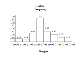
Consider the following data, which are the heights (in inches to the nearest half inch) of 100 male semiprofessional soccer players. The heights are continuous data since height is measured.
60; 60.5; 61; 61; 61.5; 63.5; 63.5; 63.5; 64; 64; 64; 64; 64; 64; 64; 64.5; 64.5; 64.5; 64.5; 64.5; 64.5; 64.5; 64.5; 66; 66; 66; 66; 66; 66; 66; 66; 66; 66; 66.5; 66.5; 66.5; 66.5; 66.5; 66.5; 66.5; 66.5; 66.5; 66.5; 66.5; 67; 67; 67; 67; 67; 67; 67; 67; 67; 67; 67; 67; 67.5; 67.5; 67.5; 67.5; 67.5; 67.5; 67.5; 68; 68; 69; 69; 69; 69; 69; 69; 69; 69; 69; 69; 69.5; 69.5; 69.5; 69.5; 69.5; 70; 70; 70; 70; 70; 70; 70.5; 70.5; 70.5; 71; 71; 71; 72; 72; 72; 72.5; 72.5; 73; 73.5; 74
The smallest data value is 60. Since the data with the most decimal places has one decimal (for instance, 61.5), we want our starting point to have two decimal places. Since the numbers 0.5, 0.05, 0.005, and so on are convenient numbers, use 0.05 and subtract it from 60, the smallest value, for the convenient starting point. The starting point, then, is 59.95.
The largest value is 74. is the ending value.
Next, calculate the width of each bar or class interval. To calculate this width, subtract the starting point from the ending value and divide by the number of bars (you must choose the number of bars you desire). Note that there is no “best” number of bars, and different bar sizes can reveal different features of the data. Some theoreticians have attempted to determine an optimal number of bars, but these methods generally make strong assumptions about the shape of the distribution. Depending on the actual data distribution and the goals of the analysis, different bar widths may be appropriate, so experimentation is usually needed to determine an appropriate width.
Histogram Example
This histogram depicts the relative frequency of heights for 100 semiprofessional soccer players. Note the roughly normal distribution, with the center of the curve around 66 inches. The chart displays the heights on the x-axis and relative frequency on the y-axis.
Suppose, in our example, we choose 8 bars. The bar width will be as follows:
We will round up to 2 and make each bar or class interval 2 units wide. Rounding up to 2 is one way to prevent a value from falling on a boundary. The boundaries are:
59.95, 61.95, 63.95, 65.95, 67.95, 69.95, 71.95, 73.95, 75.95
So that there are 2 units between each boundary.
The heights 60 through 61.5 inches are in the interval 59.95 – 61.95. The heights that are 63.5 are in the interval 61.95 – 63.95. The heights that are 64 through 64.5 are in the interval 63.95 – 65.95. The heights 66 through 67.5 are in the interval 65.95 – 67.95. The heights 68 through 69.5 are in the interval 67.95 – 69.95. The heights 70 through 71 are in the interval 69.95 – 71.95. The heights 72 through 73.5 are in the interval 71.95 – 73.95. The height 74 is in the interval 73.95 – 75.95.
3.1.3: Recognizing and Using a Histogram
A histogram is a graphical representation of the distribution of data.
Learning Objectives
Indicate how frequency and probability distributions are represented by histograms.
Key Takeaways
Key Points
- First introduced by Karl Pearson, a histogram is an estimate of the probability distribution of a continuous variable.
- If the distribution of
is continuous, then
is called a continuous random variable and, therefore, has a continuous probability distribution. - An advantage of a histogram is that it can readily display large data sets (a rule of thumb is to use a histogram when the data set consists of 100 values or more).
Key Terms
- frequency
- number of times an event occurred in an experiment (absolute frequency)
- histogram
- a representation of tabulated frequencies, shown as adjacent rectangles, erected over discrete intervals (bins), with an area equal to the frequency of the observations in the interval
- probability distribution
- A function of a discrete random variable yielding the probability that the variable will have a given value.
A histogram is a graphical representation of the distribution of data. More specifically, a histogram is a representation of tabulated frequencies, shown as adjacent rectangles, erected over discrete intervals (bins), with an area equal to the frequency of the observations in the interval. First introduced by Karl Pearson, it is an estimate of the probability distribution of a continuous variable.
A histogram has both a horizontal axis and a vertical axis. The horizontal axis is labeled with what the data represents (for instance, distance from your home to school). The vertical axis is labeled either frequency or relative frequency. The graph will have the same shape with either label. An advantage of a histogram is that it can readily display large data sets (a rule of thumb is to use a histogram when the data set consists of 100 values or more). The histogram can also give you the shape, the center, and the spread of the data.
The categories of a histogram are usually specified as consecutive, non-overlapping intervals of a variable. The categories (intervals) must be adjacent and often are chosen to be of the same size. The rectangles of a histogram are drawn so that they touch each other to indicate that the original variable is continuous.
Frequency and Probability Distributions
In statistical terms, the frequency of an event is the number of times the event occurred in an experiment or study. The relative frequency (or empirical probability) of an event refers to the absolute frequency normalized by the total number of events:
Put more simply, the relative frequency is equal to the frequency for an observed value of the data divided by the total number of data values in the sample.
The height of a rectangle in a histogram is equal to the frequency density of the interval, i.e., the frequency divided by the width of the interval. A histogram may also be normalized displaying relative frequencies. It then shows the proportion of cases that fall into each of several categories, with the total area equaling one.
As mentioned, a histogram is an estimate of the probability distribution of a continuous variable. To define probability distributions for the simplest cases, one needs to distinguish between discrete and continuous random variables. In the discrete case, one can easily assign a probability to each possible value. For example, when throwing a die, each of the six values 1 to 6 has the probability 1/6. In contrast, when a random variable takes values from a continuum, probabilities are nonzero only if they refer to finite intervals. For example, in quality control one might demand that the probability of a “500 g” package containing between 490 g and 510 g should be no less than 98%.
Intuitively, a continuous random variable is the one which can take a continuous range of values — as opposed to a discrete distribution, where the set of possible values for the random variable is, at most, countable. If the distribution of X is continuous, then X is called a continuous random variable and, therefore, has a continuous probability distribution. There are many examples of continuous probability distributions: normal, uniform, chi-squared, and others.

The Histogram: This is an example of a histogram, depicting graphically the distribution of heights for 31 Black Cherry trees.
3.1.4: The Density Scale
Density estimation is the construction of an estimate based on observed data of an unobservable, underlying probability density function.
Learning Objective
Describe how density estimation is used as a tool in the construction of a histogram.
Key Takeaways
Key Points
- The unobservable density function is thought of as the density according to which a large population is distributed. The data are usually thought of as a random sample from that population.
- A probability density function, or density of a continuous random variable, is a function that describes the relative likelihood for a random variable to take on a given value.
- Kernel density estimates are closely related to histograms, but can be endowed with properties such as smoothness or continuity by using a suitable kernel.
Key Terms
- quartile
- any of the three points that divide an ordered distribution into four parts, each containing a quarter of the population
- density
- the probability that an event will occur, as a function of some observed variable
- interquartile range
- The difference between the first and third quartiles; a robust measure of sample dispersion.
Density Estimation
Histograms are used to plot the density of data, and are often a useful tool for density estimation. Density estimation is the construction of an estimate based on observed data of an unobservable, underlying probability density function. The unobservable density function is thought of as the density according to which a large population is distributed. The data are usually thought of as a random sample from that population.
A probability density function, or density of a continuous random variable, is a function that describes the relative likelihood for this random variable to take on a given value. The probability for the random variable to fall within a particular region is given by the integral of this variable’s density over the region .

Boxplot Versus Probability Density Function
This image shows a boxplot and probability density function of a normal distribution.
The above image depicts a probability density function graph against a box plot. A box plot is a convenient way of graphically depicting groups of numerical data through their quartiles. The spacings between the different parts of the box help indicate the degree of dispersion (spread) and skewness in the data and to identify outliers. In addition to the points themselves, box plots allow one to visually estimate the interquartile range.
A range of data clustering techniques are used as approaches to density estimation, with the most basic form being a rescaled histogram.
Kernel Density Estimation
Kernel density estimates are closely related to histograms, but can be endowed with properties such as smoothness or continuity by using a suitable kernel. To see this, we compare the construction of histogram and kernel density estimators using these 6 data points:
, , , , ,
For the histogram, first the horizontal axis is divided into sub-intervals, or bins, which cover the range of the data. In this case, we have 6 bins, each having a width of 2. Whenever a data point falls inside this interval, we place a box of height . If more than one data point falls inside the same bin, we stack the boxes on top of each other.
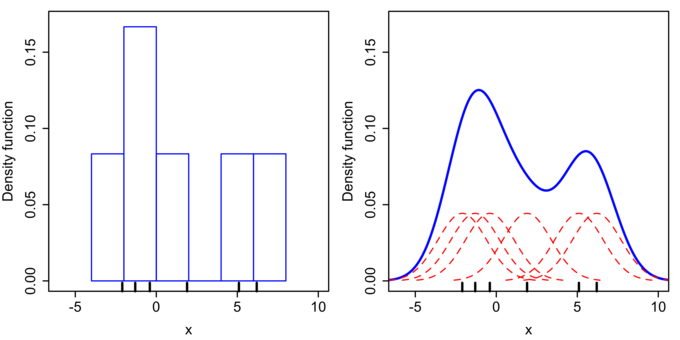
Histogram Versus Kernel Density Estimation
Comparison of the histogram (left) and kernel density estimate (right) constructed using the same data. The 6 individual kernels are the red dashed curves, the kernel density estimate the blue curves. The data points are the rug plot on the horizontal axis.
For the kernel density estimate, we place a normal kernel with variance 2.25 (indicated by the red dashed lines) on each of the data points . The kernels are summed to make the kernel density estimate (the solid blue curve). Kernel density estimates converge faster to the true underlying density for continuous random variables thus accounting for their smoothness compared to the discreteness of the histogram.
3.1.5: Types of Variables
A variable is any characteristic, number, or quantity that can be measured or counted.
Learning Objective
Distinguish between quantitative and categorical, continuous and discrete, and ordinal and nominal variables.
Key Takeaways
Key Points
- Numeric (quantitative) variables have values that describe a measurable quantity as a number, like “how many” or “how much”.
- A continuous variable is an observation that can take any value between a certain set of real numbers.
- A discrete variable is an observation that can take a value based on a count from a set of distinct whole values.
- Categorical variables have values that describe a “quality” or “characteristic” of a data unit, like “what type” or “which category”.
- An ordinal variable is an observation that can take a value that can be logically ordered or ranked.
- A nominal variable is an observation that can take a value that is not able to be organized in a logical sequence.
Key Terms
- continuous variable
- a variable that has a continuous distribution function, such as temperature
- discrete variable
- a variable that takes values from a finite or countable set, such as the number of legs of an animal
- variable
- a quantity that may assume any one of a set of values
What Is a Variable?
A variable is any characteristic, number, or quantity that can be measured or counted. A variable may also be called a data item. Age, sex, business income and expenses, country of birth, capital expenditure, class grades, eye colour and vehicle type are examples of variables. Variables are so-named because their value may vary between data units in a population and may change in value over time.
What Are the Types of Variables?
There are different ways variables can be described according to the ways they can be studied, measured, and presented. Numeric variables have values that describe a measurable quantity as a number, like “how many” or “how much. ” Therefore, numeric variables are quantitative variables.
Numeric variables may be further described as either continuous or discrete. A continuous variable is a numeric variable. Observations can take any value between a certain set of real numbers. The value given to an observation for a continuous variable can include values as small as the instrument of measurement allows. Examples of continuous variables include height, time, age, and temperature.
A discrete variable is a numeric variable. Observations can take a value based on a count from a set of distinct whole values. A discrete variable cannot take the value of a fraction between one value and the next closest value. Examples of discrete variables include the number of registered cars, number of business locations, and number of children in a family, all of of which measured as whole units (i.e., 1, 2, 3 cars).
Categorical variables have values that describe a “quality” or “characteristic” of a data unit, like “what type” or “which category. ” Categorical variables fall into mutually exclusive (in one category or in another) and exhaustive (include all possible options) categories. Therefore, categorical variables are qualitative variables and tend to be represented by a non-numeric value.
Categorical variables may be further described as ordinal or nominal. An ordinal variable is a categorical variable. Observations can take a value that can be logically ordered or ranked. The categories associated with ordinal variables can be ranked higher or lower than another, but do not necessarily establish a numeric difference between each category. Examples of ordinal categorical variables include academic grades (i.e., A, B, C), clothing size (i.e., small, medium, large, extra large) and attitudes (i.e., strongly agree, agree, disagree, strongly disagree).
A nominal variable is a categorical variable. Observations can take a value that is not able to be organized in a logical sequence. Examples of nominal categorical variables include sex, business type, eye colour, religion and brand.
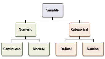
Types of Variables
Variables can be numeric or categorial, being further broken down in continuous and discrete, and nominal and ordinal variables.
3.1.6: Controlling for a Variable
Controlling for a variable is a method to reduce the effect of extraneous variations that may also affect the value of the dependent variable.
Learning Objective
Discuss how controlling for a variable leads to more reliable visualizations of probability distributions.
Key Takeaways
Key Points
- Variables refer to measurable attributes, as these typically vary over time or between individuals.
- Temperature is an example of a continuous variable, while the number of legs of an animal is an example of a discrete variable.
- In causal models, a distinction is made between “independent variables” and “dependent variables,” the latter being expected to vary in value in response to changes in the former.
- While independent variables can refer to quantities and qualities that are under experimental control, they can also include extraneous factors that influence results in a confusing or undesired manner.
- The essence of controlling is to ensure that comparisons between the control group and the experimental group are only made for groups or subgroups for which the variable to be controlled has the same statistical distribution.
Key Terms
- correlation
- One of the several measures of the linear statistical relationship between two random variables, indicating both the strength and direction of the relationship.
- control
- a separate group or subject in an experiment against which the results are compared where the primary variable is low or nonexistence
- variable
- a quantity that may assume any one of a set of values
Histograms help us to visualize the distribution of data and estimate the probability distribution of a continuous variable. In order for us to create reliable visualizations of these distributions, we must be able to procure reliable results for the data during experimentation. A method that significantly contributes to our success in this matter is the controlling of variables.
Defining Variables
In statistics, variables refer to measurable attributes, as these typically vary over time or between individuals. Variables can be discrete (taking values from a finite or countable set), continuous (having a continuous distribution function), or neither. For instance, temperature is a continuous variable, while the number of legs of an animal is a discrete variable.
In causal models, a distinction is made between “independent variables” and “dependent variables,” the latter being expected to vary in value in response to changes in the former. In other words, an independent variable is presumed to potentially affect a dependent one. In experiments, independent variables include factors that can be altered or chosen by the researcher independent of other factors.
There are also quasi-independent variables, which are used by researchers to group things without affecting the variable itself. For example, to separate people into groups by their sex does not change whether they are male or female. Also, a researcher may separate people, arbitrarily, on the amount of coffee they drank before beginning an experiment.
While independent variables can refer to quantities and qualities that are under experimental control, they can also include extraneous factors that influence results in a confusing or undesired manner. In statistics the technique to work this out is called correlation.
Controlling Variables
Controlling for Variables
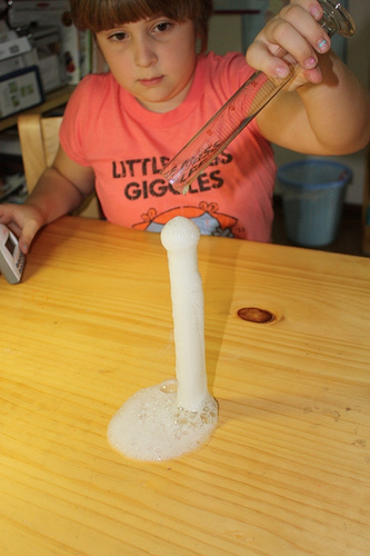
Controlling is very important in experimentation to ensure reliable results. For example, in an experiment to see which type of vinegar displays the greatest reaction to baking soda, the brand of baking soda should be controlled.
In a scientific experiment measuring the effect of one or more independent variables on a dependent variable, controlling for a variable is a method of reducing the confounding effect of variations in a third variable that may also affect the value of the dependent variable. For example, in an experiment to determine the effect of nutrition (the independent variable) on organism growth (the dependent variable), the age of the organism (the third variable) needs to be controlled for, since the effect may also depend on the age of an individual organism.
The essence of the method is to ensure that comparisons between the control group and the experimental group are only made for groups or subgroups for which the variable to be controlled has the same statistical distribution. A common way to achieve this is to partition the groups into subgroups whose members have (nearly) the same value for the controlled variable.
Controlling for a variable is also a term used in statistical data analysis when inferences may need to be made for the relationships within one set of variables, given that some of these relationships may spuriously reflect relationships to variables in another set. This is broadly equivalent to conditioning on the variables in the second set. Such analyses may be described as “controlling for variable ” or “controlling for the variations in “. Controlling, in this sense, is performed by including in the experiment not only the explanatory variables of interest but also the extraneous variables. The failure to do so results in omitted-variable bias.
3.1.7: Selective Breeding
Selective breeding is a field concerned with testing hypotheses and theories of evolution by using controlled experiments.
Learning Objective
Illustrate how controlled experiments have allowed human beings to selectively breed domesticated plants and animals.
Key Takeaways
Key Points
- Unwittingly, humans have carried out evolution experiments for as long as they have been domesticating plants and animals.
- More recently, evolutionary biologists have realized that the key to successful experimentation lies in extensive parallel replication of evolving lineages as well as a larger number of generations of selection.
- Because of the large number of generations required for adaptation to occur, evolution experiments are typically carried out with microorganisms such as bacteria, yeast, or viruses.
Key Terms
- breeding
- the process through which propagation, growth, or development occurs
- evolution
- a gradual directional change, especially one leading to a more advanced or complex form; growth; development
- stochastic
- random; randomly determined
Experimental Evolution and Selective Breeding
Experimental evolution is a field in evolutionary and experimental biology that is concerned with testing hypotheses and theories of evolution by using controlled experiments. Evolution may be observed in the laboratory as populations adapt to new environmental conditions and/or change by such stochastic processes as random genetic drift.
With modern molecular tools, it is possible to pinpoint the mutations that selection acts upon, what brought about the adaptations, and to find out how exactly these mutations work. Because of the large number of generations required for adaptation to occur, evolution experiments are typically carried out with microorganisms such as bacteria, yeast, or viruses.
History of Selective Breeding
Unwittingly, humans have carried out evolution experiments for as long as they have been domesticating plants and animals. Selective breeding of plants and animals has led to varieties that differ dramatically from their original wild-type ancestors. Examples are the cabbage varieties, maize, or the large number of different dog breeds .
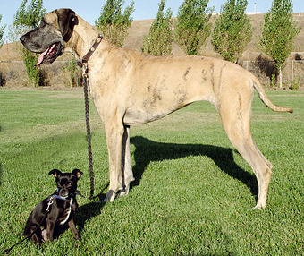
Selective Breeding
This Chihuahua mix and Great Dane show the wide range of dog breed sizes created using artificial selection, or selective breeding.
One of the first to carry out a controlled evolution experiment was William Dallinger. In the late 19th century, he cultivated small unicellular organisms in a custom-built incubator over a time period of seven years (1880–1886). Dallinger slowly increased the temperature of the incubator from an initial 60 °F up to 158 °F. The early cultures had shown clear signs of distress at a temperature of 73 °F, and were certainly not capable of surviving at 158 °F. The organisms Dallinger had in his incubator at the end of the experiment, on the other hand, were perfectly fine at 158 °F. However, these organisms would no longer grow at the initial 60 °F. Dallinger concluded that he had found evidence for Darwinian adaptation in his incubator, and that the organisms had adapted to live in a high-temperature environment .
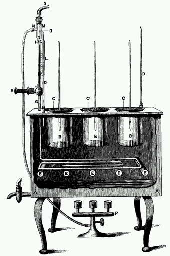
Dallinger Incubator
Drawing of the incubator used by Dallinger in his evolution experiments.
More recently, evolutionary biologists have realized that the key to successful experimentation lies in extensive parallel replication of evolving lineages as well as a larger number of generations of selection. For example, on February 15, 1988, Richard Lenski started a long-term evolution experiment with the bacterium E. coli. The experiment continues to this day, and is by now probably the largest controlled evolution experiment ever undertaken. Since the inception of the experiment, the bacteria have grown for more than 50,000 generations.
Attributions
- Cross Tabulation
-
“Crosstab of Cola Preference by Age and Gender.”
http://commons.wikimedia.org/wiki/File:Crosstab_of_Cola_Preference_by_Age_and_Gender.png.
Wikimedia
CC BY-SA.
- Drawing a Histogram
-
“Susan DeanBarbara Illowsky, Ph.D., Descriptive Statistics: Histogram. Mar 28, 2013.”
http://cnx.org/contents/20a79748-b312-4c07-ab87-820c5d8aec6e@14.
OpenStax CNX
CC BY 4.0.
- Recognizing and Using a Histogram
-
“Frequency (statistics).”
http://en.wikipedia.org/wiki/Frequency_(statistics).
Wikipedia
CC BY-SA 3.0. -
“Probability distribution.”
http://en.wikipedia.org/wiki/Probability_distribution.
Wikipedia
CC BY-SA 3.0. -
“probability distribution.”
http://en.wiktionary.org/wiki/probability_distribution.
Wiktionary
CC BY-SA 3.0. -
“Black cherry tree histogram.”
http://en.wikipedia.org/wiki/File:Black_cherry_tree_histogram.svg.
Wikipedia
CC BY-SA.
- The Density Scale
-
“Probability density function.”
http://en.wikipedia.org/wiki/Probability_density_function.
Wikipedia
CC BY-SA 3.0. -
“Kernel density estimation.”
http://en.wikipedia.org/wiki/Kernel_density_estimation.
Wikipedia
CC BY-SA 3.0. -
“Comparison of 1D histogram and KDE.”
http://en.wikipedia.org/wiki/File:Comparison_of_1D_histogram_and_KDE.png.
Wikipedia
CC BY-SA.
- Types of Variables
-
“Statistical Language – What are Variables?.”
http://www.abs.gov.au/websitedbs/a3121120.nsf/home/statistical+language+-+what+are+variables.
Austrailian Bureau of Statistics
CC BY. -
“Statistical Language – What are Variables?.”
http://www.abs.gov.au/websitedbs/a3121120.nsf/home/statistical+language+-+what+are+variables.
Austrailian Bureau of Statistics
CC BY.
- Controlling for a Variable
-
“Variable (mathematics).”
http://en.wikipedia.org/wiki/Variable_(mathematics).
Wikipedia
CC BY-SA 3.0. -
“Controlling for a variable.”
http://en.wikipedia.org/wiki/Controlling_for_a_variable.
Wikipedia
CC BY-SA 3.0. -
“vinegar experiment | Flickr – Photo Sharing!.”
http://www.flickr.com/photos/jimmiehomeschoolmom/3464814231/.
Flickr
CC BY.
- Selective Breeding
-
“Experimental evolution.”
http://en.wikipedia.org/wiki/Experimental_evolution.
Wikipedia
CC BY-SA 3.0. -
“Big and little dog 1.”
http://en.wikipedia.org/wiki/File:Big_and_little_dog_1.jpg.
Wikipedia
CC BY-SA. -
“Dallinger Incubator J.R.Microscop.Soc.1887p193.”
http://en.wikipedia.org/wiki/File:Dallinger_Incubator_J.R.Microscop.Soc.1887p193.png.
Wikipedia
Public domain.
