3.2 Graphing Data
3.2: Graphing Data
3.2.1: Statistical Graphics
Statistical graphics allow results to be displayed in some sort of pictorial form and include scatter plots, histograms, and box plots.
Learning Objective
Recognize the techniques used in exploratory data analysis
Key Takeaways
Key Points
- Graphical statistical methods explore the content of a data set.
- Graphical statistical methods are used to find structure in data.
- Graphical statistical methods check assumptions in statistical models.
- Graphical statistical methods communicate the results of an analysis.
- Graphical statistical methods communicate the results of an analysis.
Key Terms
- histogram
- a representation of tabulated frequencies, shown as adjacent rectangles, erected over discrete intervals (bins), with an area equal to the frequency of the observations in the interval
- scatter plot
- A type of display using Cartesian coordinates to display values for two variables for a set of data.
- box plot
- A graphical summary of a numerical data sample through five statistics: median, lower quartile, upper quartile, and some indication of more extreme upper and lower values.
Statistical graphics are used to visualize quantitative data. Whereas statistics and data analysis procedures generally yield their output in numeric or tabular form, graphical techniques allow such results to be displayed in some sort of pictorial form. They include plots such as scatter plots , histograms, probability plots, residual plots, box plots, block plots and bi-plots.

An example of a scatter plot
A scatter plot helps identify the type of relationship (if any) between two variables.
Exploratory data analysis (EDA) relies heavily on such techniques. They can also provide insight into a data set to help with testing assumptions, model selection and regression model validation, estimator selection, relationship identification, factor effect determination, and outlier detection. In addition, the choice of appropriate statistical graphics can provide a convincing means of communicating the underlying message that is present in the data to others.
Graphical statistical methods have four objectives:
• The exploration of the content of a data set
• The use to find structure in data
• Checking assumptions in statistical models
• Communicate the results of an analysis.
If one is not using statistical graphics, then one is forfeiting insight into one or more aspects of the underlying structure of the data.
Statistical graphics have been central to the development of science and date to the earliest attempts to analyse data. Many familiar forms, including bivariate plots, statistical maps, bar charts, and coordinate paper were used in the 18th century. Statistical graphics developed through attention to four problems:
• Spatial organization in the 17th and 18th century
• Discrete comparison in the 18th and early 19th century
• Continuous distribution in the 19th century and
• Multivariate distribution and correlation in the late 19th and 20th century.
Since the 1970s statistical graphics have been re-emerging as an important analytic tool with the revitalization of computer graphics and related technologies.
3.2.2: Stem-and-Leaf Displays
A stem-and-leaf display presents quantitative data in a graphical format to assist in visualizing the shape of a distribution.
Learning Objective
Construct a stem-and-leaf display
Key Takeaways
Key Points
- Stem-and-leaf displays are useful for displaying the relative density and shape of the data, giving the reader a quick overview of distribution.
- They retain (most of) the raw numerical data, often with perfect integrity. They are also useful for highlighting outliers and finding the mode.
- With very small data sets, a stem-and-leaf displays can be of little use, as a reasonable number of data points are required to establish definitive distribution properties.
- With very large data sets, a stem-and-leaf display will become very cluttered, since each data point must be represented numerically.
Key Terms
- outlier
- a value in a statistical sample which does not fit a pattern that describes most other data points; specifically, a value that lies 1.5 IQR beyond the upper or lower quartile
- stemplot
- a means of displaying data used especially in exploratory data analysis; another name for stem-and-leaf display
- histogram
- a representation of tabulated frequencies, shown as adjacent rectangles, erected over discrete intervals (bins), with an area equal to the frequency of the observations in the interval
A stem-and-leaf display is a device for presenting quantitative data in a graphical format in order to assist in visualizing the shape of a distribution. This graphical technique evolved from Arthur Bowley’s work in the early 1900s, and it is a useful tool in exploratory data analysis. A stem-and-leaf display is often called a stemplot (although, the latter term more specifically refers to another chart type).
Stem-and-leaf displays became more commonly used in the 1980s after the publication of John Tukey ‘s book on exploratory data analysis in 1977. The popularity during those years is attributable to the use of monospaced (typewriter) typestyles that allowed computer technology of the time to easily produce the graphics. However, the superior graphic capabilities of modern computers have lead to the decline of stem-and-leaf displays.
While similar to histograms, stem-and-leaf displays differ in that they retain the original data to at least two significant digits and put the data in order, thereby easing the move to order-based inference and non-parametric statistics.
Construction of Stem-and-Leaf Displays
A basic stem-and-leaf display contains two columns separated by a vertical line. The left column contains the stems and the right column contains the leaves. To construct a stem-and-leaf display, the observations must first be sorted in ascending order. This can be done most easily, if working by hand, by constructing a draft of the stem-and-leaf display with the leaves unsorted, then sorting the leaves to produce the final stem-and-leaf display. Consider the following set of data values:
It must be determined what the stems will represent and what the leaves will represent. Typically, the leaf contains the last digit of the number and the stem contains all of the other digits. In the case of very large numbers, the data values may be rounded to a particular place value (such as the hundreds place) that will be used for the leaves. The remaining digits to the left of the rounded place value are used as the stem. In this example, the leaf represents the ones place and the stem will represent the rest of the number (tens place and higher).
The stem-and-leaf display is drawn with two columns separated by a vertical line. The stems are listed to the left of the vertical line. It is important that each stem is listed only once and that no numbers are skipped, even if it means that some stems have no leaves. The leaves are listed in increasing order in a row to the right of each stem. Note that when there is a repeated number in the data (such as two values of ) then the plot must reflect such. Therefore, the plot would appear as when it has the numbers . The display for our data would be as follows:
| 4 | 4679 |
|---|---|
| 5 | |
| 6 | 34688 |
| 7 | 2256 |
| 8 | 148 |
| 9 | |
| 10 | 6 |
Now, let’s consider a data set with both negative numbers and numbers that need to be rounded:
For negative numbers, a negative is placed in front of the stem unit, which is still the value . Non-integers are rounded. This allows the stem-and-leaf plot to retain its shape, even for more complicated data sets:
| -2 | 4 |
|---|---|
| -1 | 2 |
| -0 | 3 |
| 0 | 466 |
| 1 | 6 |
| 2 | 4 |
| 3 | |
| 4 | |
| 5 | 7 |
Applications of Stem-and-Leaf Displays
Stem-and-leaf displays are useful for displaying the relative density and shape of data, giving the reader a quick overview of distribution. They retain (most of) the raw numerical data, often with perfect integrity. They are also useful for highlighting outliers and finding the mode.
However, stem-and-leaf displays are only useful for moderately sized data sets (around 15 to 150 data points). With very small data sets, stem-and-leaf displays can be of little use, as a reasonable number of data points are required to establish definitive distribution properties. With very large data sets, a stem-and-leaf display will become very cluttered, since each data point must be represented numerically. A box plot or histogram may become more appropriate as the data size increases.
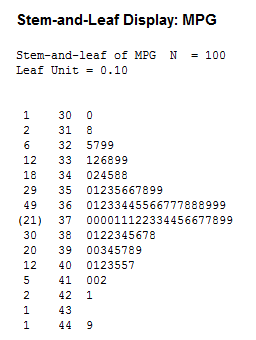
Stem-and-Leaf Display
This is an example of a stem-and-leaf display for EPA data on miles per gallon of gasoline.
3.2.3: Reading Points on a Graph
A graph is a representation of a set of objects where some pairs of the objects are connected by links.
Learning Objective
Distinguish direct and indirect edges
Key Takeaways
Key Points
- The interconnected objects are represented by mathematical abstractions called vertices.
- The links that connect some pairs of vertices are called edges.
- Vertices are also called nodes or points, and edges are also called lines or arcs.
Key Term
- graph
- A diagram displaying data; in particular one showing the relationship between two or more quantities, measurements or indicative numbers that may or may not have a specific mathematical formula relating them to each other.
In mathematics, a graph is a representation of a set of objects where some pairs of the objects are connected by links. The interconnected objects are represented by mathematical abstractions called vertices, and the links that connect some pairs of vertices are called edges .Typically, a graph is depicted in diagrammatic form as a set of dots for the vertices, joined by lines or curves for the edges. Graphs are one of the objects of study in discrete mathematics.
The edges may be directed or indirected. For example, if the vertices represent people at a party, and there is an edge between two people if they shake hands, then this is an indirected graph, because if person A shook hands with person B, then person B also shook hands with person A. In contrast, if the vertices represent people at a party, and there is an edge from person A to person B when person A knows of person B, then this graph is directed, because knowledge of someone is not necessarily a symmetric relation (that is, one person knowing another person does not necessarily imply the reverse; for example, many fans may know of a celebrity, but the celebrity is unlikely to know of all their fans). This latter type of graph is called a directed graph and the edges are called directed edges or arcs.Vertices are also called nodes or points, and edges are also called lines or arcs. Graphs are the basic subject studied by graph theory. The word “graph” was first used in this sense by J.J. Sylvester in 1878.
3.2.4: Plotting Points on a Graph
A plot is a graphical technique for representing a data set, usually as a graph showing the relationship between two or more variables.
Learning Objective
Differentiate the different tools used in quantitative and graphical techniques
Key Takeaways
Key Points
- Graphs are a visual representation of the relationship between variables, very useful because they allow us to quickly derive an understanding which would not come from lists of values.
- Quantitative techniques are the set of statistical procedures that yield numeric or tabular output.
- Examples include hypothesis testing, analysis of variance, point estimates and confidence intervals, and least squares regression.
- There are also many statistical tools generally referred to as graphical techniques, which include: scatter plots, histograms, probability plots, residual plots, box plots, and block plots.
Key Term
- plot
- a graph or diagram drawn by hand or produced by a mechanical or electronic device
A plot is a graphical technique for representing a data set, usually as a graph showing the relationship between two or more variables. The plot can be drawn by hand or by a mechanical or electronic plotter. Graphs are a visual representation of the relationship between variables, very useful because they allow us to quickly derive an understanding which would not come from lists of values. Graphs can also be used to read off the value of an unknown variable plotted as a function of a known one. Graphs of functions are used in mathematics, sciences, engineering, technology, finance, and many other areas.
Plots play an important role in statistics and data analysis. The procedures here can be broadly split into two parts: quantitative and graphical. Quantitative techniques are the set of statistical procedures that yield numeric or tabular output. Examples of quantitative techniques include:
- hypothesis testing,
- analysis of variance (ANOVA),
- point estimates and confidence intervals, and
- least squares regression.
These and similar techniques are all valuable and are mainstream in terms of classical analysis. There are also many statistical tools generally referred to as graphical techniques. These include:
- scatter plots,
- histograms,
- probability plots,
- residual plots,
- box plots, and
- block plots.
Graphical procedures such as plots are a short path to gaining insight into a data set in terms of testing assumptions, model selection, model validation, estimator selection, relationship identification, factor effect determination, and outlier detection. Statistical graphics give insight into aspects of the underlying structure of the data.
Plotting Points
As an example of plotting points on a graph, consider one of the most important visual aids available to us in the context of statistics: the scatter plot.
To display values for “lung capacity” (first variable) and how long that person could hold his breath, a researcher would choose a group of people to study, then measure each one’s lung capacity (first variable) and how long that person could hold his breath (second variable). The researcher would then plot the data in a scatter plot, assigning “lung capacity” to the horizontal axis, and “time holding breath” to the vertical axis.
A person with a lung capacity of 400 ml who held his breath for 21.7 seconds would be represented by a single dot on the scatter plot at the point
. The scatter plot of all the people in the study would enable the researcher to obtain a visual comparison of the two variables in the data set and will help to determine what kind of relationship there might be between the two variables.
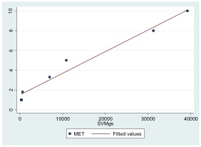
Scatterplot
Scatterplot with a fitted regression line.
3.2.5: Slope and Intercept
The concepts of slope and intercept are essential to understand in the context of graphing data.
Learning Objectives
Explain the term rise over run when describing slope
Key Takeaways
Key Points
- The slope or gradient of a line describes its steepness, incline, or grade — with a higher slope value indicating a steeper incline.
- The slope of a line in the plane containing the x and y axes is generally represented by the letter m, and is defined as the change in the y coordinate divided by the corresponding change in the x coordinate, between two distinct points on the line.
- Using the common convention that the horizontal axis represents a variable x and the vertical axis represents a variable y, a y– intercept is a point where the graph of a function or relation intersects with the y-axis of the coordinate system.
- Analogously, an x-intercept is a point where the graph of a function or relation intersects with the x-axis.
Key Terms
- intercept: the coordinate of the point at which a curve intersects an axis
- slope: the ratio of the vertical and horizontal distances between two points on a line; zero if the line is horizontal, undefined if it is vertical.
Slope
The slope or gradient of a line describes its steepness, incline, or grade. A higher slope value indicates a steeper incline. Slope is normally described by the ratio of the “rise” divided by the “run” between two points on a line. The line may be practical (as for a roadway) or in a diagram.

The slope of a line in the plane containing the x and y axes is generally represented by the letter m, and is defined as the change in the y coordinate divided by the corresponding change in the x coordinate, between two distinct points on the line. This is described by the following equation:
The Greek letter delta, , is commonly used in mathematics to mean “difference” or “change”. Given two points and , the change in from one to the other is (run), while the change in is (rise).
Intercept
Using the common convention that the horizontal axis represents a variable
and the vertical axis represents a variable
, a
-intercept is a point where the graph of a function or relation intersects with the
-axis of the coordinate system. It also acts as a reference point for slopes and some graphs.

Intercept
Graph with a y-intercept at (0,1).
If the curve in question is given as , the -coordinate of the -intercept is found by calculating . Functions which are undefined at have no -intercept.
Some 2-dimensional mathematical relationships such as circles, ellipses, and hyperbolas can have more than one -intercept. Because functions associate values to no more than one value as part of their definition, they can have at most one -intercept.
Analogously, an -intercept is a point where the graph of a function or relation intersects with the -axis. As such, these points satisfy . The zeros, or roots, of such a function or relation are the -coordinates of these -intercepts.
3.2.6: Plotting Lines
A line graph is a type of chart which displays information as a series of data points connected by straight line segments.
Learning Objective
Explain the principles of plotting a line graph
Key Takeaways
Key Points
- A line chart is often used to visualize a trend in data over intervals of time – a time series – thus the line is often drawn chronologically.
- A line chart is typically drawn bordered by two perpendicular lines, called axes. The horizontal axis is called the x-axis and the vertical axis is called the y-axis.
- Typically the y-axis represents the dependent variable and the x-axis (sometimes called the abscissa) represents the independent variable.
- In statistics, charts often include an overlaid mathematical function depicting the best-fit trend of the scattered data.
Key Terms
- bell curve
- In mathematics, the bell-shaped curve that is typical of the normal distribution.
- line
- a path through two or more points (compare ‘segment’); a continuous mark, including as made by a pen; any path, curved or straight
- gradient
- of a function y = f(x) or the graph of such a function, the rate of change of y with respect to x, that is, the amount by which y changes for a certain (often unit) change in x
A line graph is a type of chart which displays information as a series of data points connected by straight line segments. It is a basic type of chart common in many fields. It is similar to a scatter plot except that the measurement points are ordered (typically by their x-axis value) and joined with straight line segments. A line chart is often used to visualize a trend in data over intervals of time – a time series – thus the line is often drawn chronologically.
Plotting
A line chart is typically drawn bordered by two perpendicular lines, called axes. The horizontal axis is called the x-axis and the vertical axis is called the y-axis. To aid visual measurement, there may be additional lines drawn parallel either axis. If lines are drawn parallel to both axes, the resulting lattice is called a grid.
Each axis represents one of the data quantities to be plotted. Typically the y-axis represents the dependent variable and the x-axis (sometimes called the abscissa) represents the independent variable. The chart can then be referred to as a graph of quantity one versus quantity two, plotting quantity one up the y-axis and quantity two along the x-axis.
Example
In the experimental sciences, such as statistics, data collected from experiments are often visualized by a graph. For example, if one were to collect data on the speed of a body at certain points in time, one could visualize the data to look like the graph in :
| Elapsed Time (s) | Speed (m s^-1) |
|---|---|
| 0 | 0 |
| 1 | 3 |
| 2 | |
| 3 | 12 |
| 4 | 20 |
| 5 | 30 |
| 6 | 45 |
Data Table
A data table showing elapsed time and measured speed.
The table “visualization” is a great way of displaying exact values, but can be a poor way to understand the underlying patterns that those values represent. Understanding the process described by the data in the table is aided by producing a graph or line chart of Speed versus Time:

Line chart
A graph of speed versus time
Best-Fit
In statistics, charts often include an overlaid mathematical function depicting the best-fit trend of the scattered data. This layer is referred to as a best-fit layer and the graph containing this layer is often referred to as a line graph.
It is simple to construct a “best-fit” layer consisting of a set of line segments connecting adjacent data points; however, such a “best-fit” is usually not an ideal representation of the trend of the underlying scatter data for the following reasons:
- It is highly improbable that the discontinuities in the slope of the best-fit would correspond exactly with the positions of the measurement values.
- It is highly unlikely that the experimental error in the data is negligible, yet the curve falls exactly through each of the data points.
In either case, the best-fit layer can reveal trends in the data. Further, measurements such as the gradient or the area under the curve can be made visually, leading to more conclusions or results from the data.
A true best-fit layer should depict a continuous mathematical function whose parameters are determined by using a suitable error-minimization scheme, which appropriately weights the error in the data values. Such curve fitting functionality is often found in graphing software or spreadsheets. Best-fit curves may vary from simple linear equations to more complex quadratic, polynomial, exponential, and periodic curves. The so-called “bell curve”, or normal distribution often used in statistics, is a Gaussian function.
3.2.7: The Equation of a Line
In statistics, linear regression can be used to fit a predictive model to an observed data set of y and x values.
Learning Objective
Examine simple linear regression in terms of slope and intercept
Key Takeaways
Key Points
- Simple linear regression fits a straight line through a set of points that makes the vertical distances between the points of the data set and the fitted line as small as possible.
- , where and designate constants is a common form of a linear equation.
- Linear regression can be used to fit a predictive model to an observed data set of and values.
Key Term
- linear regression
- an approach to modeling the relationship between a scalar dependent variable $y$ and one or more explanatory variables denoted $x$.
In statistics, simple linear regression is the least squares estimator of a linear regression model with a single explanatory variable. Simple linear regression fits a straight line through the set of points in such a way that makes the sum of squared residuals of the model (that is, vertical distances between the points of the data set and the fitted line) as small as possible.
The slope of the fitted line is equal to the correlation between and corrected by the ratio of standard deviations of these variables. The intercept of the fitted line is such that it passes through the center of mass of the data points.

The function of a line
Three lines — the red and blue lines have the same slope, while the red and green ones have same y-intercept.
Linear regression was the first type of regression analysis to be studied rigorously, and to be used extensively in practical applications. This is because models which depend linearly on their unknown parameters are easier to fit than models which are non-linearly related to their parameters and because the statistical properties of the resulting estimators are easier to determine.
A common form of a linear equation in the two variables x and y is: y= mx + b.
Where (slope) and (intercept) designate constants. The origin of the name “linear” comes from the fact that the set of solutions of such an equation forms a straight line in the plane. In this particular equation, the constant determines the slope or gradient of that line, and the constant term determines the point at which the line crosses the -axis, otherwise known as the -intercept.
If the goal is prediction, or forecasting, linear regression can be used to fit a predictive model to an observed data set of and values. After developing such a model, if an additional value of is then given without its accompanying value of , the fitted model can be used to make a prediction of the value of .

Linear regression
An example of a simple linear regression analysis
Attributions
- Statistical Graphics
-
“Exploratory data analysis.”
http://en.wikipedia.org/wiki/Exploratory_data_analysis.
Wikipedia
CC BY-SA 3.0. -
“Scatter diagram for quality characteristic XXX.”
http://en.wikipedia.org/wiki/File:Scatter_diagram_for_quality_characteristic_XXX.svg.
Wikipedia
CC BY-SA.
- Stem-and-Leaf Displays
-
“Stem-and-leaf display.”
http://en.wikipedia.org/wiki/Stem-and-leaf_display.
Wikipedia
CC BY-SA 3.0. -
“Lab 1 – Stem-and-Leaf Display.”
http://commons.wikimedia.org/wiki/File:Lab_1_-_Stem-and-Leaf_Display.png.
Wikimedia
CC BY-SA.
- Reading Points on a Graph
- Plotting Points on a Graph
-
“Scatterplot with a fitted regression line for Mean SVMgs = accelerometer output and MET value.”
http://commons.wikimedia.org/wiki/File:Scatterplot_with_a_fitted_regression_line_for_Mean_SVMgs_=_accelerometer_output_and_MET_value.jpg.
Wikimedia
CC BY-SA.
- Slope and Intercept
- Plotting Lines
- The Equation of a Line
-
“Simple linear regression.”
http://en.wikipedia.org/wiki/Simple_linear_regression.
Wikipedia
CC BY-SA 3.0. -
“Correlation and dependence.”
http://en.wikipedia.org/wiki/Correlation_and_dependence.
Wikipedia
CC BY-SA 3.0. -
“Linear regression.”
http://en.wikipedia.org/wiki/File:Linear_regression.svg.
Wikipedia
Public domain.
