4.2 Frequency Distributions for Qualitative Data
4.2: Frequency Distributions for Qualitative Data
4.2.1: Describing Qualitative Data
Qualitative data is a categorical measurement expressed not in terms of numbers, but rather by means of a natural language description.
Learning Objectives
Summarize the processes available to researchers that allow qualitative data to be analyzed similarly to quantitative data.
Key Takeaways
Key Points
- Observer impression is when expert or bystander observers examine the data, interpret it via forming an impression and report their impression in a structured and sometimes quantitative form.
- To discover patterns in qualitative data, one must try to find frequencies, magnitudes, structures, processes, causes, and consequences.
- The Ground Theory Method (GTM) is an inductive approach to research in which theories are generated solely from an examination of data rather than being derived deductively.
- Coding is an interpretive technique that both organizes the data and provides a means to introduce the interpretations of it into certain quantitative methods.
- Most coding requires the analyst to read the data and demarcate segments within it.
Key Terms
- nominal
- Having values whose order is insignificant.
- ordinal
- Of a number, indicating position in a sequence.
- qualitative analysis
- The numerical examination and interpretation of observations for the purpose of discovering underlying meanings and patterns of relationships.
Qualitative data is a categorical measurement expressed not in terms of numbers, but rather by means of a natural language description. In statistics, it is often used interchangeably with “categorical” data. When there is not a natural ordering of the categories, we call these nominal categories. Examples might be gender, race, religion, or sport.
When the categories may be ordered, these are called ordinal variables. Categorical variables that judge size (small, medium, large, etc.) are ordinal variables. Attitudes (strongly disagree, disagree, neutral, agree, strongly agree) are also ordinal variables; however, we may not know which value is the best or worst of these issues. Note that the distance between these categories is not something we can measure.
Qualitative Analysis
Qualitative Analysis is the numerical examination and interpretation of observations for the purpose of discovering underlying meanings and patterns of relationships. The most common form of qualitative qualitative analysis is observer impression—when an expert or bystander observers examine the data, interpret it via forming an impression and report their impression in a structured and sometimes quantitative form.
An important first step in qualitative analysis and observer impression is to discover patterns. One must try to find frequencies, magnitudes, structures, processes, causes, and consequences. One method of this is through cross-case analysis, which is analysis that involves an examination of more than one case. Cross-case analysis can be further broken down into variable-oriented analysis and case-oriented analysis. Variable-oriented analysis is that which describes and/or explains a particular variable, while case-oriented analysis aims to understand a particular case or several cases by looking closely at the details of each.
The Ground Theory Method (GTM) is an inductive approach to research, introduced by Barney Glaser and Anselm Strauss, in which theories are generated solely from an examination of data rather than being derived deductively. A component of the Grounded Theory Method is the constant comparative method, in which observations are compared with one another and with the evolving inductive theory.
Four Stages of the Constant Comparative Method
- comparing incident application to each category
- integrating categories and their properties
- delimiting the theory
- writing theory
Other methods of discovering patterns include semiotics and conversation analysis. Semiotics is the study of signs and the meanings associated with them. It is commonly associated with content analysis. Conversation analysis is a meticulous analysis of the details of conversation, based on a complete transcript that includes pauses and other non-verbal communication.
Conceptualization and Coding
In quantitative analysis, it is usually obvious what the variables to be analyzed are, for example, race, gender, income, education, etc. Deciding what is a variable, and how to code each subject on each variable, is more difficult in qualitative data analysis.
Concept formation is the creation of variables (usually called themes) out of raw qualitative data. It is more sophisticated in qualitative data analysis. Casing is an important part of concept formation. It is the process of determining what represents a case. Coding is the actual transformation of qualitative data into themes.
More specifically, coding is an interpretive technique that both organizes the data and provides a means to introduce the interpretations of it into certain quantitative methods. Most coding requires the analyst to read the data and demarcate segments within it, which may be done at different times throughout the process. Each segment is labeled with a “code” – usually a word or short phrase that suggests how the associated data segments inform the research objectives. When coding is complete, the analyst prepares reports via a mix of: summarizing the prevalence of codes, discussing similarities and differences in related codes across distinct original sources/contexts, or comparing the relationship between one or more codes.
Some qualitative data that is highly structured (e.g., close-end responses from surveys or tightly defined interview questions) is typically coded without additional segmenting of the content. In these cases, codes are often applied as a layer on top of the data. Quantitative analysis of these codes is typically the capstone analytical step for this type of qualitative data.
A frequent criticism of coding method is that it seeks to transform qualitative data into empirically valid data that contain actual value range, structural proportion, contrast ratios, and scientific objective properties. This can tend to drain the data of its variety, richness, and individual character. Analysts respond to this criticism by thoroughly expositing their definitions of codes and linking those codes soundly to the underlying data, therein bringing back some of the richness that might be absent from a mere list of codes.
Alternatives to Coding
Alternatives to coding include recursive abstraction and mechanical techniques. Recursive abstraction involves the summarizing of datasets. Those summaries are then further summarized and so on. The end result is a more compact summary that would have been difficult to accurately discern without the preceding steps of distillation.
Mechanical techniques rely on leveraging computers to scan and reduce large sets of qualitative data. At their most basic level, mechanical techniques rely on counting words, phrases, or coincidences of tokens within the data. Often referred to as content analysis, the output from these techniques is amenable to many advanced statistical analyses.
4.2.2: Interpreting Distributions Constructed by Others
Graphs of distributions created by others can be misleading, either intentionally or unintentionally.
Learning Objective
Demonstrate how distributions constructed by others may be misleading, either intentionally or unintentionally
Key Takeaways
Key Points
- Misleading graphs will misrepresent data, constituting a misuse of statistics that may result in an incorrect conclusion being derived from them.
- Graphs can be misleading if they’re used excessively, if they use the third dimensions where it is unnecessary, if they are improperly scaled, or if they’re truncated.
- The use of biased or loaded words in the graph’s title, axis labels, or caption may inappropriately prime the reader.
Key Terms
- bias
- (Uncountable) Inclination towards something; predisposition, partiality, prejudice, preference, predilection.
- distribution
- the set of relative likelihoods that a variable will have a value in a given interval
- truncate
- To shorten something as if by cutting off part of it.
Distributions Constructed by Others
Unless you are constructing a graph of a distribution on your own, you need to be very careful about how you read and interpret graphs. Graphs are made in order to display data; however, some people may intentionally try to mislead the reader in order to convey certain information.
In statistics, these types of graphs are called misleading graphs (or distorted graphs). They misrepresent data, constituting a misuse of statistics that may result in an incorrect conclusion being derived from them. Graphs may be misleading through being excessively complex or poorly constructed. Even when well-constructed to accurately display the characteristics of their data, graphs can be subject to different interpretation.
Misleading graphs may be created intentionally to hinder the proper interpretation of data, but can also be created accidentally by users for a variety of reasons including unfamiliarity with the graphing software, the misinterpretation of the data, or because the data cannot be accurately conveyed. Misleading graphs are often used in false advertising.
Types of Misleading Graphs
The use of graphs where they are not needed can lead to unnecessary confusion/interpretation. Generally, the more explanation a graph needs, the less the graph itself is needed. Graphs do not always convey information better than tables. This is often called excessive usage.
The use of biased or loaded words in the graph’s title, axis labels, or caption may inappropriately prime the reader.
Pie charts can be especially misleading. Comparing pie charts of different sizes could be misleading as people cannot accurately read the comparative area of circles. The usage of thin slices which are hard to discern may be difficult to interpret. The usage of percentages as labels on a pie chart can be misleading when the sample size is small. A perspective (3D) pie chart is used to give the chart a 3D look. Often used for aesthetic reasons, the third dimension does not improve the reading of the data; on the contrary, these plots are difficult to interpret because of the distorted effect of perspective associated with the third dimension. In a 3D pie chart, the slices that are closer to the reader appear to be larger than those in the back due to the angle at which they’re presented .
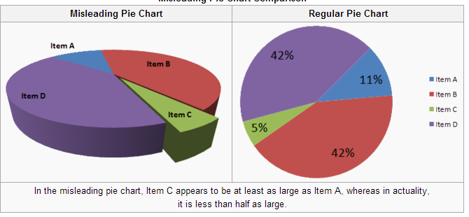
3-D Pie Chart
In the misleading pie chart, Item C appears to be at least as large as Item A, whereas in actuality, it is less than half as large.
When using pictogram in bar graphs, they should not be scaled uniformly as this creates a perceptually misleading comparison. The area of the pictogram is interpreted instead of only its height or width. This causes the scaling to make the difference appear to be squared .

Improper Scaling
Note how in the improperly scaled pictogram bar graph, the image for B is actually 9 times larger than A.
A truncated graph has a y-axis that does not start at 0. These graphs can create the impression of important change where there is relatively little change .
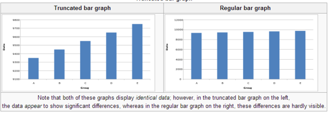
Truncated Bar Graph
Note that both of these graphs display identical data; however, in the truncated bar graph on the left, the data appear to show significant differences, whereas in the regular bar graph on the right, these differences are hardly visible.
Usage in the Real World
Graphs are useful in the summary and interpretation of financial data. Graphs allow for trends in large data sets to be seen while also allowing the data to be interpreted by non-specialists. Graphs are often used in corporate annual reports as a form of impression management. In the United States, graphs do not have to be audited as they fall under AU Section 550 Other Information in Documents Containing Audited Financial Statements. Several published studies have looked at the usage of graphs in corporate reports for different corporations in different countries and have found frequent usage of improper design, selectivity, and measurement distortion within these reports. The presence of misleading graphs in annual reports have led to requests for standards to be set. Research has found that while readers with poor levels of financial understanding have a greater chance of being misinformed by misleading graphs, even those with financial understanding, such as loan officers, may be misled.
4.2.3: Graphs of Qualitative Data
Qualitative data can be graphed in various ways, including using pie charts and bar charts.
Learning Objective
Create a pie chart and bar chart representing qualitative data.
Key Takeaways
Key Points
- Since qualitative data represent individual categories, calculating descriptive statistics is limited. Mean, median, and measures of spread cannot be calculated; however, the mode can be calculated.
- One way in which we can graphically represent qualitative data is in a pie chart. Categories are represented by slices of the pie, whose areas are proportional to the percentage of items in that category.
- The key point about the qualitative data is that they do not come with a pre-established ordering (the way numbers are ordered).
- Bar charts can also be used to graph qualitative data. The Y axis displays the frequencies and the X axis displays the categories.
Key Term
- descriptive statistics
- A branch of mathematics dealing with summarization and description of collections of data sets, including the concepts of arithmetic mean, median, and mode.
Qualitative Data
Recall the difference between quantitative and qualitative data. Quantitative data are data about numeric values. Qualitative data are measures of types and may be represented as a name or symbol. Statistics that describe or summarize can be produced for quantitative data and to a lesser extent for qualitative data. As quantitative data are always numeric they can be ordered, added together, and the frequency of an observation can be counted. Therefore, all descriptive statistics can be calculated using quantitative data. As qualitative data represent individual (mutually exclusive) categories, the descriptive statistics that can be calculated are limited, as many of these techniques require numeric values which can be logically ordered from lowest to highest and which express a count. Mode can be calculated, as it it the most frequency observed value. Median, measures of shape, measures of spread such as the range and interquartile range, require an ordered data set with a logical low-end value and high-end value. Variance and standard deviation require the mean to be calculated, which is not appropriate for categorical variables as they have no numerical value.
Graphing Qualitative Data
There are a number of ways in which qualitative data can be displayed. A good way to demonstrate the different types of graphs is by looking at the following example:
When Apple Computer introduced the iMac computer in August 1998, the company wanted to learn whether the iMac was expanding Apple’s market share. Was the iMac just attracting previous Macintosh owners? Or was it purchased by newcomers to the computer market, and by previous Windows users who were switching over? To find out, 500 iMac customers were interviewed. Each customer was categorized as a previous Macintosh owners, a previous Windows owner, or a new computer purchaser. The qualitative data results were displayed in a frequency table.
| Previous Ownership | Frequency | Relative Frequency |
|---|---|---|
| None | 85 | 0.17 |
| Windows | 60 | 0.12 |
| Mac | 355 | 0.71 |
| Total | 500 | 1.00 |
Frequency Table for Mac Data
The frequency table shows how many people in the study were previous Mac owners, previous Windows owners, or neither.
The key point about the qualitative data is that they do not come with a pre-established ordering (the way numbers are ordered). For example, there is no natural sense in which the category of previous Windows users comes before or after the category of previous iMac users. This situation may be contrasted with quantitative data, such as a person’s weight. People of one weight are naturally ordered with respect to people of a different weight.
Pie Charts
One way in which we can graphically represent this qualitative data is in a pie chart. In a pie chart, each category is represented by a slice of the pie. The area of the slice is proportional to the percentage of responses in the category. This is simply the relative frequency multiplied by 100. Although most iMac purchasers were Macintosh owners, Apple was encouraged by the 12% of purchasers who were former Windows users, and by the 17% of purchasers who were buying a computer for the first time .
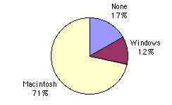
Pie Chart for Mac Data
The pie chart shows how many people in the study were previous Mac owners, previous Windows owners, or neither.
Pie charts are effective for displaying the relative frequencies of a small number of categories. They are not recommended, however, when you have a large number of categories. Pie charts can also be confusing when they are used to compare the outcomes of two different surveys or experiments.
Here is another important point about pie charts. If they are based on a small number of observations, it can be misleading to label the pie slices with percentages. For example, if just 5 people had been interviewed by Apple Computers, and 3 were former Windows users, it would be misleading to display a pie chart with the Windows slice showing 60%. With so few people interviewed, such a large percentage of Windows users might easily have accord since chance can cause large errors with small samples. In this case, it is better to alert the user of the pie chart to the actual numbers involved. The slices should therefore be labeled with the actual frequencies observed (e.g., 3) instead of with percentages.
Bar Charts
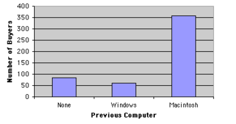
Bar Chart for Mac Data
The bar chart shows how many people in the study were previous Mac owners, previous Windows owners, or neither.
Bar charts can also be used to represent frequencies of different categories . Frequencies are shown on the Y axis and the type of computer previously owned is shown on the X axis. Typically the Y-axis shows the number of observations rather than the percentage of observations in each category as is typical in pie charts.
4.2.4: Misleading Graphs
A misleading graph misrepresents data and may result in incorrectly derived conclusions.
Learning Objectives
Key Takeaways
Key Points
- Misleading graphs may be created intentionally to hinder the proper interpretation of data, but can be also created accidentally by users for a variety of reasons.
- The use of graphs where they are not needed can lead to unnecessary confusion/interpretation. This is referred to as excessive usage.
- The use of biased or loaded words in the graph’s title, axis labels, or caption may inappropriately sway the reader. This is called biased labeling.
- Graphs can also be misleading if they are improperly labeled, if they are truncated, if there is an axis change, if they lack a scale, or if they are unnecessarily displayed in the third dimension.
Key Terms
- pictogram
- a picture that represents a word or an idea by illustration; used often in graphs
- volatility
- the state of sharp and regular fluctuation
What is a Misleading Graph?
In statistics, a misleading graph, also known as a distorted graph, is a graph which misrepresents data, constituting a misuse of statistics and with the result that an incorrect conclusion may be derived from it. Graphs may be misleading through being excessively complex or poorly constructed. Even when well-constructed to accurately display the characteristics of their data, graphs can be subject to different interpretation.
Misleading graphs may be created intentionally to hinder the proper interpretation of data, but can be also created accidentally by users for a variety of reasons including unfamiliarity with the graphing software, the misinterpretation of the data, or because the data cannot be accurately conveyed. Misleading graphs are often used in false advertising. One of the first authors to write about misleading graphs was Darrell Huff, who published the best-selling book How to Lie With Statistics in 1954. It is still in print.
Excessive Usage
There are numerous ways in which a misleading graph may be constructed. The use of graphs where they are not needed can lead to unnecessary confusion/interpretation. Generally, the more explanation a graph needs, the less the graph itself is needed. Graphs do not always convey information better than tables.
Biased Labeling
The use of biased or loaded words in the graph’s title, axis labels, or caption may inappropriately sway the reader.
Improper Scaling
When using pictogram in bar graphs, they should not be scaled uniformly as this creates a perceptually misleading comparison. The area of the pictogram is interpreted instead of only its height or width. This causes the scaling to make the difference appear to be squared.
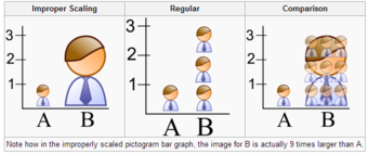
Improper Scaling
In the improperly scaled pictogram bar graph, the image for B is actually 9 times larger than A.
Truncated Graphs
A truncated graph has a y-axis that does not start at zero. These graphs can create the impression of important change where there is relatively little change.Truncated graphs are useful in illustrating small differences. Graphs may also be truncated to save space. Commercial software such as MS Excel will tend to truncate graphs by default if the values are all within a narrow range.
Truncated Bar Graph
Both of these graphs display identical data; however, in the truncated bar graph on the left, the data appear to show significant differences, whereas in the regular bar graph on the right, these differences are hardly visible.
Misleading 3D Pie Charts
A perspective (3D) pie chart is used to give the chart a 3D look. Often used for aesthetic reasons, the third dimension does not improve the reading of the data; on the contrary, these plots are difficult to interpret because of the distorted effect of perspective associated with the third dimension. The use of superfluous dimensions not used to display the data of interest is discouraged for charts in general, not only for pie charts. In a 3D pie chart, the slices that are closer to the reader appear to be larger than those in the back due to the angle at which they’re presented .
Misleading 3D Pie Chart
In the misleading pie chart, Item C appears to be at least as large as Item A, whereas in actuality, it is less than half as large.
Other Misleading Graphs
Graphs can also be misleading for a variety of other reasons. An axis change affects how the graph appears in terms of its growth and volatility. A graph with no scale can be easily manipulated to make the difference between bars look larger or smaller than they actually are. Improper intervals can affect the appearance of a graph, as well as omitting data. Finally, graphs can also be misleading if they are overly complex or poorly constructed.
Graphs in Finance and Corporate Reports
Graphs are useful in the summary and interpretation of financial data. Graphs allow for trends in large data sets to be seen while also allowing the data to be interpreted by non-specialists. Graphs are often used in corporate annual reports as a form of impression management. In the United States, graphs do not have to be audited. Several published studies have looked at the usage of graphs in corporate reports for different corporations in different countries and have found frequent usage of improper design, selectivity, and measurement distortion within these reports. The presence of misleading graphs in annual reports have led to requests for standards to be set. Research has found that while readers with poor levels of financial understanding have a greater chance of being misinformed by misleading graphs, even those with financial understanding, such as loan officers, may be misled.
4.2.5: Do It Yourself: Plotting Qualitative Frequency Distributions
Qualitative frequency distributions can be displayed in bar charts, Pareto charts, and pie charts.
Learning Objectives
Key Takeaways
Key Points
- The first step to plotting a qualitative frequency distributions is to create a frequency table.
- If drawing a bar graph or Pareto chart, first draw two axes. The y-axis is labeled with the frequency (or relative frequency) and the x-axis is labeled with the category.
- In bar graphs and Pareto graphs, draw rectangles of equal width and heights that correspond to their frequencies/relative frequencies.
- A pie chart shows the distribution in a different way, where each percentage is a slice of the pie.
Key Terms
- relative frequency distribution
- a representation, either in graphical or tabular format, which displays the fraction of observations in a certain category
- frequency distribution
- a representation, either in a graphical or tabular format, which displays the number of observations within a given interval
- Pareto chart
- a type of bar graph where where the bars are drawn in decreasing order of frequency or relative frequency
Ways to Organize Data
When data is collected from a survey or an experiment, they must be organized into a manageable form. Data that is not organized is referred to as raw data. A few different ways to organize data include tables, graphs, and numerical summaries.
One common way to organize qualitative, or categorical, data is in a frequency distribution. A frequency distribution lists the number of occurrences for each category of data.
Step-by-Step Guide to Plotting Qualitative Frequency Distributions
The first step towards plotting a qualitative frequency distribution is to create a table of the given or collected data. For example, let’s say you want to determine the distribution of colors in a bag of Skittles. You open up a bag, and you find that there are 15 red, 7 orange, 7 yellow, 13 green, and 8 purple. Create a two column chart, with the titles of Color and Frequency, and fill in the corresponding data.
To construct a frequency distribution in the form of a bar graph, you must first draw two axes. The y-axis (vertical axis) should be labeled with the frequencies and the x-axis (horizontal axis) should be labeled with each category (in this case, Skittle color). The graph is completed by drawing rectangles of equal width for each color, each as tall as their frequency .
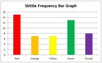
Bar Graph
This graph shows the frequency distribution of a bag of Skittles.
Sometimes a relative frequency distribution is desired. If this is the case, simply add a third column in the table called Relative Frequency. This is found by dividing the frequency of each color by the total number of Skittles (50, in this case). This number can be written as a decimal, a percentage, or as a fraction. If we decided to use decimals, the relative frequencies for the red, orange, yellow, green, and purple Skittles are respectively 0.3, 0.14, 0.14, 0.26, and 0.16. The decimals should add up to 1 (or very close to it due to rounding). Bar graphs for relative frequency distributions are very similar to bar graphs for regular frequency distributions, except this time, the y-axis will be labeled with the relative frequency rather than just simply the frequency. A special type of bar graph where the bars are drawn in decreasing order of relative frequency is called a Pareto chart .
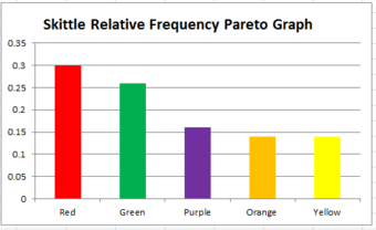
Pareto Chart
This graph shows the relative frequency distribution of a bag of Skittles.
The distribution can also be displayed in a pie chart, where the percentages of the colors are broken down into slices of the pie. This may be done by hand, or by using a computer program such as Microsoft Excel . If done by hand, you must find out how many degrees each piece of the pie corresponds to. Since a circle has 360 degrees, this is found out by multiplying the relative frequencies by 360. The respective degrees for red, orange, yellow, green, and purple in this case are 108, 50.4, 50.4, 93.6, and 57.6. Then, use a protractor to properly draw in each slice of the pie.
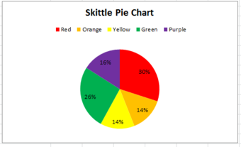
Pie Chart
This pie chart shows the frequency distribution of a bag of Skittles.
4.2.6: Summation Notation
In statistical formulas that involve summing numbers, the Greek letter sigma is used as the summation notation.
Learning Objectives
Key Takeaways
Key Points
- There is no special notation for the summation of explicit sequences (such as 1+2+4+2), as the corresponding repeated addition expression will do.
- If the terms of the sequence are given by a regular pattern, possibly of variable length, then the summation notation may be useful or even essential.
- In general, mathematicians use the following sigma notation: , where m is the lower bound, n is the upper bound, i is the index of summation, and a(i) represents each successive term to be added.

Key Terms
- summation notation
- a notation, given by the Greek letter sigma, that denotes the operation of adding a sequence of numbers
- ellipsis
- a mark consisting of three periods, historically with spaces in between, before, and after them ” . . . “, nowadays a single character ” (used in printing to indicate an omission)
Summation
Many statistical formulas involve summing numbers. Fortunately there is a convenient notation for expressing summation. This section covers the basics of this summation notation.
Summation is the operation of adding a sequence of numbers, the result being their sum or total. If numbers are added sequentially from left to right, any intermediate result is a partial sum, prefix sum, or running total of the summation. The numbers to be summed (called addends, or sometimes summands) may be integers, rational numbers, real numbers, or complex numbers. Besides numbers, other types of values can be added as well: vectors, matrices, polynomials and, in general, elements of any additive group. For finite sequences of such elements, summation always produces a well-defined sum.
The summation of the sequence [1, 2, 4, 2] is an expression whose value is the sum of each of the members of the sequence. In the example, 1+2+4+2=9. Since addition is associative, the value does not depend on how the additions are grouped. For instance (1+2) + (4+2) and 1 + ((2+4) + 2) both have the value 9; therefore, parentheses are usually omitted in repeated additions. Addition is also commutative, so changing the order of the terms of a finite sequence does not change its sum.
Notation
There is no special notation for the summation of such explicit sequences as the example above, as the corresponding repeated addition expression will do. If, however, the terms of the sequence are given by a regular pattern, possibly of variable length, then a summation operator may be useful or even essential.
For the summation of the sequence of consecutive integers from 1 to 100 one could use an addition expression involving an ellipsis to indicate the missing terms: . In this case the reader easily guesses the pattern; however, for more complicated patterns, one needs to be precise about the rule used to find successive terms. This can be achieved by using the summation notation “ ” Using this sigma notation, the above summation is written as:

In general, mathematicians use the following sigma notation:

In this notation, represents the index of summation, is an indexed variable representing each successive term in the series, is the lower bound of summation, and is the upper bound of summation. The “” under the summation symbol means that the index starts out equal to . The index, , is incremented by 1 for each successive term, stopping when .
Here is an example showing the summation of exponential terms (terms to the power of 2):

Informal writing sometimes omits the definition of the index and bounds of summation when these are clear from context, as in:

One often sees generalizations of this notation in which an arbitrary logical condition is supplied, and the sum is intended to be taken over all values satisfying the condition. For example, the sum of over all integers in the specified range can be written as:

The sum of over all elements in the set can be written as:

4.2.7: Graphing Bivariate Relationships
We can learn much more by displaying bivariate data in a graphical form that maintains the pairing of variables.
Learning Objectives
Compare the strengths and weaknesses of the various methods used to graph bivariate data.
Key Takeaways
Key Points
- When one variable increases with the second variable, we say that x and y have a positive association.
- Conversely, when y decreases as x increases, we say that they have a negative association.
- The presence of qualitative data leads to challenges in graphing bivariate relationships.
- If both variables are qualitative, we would be able to graph them in a contingency table.
Key Terms
- bivariate
- Having or involving exactly two variables.
- contingency table
- a table presenting the joint distribution of two categorical variables
- skewed
- Biased or distorted (pertaining to statistics or information).
Introduction to Bivariate Data
Measures of central tendency, variability, and spread summarize a single variable by providing important information about its distribution. Often, more than one variable is collected on each individual. For example, in large health studies of populations it is common to obtain variables such as age, sex, height, weight, blood pressure, and total cholesterol on each individual. Economic studies may be interested in, among other things, personal income and years of education. As a third example, most university admissions committees ask for an applicant’s high school grade point average and standardized admission test scores (e.g., SAT). In the following text, we consider bivariate data, which for now consists of two quantitative variables for each individual. Our first interest is in summarizing such data in a way that is analogous to summarizing univariate (single variable) data.
By way of illustration, let’s consider something with which we are all familiar: age. More specifically, let’s consider if people tend to marry other people of about the same age. One way to address the question is to look at pairs of ages for a sample of married couples. Bivariate Sample 1 shows the ages of 10 married couples. Going across the columns we see that husbands and wives tend to be of about the same age, with men having a tendency to be slightly older than their wives.
| Couple | A | B | C | D | E | F | G | H | I | J |
|---|---|---|---|---|---|---|---|---|---|---|
| Husband | 36 | 72 | 37 | 36 | 51 | 50 | 47 | 50 | 37 | 41 |
| Wife | 35 | 67 | 33 | 35 | 50 | 46 | 47 | 42 | 36 | 41 |
Bivariate Sample 1
Sample of spousal ages of 10 white American couples.
These pairs are from a dataset consisting of 282 pairs of spousal ages (too many to make sense of from a table). What we need is a way to graphically summarize the 282 pairs of ages, such as a histogram. as in .
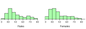
Bivariate Histogram
Histogram of spousal ages.
Each distribution is fairly skewed with a long right tail. From the first figure we see that not all husbands are older than their wives. It is important to see that this fact is lost when we separate the variables. That is, even though we provide summary statistics on each variable, the pairing within couples is lost by separating the variables. Only by maintaining the pairing can meaningful answers be found about couples, per se.
Therefore, we can learn much more by displaying the bivariate data in a graphical form that maintains the pairing. shows a scatter plot of the paired ages. The x-axis represents the age of the husband and the y-axis the age of the wife.
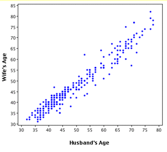
Bivariate Scatterplot
Scatterplot showing wife age as a function of husband age.
There are two important characteristics of the data revealed by this figure. First, it is clear that there is a strong relationship between the husband’s age and the wife’s age: the older the husband, the older the wife. When one variable increases with the second variable, we say that x and y have a positive association. Conversely, when y decreases as x increases, we say that they have a negative association. Second, the points cluster along a straight line. When this occurs, the relationship is called a linear relationship.
Bivariate Relationships in Qualitative Data
The presence of qualitative data leads to challenges in graphing bivariate relationships. We could have one qualitative variable and one quantitative variable, such as SAT subject and score. However, making a scatter plot would not be possible as only one variable is numerical. A bar graph would be possible.
If both variables are qualitative, we would be able to graph them in a contingency table. We can then use this to find whatever information we may want. In , this could include what percentage of the group are female and right-handed or what percentage of the males are left-handed.
| Right-handed | Left-handed | Total | |
|---|---|---|---|
| Males | 43 | 9 | 52 |
| Females | 44 | 4 | 48 |
| Totals | 87 | 13 | 100 |
Contingency Table
Contingency tables are useful for graphically representing qualitative bivariate relationships.
Attributions
- Describing Qualitative Data
-
“qualitative analysis.”
http://en.wikipedia.org/wiki/qualitative%20analysis.
Wikipedia
CC BY-SA 3.0. -
“Statistics/Different Types of Data/Quantitative and Qualitative Data.”
http://en.wikibooks.org/wiki/Statistics/Different_Types_of_Data/Quantitative_and_Qualitative_Data%23Qualitative_data.
Wikibooks
CC BY-SA 3.0. -
“Social Research Methods/Qualitative Research.”
http://en.wikibooks.org/wiki/Social_Research_Methods/Qualitative_Research.
Wikibooks
CC BY-SA 3.0.
- Interpreting Distributions Constructed by Others
- Graphs of Qualitative Data
-
“descriptive statistics.”
http://en.wiktionary.org/wiki/descriptive_statistics.
Wiktionary
CC BY-SA 3.0. -
“David Lane, Graphing Qualitative Variables. September 17, 2013.”
http://cnx.org/content/m10927/latest/.
OpenStax CNX
CC BY 3.0. -
“Error 404.”
http://www.abs.gov.au/websitedbs/a3121120.nsf/89a5f3d8684682b6ca256de4002c809b/e200e8e572a2ae52ca25794900127f4f!OpenDocument.
Austrailian Bureau of Statistics
CC BY. -
“David Lane, Graphing Qualitative Variables. April 22, 2013.”
http://cnx.org/content/m10927/latest/.
OpenStax CNX
CC BY 3.0. -
“David Lane, Graphing Qualitative Variables. April 22, 2013.”
http://cnx.org/content/m10927/latest/.
OpenStax CNX
CC BY 3.0. -
“David Lane, Graphing Qualitative Variables. April 22, 2013.”
http://cnx.org/content/m10927/latest/.
OpenStax CNX
CC BY 3.0.
- Misleading Graphs
- Do It Yourself: Plotting Qualitative Frequency Distributions
-
“Frequency distribution.”
http://en.wikipedia.org/wiki/Frequency_distribution.
Wikipedia
CC BY-SA 3.0. -
“Microsoft Excel – spreadsheet software – Office.com.”
http://office.microsoft.com/en-us/excel/.
Microsoft
License: Other. -
“Microsoft Excel – spreadsheet software – Office.com.”
http://office.microsoft.com/en-us/excel/.
Microsoft
License: Other. -
“Microsoft Excel – spreadsheet software – Office.com.”
http://office.microsoft.com/en-us/excel/.
Microsoft
License: Other.
- Summation Notation
-
“Summation.”
http://en.wikipedia.org/wiki/Summation%23Capital-sigma_notation.
Wikipedia
CC BY-SA 3.0.
- Graphing Bivariate Relationships
-
“Bivariate Data Tutorial | Sophia Learning.”
http://www.sophia.org/bivariate-data-tutorial.
Sophia Learning Online
CC BY. -
“David Lane, Introduction to Bivariate Data. September 17, 2013.”
http://cnx.org/content/m10949/latest/.
OpenStax CNX
CC BY 3.0. -
“David Lane, Introduction to Bivariate Data. May 6, 2013.”
http://cnx.org/content/m10949/latest/.
OpenStax CNX
CC BY 3.0. -
“David Lane, Introduction to Bivariate Data. May 6, 2013.”
http://cnx.org/content/m10949/latest/.
OpenStax CNX
CC BY 3.0. -
“David Lane, Introduction to Bivariate Data. May 6, 2013.”
http://cnx.org/content/m10949/latest/.
OpenStax CNX
CC BY 3.0.
