4.1 Frequency Distributions for Quantitative Data
4.1: Frequency Distributions for Quantitative Data
4.1.1: Guidelines for Plotting Frequency Distributions
The frequency distribution of events is the number of times each event occurred in an experiment or study.
Learning Objective
Define statistical frequency and illustrate how it can be depicted graphically.
Key Takeaways
Key Points
- Frequency distributions can be displayed in a table, histogram, line graph, dot plot, or a pie chart, just to name a few.
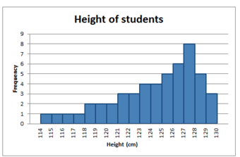
- A histogram is a graphical representation of tabulated frequencies, shown as adjacent rectangles, erected over discrete intervals (bins), with an area equal to the frequency of the observations in the interval.
- There is no “best” number of bins, and different bin sizes can reveal different features of the data.
- Frequency distributions can be displayed in a table, histogram, line graph, dot plot, or a pie chart, to just name a few.
Key Terms
- frequency
- number of times an event occurred in an experiment (absolute frequency)
- histogram
- a representation of tabulated frequencies, shown as adjacent rectangles, erected over discrete intervals (bins), with an area equal to the frequency of the observations in the interval
In statistics, the frequency (or absolute frequency) of an event is the number of times the event occurred in an experiment or study. These frequencies are often graphically represented in histograms. The relative frequency (or empirical probability) of an event refers to the absolute frequency normalized by the total number of events. The values of all events can be plotted to produce a frequency distribution.
A histogram is a graphical representation of tabulated frequencies , shown as adjacent rectangles, erected over discrete intervals (bins), with an area equal to the frequency of the observations in the interval. The height of a rectangle is also equal to the frequency density of the interval, i.e., the frequency divided by the width of the interval. The total area of the histogram is equal to the number of data. An example of the frequency distribution of letters of the alphabet in the English language is shown in the histogram in .

Letter frequency in the English language
A typical distribution of letters in English language text.
A histogram may also be normalized displaying relative frequencies. It then shows the proportion of cases that fall into each of several categories, with the total area equaling 1. The categories are usually specified as consecutive, non-overlapping intervals of a variable. The categories (intervals) must be adjacent, and often are chosen to be of the same size. The rectangles of a histogram are drawn so that they touch each other to indicate that the original variable is continuous.
There is no “best” number of bins, and different bin sizes can reveal different features of the data. Some theoreticians have attempted to determine an optimal number of bins, but these methods generally make strong assumptions about the shape of the distribution. Depending on the actual data distribution and the goals of the analysis, different bin widths may be appropriate, so experimentation is usually needed to determine an appropriate width.
4.1.2: Outliers
In statistics, an outlier is an observation that is numerically distant from the rest of the data.
Learning Objectives
Discuss outliers in terms of their causes and consequences, identification, and exclusion.
Key Takeaways
Key Points
- Outliers can occur by chance, by human error, or by equipment malfunction.
- Outliers may be indicative of a non-normal distribution, or they may just be natural deviations that occur in a large sample.
- Unless it can be ascertained that the deviation is not significant, it is not wise to ignore the presence of outliers.
- There is no rigid mathematical definition of what constitutes an outlier; thus, determining whether or not an observation is an outlier is ultimately a subjective experience.
Key Terms
- skewed
- Biased or distorted (pertaining to statistics or information).
- standard deviation
- a measure of how spread out data values are around the mean, defined as the square root of the variance
- interquartile range
- The difference between the first and third quartiles; a robust measure of sample dispersion.
What is an Outlier?
In statistics, an outlier is an observation that is numerically distant from the rest of the data. Outliers can occur by chance in any distribution, but they are often indicative either of measurement error or of the population having a heavy-tailed distribution. In the former case, one wishes to discard the outliers or use statistics that are robust against them. In the latter case, outliers indicate that the distribution is skewed and that one should be very cautious in using tools or intuitions that assume a normal distribution.

Outliers
This box plot shows where the US states fall in terms of their size. Rhode Island, Texas, and Alaska are outside the normal data range, and therefore are considered outliers in this case.
In most larger samplings of data, some data points will be further away from the sample mean than what is deemed reasonable. This can be due to incidental systematic error or flaws in the theory that generated an assumed family of probability distributions, or it may be that some observations are far from the center of the data. Outlier points can therefore indicate faulty data, erroneous procedures, or areas where a certain theory might not be valid. However, in large samples, a small number of outliers is to be expected, and they typically are not due to any anomalous condition.
Outliers, being the most extreme observations, may include the sample maximum or sample minimum, or both, depending on whether they are extremely high or low. However, the sample maximum and minimum are not always outliers because they may not be unusually far from other observations.
Interpretations of statistics derived from data sets that include outliers may be misleading. For example, imagine that we calculate the average temperature of 10 objects in a room. Nine of them are between 20° and 25° Celsius, but an oven is at 175°C. In this case, the median of the data will be between 20° and 25°C, but the mean temperature will be between 35.5° and 40 °C. The median better reflects the temperature of a randomly sampled object than the mean; however, interpreting the mean as “a typical sample”, equivalent to the median, is incorrect. This case illustrates that outliers may be indicative of data points that belong to a different population than the rest of the sample set. Estimators capable of coping with outliers are said to be robust. The median is a robust statistic, while the mean is not.
Causes for Outliers
Outliers can have many anomalous causes. For example, a physical apparatus for taking measurements may have suffered a transient malfunction, or there may have been an error in data transmission or transcription. Outliers can also arise due to changes in system behavior, fraudulent behavior, human error, instrument error or simply through natural deviations in populations. A sample may have been contaminated with elements from outside the population being examined. Alternatively, an outlier could be the result of a flaw in the assumed theory, calling for further investigation by the researcher.
Unless it can be ascertained that the deviation is not significant, it is ill-advised to ignore the presence of outliers. Outliers that cannot be readily explained demand special attention.
Identifying Outliers
There is no rigid mathematical definition of what constitutes an outlier. Thus, determining whether or not an observation is an outlier is ultimately a subjective exercise. Model-based methods, which are commonly used for identification, assume that the data is from a normal distribution and identify observations which are deemed “unlikely” based on mean and standard deviation. Other methods flag observations based on measures such as the interquartile range (IQR). For example, some people use the rule. This defines an outlier to be any observation that falls below the first quartile or any observation that falls above the third quartile.
Working With Outliers
Deletion of outlier data is a controversial practice frowned on by many scientists and science instructors. While mathematical criteria provide an objective and quantitative method for data rejection, they do not make the practice more scientifically or methodologically sound — especially in small sets or where a normal distribution cannot be assumed. Rejection of outliers is more acceptable in areas of practice where the underlying model of the process being measured and the usual distribution of measurement error are confidently known. An outlier resulting from an instrument reading error may be excluded, but it is desirable that the reading is at least verified.
Even when a normal distribution model is appropriate to the data being analyzed, outliers are expected for large sample sizes and should not automatically be discarded if that is the case. The application should use a classification algorithm that is robust to outliers to model data with naturally occurring outlier points. Additionally, the possibility should be considered that the underlying distribution of the data is not approximately normal, but rather skewed.
4.1.3: Relative Frequency Distributions
A relative frequency is the fraction or proportion of times a value occurs in a data set.
Learning Objective
Define relative frequency and construct a relative frequency distribution.
Key Takeaways
Key Points
- To find the relative frequencies, divide each frequency by the total number of data points in the sample.
- Relative frequencies can be written as fractions, percents, or decimals. The column should add up to 1 (or 100%).
- The only difference between a relative frequency distribution graph and a frequency distribution graph is that the vertical axis uses proportional or relative frequency rather than simple frequency.
- Cumulative relative frequency (also called an ogive) is the accumulation of the previous relative frequencies.
Key Terms
- cumulative relative frequency
- the accumulation of the previous relative frequencies
- relative frequency
- the fraction or proportion of times a value occurs
- histogram
- a representation of tabulated frequencies, shown as adjacent rectangles, erected over discrete intervals (bins), with an area equal to the frequency of the observations in the interval
What is a Relative Frequency Distribution?
A relative frequency is the fraction or proportion of times a value occurs. To find the relative frequencies, divide each frequency by the total number of data points in the sample. Relative frequencies can be written as fractions, percents, or decimals.
How to Construct a Relative Frequency Distribution
Constructing a relative frequency distribution is not that much different than from constructing a regular frequency distribution. The beginning process is the same, and the same guidelines must be used when creating classes for the data. Recall the following:
- Each data value should fit into one class only (classes are mutually exclusive).
- The classes should be of equal size.
- Classes should not be open-ended.
- Try to use between 5 and 20 classes.
Create the frequency distribution table, as you would normally. However, this time, you will need to add a third column. The first column should be labeled Class or Category. The second column should be labeled Frequency. The third column should be labeled Relative Frequency. Fill in your class limits in column one. Then, count the number of data points that fall in each class and write that number in column two.
Next, start to fill in the third column. The entries will be calculated by dividing the frequency of that class by the total number of data points. For example, suppose we have a frequency of 5 in one class, and there are a total of 50 data points. The relative frequency for that class would be calculated by the following:
5/50=0.10
You can choose to write the relative frequency as a decimal (0.10), as a fraction (), or as a percent (10%). Since we are dealing with proportions, the relative frequency column should add up to 1 (or 100%). It may be slightly off due to rounding.
Relative frequency distributions is often displayed in histograms and in frequency polygons. The only difference between a relative frequency distribution graph and a frequency distribution graph is that the vertical axis uses proportional or relative frequency rather than simple frequency.
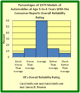
Relative Frequency Histogram
This graph shows a relative frequency histogram. Notice the vertical axis is labeled with percentages rather than simple frequencies.
Cumulative Relative Frequency Distributions
Just like we use cumulative frequency distributions when discussing simple frequency distributions, we often use cumulative frequency distributions when dealing with relative frequency as well. Cumulative relative frequency (also called an ogive) is the accumulation of the previous relative frequencies. To find the cumulative relative frequencies, add all the previous relative frequencies to the relative frequency for the current row.
4.1.4: Cumulative Frequency Distributions
A cumulative frequency distribution displays a running total of all the preceding frequencies in a frequency distribution.
Learning Objectives
Define cumulative frequency and construct a cumulative frequency distribution.
Key Takeaways
Key Points
- To create a cumulative frequency distribution, start by creating a regular frequency distribution with one extra column added.
- To complete the cumulative frequency column, add all the frequencies at that class and all preceding classes.
- Cumulative frequency distributions are often displayed in histograms and in frequency polygons.
Key Terms
- histogram
- a representation of tabulated frequencies, shown as adjacent rectangles, erected over discrete intervals (bins), with an area equal to the frequency of the observations in the interval
- frequency distribution
- a representation, either in a graphical or tabular format, which displays the number of observations within a given interval
What is a Cumulative Frequency Distribution?
A cumulative frequency distribution is the sum of the class and all classes below it in a frequency distribution. Rather than displaying the frequencies from each class, a cumulative frequency distribution displays a running total of all the preceding frequencies.
How to Construct a Cumulative Frequency Distribution
Constructing a cumulative frequency distribution is not that much different than constructing a regular frequency distribution. The beginning process is the same, and the same guidelines must be used when creating classes for the data. Recall the following:
- Each data value should fit into one class only (classes are mutually exclusive).
- The classes should be of equal size.
- Classes should not be open-ended.
- Try to use between 5 and 20 classes.
Create the frequency distribution table, as you would normally. However, this time, you will need to add a third column. The first column should be labeled Class or Category. The second column should be labeled Frequency. The third column should be labeled Cumulative Frequency. Fill in your class limits in column one. Then, count the number of data points that falls in each class and write that number in column two.
Next, start to fill in the third column. The first entry will be the same as the first entry in the Frequency column. The second entry will be the sum of the first two entries in the Frequency column, the third entry will be the sum of the first three entries in the Frequency column, etc. The last entry in the Cumulative Frequency column should equal the number of total data points, if the math has been done correctly.
Graphical Displays of Cumulative Frequency Distributions
There are a number of ways in which cumulative frequency distributions can be displayed graphically. Histograms are common , as are frequency polygons . Frequency polygons are a graphical device for understanding the shapes of distributions. They serve the same purpose as histograms, but are especially helpful in comparing sets of data.
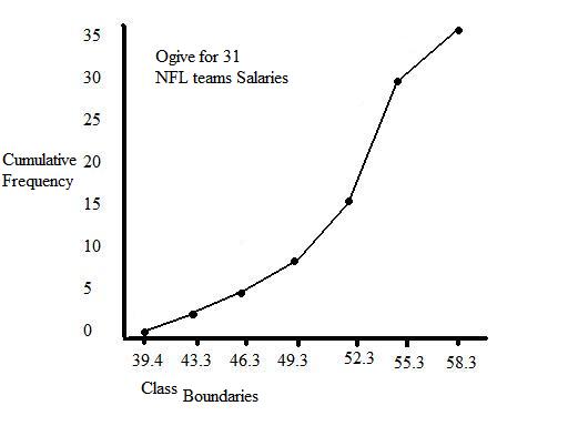
Frequency Polygon
This graph shows an example of a cumulative frequency polygon.

Frequency Histograms
This image shows the difference between an ordinary histogram and a cumulative frequency histogram.
4.1.5: Graphs for Quantitative Data
A plot is a graphical technique for representing a data set, usually as a graph showing the relationship between two or more variables.
Learning Objective
Identify common plots used in statistical analysis.
Key Takeaways
Key Points
- Graphical procedures such as plots are used to gain insight into a data set in terms of testing assumptions, model selection, model validation, estimator selection, relationship identification, factor effect determination, or outlier detection.
- Statistical graphics give insight into aspects of the underlying structure of the data.
- Graphs can also be used to solve some mathematical equations, typically by finding where two plots intersect.
Key Terms
- histogram
- a representation of tabulated frequencies, shown as adjacent rectangles, erected over discrete intervals (bins), with an area equal to the frequency of the observations in the interval
- plot
- a graph or diagram drawn by hand or produced by a mechanical or electronic device
- scatter plot
- A type of display using Cartesian coordinates to display values for two variables for a set of data.
A plot is a graphical technique for representing a data set, usually as a graph showing the relationship between two or more variables. Graphs of functions are used in mathematics, sciences, engineering, technology, finance, and other areas where a visual representation of the relationship between variables would be useful. Graphs can also be used to read off the value of an unknown variable plotted as a function of a known one. Graphical procedures are also used to gain insight into a data set in terms of:
- testing assumptions,
- model selection,
- model validation,
- estimator selection,
- relationship identification,
- factor effect determination, or
- outlier detection.
Plots play an important role in statistics and data analysis. The procedures here can broadly be split into two parts: quantitative and graphical. Quantitative techniques are the set of statistical procedures that yield numeric or tabular output. Some examples of quantitative techniques include:
- hypothesis testing,
- analysis of variance,
- point estimates and confidence intervals, and
- least squares regression.
There are also many statistical tools generally referred to as graphical techniques which include:
- scatter plots ,
- histograms,
- probability plots,
- residual plots,
- box plots, and
- block plots.
Below are brief descriptions of some of the most common plots:
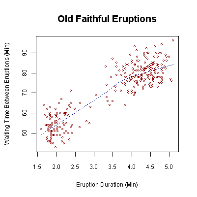
Scatter plot: This is a type of mathematical diagram using Cartesian coordinates to display values for two variables for a set of data. The data is displayed as a collection of points, each having the value of one variable determining the position on the horizontal axis and the value of the other variable determining the position on the vertical axis. This kind of plot is also called a scatter chart, scattergram, scatter diagram, or scatter graph.
Histogram: In statistics, a histogram is a graphical representation of the distribution of data. It is an estimate of the probability distribution of a continuous variable or can be used to plot the frequency of an event (number of times an event occurs) in an experiment or study.
Box plot: In descriptive statistics, a boxplot, also known as a box-and-whisker diagram, is a convenient way of graphically depicting groups of numerical data through their five-number summaries (the smallest observation, lower quartile (Q1), median (Q2), upper quartile (Q3), and largest observation). A boxplot may also indicate which observations, if any, might be considered outliers.

Scatter Plot
This is an example of a scatter plot, depicting the waiting time between eruptions and the duration of the eruption for the Old Faithful geyser in Yellowstone National Park, Wyoming, USA.
4.1.6: Typical Shapes
Distributions can be symmetrical or asymmetrical depending on how the data falls.
Learning Objective
Evaluate the shapes of symmetrical and asymmetrical frequency distributions.
Key Takeaways
Key Points
- A normal distribution is a symmetric distribution in which the mean and median are equal. Most data are clustered in the center.
- An asymmetrical distribution is said to be positively skewed (or skewed to the right) when the tail on the right side of the histogram is longer than the left side.
- An asymmetrical distribution is said to be negatively skewed (or skewed to the left) when the tail on the left side of the histogram is longer than the right side.
- Distributions can also be uni-modal, bi-modal, or multi-modal.
Key Terms
- skewness
- A measure of the asymmetry of the probability distribution of a real-valued random variable; is the third standardized moment, defined as where is the third moment about the mean and is the standard deviation.
- empirical rule
- That a normal distribution has 68% of its observations within one standard deviation of the mean, 95% within two, and 99.7% within three.
- standard deviation
- a measure of how spread out data values are around the mean, defined as the square root of the variance
Distribution Shapes
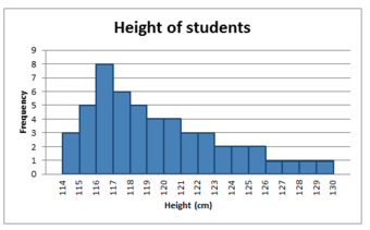
In statistics, distributions can take on a variety of shapes. Considerations of the shape of a distribution arise in statistical data analysis, where simple quantitative descriptive statistics and plotting techniques, such as histograms, can lead to the selection of a particular family of distributions for modelling purposes.
Symmetrical Distributions
In a symmetrical distribution, the two sides of the distribution are mirror images of each other. A normal distribution is an example of a truly symmetric distribution of data item values. When a histogram is constructed on values that are normally distributed, the shape of the columns form a symmetrical bell shape. This is why this distribution is also known as a “normal curve” or “bell curve. ” In a true normal distribution, the mean and median are equal, and they appear in the center of the curve. Also, there is only one mode, and most of the data are clustered around the center. The more extreme values on either side of the center become more rare as distance from the center increases. About 68% of values lie within one standard deviation (σ) away from the mean, about 95% of the values lie within two standard deviations, and about 99.7% lie within three standard deviations . This is known as the empirical rule or the 3-sigma rule.
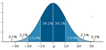
Normal Distribution
This image shows a normal distribution. About 68% of data fall within one standard deviation, about 95% fall within two standard deviations, and 99.7% fall within three standard deviations.
Asymmetrical Distributions
In an asymmetrical distribution, the two sides will not be mirror images of each other. Skewness is the tendency for the values to be more frequent around the high or low ends of the x-axis. When a histogram is constructed for skewed data, it is possible to identify skewness by looking at the shape of the distribution.
A distribution is said to be positively skewed (or skewed to the right) when the tail on the right side of the histogram is longer than the left side. Most of the values tend to cluster toward the left side of the x-axis (i.e., the smaller values) with increasingly fewer values at the right side of the x-axis (i.e., the larger values). In this case, the median is less than the mean .
Positively Skewed Distribution
This distribution is said to be positively skewed (or skewed to the right) because the tail on the right side of the histogram is longer than the left side.
A distribution is said to be negatively skewed (or skewed to the left) when the tail on the left side of the histogram is longer than the right side. Most of the values tend to cluster toward the right side of the x-axis (i.e., the larger values), with increasingly less values on the left side of the x-axis (i.e., the smaller values). In this case, the median is greater than the mean .
Negatively Skewed Distribution
This distribution is said to be negatively skewed (or skewed to the left) because the tail on the left side of the histogram is longer than the right side.
When data are skewed, the median is usually a more appropriate measure of central tendency than the mean.
Other Distribution Shapes
A uni-modal distribution occurs if there is only one “peak” (or highest point) in the distribution, as seen previously in the normal distribution. This means there is one mode (a value that occurs more frequently than any other) for the data. A bi-modal distribution occurs when there are two modes. Multi-modal distributions with more than two modes are also possible.
4.1.7: Z-Scores and Location in a Distribution
A z-score is the signed number of standard deviations an observation is above the mean of a distribution.
Learning Objectives
Define z-scores and demonstrate how they are converted from raw scores.
Key Takeaways
Key Points
- A positive z-score represents an observation above the mean, while a negative z-score represents an observation below the mean.
- We obtain a z-score through a conversion process known as standardizing or normalizing.
- Z-scores are most frequently used to compare a sample to a standard normal deviate (standard normal distribution, with with and ).
- While z-scores can be defined without assumptions of normality, they can only be defined if one knows the population parameters.
- z-scores provide an assessment of how off-target a process is operating.
Key Terms
- Student’s t-statistic
- a ratio of the departure of an estimated parameter from its notional value and its standard error
- z-score
- The standardized value of observation $x$ from a distribution that has mean $mu$ and standard deviation $sigma$.
- raw score
- an original observation that has not been transformed to a z-score
A z-score is the signed number of standard deviations an observation is above the mean of a distribution. Thus, a positive z-score represents an observation above the mean, while a negative z-score represents an observation below the mean. We obtain a z-score through a conversion process known as standardizing or normalizing.
z-scores are also called standard scores, z-values, normal scores or standardized variables. The use of “z” is because the normal distribution is also known as the “z distribution.” z-scores are most frequently used to compare a sample to a standard normal deviate (standard normal distribution, with and ).
While z-scores can be defined without assumptions of normality, they can only be defined if one knows the population parameters. If one only has a sample set, then the analogous computation with sample mean and sample standard deviation yields the Student’s – statistic.
Calculation From a Raw Score
A raw score is an original datum, or observation, that has not been transformed. This may include, for example, the original result obtained by a student on a test (i.e., the number of correctly answered items) as opposed to that score after transformation to a standard score or percentile rank. The z-score, in turn, provides an assessment of how off-target a process is operating.
The conversion of a raw score, , to a -score can be performed using the following equation:
where is the mean of the population and is the standard deviation of the population. The absolute value of represents the distance between the raw score and the population mean in units of the standard deviation. is negative when the raw score is below the mean and positive when the raw score is above the mean.
A key point is that calculating requires the population mean and the population standard deviation, not the sample mean nor sample deviation. It requires knowing the population parameters, not the statistics of a sample drawn from the population of interest. However, in cases where it is impossible to measure every member of a population, the standard deviation may be estimated using a random sample.
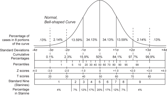
Normal Distribution and Scales
Shown here is a chart comparing the various grading methods in a normal distribution. z-scores for this standard normal distribution can be seen in between percentiles and z-scores.
Attributions
- Guidelines for Plotting Frequency Distributions
-
“Statistical frequency.”
https://en.wikipedia.org/wiki/Statistical_frequency.
Wikipedia
CC BY-SA 3.0. -
“Chapter 2.
Summarizing Data: listing and grouping – Statistics.”
http://statistics.wikidot.com/ch2.
Wikidot
CC BY. -
“English letter frequency (alphabetic).”
https://en.wikipedia.org/wiki/File:English_letter_frequency_(alphabetic).svg.
Wikipedia
Public domain.
- Outliers
-
“Outliers in statistics.”
http://en.wikipedia.org/wiki/Outliers_in_statistics.
Wikipedia
CC BY-SA 3.0.
- Relative Frequency Distributions
-
“Susan Dean and Barbara Illowsky, Sampling and Data: Frequency, Relative Frequency, and Cumulative Frequency. September 17, 2013.”
http://cnx.org/content/m16012/latest/.
OpenStax CNX
CC BY 3.0. -
“Histogram of Consumer Reports.”
http://commons.wikimedia.org/wiki/File:Histogram_of_Consumer_Reports.
Wikimedia
CC BY-SA.
- Cumulative Frequency Distributions
-
“David Lane, Frequency Polygons. September 17, 2013.”
http://cnx.org/content/m11214/latest/.
OpenStax CNX
CC BY 3.0. -
“David Lane, Frequency Polygons. September 17, 2013.”
http://cnx.org/content/m11214/latest/.
OpenStax CNX
CC BY 3.0. -
“Terms of Use – Wikimedia Foundation.”
http://wikimediafoundation.org/wiki/Terms_of_Use.
Wikimedia Foundation
CC BY-SA. -
“Terms of Use – Wikimedia Foundation.”
http://wikimediafoundation.org/wiki/Terms_of_Use.
Wikimedia Foundation
CC BY-SA.
- Graphs for Quantitative Data
- Typical Shapes
-
“Statistical Language – Measures of Shape.”
http://www.abs.gov.au/websitedbs/a3121120.nsf/home/statistical+language+-+measures+of+shape.
Austrailian Bureau of Statistics
CC BY. -
“Shape of the distribution.”
http://en.wikipedia.org/wiki/Shape_of_the_distribution.
Wikipedia
CC BY-SA 3.0. -
“Error 404.”
http://www.abs.gov.au/websitedbs/a3121120.nsf/89a5f3d8684682b6ca256de4002c809b/81a53a0a10c05d3bca257949001281b5!OpenDocument.
Austrailian Bureau of Statistics
CC BY. -
“Error 404.”
http://www.abs.gov.au/websitedbs/a3121120.nsf/89a5f3d8684682b6ca256de4002c809b/81a53a0a10c05d3bca257949001281b5!OpenDocument.
Austrailian Bureau of Statistics
CC BY. -
“Error 404.”
http://www.abs.gov.au/websitedbs/a3121120.nsf/89a5f3d8684682b6ca256de4002c809b/81a53a0a10c05d3bca257949001281b5!OpenDocument.
Austrailian Bureau of Statistics
CC BY.
- Z-Scores and Location in a Distribution
-
“Student’s t-statistic.”
http://en.wikipedia.org/wiki/Student’s%20t-statistic.
Wikipedia
CC BY-SA 3.0. -
“Normal distribution and scales.”
http://en.wikipedia.org/wiki/File:Normal_distribution_and_scales.gif.
Wikipedia
Public domain.

.svg)