11.7 – How to Make Slides & Visuals
If your presentation includes slides and images, they must be clear, compelling and well-organized. In this chapter you’ll learn the basics of visual design, where to find great images, and how to storyboard your presentation.
GETTING STARTED
Before starting on your slides create a storyboard that’s based on your presentation outline. The storyboard helps you organize and plan your slide deck, including the order slides appear and what text or images you’ll include on each slide.
We recommend using sticky notes to create your storyboard, with one sticky note representing one slide. Sticky notes help you organize your slides because they’re so easy to move around, edit and delete. They’ll save you lots of time!
In the example below you can see that you don’t need to be an artist or expert to make an effective storyboard.

CREATING SLIDES
When making slides, make sure to include these five elements: organization, titles & text, visual design, content and user experience.
Organization
Your slide deck must be logically organized to match the order of your presentation. Make sure that information is presented in a logical way. For example, if you’re talking about something that happens in a sequence, make sure it’s in the correct order in your slides. And present information based on its importance. The size and list format of key points, sub-points and sub-subpoints should be consistent with their importance.
Titles and Text
Consistent Throughout your slide deck, titles and text should be consistent in title & text size, shape, placement, bullet & heading hierarchy, and formatting. If any of this does change, it should be an intentional design choice that reflects the presentation. Be especially careful with team projects – it’s easy to lose consistency when more than one person creates the slides.
Brief Your slides are not a script. If you include too much information on them, your audience will be reading, not listening to you. Slides should reinforce your key points, highlighting only the most important information. Share the rest verbally – anecdotes, smaller details and extra information.
Pro Tip
There are two great ways to help you keep slides brief: The 1-6-6 Method recommends that each slide have a maximum of 1 idea, 6 bullet points, and 6 words per bullet. The 1-3-5 Method is similar: it suggests 1 idea, 3 bullet points and 5 words per bullet, per slide
Fonts Your audience might have less than perfect vision or a small device, so make type easy to read. If you’re not sure which font to use, avoid fancy decorative fonts and use a standard font like Arial, Helvetica or Times. Unless you’re a trained designer, limit the number of fonts you use to about three per slide deck.
Use high-contrast colours for text, such as black on white, or white on navy blue. If you’re placing text on an image, use a solid background colour in the text box.
We recommend using at least size 32 for your text. If you’re using a font size smaller than 32, test your slides to make sure text is visible from the back of the room or an a small device.
Spelling & grammar Checking your spelling and grammar! (Most presentation apps include spell-check tools.) Typos and grammar errors make you look sloppy and unprofessional.
Animations You can use the app’s animation tools to move objects and text on, off or around a slide. You’ve probably seen slides with bullet points that appear one at a time. Animations are useful when you want to gradually reveal information. For example if you want the audience to focus on one point at a time, or when you want to ask a question before showing the answer.
Limit the number of animations you use, and avoid whimsical or unnecessary ones – they can make your slides annoying and unprofessional.
Transitions You can use transitions, like fade-in or fade-out, when you’re moving from one slide to the next. To avoid distracting your audience, don’t use too many different types of transitions, and avoid overly dramatic transitions. Just like animations, a little goes a long way.
Visual design
You don’t have to be a designer to make professional slides – most apps include professionally-designed templates, or you can start with a blank slide. Whichever you choose, make sure the visual design supports your content and strengthens your message. Slides should relate to each other visually: colours, layout, text and images should be consistent.
Consistent All slides should have a consistent design as though they were created by one person, not cobbled together from multiple sources. If any of this does change, it should be an intentional design choice that reflects the presentation. Be especially careful during team projects – it’s easy to lose consistency when more than one person creates the slides.
Alignment Keep slides looking clean and professional by aligning various text or image elements. For example, text is almost always left-aligned (except captions and titles). Space text and images so they’re balanced and visually pleasing. PowerPoint shows alignment markings to help with this.
Branding Branded elements make your slides look professional. You can use your brand’s colours and logo on the title page, and/or at the top or bottom of each slide. Your branding may include fonts, text size and colour. Whatever you choose, make sure all text is easy to read and not distracting.
Images Human brains love images! Include images in your slides to add interest and explain key points. Make sure every image is high quality, high resolution, relevant and appropriate, large enough to be easily seen from afar, not stretched or distorted, and free of watermarks. (More about watermarks in Using other people’s images below)
Single images are generally better than collages because you want slides to be uncluttered. No matter how cute they are, don’t include images that are unprofessional or unrelated to your subject – such as emojis, minion pictures, and bad clip art.
Charts & graphs Well-displayed information can enhance your audience’s understanding and help to convince them that you’re a professional expert. Charts and graphs are fantastic ways to show data, describe relationships, and help your audience understand a key point. Make sure the labels and titles are large enough to be easily read, and remove unnecessary details; you can verbally explain details and background information. If your presentation includes handouts, you can show the basic chart or graph on screen, and add a more detailed version in the handout. See Which chart, or visual should I use? below for examples and additional guidelines.
Content
Complete Your presentation should include at least one slide for each key point. Make sure the most important information of your presentation is on your slides.
Makes sense Information presented is well researched & makes sense. Your content should also be interesting or exciting.
Fits audience Assume that your audience is smart like you, but doesn’t have specialist knowledge. Take the time to explain anything that the majority of people might not know.
Citations and references For facts, quotes, or other statistics, you may want to include your source on the slide, especially if it adds credibility. Otherwise, sources (including for images) are listed in 1) the notes section; and 2) in a list of sources at the end of your presentation.
Authorship Include your full name at the start of your slides. You may want to include your name and contact information on your last slide.
Engages the left & right brain Audience members engage and remember better when you engage the “left brain” – logic, facts, science, numbers, and hard data – and the “right brain” – emotion, colour, artistic and sensory information like music, videos, and other media.
Audience experience
This element is a bit different from the ones above because it focuses on the live integration of your slides and your presentation.
Slides enhance the presentation Remember that you’re the star of the show, and your slides are there to support your live delivery. For this reason it’s important to ensure that you don’t use the slides as a teleprompter – always practice and know your entire presentation and slideshow thoroughly.
Number of slides is reasonable As a general rule, 1-2 slides per minute is appropriate. Practise delivering your presentation to ensure you’re not rushing through too many slides, or forcing the audience to stare a the same slide for several minutes.
Agenda / overview Longer or more complex presentations often include an agenda or overview slide. Shorter presentations typically don’t use them.
Animations & transitions executed When practicing your presentation, remember which slides have animations or transitions, and practice advancing your slides at the right time. Sometimes presenters get caught up in their content and forget to move the slides ahead. This is especially common during online presentations.
Using Other People’s Images
You can use your own images in your presentations. You can also use downloaded images, but be careful to use copyright-free images, and credit them properly.
Many images that you see online are copyrighted, meaning you can’t use them without the creator’s permission. A lot of those images have watermarks to make sure people don’t use them, or pay to use them. Don’t use watermarked images—it’s illegal and unethical. A watermark looks like this:

Where to find images
Many high-quality images are freely available online. Here are some places to find them:
- Burst
- Pexels
- Unsplash
- Pixabay
- Flicker – Creative Commons license
- Google: Enter your search words and click Search. Then click Images, and Tools (underneath the search bar). Then click Usage Rights and select Creative Commons Licenses.
How to give credit
Always give credit to the creators of anything you didn’t create – including images, charts, graphs, video, audio and gifs. You don’t need to credit anything you made, but you might want to include a note so your instructor knows it’s your creation.
- List all your image credits on one blank slide
- Make it the last slide in the deck
- Select that slide and click “Hide Slide” so it won’t show during your presentation
A Chicago style citation for images can use any of these formats:
Photograph by [creator’s name] from [URL] For example: Photo by wsilver from https://ccsearch.creativecommons.org/photos/73d7b905-f5ee-4571-8056-6ccfd4e450cb
Or:
Image courtesy of [name of the organization] from [URL] For example: Image courtesy of wsilver from https://ccsearch.creativecommons.org/photos/73d7b905-f5ee-4571-8056-6ccfd4e450c
Or:
[Title and embedded URL of the Creative-Commons-licensed image] by [creator’s name] is licensed under CC BY [license type] For example: More Puppies by wsilver is licensed under CC BY Attribution 4.0 International (CC BY 4.0)
Which graph, chart, or visual should I use?
You can easily make charts and graphs for your presentation, using Excel or Google Spreadsheets. Add the data to the spreadsheet, then decide which type of chart or graph to use.
No matter what type you use, always include a title, clear labels, and high-contrast colours that are visible to all users. For example, many people can’t see the difference between red and green, so avoid using them together.
Here the most common types:
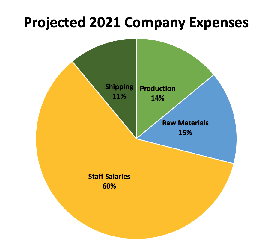
Pie chart Shows percentages – portions of a whole. The total segments should add up to 100% or a complete whole. Pie charts are excellent for showing relationships. In the example below we quickly see that Staff Salaries are a huge portion of the company expenses.
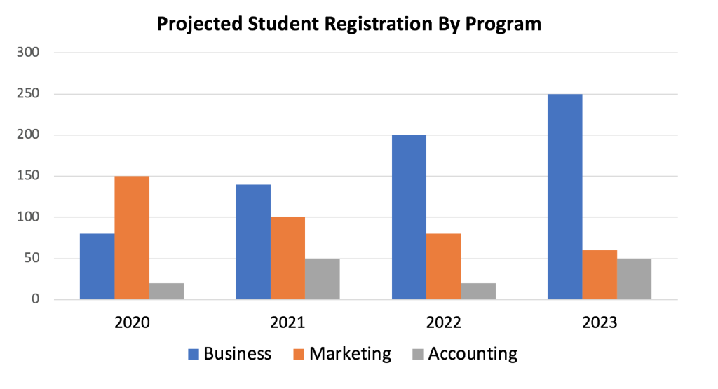
Bar graph Allows comparison between different values, and can show changes over time (if the difference in values are large). The horizontal and vertical axis must always be labelled. This graph show that the number of Business students is expected to rise, while the number of Marketing students will decrease.
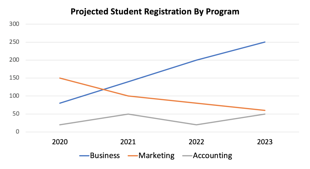
Line graph Shows a trend or progress over time. They can show small changes over time better than a bar graph. Note that the example below shows the same data used in the chart above, but emphasizes the trend of business registrations growing, marketing registrations declining, and accounting registrations remaining low with a bit of fluctuation. This would better if you wanted to focus on changes over time.
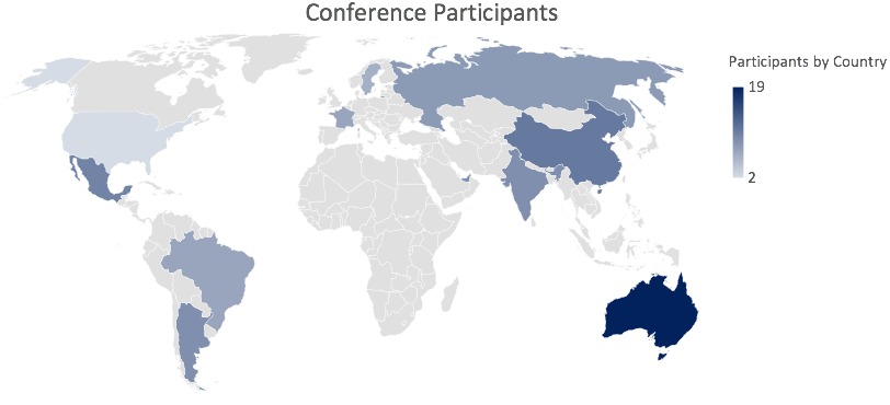
Heatmap chart Uses colour to convey the magnitude of certain values. Examples include a risk management heatmap showing low, medium, and high risk based on the likelihood and impact of various outcomes, or an atlas heatmap as displayed below. Because heatmaps depend only on colour – not shape or size – be very careful to use colours that all users can see.
Which chart? An example
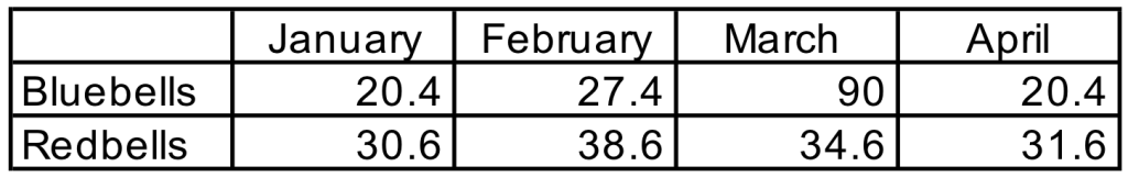
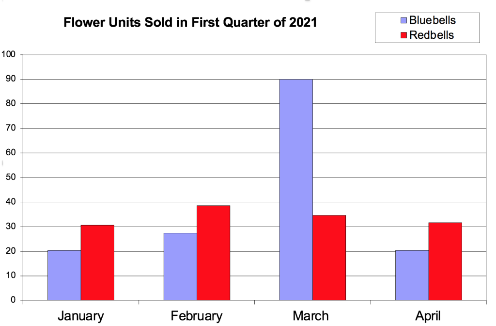
Imagine that our team is excited to share the success of our recent marketing campaign to promote bluebell flower sales during the month of March. Here are two ways we might display the data. Look at both and note your response: which one is easier to understand? Which do you prefer to look at?
Example 1
Example 2
Example 1 is harder to read because it’s not visual. There are lots of percentages, no hierarchy or colour, and the heavy lines compete with the content. It’s not easy for the viewer to quickly understand the information. This example also lacks a title or legend (a description of what the data is conveying).
Example 2 shows the same information, but in a way that’s easy to quickly understand. This version emphasizes the dramatic success of our marketing campaign, which boosted sales of bluebells during March. Also notice the inclusion of a title, legend, clear axis labels, and colour coding – all of which help the audience’s understanding.
Test your knowledge
Media Attributions
- IMG_5728
- IMG_3447-Watermark example copy
- Pie
- Bar
- Line
- Heatmap 2
- FlowerFix
- Flowerfix 2

LEARNING OBJECTIVES
- Discuss divergent cultural characteristics and list several examples of such characteristics in the culture(s) with which you identify
HOFSTEDE'S CULTURAL DIMENSIONS
Let’s dig in deeper by examining several points of divergence across cultures and consider how these dimensions might play out in organizations and in groups or teams. Hofstede’s cultural dimensions provide a framework that describes the effects of culture on the values of its members, and how these values relate to behavior. Hofstede’s work is a major resource in fields like cross-cultural psychology, international management, and cross-cultural communication.
Hofstede conducted a large survey (1967-1973) that examined value differences across the divisions of IBM, a multinational corporation. Data were collected from 117,000 employees from 50 countries across 3 regions. Using factor analysis, a statistical method, Hofstede initially identified four value dimensions (Individualist/Collectivist, Power Distance, Uncertainty Avoidance, and Masculinity/Femininity). Additional research that used a Chinese developed tool identified a fifth dimension: Long Term/Short Term orientation (Bond, 1991) and a replication, conducted across 93 separate countries, confirmed the existence of the five dimensions and identified a sixth known as Indulgence/Restraint (Minkov, 2010). The five values are discussed in detail below.

Low-Power versus High-Power Distance
How comfortable are you with critiquing your boss’s decisions? If you are from a low-power distance culture, your answer might be “no problem.” In low-power distance cultures, according to Dutch researcher Geert Hofstede, people relate to one another more as equals and less as a reflection of dominant or subordinate roles, regardless of their actual formal roles as employee and manager, for example.
In a high-power distance culture, you would probably be much less likely to challenge the decision, to provide an alternative, or to give input. If you are working with people from a high-power distance culture, you may need to take extra care to elicit feedback and involve them in the discussion because their cultural framework may preclude their participation. They may have learned that less powerful people must accept decisions without comment, even if they have a concern or know there is a significant problem. Unless you are sensitive to cultural orientation and power distance, you may lose valuable information.
Individualistic versus Collectivist Cultures
People in individualistic cultures value individual freedom and personal independence, and cultures always have stories to reflect their values. People who grew up in the United States may recall the story of Superman or John McLean in the Diehard series, and note how one person overcomes all obstacles. Through personal ingenuity, despite challenges, one person rises successfully to conquer or vanquish those obstacles. Sometimes there is an assist, as in basketball or football, where another person lends a hand, but still the story repeats itself again and again, reflecting the cultural viewpoint.
When Hofstede explored the concepts of individualism and collectivism across diverse cultures (Hofstede, 1982, 2001, 2005), he found that in individualistic cultures like the United States, people perceived their world primarily from their own viewpoint. They perceived themselves as empowered individuals, capable of making their own decisions, and able to make an impact on their own lives.
Cultural viewpoint is not an either/or dichotomy, but rather a continuum or range. You may belong to some communities that express individualistic cultural values, while others place the focus on a collective viewpoint. Collectivist cultures (Hofstede, 1982), including many in Asia and South America, focus on the needs of the nation, community, family, or group of workers. Ownership and private property is one way to examine this difference. In some cultures, property is almost exclusively private, while others tend toward community ownership. The collectively owned resource returns benefits to the community. Water, for example, has long been viewed as a community resource, much like air, but that has been changing as businesses and organizations have purchased water rights and gained control over resources. Public lands, such as parks, are often considered public, and individual exploitation of them is restricted. Copper, a metal with a variety of industrial applications, is collectively owned in Chile, with profits deposited in the general government fund. While public and private initiatives exist, the cultural viewpoint is our topic. How does someone raised in a culture that emphasizes the community interact with someone raised in a primarily individualistic culture? How could tensions be expressed and how might interactions be influenced by this point of divergence?
Masculine versus Feminine Orientation
Hofstede describes the masculine-feminine dichotomy not in terms of whether men or women hold the power in a given culture, but rather the extent to which that culture values certain traits that may be considered masculine or feminine. Thus, “the assertive pole has been called ‘masculine’ and the modest, caring pole ‘feminine.’ The women in feminine countries have the same modest, caring values as the men; in the masculine countries, they are somewhat assertive and competitive, but not as much as the men, so that these countries show a gap between men’s values and women’s values” (Hofstede, 2009).
We can observe this difference in where people gather, how they interact, and how they dress. We can see it during business negotiations, where it may make an important difference in the success of the organizations involved. Cultural expectations precede the interaction, so someone who doesn’t match those expectations may experience tension. Business in the United States has a masculine orientation—assertiveness and competition are highly valued. In other cultures, such as Sweden, business values are more attuned to modesty (lack of self-promotion) and taking care of society’s weaker members. This range of differences is one aspect of intercultural communication that requires significant attention when the business communicator enters a new environment.
Uncertainty-Accepting Cultures versus Uncertainty-Rejecting Cultures
Uncertainty Avoidance addresses a society’s tolerance for uncertainty and ambiguity. It reflects the extent to which members of a society attempt to cope with anxiety by minimizing uncertainty. In other words, when we meet each other for the first time, we often use what we have previously learned to understand our current context. We also do this to reduce our uncertainty. Another, more simplified, way to think about Uncertainty Avoidance is how threatening change is to a culture.
Some cultures go to great lengths to reduce the element of surprise. Cultures in the Arab world, for example, are high in uncertainty avoidance. People in these cultures tend to be resistant to change and reluctant to take risks. They lean towards being more emotional, trying to minimize the unknown and unusual circumstances, and proceed with carefully planned steps and rules, laws and regulations
Other cultures, such as the United States and Britain, are highly tolerant of uncertainty. These cultures accept and feel comfortable in unstructured situations or changeable environments. They try to have as few rules as possible. People in these cultures tend to be more tolerant of change. Students from countries with low uncertainty avoidance don’t mind it when a teacher says, “I don’t know.”
Ultimately, the dimension of Uncertainty Avoidance helps us understand how people view and accept change. Whereas a U.S. business negotiator might enthusiastically agree to try a new procedure, an Egyptian counterpart would likely refuse to get involved until all the details are worked out.
Short-Term versus Long-Term Orientation
Do you want your reward right now or can you dedicate yourself to a long-term goal? You may work in a culture whose people value immediate results and grow impatient when those results do not materialize. Hofstede discusses this relationship of time orientation to a culture as a “time horizon,” and it underscores the perspective of the individual within a cultural context. Many countries in Asia, influenced by the teachings of Confucius, value a long-term orientation, whereas other countries, including the United States, have a more short-term approach to life and results. Native American cultures are known for holding a long-term orientation, as illustrated by the proverb attributed to the Iroquois Confederacy that decisions require contemplation of their impact seven generations removed.
If you work within a culture that has a short-term orientation, you may need to place greater emphasis on reciprocation of greetings, gifts, and rewards. For example, if you send a thank-you note the morning after being treated to a business dinner, your host will appreciate your promptness. While there may be respect for tradition, there is also an emphasis on personal representation and honor, a reflection of identity and integrity. Personal stability and consistency are also valued in a short-term-oriented culture, contributing to an overall sense of predictability and familiarity.
Long-term orientation is often marked by persistence, thrift and frugality, and an order to relationships based on age and status. A sense of shame for the family and community is also observed across generations. What an individual does reflects on the family and is carried by immediate and extended family members.
Time Orientation
An addition to Hofstede's dimensions is time orientation. Edward T. Hall and Mildred Reed Hall (1987) state that monochronic time-oriented cultures consider one thing at a time, whereas polychronic time-oriented cultures schedule many things at one time, and time is considered in a more fluid sense. In monochromatic time, interruptions are to be avoided, and everything has its own specific time. Even the multitasker from a monochromatic culture will, for example, recognize the value of work first before play or personal time. The United States, Germany, and Switzerland are often noted as countries that value a monochromatic time orientation.
Polychromatic time looks a little more complicated, with business and family mixing with dinner and dancing. Greece, Italy, Chile, and Saudi Arabia are countries where one can observe this perception of time; business meetings may be scheduled at a fixed time, but when they actually begin may be another story. Also, note that the dinner invitation for 8 p.m. may in reality be more like 9 p.m. If you were to show up on time, you might be the first person to arrive and find that the hosts are not quite ready to receive you.
When in doubt, always ask before the event; many people from polychromatic cultures will be used to foreigner’s tendency to be punctual, even compulsive, about respecting established times for events. The skilled business communicator is aware of this difference and takes steps to anticipate it. The value of time in different cultures is expressed in many ways, and your understanding can help you communicate more effectively.
FINAL NOTES
The cultural value dimensions identified by Hofstede are useful ways to think about culture and to study cultural psychology; however, Hofstede’s theory has also been seriously questioned. Most of the criticism has been directed at the methodology of the study beginning with the original instrument. The questionnaire was not originally designed to measure culture but rather workplace satisfaction (Orr & Hauser, 2008) and many of the conclusions are based on a small number of responses (McSweeney, 2002). Although 117,000 questionnaires were administered, the results from 40 countries were used and only six countries had more than 1000 respondents. Critics also question the representativeness of the original sample.
The study was conducted using employees of a multinational corporation (IBM) who were highly educated, mostly male, who performed what we call ‘white collar’ work (McSweeney, 2002). Hofstede’s theory has also been criticized for promoting a largely static view of culture (Hamden-Turner & Trompenaars, 1997; Orr and Hauser, 2008) that does not respond to changes or influences of other cultures. It is hard to deny that the world has changed in dramatic ways since Hofstede’s research began.
Material and nonmaterial aspects of culture can vary subtly from region to region. As people travel, moving from different regions to entirely different parts of the world, certain material and nonmaterial aspects of culture become dramatically unfamiliar. As we interact with cultures other than our own, we become more aware of our own culture, which might otherwise be invisible to us, and to the differences and commonalities between our culture and others.
EXERCISES - Divergent Cultural Dimensions
- Imagine a scenario where you are working on a diverse team (either at work, in class, or with a personal enrichment group). How might differences in Hofstede's dimensions affect communication among members? Provide a concrete example to help explain.
- In what ways do you think Hofstede's dimensions will affect group decision-making, group roles, and participation levels?
KEY TAKEAWAY
- Hofstede identified 5 cultural values dimensions as a framework that describes the effects of culture on the values of its members, and how these values relate to behavior.
- Hall and Hall extended the framework to include a time dimension.
the tendency to look back at an unpredictable event and think it was easily predictable
