
Boundless Statistics for Organizations by Brad Griffith and Lisa Friesen is licensed under a Creative Commons Attribution-ShareAlike 4.0 International License, except where otherwise noted.
Online Consortium of Oklahoma
Oklahoma City
Boundless Statistics for Organizations by Brad Griffith and Lisa Friesen is licensed under a Creative Commons Attribution-ShareAlike 4.0 International License, except where otherwise noted.
1
Boundless Statistics for Organizations is a 2021 adaptation of Boundless Statistics from Lumen Learning, customized for the Reach Higher Organizational Leadership program in Oklahoma. For more information, visit the Reach Higher website (click image below):
![]()
If you have suggestions for improvement or need to report an issue, please contact Brad Griffith(bgriffith@osrhe.edu).
2
I
There are four main levels of measurement: nominal, ordinal, interval, and ratio.
Distinguish between the nominal, ordinal, interval and ratio methods of data measurement.
An example of an observational study is one that explores the correlation between smoking and lung cancer. This type of study typically uses a survey to collect observations about the area of interest and then performs statistical analysis. In this case, the researchers would collect observations of both smokers and non-smokers, perhaps through a case-control study, and then look for the number of cases of lung cancer in each group.
There are four main levels of measurement used in statistics: nominal, ordinal, interval, and ratio. Each of these have different degrees of usefulness in statistical research. Data is collected about a population by random sampling .
Nominal measurements have no meaningful rank order among values. Nominal data differentiates between items or subjects based only on qualitative classifications they belong to. Examples include gender, nationality, ethnicity, language, genre, style, biological species, visual pattern, etc.

Defining a population
In applying statistics to a scientific, industrial, or societal problem, it is necessary to begin with a population or process to be studied. Populations can be diverse topics such as “all persons living in a country” or “all stamps produced in the year 1943”.
Ordinal measurements have imprecise differences between consecutive values, but have a meaningful order to those values. Ordinal data allows for rank order (1st, 2nd, 3rd, etc) by which data can be sorted, but it still does not allow for relative degree of difference between them. Examples of ordinal data include dichotomous values such as “sick” versus “healthy” when measuring health, “guilty” versus “innocent” when making judgments in courts, “false” versus “true”, when measuring truth value. Examples also include non-dichotomous data consisting of a spectrum of values, such as “completely agree”, “mostly agree”, “mostly disagree”, or “completely disagree” when measuring opinion.
Interval measurements have meaningful distances between measurements defined, but the zero value is arbitrary (as in the case with longitude and temperature measurements in Celsius or Fahrenheit). Interval data allows for the degree of difference between items, but not the ratio between them. Ratios are not allowed with interval data since 20°C cannot be said to be “twice as hot” as 10°C, nor can multiplication/division be carried out between any two dates directly. However, ratios of differences can be expressed; for example, one difference can be twice another. Interval type variables are sometimes also called “scaled variables”.
Ratio measurements have both a meaningful zero value and the distances between different measurements are defined; they provide the greatest flexibility in statistical methods that can be used for analyzing the data.
Because variables conforming only to nominal or ordinal measurements cannot be reasonably measured numerically, sometimes they are grouped together as categorical variables, whereas ratio and interval measurements are grouped together as quantitative variables, which can be either discrete or continuous, due to their numerical nature.
Measurement processes that generate statistical data are also subject to error. Many of these errors are classified as random (noise) or systematic (bias), but other important types of errors (e.g., blunder, such as when an analyst reports incorrect units) can also be important.
Statistics is the study of the collection, organization, analysis, interpretation, and presentation of data.
Define the field of Statistics in terms of its definition, application and history.
Say you want to conduct a poll on whether your school should use its funding to build a new athletic complex or a new library. Appropriate questions to ask would include: How many people do you have to poll? How do you ensure that your poll is free of bias? How do you interpret your results?
Statistics is the study of the collection, organization, analysis, interpretation, and presentation of data. It deals with all aspects of data, including the planning of its collection in terms of the design of surveys and experiments. Some consider statistics a mathematical body of science that pertains to the collection, analysis, interpretation or explanation, and presentation of data, while others consider it a branch of mathematics concerned with collecting and interpreting data. Because of its empirical roots and its focus on applications, statistics is usually considered a distinct mathematical science rather than a branch of mathematics. As one would expect, statistics is largely grounded in mathematics, and the study of statistics has lent itself to many major concepts in mathematics, such as:
However, much of statistics is also non-mathematical. This includes:
In short, statistics is the study of data. It includes descriptive statistics (the study of methods and tools for collecting data, and mathematical models to describe and interpret data) and inferential statistics (the systems and techniques for making probability-based decisions and accurate predictions based on incomplete data).
A statistician is someone who is particularly well-versed in the ways of thinking necessary to successfully apply statistical analysis. Such people often gain experience through working in any of a wide number of fields. Statisticians improve data quality by developing specific experimental designs and survey samples. Statistics itself also provides tools for predicting and forecasting the use of data and statistical models. Statistics is applicable to a wide variety of academic disciplines, including natural and social sciences, government, and business. Statistical consultants can help organizations and companies that don’t have in-house expertise relevant to their particular questions.
Statistical methods date back at least to the 5th century BC. The earliest known writing on statistics appears in a 9th century book entitled Manuscript on Deciphering Cryptographic Messages, written by Al-Kindi. In this book, Al-Kindi provides a detailed description of how to use statistics and frequency analysis to decipher encrypted messages. This was the birth of both statistics and cryptanalysis, according to the Saudi engineer Ibrahim Al-Kadi.
The Nuova Cronica, a 14th century history of Florence by the Florentine banker and official Giovanni Villani, includes much statistical information on population, ordinances, commerce, education, and religious facilities, and has been described as the first introduction of statistics as a positive element in history.
Some scholars pinpoint the origin of statistics to 1663, with the publication of Natural and Political Observations upon the Bills of Mortality by John Graunt. Early applications of statistical thinking revolved around the needs of states to base policy on demographic and economic data, hence its “stat-” etymology. The scope of the discipline of statistics broadened in the early 19th century to include the collection and analysis of data in general.
Statistics teaches people to use a limited sample to make intelligent and accurate conclusions about a greater population.
Describe how Statistics helps us to make inferences about a population, understand and interpret variation, and make more informed everyday decisions.
A company selling the cat food brand “Cato” (a fictitious name here), may claim quite truthfully in their advertisements that eight out of ten cat owners said that their cats preferred Cato brand cat food to “the other leading brand” cat food. What they may not mention is that the cat owners questioned were those they found in a supermarket buying Cato, which doesn’t represent an unbiased sample of cat owners.
Imagine reading a book for the first few chapters and then being able to get a sense of what the ending will be like. This ability is provided by the field of inferential statistics. With the appropriate tools and solid grounding in the field, one can use a limited sample (e.g., reading the first five chapters of Pride & Prejudice) to make intelligent and accurate statements about the population (e.g., predicting the ending of Pride & Prejudice).

The Purpose of Statistics
Statistics teaches people to use a limited sample to make intelligent and accurate conclusions about a greater population. The use of tables, graphs, and charts play a vital role in presenting the data being used to draw these conclusions.
Those proceeding to higher education will learn that statistics is an extremely powerful tool available for assessing the significance of experimental data and for drawing the right conclusions from the vast amounts of data encountered by engineers, scientists, sociologists, and other professionals in most spheres of learning. There is no study with scientific, clinical, social, health, environmental or political goals that does not rely on statistical methodologies. The most essential reason for this fact is that variation is ubiquitous in nature, and probability and statistics are the fields that allow us to study, understand, model, embrace and interpret this variation.
In today’s information-overloaded age, statistics is one of the most useful subjects anyone can learn. Newspapers are filled with statistical data, and anyone who is ignorant of statistics is at risk of being seriously misled about important real-life decisions such as what to eat, who is leading the polls, how dangerous smoking is, et cetera. Statistics are often used by politicians, advertisers, and others to twist the truth for their own gain. Knowing at least a little about the field of statistics will help one to make more informed decisions about these and other important questions.
The mathematical procedure in which we make intelligent guesses about a population based on a sample is called inferential statistics.
Discuss how inferential statistics allows us to draw conclusions about a population from a random sample and corresponding tests of significance.
In statistics, statistical inference is the process of drawing conclusions from data that is subject to random variation–for example, observational errors or sampling variation. More substantially, the terms statistical inference, statistical induction, and inferential statistics are used to describe systems of procedures that can be used to draw conclusions from data sets arising from systems affected by random variation, such as observational errors, random sampling, or random experimentation. Initial requirements of such a system of procedures for inference and induction are that the system should produce reasonable answers when applied to well-defined situations and that it should be general enough to be applied across a range of situations.
The outcome of statistical inference may be an answer to the question “what should be done next? ” where this might be a decision about making further experiments or surveys, or about drawing a conclusion before implementing some organizational or governmental policy.
Suppose you have been hired by the National Election Commission to examine how the American people feel about the fairness of the voting procedures in the U.S. How will you do it? Who will you ask?
It is not practical to ask every single American how he or she feels about the fairness of the voting procedures. Instead, we query a relatively small number of Americans, and draw inferences about the entire country from their responses. The Americans actually queried constitute our sample of the larger population of all Americans. The mathematical procedures whereby we convert information about the sample into intelligent guesses about the population fall under the rubric of inferential statistics.
In the case of voting attitudes, we would sample a few thousand Americans, drawn from the hundreds of millions that make up the country. In choosing a sample, it is therefore crucial that it be representative. It must not over-represent one kind of citizen at the expense of others. For example, something would be wrong with our sample if it happened to be made up entirely of Florida residents. If the sample held only Floridians, it could not be used to infer the attitudes of other Americans. The same problem would arise if the sample were comprised only of Republicans. Inferential statistics are based on the assumption that sampling is random. We trust a random sample to represent different segments of society in close to the appropriate proportions (provided the sample is large enough).
Furthermore, when generalizing a trend found in a sample to the larger population, statisticians uses tests of significance (such as the Chi-Square test or the T-test). These tests determine the probability that the results found were by chance, and therefore not representative of the entire population.
 Linear Regression in Inferential Statistics
This graph shows a linear regression model, which is a tool used to make inferences in statistics.
Data can be categorized as either primary or secondary and as either qualitative or quantitative.
Differentiate between primary and secondary data and qualitative and quantitative data.
Examples
Qualitative data: race, religion, gender, etc. Quantitative data: height in inches, time in seconds, temperature in degrees, etc.
Data can be classified as either primary or secondary. Primary data is original data that has been collected specially for the purpose in mind. This type of data is collected first hand. Those who gather primary data may be an authorized organization, investigator, enumerator or just someone with a clipboard. These people are acting as a witness, so primary data is only considered as reliable as the people who gather it. Research where one gathers this kind of data is referred to as field research. An example of primary data is conducting your own questionnaire.
Secondary data is data that has been collected for another purpose. This type of data is reused, usually in a different context from its first use. You are not the original source of the data–rather, you are collecting it from elsewhere. An example of secondary data is using numbers and information found inside a textbook.
Knowing how the data was collected allows critics of a study to search for bias in how it was conducted. A good study will welcome such scrutiny. Each type has its own weaknesses and strengths. Primary data is gathered by people who can focus directly on the purpose in mind. This helps ensure that questions are meaningful to the purpose, but this can introduce bias in those same questions. Secondary data doesn’t have the privilege of this focus, but is only susceptible to bias introduced in the choice of what data to reuse. Stated another way, those who gather secondary data get to pick the questions. Those who gather primary data get to write the questions. There may be bias either way.
Qualitative data is a categorical measurement expressed not in terms of numbers, but rather by means of a natural language description. In statistics, it is often used interchangeably with “categorical” data. Collecting information about a favorite color is an example of collecting qualitative data. Although we may have categories, the categories may have a structure to them. When there is not a natural ordering of the categories, we call these nominal categories. Examples might be gender, race, religion, or sport. When the categories may be ordered, these are called ordinal categories. Categorical data that judge size (small, medium, large, etc. ) are ordinal categories. Attitudes (strongly disagree, disagree, neutral, agree, strongly agree) are also ordinal categories; however, we may not know which value is the best or worst of these issues. Note that the distance between these categories is not something we can measure.
Quantitative data is a numerical measurement expressed not by means of a natural language description, but rather in terms of numbers. Quantitative data always are associated with a scale measure. Probably the most common scale type is the ratio-scale. Observations of this type are on a scale that has a meaningful zero value but also have an equidistant measure (i.e. the difference between 10 and 20 is the same as the difference between 100 and 110). For example, a 10 year-old girl is twice as old as a 5 year-old girl. Since you can measure zero years, time is a ratio-scale variable. Money is another common ratio-scale quantitative measure. Observations that you count are usually ratio-scale (e.g. number of widgets). A more general quantitative measure is the interval scale. Interval scales also have an equidistant measure. However, the doubling principle breaks down in this scale. A temperature of 50 degrees Celsius is not “half as hot” as a temperature of 100, but a difference of 10 degrees indicates the same difference in temperature anywhere along the scale.

Quantitative Data: The graph shows a display of quantitative data.
Statistics deals with all aspects of the collection, organization, analysis, interpretation, and presentation of data.
Describe how statistics is applied to scientific, industrial, and societal problems.
In calculating the arithmetic mean of a sample, for example, the algorithm works by summing all the data values observed in the sample and then dividing this sum by the number of data items. This single measure, the mean of the sample, is called a statistic; its value is frequently used as an estimate of the mean value of all items comprising the population from which the sample is drawn. The population mean is also a single measure; however, it is not called a statistic; instead it is called a population parameter.
Statistics deals with all aspects of the collection, organization, analysis, interpretation, and presentation of data. It includes the planning of data collection in terms of the design of surveys and experiments.
Statistics can be used to improve data quality by developing specific experimental designs and survey samples. Statistics also provides tools for prediction and forecasting. Statistics is applicable to a wide variety of academic disciplines, including natural and social sciences as well as government and business. Statistical consultants can help organizations and companies that don’t have in-house expertise relevant to their particular questions.
Statistical methods can summarize or describe a collection of data. This is called descriptive statistics . This is particularly useful in communicating the results of experiments and research. Statistical models can also be used to draw statistical inferences about the process or population under study—a practice called inferential statistics. Inference is a vital element of scientific advancement, since it provides a way to draw conclusions from data that are subject to random variation. Conclusions are tested in order to prove the propositions being investigated further, as part of the scientific method. Descriptive statistics and analysis of the new data tend to provide more information as to the truth of the proposition.

Summary statistics: In descriptive statistics, summary statistics are used to summarize a set of observations, in order to communicate the largest amount as simply as possible. This Boxplot represents Michelson and Morley’s data on the speed of light. It consists of five experiments, each made of 20 consecutive runs.
When applying statistics to a scientific, industrial, or societal problems, it is necessary to begin with a population or process to be studied. Populations can be diverse topics such as “all persons living in a country” or “every atom composing a crystal”. A population can also be composed of observations of a process at various times, with the data from each observation serving as a different member of the overall group. Data collected about this kind of “population” constitutes what is called a time series. For practical reasons, a chosen subset of the population called a sample is studied—as opposed to compiling data about the entire group (an operation called census). Once a sample that is representative of the population is determined, data is collected for the sample members in an observational or experimental setting. This data can then be subjected to statistical analysis, serving two related purposes: description and inference.
Descriptive statistics summarize the population data by describing what was observed in the sample numerically or graphically. Numerical descriptors include mean and standard deviation for continuous data types (like heights or weights), while frequency and percentage are more useful in terms of describing categorical data (like race). Inferential statistics uses patterns in the sample data to draw inferences about the population represented, accounting for randomness. These inferences may take the form of: answering yes/no questions about the data (hypothesis testing), estimating numerical characteristics of the data (estimation), describing associations within the data (correlation) and modeling relationships within the data (for example, using regression analysis). Inference can extend to forecasting, prediction and estimation of unobserved values either in or associated with the population being studied. It can include extrapolation and interpolation of time series or spatial data and can also include data mining.
Statistical analysis of a data set often reveals that two variables of the population under consideration tend to vary together, as if they were connected. For example, a study of annual income that also looks at age of death might find that poor people tend to have shorter lives than affluent people. The two variables are said to be correlated; however, they may or may not be the cause of one another. The correlation could be caused by a third, previously unconsidered phenomenon, called a confounding variable. For this reason, there is no way to immediately infer the existence of a causal relationship between the two variables.
To use a sample as a guide to an entire population, it is important that it truly represent the overall population. Representative sampling assures that inferences and conclusions can safely extend from the sample to the population as a whole. A major problem lies in determining the extent that the sample chosen is actually representative. Statistics offers methods to estimate and correct for any random trending within the sample and data collection procedures. There are also methods of experimental design for experiments that can lessen these issues at the outset of a study, strengthening its capability to discern truths about the population. Randomness is studied using the mathematical discipline of probability theory. Probability is used in “mathematical statistics” (alternatively, “statistical theory”) to study the sampling distributions of sample statistics and, more generally, the properties of statistical procedures. The use of any statistical method is valid when the system or population under consideration satisfies the assumptions of the method.
In applying statistics to a scientific, industrial, or societal problem, it is necessary to begin with a population or process to be studied.
Recall that the field of Statistics involves using samples to make inferences about populations and describing how variables relate to each other.
In applying statistics to a scientific, industrial, or societal problem, it is necessary to begin with a population or process to be studied. Populations can be diverse topics such as “all persons living in a country” or “every atom composing a crystal.”. A population can also be composed of observations of a process at various times, with the data from each observation serving as a different member of the overall group. Data collected about this kind of “population” constitutes what is called a time series.
For practical reasons, a chosen subset of the population called a sample is studied—as opposed to compiling data about the entire group (an operation called census). Once a sample that is representative of the population is determined, data is collected for the sample members in an observational or experimental setting. This data can then be subjected to statistical analysis, serving two related purposes: description and inference.
The concept of correlation is particularly noteworthy for the potential confusion it can cause. Statistical analysis of a data set often reveals that two variables (properties) of the population under consideration tend to vary together, as if they were connected. For example, a study of annual income that also looks at age of death might find that poor people tend to have shorter lives than affluent people. The two variables are said to be correlated; however, they may or may not be the cause of one another. The correlation phenomena could be caused by a third, previously unconsidered phenomenon, called a confounding variable. For this reason, there is no way to immediately infer the existence of a causal relationship between the two variables.
To use a sample as a guide to an entire population, it is important that it truly represent the overall population. Representative sampling assures that inferences and conclusions can safely extend from the sample to the population as a whole. A major problem lies in determining the extent that the sample chosen is actually representative. Statistics offers methods to estimate and correct for any random trending within the sample and data collection procedures. There are also methods of experimental design for experiments that can lessen these issues at the outset of a study, strengthening its capability to discern truths about the population.
Randomness is studied using the mathematical discipline of probability theory. Probability is used in “mathematical statistics” (alternatively, “statistical theory”) to study the sampling distributions of sample statistics and, more generally, the properties of statistical procedures. The use of any statistical method is valid when the system or population under consideration satisfies the assumptions of the method.
The essential skill of critical thinking will go a long way in helping one to develop statistical literacy.
Interpret the role that the process of critical thinking plays in statistical literacy.
Each day people are inundated with statistical information from advertisements (“4 out of 5 dentists recommend”), news reports (“opinion polls show the incumbent leading by four points”), and even general conversation (“half the time I don’t know what you’re talking about”). Experts and advocates often use numerical claims to bolster their arguments, and statistical literacy is a necessary skill to help one decide what experts mean and which advocates to believe. This is important because statistics can be made to produce misrepresentations of data that may seem valid. The aim of statistical literacy is to improve the public understanding of numbers and figures.
For example, results of opinion polling are often cited by news organizations, but the quality of such polls varies considerably. Some understanding of the statistical technique of sampling is necessary in order to be able to correctly interpret polling results. Sample sizes may be too small to draw meaningful conclusions, and samples may be biased. The wording of a poll question may introduce a bias, and thus can even be used intentionally to produce a biased result. Good polls use unbiased techniques, with much time and effort being spent in the design of the questions and polling strategy. Statistical literacy is necessary to understand what makes a poll trustworthy and to properly weigh the value of poll results and conclusions.
The essential skill of critical thinking will go a long way in helping one to develop statistical literacy. Critical thinking is a way of deciding whether a claim is always true, sometimes true, partly true, or false. The list of core critical thinking skills includes observation, interpretation, analysis, inference, evaluation, explanation, and meta-cognition. There is a reasonable level of consensus that an individual or group engaged in strong critical thinking gives due consideration to establish:
Critical thinking calls for the ability to:

Critical Thinking
Critical thinking is an inherent part of data analysis and statistical literacy.
Experimental design is the design of studies where variation, which may or may not be under full control of the experimenter, is present.
Outline the methodology for designing experiments in terms of comparison, randomization, replication, blocking, orthogonality, and factorial experiments
In general usage, design of experiments or experimental design is the design of any information-gathering exercises where variation is present, whether under the full control of the experimenter or not. Formal planned experimentation is often used in evaluating physical objects, chemical formulations, structures, components, and materials. In the design of experiments, the experimenter is often interested in the effect of some process or intervention (the “treatment”) on some objects (the “experimental units”), which may be people, parts of people, groups of people, plants, animals, etc. Design of experiments is thus a discipline that has very broad application across all the natural and social sciences and engineering.
A methodology for designing experiments was proposed by Ronald A. Fisher in his innovative books The Arrangement of Field Experiments (1926) and The Design of Experiments (1935). These methods have been broadly adapted in the physical and social sciences.

Old-fashioned scale
A scale is emblematic of the methodology of experimental design which includes comparison, replication, and factorial considerations.
It is best that a process be in reasonable statistical control prior to conducting designed experiments. When this is not possible, proper blocking, replication, and randomization allow for the careful conduct of designed experiments. To control for nuisance variables, researchers institute control checks as additional measures. Investigators should ensure that uncontrolled influences (e.g., source credibility perception) are measured do not skew the findings of the study.
One of the most important requirements of experimental research designs is the necessity of eliminating the effects of spurious, intervening, and antecedent variables. In the most basic model, cause (X) leads to effect (Y">). But there could be a third variable (Z">) that influences (Y">), and X"> might not be the true cause at all. Z"> is said to be a spurious variable and must be controlled for. The same is true for intervening variables (a variable in between the supposed cause (X">) and the effect (Y">)), and anteceding variables (a variable prior to the supposed cause (X">) that is the true cause). In most designs, only one of these causes is manipulated at a time.
An unbiased random selection of individuals is important so that in the long run, the sample represents the population.
Explain how simple random sampling leads to every object having the same possibility of being chosen.
Sampling is concerned with the selection of a subset of individuals from within a statistical population to estimate characteristics of the whole population . Two advantages of sampling are that the cost is lower and data collection is faster than measuring the entire population.
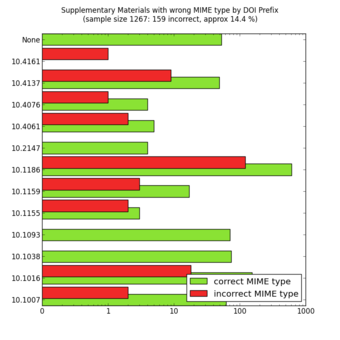
Random Sampling
MIME types of a random sample of supplementary materials from the Open Access subset in PubMed Central as of October 23, 2012. The colour code means that the MIME type of the supplementary files is indicated correctly (green) or incorrectly (red) in the XML at PubMed Central.
Each observation measures one or more properties (such as weight, location, color) of observable bodies distinguished as independent objects or individuals. In survey sampling, weights can be applied to the data to adjust for the sample design, particularly stratified sampling (blocking). Results from probability theory and statistical theory are employed to guide practice. In business and medical research, sampling is widely used for gathering information about a population.
A simple random sample is a subset of individuals chosen from a larger set (a population). Each individual is chosen randomly and entirely by chance, such that each individual has the same probability of being chosen at any stage during the sampling process and each subset of k individuals has the same probability of being chosen for the sample as any other subset of k individuals. A simple random sample is an unbiased surveying technique.
Simple random sampling is a basic type of sampling, since it can be a component of other more complex sampling methods. The principle of simple random sampling is that every object has the same possibility to be chosen. For example, N college students want to get a ticket for a basketball game, but there are not enough tickets (X) for them, so they decide to have a fair way to see who gets to go. Then, everybody is given a number (0 to N-1), and random numbers are generated. The first X numbers would be the lucky ticket winners.
In small populations and often in large ones, such sampling is typically done “without replacement” (i.e., one deliberately avoids choosing any member of the population more than once). Although simple random sampling can be conducted with replacement instead, this is less common and would normally be described more fully as simple random sampling with replacement. Sampling done without replacement is no longer independent, but still satisfies exchangeability. Hence, many results still hold. Further, for a small sample from a large population, sampling without replacement is approximately the same as sampling with replacement, since the odds of choosing the same individual twice is low.
An unbiased random selection of individuals is important so that, in the long run, the sample represents the population. However, this does not guarantee that a particular sample is a perfect representation of the population. Simple random sampling merely allows one to draw externally valid conclusions about the entire population based on the sample.
Conceptually, simple random sampling is the simplest of the probability sampling techniques. It requires a complete sampling frame, which may not be available or feasible to construct for large populations. Even if a complete frame is available, more efficient approaches may be possible if other useful information is available about the units in the population.
Advantages are that it is free of classification error, and it requires minimum advance knowledge of the population other than the frame. Its simplicity also makes it relatively easy to interpret data collected via SRS. For these reasons, simple random sampling best suits situations where not much information is available about the population and data collection can be efficiently conducted on randomly distributed items, or where the cost of sampling is small enough to make efficiency less important than simplicity. If these conditions are not true, stratified sampling or cluster sampling may be a better choice.
II
An observational study is one in which no variables can be manipulated or controlled by the investigator.
Identify situations in which observational studies are necessary and the challenges that arise in their interpretation.
A common goal in statistical research is to investigate causality, which is the relationship between an event (the cause) and a second event (the effect), where the second event is understood as a consequence of the first. There are two major types of causal statistical studies: experimental studies and observational studies. An observational study draws inferences about the possible effect of a treatment on subjects, where the assignment of subjects into a treated group versus a control group is outside the control of the investigator. This is in contrast with experiments, such as randomized controlled trials, where each subject is randomly assigned to a treated group or a control group. In other words, observational studies have no independent variables — nothing is manipulated by the experimenter. Rather, observations have the equivalent of two dependent variables.
In an observational study, the assignment of treatments may be beyond the control of the investigator for a variety of reasons:
Observational studies can never identify causal relationships because even though two variables are related both might be caused by a third, unseen, variable. Since the underlying laws of nature are assumed to be causal laws, observational findings are generally regarded as less compelling than experimental findings.
Observational studies can, however:
A major challenge in conducting observational studies is to draw inferences that are acceptably free from influences by overt biases, as well as to assess the influence of potential hidden biases.

Observational Studies
Nature Observation and Study Hall in The Natural and Cultural Gardens, The Expo Memorial Park, Suita City, Osaka, Japan. Observational studies are a type of experiments in which the variables are outside the control of the investigator.
The Clofibrate Trial was a placebo-controlled study to determine the safety and effectiveness of drugs treating coronary heart disease in men.
Outline how the use of placebos in controlled experiments leads to more reliable results.
Clofibrate (tradename Atromid-S) is an organic compound that is marketed as a fibrate. It is a lipid-lowering agent used for controlling the high cholesterol and triacylglyceride level in the blood. Clofibrate was one of four lipid-modifying drugs tested in an observational study known as the Coronary Drug Project. Also known as the World Health Organization Cooperative Trial on Primary Prevention of Ischaemic Heart Disease, the study was a randomized, multi-center, double-blind, placebo-controlled trial that was intended to study the safety and effectiveness of drugs for long-term treatment of coronary heart disease in men.
Placebo-controlled studies are a way of testing a medical therapy in which, in addition to a group of subjects that receives the treatment to be evaluated, a separate control group receives a sham “placebo” treatment which is specifically designed to have no real effect. Placebos are most commonly used in blinded trials, where subjects do not know whether they are receiving real or placebo treatment.
The purpose of the placebo group is to account for the placebo effect — that is, effects from treatment that do not depend on the treatment itself. Such factors include knowing one is receiving a treatment, attention from health care professionals, and the expectations of a treatment’s effectiveness by those running the research study. Without a placebo group to compare against, it is not possible to know whether the treatment itself had any effect.
Appropriate use of a placebo in a clinical trial often requires, or at least benefits from, a double-blind study design, which means that neither the experimenters nor the subjects know which subjects are in the “test group” and which are in the “control group. ” This creates a problem in creating placebos that can be mistaken for active treatments. Therefore, it can be necessary to use a psychoactive placebo, a drug that produces physiological effects that encourage the belief in the control groups that they have received an active drug.
Patients frequently show improvement even when given a sham or “fake” treatment. Such intentionally inert placebo treatments can take many forms, such as a pill containing only sugar, a surgery where nothing is actually done, or a medical device (such as ultrasound) that is not actually turned on. Also, due to the body’s natural healing ability and statistical effects such as regression to the mean, many patients will get better even when given no treatment at all. Thus, the relevant question when assessing a treatment is not “does the treatment work? ” but “does the treatment work better than a placebo treatment, or no treatment at all? ”
Therefore, the use of placebos is a standard control component of most clinical trials which attempt to make some sort of quantitative assessment of the efficacy of medicinal drugs or treatments.
Those in the placebo group who adhered to the placebo treatment (took the placebo regularly as instructed) showed nearly half the mortality rate as those who were not adherent. A similar study of women found survival was nearly 2.5 times greater for those who adhered to their placebo. This apparent placebo effect may have occurred because:
The Coronary Drug Project found that subjects using clofibrate to lower serum cholesterol observed excess mortality in the clofibrate-treated group despite successful cholesterol lowering (47% more deaths during treatment with clofibrate and 5% after treatment with clofibrate) than the non-treated high cholesterol group. These deaths were due to a wide variety of causes other than heart disease, and remain “unexplained”.
Clofibrate was discontinued in 2002 due to adverse affects.

Placebo-Controlled Observational Studies
Prescription placebos used in research and practice.
A confounding variable is an extraneous variable in a statistical model that correlates with both the dependent variable and the independent variable.
Break down why confounding variables may lead to bias and spurious relationships and what can be done to avoid these phenomenons.
In risk assessments, factors such as age, gender, and educational levels often have impact on health status and so should be controlled. Beyond these factors, researchers may not consider or have access to data on other causal factors. An example is on the study of smoking tobacco on human health. Smoking, drinking alcohol, and diet are lifestyle activities that are related. A risk assessment that looks at the effects of smoking but does not control for alcohol consumption or diet may overestimate the risk of smoking. Smoking and confounding are reviewed in occupational risk assessments such as the safety of coal mining. When there is not a large sample population of non-smokers or non-drinkers in a particular occupation, the risk assessment may be biased towards finding a negative effect on health.
A confounding variable is an extraneous variable in a statistical model that correlates (positively or negatively) with both the dependent variable and the independent variable. A perceived relationship between an independent variable and a dependent variable that has been misestimated due to the failure to account for a confounding factor is termed a spurious relationship, and the presence of misestimation for this reason is termed omitted-variable bias.
As an example, suppose that there is a statistical relationship between ice cream consumption and number of drowning deaths for a given period. These two variables have a positive correlation with each other. An individual might attempt to explain this correlation by inferring a causal relationship between the two variables (either that ice cream causes drowning, or that drowning causes ice cream consumption). However, a more likely explanation is that the relationship between ice cream consumption and drowning is spurious and that a third, confounding, variable (the season) influences both variables: during the summer, warmer temperatures lead to increased ice cream consumption as well as more people swimming and, thus, more drowning deaths.
Confounding by indication has been described as the most important limitation of observational studies. Confounding by indication occurs when prognostic factors cause bias, such as biased estimates of treatment effects in medical trials. Controlling for known prognostic factors may reduce this problem, but it is always possible that a forgotten or unknown factor was not included or that factors interact complexly. Randomized trials tend to reduce the effects of confounding by indication due to random assignment.
Confounding variables may also be categorised according to their source:
A reduction in the potential for the occurrence and effect of confounding factors can be obtained by increasing the types and numbers of comparisons performed in an analysis. If a relationship holds among different subgroups of analyzed units, confounding may be less likely. That said, if measures or manipulations of core constructs are confounded (i.e., operational or procedural confounds exist), subgroup analysis may not reveal problems in the analysis.
Peer review is a process that can assist in reducing instances of confounding, either before study implementation or after analysis has occurred. Similarly, study replication can test for the robustness of findings from one study under alternative testing conditions or alternative analyses (e.g., controlling for potential confounds not identified in the initial study). Also, confounding effects may be less likely to occur and act similarly at multiple times and locations.
Moreover, depending on the type of study design in place, there are various ways to modify that design to actively exclude or control confounding variables:
The Berkeley study is one of the best known real life examples of an experiment suffering from a confounding variable.
Women have traditionally had limited access to higher education. Moreover, when women began to be admitted to higher education, they were encouraged to major in less-intellectual subjects. For example, the study of English literature in American and British colleges and universities was instituted as a field considered suitable to women’s “lesser intellects”.
However, since 1991 the proportion of women enrolled in college in the U.S. has exceeded the enrollment rate for men, and that gap has widened over time. As of 2007, women made up the majority — 54 percent — of the 10.8 million college students enrolled in the U.S.
This has not negated the fact that gender bias exists in higher education. Women tend to score lower on graduate admissions exams, such as the Graduate Record Exam (GRE) and the Graduate Management Admissions Test (GMAT). Representatives of the companies that publish these tests have hypothesized that greater number of female applicants taking these tests pull down women’s average scores. However, statistical research proves this theory wrong. Controlling for the number of people taking the test does not account for the scoring gap.
On February 7, 1975, a study was published in the journal Science by P.J. Bickel, E.A. Hammel, and J.W. O’Connell entitled “Sex Bias in Graduate Admissions: Data from Berkeley. ” This study was conducted in the aftermath of a law suit filed against the University, citing admission figures for the fall of 1973, which showed that men applying were more likely than women to be admitted, and the difference was so large that it was unlikely to be due to chance.
Examination of the aggregate data on admissions showed a blatant, if easily misunderstood, pattern of gender discrimination against applicants.
| All | Men | Women | ||||
|---|---|---|---|---|---|---|
| Applicants | Admitted | Applicants | Admitted | Applicants | Admitted | |
| Total | 12,763 | 41% | 8,442 | 44% | 4,321 | 35% |
When examining the individual departments, it appeared that no department was significantly biased against women. In fact, most departments had a small but statistically significant bias in favor of women. The data from the six largest departments are listed below.
| Department | Men (# Applicants) | Men (% Admitted) | Women (# Applicants) | Women (% Admitted) |
|---|---|---|---|---|
| A | 825 | 62 | 108 | 82 |
| B | 560 | 63 | 25 | 68 |
| C | 325 | 37 | 593 | 34 |
| D | 417 | 33 | 375 | 35 |
| E | 191 | 28 | 393 | 24 |
| F | 272 | 6 | 341 | 7 |
The research paper by Bickel et al. concluded that women tended to apply to competitive departments with low rates of admission even among qualified applicants (such as in the English Department), whereas men tended to apply to less-competitive departments with high rates of admission among the qualified applicants (such as in engineering and chemistry). The study also concluded that the graduate departments that were easier to enter at the University, at the time, tended to be those that required more undergraduate preparation in mathematics. Therefore, the admission bias seemed to stem from courses previously taken.
The above study is one of the best known real life examples of an experiment suffering from a confounding variable. In this particular case, we can see an occurrence of Simpson’s Paradox . Simpson’s Paradox is a paradox in which a trend that appears in different groups of data disappears when these groups are combined, and the reverse trend appears for the aggregate data. This result is often encountered in social-science and medical-science statistics, and is particularly confounding when frequency data are unduly given causal interpretations.

Simpson’s Paradox: For a full explanation of the figure, visit: Simpson’s Paradox on Wikipedia
The practical significance of Simpson’s paradox surfaces in decision making situations where it poses the following dilemma: Which data should we consult in choosing an action, the aggregated or the partitioned? The answer seems to be that one should sometimes follow the partitioned and sometimes the aggregated data, depending on the story behind the data; with each story dictating its own choice.
As to why and how a story, not data, should dictate choices, the answer is that it is the story which encodes the causal relationships among the variables. Once we extract these relationships we can test algorithmically whether a given partition, representing confounding variables, gives the correct answer.

Confounding Variables in Practice
One of the best real life examples of the presence of confounding variables occurred in a study regarding sex bias in graduate admissions here, at the University of California, Berkeley.
The Salk polio vaccine field trial incorporated a double blind placebo control methodology to determine the effectiveness of the vaccine.
The Salk polio vaccine field trials constitute one of the most famous and one of the largest statistical studies ever conducted. The field trials are of particular value to students of statistics because two different experimental designs were used.
The Salk vaccine, or inactivated poliovirus vaccine (IPV), is based on three wild, virulent reference strains:
grown in a type of monkey kidney tissue culture (Vero cell line), which are then inactivated with formalin. The injected Salk vaccine confers IgG-mediated immunity in the bloodstream, which prevents polio infection from progressing to viremia and protects the motor neurons, thus eliminating the risk of bulbar polio and post-polio syndrome.
Statistical tests of new medical treatments almost always have the same basic format. The responses of a treatment group of subjects who are given the treatment are compared to the responses of a control group of subjects who are not given the treatment. The treatment groups and control groups should be as similar as possible.
Beginning February 23, 1954, the vaccine was tested at Arsenal Elementary School and the Watson Home for Children in Pittsburgh, Pennsylvania. Salk’s vaccine was then used in a test called the Francis Field Trial, led by Thomas Francis; the largest medical experiment in history. The test began with some 4,000 children at Franklin Sherman Elementary School in McLean, Virginia, and would eventually involve 1.8 million children, in 44 states from Maine to California. By the conclusion of the study, roughly 440,000 received one or more injections of the vaccine, about 210,000 children received a placebo, consisting of harmless culture media, and 1.2 million children received no vaccination and served as a control group, who would then be observed to see if any contracted polio.
The results of the field trial were announced April 12, 1955 (the 10th anniversary of the death of President Franklin D. Roosevelt, whose paralysis was generally believed to have been caused by polio). The Salk vaccine had been 60–70% effective against PV1 (poliovirus type 1), over 90% effective against PV2 and PV3, and 94% effective against the development of bulbar polio. Soon after Salk’s vaccine was licensed in 1955, children’s vaccination campaigns were launched. In the U.S, following a mass immunization campaign promoted by the March of Dimes, the annual number of polio cases fell from 35,000 in 1953 to 5,600 by 1957. By 1961 only 161 cases were recorded in the United States.
The original design of the experiment called for second graders (with parental consent) to form the treatment group and first and third graders to form the control group. This design was known as the observed control experiment.
The Salk Polio Vaccine Field Trial
Jonas Salk administers his polio vaccine on February 26, 1957 in the Commons Room of the Cathedral of Learning at the University of Pittsburgh where the vaccine was created by Salk and his team.
Two serious issues arose in this design: selection bias and diagnostic bias. Because only second graders with permission from their parents were administered the treatment, this treatment group became self-selecting.
Thus, a randomized control design was implemented to overcome these apparent deficiencies. The key distinguishing feature of the randomized control design is that study subjects, after assessment of eligibility and recruitment, but before the intervention to be studied begins, are randomly allocated to receive one or the other of the alternative treatments under study. Therefore, randomized control tends to negate all effects (such as confounding variables) except for the treatment effect.
This design also had the characteristic of being double-blind. Double-blind describes an especially stringent way of conducting an experiment on human test subjects which attempts to eliminate subjective, unrecognized biases carried by an experiment’s subjects and conductors. In a double-blind experiment, neither the participants nor the researchers know which participants belong to the control group, as opposed to the test group. Only after all data have been recorded (and in some cases, analyzed) do the researchers learn which participants were which.
This combination of randomized control and double-blind experimental factors has become the gold standard for a clinical trial.
Numerous studies have been conducted to examine the value of the portacaval shunt procedure, many using randomized controls.
A portacaval shunt is a treatment for high blood pressure in the liver. A connection is made between the portal vein, which supplies 75% of the liver’s blood, and the inferior vena cava, the vein that drains blood from the lower two-thirds of the body. The most common causes of liver disease resulting in portal hypertension are cirrhosis , caused by alcohol abuse, and viral hepatitis (hepatitis B and C). Less common causes include diseases such as hemochromatosis, primary biliary cirrhosis (PBC), and portal vein thrombosis. The procedure is long and hazardous .

The Portacaval Shunt
This image is a trichrome stain showing cirrhosis of the liver. Cirrhosis can be combatted by the portacaval shunt procedure, for which there have been numerous experimental trials using randomized assignment.
Numerous studies have been conducted to examine the value of and potential concerns with the surgery. Of these studies, 63% were conducted without controls, 29% were conducted with non-randomized controls, and 8% were conducted with randomized controls.
Random assignment, or random placement, is an experimental technique for assigning subjects to different treatments (or no treatment). The thinking behind random assignment is that by randomizing treatment assignments, the group attributes for the different treatments will be roughly equivalent; therefore, any effect observed between treatment groups can be linked to the treatment effect and cannot be considered a characteristic of the individuals in the group.
In experimental design, random assignment of participants in experiments or treatment and control groups help to ensure that any differences between and within the groups are not systematic at the outset of the experiment. Random assignment does not guarantee that the groups are “matched” or equivalent, only that any differences are due to chance.
The steps to random assignment include:
Because most basic statistical tests require the hypothesis of an independent randomly sampled population, random assignment is the desired assignment method. It provides control for all attributes of the members of the samples—in contrast to matching on only one or more variables—and provides the mathematical basis for estimating the likelihood of group equivalence for characteristics one is interested in. This applies both for pre-treatment checks on equivalence and the evaluation of post treatment results using inferential statistics. More advanced statistical modeling can be used to adapt the inference to the sampling method.
A scientific control is an observation designed to minimize the effects of variables other than the single independent variable.
Classify scientific controls and identify how they are used in experiments.
A scientific control is an observation designed to minimize the effects of variables other than the single independent variable. This increases the reliability of the results, often through a comparison between control measurements and the other measurements.
For example, during drug testing, scientists will try to control two groups to keep them as identical as possible, then allow one group to try the drug. Another example might be testing plant fertilizer by giving it to only half the plants in a garden: the plants that receive no fertilizer are the control group, because they establish the baseline level of growth that the fertilizer-treated plants will be compared against. Without a control group, the experiment cannot determine whether the fertilizer-treated plants grow more than they would have if untreated.
Ideally, all variables in an experiment will be controlled (accounted for by the control measurements) and none will be uncontrolled. In such an experiment, if all the controls work as expected, it is possible to conclude that the experiment is working as intended and that the results of the experiment are due to the effect of the variable being tested. That is, scientific controls allow an investigator to make a claim like “Two situations were identical until factor X occurred. Since factor X is the only difference between the two situations, the new outcome was caused by factor X. ”
Controlled experiments can be performed when it is difficult to exactly control all the conditions in an experiment. In this case, the experiment begins by creating two or more sample groups that are probabilistically equivalent, which means that measurements of traits should be similar among the groups and that the groups should respond in the same manner if given the same treatment. This equivalency is determined by statistical methods that take into account the amount of variation between individuals and the number of individuals in each group. In fields such as microbiology and chemistry, where there is very little variation between individuals and the group size is easily in the millions, these statistical methods are often bypassed and simply splitting a solution into equal parts is assumed to produce identical sample groups.
The simplest types of control are negative and positive controls. These two controls, when both are successful, are usually sufficient to eliminate most potential confounding variables. This means that the experiment produces a negative result when a negative result is expected and a positive result when a positive result is expected.
Negative controls are groups where no phenomenon is expected. They ensure that there is no effect when there should be no effect. To continue with the example of drug testing, a negative control is a group that has not been administered the drug. We would say that the control group should show a negative or null effect.
If the treatment group and the negative control both produce a negative result, it can be inferred that the treatment had no effect. If the treatment group and the negative control both produce a positive result, it can be inferred that a confounding variable acted on the experiment, and the positive results are likely not due to the treatment.
Positive controls are groups where a phenomenon is expected. That is, they ensure that there is an effect when there should be an effect. This is accomplished by using an experimental treatment that is already known to produce that effect and then comparing this to the treatment that is being investigated in the experiment.
Positive controls are often used to assess test validity. For example, to assess a new test’s ability to detect a disease, then we can compare it against a different test that is already known to work. The well-established test is the positive control, since we already know that the answer to the question (whether the test works) is yes.
For difficult or complicated experiments, the result from the positive control can also help in comparison to previous experimental results. For example, if the well-established disease test was determined to have the same effectiveness as found by previous experimenters, this indicates that the experiment is being performed in the same way that the previous experimenters did.
When possible, multiple positive controls may be used. For example, if there is more than one disease test that is known to be effective, more than one might be tested. Multiple positive controls also allow finer comparisons of the results (calibration or standardization) if the expected results from the positive controls have different sizes.
Controlled Experiments
An all-female crew of scientific experimenters began a five-day exercise on December 16, 1974. They conducted 11 selected experiments in materials science to determine their practical application for Spacelab missions and to identify integration and operational problems that might occur on actual missions. Air circulation, temperature, humidity and other factors were carefully controlled.
III
Microsoft® Excel® is a tool that can be used in virtually all careers and is valuable in both professional and personal settings. Whether you need to keep track of medications in inventory for a hospital or create a financial plan for your retirement, Excel enables you to do these activities efficiently and accurately. The following trainings and Excel Challenge assignment introduce the fundamental skills necessary to get you started in using Excel. You will find that just a few skills can make you very productive in a short period of time.
Adapted from How to Use Microsoft Excel: The Careers in Practice Series, adapted by The Saylor Foundation without attribution as requested by the work’s original creator or licensee, and licensed under CC BY-NC-SA 3.0.
Microsoft® Office contains a variety of tools that help people accomplish many personal and professional objectives. Microsoft Excel is perhaps the most versatile and widely used of all the Office applications. No matter which career path you choose, you will likely need to use Excel to accomplish your professional objectives, some of which may occur daily. This chapter provides an overview of the Excel application along with an orientation for accessing the commands and features of an Excel workbook.
Taking a very simple view, Excel is a tool that allows you to enter quantitative data into an electronic spreadsheet to apply one or many mathematical computations. These computations ultimately convert that quantitative data into information. The information produced in Excel can be used to make decisions in both professional and personal contexts. For example, employees can use Excel to determine how much inventory to buy for a clothing retailer, how much medication to administer to a patient, or how much money to spend to stay within a budget. With respect to personal decisions, you can use Excel to determine how much money you can spend on a house, how much you can spend on car lease payments, or how much you need to save to reach your retirement goals. We will demonstrate how you can use Excel to make these decisions and many more throughout this text.
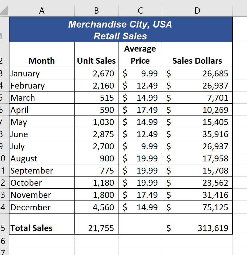
Figure 1.1 shows a completed Excel worksheet that will be constructed in this chapter. The information shown in this worksheet contains sales data for a hypothetical merchandise retail company. The worksheet data can help a retailer analyze the business and determine the number of salespeople needed for each month for example.
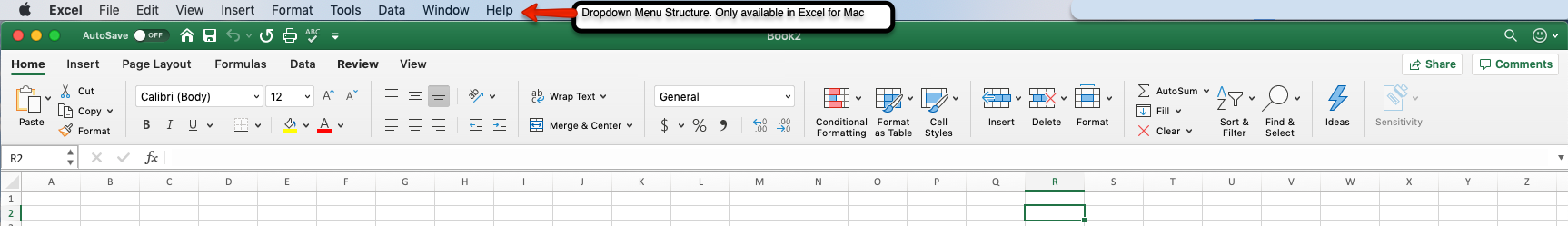
The Excel for Windows and Excel for Mac software versions are very similar. Most of the features, tools and commands are available in both versions. There are, however, some differences with the Excel interface. There are also a few features that are not available in the Excel for Mac version. The screenshots and step-by-step instructions in this textbook are specific to Excel for Windows. We have attempted to provide alternate screenshots and instructions for the Mac version when the differences are significant. When you see this icon ![]() , it means we are providing information specific to Mac users.
, it means we are providing information specific to Mac users.
The Excel Workbook
A workbook is an Excel file that contains one or more worksheets (referred to as spreadsheets). Excel will assign a file name to the workbook, such as Book1, Book2, Book3, and so on, depending on how many new workbooks are opened. Figure 1.2 shows a blank workbook after starting Excel. Take some time to familiarize yourself with this screen. Your screen may be slightly different based on the version you’re using.
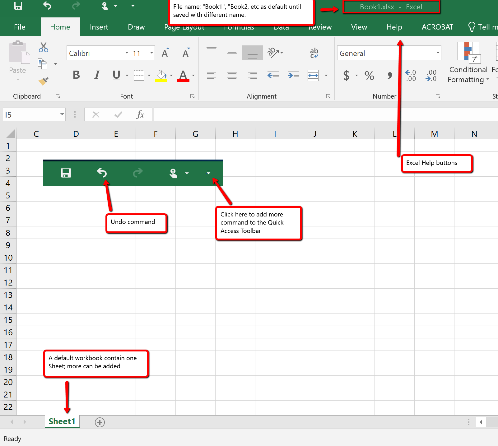
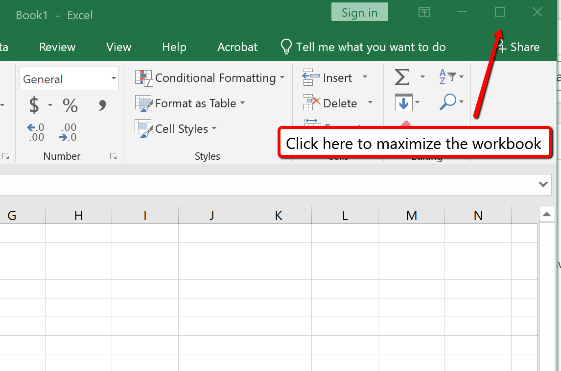
Your workbook should already be maximized (or shown at full size) once Excel is started, as shown in Figure 1.2. However, if your screen looks like Figure 1.3 after starting Excel, you should click the Maximize button, as shown in the figure.
Data are entered and managed in an Excel worksheet. The worksheet contains several rectangles called cells for entering numeric and non-numeric data. Each cell in an Excel worksheet contains an address, which is defined by a column letter followed by a row number. For example, the cell that is currently activated in Figure 1.3 is A1. This would be referred to as cell location A1 or cell reference A1. The following steps explain how you can navigate in an Excel worksheet:
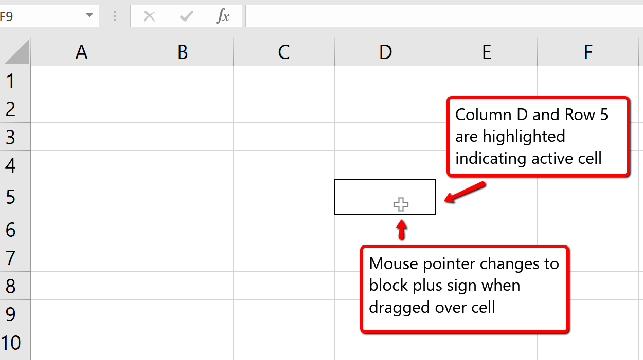
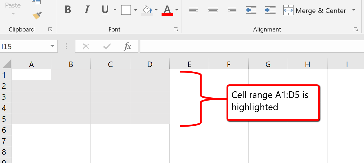
This is referred to as a cell range and is documented as follows: A1:D5. Any two cell locations separated by a colon are known as a cell range. The first cell is the top left corner of the range, and the second cell is the lower right corner of the range.
Basic Worksheet Navigation
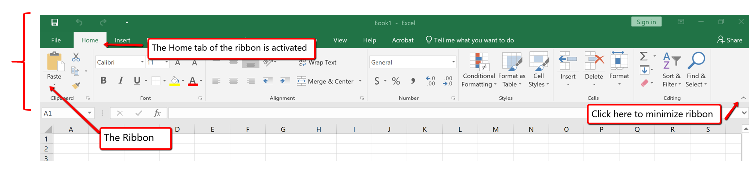
Excel’s features and commands are found in the Ribbon, which is the upper area of the Excel screen that contains several tabs running across the top. Each tab provides access to a different set of Excel commands. Figure 1.6 shows the commands available in the Home tab of the Ribbon. Table 1.1 “Command Overview for Each Tab of the Ribbon” provides an overview of the commands that are found in each tab of the Ribbon.
![]() The Excel for Mac ribbon, as shown in Figure 1.6a below, has two primary differences:
The Excel for Mac ribbon, as shown in Figure 1.6a below, has two primary differences:
If you look closely at the Excel Ribbon (See Figure 1.6 above), you will see that the Ribbon is separated in groups of tool buttons, and each group has a title name. On Home tab, the group title names are “Clipboard”, “Font”, “Alignment”, “Number”, “Styles”. “Cells”, “Editing”, etc. The tool buttons within each group are all related to the group title.
![]() Mac Users Only: The default “View” for the Excel for Mac ribbon does not display these “group title names”. Notice in Figure 1.6a above, there are no group title names. It is a good idea to change this “view” so you can see the group title names. Here are the steps:
Mac Users Only: The default “View” for the Excel for Mac ribbon does not display these “group title names”. Notice in Figure 1.6a above, there are no group title names. It is a good idea to change this “view” so you can see the group title names. Here are the steps:
Table 1.1 Command Overview for Each Tab of the Ribbon
| Tab Name | Description of Commands |
| File | Also known as the Backstage view of the Excel workbook. Contains all commands for opening, closing, saving, and creating new Excel workbooks. Includes print commands, document properties, e-mailing options, and help features. The default settings and options are also found in this tab. |
| Home | Contains the most frequently used Excel commands. Formatting commands are found in this tab along with commands for cutting, copying, pasting, and for inserting and deleting rows and columns. |
| Insert | Used to insert objects such as charts, pictures, shapes, PivotTables, Internet links, symbols, or text boxes. |
| Page Layout | Contains commands used to prepare a worksheet for printing. Also includes commands used to show and print the gridlines on a worksheet. |
| Formulas | Includes commands for adding mathematical functions to a worksheet. Also contains tools for auditing mathematical formulas. |
| Data | Used when working with external data sources such as Microsoft® Access®, text files, or the Internet. Also contains sorting commands and access to scenario tools. |
| Review | Includes Spelling and Track Changes features. Also contains protection features to password protect worksheets or workbooks. |
| View | Used to adjust the visual appearance of a workbook. Common commands include the Zoom and Page Layout view. |
| Help | This tab provides access to help and support features such as contacting Microsoft support, sending feedback, suggesting a new feature, and community discussion groups. |
| Draw | Provides drawing options for using a digital pen, mouse or finger depending on the type of device (laptop with touch screen, tablet, computer, etc). This tab is not visible by default. See below on how to customize the Ribbon to add or remove tabs. |
| Developer | Provides access to some advanced features such as macros, form controls, and XML commands. This tab is not visible by default. See below on how to customize the Ribbon to add or remove tabs. |
The Ribbon shown in Figure 1.6 and Figure 1.6a (above) is full, or maximized. The benefit of having a full Ribbon is that the commands are always visible while you are developing a worksheet. However, depending on the screen dimensions of your computer, you may find that the Ribbon takes up too much vertical space on your worksheet. If this is the case, you can minimize the Ribbon by clicking the button shown in Figure 1.6. When minimized, the Ribbon will show only the tabs and not the command buttons. When you click on a tab, the command buttons will appear until you select a command or click anywhere on your worksheet.
![]() To hide the Ribbon with Excel for Mac you can use the keyboard shortcut:
To hide the Ribbon with Excel for Mac you can use the keyboard shortcut:
Hold down the “Command and Option” keys and tap the “R” key
The same keyboard shortcut will unhide the Ribbon as well.
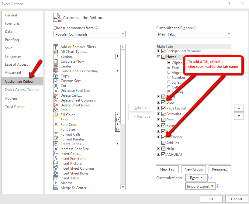
Here are the steps to add additional tabs to the Excel Ribbon
Minimizing or Maximizing the Ribbon
The Quick Access Toolbar is found at the upper left side of the Excel screen above the Ribbon, as shown in Figure 1.7. This area provides access to the most frequently used commands, such as Save and Undo. You also can customize the Quick Access Toolbar by adding commands that you use on a regular basis. By placing these commands in the Quick Access Toolbar, you do not have to navigate through the Ribbon to find them. To customize the Quick Access Toolbar, click the down arrow as shown in Figure 1.8. This will open a menu of commands that you can add to the Quick Access Toolbar. If you do not see the command you are looking for on the list, select the More Commands option.
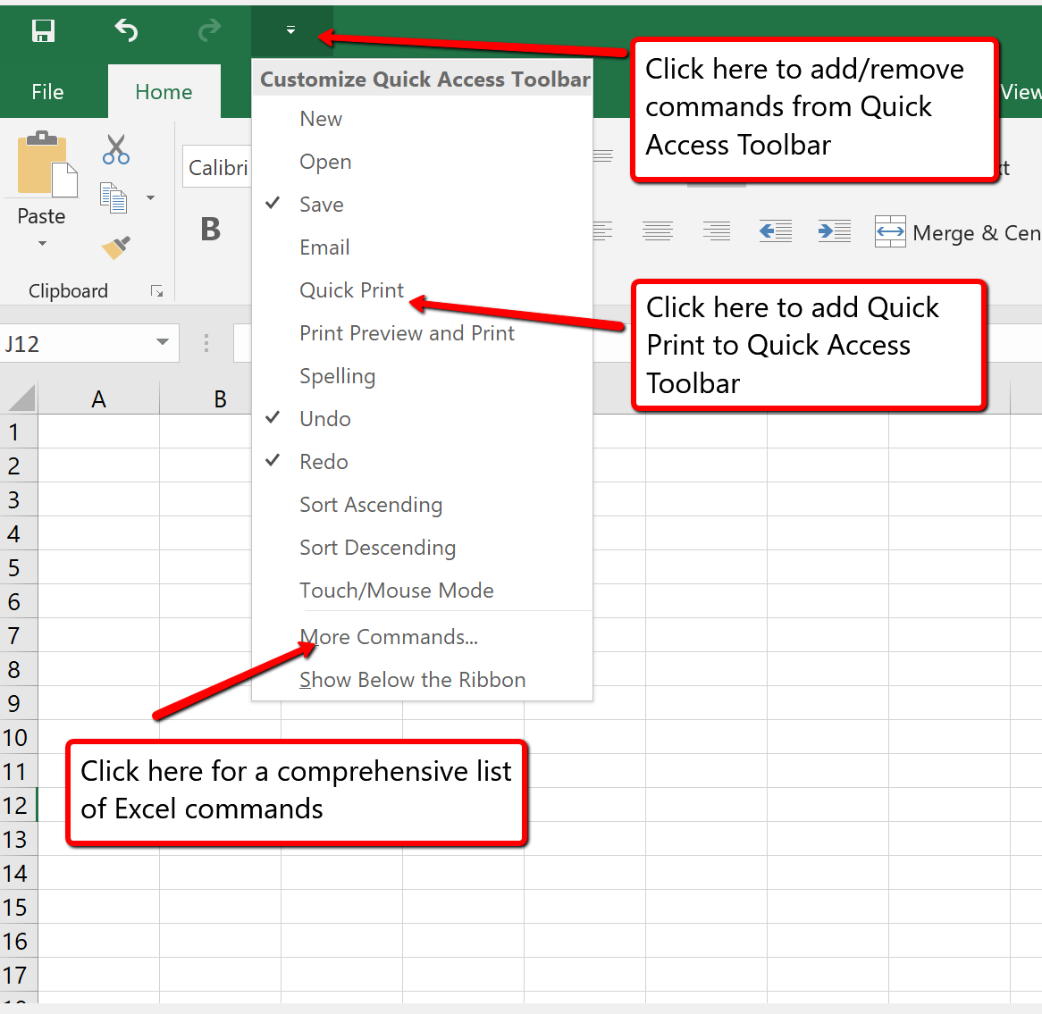
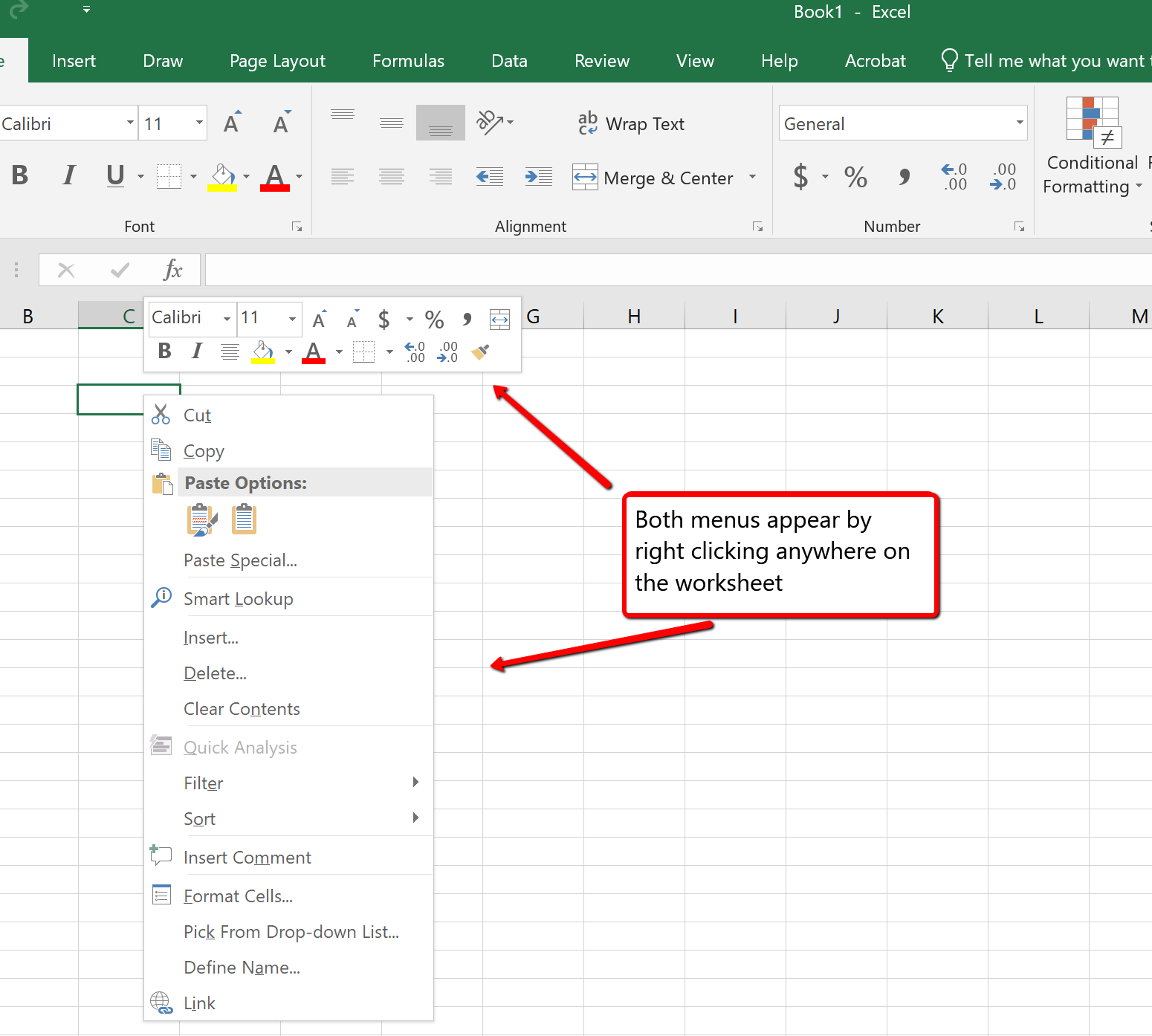
In addition to the Ribbon and Quick Access Toolbar, you can also access many commands by right clicking anywhere on the worksheet. Figure 1.9 shows an example of the commands available in the right-click menu.
![]() There is no “Right-click” option for Excel for Mac. To access the same commands with Excel for Mac, hold down the Control key and click the mouse button.
There is no “Right-click” option for Excel for Mac. To access the same commands with Excel for Mac, hold down the Control key and click the mouse button.
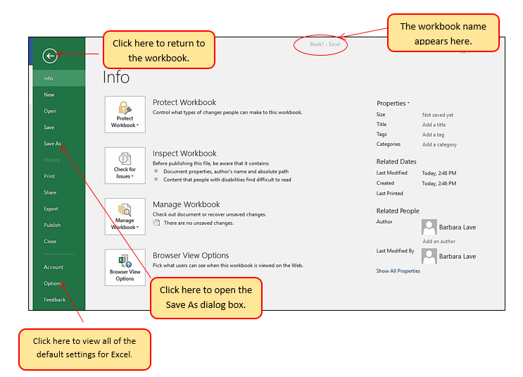
The File tab is also known as the Backstage view of the workbook. It contains a variety of features and commands related to the workbook that is currently open, new workbooks, or workbooks stored in other locations on your computer or network. Figure 1.10 shows the options available in the File tab or Backstage view. To leave the Backstage view and return to the worksheet, click the arrow in the upper left-hand corner as shown below.
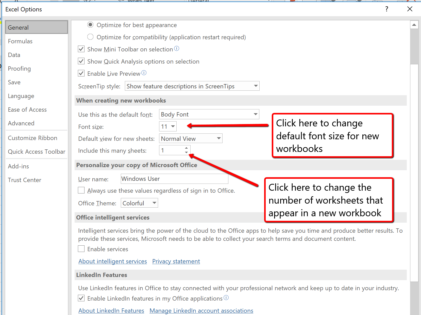
Included in the File tab are the default settings for the Excel application that can be accessed and modified by clicking the Options button. Figure 1.11 shows the Excel Options window, which gives you access to settings such as the default font style, font size, and the number of worksheets that appear in new workbooks.
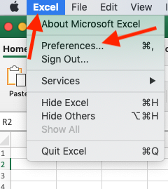
![]() To access these same options in Excel for Mac, you must click the “Excel” menu option and choose “Preferences” (see Figure 1.12 below)
To access these same options in Excel for Mac, you must click the “Excel” menu option and choose “Preferences” (see Figure 1.12 below)
![]()
Once you create a new workbook, you will need to change the file name and choose a location on your computer or network to save that file. It is important to remember where you save this workbook on your computer or network as you will be using this file in the Section 1.2 “Entering, Editing, and Managing Data” to construct the workbook shown in Figure 1.1. The process of saving can be different with different versions of Excel. Please be sure you follow the steps for the version of Excel you are using. The following steps explain how to save a new workbook and assign it a file name.
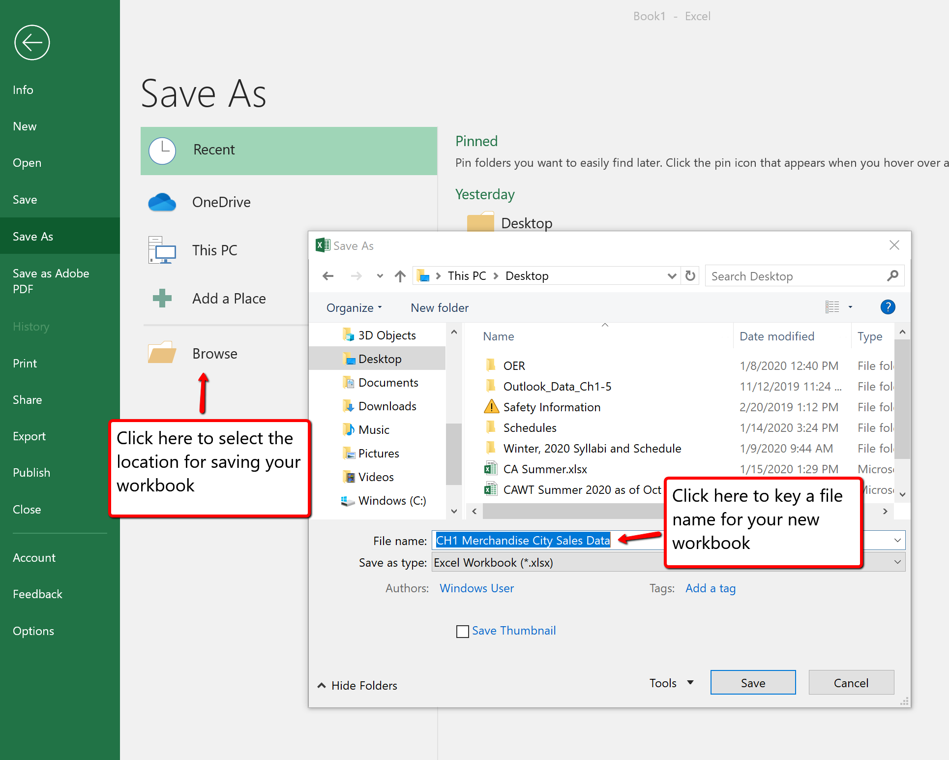
Save As
Saving Workbooks (Save As)
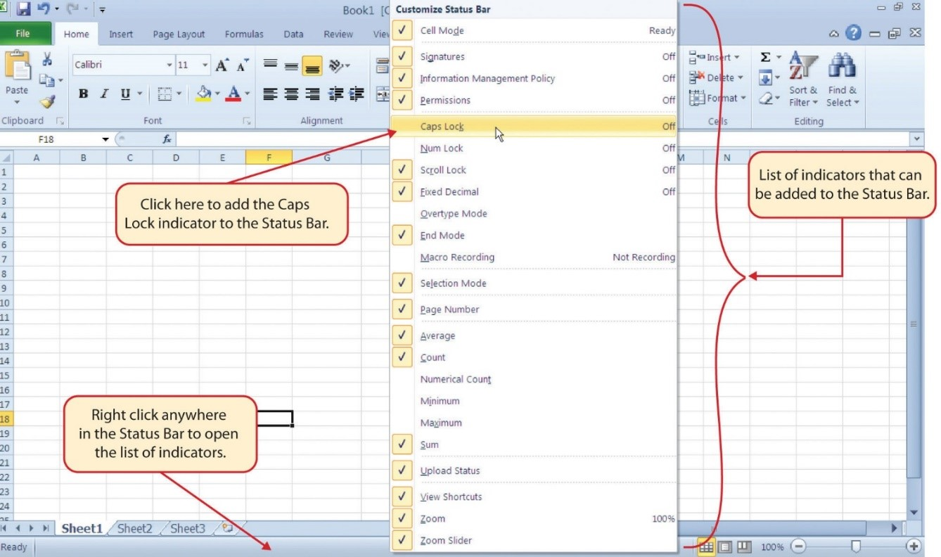
The Status Bar is located below the worksheet tabs on the Excel screen (see Figure 1.13). It displays a variety of information, such as the status of certain keys on your keyboard (e.g., CAPS LOCK), the available views for a workbook, the magnification of the screen, and mathematical functions that can be performed when data are highlighted on a worksheet. You can customize the Status Bar as follows:
The Help feature provides extensive information about the Excel application. Although some of this information may be stored on your computer, the Help window will automatically connect to the Internet, if you have a live connection, to provide you with resources that can answer most of your questions. You can open the Excel Help window by clicking the question mark in the upper right area of the screen or ribbon. With newer versions of Excel, use the query box to enter your question and select from helpful option links or select the question mark from the dropdown list to launch Excel Help windows.
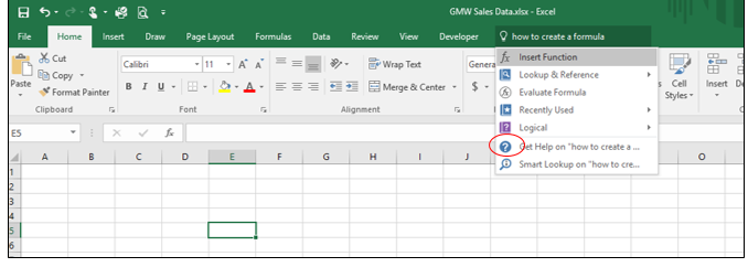
Excel Help
Adapted by Barbara Lave from How to Use Microsoft Excel: The Careers in Practice Series, adapted by The Saylor Foundation without attribution as requested by the work’s original creator or licensee, and licensed under CC BY-NC-SA 3.0.
In this section, we will begin the development of the workbook shown in Figure 1.1. The skills covered in this section are typically used in the early stages of developing one or more worksheets in a workbook.
You will begin building the workbook shown in Figure 1.1 by manually entering data into the worksheet. The following steps explain how the column headings in Row 2 are typed into the worksheet:
Figure 1.15 shows how your worksheet should appear after you have typed the column headings into Row 2. Notice that the word Price in cell location C2 is not visible. This is because the column is too narrow to fit the entry you typed. We will examine formatting techniques to correct this problem in the next section.
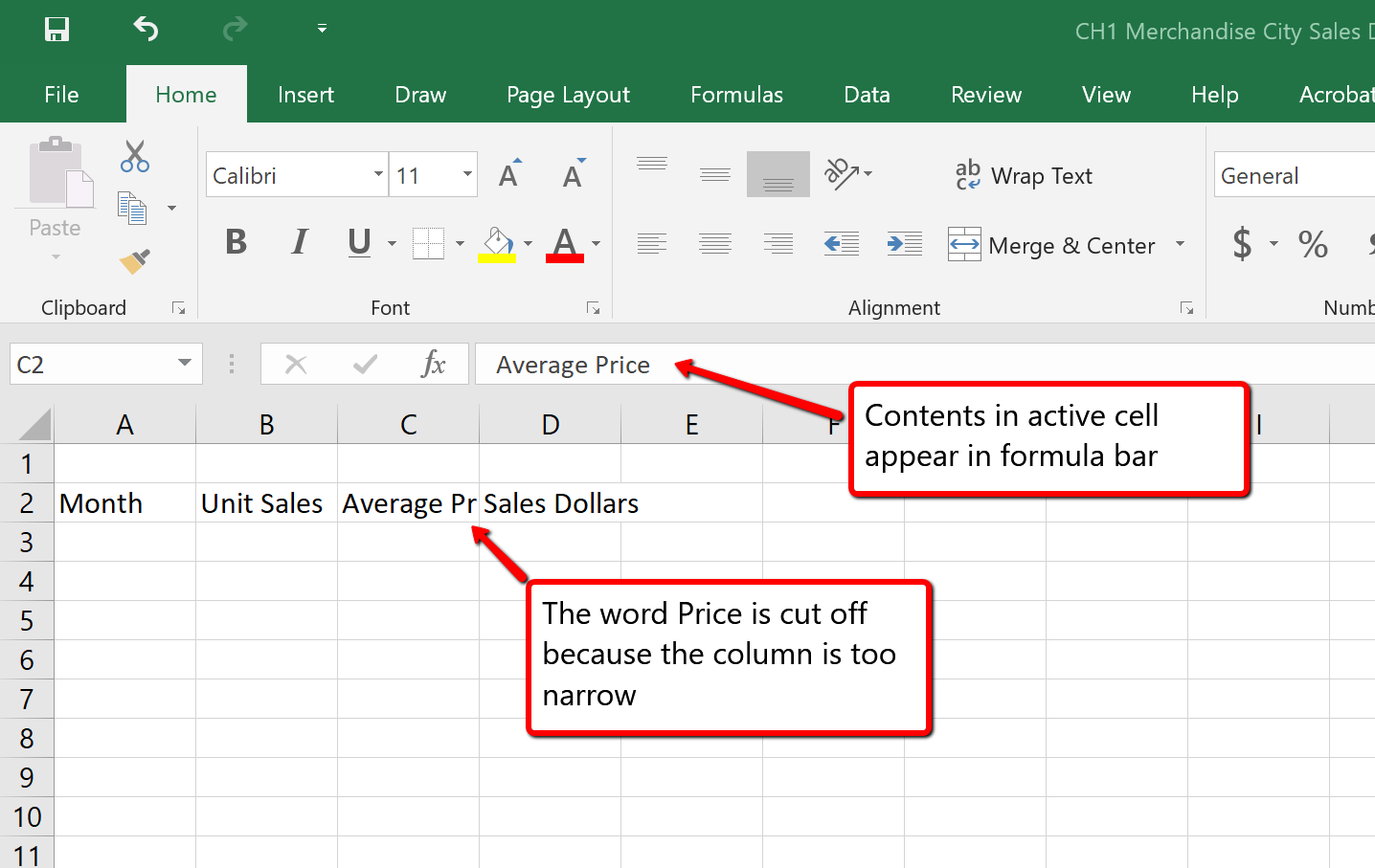
Column Headings
It is critical to include column headings that accurately describe the data in each column of a worksheet. In professional environments, you will likely be sharing Excel workbooks with coworkers. Good column headings reduce the chance of someone misinterpreting the data contained in a worksheet, which could lead to costly errors depending on your career.
Avoid Formatting Symbols When Entering Numbers
When typing numbers into an Excel worksheet, it is best to avoid adding any formatting symbols such as dollar signs and commas. Although Excel allows you to add these symbols while typing numbers, it slows down the process of entering data. It is more efficient to use Excel’s formatting features to add these symbols to numbers after you type them into a worksheet.
Data Entry
It is very important to proofread your worksheet carefully, especially when you have entered numbers. Transposing numbers when entering data manually into a worksheet is a common error. For example, the number 563 could be transposed to 536. Such errors can seriously compromise the integrity of your workbook.
Figure 1.16 shows how your worksheet should appear after entering the data. Check your numbers carefully to make sure they are accurately entered into the worksheet.
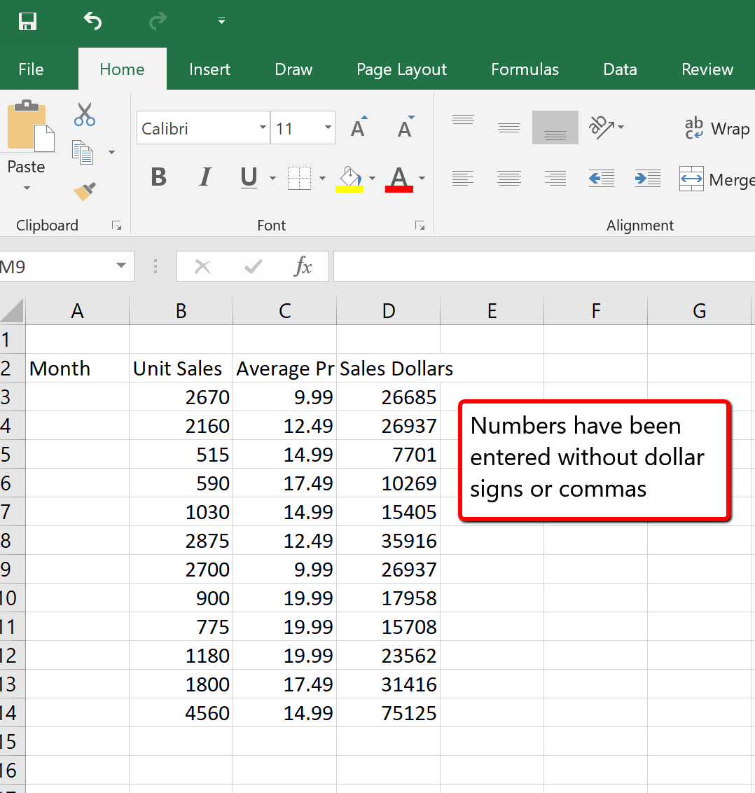
Data that has been entered in a cell can be changed by double clicking the cell location or using the Formula Bar. You may have noticed that as you were typing data into a cell location, the data you typed appeared in the Formula Bar. The Formula Bar can be used for entering data into cells as well as for editing data that already exists in a cell. The following steps provide an example of entering and then editing data that has been entered into a cell location:
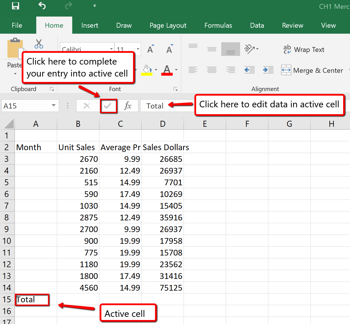
Editing Data in a Cell
The Auto Fill feature is a valuable tool when manually entering data into a worksheet. This feature has many uses, but it is most beneficial when you are entering data in a defined sequence, such as the numbers 2, 4, 6, 8, and so on, or nonnumeric data such as the days of the week or months of the year. The following steps demonstrate how Auto Fill can be used to enter the months of the year in Column A:
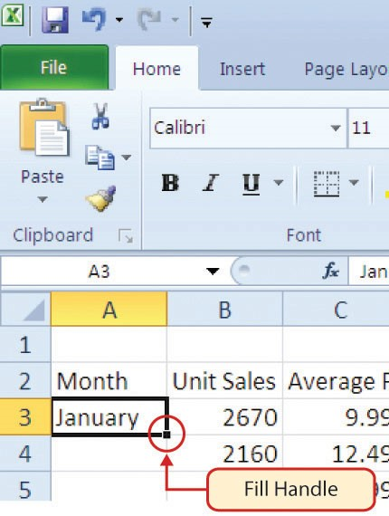
Left click and drag the Fill Handle to cell A14. Notice that the Auto Fill tip box indicates what month will be placed into each cell (see Figure 1.19). Release the mouse button when the tip box reads “December.”
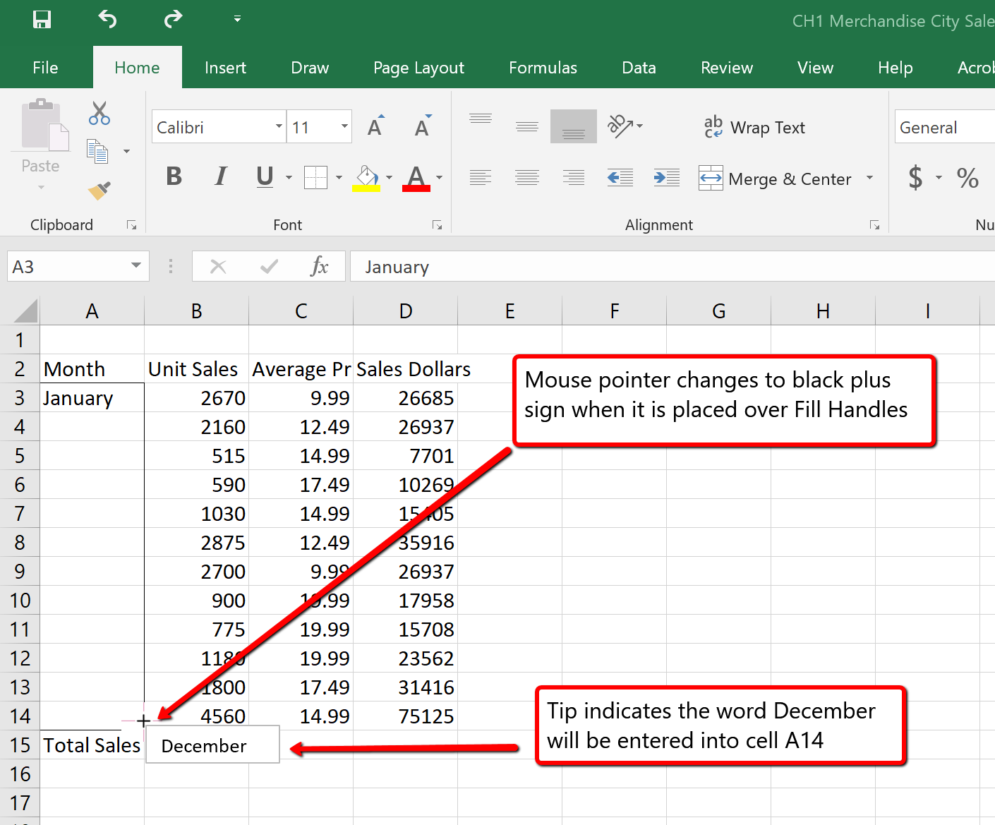
Once you release the left mouse button, all twelve months of the year should appear in the cell range A3:A14, as shown in Figure 1.20. You will also see the Auto Fill Options button. By clicking this button, you have several options for inserting data into a group of cells.
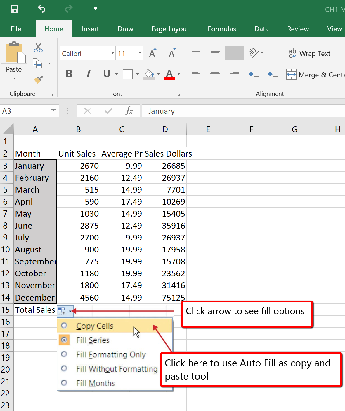
There are several methods for removing data from a worksheet, a few of which are demonstrated here. With each method, you use the Undo command. This is a helpful command in the event you mistakenly remove data from your worksheet. The following steps demonstrate how you can delete data from a cell or range of cells:
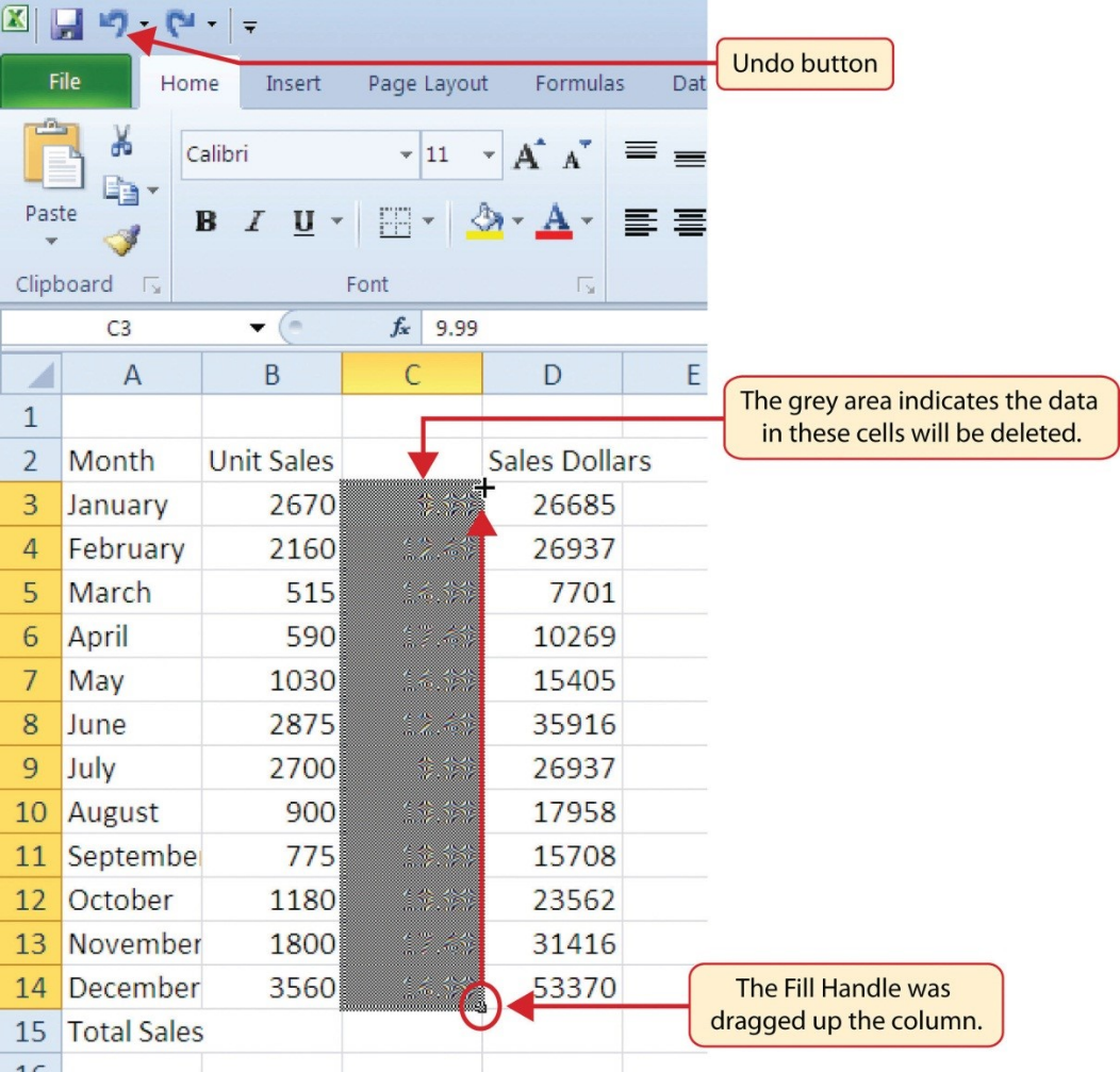
Undo Command
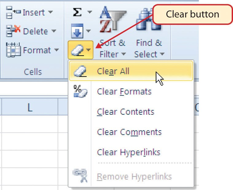
There are a few entries in the worksheet that appear cut off. For example, the last letter of the word September cannot be seen in cell A11. This is because the column is too narrow for this word. The columns and rows on an Excel worksheet can be adjusted to accommodate the data that is being entered into a cell using three different methods. The following steps explain how to adjust the column widths and row heights in a worksheet:
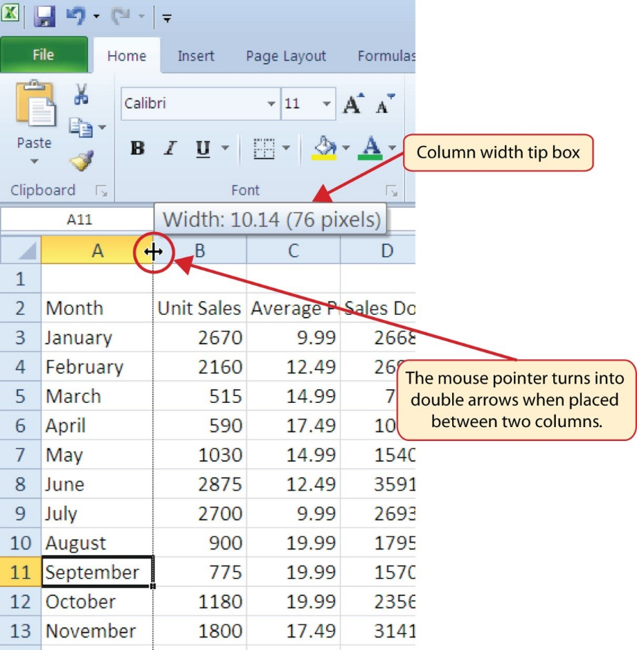
You may find that using the click-and-drag method is inefficient if you need to set a specific character width for one or more columns. Steps 1 through 6 illustrate a second method for adjusting column widths when using a specific number of characters:
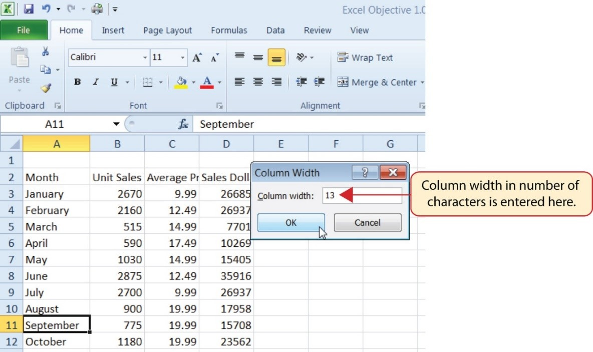
Column Width
Steps 1 through 4 demonstrate how to adjust row height, which is similar to adjusting column width:
Row Height
Figure 1.25 shows the appearance of the worksheet after Column A and Row 15 are adjusted.
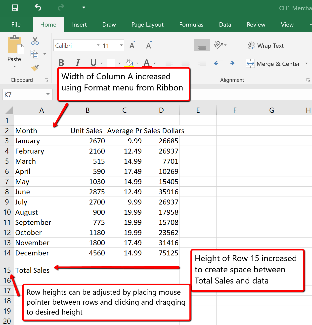
Adjusting Columns and Rows
In addition to adjusting the columns and rows on a worksheet, you can also hide columns and rows. This is a useful technique for enhancing the visual appearance of a worksheet that contains data that is not necessary to display. These features will be demonstrated using the GMW Sales Data workbook. However, there is no need to have hidden columns or rows for this worksheet. The use of these skills here will be for demonstration purposes only.
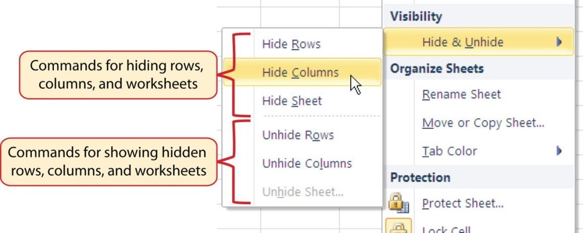
Hiding Columns
Figure 1.27 shows the workbook with Column C hidden in the Sheet1 worksheet. You can tell a column is hidden by the missing letter C.
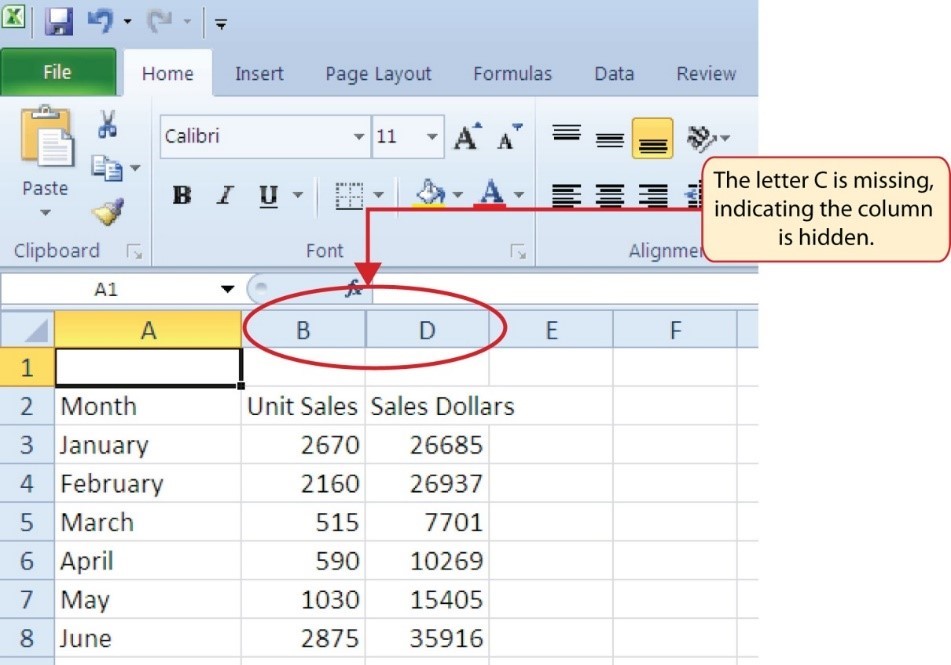
To unhide a column, follow these steps:
Unhiding Columns
The following steps demonstrate how to hide rows, which is similar to hiding columns:
Hiding Rows
To unhide a row, follow these steps:
Unhiding Rows
Hidden Rows and Columns
In most careers, it is common for professionals to use Excel workbooks that have been designed by a coworker. Before you use a workbook developed by someone else, always check for hidden rows and columns. You can quickly see whether a row or column is hidden if a row number or column letter is missing.
Hiding Columns and Rows
Unhiding Columns and Rows
Using Excel workbooks that have been created by others is a very efficient way to work because it eliminates the need to create data worksheets from scratch. However, you may find that to accomplish your goals, you need to add additional columns or rows of data. In this case, you can insert blank columns or rows into a worksheet. The following steps demonstrate how to do this:
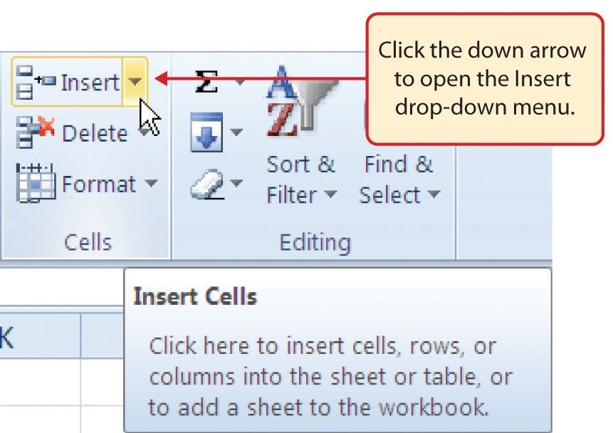
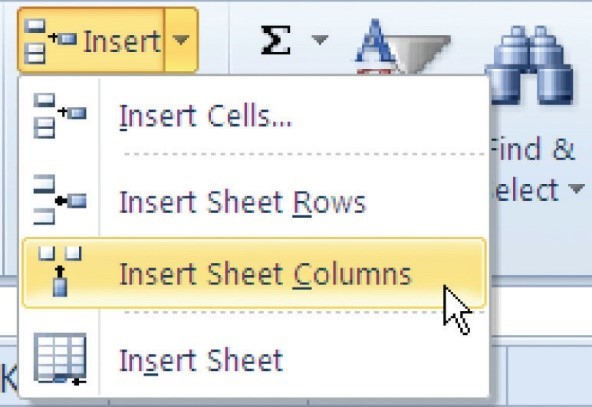
Inserting Columns
Inserting Rows
Inserting Columns and Rows
Once data are entered into a worksheet, you have the ability to move it to different locations. The following steps demonstrate how to move data to different locations on a worksheet:
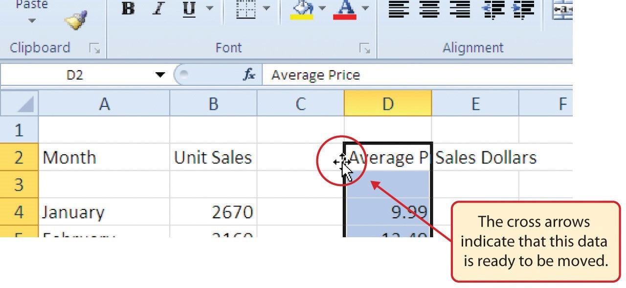
![]() Mac Users: when the mouse hovers over the left edge of cell D2, the pointer will turn into a small hand that looks like this:
Mac Users: when the mouse hovers over the left edge of cell D2, the pointer will turn into a small hand that looks like this: ![]()
Moving Data
Before moving data on a worksheet, make sure you identify all the components that belong with the series you are moving. For example, if you are moving a column of data, make sure the column heading is included. Also, make sure all values are highlighted in the column before moving it.
You may need to delete entire columns or rows of data from a worksheet. This need may arise if you need to remove either blank columns or rows from a worksheet or columns and rows that contain data. The methods for removing cell contents were covered earlier and can be used to delete unwanted data. However, if you do not want a blank row or column in your workbook, you can delete it using the following steps:
Deleting Rows

Deleting Columns
Deleting Columns and Rows
Adapted by Barbara Lave from How to Use Microsoft Excel: The Careers in Practice Series, adapted by The Saylor Foundation without attribution as requested by the work’s original creator or licensee, and licensed under CC BY-NC-SA 3.0.
This section addresses formatting commands that can be used to enhance the visual appearance of a worksheet. It also provides an introduction to mathematical calculations. The skills introduced in this section will give you powerful tools for analyzing the data that we have been working with in this workbook and will highlight how Excel is used to make key decisions in virtually any career. Additionally, Excel Spreadsheet Guidelines for format and appearance will be introduced as a format for the course and spreadsheets submitted.
Enhancing the visual appearance of a worksheet is a critical step in creating a valuable tool for you or your coworkers when making key decisions. There are accepted professional formatting standards when spreadsheets contain only currency data. For this course, we will use the following Excel Guidelines for Formatting. The first figure displays how to use Accounting number format when ALL figures are currency. Only the first row of data and the totals should be formatted with the Accounting format. The other data should be formatted with Comma style. There also needs to be a Top Border above the numbers in the total row. If any of the numbers have cents, you need to format all of the data with two decimal places.

Often, your Excel spreadsheet will contain values that are both currency and non-currency in nature. When that is the case, you’ll want to use the guidelines in the following figure:

The following steps demonstrate several fundamental formatting skills that will be applied to the workbook that we are developing for this chapter. Several of these formatting skills are identical to ones that you may have already used in other Microsoft applications such as Microsoft® Word® or Microsoft® PowerPoint®.
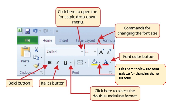
Bold Format
Italics Format
Underline Format
Format Column Headings and Totals
Applying formatting enhancements to the column headings and column totals in a worksheet is a very important technique, especially if you are sharing a workbook with other people. These formatting techniques allow users of the worksheet to clearly see the column headings that define the data. In addition, the column totals usually contain the most important data on a worksheet with respect to making decisions, and formatting techniques allow users to quickly see this information.
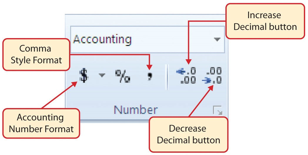
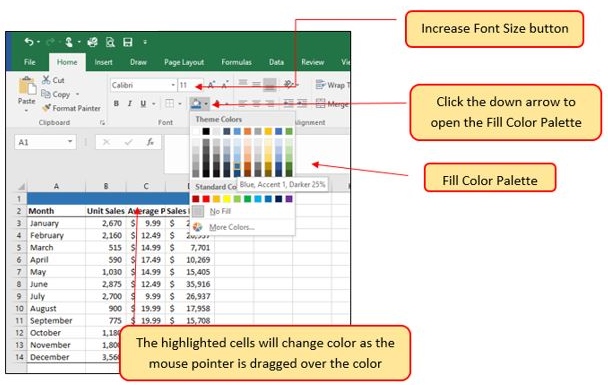
Pound Signs (####) Appear in Columns
When a column is too narrow for a long number, Excel will automatically convert the number to a series of pound signs (####). In the case of words or text data, Excel will only show the characters that fit in the column. However, this is not the case with numeric data because it can give the appearance of a number that is much smaller than what is actually in the cell. To remove the pound signs, increase the width of the column.
Figure 1.35 shows how the Sheet1 worksheet should appear after the formatting techniques are applied.
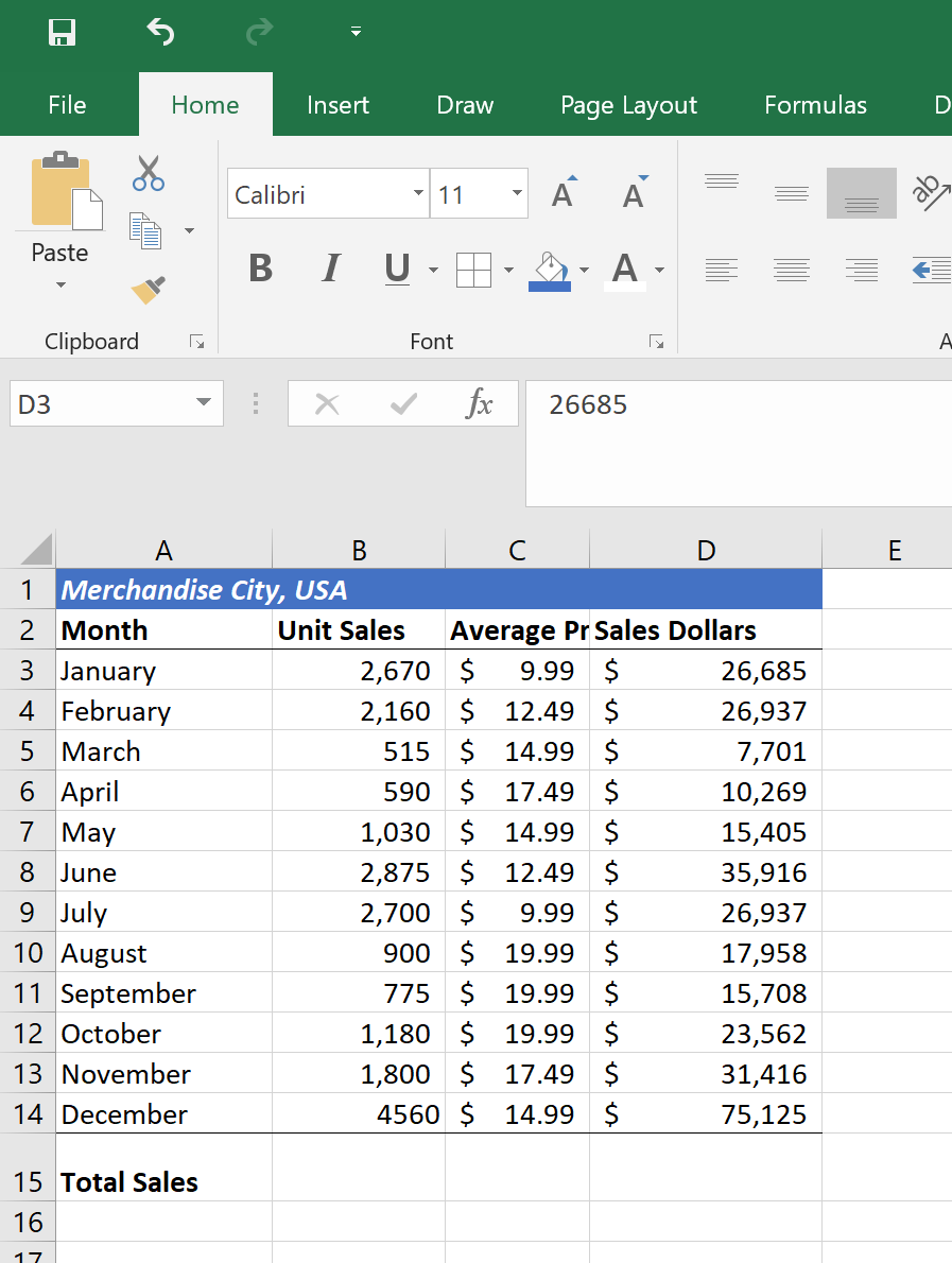
The skills presented in this segment show how data are aligned within cell locations. For example, text and numbers can be centered in a cell location, left justified, right justified, and so on. In some cases you may want to stack multiword text entries vertically in a cell instead of expanding the width of a column. This is referred to as wrapping text. These skills are demonstrated in the following steps:
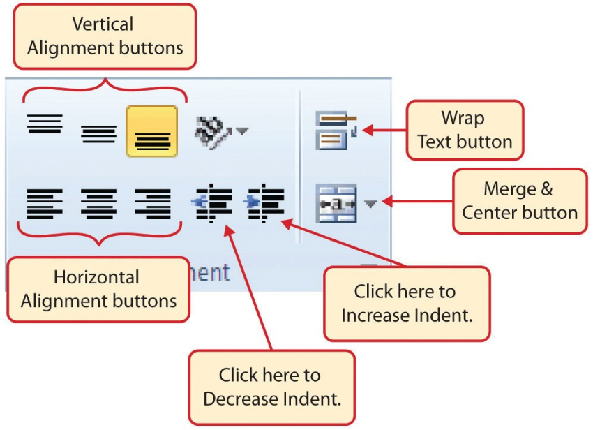
Wrap Text
Wrap Text
The benefit of using the Wrap Text command is that it significantly reduces the need to expand the column width to accommodate multiword column headings. The problem with increasing the column width is that you may reduce the amount of data that can fit on a piece of paper or one screen. This makes it cumbersome to analyze the data in the worksheet and could increase the time it takes to make a decision.
Merge Commands
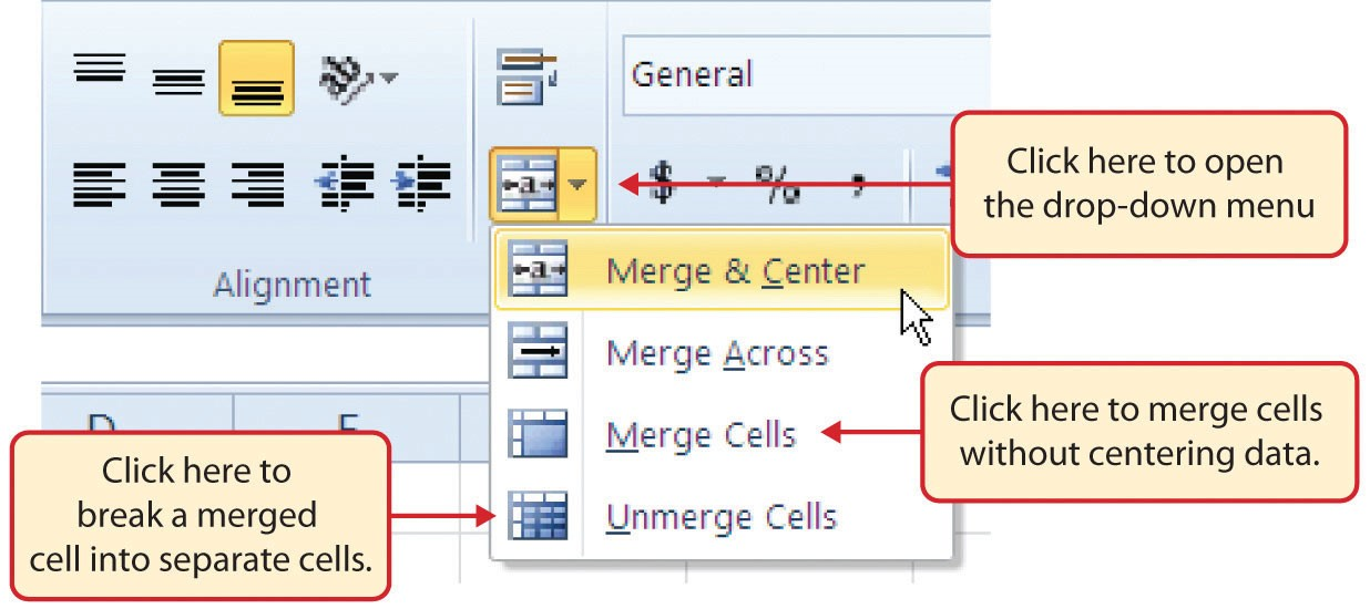
Merge & Center
One of the most common reasons the Merge & Center command is used is to center the title of a worksheet directly above the columns of data. Once the cells above the column headings are merged, a title can be centered above the columns of data. It is very difficult to center the title over the columns of data if the cells are not merged.
Figure 1.38 shows the Sheet1 worksheet with the data alignment commands applied. The reason for merging the cells in the range A1:D1 will become apparent in the next segment.
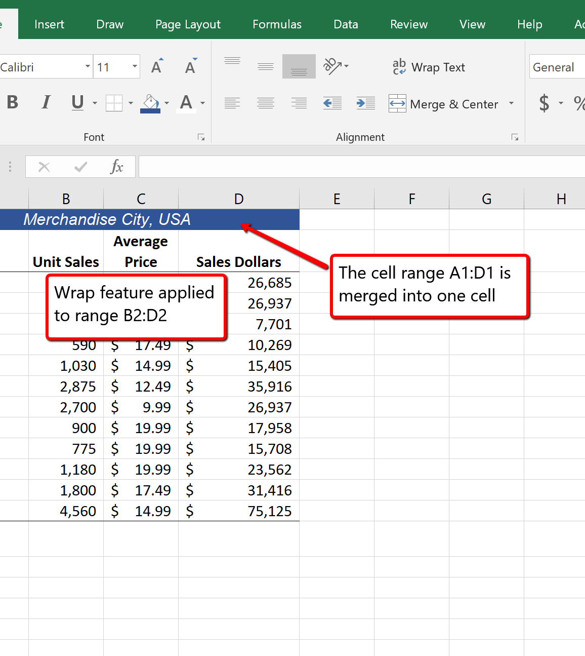
Wrap Text
Merge Cells
In the Sheet1 worksheet, the cells in the range A1:D1 were merged for the purposes of adding a title to the worksheet. This worksheet will contain both a title and a subtitle. The following steps explain how you can enter text into a cell and determine where you want the second line of text to begin:
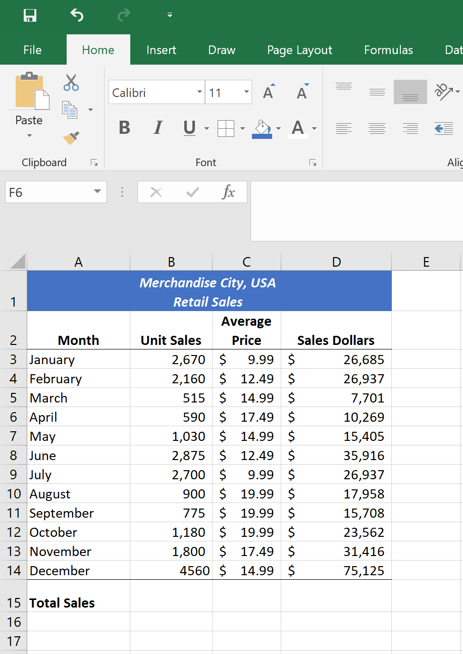
Entering Multiple Lines of Text
In Excel, adding custom lines to a worksheet is known as adding borders. Borders are different from the grid lines that appear on a worksheet and that define the perimeter of the cell locations. The Borders command lets you add a variety of line styles to a worksheet that can make reading the worksheet much easier. The following steps illustrate methods for adding preset borders and custom borders to a worksheet:
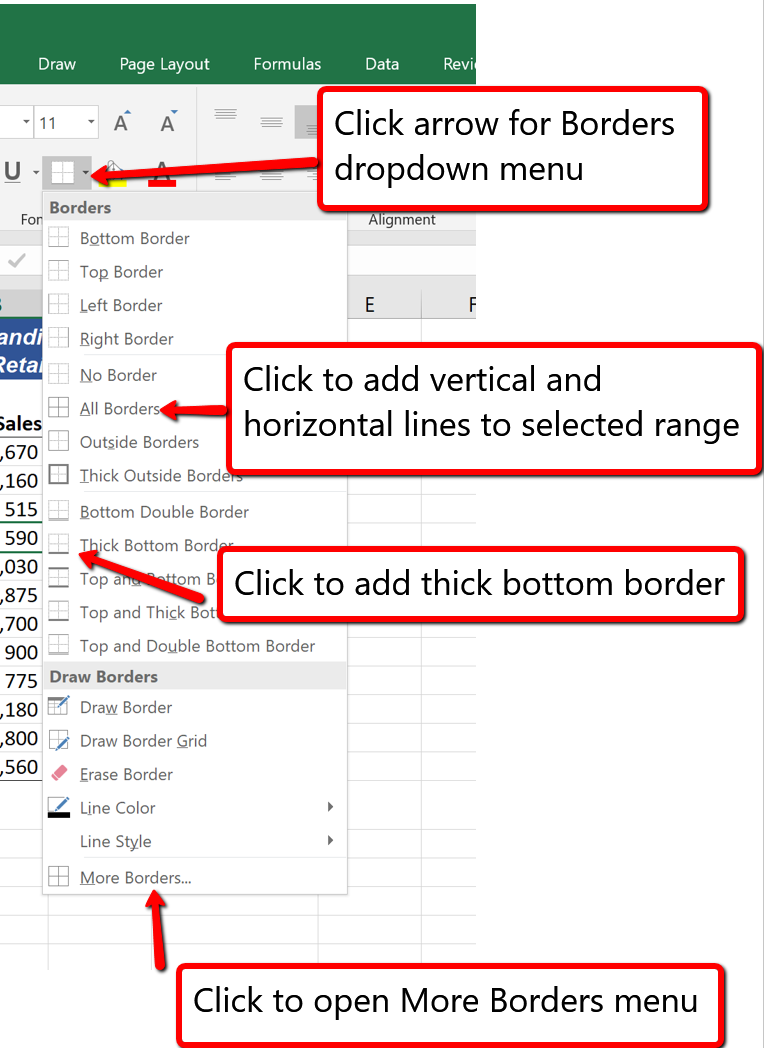
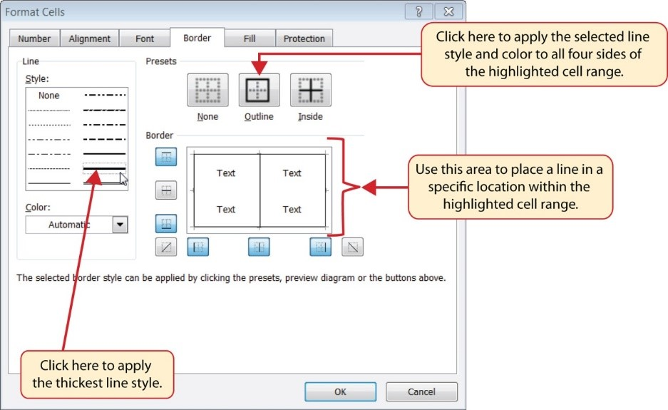
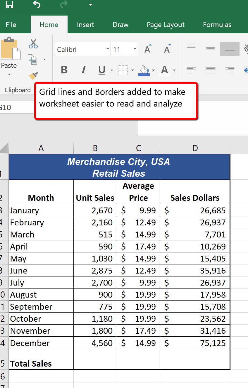
Preset Borders
Custom Borders
You will see at the bottom of Figure 1.42 that Row 15 is intended to show the totals for the data in this worksheet. Applying mathematical computations to a range of cells is accomplished through functions in Excel. Chapter 2 will review mathematical formulas and functions in detail. However, the following steps will demonstrate how you can quickly sum the values in a column of data using the AutoSum command:
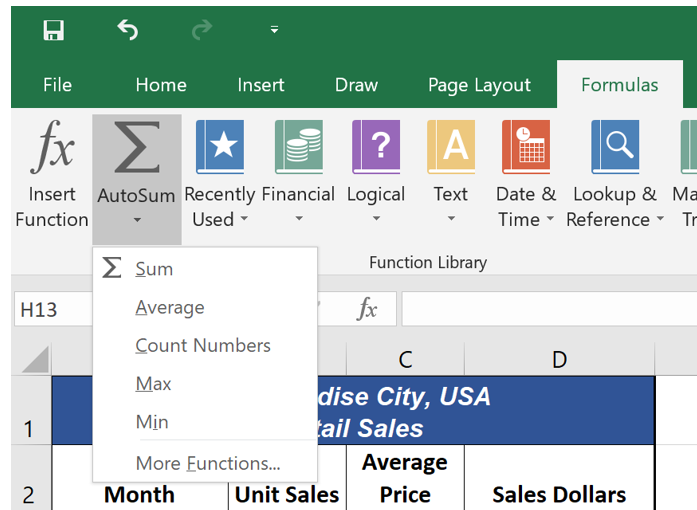
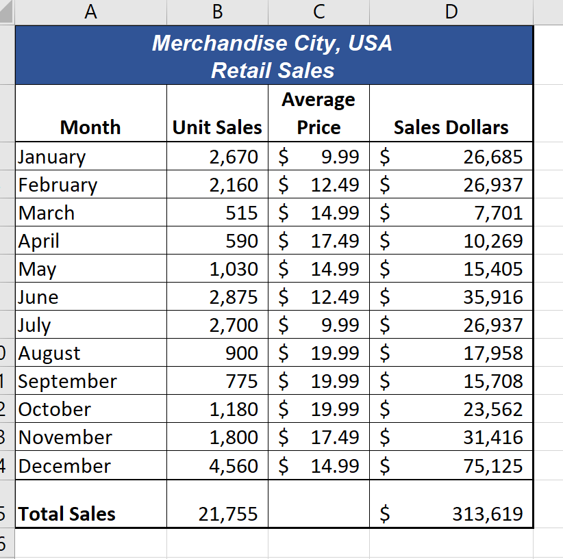
AutoSum
The default names for the worksheet tabs at the bottom of workbook are Sheet1, Sheet2, and so on. However, you can change the worksheet tab names to identify the data you are using in a workbook. Additionally, you can change the order in which the worksheet tabs appear in the workbook. The following steps explain how to rename and move the worksheets in a workbook:


Deleting Worksheets
Be very cautious when deleting worksheets that contain data. Once a worksheet is deleted, you cannot use the Undo command to bring the sheet back. Deleting a worksheet is a permanent command.
Inserting New Worksheets
Figure 1.46 shows the final appearance of the Merchandise City, USA workbook.

Renaming Worksheets
Moving Worksheets
Deleting Worksheets
Adapted by Barbara Lave from How to Use Microsoft Excel: The Careers in Practice Series, adapted by The Saylor Foundation without attribution as requested by the work’s original creator or licensee, and licensed under CC BY-NC-SA 3.0.
Once you have completed a workbook, it is good practice to select the appropriate settings for printing. These settings are in the Page Layout tab of the Ribbon and discussed in this section of the chapter.
Before you can properly print the worksheets in a workbook, you must establish appropriate settings. The following steps explain several of the commands in the Page Layout tab of the Ribbon used to prepare a worksheet for printing:
Use Print Settings
Because professionals often share Excel workbooks, it is a good practice to select the appropriate print settings in the Page Layout tab even if you do not intend to print the worksheets in a workbook. It can be extremely frustrating for recipients of a workbook who wish to print your worksheets to find that the necessary print settings have not been selected. This may reflect poorly on your attention to detail, especially if the recipient of the workbook is your boss.
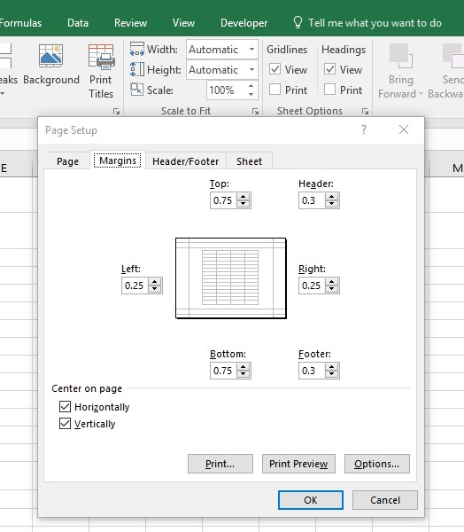
Table 1.2 Printing Resources: Purpose and Use for Page Setup Commands
| Command | Purpose | Use |
| Margins | Sets the top, bottom, right, and left margin space for the printed document | 1. Click the Page Layout tab of the Ribbon. |
| 2. Click the Margin button. | ||
| 3. Click one of the preset margin options or click Custom Margins. | ||
| Orientation | Sets the orientation of the printed document to either portrait or landscape | 1. Click the Page Layout tab of the Ribbon. |
| 2. Click the Orientation button. | ||
| 3. Click one of the preset orientation options. | ||
| Size | Sets the paper size for the printed document | 1. Click the Page Layout tab of the Ribbon. |
| 2. Click the Size button. | ||
| 3. Click one of the preset paper size options or click More Paper Sizes. | ||
| Print Area | Used for printing only a specific area or range of cells on a worksheet | 1. Highlight the range of cells on a worksheet that you wish to print. |
| 2. Click the Page Layout tab of the Ribbon. | ||
| 3. Click the Print Area button. | ||
| 4. Click the Set Print Area option from the drop-down list. | ||
| Breaks | Allows you to manually set the page breaks on a worksheet | 1. Activate a cell on the worksheet where the page break should be placed. Breaks are created above and to the left of the activated cell. |
| 2. Click the Page Layout tab of the Ribbon. | ||
| 3. Click the Breaks button. | ||
| 4. Click the Insert Page Break option from the drop-down list. | ||
| Background | Adds a picture behind the cell locations in a worksheet | 1. Click the Page Layout tab of the Ribbon. |
| 2. Click the Background button. | ||
| 3. Select a picture stored on your computer or network. | ||
| Print Titles | Used when printing large data sets that are several pages long. This command will repeat the column headings at the top of each printed page. | 1. Click the Page Layout tab of the Ribbon. |
| 2. Click the Print Titles button. | ||
| 3. Click in the Rows to Repeat at Top input box in the Page Setup dialog box. | ||
| 4. Click any cell in the row that contains the column headings for your worksheet. | ||
| 5. Click the OK button at the bottom of the Page Setup dialog box. | ||
When printing worksheets from Excel, it is common to add headers and footers to the printed document. Information in the header or footer could include the date, page number, file name, company name, and so on. The following steps explain how to add headers and footers to the Merchandise City, USA Retail Sales worksheet.
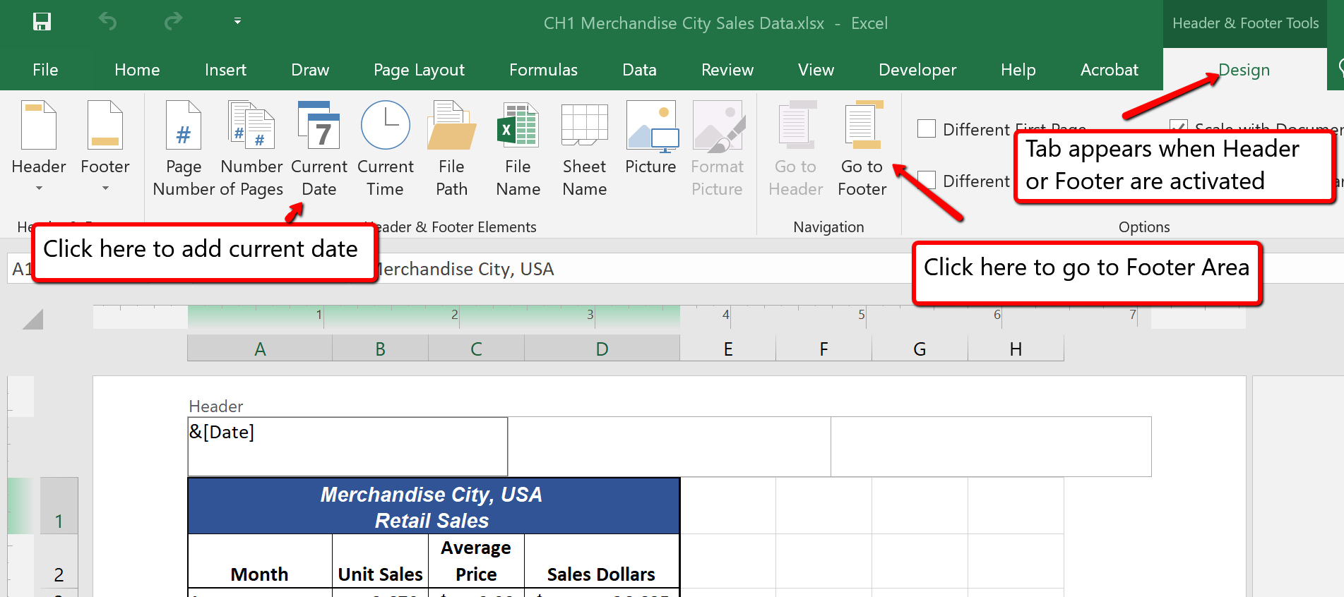
Figure 1.48 Design Tab for Creating Headers and Footers
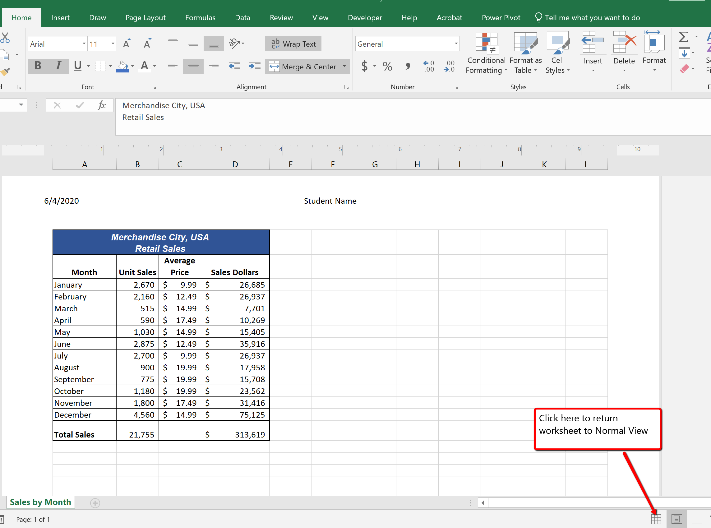
Once you have established the print settings for the worksheets in a workbook and have added headers and footers, you are ready to print your worksheets. The following steps explain how to print the worksheets in the Merchandise City, USA Sales workbook:
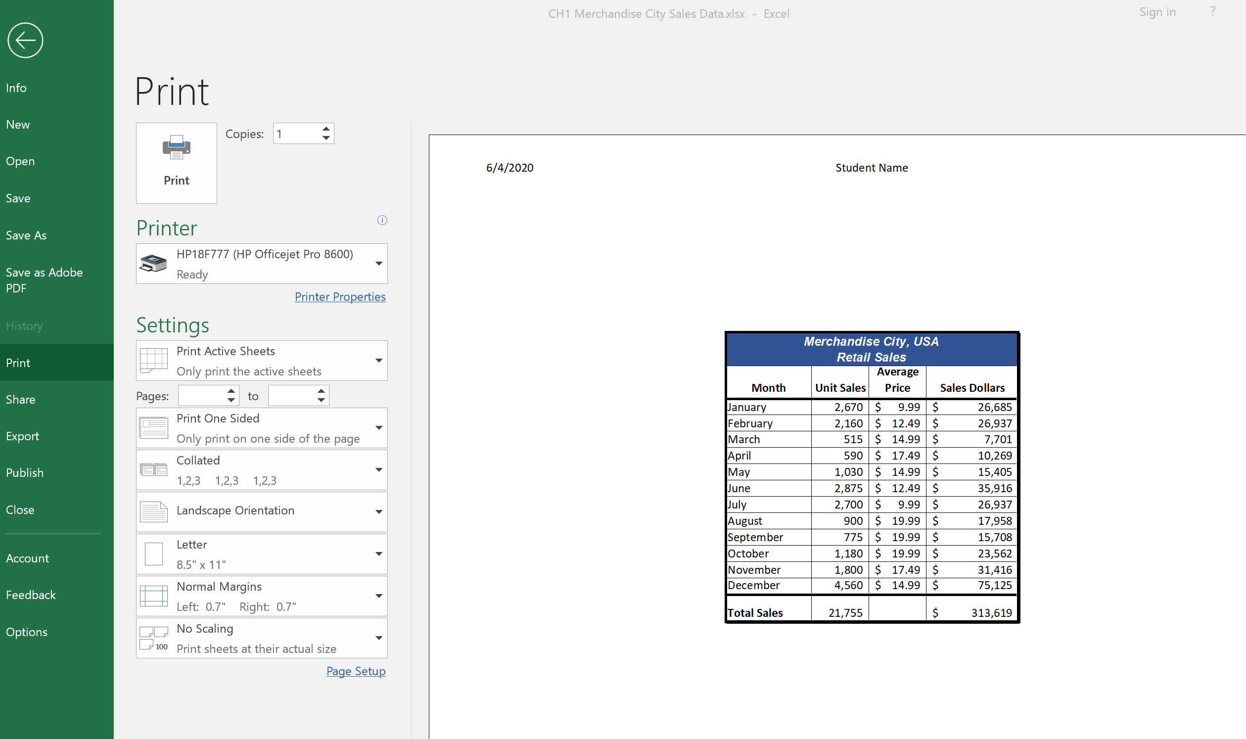
Adapted by Barbara Lave from How to Use Microsoft Excel: The Careers in Practice Series, adapted by The Saylor Foundation without attribution as requested by the work’s original creator or licensee, and licensed under CC BY-NC-SA 3.0.
To assess your understanding of the material covered in the chapter, complete the following assignment.
Download Data File: PR1 Data
Creating and maintaining budgets are common practices in many careers. Budgets play a critical role in helping a business or household control expenditures. In this exercise you will create a budget for a hypothetical medical office while reviewing the skills covered in this chapter.
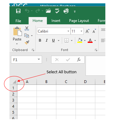
Adapted by Barbara Lave from How to Use Microsoft Excel: The Careers in Practice Series, adapted by The Saylor Foundation without attribution as requested by the work’s original creator or licensee, and licensed under CC BY-NC-SA 3.0.
Download Data File: SC1 Data
A key activity for marketing professionals is to analyze projected sales and inventory information. This is especially important for retail environments. This exercise utilizes the skills covered in this chapter to analyze sales and inventory data.
Adapted by Barbara Lave from How to Use Microsoft Excel: The Careers in Practice Series, adapted by The Saylor Foundation without attribution as requested by the work’s original creator or licensee, and licensed under CC BY-NC-SA 3.0.
IV
Cross tabulation (or crosstabs for short) is a statistical process that summarizes categorical data to create a contingency table.
Demonstrate how cross tabulation provides a basic picture of the interrelation between two variables and helps to find interactions between them.
Key Takeaways
Cross tabulation (or crosstabs for short) is a statistical process that summarizes categorical data to create a contingency table. It is used heavily in survey research, business intelligence, engineering, and scientific research. Moreover, it provides a basic picture of the interrelation between two variables and can help find interactions between them.
In survey research (e.g., polling, market research), a “crosstab” is any table showing summary statistics. Commonly, crosstabs in survey research are combinations of multiple different tables. For example, combines multiple contingency tables and tables of averages.

Crosstab of Cola Preference by Age and Gender
A crosstab is a combination of various tables showing summary statistics.
A contingency table is a type of table in a matrix format that displays the (multivariate) frequency distribution of the variables. A crucial problem of multivariate statistics is finding the direct dependence structure underlying the variables contained in high dimensional contingency tables. If some of the conditional independences are revealed, then even the storage of the data can be done in a smarter way. In order to do this, one can use information theory concepts, which gain the information only from the distribution of probability. Probability can be expressed easily from the contingency table by the relative frequencies.
As an example, suppose that we have two variables, sex (male or female) and handedness (right- or left-handed). Further suppose that 100 individuals are randomly sampled from a very large population as part of a study of sex differences in handedness. A contingency table can be created to display the numbers of individuals who are male and right-handed, male and left-handed, female and right-handed, and female and left-handed .
The numbers of the males, females, and right-and-left-handed individuals are called marginal totals. The grand total–i.e., the total number of individuals represented in the contingency table– is the number in the bottom right corner.
The table allows us to see at a glance that the proportion of men who are right-handed is about the same as the proportion of women who are right-handed, although the proportions are not identical. If the proportions of individuals in the different columns vary significantly between rows (or vice versa), we say that there is a contingency between the two variables. In other words, the two variables are not independent. If there is no contingency, we say that the two variables are independent.
Most general-purpose statistical software programs are able to produce simple crosstabs. Creation of the standard crosstabs used in survey research, as shown above, is typically done using specialist crosstab software packages, such as:
To draw a histogram, one must decide how many intervals represent the data, the width of the intervals, and the starting point for the first interval.
Outline the steps involved in creating a histogram.
To construct a histogram, one must first decide how many bars or intervals (also called classes) are needed to represent the data. Many histograms consist of between 5 and 15 bars, or classes. One must choose a starting point for the first interval, which must be less than the smallest data value. A convenient starting point is a lower value carried out to one more decimal place than the value with the most decimal places.
For example, if the value with the most decimal places is 6.1, and this is the smallest value, a convenient starting point is 6.05 (6.1−0.05=6.05">). We say that 6.05 has more precision. If the value with the most decimal places is 2.23 and the lowest value is 1.5, a convenient starting point is 1.495 (1.5−0.005=1.495">). If the value with the most decimal places is 3.234 and the lowest value is 1.0, a convenient starting point is 0.9995 (1.0−0.0005=0.9995">). If all the data happen to be integers and the smallest value is 2, then a convenient starting point is 1.5 (2−0.5=1.5">). Also, when the starting point and other boundaries are carried to one additional decimal place, no data value will fall on a boundary.
Consider the following data, which are the heights (in inches to the nearest half inch) of 100 male semiprofessional soccer players. The heights are continuous data since height is measured.
60; 60.5; 61; 61; 61.5; 63.5; 63.5; 63.5; 64; 64; 64; 64; 64; 64; 64; 64.5; 64.5; 64.5; 64.5; 64.5; 64.5; 64.5; 64.5; 66; 66; 66; 66; 66; 66; 66; 66; 66; 66; 66.5; 66.5; 66.5; 66.5; 66.5; 66.5; 66.5; 66.5; 66.5; 66.5; 66.5; 67; 67; 67; 67; 67; 67; 67; 67; 67; 67; 67; 67; 67.5; 67.5; 67.5; 67.5; 67.5; 67.5; 67.5; 68; 68; 69; 69; 69; 69; 69; 69; 69; 69; 69; 69; 69.5; 69.5; 69.5; 69.5; 69.5; 70; 70; 70; 70; 70; 70; 70.5; 70.5; 70.5; 71; 71; 71; 72; 72; 72; 72.5; 72.5; 73; 73.5; 74
The smallest data value is 60. Since the data with the most decimal places has one decimal (for instance, 61.5), we want our starting point to have two decimal places. Since the numbers 0.5, 0.05, 0.005, and so on are convenient numbers, use 0.05 and subtract it from 60, the smallest value, for the convenient starting point. The starting point, then, is 59.95.
The largest value is 74. 74+0.05=74.79"> is the ending value.
Next, calculate the width of each bar or class interval. To calculate this width, subtract the starting point from the ending value and divide by the number of bars (you must choose the number of bars you desire). Note that there is no “best” number of bars, and different bar sizes can reveal different features of the data. Some theoreticians have attempted to determine an optimal number of bars, but these methods generally make strong assumptions about the shape of the distribution. Depending on the actual data distribution and the goals of the analysis, different bar widths may be appropriate, so experimentation is usually needed to determine an appropriate width.
Histogram Example
This histogram depicts the relative frequency of heights for 100 semiprofessional soccer players. Note the roughly normal distribution, with the center of the curve around 66 inches. The chart displays the heights on the x-axis and relative frequency on the y-axis.
Suppose, in our example, we choose 8 bars. The bar width will be as follows:
74.05−59.958=1.76">
We will round up to 2 and make each bar or class interval 2 units wide. Rounding up to 2 is one way to prevent a value from falling on a boundary. The boundaries are:
59.95, 61.95, 63.95, 65.95, 67.95, 69.95, 71.95, 73.95, 75.95
So that there are 2 units between each boundary.
The heights 60 through 61.5 inches are in the interval 59.95 – 61.95. The heights that are 63.5 are in the interval 61.95 – 63.95. The heights that are 64 through 64.5 are in the interval 63.95 – 65.95. The heights 66 through 67.5 are in the interval 65.95 – 67.95. The heights 68 through 69.5 are in the interval 67.95 – 69.95. The heights 70 through 71 are in the interval 69.95 – 71.95. The heights 72 through 73.5 are in the interval 71.95 – 73.95. The height 74 is in the interval 73.95 – 75.95.
A histogram is a graphical representation of the distribution of data.
Indicate how frequency and probability distributions are represented by histograms.
A histogram is a graphical representation of the distribution of data. More specifically, a histogram is a representation of tabulated frequencies, shown as adjacent rectangles, erected over discrete intervals (bins), with an area equal to the frequency of the observations in the interval. First introduced by Karl Pearson, it is an estimate of the probability distribution of a continuous variable.
A histogram has both a horizontal axis and a vertical axis. The horizontal axis is labeled with what the data represents (for instance, distance from your home to school). The vertical axis is labeled either frequency or relative frequency. The graph will have the same shape with either label. An advantage of a histogram is that it can readily display large data sets (a rule of thumb is to use a histogram when the data set consists of 100 values or more). The histogram can also give you the shape, the center, and the spread of the data.
The categories of a histogram are usually specified as consecutive, non-overlapping intervals of a variable. The categories (intervals) must be adjacent and often are chosen to be of the same size. The rectangles of a histogram are drawn so that they touch each other to indicate that the original variable is continuous.
In statistical terms, the frequency of an event is the number of times the event occurred in an experiment or study. The relative frequency (or empirical probability) of an event refers to the absolute frequency normalized by the total number of events:
Put more simply, the relative frequency is equal to the frequency for an observed value of the data divided by the total number of data values in the sample.
The height of a rectangle in a histogram is equal to the frequency density of the interval, i.e., the frequency divided by the width of the interval. A histogram may also be normalized displaying relative frequencies. It then shows the proportion of cases that fall into each of several categories, with the total area equaling one.
As mentioned, a histogram is an estimate of the probability distribution of a continuous variable. To define probability distributions for the simplest cases, one needs to distinguish between discrete and continuous random variables. In the discrete case, one can easily assign a probability to each possible value. For example, when throwing a die, each of the six values 1 to 6 has the probability 1/6. In contrast, when a random variable takes values from a continuum, probabilities are nonzero only if they refer to finite intervals. For example, in quality control one might demand that the probability of a “500 g” package containing between 490 g and 510 g should be no less than 98%.
Intuitively, a continuous random variable is the one which can take a continuous range of values — as opposed to a discrete distribution, where the set of possible values for the random variable is, at most, countable. If the distribution of X is continuous, then X is called a continuous random variable and, therefore, has a continuous probability distribution. There are many examples of continuous probability distributions: normal, uniform, chi-squared, and others.

The Histogram: This is an example of a histogram, depicting graphically the distribution of heights for 31 Black Cherry trees.
Density estimation is the construction of an estimate based on observed data of an unobservable, underlying probability density function.
Describe how density estimation is used as a tool in the construction of a histogram.
Histograms are used to plot the density of data, and are often a useful tool for density estimation. Density estimation is the construction of an estimate based on observed data of an unobservable, underlying probability density function. The unobservable density function is thought of as the density according to which a large population is distributed. The data are usually thought of as a random sample from that population.
A probability density function, or density of a continuous random variable, is a function that describes the relative likelihood for this random variable to take on a given value. The probability for the random variable to fall within a particular region is given by the integral of this variable’s density over the region .

Boxplot Versus Probability Density Function
This image shows a boxplot and probability density function of a normal distribution.
The above image depicts a probability density function graph against a box plot. A box plot is a convenient way of graphically depicting groups of numerical data through their quartiles. The spacings between the different parts of the box help indicate the degree of dispersion (spread) and skewness in the data and to identify outliers. In addition to the points themselves, box plots allow one to visually estimate the interquartile range.
A range of data clustering techniques are used as approaches to density estimation, with the most basic form being a rescaled histogram.
Kernel density estimates are closely related to histograms, but can be endowed with properties such as smoothness or continuity by using a suitable kernel. To see this, we compare the construction of histogram and kernel density estimators using these 6 data points:
x1=−2.1">, x2=−1.3">, x3=−0.4">, x4=1.9">, x5=5.1">, x6=6.2">
For the histogram, first the horizontal axis is divided into sub-intervals, or bins, which cover the range of the data. In this case, we have 6 bins, each having a width of 2. Whenever a data point falls inside this interval, we place a box of height 112">. If more than one data point falls inside the same bin, we stack the boxes on top of each other.
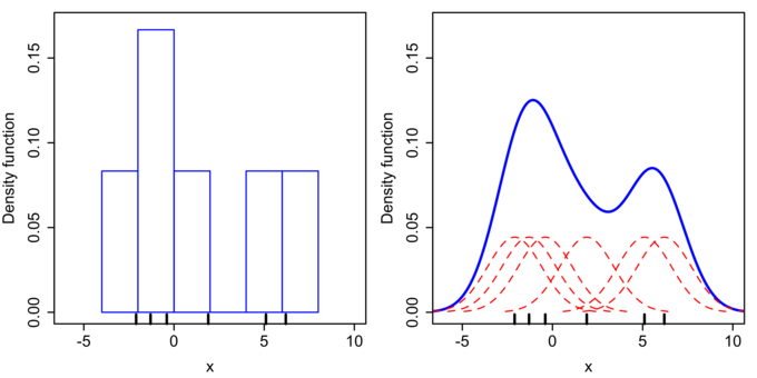
Histogram Versus Kernel Density Estimation
Comparison of the histogram (left) and kernel density estimate (right) constructed using the same data. The 6 individual kernels are the red dashed curves, the kernel density estimate the blue curves. The data points are the rug plot on the horizontal axis.
For the kernel density estimate, we place a normal kernel with variance 2.25 (indicated by the red dashed lines) on each of the data points xi">. The kernels are summed to make the kernel density estimate (the solid blue curve). Kernel density estimates converge faster to the true underlying density for continuous random variables thus accounting for their smoothness compared to the discreteness of the histogram.
A variable is any characteristic, number, or quantity that can be measured or counted.
Distinguish between quantitative and categorical, continuous and discrete, and ordinal and nominal variables.
A variable is any characteristic, number, or quantity that can be measured or counted. A variable may also be called a data item. Age, sex, business income and expenses, country of birth, capital expenditure, class grades, eye colour and vehicle type are examples of variables. Variables are so-named because their value may vary between data units in a population and may change in value over time.
There are different ways variables can be described according to the ways they can be studied, measured, and presented. Numeric variables have values that describe a measurable quantity as a number, like “how many” or “how much. ” Therefore, numeric variables are quantitative variables.
Numeric variables may be further described as either continuous or discrete. A continuous variable is a numeric variable. Observations can take any value between a certain set of real numbers. The value given to an observation for a continuous variable can include values as small as the instrument of measurement allows. Examples of continuous variables include height, time, age, and temperature.
A discrete variable is a numeric variable. Observations can take a value based on a count from a set of distinct whole values. A discrete variable cannot take the value of a fraction between one value and the next closest value. Examples of discrete variables include the number of registered cars, number of business locations, and number of children in a family, all of of which measured as whole units (i.e., 1, 2, 3 cars).
Categorical variables have values that describe a “quality” or “characteristic” of a data unit, like “what type” or “which category. ” Categorical variables fall into mutually exclusive (in one category or in another) and exhaustive (include all possible options) categories. Therefore, categorical variables are qualitative variables and tend to be represented by a non-numeric value.
Categorical variables may be further described as ordinal or nominal. An ordinal variable is a categorical variable. Observations can take a value that can be logically ordered or ranked. The categories associated with ordinal variables can be ranked higher or lower than another, but do not necessarily establish a numeric difference between each category. Examples of ordinal categorical variables include academic grades (i.e., A, B, C), clothing size (i.e., small, medium, large, extra large) and attitudes (i.e., strongly agree, agree, disagree, strongly disagree).
A nominal variable is a categorical variable. Observations can take a value that is not able to be organized in a logical sequence. Examples of nominal categorical variables include sex, business type, eye colour, religion and brand.
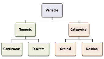
Types of Variables
Variables can be numeric or categorial, being further broken down in continuous and discrete, and nominal and ordinal variables.
Controlling for a variable is a method to reduce the effect of extraneous variations that may also affect the value of the dependent variable.
Discuss how controlling for a variable leads to more reliable visualizations of probability distributions.
Histograms help us to visualize the distribution of data and estimate the probability distribution of a continuous variable. In order for us to create reliable visualizations of these distributions, we must be able to procure reliable results for the data during experimentation. A method that significantly contributes to our success in this matter is the controlling of variables.
In statistics, variables refer to measurable attributes, as these typically vary over time or between individuals. Variables can be discrete (taking values from a finite or countable set), continuous (having a continuous distribution function), or neither. For instance, temperature is a continuous variable, while the number of legs of an animal is a discrete variable.
In causal models, a distinction is made between “independent variables” and “dependent variables,” the latter being expected to vary in value in response to changes in the former. In other words, an independent variable is presumed to potentially affect a dependent one. In experiments, independent variables include factors that can be altered or chosen by the researcher independent of other factors.
There are also quasi-independent variables, which are used by researchers to group things without affecting the variable itself. For example, to separate people into groups by their sex does not change whether they are male or female. Also, a researcher may separate people, arbitrarily, on the amount of coffee they drank before beginning an experiment.
While independent variables can refer to quantities and qualities that are under experimental control, they can also include extraneous factors that influence results in a confusing or undesired manner. In statistics the technique to work this out is called correlation.

Controlling for Variables
Controlling is very important in experimentation to ensure reliable results. For example, in an experiment to see which type of vinegar displays the greatest reaction to baking soda, the brand of baking soda should be controlled.
In a scientific experiment measuring the effect of one or more independent variables on a dependent variable, controlling for a variable is a method of reducing the confounding effect of variations in a third variable that may also affect the value of the dependent variable. For example, in an experiment to determine the effect of nutrition (the independent variable) on organism growth (the dependent variable), the age of the organism (the third variable) needs to be controlled for, since the effect may also depend on the age of an individual organism.
The essence of the method is to ensure that comparisons between the control group and the experimental group are only made for groups or subgroups for which the variable to be controlled has the same statistical distribution. A common way to achieve this is to partition the groups into subgroups whose members have (nearly) the same value for the controlled variable.
Controlling for a variable is also a term used in statistical data analysis when inferences may need to be made for the relationships within one set of variables, given that some of these relationships may spuriously reflect relationships to variables in another set. This is broadly equivalent to conditioning on the variables in the second set. Such analyses may be described as “controlling for variable x">” or “controlling for the variations in x">“. Controlling, in this sense, is performed by including in the experiment not only the explanatory variables of interest but also the extraneous variables. The failure to do so results in omitted-variable bias.
Selective breeding is a field concerned with testing hypotheses and theories of evolution by using controlled experiments.
Illustrate how controlled experiments have allowed human beings to selectively breed domesticated plants and animals.
Experimental evolution is a field in evolutionary and experimental biology that is concerned with testing hypotheses and theories of evolution by using controlled experiments. Evolution may be observed in the laboratory as populations adapt to new environmental conditions and/or change by such stochastic processes as random genetic drift.
With modern molecular tools, it is possible to pinpoint the mutations that selection acts upon, what brought about the adaptations, and to find out how exactly these mutations work. Because of the large number of generations required for adaptation to occur, evolution experiments are typically carried out with microorganisms such as bacteria, yeast, or viruses.
Unwittingly, humans have carried out evolution experiments for as long as they have been domesticating plants and animals. Selective breeding of plants and animals has led to varieties that differ dramatically from their original wild-type ancestors. Examples are the cabbage varieties, maize, or the large number of different dog breeds .

Selective Breeding
This Chihuahua mix and Great Dane show the wide range of dog breed sizes created using artificial selection, or selective breeding.
One of the first to carry out a controlled evolution experiment was William Dallinger. In the late 19th century, he cultivated small unicellular organisms in a custom-built incubator over a time period of seven years (1880–1886). Dallinger slowly increased the temperature of the incubator from an initial 60 °F up to 158 °F. The early cultures had shown clear signs of distress at a temperature of 73 °F, and were certainly not capable of surviving at 158 °F. The organisms Dallinger had in his incubator at the end of the experiment, on the other hand, were perfectly fine at 158 °F. However, these organisms would no longer grow at the initial 60 °F. Dallinger concluded that he had found evidence for Darwinian adaptation in his incubator, and that the organisms had adapted to live in a high-temperature environment .
Dallinger Incubator
Drawing of the incubator used by Dallinger in his evolution experiments.
More recently, evolutionary biologists have realized that the key to successful experimentation lies in extensive parallel replication of evolving lineages as well as a larger number of generations of selection. For example, on February 15, 1988, Richard Lenski started a long-term evolution experiment with the bacterium E. coli. The experiment continues to this day, and is by now probably the largest controlled evolution experiment ever undertaken. Since the inception of the experiment, the bacteria have grown for more than 50,000 generations.
Statistical graphics allow results to be displayed in some sort of pictorial form and include scatter plots, histograms, and box plots.
Recognize the techniques used in exploratory data analysis
Statistical graphics are used to visualize quantitative data. Whereas statistics and data analysis procedures generally yield their output in numeric or tabular form, graphical techniques allow such results to be displayed in some sort of pictorial form. They include plots such as scatter plots , histograms, probability plots, residual plots, box plots, block plots and bi-plots.

An example of a scatter plot
A scatter plot helps identify the type of relationship (if any) between two variables.
Exploratory data analysis (EDA) relies heavily on such techniques. They can also provide insight into a data set to help with testing assumptions, model selection and regression model validation, estimator selection, relationship identification, factor effect determination, and outlier detection. In addition, the choice of appropriate statistical graphics can provide a convincing means of communicating the underlying message that is present in the data to others.
Graphical statistical methods have four objectives:
• The exploration of the content of a data set
• The use to find structure in data
• Checking assumptions in statistical models
• Communicate the results of an analysis.
If one is not using statistical graphics, then one is forfeiting insight into one or more aspects of the underlying structure of the data.
Statistical graphics have been central to the development of science and date to the earliest attempts to analyse data. Many familiar forms, including bivariate plots, statistical maps, bar charts, and coordinate paper were used in the 18th century. Statistical graphics developed through attention to four problems:
• Spatial organization in the 17th and 18th century
• Discrete comparison in the 18th and early 19th century
• Continuous distribution in the 19th century and
• Multivariate distribution and correlation in the late 19th and 20th century.
Since the 1970s statistical graphics have been re-emerging as an important analytic tool with the revitalization of computer graphics and related technologies.
A stem-and-leaf display presents quantitative data in a graphical format to assist in visualizing the shape of a distribution.
Construct a stem-and-leaf display
A stem-and-leaf display is a device for presenting quantitative data in a graphical format in order to assist in visualizing the shape of a distribution. This graphical technique evolved from Arthur Bowley’s work in the early 1900s, and it is a useful tool in exploratory data analysis. A stem-and-leaf display is often called a stemplot (although, the latter term more specifically refers to another chart type).
Stem-and-leaf displays became more commonly used in the 1980s after the publication of John Tukey ‘s book on exploratory data analysis in 1977. The popularity during those years is attributable to the use of monospaced (typewriter) typestyles that allowed computer technology of the time to easily produce the graphics. However, the superior graphic capabilities of modern computers have lead to the decline of stem-and-leaf displays.
While similar to histograms, stem-and-leaf displays differ in that they retain the original data to at least two significant digits and put the data in order, thereby easing the move to order-based inference and non-parametric statistics.
A basic stem-and-leaf display contains two columns separated by a vertical line. The left column contains the stems and the right column contains the leaves. To construct a stem-and-leaf display, the observations must first be sorted in ascending order. This can be done most easily, if working by hand, by constructing a draft of the stem-and-leaf display with the leaves unsorted, then sorting the leaves to produce the final stem-and-leaf display. Consider the following set of data values:
{44,46,47,49,63,64,66,68,68,72,72,75,76,81,84,88,106}">
It must be determined what the stems will represent and what the leaves will represent. Typically, the leaf contains the last digit of the number and the stem contains all of the other digits. In the case of very large numbers, the data values may be rounded to a particular place value (such as the hundreds place) that will be used for the leaves. The remaining digits to the left of the rounded place value are used as the stem. In this example, the leaf represents the ones place and the stem will represent the rest of the number (tens place and higher).
The stem-and-leaf display is drawn with two columns separated by a vertical line. The stems are listed to the left of the vertical line. It is important that each stem is listed only once and that no numbers are skipped, even if it means that some stems have no leaves. The leaves are listed in increasing order in a row to the right of each stem. Note that when there is a repeated number in the data (such as two values of 72">) then the plot must reflect such. Therefore, the plot would appear as 7|2256"> when it has the numbers {72,72,75,76}">. The display for our data would be as follows:
| 4 | 4679 |
|---|---|
| 5 | |
| 6 | 34688 |
| 7 | 2256 |
| 8 | 148 |
| 9 | |
| 10 | 6 |
Now, let’s consider a data set with both negative numbers and numbers that need to be rounded:
{−23.678758,−12.45,−3.4,4.43,5.5,5.678,16.87,24.7,56.8}">
For negative numbers, a negative is placed in front of the stem unit, which is still the value X|10">. Non-integers are rounded. This allows the stem-and-leaf plot to retain its shape, even for more complicated data sets:
| -2 | 4 |
|---|---|
| -1 | 2 |
| -0 | 3 |
| 0 | 466 |
| 1 | 6 |
| 2 | 4 |
| 3 | |
| 4 | |
| 5 | 7 |
Stem-and-leaf displays are useful for displaying the relative density and shape of data, giving the reader a quick overview of distribution. They retain (most of) the raw numerical data, often with perfect integrity. They are also useful for highlighting outliers and finding the mode.
However, stem-and-leaf displays are only useful for moderately sized data sets (around 15 to 150 data points). With very small data sets, stem-and-leaf displays can be of little use, as a reasonable number of data points are required to establish definitive distribution properties. With very large data sets, a stem-and-leaf display will become very cluttered, since each data point must be represented numerically. A box plot or histogram may become more appropriate as the data size increases.
Stem-and-Leaf Display
This is an example of a stem-and-leaf display for EPA data on miles per gallon of gasoline.
A graph is a representation of a set of objects where some pairs of the objects are connected by links.
Distinguish direct and indirect edges
In mathematics, a graph is a representation of a set of objects where some pairs of the objects are connected by links. The interconnected objects are represented by mathematical abstractions called vertices, and the links that connect some pairs of vertices are called edges .Typically, a graph is depicted in diagrammatic form as a set of dots for the vertices, joined by lines or curves for the edges. Graphs are one of the objects of study in discrete mathematics.
The edges may be directed or indirected. For example, if the vertices represent people at a party, and there is an edge between two people if they shake hands, then this is an indirected graph, because if person A shook hands with person B, then person B also shook hands with person A. In contrast, if the vertices represent people at a party, and there is an edge from person A to person B when person A knows of person B, then this graph is directed, because knowledge of someone is not necessarily a symmetric relation (that is, one person knowing another person does not necessarily imply the reverse; for example, many fans may know of a celebrity, but the celebrity is unlikely to know of all their fans). This latter type of graph is called a directed graph and the edges are called directed edges or arcs.Vertices are also called nodes or points, and edges are also called lines or arcs. Graphs are the basic subject studied by graph theory. The word “graph” was first used in this sense by J.J. Sylvester in 1878.
A plot is a graphical technique for representing a data set, usually as a graph showing the relationship between two or more variables.
Differentiate the different tools used in quantitative and graphical techniques
A plot is a graphical technique for representing a data set, usually as a graph showing the relationship between two or more variables. The plot can be drawn by hand or by a mechanical or electronic plotter. Graphs are a visual representation of the relationship between variables, very useful because they allow us to quickly derive an understanding which would not come from lists of values. Graphs can also be used to read off the value of an unknown variable plotted as a function of a known one. Graphs of functions are used in mathematics, sciences, engineering, technology, finance, and many other areas.
Plots play an important role in statistics and data analysis. The procedures here can be broadly split into two parts: quantitative and graphical. Quantitative techniques are the set of statistical procedures that yield numeric or tabular output. Examples of quantitative techniques include:
These and similar techniques are all valuable and are mainstream in terms of classical analysis. There are also many statistical tools generally referred to as graphical techniques. These include:
Graphical procedures such as plots are a short path to gaining insight into a data set in terms of testing assumptions, model selection, model validation, estimator selection, relationship identification, factor effect determination, and outlier detection. Statistical graphics give insight into aspects of the underlying structure of the data.
As an example of plotting points on a graph, consider one of the most important visual aids available to us in the context of statistics: the scatter plot.
To display values for “lung capacity” (first variable) and how long that person could hold his breath, a researcher would choose a group of people to study, then measure each one’s lung capacity (first variable) and how long that person could hold his breath (second variable). The researcher would then plot the data in a scatter plot, assigning “lung capacity” to the horizontal axis, and “time holding breath” to the vertical axis.
A person with a lung capacity of 400 ml who held his breath for 21.7 seconds would be represented by a single dot on the scatter plot at the point
. The scatter plot of all the people in the study would enable the researcher to obtain a visual comparison of the two variables in the data set and will help to determine what kind of relationship there might be between the two variables.
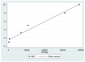
Scatterplot
Scatterplot with a fitted regression line.
The concepts of slope and intercept are essential to understand in the context of graphing data.
Explain the term rise over run when describing slope
The slope or gradient of a line describes its steepness, incline, or grade. A higher slope value indicates a steeper incline. Slope is normally described by the ratio of the “rise” divided by the “run” between two points on a line. The line may be practical (as for a roadway) or in a diagram.

The slope of a line in the plane containing the x and y axes is generally represented by the letter m, and is defined as the change in the y coordinate divided by the corresponding change in the x coordinate, between two distinct points on the line. This is described by the following equation:
m=ΔyΔx=riserun">
The Greek letter delta, Δ">, is commonly used in mathematics to mean “difference” or “change”. Given two points (x1,y1)"> and (x2,y2)">, the change in x"> from one to the other is x2−x1"> (run), while the change in y"> is y2−y1"> (rise).
Using the common convention that the horizontal axis represents a variable
and the vertical axis represents a variable
, a
-intercept is a point where the graph of a function or relation intersects with the
-axis of the coordinate system. It also acts as a reference point for slopes and some graphs.

Intercept
Graph with a y-intercept at (0,1).
If the curve in question is given as y=f(x)">, the y">-coordinate of the y">-intercept is found by calculating f(0)">. Functions which are undefined at x=0"> have no y">-intercept.
Some 2-dimensional mathematical relationships such as circles, ellipses, and hyperbolas can have more than one y">-intercept. Because functions associate x"> values to no more than one y"> value as part of their definition, they can have at most one y">-intercept.
Analogously, an x">-intercept is a point where the graph of a function or relation intersects with the x">-axis. As such, these points satisfy y=0">. The zeros, or roots, of such a function or relation are the x">-coordinates of these x">-intercepts.
A line graph is a type of chart which displays information as a series of data points connected by straight line segments.
Explain the principles of plotting a line graph
A line graph is a type of chart which displays information as a series of data points connected by straight line segments. It is a basic type of chart common in many fields. It is similar to a scatter plot except that the measurement points are ordered (typically by their x-axis value) and joined with straight line segments. A line chart is often used to visualize a trend in data over intervals of time – a time series – thus the line is often drawn chronologically.
A line chart is typically drawn bordered by two perpendicular lines, called axes. The horizontal axis is called the x-axis and the vertical axis is called the y-axis. To aid visual measurement, there may be additional lines drawn parallel either axis. If lines are drawn parallel to both axes, the resulting lattice is called a grid.
Each axis represents one of the data quantities to be plotted. Typically the y-axis represents the dependent variable and the x-axis (sometimes called the abscissa) represents the independent variable. The chart can then be referred to as a graph of quantity one versus quantity two, plotting quantity one up the y-axis and quantity two along the x-axis.
Example
In the experimental sciences, such as statistics, data collected from experiments are often visualized by a graph. For example, if one were to collect data on the speed of a body at certain points in time, one could visualize the data to look like the graph in :
| Elapsed Time (s) | Speed (m s^-1) |
|---|---|
| 0 | 0 |
| 1 | 3 |
| 2 | |
| 3 | 12 |
| 4 | 20 |
| 5 | 30 |
| 6 | 45 |
Data Table
A data table showing elapsed time and measured speed.
The table “visualization” is a great way of displaying exact values, but can be a poor way to understand the underlying patterns that those values represent. Understanding the process described by the data in the table is aided by producing a graph or line chart of Speed versus Time:

Line chart
A graph of speed versus time
In statistics, charts often include an overlaid mathematical function depicting the best-fit trend of the scattered data. This layer is referred to as a best-fit layer and the graph containing this layer is often referred to as a line graph.
It is simple to construct a “best-fit” layer consisting of a set of line segments connecting adjacent data points; however, such a “best-fit” is usually not an ideal representation of the trend of the underlying scatter data for the following reasons:
In either case, the best-fit layer can reveal trends in the data. Further, measurements such as the gradient or the area under the curve can be made visually, leading to more conclusions or results from the data.
A true best-fit layer should depict a continuous mathematical function whose parameters are determined by using a suitable error-minimization scheme, which appropriately weights the error in the data values. Such curve fitting functionality is often found in graphing software or spreadsheets. Best-fit curves may vary from simple linear equations to more complex quadratic, polynomial, exponential, and periodic curves. The so-called “bell curve”, or normal distribution often used in statistics, is a Gaussian function.
In statistics, linear regression can be used to fit a predictive model to an observed data set of y and x values.
Examine simple linear regression in terms of slope and intercept
In statistics, simple linear regression is the least squares estimator of a linear regression model with a single explanatory variable. Simple linear regression fits a straight line through the set of n">points in such a way that makes the sum of squared residuals of the model (that is, vertical distances between the points of the data set and the fitted line) as small as possible.
The slope of the fitted line is equal to the correlation between y">and x"> corrected by the ratio of standard deviations of these variables. The intercept of the fitted line is such that it passes through the center of mass (x,y)"> of the data points.

The function of a line
Three lines — the red and blue lines have the same slope, while the red and green ones have same y-intercept.
Linear regression was the first type of regression analysis to be studied rigorously, and to be used extensively in practical applications. This is because models which depend linearly on their unknown parameters are easier to fit than models which are non-linearly related to their parameters and because the statistical properties of the resulting estimators are easier to determine.
A common form of a linear equation in the two variables x and y is: y= mx + b.
Where m"> (slope) and b"> (intercept) designate constants. The origin of the name “linear” comes from the fact that the set of solutions of such an equation forms a straight line in the plane. In this particular equation, the constant m"> determines the slope or gradient of that line, and the constant term b"> determines the point at which the line crosses the y">-axis, otherwise known as the y">-intercept.
If the goal is prediction, or forecasting, linear regression can be used to fit a predictive model to an observed data set of y">and X"> values. After developing such a model, if an additional value of X"> is then given without its accompanying value of y">, the fitted model can be used to make a prediction of the value of y">.

Linear regression
An example of a simple linear regression analysis
V
One of the most important things to consider when using charts in Excel is that they are intended to be used for communicating an idea to an audience. Your audience can be reading your charts in a written document or listening to you in a live presentation. In fact, Excel charts are often imported or pasted into Word documents or PowerPoint slides, which serve this very purpose of communicating ideas to an audience. Although there are no rules set in stone for using specific charts for certain data types, some chart types are designed to communicate certain messages better than others. This chapter explores numerous charts that can be used for a variety of purposes. In addition, we will examine formatting charts and using those charts in Word and PowerPoint documents.
Adapted by Hallie Puncochar and Noreen Brown from How to Use Microsoft Excel: The Careers in Practice Series, adapted by The Saylor Foundation without attribution as requested by the work’s original creator or licensee, and licensed under CC BY-NC-SA 3.0.
This section reviews the most commonly used Excel chart types. To demonstrate the variety of chart types available in Excel, it is necessary to use a variety of data sets. This is necessary not only to demonstrate the construction of charts but also to explain how to choose the right type of chart given your data and the idea you intend to communicate.
Before we begin, let’s review a few key points you need to consider before creating any chart in Excel.
Carefully Select Data When Creating a Chart
Just because you have data in a worksheet does not mean it must all be placed onto a chart. When creating a chart, it is common for only specific data points to be used. To determine what data should be used when creating a chart, you must first identify the message or idea that you want to communicate to an audience.
Table 4.1 Key Steps before Constructing an Excel Chart
| Step | Description |
| Define your message. | Identify the main idea you are trying to communicate to an audience. If there is no main point or important message that can be revealed by a chart, you might want to question the necessity of creating a chart. |
| Identify the data you need. | Once you have a clear message, identify the data on a worksheet that you will need to construct a chart. In some cases, you may need to create formulas or consolidate items into broader categories. |
| Select a chart type. | The type of chart you select will depend on the message you are communicating and the data you are using. |
| Identify the values for the X and Y axes. | After you have selected a chart type, you may find that drawing a sketch is helpful in identifying which values should be on the X and Y axes. In Excel, the axes are: The “category” axis. Usually the horizontal axis – where the labels are found. The “value” axis. Usually the vertical axis – where the numbers are found. |
The first chart we will demonstrate is a line chart. Figure 4.1 shows part of the data that will be used to create two line charts. This chart will show the trend of the NASDAQ stock index.
Read more: http://www.investopedia.com/terms/n/nasdaq.asp
This chart will be used to communicate a simple message: to show how the index has performed over a two-year period. We can use this chart in a presentation to show whether stock prices have been increasing, decreasing, or remaining constant over the designated period of time.
Before we create the line chart, it is important to identify why it is an appropriate chart type given the message we wish to communicate and the data we have. When presenting the trend for any data over a designated period of time, the most commonly used chart types are the line chart and the column chart. With the column chart, you are limited to a certain number of bars or data points. As shown below in Figure 4.1, as the number of bars increases on a column chart, it becomes increasingly difficult to read. In our first example, there are 24 points of data used to construct the chart. This is generally too many data points to put on a column chart, which is why we are using a line chart.
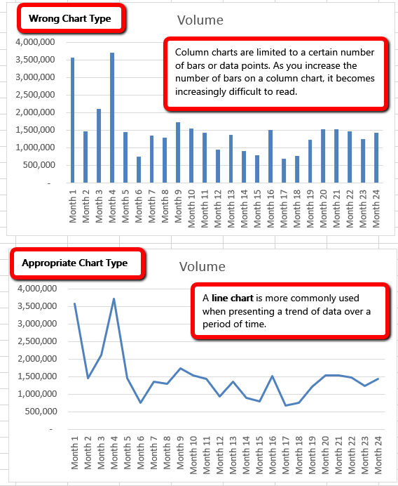
The following steps explain how to construct this chart:
Download Data file: CH4 Data
1. Open data file CH4 Data and save a file to your computer as CH4 Charting.
2. Navigate to the Stock Trend worksheet.
3. Highlight the range B4:C28 on the Stock Trend worksheet. (Note – you have selected a label in the first row and more labels in column B. Watch where they show up in your completed chart.)
4. Click the Insert tab of the ribbon.
5. Click the Line button in the Charts group of commands. Click the first option from the list, which is a basic 2D Line Chart (see Figure 4.2). Notice Excel adds, or embeds, the line chart into the worksheet.
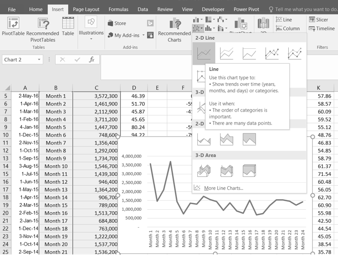
Line Chart vs. Column Chart
We can use both a line chart and a column chart to illustrate a trend over time. However, a line chart is far more effective when there are many periods of time being measured. For example, if we are measuring fifty-two weeks, a column chart would require fifty-two bars. A general rule of thumb is to use a column chart when twenty bars or less are required. A column chart becomes difficult to read as the number of bars exceeds twenty.
Figure 4.3 shows the embedded line chart in the Stock Trend worksheet. Do you see where your labels showed up on the chart?
Notice that additional tabs, or contextual tabs, are added to the ribbon. We will demonstrate the commands in these tabs throughout this chapter. These tabs appear only when the chart is activated.
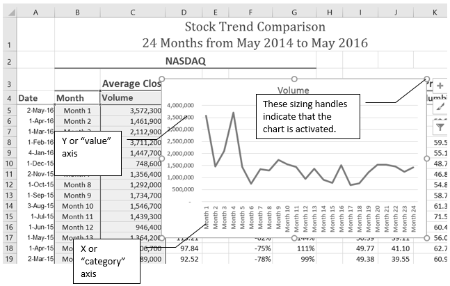
As shown in Figure 4.3, the embedded chart is not placed in an ideal location on the worksheet since it is covering several cell locations that contain data. The following steps demonstrate common adjustments that are made when working with embedded charts:
1. Moving a chart: Click and drag the upper left corner of the chart to the corner of cell B30.
2. Resizing a chart: Place the mouse pointer over the bottom lower corner sizing handle, drag and drop to approximately the end of Column I, and Row 45.
3. Adjusting the chart title: Click the chart title once. Then click in front of the first letter. You should see a blinking cursor in front of the letter. This allows you to modify the title of the chart.
4. Type the following in front of the first letter in the chart title: May 2014-2016 Trend for NASDAQ Sales.
5. Click anywhere outside of the chart to deactivate it.
6. Save your work.
Figure 4.4 shows the line chart after it is moved and resized. Notice that the sizing handles do not appear around the perimeter of the chart. This is because the chart has been deactivated. To activate the chart, click anywhere inside the chart perimeter.
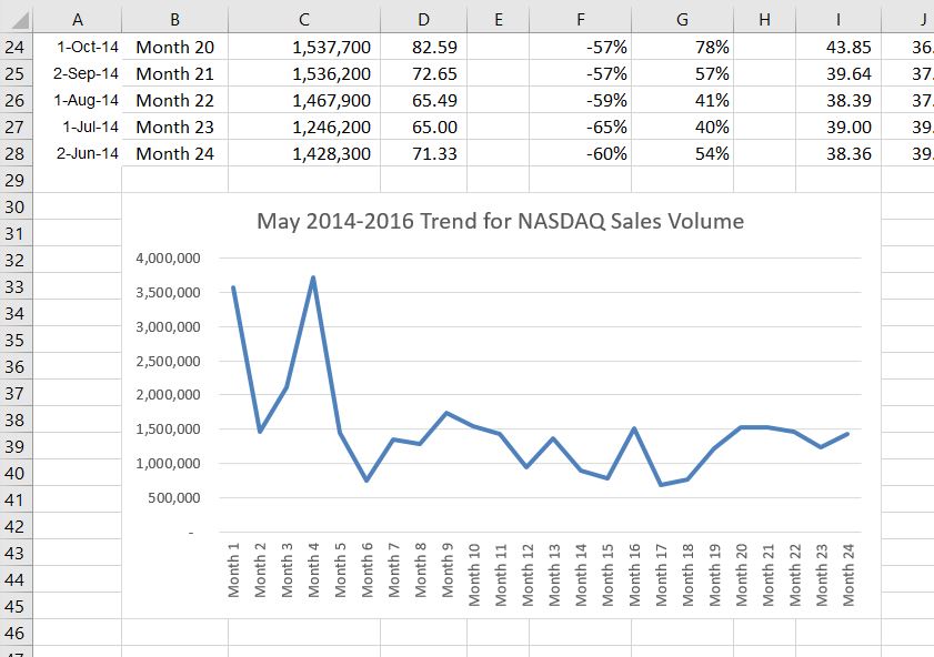
When using line charts in Excel, keep in mind that anything placed on the X-axis is considered a descriptive label, not a numeric value. This is an example of a category axis. This is important because there will never be a change in the spacing of any items placed on the X-axis of a line chart. If you need to create a chart using numeric data on the category axis, you will have to modify the chart. We will do that later in the chapter.
Inserting a Line Chart
After creating an Excel chart, you may find it necessary to adjust the scale of the Y-axis. Excel automatically sets the maximum value for the Y-axis based on the data used to create the chart. The minimum value is usually set to zero. That is usually a good thing. However, depending on the data you are using to create the chart, setting the minimum value to zero can substantially minimize the graphical presentation of a trend. For example, the trend shown in Figure 4.4 appears to be increasing slightly in recent months. The presentation of this trend can be improved if the minimum value started at 500,000. The following steps explain how to make this adjustment to the Y-axis:
1. Click anywhere on the Y (value or vertical) axis on the May 2014-2016 Trend for NASDAQ Sales Volume line chart (Stock Trend worksheet).
2. Right Click and select Format Axis. The Format Axis Pane should appear, as shown in Figure 4.5.
![]() Mac Users: Hold down the Control key and click the Y axis. Then choose Format Axis.
Mac Users: Hold down the Control key and click the Y axis. Then choose Format Axis.
3. In the Format Axis Pane, click the input box for the “Minimum” axis option and delete the zero. Then type the number 500000 and hit Enter. As soon as you make this change, the Y axis on the chart adjusts.
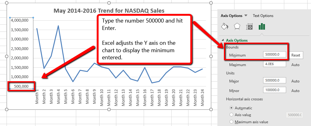
4. Click the X in the upper right corner of the Format Axis pane to close it.
5. Save your work.
Figure 4.6 shows the change in the presentation of the trend line. Notice that with the Y axis starting at 500,000, the trend for the NASDAQ is more pronounced. This adjustment makes it easier for the audience to see the magnitude of the trend.
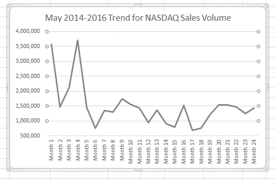
Adjusting the Y-Axis Scale
We will now create a second line chart using the data in the Stock Trend worksheet. The purpose of this chart is to compare two trends: the change in volume for the NASDAQ and the change in the Closing price.
Before creating the chart to compare the NASDAQ volume and sales price, it is important to review the data in the range B4:D28 on the Stock Trend worksheet. We cannot use the volume of sales and the closing price because the values are not comparable. That is, the closing price is in a range of $45.00 to $115.00, but the data for the volume of Sales is in a range of 684,000 to 3,711,000. If we used these values – without making changes to the chart — we would not be able to see the closing price at all.
The construction of this second line chart will be similar to the first line chart. The X axis will be the months in the range B4:D28.
Figure 4.6.5 shows the appearance of the line chart comparing both the volume and the closing price before it is moved and resized. Notice that the line for the closing price (Close) appears as a straight line at the bottom of the chart.
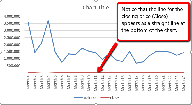
1. Move the chart so the upper left corner is in the middle of cell M1.
2. Resize the chart, using the resizing handle so the graph is approximately in the area of M1:U13.
3. Click in the text box that says “Chart Title.” Delete the text and replace it with the following: 24 Month Trend Comparison.
4. Adjust the Closing Price axis, by double-clicking the red line across the bottom of the chart that represents the Closing Price.
5. The Format Data Series dialogue box opens. In the Series Options, select Secondary Axis.
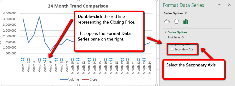
Excel adds the secondary axis. Format the values on the secondary axis to represent prices.
1. Double click the Secondary Vertical Axis. (The vertical axis on the right that goes from 0 to 140.)
2. In axis options, scroll down to the Number section.
![]() Mac Users: If needed, click the Number “expand arrow”
Mac Users: If needed, click the Number “expand arrow” ![]()
3. Use the Symbol list box to add the $.
4. Press the Close button to close the Format Axis pane.
5. Save your work.
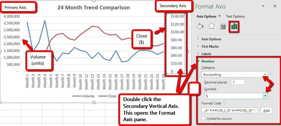
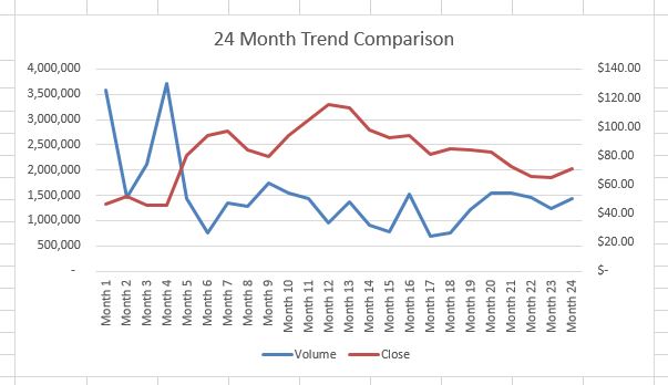
Skill Refresher
X and Y-Axis Number Formats
A column chart is commonly used to show trends over time, as long as the data are limited to approximately twenty points or less. A common use for column charts is frequency distributions. A frequency distribution shows the number of occurrences by established categories.
For example, a common frequency distribution used in most academic institutions is a grade distribution. A grade distribution shows the number of students that achieve each level of a typical grading scale (A, A−, B+, B, etc.). The Grade Distribution worksheet contains final grades for some hypothetical Excel classes.
To show the grade frequency distribution for all the Excel classes in that year, the Numbers of Students appear on the Y-axis and the Grade Categories appear on the X-axis. In this situation, notice we do not select the Total row. The totals are a representation of all data and would skew the graph. Essentially you would be graphing the information twice. If you want to display the totals in a chart, the best approach is to create a separate chart that only displays the total values.
The following steps to create the column chart:
1. Select the Grade Distribution worksheet.
2. In Row3, replace the red text at states [Insert Current Year] and replace it with the actual current academic term and year.
3. Select two non-adjacent columns by selecting A3:A8.
4. Press, and hold down the Crtl key.
![]() Mac Users: Hold down the Command key instead.
Mac Users: Hold down the Command key instead.
5. Without letting go of the Ctrl key, select C3:C8
6. From the ribbon click the Insert tab. Choose the Column button.
7. Select the Clustered Column format. (First option listed.)
8. Click and drag the chart so the upper left corner is in the middle of cell H2. Resize the graph to fit in the area of H2: O13.
9. Click any cell location on the Grade Distribution worksheet to deactivate the chart.
10. Save your work.
Figure 4.10 shows the completed grade frequency distribution chart. By looking at the chart, you can immediately see that the greatest number of students earned a final grade in the B+ to B− range.
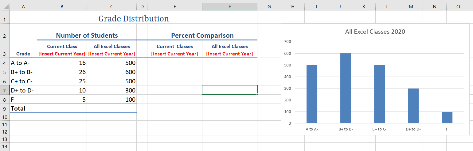
When using charts to show frequency distributions, the difference between a column chart and a bar chart is really a matter of preference. Both are very effective in showing frequency distributions. However, if you are showing a trend over a period of time, a column chart is preferred over a bar chart. This is because a period of time is typically shown horizontally, with the oldest date on the far left and the newest date on the far right. Therefore, the descriptive categories for the chart would have to fall on the horizontal – or category axis, which is the configuration of a column chart. On a bar chart, the descriptive categories are displayed on the vertical axis.
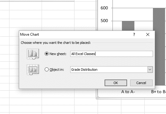
Figure 4.12 shows the Final Grades for all the Excel Classes column chart is in a separate chart sheet. Notice the new worksheet tab added to the workbook matches the New sheet name entered into the Move Chart dialog box. Since the chart is moved to a separate chart sheet, it no longer is displayed in the Grade Distribution worksheet.
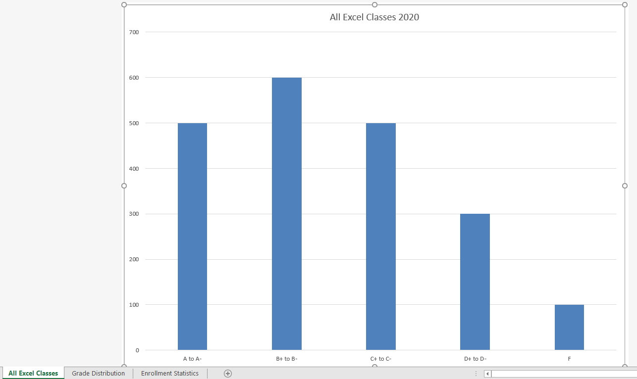
We will create a second column chart to show a comparison between two frequency distributions. Column B on the Grade Distribution worksheet contains data showing the number of students who received grades within each category for the Current Excel Class Class. We will use a column chart to compare the grade distribution for the current class (Column B) with the overall grade distribution for Excel courses for the whole year (Column C).
However, since the number of students in the term is significantly different from the total number of students in the year, we must calculate percentages in order to make an effective comparison. The following steps explain how to calculate the percentages:
1. Highlight the range B4:C9 on the Grade Distribution worksheet.
2. Click the AutoSum button in the Editing group of commands on the Home tab of the ribbon. This automatically sums the values in the selected range.
3. Select cell E4. Enter a formula that divides the value in cell B4 by the total in cell B9. Add an absolute reference to cell B9 in the formula =B4/$B$9. Autofill the formula down to cell E8.
4. Select cell F4 . Enter a formula that divides the value in cell C4 by the total in cell C9. Add an absolute reference to cell C9 in the formula =C4/$C$9.
5. Autofill the down to F8.
6. Select A3:A8, press and hold down the Ctrl key and select E3:F8.
![]() Mac Users: Hold down the Command key
Mac Users: Hold down the Command key
7. Click the Insert tab of the ribbon.
8. Select the Column button. Select the first option from the drop-down list of chart formats, which is the Clustered Column.
9. Click and drag the chart so the upper left corner is in the middle of cell H2.
10. Resize the chart to the approximate area of H2:N12.
11. Change the chart title to Grade Distribution Comparison. If you do not have a chart title, you can add one. On the Design tab, select Add Chart Element. Find the Chart Title. Select the Above Chart option from the drop-down list.
12. Save your work.
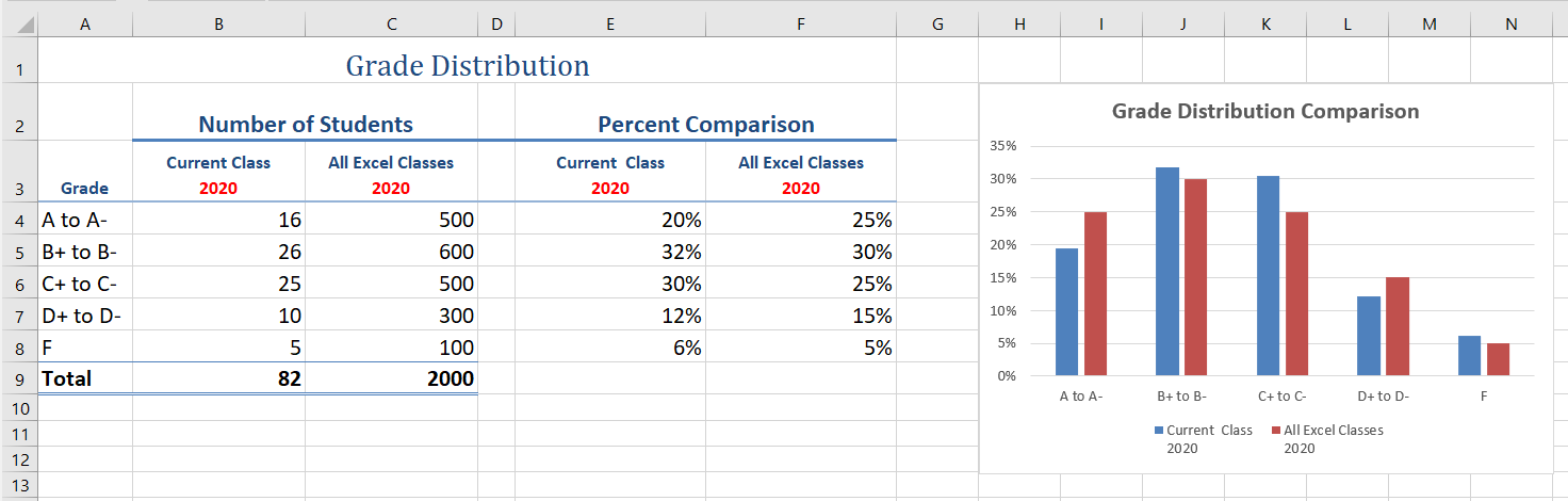
Figure 4.13 shows the final appearance of the column chart. The column chart is an appropriate type for this data as there are fewer than twenty data points and we can easily see the comparison for each category. An audience can quickly see that the class issued fewer As compared to the college. However, the class had more Bs and Cs compared with the college population.
Too Many Bars on a Column Chart?
Although there is no specific limit for the number of bars you should use on a column chart, a general rule of thumb is twenty bars or less.
Data visualization brings more depth in how information, in this case geographically, connects. You can use a map chart to compare values and show categories across geographical regions like countries/regions, states, counties or postal codes. Excel will automatically convert data to geographical locations and will display values on a map. As shown below, in Figure 4.14, in the next steps we will compare West Coast Community College enrollments for Fall of 2019 using a map chart.
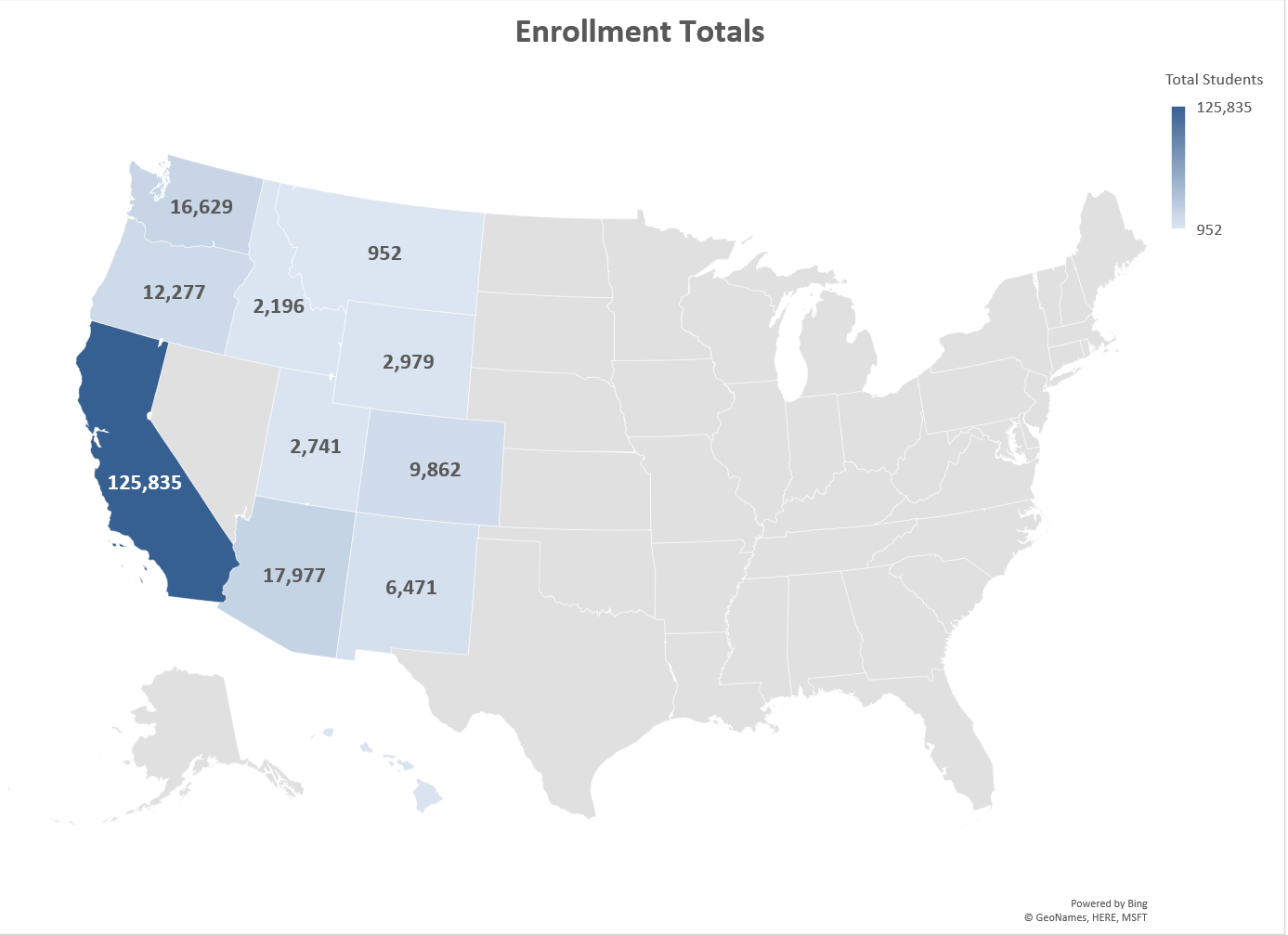
a) Select the Title. Type Enrollment Totals. Change the font to bold, size 18.
b) From the top right corner of the Chart area, choose the Charts Elements plus sign.
c) Select the Data Labels checkbox. Notice the values appear on each State.
![]() Mac Users: there is no “Charts Element plus sign”. Follow the alternate steps below.
Mac Users: there is no “Charts Element plus sign”. Follow the alternate steps below.
Click the “Chart Design” tab on the Ribbon
Click the “Add Chart Element” button on the Ribbon
Point to “Data Labels” option and click “Show”
d) Save your work.
Another graph to visualize data is a Funnel chart. Funnel charts provide a visual snapshot of a process. From our data, we will create a Funnel Chart to show how many students we have in the admissions process. You can quickly review the funnel chart to see admissions predicts to have 932 new enrolled students for Winter Term 2020.
Insert a Funnel chart by following the below steps.
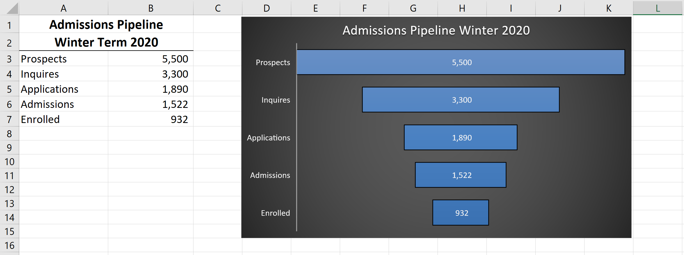
The next chart we will demonstrate is a pie chart. A pie chart is used to show a percent of the total for a data set at a specific point in time. Using the Doughnut Pie Chart, show the percentage of students enrolled at a full-time status. As in the last example, the data is located on the Enrollment Statistics sheet.
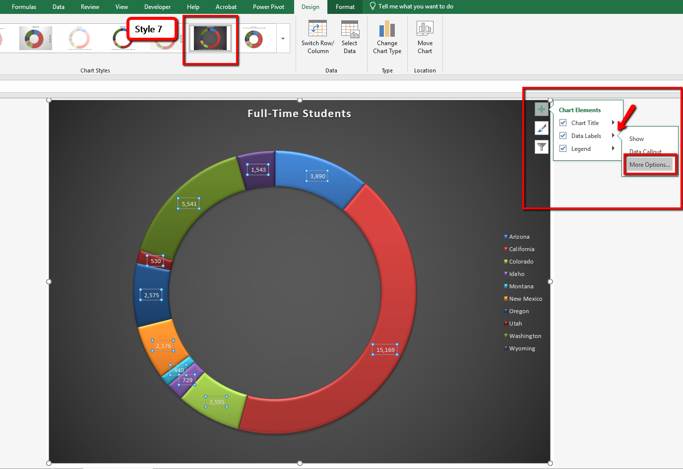
9. From the Format Data Label Options menu, select Percentages, and Deselect Values to show the percent of total students that are enrolled at a full-time status.
10. Close the Format Data Labels menu.
Notice the font is small compared to the graph size. Adjust the font size of the Title, Legend, and Data Label by following the below steps:
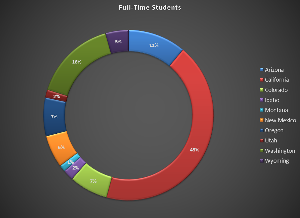
Inserting a Pie Chart
We will statistical data to compare a bar and column chart. Both the Bar and the Column chart display data using rectangular bars where the length of the bar is proportional to the data value. Both charts are used to compare two or more values. However, the difference lies in their orientation. A bar chart is oriented horizontally whereas the column chart is oriented vertically. Although alike, they cannot be always used interchangeably. The difference in their orientation, meaning typically the more data values the harder it is to read in a column format. This is where visually a bar chart would be a better choice. Complete the below steps to insert both a bar and column chart comparing not only the gender and age differences of enrolled students but the type of graphs you are viewing the data in.
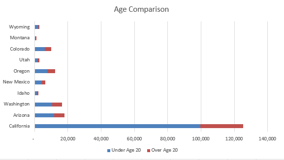
Next, insert a column chart comparing gender.
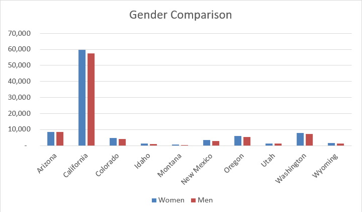
The last chart types we will demonstrate is the stacked column chart and a bar chart. You will use a stacked column chart to show differences in budgeted expense accounts for the admissions department and a bar chart for age comparisons of enrolled students at the college.
Follow the below steps to insert a stacked column chart.
Figure 4.21 shows the final stacked column chart.
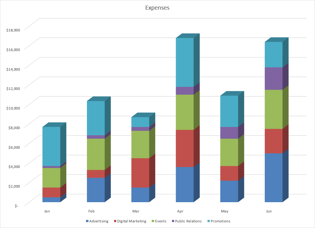
Inserting a Stacked Column Chart
Adapted by Noreen Brown from How to Use Microsoft Excel: The Careers in Practice Series, adapted by The Saylor Foundation without attribution as requested by the work’s original creator or licensee, and licensed under CC BY-NC-SA 3.0.
You can use a variety of formatting techniques to enhance the appearance of a chart once you have created it. Formatting commands are applied to a chart for the same reason they are applied to a worksheet: they make the chart easier to read. However, formatting techniques also help you qualify and explain the data in a chart. For example, you can add footnotes explaining the data source as well as notes that clarify the type of numbers being presented (i.e., if the numbers in a chart are truncated, you can state whether they are in thousands, millions, etc.). These notes are also helpful in answering questions if you are using charts in a live presentation.
There are numerous formatting commands we can apply to the X and Y axes of a chart. Although adjusting the font size, style, and color are common, many more options are available through the Format Axis pane. The following steps demonstrate a few of these formatting techniques on the Grade Distribution Comparison chart. Follow the below steps to make some changes to the percentage numbers on the Y (vertical) axis.
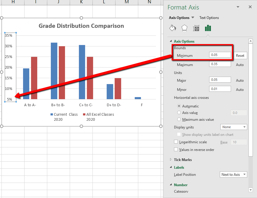
Titles for the X and Y axes are necessary for defining the numbers and categories presented on a chart. For example, by looking at the Grade Distribution Comparison chart, it is not clear what the percentages along the Y-axis represent. The following steps explain how to add titles to the X and Y axes to define these numbers and categories:
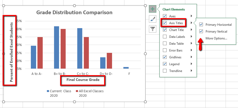
X and Y Axis Titles
Adding labels to the data series of a chart is a key formatting feature. A data series is an item that is being displayed graphically on a chart. For example, the blue bars on the Grade Distribution Comparison chart represent one data series. We can add labels at the end of each bar to show the exact percentage the bar represents. In addition, we can add other formatting enhancements to the data series, such as changing the color of the bars or adding an effect. The following steps explain how to add these labels and formats to the chart:
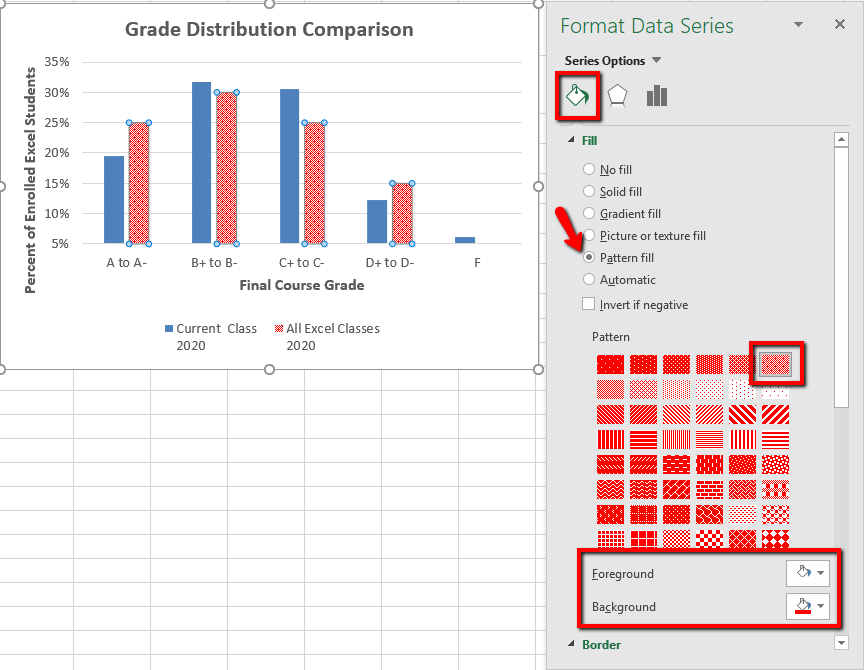
Now we are going to add the Data Labels at the end of the columns.
Figure 4.25 shows the Grade Distribution Comparison chart with the completed formatting adjustments and labels added to the data series. Note that we can move each individual data label. This might be necessary if two data labels overlap or if a data label falls in the middle of a grid line. To move an individual data label, click it twice, then click and drag.
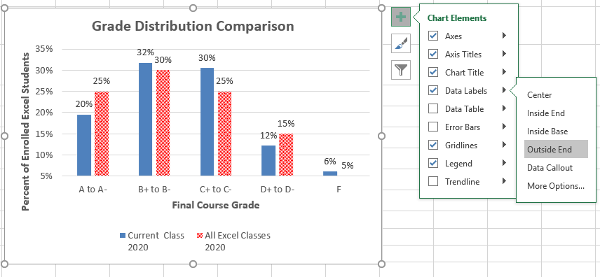
Adding Data Labels
Adapted by Hallie Puncochar and Noreen Brown from How to Use Microsoft Excel: The Careers in Practice Series, adapted by The Saylor Foundation without attribution as requested by the work’s original creator or licensee, and licensed under CC BY-NC-SA 3.0.
Charts that are created in Excel are commonly used in Microsoft Word documents or for presentations that use Microsoft PowerPoint slides. Excel provides options for pasting an image of a chart into either a Word document or a PowerPoint slide. You can also establish a link to your Excel charts so that if you change the data in your Excel file, it is automatically reflected in your Word or PowerPoint files. We will demonstrate both methods in this section.
For this exercise you will need two files:
Excel charts can be valuable tools for explaining quantitative data in a written report. Reports that address business plans, public policies, budgets, and so. For this example, we will assume that the total enrollment per state from the Enrollment Statistics Map chart is being used in a student’s written report. (see Figure 4.26). The following steps demonstrate how to paste an image, or picture, of this chart into a Word document:

Pasting a Chart Image into Word
For this exercise you will need two files:
![]() Mac Users should choose “Use Destination Theme”
Mac Users should choose “Use Destination Theme”
This pastes an image of the Excel chart into the PowerPoint slide yet changing the appearance to match the current theme of the PowerPoint slide.

The benefit of adding this chart to the presentation as a link is that it will automatically update when you change the data in the linked spreadsheet file.
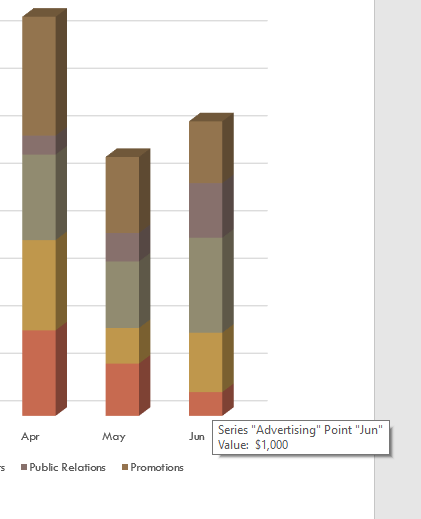
Refreshing Linked Charts in PowerPoint and Word
When creating a link to a chart in Word or PowerPoint, you must refresh the data if you make any changes in the Excel workbook. This is especially true if you make changes in the Excel file prior to opening the Word or PowerPoint file that contains a link to a chart. To refresh the chart, make sure it is activated, then click the Refresh Data button in the Design tab of the ribbon. Forgetting this step can result in old or erroneous data being displayed on the chart.
Severed Link?
When creating a link to an Excel chart in Word or PowerPoint, you must keep the Excel workbook in its original location on your computer or network. If you move or delete the Excel workbook, you will get an error message when you try to update the link in your Word or PowerPoint file. You will also get an error if the Excel workbook is saved on a network drive that your computer cannot access. These errors occur because the link to the Excel workbook has been severed. Therefore, if you know in advance that you will be using a USB drive to pull up your documents or presentation, move the Excel workbook to your USB drive before you establish the link in your Word or PowerPoint file.
Pasting a Linked Chart Image into PowerPoint
Adapted by Hallie Puncochar, and Noreen Brown from How to Use Microsoft Excel: The Careers in Practice Series, adapted by The Saylor Foundation without attribution as requested by the work’s original creator or licensee, and licensed under CC BY-NC-SA 3.0.
In this section, we will take a look at each of the worksheets created in the previous sections. Since these worksheets contain a combination of data and charts, there are specific things to watch for if you will be printing the sheets.
We will start by looking at each worksheet in Print Preview in Backstage View. We will then make any changes necessary, such as changing the orientation and scaling or moving charts around on the worksheet. To make sure we don’t miss any worksheets, we are going to review the worksheets in the order they appear in the tabs.
Data file: Continue with CH4 Charting.
The All Excel Classes is a chart sheet. This means that it does not contain any data; remember that chart sheets just contain charts. We still need to review it in Print Preview.
The Stock Trend worksheet has a lot of data and multiple embedded charts. We need to print the data and the charts, which will require modifications to the page setup.
1. Click on the Stock Trend worksheet tab.
2. Go to Print Preview by clicking Print in Backstage View.
![]() Mac Users choose “File/Print…” from the Excel File menu option.
Mac Users choose “File/Print…” from the Excel File menu option.
3. Notice that this worksheet is currently printing on seven pages.
4. As you click through each page you should make the following observations:
5. Exit Backstage View.
6. The first thing we are going to do is hide the numbers that are appearing on page 7. We are going to hide the column, instead of deleting the numbers, in case the numbers are being utilized somewhere else in the workbook.
7. Scroll to the right on the worksheet until you find the numbers in column AH.
8. Click anywhere in column AH.
9. On the Home ribbon, click the Format button in the Cells group.
10. In the Visibility section, select Hide & Unhide then select Hide Columns.
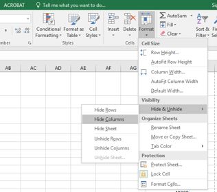
Figure 4.29 Hide Columns in Format Menu
11. The visible column headings should now go from AG to AI.
12. Return to Print Preview in Backstage View to see the changes to the printed worksheet.
13. Notice that there are now five pages. The data and charts are still splitting across multiple pages, but the numbers in column AH are no longer going to print.
14. Remain in Backstage View for the next steps.
The data is still split between pages 2 and 3, and the charts are splitting oddly as well. The first step we will try to fix these issues is to change the page orientation and scaling.
1. While still in Backstage View, change the page orientation to Landscape (use the Orientation drop-down menu in the Settings section).
![]() Mac Users click the Landscape Orientation button
Mac Users click the Landscape Orientation button ![]()
2. This puts all of the data on one sheet, but the charts are still split between multiple pages.
3. Change the page scaling to Fit Sheet on One Page (use the Scaling drop-down menu in the Settings section).
![]() Mac Users click the Scale to Fit option
Mac Users click the Scale to Fit option ![]()
4. This fits everything on one page, but it is too small to be able to read.
5. Change the page scaling back to No Scaling.
![]() Mac Users: uncheck the Scale to Fit option
Mac Users: uncheck the Scale to Fit option
The next thing we will try is moving one, or both, of the charts. In order to move the charts, we need to exit out of Backstage View.
1. Exit Backstage View.
2. Switch to the View ribbon and then select Page Break Preview. Your screen should look similar to Figure 4.30. (Remember that the dotted blue lines indicate automatic page breaks.)
3. Move the 24 Month Comparison (double-line) chart closer to the top of its page.
4. Move the May 2014-2015 Trend for NASDAQ Sales Volume (line chart) so that it is under the 24 Month Comparison chart.
5. The link to the data source is still at the bottom of page 2 (in A50:A51) so you need to move it as well. Using your preferred method, move the text from A50:A51 to M31:M32.
Now your screen should look similar to Figure 4.30.
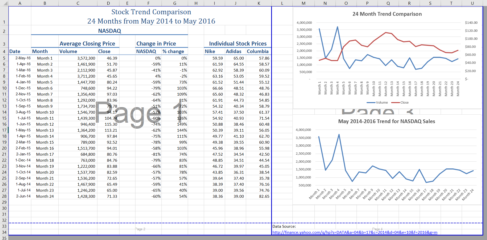
We don’t want the data source link text to print on its own page, but there is no room to move it onto the same page as the charts. To fix this, we are going to remove the automatic page break between the charts and the text in M31:M32.
1. Place your pointer on the horizontal blue dashed line (automatic page break) between the line chart and the Data Source link text.
2. When your pointer changes to the double arrow (pointing up and down), drag the page break down into the gray area. This removes the page break.
3. If your vertical automatic page break between columns K and L moves, drag it back between columns K and L. This will make it a solid blue line, which will no longer adjust automatically.
Note: you may need to slightly re-size the two charts in order to make your screen look like Figure 4.31. Your “goal” is to only have two pages.
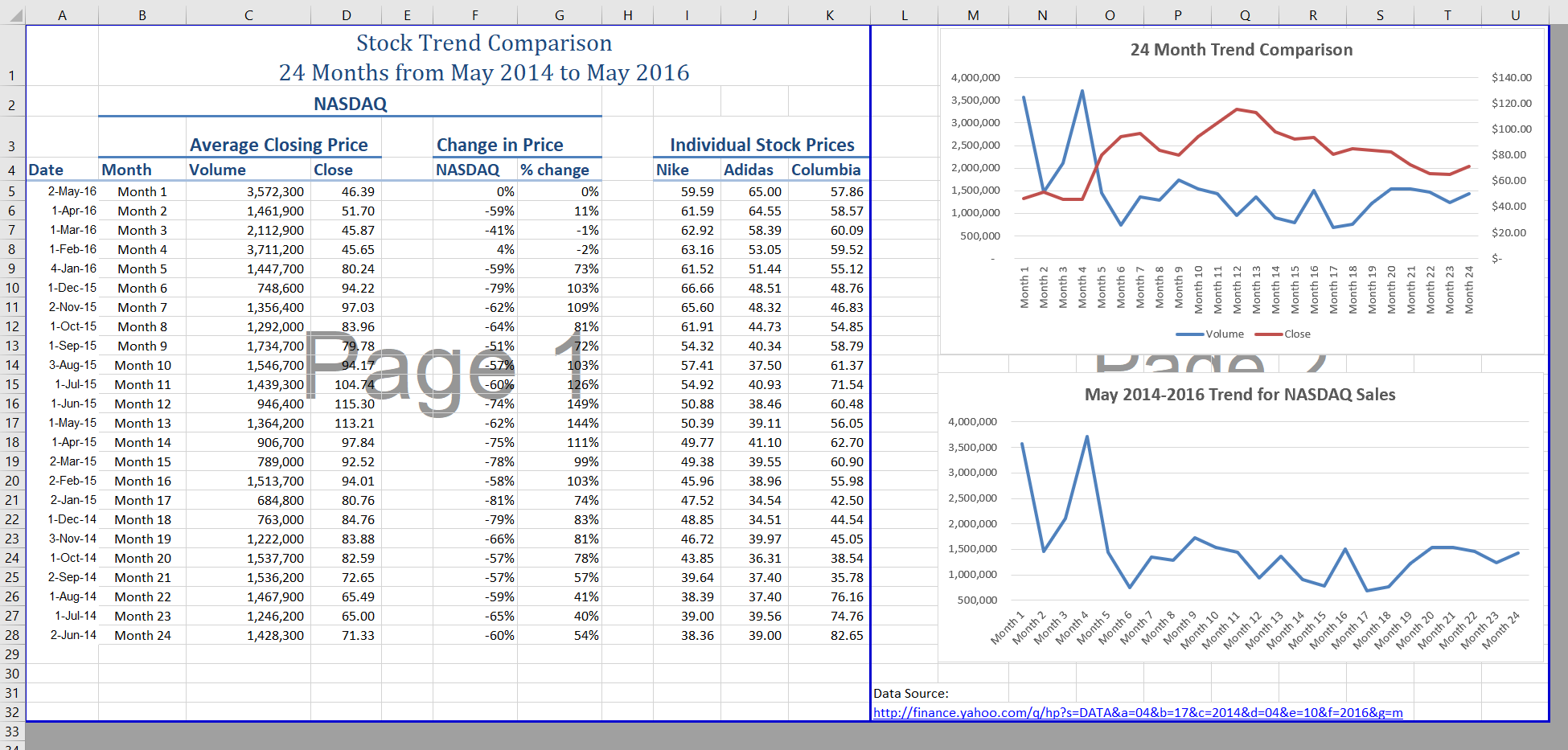
Now you need to do one final check of this worksheet in Print Preview.
1. Go to Print Preview and look at both pages. Page 1 should contain just the data and page 2 should have both charts and the Data Source link text.
2. Exit Backstage View and save the file.
The remaining worksheets need to be reviewed. Some of them will need minor changes and some will not need any changes. You will need to preview each one and then make the specified changes. In the following steps, you will preview and modify all other worksheets.
1. Grade Distribution, Enrollment Statistics, and Admissions sheets – the charts split across two pages. Fix this by changing the orientation (Landscape) and scaling (Fit Sheet on One Page).
2. The remaining chart sheets should not need any changes.
Sometimes you might have a worksheet that has data and a chart, but you only want the chart to print. That is the case with the Enrollment Statistics worksheet.
1. Switch to the Enrollment Statistics worksheet.
2. Select the Gender Comparision chart.
![]() Mac Users: Steps 3-5 will not work in Excel for Mac. See alternate steps below step 5.
Mac Users: Steps 3-5 will not work in Excel for Mac. See alternate steps below step 5.
3. Go to Print Preview. Only the chart is printing. (If it shows the data printing along with the chart, exit Backstage View and be sure to select just the chart on the worksheet.)
4. If needed, change the orientation to Landscape. This orientation looks better when printing just a chart.
5. Exit Backstage View.
![]() Mac Users: the only way to print a Chart separately is to click on the chart you want to print move it to a new sheet by clicking on the chart, click the Move Chart button on the Chart Design tab, click New Sheet then choose File/Print from the Excel menu and switch to Landscape Orientation if necessary.
Mac Users: the only way to print a Chart separately is to click on the chart you want to print move it to a new sheet by clicking on the chart, click the Move Chart button on the Chart Design tab, click New Sheet then choose File/Print from the Excel menu and switch to Landscape Orientation if necessary.
You have actually decided that you do not want the Expenses sheet to be visible at all, but you do not want to delete it. We are going to hide it from anyone looking at the workbook.
1. Right-click on the Expenses tab.
![]() Mac Users should hold down the CTRL key and click on the Expenses tab
Mac Users should hold down the CTRL key and click on the Expenses tab
2. Select Hide from the menu that appears. The sheet should no longer be visible.
3. Save the CH4 Charting workbook.
4. Submit all three files from this chapter: CH4 Charting.xlsx, CH4 CC Enrollment.docx, and CH4 PowerPoint CC Enrollment.pptx as directed by your instructor.
“4.4 Preparing to Print” by Hallie Puncochar, and Julie Romey, Portland Community College is licensed under CC BY 4.0
To assess your understanding of the material covered in the chapter, please complete the following assignments.
Although Excel is primarily used in business and scientific applications, you will find it useful in other areas of study as well. In these exercises, we will use Excel to create charts using historical, and health data.
Download Data File: PR4 Data
Excel is an excellent tool for helping display historical data. In this exercise, we will be examining ways to display information on minimum mage data and life expectancy.
Since the beginning of the previous century, the United States has set a minimum wage, in order to set a “floor” beneath which wages cannot fall. Most states have set their own minimum wages, but none are lower than the national minimum wage. Follow the below steps to insert a Map Chart outlining what the current minimum wage is per state.
1. Open the file named PR4 Data and then Save As PR4 Historical Data.
2. On the Minimum Wage worksheet, select the range B4:B55. Press and hold the CTRL key and select D4:D55.
![]() Mac Users: hold down the “Command” key not the CTRL key
Mac Users: hold down the “Command” key not the CTRL key
3. Select the Insert tab, then the Map Chart tool in the Charts group.
4. Move the Chart as a New Sheet. Rename the sheet Map.
5. Update the Chart Title to US Minimum Wage 2020.
6. From the Charts Element menu choose to display the Data Labels.
7. From the Charts Element menu, turn off the Legend.
8. Prepare the Minimum Wage worksheet for printing by changing the scaling to Fit Sheet on One Page.
9. Save your work.

Task 2 – Oregon: Projected Life Expectancy at Birth
In the past 40 years, between 1970 and 2010, life expectancy for Oregon men improved by 8.7 years and for women by 5.5 years. Oregon’s life expectancy has remained slightly higher than the U.S. average. The life expectancy will continue to improve for both men and women. However, the gain for men has been outpacing the gain for women. Consequently, the difference between men’s and women’s life expectancies has continued to shrink.
https://www.oregon.gov/das/OEA/Documents/OR_pop_trend2012.pdf
1. On the Life Expectancy sheet, select A5:B11.
2. From the Insert tab choose Recommend Charts. Select the second option, Clustered Column chart.
3. Move the chart to a new sheet. Name the sheet Men.
4. Repeat steps above to create a matching chart for Life Expectancy for Oregon Women, by selecting A5:A11. Press and hold the CTRL key and select C5:C11.
![]() Mac Users hold down the Command key
Mac Users hold down the Command key
5. Use the Recommended Charts and select the Clustered Column chart.
6. Move the chart to a new sheet. Name the sheet Women.
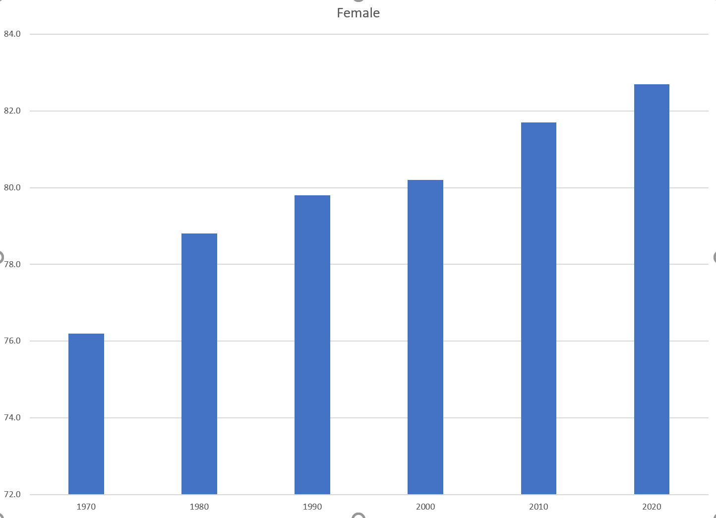
7. Notice on the men’s and women’s vertical axis the min and maximum bounds do not match. To ensure data is comparable, adjust the min and max bounds of both the Mens and Womens chart to chart to match:
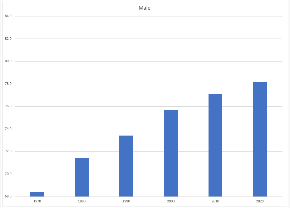
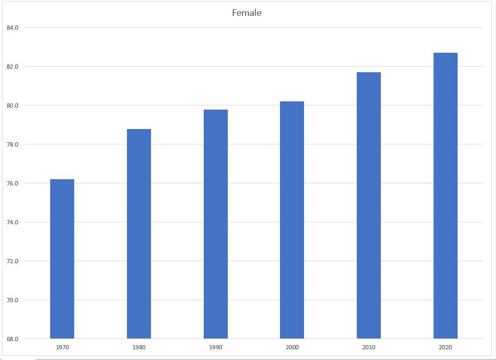
8. Return to the Life Expectancy tab, select A5:D11.
9. Use the Recommended Charts tool to create a simple line chart.
10. Change the Chart Title to Oregon: Projected Life Expectancy at Birth.
11. Leave the chart embedded in the worksheet. Move and resize it accordingly.
12. The line across the bottom of the chart represents the difference between men’s and women’s life expectancy. It is not very helpful as it is. Right-click on the line to open the pop-up menu. Select Format Data Series. In the Format Data Series pane, under the Series Options tab, select the radio button in front of Secondary Axis.
![]() Mac Users should hold down the CTRL key and click the line at the bottom.
Mac Users should hold down the CTRL key and click the line at the bottom.
Select Format Data Series. In the Format Data Series pane, under the Series Options tab, select the radio button in front of Secondary Axis.
13. Close the Format Data Series pane.
14. Use the Chart Styles tools to change your chart to something a bit more dramatic.
15. Preview the Life Expectancy worksheet in Print Preview and make any necessary changes. The solutions are shown in below in Figure 4.35.
16. Check the spelling on all of the worksheets and make any necessary changes. Save the PR4 Historical Data workbook.
17. Submit the PR4 Historical Data workbook as directed by your instructor.
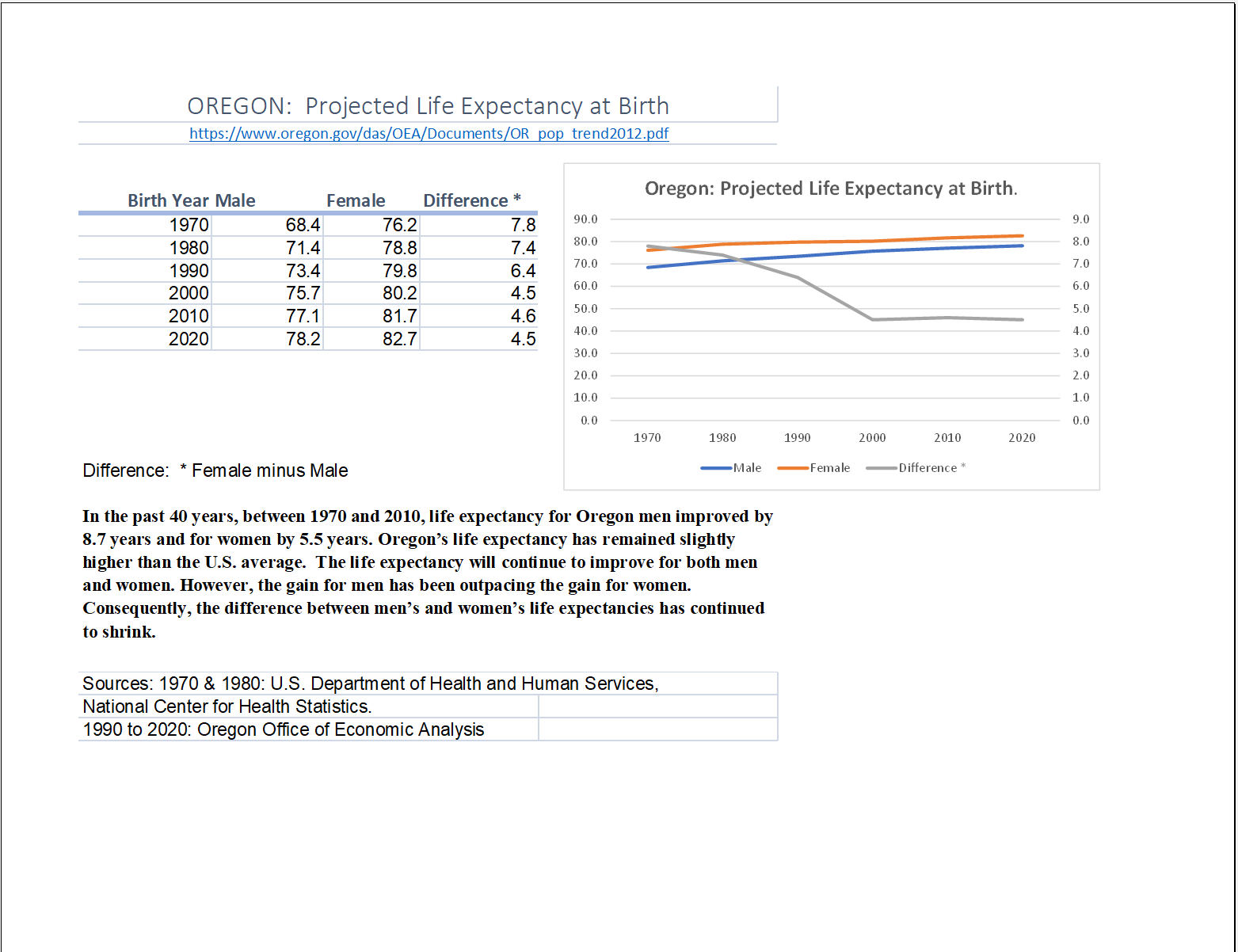
“4.5 Chapter Practice” by Hallie Puncochar and Noreen Brown, Portland Community College is licensed under CC BY 4.0
Download Data File: SC4 Data
An effective way to communicate findings in Excel is by graphing data. Graph the attached sales information, visualizing profit margin trends, and production patterns, and the sales pipeline; enabling decision-makers to grasp concepts of current business practices.
Following the directions below create the below charts. Note to match each chart exactly, including the chart styles, and axis bounds.
Create the below Pie Chart showing how many locations will be producing products in the North, South, East and West Regions.
Create the below Funnel Chart to provide our sales team a visual snapshot of the company’s sales process, outlining deals that are expected to close within the month.
VI
The frequency distribution of events is the number of times each event occurred in an experiment or study.
Define statistical frequency and illustrate how it can be depicted graphically.
In statistics, the frequency (or absolute frequency) of an event is the number of times the event occurred in an experiment or study. These frequencies are often graphically represented in histograms. The relative frequency (or empirical probability) of an event refers to the absolute frequency normalized by the total number of events. The values of all events can be plotted to produce a frequency distribution.
A histogram is a graphical representation of tabulated frequencies , shown as adjacent rectangles, erected over discrete intervals (bins), with an area equal to the frequency of the observations in the interval. The height of a rectangle is also equal to the frequency density of the interval, i.e., the frequency divided by the width of the interval. The total area of the histogram is equal to the number of data. An example of the frequency distribution of letters of the alphabet in the English language is shown in the histogram in .

Letter frequency in the English language
A typical distribution of letters in English language text.
A histogram may also be normalized displaying relative frequencies. It then shows the proportion of cases that fall into each of several categories, with the total area equaling 1. The categories are usually specified as consecutive, non-overlapping intervals of a variable. The categories (intervals) must be adjacent, and often are chosen to be of the same size. The rectangles of a histogram are drawn so that they touch each other to indicate that the original variable is continuous.
There is no “best” number of bins, and different bin sizes can reveal different features of the data. Some theoreticians have attempted to determine an optimal number of bins, but these methods generally make strong assumptions about the shape of the distribution. Depending on the actual data distribution and the goals of the analysis, different bin widths may be appropriate, so experimentation is usually needed to determine an appropriate width.
In statistics, an outlier is an observation that is numerically distant from the rest of the data.
Discuss outliers in terms of their causes and consequences, identification, and exclusion.
In statistics, an outlier is an observation that is numerically distant from the rest of the data. Outliers can occur by chance in any distribution, but they are often indicative either of measurement error or of the population having a heavy-tailed distribution. In the former case, one wishes to discard the outliers or use statistics that are robust against them. In the latter case, outliers indicate that the distribution is skewed and that one should be very cautious in using tools or intuitions that assume a normal distribution.

Outliers
This box plot shows where the US states fall in terms of their size. Rhode Island, Texas, and Alaska are outside the normal data range, and therefore are considered outliers in this case.
In most larger samplings of data, some data points will be further away from the sample mean than what is deemed reasonable. This can be due to incidental systematic error or flaws in the theory that generated an assumed family of probability distributions, or it may be that some observations are far from the center of the data. Outlier points can therefore indicate faulty data, erroneous procedures, or areas where a certain theory might not be valid. However, in large samples, a small number of outliers is to be expected, and they typically are not due to any anomalous condition.
Outliers, being the most extreme observations, may include the sample maximum or sample minimum, or both, depending on whether they are extremely high or low. However, the sample maximum and minimum are not always outliers because they may not be unusually far from other observations.
Interpretations of statistics derived from data sets that include outliers may be misleading. For example, imagine that we calculate the average temperature of 10 objects in a room. Nine of them are between 20° and 25° Celsius, but an oven is at 175°C. In this case, the median of the data will be between 20° and 25°C, but the mean temperature will be between 35.5° and 40 °C. The median better reflects the temperature of a randomly sampled object than the mean; however, interpreting the mean as “a typical sample”, equivalent to the median, is incorrect. This case illustrates that outliers may be indicative of data points that belong to a different population than the rest of the sample set. Estimators capable of coping with outliers are said to be robust. The median is a robust statistic, while the mean is not.
Outliers can have many anomalous causes. For example, a physical apparatus for taking measurements may have suffered a transient malfunction, or there may have been an error in data transmission or transcription. Outliers can also arise due to changes in system behavior, fraudulent behavior, human error, instrument error or simply through natural deviations in populations. A sample may have been contaminated with elements from outside the population being examined. Alternatively, an outlier could be the result of a flaw in the assumed theory, calling for further investigation by the researcher.
Unless it can be ascertained that the deviation is not significant, it is ill-advised to ignore the presence of outliers. Outliers that cannot be readily explained demand special attention.
There is no rigid mathematical definition of what constitutes an outlier. Thus, determining whether or not an observation is an outlier is ultimately a subjective exercise. Model-based methods, which are commonly used for identification, assume that the data is from a normal distribution and identify observations which are deemed “unlikely” based on mean and standard deviation. Other methods flag observations based on measures such as the interquartile range (IQR). For example, some people use the 1.5⋅IQR"> rule. This defines an outlier to be any observation that falls 1.5⋅IQR"> below the first quartile or any observation that falls 1.5⋅IQR"> above the third quartile.
Deletion of outlier data is a controversial practice frowned on by many scientists and science instructors. While mathematical criteria provide an objective and quantitative method for data rejection, they do not make the practice more scientifically or methodologically sound — especially in small sets or where a normal distribution cannot be assumed. Rejection of outliers is more acceptable in areas of practice where the underlying model of the process being measured and the usual distribution of measurement error are confidently known. An outlier resulting from an instrument reading error may be excluded, but it is desirable that the reading is at least verified.
Even when a normal distribution model is appropriate to the data being analyzed, outliers are expected for large sample sizes and should not automatically be discarded if that is the case. The application should use a classification algorithm that is robust to outliers to model data with naturally occurring outlier points. Additionally, the possibility should be considered that the underlying distribution of the data is not approximately normal, but rather skewed.
A relative frequency is the fraction or proportion of times a value occurs in a data set.
Define relative frequency and construct a relative frequency distribution.
A relative frequency is the fraction or proportion of times a value occurs. To find the relative frequencies, divide each frequency by the total number of data points in the sample. Relative frequencies can be written as fractions, percents, or decimals.
Constructing a relative frequency distribution is not that much different than from constructing a regular frequency distribution. The beginning process is the same, and the same guidelines must be used when creating classes for the data. Recall the following:
Create the frequency distribution table, as you would normally. However, this time, you will need to add a third column. The first column should be labeled Class or Category. The second column should be labeled Frequency. The third column should be labeled Relative Frequency. Fill in your class limits in column one. Then, count the number of data points that fall in each class and write that number in column two.
Next, start to fill in the third column. The entries will be calculated by dividing the frequency of that class by the total number of data points. For example, suppose we have a frequency of 5 in one class, and there are a total of 50 data points. The relative frequency for that class would be calculated by the following:
5/50=0.10
You can choose to write the relative frequency as a decimal (0.10), as a fraction (110">), or as a percent (10%). Since we are dealing with proportions, the relative frequency column should add up to 1 (or 100%). It may be slightly off due to rounding.
Relative frequency distributions is often displayed in histograms and in frequency polygons. The only difference between a relative frequency distribution graph and a frequency distribution graph is that the vertical axis uses proportional or relative frequency rather than simple frequency.
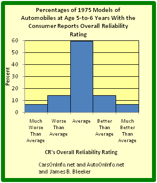
Relative Frequency Histogram
This graph shows a relative frequency histogram. Notice the vertical axis is labeled with percentages rather than simple frequencies.
Just like we use cumulative frequency distributions when discussing simple frequency distributions, we often use cumulative frequency distributions when dealing with relative frequency as well. Cumulative relative frequency (also called an ogive) is the accumulation of the previous relative frequencies. To find the cumulative relative frequencies, add all the previous relative frequencies to the relative frequency for the current row.
A cumulative frequency distribution displays a running total of all the preceding frequencies in a frequency distribution.
Define cumulative frequency and construct a cumulative frequency distribution.
A cumulative frequency distribution is the sum of the class and all classes below it in a frequency distribution. Rather than displaying the frequencies from each class, a cumulative frequency distribution displays a running total of all the preceding frequencies.
Constructing a cumulative frequency distribution is not that much different than constructing a regular frequency distribution. The beginning process is the same, and the same guidelines must be used when creating classes for the data. Recall the following:
Create the frequency distribution table, as you would normally. However, this time, you will need to add a third column. The first column should be labeled Class or Category. The second column should be labeled Frequency. The third column should be labeled Cumulative Frequency. Fill in your class limits in column one. Then, count the number of data points that falls in each class and write that number in column two.
Next, start to fill in the third column. The first entry will be the same as the first entry in the Frequency column. The second entry will be the sum of the first two entries in the Frequency column, the third entry will be the sum of the first three entries in the Frequency column, etc. The last entry in the Cumulative Frequency column should equal the number of total data points, if the math has been done correctly.
There are a number of ways in which cumulative frequency distributions can be displayed graphically. Histograms are common , as are frequency polygons . Frequency polygons are a graphical device for understanding the shapes of distributions. They serve the same purpose as histograms, but are especially helpful in comparing sets of data.
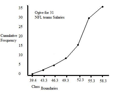
Frequency Polygon
This graph shows an example of a cumulative frequency polygon.

Frequency Histograms
This image shows the difference between an ordinary histogram and a cumulative frequency histogram.
A plot is a graphical technique for representing a data set, usually as a graph showing the relationship between two or more variables.
Identify common plots used in statistical analysis.
A plot is a graphical technique for representing a data set, usually as a graph showing the relationship between two or more variables. Graphs of functions are used in mathematics, sciences, engineering, technology, finance, and other areas where a visual representation of the relationship between variables would be useful. Graphs can also be used to read off the value of an unknown variable plotted as a function of a known one. Graphical procedures are also used to gain insight into a data set in terms of:
Plots play an important role in statistics and data analysis. The procedures here can broadly be split into two parts: quantitative and graphical. Quantitative techniques are the set of statistical procedures that yield numeric or tabular output. Some examples of quantitative techniques include:
There are also many statistical tools generally referred to as graphical techniques which include:
Below are brief descriptions of some of the most common plots:
Scatter plot: This is a type of mathematical diagram using Cartesian coordinates to display values for two variables for a set of data. The data is displayed as a collection of points, each having the value of one variable determining the position on the horizontal axis and the value of the other variable determining the position on the vertical axis. This kind of plot is also called a scatter chart, scattergram, scatter diagram, or scatter graph.
Histogram: In statistics, a histogram is a graphical representation of the distribution of data. It is an estimate of the probability distribution of a continuous variable or can be used to plot the frequency of an event (number of times an event occurs) in an experiment or study.
Box plot: In descriptive statistics, a boxplot, also known as a box-and-whisker diagram, is a convenient way of graphically depicting groups of numerical data through their five-number summaries (the smallest observation, lower quartile (Q1), median (Q2), upper quartile (Q3), and largest observation). A boxplot may also indicate which observations, if any, might be considered outliers.

Scatter Plot
This is an example of a scatter plot, depicting the waiting time between eruptions and the duration of the eruption for the Old Faithful geyser in Yellowstone National Park, Wyoming, USA.
Distributions can be symmetrical or asymmetrical depending on how the data falls.
Evaluate the shapes of symmetrical and asymmetrical frequency distributions.
In statistics, distributions can take on a variety of shapes. Considerations of the shape of a distribution arise in statistical data analysis, where simple quantitative descriptive statistics and plotting techniques, such as histograms, can lead to the selection of a particular family of distributions for modelling purposes.
In a symmetrical distribution, the two sides of the distribution are mirror images of each other. A normal distribution is an example of a truly symmetric distribution of data item values. When a histogram is constructed on values that are normally distributed, the shape of the columns form a symmetrical bell shape. This is why this distribution is also known as a “normal curve” or “bell curve. ” In a true normal distribution, the mean and median are equal, and they appear in the center of the curve. Also, there is only one mode, and most of the data are clustered around the center. The more extreme values on either side of the center become more rare as distance from the center increases. About 68% of values lie within one standard deviation (σ) away from the mean, about 95% of the values lie within two standard deviations, and about 99.7% lie within three standard deviations . This is known as the empirical rule or the 3-sigma rule.
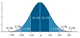
Normal Distribution
This image shows a normal distribution. About 68% of data fall within one standard deviation, about 95% fall within two standard deviations, and 99.7% fall within three standard deviations.
In an asymmetrical distribution, the two sides will not be mirror images of each other. Skewness is the tendency for the values to be more frequent around the high or low ends of the x-axis. When a histogram is constructed for skewed data, it is possible to identify skewness by looking at the shape of the distribution.
A distribution is said to be positively skewed (or skewed to the right) when the tail on the right side of the histogram is longer than the left side. Most of the values tend to cluster toward the left side of the x-axis (i.e., the smaller values) with increasingly fewer values at the right side of the x-axis (i.e., the larger values). In this case, the median is less than the mean .
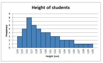
Positively Skewed Distribution
This distribution is said to be positively skewed (or skewed to the right) because the tail on the right side of the histogram is longer than the left side.
A distribution is said to be negatively skewed (or skewed to the left) when the tail on the left side of the histogram is longer than the right side. Most of the values tend to cluster toward the right side of the x-axis (i.e., the larger values), with increasingly less values on the left side of the x-axis (i.e., the smaller values). In this case, the median is greater than the mean .
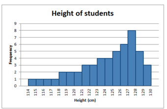
Negatively Skewed Distribution
This distribution is said to be negatively skewed (or skewed to the left) because the tail on the left side of the histogram is longer than the right side.
When data are skewed, the median is usually a more appropriate measure of central tendency than the mean.
A uni-modal distribution occurs if there is only one “peak” (or highest point) in the distribution, as seen previously in the normal distribution. This means there is one mode (a value that occurs more frequently than any other) for the data. A bi-modal distribution occurs when there are two modes. Multi-modal distributions with more than two modes are also possible.
A z-score is the signed number of standard deviations an observation is above the mean of a distribution.
Define z-scores and demonstrate how they are converted from raw scores.
A z-score is the signed number of standard deviations an observation is above the mean of a distribution. Thus, a positive z-score represents an observation above the mean, while a negative z-score represents an observation below the mean. We obtain a z-score through a conversion process known as standardizing or normalizing.
z-scores are also called standard scores, z-values, normal scores or standardized variables. The use of “z” is because the normal distribution is also known as the “z distribution.” z-scores are most frequently used to compare a sample to a standard normal deviate (standard normal distribution, with μ=0"> and σ=1">).
While z-scores can be defined without assumptions of normality, they can only be defined if one knows the population parameters. If one only has a sample set, then the analogous computation with sample mean and sample standard deviation yields the Student’s t">– statistic.
A raw score is an original datum, or observation, that has not been transformed. This may include, for example, the original result obtained by a student on a test (i.e., the number of correctly answered items) as opposed to that score after transformation to a standard score or percentile rank. The z-score, in turn, provides an assessment of how off-target a process is operating.
The conversion of a raw score, x">, to a z">-score can be performed using the following equation:
z=x−μσ">
where μ"> is the mean of the population and σ"> is the standard deviation of the population. The absolute value of z"> represents the distance between the raw score and the population mean in units of the standard deviation. z">is negative when the raw score is below the mean and positive when the raw score is above the mean.
A key point is that calculating z">requires the population mean and the population standard deviation, not the sample mean nor sample deviation. It requires knowing the population parameters, not the statistics of a sample drawn from the population of interest. However, in cases where it is impossible to measure every member of a population, the standard deviation may be estimated using a random sample.
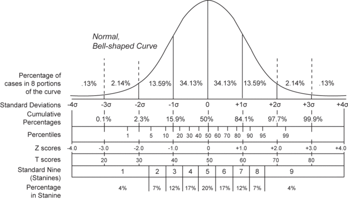
Normal Distribution and Scales
Shown here is a chart comparing the various grading methods in a normal distribution. z-scores for this standard normal distribution can be seen in between percentiles and z-scores.
Qualitative data is a categorical measurement expressed not in terms of numbers, but rather by means of a natural language description.
Summarize the processes available to researchers that allow qualitative data to be analyzed similarly to quantitative data.
Qualitative data is a categorical measurement expressed not in terms of numbers, but rather by means of a natural language description. In statistics, it is often used interchangeably with “categorical” data. When there is not a natural ordering of the categories, we call these nominal categories. Examples might be gender, race, religion, or sport.
When the categories may be ordered, these are called ordinal variables. Categorical variables that judge size (small, medium, large, etc.) are ordinal variables. Attitudes (strongly disagree, disagree, neutral, agree, strongly agree) are also ordinal variables; however, we may not know which value is the best or worst of these issues. Note that the distance between these categories is not something we can measure.
Qualitative Analysis is the numerical examination and interpretation of observations for the purpose of discovering underlying meanings and patterns of relationships. The most common form of qualitative qualitative analysis is observer impression—when an expert or bystander observers examine the data, interpret it via forming an impression and report their impression in a structured and sometimes quantitative form.
An important first step in qualitative analysis and observer impression is to discover patterns. One must try to find frequencies, magnitudes, structures, processes, causes, and consequences. One method of this is through cross-case analysis, which is analysis that involves an examination of more than one case. Cross-case analysis can be further broken down into variable-oriented analysis and case-oriented analysis. Variable-oriented analysis is that which describes and/or explains a particular variable, while case-oriented analysis aims to understand a particular case or several cases by looking closely at the details of each.
The Ground Theory Method (GTM) is an inductive approach to research, introduced by Barney Glaser and Anselm Strauss, in which theories are generated solely from an examination of data rather than being derived deductively. A component of the Grounded Theory Method is the constant comparative method, in which observations are compared with one another and with the evolving inductive theory.
Other methods of discovering patterns include semiotics and conversation analysis. Semiotics is the study of signs and the meanings associated with them. It is commonly associated with content analysis. Conversation analysis is a meticulous analysis of the details of conversation, based on a complete transcript that includes pauses and other non-verbal communication.
In quantitative analysis, it is usually obvious what the variables to be analyzed are, for example, race, gender, income, education, etc. Deciding what is a variable, and how to code each subject on each variable, is more difficult in qualitative data analysis.
Concept formation is the creation of variables (usually called themes) out of raw qualitative data. It is more sophisticated in qualitative data analysis. Casing is an important part of concept formation. It is the process of determining what represents a case. Coding is the actual transformation of qualitative data into themes.
More specifically, coding is an interpretive technique that both organizes the data and provides a means to introduce the interpretations of it into certain quantitative methods. Most coding requires the analyst to read the data and demarcate segments within it, which may be done at different times throughout the process. Each segment is labeled with a “code” – usually a word or short phrase that suggests how the associated data segments inform the research objectives. When coding is complete, the analyst prepares reports via a mix of: summarizing the prevalence of codes, discussing similarities and differences in related codes across distinct original sources/contexts, or comparing the relationship between one or more codes.
Some qualitative data that is highly structured (e.g., close-end responses from surveys or tightly defined interview questions) is typically coded without additional segmenting of the content. In these cases, codes are often applied as a layer on top of the data. Quantitative analysis of these codes is typically the capstone analytical step for this type of qualitative data.
A frequent criticism of coding method is that it seeks to transform qualitative data into empirically valid data that contain actual value range, structural proportion, contrast ratios, and scientific objective properties. This can tend to drain the data of its variety, richness, and individual character. Analysts respond to this criticism by thoroughly expositing their definitions of codes and linking those codes soundly to the underlying data, therein bringing back some of the richness that might be absent from a mere list of codes.
Alternatives to coding include recursive abstraction and mechanical techniques. Recursive abstraction involves the summarizing of datasets. Those summaries are then further summarized and so on. The end result is a more compact summary that would have been difficult to accurately discern without the preceding steps of distillation.
Mechanical techniques rely on leveraging computers to scan and reduce large sets of qualitative data. At their most basic level, mechanical techniques rely on counting words, phrases, or coincidences of tokens within the data. Often referred to as content analysis, the output from these techniques is amenable to many advanced statistical analyses.
Graphs of distributions created by others can be misleading, either intentionally or unintentionally.
Demonstrate how distributions constructed by others may be misleading, either intentionally or unintentionally
Unless you are constructing a graph of a distribution on your own, you need to be very careful about how you read and interpret graphs. Graphs are made in order to display data; however, some people may intentionally try to mislead the reader in order to convey certain information.
In statistics, these types of graphs are called misleading graphs (or distorted graphs). They misrepresent data, constituting a misuse of statistics that may result in an incorrect conclusion being derived from them. Graphs may be misleading through being excessively complex or poorly constructed. Even when well-constructed to accurately display the characteristics of their data, graphs can be subject to different interpretation.
Misleading graphs may be created intentionally to hinder the proper interpretation of data, but can also be created accidentally by users for a variety of reasons including unfamiliarity with the graphing software, the misinterpretation of the data, or because the data cannot be accurately conveyed. Misleading graphs are often used in false advertising.
The use of graphs where they are not needed can lead to unnecessary confusion/interpretation. Generally, the more explanation a graph needs, the less the graph itself is needed. Graphs do not always convey information better than tables. This is often called excessive usage.
The use of biased or loaded words in the graph’s title, axis labels, or caption may inappropriately prime the reader.
Pie charts can be especially misleading. Comparing pie charts of different sizes could be misleading as people cannot accurately read the comparative area of circles. The usage of thin slices which are hard to discern may be difficult to interpret. The usage of percentages as labels on a pie chart can be misleading when the sample size is small. A perspective (3D) pie chart is used to give the chart a 3D look. Often used for aesthetic reasons, the third dimension does not improve the reading of the data; on the contrary, these plots are difficult to interpret because of the distorted effect of perspective associated with the third dimension. In a 3D pie chart, the slices that are closer to the reader appear to be larger than those in the back due to the angle at which they’re presented .
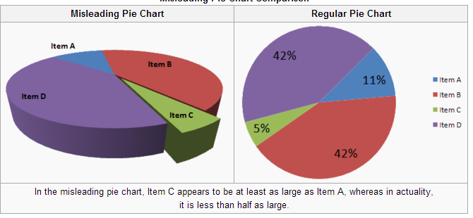
3-D Pie Chart
In the misleading pie chart, Item C appears to be at least as large as Item A, whereas in actuality, it is less than half as large.
When using pictogram in bar graphs, they should not be scaled uniformly as this creates a perceptually misleading comparison. The area of the pictogram is interpreted instead of only its height or width. This causes the scaling to make the difference appear to be squared .

Improper Scaling
Note how in the improperly scaled pictogram bar graph, the image for B is actually 9 times larger than A.
A truncated graph has a y-axis that does not start at 0. These graphs can create the impression of important change where there is relatively little change .
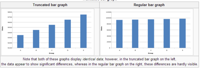
Truncated Bar Graph
Note that both of these graphs display identical data; however, in the truncated bar graph on the left, the data appear to show significant differences, whereas in the regular bar graph on the right, these differences are hardly visible.
Graphs are useful in the summary and interpretation of financial data. Graphs allow for trends in large data sets to be seen while also allowing the data to be interpreted by non-specialists. Graphs are often used in corporate annual reports as a form of impression management. In the United States, graphs do not have to be audited as they fall under AU Section 550 Other Information in Documents Containing Audited Financial Statements. Several published studies have looked at the usage of graphs in corporate reports for different corporations in different countries and have found frequent usage of improper design, selectivity, and measurement distortion within these reports. The presence of misleading graphs in annual reports have led to requests for standards to be set. Research has found that while readers with poor levels of financial understanding have a greater chance of being misinformed by misleading graphs, even those with financial understanding, such as loan officers, may be misled.
Qualitative data can be graphed in various ways, including using pie charts and bar charts.
Create a pie chart and bar chart representing qualitative data.
Recall the difference between quantitative and qualitative data. Quantitative data are data about numeric values. Qualitative data are measures of types and may be represented as a name or symbol. Statistics that describe or summarize can be produced for quantitative data and to a lesser extent for qualitative data. As quantitative data are always numeric they can be ordered, added together, and the frequency of an observation can be counted. Therefore, all descriptive statistics can be calculated using quantitative data. As qualitative data represent individual (mutually exclusive) categories, the descriptive statistics that can be calculated are limited, as many of these techniques require numeric values which can be logically ordered from lowest to highest and which express a count. Mode can be calculated, as it it the most frequency observed value. Median, measures of shape, measures of spread such as the range and interquartile range, require an ordered data set with a logical low-end value and high-end value. Variance and standard deviation require the mean to be calculated, which is not appropriate for categorical variables as they have no numerical value.
There are a number of ways in which qualitative data can be displayed. A good way to demonstrate the different types of graphs is by looking at the following example:
When Apple Computer introduced the iMac computer in August 1998, the company wanted to learn whether the iMac was expanding Apple’s market share. Was the iMac just attracting previous Macintosh owners? Or was it purchased by newcomers to the computer market, and by previous Windows users who were switching over? To find out, 500 iMac customers were interviewed. Each customer was categorized as a previous Macintosh owners, a previous Windows owner, or a new computer purchaser. The qualitative data results were displayed in a frequency table.
| Previous Ownership | Frequency | Relative Frequency |
|---|---|---|
| None | 85 | 0.17 |
| Windows | 60 | 0.12 |
| Mac | 355 | 0.71 |
| Total | 500 | 1.00 |
Frequency Table for Mac Data
The frequency table shows how many people in the study were previous Mac owners, previous Windows owners, or neither.
The key point about the qualitative data is that they do not come with a pre-established ordering (the way numbers are ordered). For example, there is no natural sense in which the category of previous Windows users comes before or after the category of previous iMac users. This situation may be contrasted with quantitative data, such as a person’s weight. People of one weight are naturally ordered with respect to people of a different weight.
One way in which we can graphically represent this qualitative data is in a pie chart. In a pie chart, each category is represented by a slice of the pie. The area of the slice is proportional to the percentage of responses in the category. This is simply the relative frequency multiplied by 100. Although most iMac purchasers were Macintosh owners, Apple was encouraged by the 12% of purchasers who were former Windows users, and by the 17% of purchasers who were buying a computer for the first time .
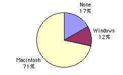
Pie Chart for Mac Data
The pie chart shows how many people in the study were previous Mac owners, previous Windows owners, or neither.
Pie charts are effective for displaying the relative frequencies of a small number of categories. They are not recommended, however, when you have a large number of categories. Pie charts can also be confusing when they are used to compare the outcomes of two different surveys or experiments.
Here is another important point about pie charts. If they are based on a small number of observations, it can be misleading to label the pie slices with percentages. For example, if just 5 people had been interviewed by Apple Computers, and 3 were former Windows users, it would be misleading to display a pie chart with the Windows slice showing 60%. With so few people interviewed, such a large percentage of Windows users might easily have accord since chance can cause large errors with small samples. In this case, it is better to alert the user of the pie chart to the actual numbers involved. The slices should therefore be labeled with the actual frequencies observed (e.g., 3) instead of with percentages.
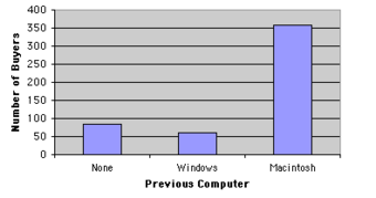
Bar Chart for Mac Data
The bar chart shows how many people in the study were previous Mac owners, previous Windows owners, or neither.
Bar charts can also be used to represent frequencies of different categories . Frequencies are shown on the Y axis and the type of computer previously owned is shown on the X axis. Typically the Y-axis shows the number of observations rather than the percentage of observations in each category as is typical in pie charts.
A misleading graph misrepresents data and may result in incorrectly derived conclusions.
In statistics, a misleading graph, also known as a distorted graph, is a graph which misrepresents data, constituting a misuse of statistics and with the result that an incorrect conclusion may be derived from it. Graphs may be misleading through being excessively complex or poorly constructed. Even when well-constructed to accurately display the characteristics of their data, graphs can be subject to different interpretation.
Misleading graphs may be created intentionally to hinder the proper interpretation of data, but can be also created accidentally by users for a variety of reasons including unfamiliarity with the graphing software, the misinterpretation of the data, or because the data cannot be accurately conveyed. Misleading graphs are often used in false advertising. One of the first authors to write about misleading graphs was Darrell Huff, who published the best-selling book How to Lie With Statistics in 1954. It is still in print.
There are numerous ways in which a misleading graph may be constructed. The use of graphs where they are not needed can lead to unnecessary confusion/interpretation. Generally, the more explanation a graph needs, the less the graph itself is needed. Graphs do not always convey information better than tables.
The use of biased or loaded words in the graph’s title, axis labels, or caption may inappropriately sway the reader.
When using pictogram in bar graphs, they should not be scaled uniformly as this creates a perceptually misleading comparison. The area of the pictogram is interpreted instead of only its height or width. This causes the scaling to make the difference appear to be squared.
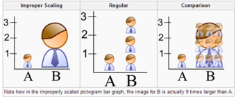
Improper Scaling
In the improperly scaled pictogram bar graph, the image for B is actually 9 times larger than A.
A truncated graph has a y-axis that does not start at zero. These graphs can create the impression of important change where there is relatively little change.Truncated graphs are useful in illustrating small differences. Graphs may also be truncated to save space. Commercial software such as MS Excel will tend to truncate graphs by default if the values are all within a narrow range.
Truncated Bar Graph
Both of these graphs display identical data; however, in the truncated bar graph on the left, the data appear to show significant differences, whereas in the regular bar graph on the right, these differences are hardly visible.
A perspective (3D) pie chart is used to give the chart a 3D look. Often used for aesthetic reasons, the third dimension does not improve the reading of the data; on the contrary, these plots are difficult to interpret because of the distorted effect of perspective associated with the third dimension. The use of superfluous dimensions not used to display the data of interest is discouraged for charts in general, not only for pie charts. In a 3D pie chart, the slices that are closer to the reader appear to be larger than those in the back due to the angle at which they’re presented .
Misleading 3D Pie Chart
In the misleading pie chart, Item C appears to be at least as large as Item A, whereas in actuality, it is less than half as large.
Graphs can also be misleading for a variety of other reasons. An axis change affects how the graph appears in terms of its growth and volatility. A graph with no scale can be easily manipulated to make the difference between bars look larger or smaller than they actually are. Improper intervals can affect the appearance of a graph, as well as omitting data. Finally, graphs can also be misleading if they are overly complex or poorly constructed.
Graphs are useful in the summary and interpretation of financial data. Graphs allow for trends in large data sets to be seen while also allowing the data to be interpreted by non-specialists. Graphs are often used in corporate annual reports as a form of impression management. In the United States, graphs do not have to be audited. Several published studies have looked at the usage of graphs in corporate reports for different corporations in different countries and have found frequent usage of improper design, selectivity, and measurement distortion within these reports. The presence of misleading graphs in annual reports have led to requests for standards to be set. Research has found that while readers with poor levels of financial understanding have a greater chance of being misinformed by misleading graphs, even those with financial understanding, such as loan officers, may be misled.
Qualitative frequency distributions can be displayed in bar charts, Pareto charts, and pie charts.
When data is collected from a survey or an experiment, they must be organized into a manageable form. Data that is not organized is referred to as raw data. A few different ways to organize data include tables, graphs, and numerical summaries.
One common way to organize qualitative, or categorical, data is in a frequency distribution. A frequency distribution lists the number of occurrences for each category of data.
The first step towards plotting a qualitative frequency distribution is to create a table of the given or collected data. For example, let’s say you want to determine the distribution of colors in a bag of Skittles. You open up a bag, and you find that there are 15 red, 7 orange, 7 yellow, 13 green, and 8 purple. Create a two column chart, with the titles of Color and Frequency, and fill in the corresponding data.
To construct a frequency distribution in the form of a bar graph, you must first draw two axes. The y-axis (vertical axis) should be labeled with the frequencies and the x-axis (horizontal axis) should be labeled with each category (in this case, Skittle color). The graph is completed by drawing rectangles of equal width for each color, each as tall as their frequency .
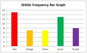
Bar Graph
This graph shows the frequency distribution of a bag of Skittles.
Sometimes a relative frequency distribution is desired. If this is the case, simply add a third column in the table called Relative Frequency. This is found by dividing the frequency of each color by the total number of Skittles (50, in this case). This number can be written as a decimal, a percentage, or as a fraction. If we decided to use decimals, the relative frequencies for the red, orange, yellow, green, and purple Skittles are respectively 0.3, 0.14, 0.14, 0.26, and 0.16. The decimals should add up to 1 (or very close to it due to rounding). Bar graphs for relative frequency distributions are very similar to bar graphs for regular frequency distributions, except this time, the y-axis will be labeled with the relative frequency rather than just simply the frequency. A special type of bar graph where the bars are drawn in decreasing order of relative frequency is called a Pareto chart .
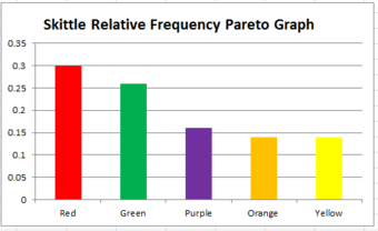
Pareto Chart
This graph shows the relative frequency distribution of a bag of Skittles.
The distribution can also be displayed in a pie chart, where the percentages of the colors are broken down into slices of the pie. This may be done by hand, or by using a computer program such as Microsoft Excel . If done by hand, you must find out how many degrees each piece of the pie corresponds to. Since a circle has 360 degrees, this is found out by multiplying the relative frequencies by 360. The respective degrees for red, orange, yellow, green, and purple in this case are 108, 50.4, 50.4, 93.6, and 57.6. Then, use a protractor to properly draw in each slice of the pie.
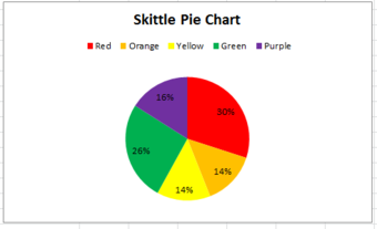
Pie Chart
This pie chart shows the frequency distribution of a bag of Skittles.
In statistical formulas that involve summing numbers, the Greek letter sigma is used as the summation notation.
Many statistical formulas involve summing numbers. Fortunately there is a convenient notation for expressing summation. This section covers the basics of this summation notation.
Summation is the operation of adding a sequence of numbers, the result being their sum or total. If numbers are added sequentially from left to right, any intermediate result is a partial sum, prefix sum, or running total of the summation. The numbers to be summed (called addends, or sometimes summands) may be integers, rational numbers, real numbers, or complex numbers. Besides numbers, other types of values can be added as well: vectors, matrices, polynomials and, in general, elements of any additive group. For finite sequences of such elements, summation always produces a well-defined sum.
The summation of the sequence [1, 2, 4, 2] is an expression whose value is the sum of each of the members of the sequence. In the example, 1+2+4+2=9. Since addition is associative, the value does not depend on how the additions are grouped. For instance (1+2) + (4+2) and 1 + ((2+4) + 2) both have the value 9; therefore, parentheses are usually omitted in repeated additions. Addition is also commutative, so changing the order of the terms of a finite sequence does not change its sum.
There is no special notation for the summation of such explicit sequences as the example above, as the corresponding repeated addition expression will do. If, however, the terms of the sequence are given by a regular pattern, possibly of variable length, then a summation operator may be useful or even essential.
For the summation of the sequence of consecutive integers from 1 to 100 one could use an addition expression involving an ellipsis to indicate the missing terms: 1+2+3+4+⋯+99+100">. In this case the reader easily guesses the pattern; however, for more complicated patterns, one needs to be precise about the rule used to find successive terms. This can be achieved by using the summation notation “Σ"> ” Using this sigma notation, the above summation is written as:
∑i=1100i">
In general, mathematicians use the following sigma notation: ∑i=mnai">
In this notation, i">represents the index of summation, ai"> is an indexed variable representing each successive term in the series, m"> is the lower bound of summation, and n"> is the upper bound of summation. The “i=m">” under the summation symbol means that the index i"> starts out equal to m">. The index, i">, is incremented by 1 for each successive term, stopping when i=n">.
Here is an example showing the summation of exponential terms (terms to the power of 2):
∑i=3612=32+42+52+62=86">
Informal writing sometimes omits the definition of the index and bounds of summation when these are clear from context, as in:
∑ai2=∑i=1nai2">
One often sees generalizations of this notation in which an arbitrary logical condition is supplied, and the sum is intended to be taken over all values satisfying the condition. For example, the sum of f(k)">over all integers k"> in the specified range can be written as: ∑0≤k">
The sum of f(x)">over all elements x"> in the set S"> can be written as: ∑xϵSf(x)">
We can learn much more by displaying bivariate data in a graphical form that maintains the pairing of variables.
Compare the strengths and weaknesses of the various methods used to graph bivariate data.
Measures of central tendency, variability, and spread summarize a single variable by providing important information about its distribution. Often, more than one variable is collected on each individual. For example, in large health studies of populations it is common to obtain variables such as age, sex, height, weight, blood pressure, and total cholesterol on each individual. Economic studies may be interested in, among other things, personal income and years of education. As a third example, most university admissions committees ask for an applicant’s high school grade point average and standardized admission test scores (e.g., SAT). In the following text, we consider bivariate data, which for now consists of two quantitative variables for each individual. Our first interest is in summarizing such data in a way that is analogous to summarizing univariate (single variable) data.
By way of illustration, let’s consider something with which we are all familiar: age. More specifically, let’s consider if people tend to marry other people of about the same age. One way to address the question is to look at pairs of ages for a sample of married couples. Bivariate Sample 1 shows the ages of 10 married couples. Going across the columns we see that husbands and wives tend to be of about the same age, with men having a tendency to be slightly older than their wives.
| Couple | A | B | C | D | E | F | G | H | I | J |
|---|---|---|---|---|---|---|---|---|---|---|
| Husband | 36 | 72 | 37 | 36 | 51 | 50 | 47 | 50 | 37 | 41 |
| Wife | 35 | 67 | 33 | 35 | 50 | 46 | 47 | 42 | 36 | 41 |
Bivariate Sample 1
Sample of spousal ages of 10 white American couples.
These pairs are from a dataset consisting of 282 pairs of spousal ages (too many to make sense of from a table). What we need is a way to graphically summarize the 282 pairs of ages, such as a histogram. as in .
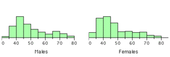
Bivariate Histogram
Histogram of spousal ages.
Each distribution is fairly skewed with a long right tail. From the first figure we see that not all husbands are older than their wives. It is important to see that this fact is lost when we separate the variables. That is, even though we provide summary statistics on each variable, the pairing within couples is lost by separating the variables. Only by maintaining the pairing can meaningful answers be found about couples, per se.
Therefore, we can learn much more by displaying the bivariate data in a graphical form that maintains the pairing. shows a scatter plot of the paired ages. The x-axis represents the age of the husband and the y-axis the age of the wife.
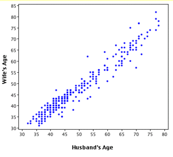
Bivariate Scatterplot
Scatterplot showing wife age as a function of husband age.
There are two important characteristics of the data revealed by this figure. First, it is clear that there is a strong relationship between the husband’s age and the wife’s age: the older the husband, the older the wife. When one variable increases with the second variable, we say that x and y have a positive association. Conversely, when y decreases as x increases, we say that they have a negative association. Second, the points cluster along a straight line. When this occurs, the relationship is called a linear relationship.
The presence of qualitative data leads to challenges in graphing bivariate relationships. We could have one qualitative variable and one quantitative variable, such as SAT subject and score. However, making a scatter plot would not be possible as only one variable is numerical. A bar graph would be possible.
If both variables are qualitative, we would be able to graph them in a contingency table. We can then use this to find whatever information we may want. In , this could include what percentage of the group are female and right-handed or what percentage of the males are left-handed.
| Right-handed | Left-handed | Total | |
|---|---|---|---|
| Males | 43 | 9 | 52 |
| Females | 44 | 4 | 48 |
| Totals | 87 | 13 | 100 |
Contingency Table
Contingency tables are useful for graphically representing qualitative bivariate relationships.
VII
Perhaps the most valuable feature of Excel is its ability to produce mathematical outputs using the data in a workbook. This chapter reviews several mathematical outputs that you can produce in Excel through the construction of formulas and functions. The chapter begins with the construction of formulas for basic and complex mathematical computations. The second section reviews statistical functions, such as SUM, AVERAGE, MIN, and MAX, which can be applied to a range of cells. The last section of the chapter addresses functions used to calculate mortgage and lease payments as well as the valuation of investments. This chapter also shows how you can use data from multiple worksheets to construct formulas and functions. These skills will be demonstrated in the context of a personal cash budget, which is a vital tool for managing your money for long-term financial security. The personal budget objective will also provide you with several opportunities to demonstrate Excel’s what-if scenario capabilities, which highlight how formulas and functions automatically produce new outputs when one or more inputs are changed.
Adapted by Mary Schatz from How to Use Microsoft Excel: The Careers in Practice Series, adapted by The Saylor Foundation without attribution as requested by the work’s original creator or licensee, and licensed under CC BY-NC-SA 3.0.
This section reviews the fundamental skills for entering formulas into an Excel worksheet. The example used for this chapter is the construction of a personal budget. Most financial advisors recommend that all households construct and maintain a personal budget to achieve and maintain strong financial health. Organizing and maintaining a personal budget is a skill you can practice at any point in your life. Whether you are managing your expenses during college or maintaining the finances of a family of four, a personal budget can be a vital tool when making financial decisions. Excel can make managing your money a fun and rewarding exercise.
Download Data File: CH2 Data
Figure 2.1 shows the completed workbook that will be demonstrated in this chapter. Notice that this workbook contains four worksheets. The first worksheet, Budget Summary, serves as an overview of the data that was entered and calculated in the second and third worksheets, Budget Detail and Loan Payments. The second worksheet, Budget Detail, provides a detailed list of all the expenses and the third worksheet, Loan Payments, provides information regarding car payment and mortgage payment amounts. The last worksheet, Prepare to Print, has data that is unrelated to the budget worksheets but will be used in Section 2.4 – Preparing to Print.
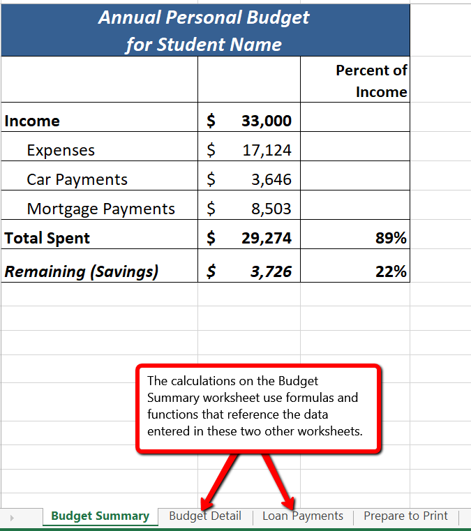
When formulas and cell references are used Excel will automatically recalculate when data is changed
Formulas are used to calculate a variety of mathematical outputs in Excel and can be used to create virtually any custom calculation required for your objective. Furthermore, when constructing a formula in Excel, you use cell addresses that, when added to a formula, become cell references. This means that Excel uses, or references, the number entered into the cell location when performing the calculation. As a result, when the numbers in the cells that are referenced are changed, Excel automatically recalculates the formula and produces a new result. This is what gives Excel the ability to create a variety of what-if scenarios, which will be explained later in the chapter.
To demonstrate the construction of a basic formula, we will begin working on the Budget Detail worksheet, which is shown in Figure 2.2. To complete this worksheet, we will enter some data, and then create several formulas and functions. Table 2.1 provides definitions for each of the spend categories listed in the range A3:A11. When you develop a personal budget, these categories are defined on the basis of how you spend your money. It is likely that every person could have different categories or define the same categories differently. Therefore, it is important to review the definitions in Table 2.1 to understand how we are defining these categories before proceeding.
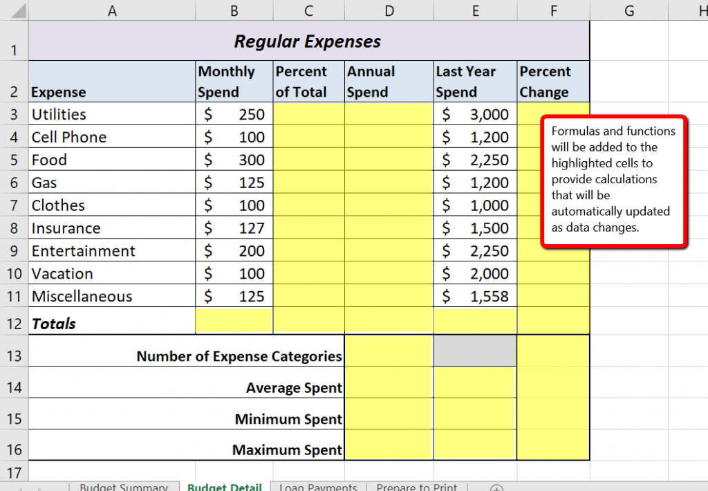
Table 2.1 Spend Category Definitions
| Category | Definition |
| Utilities | Electricity, heat, water, home phone, cable, Internet access |
| Cell Phone | Cell phone plan and equipment charges |
| Food | Groceries |
| Gas | Cost of gas for vehicle |
| Clothes | Clothes, shoes, and accessories |
| Insurance | Renter, homeowner, and/or car insurance |
| Entertainment | Activities like dining out, movie and theater tickets, parties, and so on |
| Vacation | Vacation expenses |
| Miscellaneous | Any other spending categories |
The amount of money spent each month for each category, as well as the amount of money spent last year, is already entered into the worksheet. We will write formulas that will calculate the annual (yearly) amount spent, the percent of the total spent each category represents, as well as the percent change from last year’s spending to the current year.
The first formula will calculate the Annual Spend values. The formula will be constructed so that it takes the values in the Monthly Spend column and multiplies them by 12 (the number of months in a year). This will show how much money will be spent per year for each of the categories listed in Column A. Since the first category is Utilities, we will start by creating the formula to multiply the Monthly Spend amount in B3 by 12. This formula will be created in D3 – the Annual Spend cell for the Utilities category. This formula will be written as: =B3*12
Table 2.2 Excel Mathematical Operators (move up)
| Symbol | Operation |
| + | Addition |
| − | Subtraction |
| / | Division |
| * | Multiplication |
| ^ | Power/Exponent |
Use Cell References
Cell references enable Excel to automatically recalculate when one or more inputs in the referenced cells are changed. Cell references also allow you to trace how results are being calculated in a formula. You should never use a calculator to determine a mathematical output and type it into the cell location of a worksheet. Doing so eliminates Excel’s cell-referencing benefits as well as your ability to trace a formula to determine how results are being calculated.
Use Universal Constants
There will be times when you are writing formulas that you will need to use universal constants, or numbers that do not change, such as the number of days in a week, weeks or months in a year, and so on. For example, if you are calculating the monthly cost of an item when you know the yearly cost, you will always divide by 12 since there are 12 months in a year. In this case, you use the constant of 12 instead of a cell reference because the number of months in a year never changes.
Figure 2.3 shows how the formula appears in cell D3 before you press the ENTER key. Figure 2.4 shows the result of the formula after you press the ENTER key, as well as the formula bar which displays the formula as it was entered in the cell.
The Annual Spend for Utilities is $3,000 because the formula is taking the Monthly Spend in cell B3 and multiplying it by 12. If the value in cell B3 is changed, the formula automatically produces a new result.
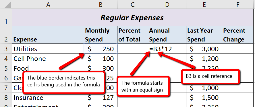
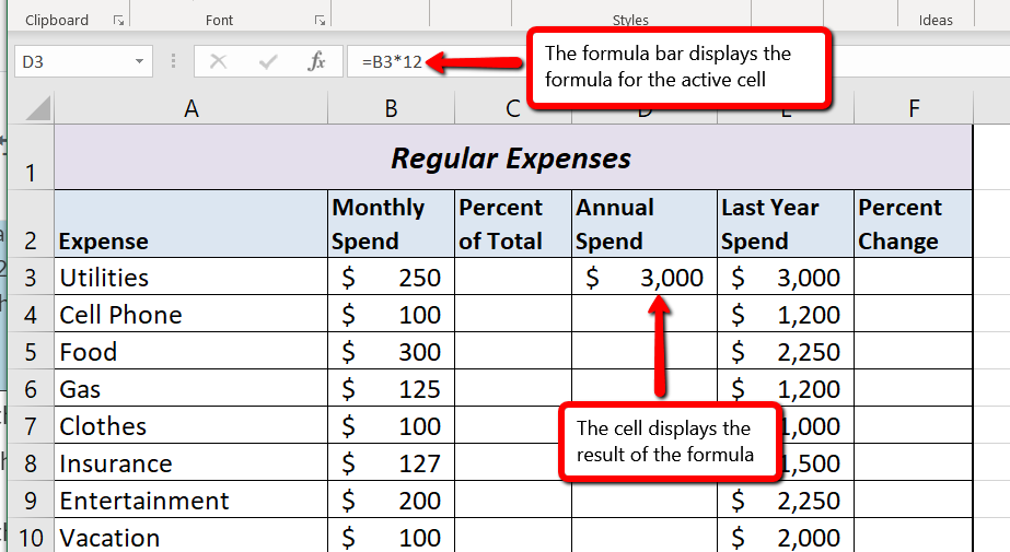
Once a formula is typed into a worksheet, it can be copied and pasted to other cell locations. For example, in cell D3 we have calculated the annual spend for the Utilities category, but this calculation needs to be performed for the rest of the cell locations in Column D. Since we used the B3 cell reference in the formula, Excel automatically adjusts that cell reference when the formula is copied and pasted into the rest of the cell locations in the column. This is called relative referencing and is demonstrated as follows:
Figure 2.5 shows the results added to the rest of the cell locations in the Annual Spend column. For each row, the formula takes the value in the Monthly Spend column and multiplies it by 12. You will also see that cell D6 has been double clicked to show the formula. Notice that Excel automatically changed the original cell reference of B3 to B6. This is the result of relative referencing, which means Excel automatically adjusts a cell reference relative to its original location when it is pasted into new cell locations. In this example, the formula was pasted into eight cell locations below the original cell location. As a result, Excel increased the row number of the original cell reference by a value of one for each row it was pasted into.
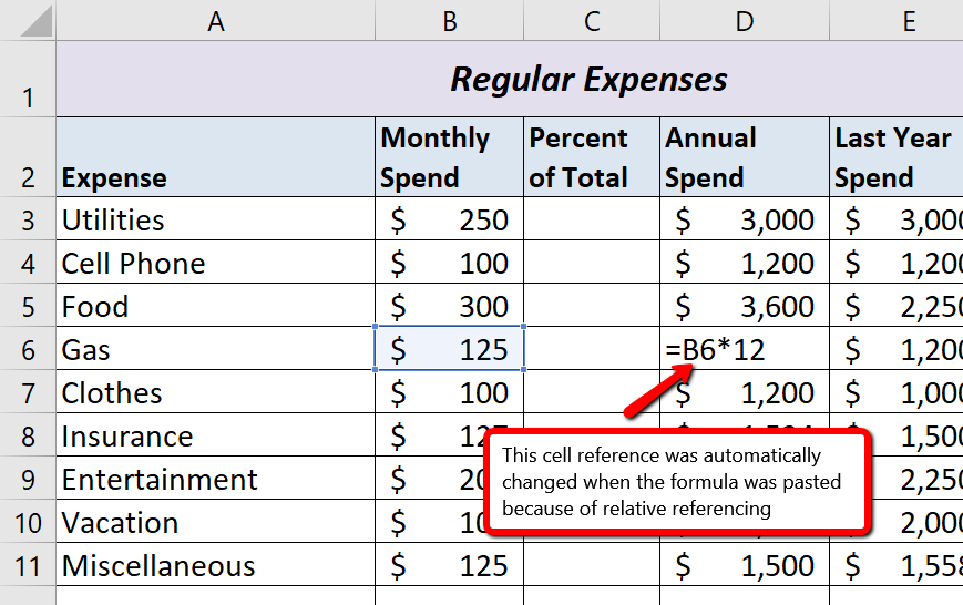
Use Relative Referencing
Relative referencing is a convenient feature in Excel. When you use cell references in a formula, Excel automatically adjusts the cell references when the formula is pasted into new cell locations. If this feature were not available, you would have to manually retype the formula when you want the same calculation applied to other cell locations in a column or row.
The next formula to be added to the Personal Budget workbook is the percent change over last year (Column F). This formula determines the difference between this year’s Annual Spend values (Column D) and the values in the Last Year Spend column (Column E) and shows the difference in terms of a percentage. This requires that the order of mathematical operations be controlled to get an accurate result.
Excel uses the standard mathematical order of operations, as defined in Table 2.3. When writing complex formulas it is important to remember this order of operations. You want to be sure that your formulas will calculate in the order you intend. To help you remember which operations will be performed first, you can use the acronym PEMDAS.
P – parentheses
E – exponents
MD – multiplication and division
AS – addition and subtraction
Table 2.3 shows the standard order of operations (PEMDAS) for a typical formula. To change the order of operations shown in the table, you can use parentheses to process certain mathematical calculations first.
Table 2.3 Standard Order of Mathematical Operations (PEMDAS)
| Symbol | Order |
| ( ) | Any calculation inside parentheses will be done first. If there are layers of parentheses used in a formula, Excel computes the innermost parentheses first and the outermost parentheses last. |
| ^ | Excel executes any exponential computations next. |
| * or / | Excel performs any multiplication or division computations next. When there are multiple instances of these computations in a formula, they are executed in order from left to right. |
| + or − | Excel performs any addition or subtraction computations last. When there are multiple instances of these computations in a formula, they are executed in order from left to right. |
To create the Percent Change formula, we will need to use parentheses to control the order of the calculations. We need the difference of the two values to be found before the division is done, so we will use parentheses around the subtraction portion of the formula to indicate that calculation needs to be done first. This formula is added to the worksheet as follows:
Figure 2.6 shows the formula that was added to the Budget Detail worksheet to calculate the percent change in spending. The parentheses were added to this formula to control the order of operations. Any mathematical computations placed in parentheses are executed first before the standard order of mathematical operations (see Table 2.3). In this case, if parentheses were not used, Excel would produce an erroneous result for this worksheet.
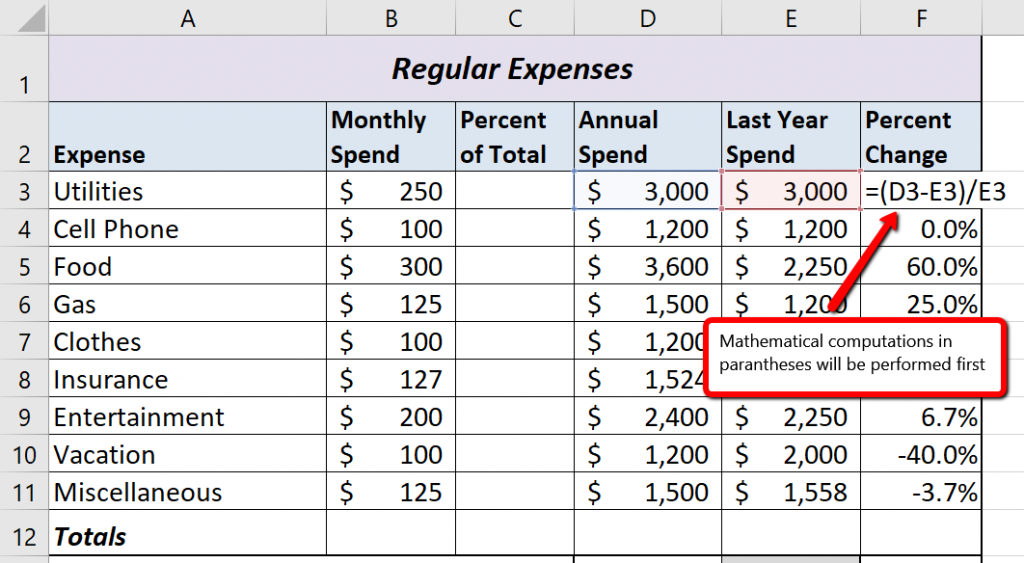
Figure 2.7 shows the result of the percent change formula if the parentheses are removed. The formula produces a result of a 299900% increase. Since there is no change between the LY spend and the budget Annual Spend, the result should be 0%. However, without the parentheses, Excel is following the standard order of operations. This means the value in cell E3 will be divided by E3 first (3,000/3,000), which is 1. Then, the value of 1 will be subtracted from the value in cell D3 (3,000−1), which is 2,999. Since cell F3 is formatted as a percentage, Excel expresses the output as an increase of 299900%.
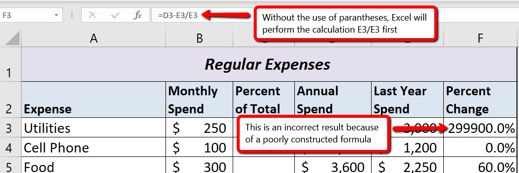
Does the Output of Your Formula Make Sense?
It is important to note that the accuracy of the output produced by a formula depends on how it is constructed. Therefore, always check the result of your formula to see whether it makes sense with data in your worksheet. As shown in Figure 2.7, a poorly constructed formula can give you an inaccurate result. In other words, you can see that there is no change between the Annual Spend and LY Spend for Household Utilities. Therefore, the result of the formula should be 0%. However, since the parentheses were removed in this case, the formula is clearly producing an erroneous result.
Formulas
Excel provides a few tools that you can use to review the formulas entered into a worksheet. For example, instead of showing the outputs for the formulas used in a worksheet, you can have Excel show the formula as it was entered in the cell locations. This is demonstrated as follows:
You can also toggle Show Formulas on and off using the keyboard. Hold down the CTRL key while pressing the ` key.
Figure 2.8 shows the Budget Detail worksheet after activating the Show Formulas command in the Formulas tab of the Ribbon. As shown in the figure, this command allows you to view and check all the formulas in a worksheet without having to click each cell individually. After activating this command, the column widths in your worksheet increase significantly. The column widths were adjusted for the worksheet shown in Figure 2.8 so all columns can be seen. The column widths return to their previous width when the Show Formulas command is deactivated.
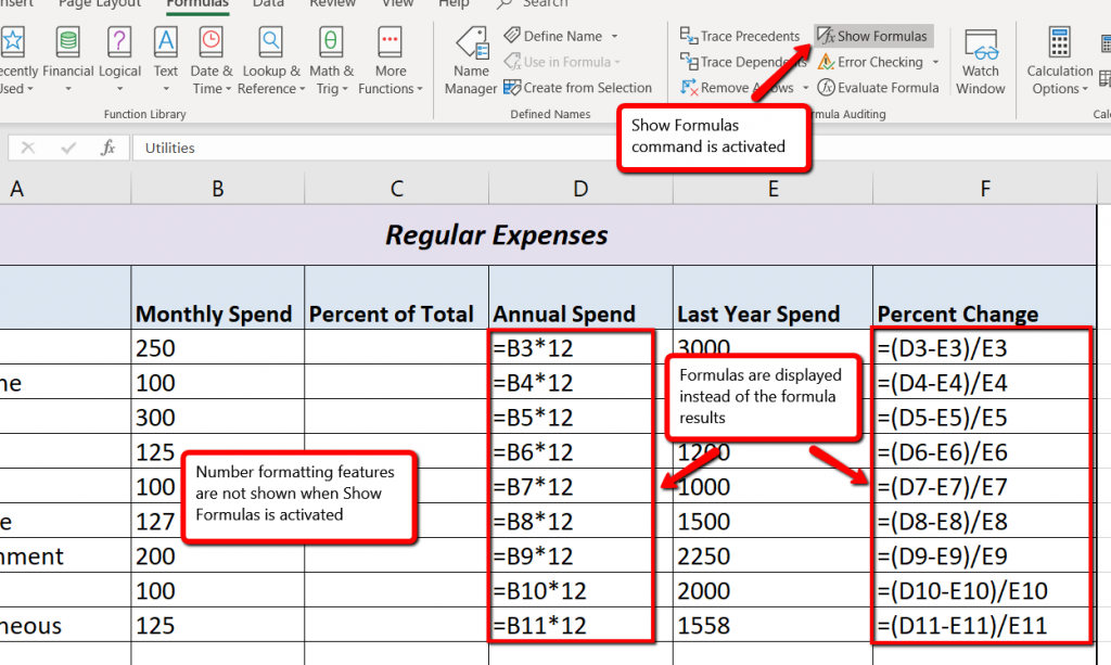
Show Formulas
Show Formulas
Two other tools in the Formula Auditing group of commands are the Trace Precedents and Trace Dependents commands. These commands are used to trace the cell references used in a formula. A precedent cell is a cell whose value is used in other cells. The Trace Precedents command shows an arrow to indicate the cells or ranges (precedents) which affect the active cell’s value. A dependent cell is a cell whose value depends on the values of other cells in the workbook. The Trace Dependents command shows where any given cell is referenced in a formula. The following is a demonstration of these commands:
Figure 2.9 shows the Trace Dependents arrow on the Budget Detail worksheet. The blue dot represents the activated cell. The arrows indicate where the cell is referenced in formulas.
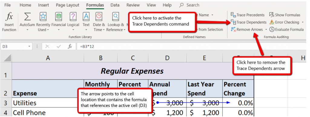
Figure 2.10 shows the Trace Precedents arrow on the Budget Detail worksheet. The blue dots on this arrow indicate the cells that are referenced in the formula contained in the activated cell. The arrow is pointing to the activated cell location that contains the formula.
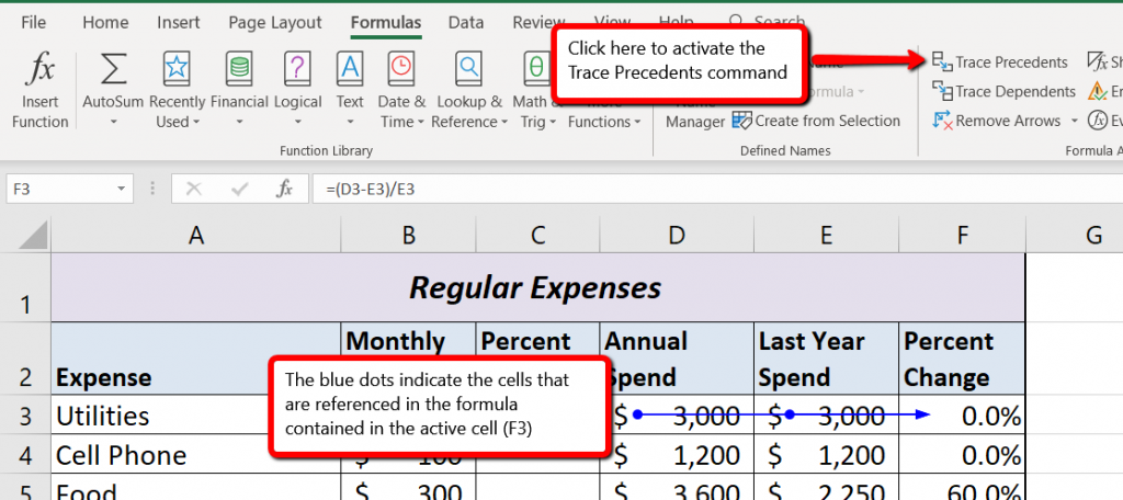
Trace Dependents
Trace Precedents
Adapted by Mary Schatz from How to Use Microsoft Excel: The Careers in Practice Series, adapted by The Saylor Foundation without attribution as requested by the work’s original creator or licensee, and licensed under CC BY-NC-SA 3.0.
In addition to formulas, another way to conduct mathematical computations in Excel is through functions. Excel functions apply a mathematical process to a group of cells in a worksheet. For example, the SUM function is used to add the values contained in a range of cells. Functions are more efficient than formulas when you are applying a mathematical process to a group of cells. If you use a formula to add the values in a range of cells, you would have to add each cell location to the formula one at a time. This can be very time-consuming if you have to add the values in a few hundred cell locations. However, when you use a function, you can highlight all the cells that contain values you wish to sum in just one step.
The components of a function are as follows:
=FunctionName(Arguments)
Functions are a type of formula, therefore they start with an equal sign. The next component is the name of the function. A list of commonly used functions is shown in Table 2.4. After the function name comes the arguments for the function, which are always enclosed in parentheses. The arguments are the cell locations and/or values that will be used in the function. The number and type of arguments varies based on the the function being used, although in this section we will only work with a range of cells for the function arguments. Some examples of different functions with their arguments are:
=SUM(B2:B15) – adds the values in B2 through B15
=SQRT(A5) – finds the square root of the value in A5
=COUNTA(A1:A20) – finds the number of cells from A1 through A20 that contain text or a number
Throughout Section 2.2 we will add a variety of mathematical functions to the Personal Budget workbook. In addition to creating functions, this section also reviews percent of total calculations and the use of absolute references.
Table 2.4 Commonly Used Functions
| Function | Output |
| ABS | The absolute value of a number |
| AVERAGE | The average or arithmetic mean for a group of numbers |
| COUNT | The number of cell locations in a range that contain a numeric value |
| COUNTA | The number of cell locations in a range that contain text or a numeric value |
| MAX | The highest numeric value in a group of numbers |
| MEDIAN | The middle number in a group of numbers (half the numbers in the group are higher than the median and half the numbers in the group are lower than the median) |
| MIN | The lowest numeric value in a group of numbers |
| MODE | The number that appears most frequently in a group of numbers |
| PRODUCT | The result of multiplying all the values in a range of cell locations |
| SQRT | The positive square root of a number |
| SUM | The total of all numeric values in a group |
It is important to note that there are several methods for adding a function to a worksheet, and we will explore each of them throughout this section.
The SUM function is used when you need to calculate totals for a range of cells or a group of selected cells on a worksheet. With regard to the Budget Detail worksheet, we will use the SUM function to calculate the totals in row 12, starting with the Monthly Spend total in B12. The following illustrates how a function can be added to a worksheet by typing it into a cell location:
Figure 2.11 shows the appearance of the SUM function added to the Budget Detail worksheet before pressing the ENTER key.
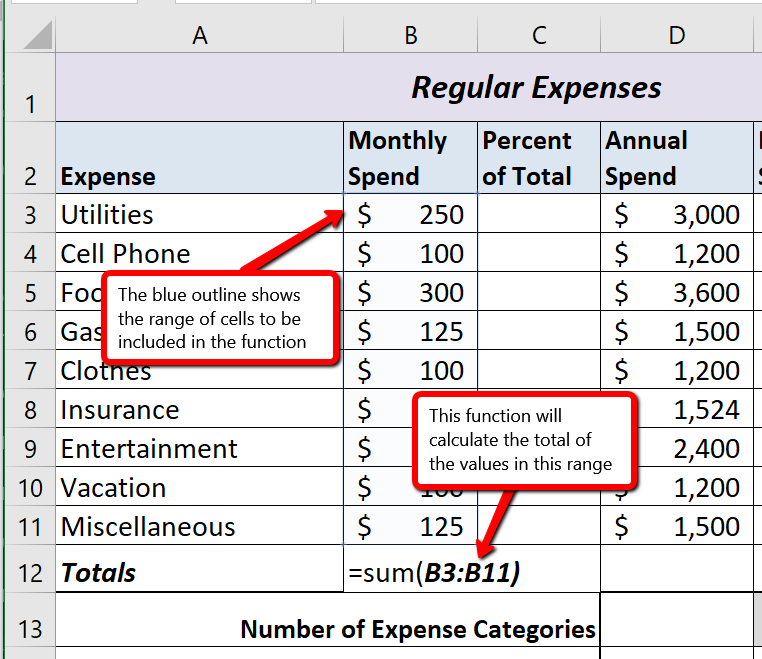
As shown in Figure 2.11, the SUM function was added to cell B12. However, this function is also needed to calculate the totals in the Annual Spend and Last Year Spend columns. The function can be copied and pasted into these cell locations because of relative referencing. Relative referencing serves the same purpose for functions as it does for formulas. To complete the Totals in row 12, we need to copy and paste the SUM function into D12 and E12. Since we will then have totals in D12 and E12, we can paste the percent change formula into F12.
Figure 2.12 shows the output of the SUM function that was added to cells B12, D12, and E12. In addition, the percent change formula was copied and pasted into cell F12. Notice that this version of the budget is planning an increase in spending compared to last year.
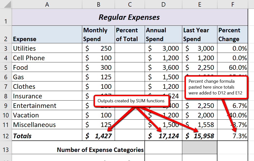
Cell Ranges in Functions
When you intend to use a function on a range of cells in a worksheet, make sure there are two cell locations separated by a colon and not a comma. If you enter two cell locations separated by a comma, the function will calculate only the two cell locations listed instead of an entire range of cells. For example, the SUM function shown in Figure 2.13 will add only the values in cells C3 and C11, not the range C3:C11.
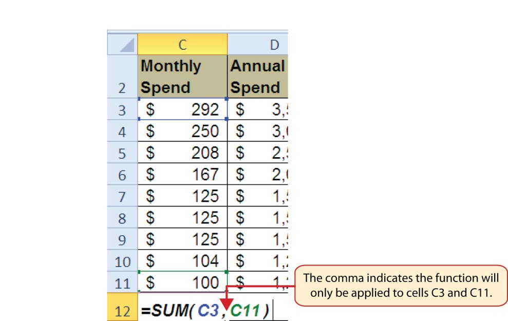
Data file: Continue with CH2 Personal Budget.
The next function that we will add to the Budget Detail worksheet is the COUNT function. The COUNT function is used to determine how many cells in a range contain a numeric entry. The COUNT function will not work for counting text or other non-numeric entries. If you want to count text instead of, or in addition to, numeric entries you use the COUNTA function. For the Budget Detail worksheet, we will use the COUNT function to count the number of items that are planned in the Annual Spend column (Column D). The following explains how the COUNT function is added to the worksheet by selecting from the function list:
Figure 2.14 shows the function list box that appears after completing steps 2 and 3 for the COUNT function. The function list provides an alternative method for adding a function to a worksheet.
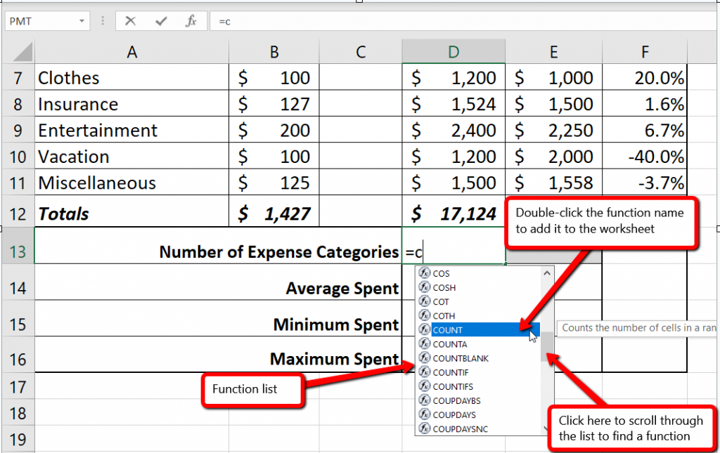
Figure 2.15 shows the output of the COUNT function after pressing the ENTER key. The function counts the number of cells in the range D3:D11 that contain a numeric value. The result of 9 indicates that there are 9 categories planned for this budget.
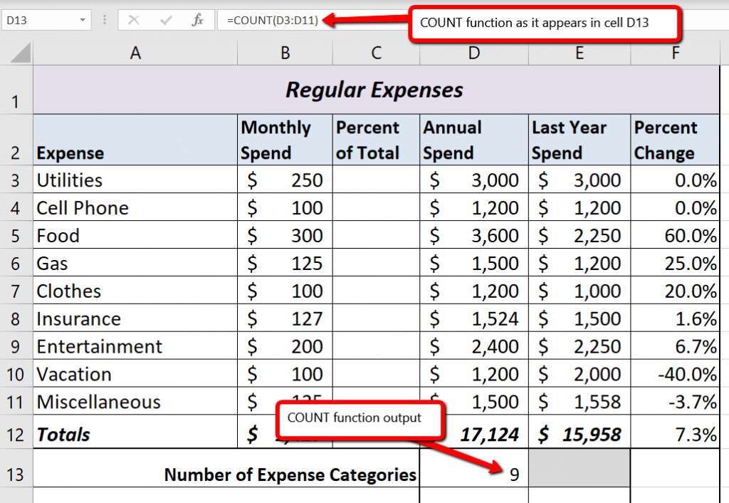
The next function we will add to the Budget Detail worksheet is the AVERAGE function. This function is used to calculate the arithmetic mean for a group of numbers. For the Budget Detail worksheet, we will use the function to calculate the average of the values in the Annual Spend column. We will add this to the worksheet by using the Function Library on the Formulas ribbon. The following steps explain how this is accomplished:
Figure 2.16 illustrates how a function is selected from the Function Library in the Formulas tab of the Ribbon.
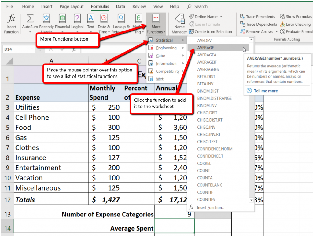
Figure 2.17 shows the Function Arguments dialog box. This appears after a function is selected from the Function Library. The Collapse Dialog button is used to hide the dialog box so a range of cells can be highlighted on the worksheet and then added to the function.
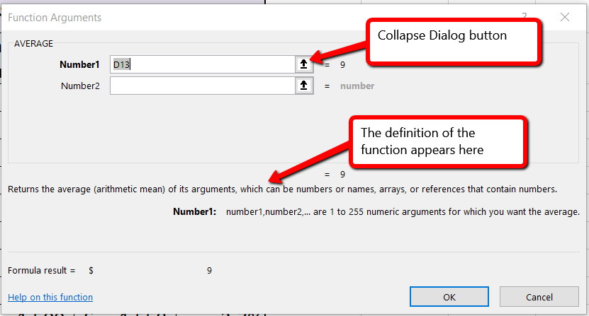
Figure 2.18 shows how a range of cells can be selected from the Function Arguments dialog box once it has been collapsed.
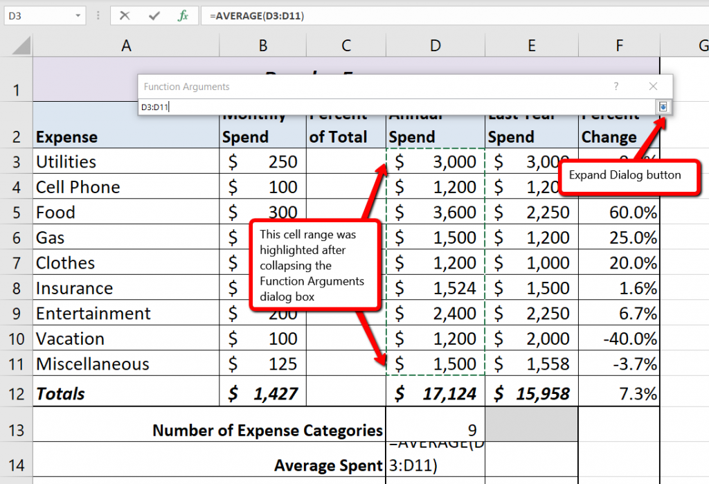
Figure 2.19 shows the Function Arguments dialog box after the cell range is defined for the AVERAGE function. The dialog box shows the result of the function before it is added to the cell location. This allows you to assess the function output to determine whether it makes sense before adding it to the worksheet.
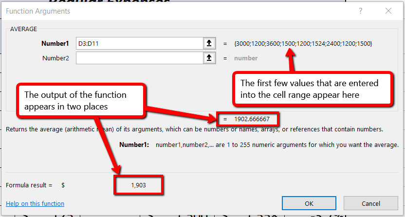
Figure 2.20 shows the completed AVERAGE function in the Budget Detail worksheet. The output of the function shows that on average we expect to spend $1,903 for each of the categories listed in Column A of the budget. This average spend calculation per category can be used as an indicator to determine which categories are costing more or less than the average budgeted spend dollars.
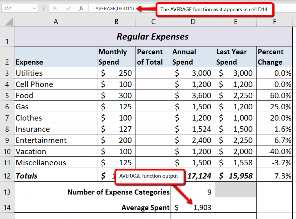
Data file: Continue with CH2 Personal Budget.
The final two statistical functions that we will add to the Budget Detail worksheet are the MAX and MIN functions. These functions identify the highest and lowest values in a range of cells. The following steps explain how to add these functions to the Budget Detail worksheet using the Insert Function button:
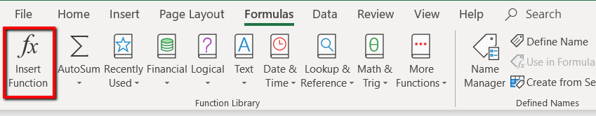
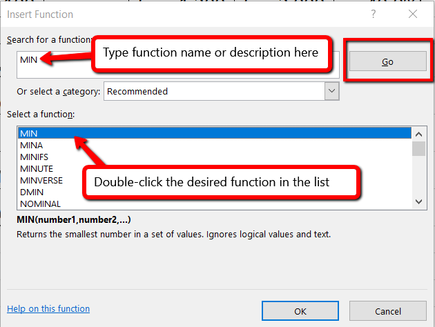
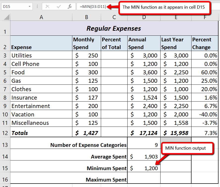
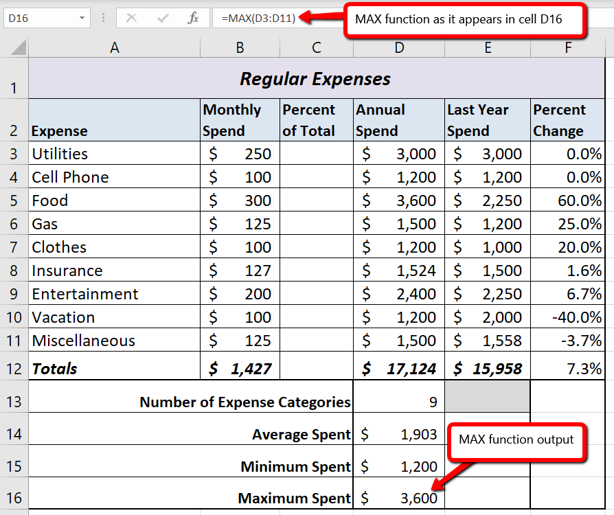
Typing a function or selecting from the function list
Inserting a function using the ribbon
Inserting (and searching for) a function using the Insert Function button
Data file: Continue with CH2 Personal Budget.
As shown in Figure 2.24, the COUNT, AVERAGE, MIN, and MAX functions are summarizing the data in the Annual Spend column. You will also notice that there is space to copy and paste these functions under the Last Year Spend column. This allows us to compare what we spent last year and what we are planning to spend this year. Normally, we would simply copy and paste these functions into the range E14:E16. However, you may have noticed the thicker style border that was used around the perimeter of the range D13:E16. If we used the regular Paste command, the thick line on the right side of the range D13:E16 would be replaced with a single line. Therefore, we are going to use one of the Paste Special commands to paste only the functions without any of the formatting treatments. This is accomplished through the following steps:
Figure 2.25 shows the list of buttons that appear when you click the down arrow below the Paste button in the Home tab of the Ribbon. One thing to note about these options is that you can preview them before you make a selection by dragging the mouse pointer over the options. When the mouse pointer is placed over the Formulas button, you can see how the functions will appear before making a selection. Notice that the thick line border does not change when this option is previewed. That is why this selection is made instead of the regular Paste option.
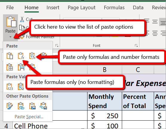
Paste Formulas without formatting
Data file: Continue with CH2 Personal Budget.
To further analyze your budget, you want to see what percentage of your total monthly spending is spent in each category. Since totals were added to row 12 of the Budget Detail worksheet, a percent of total calculation can be added to Column C beginning in cell C3. The percent of total calculation shows the percentage for each value in the Monthly Spend column with respect to the total in cell B12. However, after the formula is created, it will be necessary to turn off Excel’s relative referencing feature before copying and pasting the formula to the rest of the cell locations in the column. Turning off Excel’s relative referencing feature is accomplished through an absolute reference.
First we will create the formula, which needs needs to divide the amount in B3 by the total monthly spend in B12.
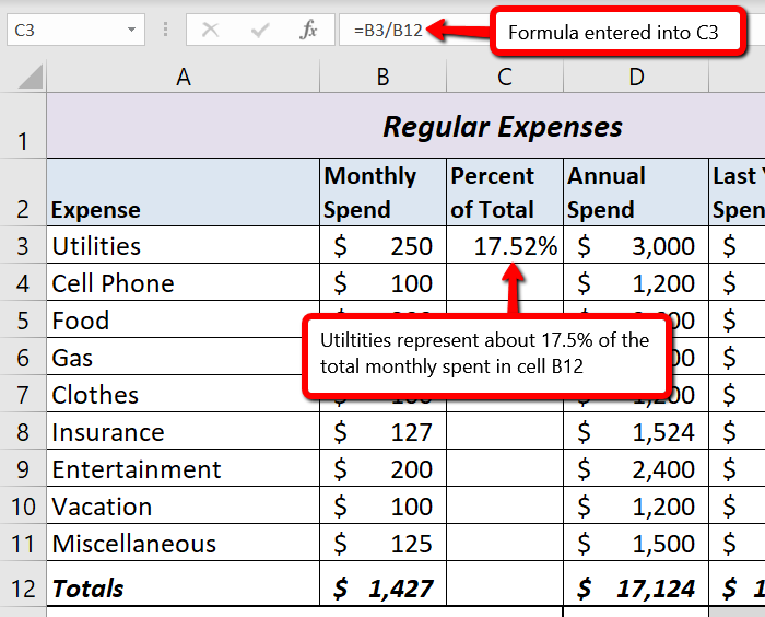
Figure 2.26 shows the completed formula that is calculating the percentage that Utilities represents to the total Monthly Spend for the budget (see cell C3). Normally, we would copy this formula and paste it into the range C4:C11. However, because of relative referencing, both cell references will increase by one row as the formula is pasted into the cells below C3. This is fine for the first cell reference in the formula (C3) but not for the second cell reference (C12).
Figure 2.27 illustrates what happens if we paste the formula into the range C4:C12 in its current state. Notice that Excel produces the #DIV/0 error code. This means that Excel is trying to divide a number by zero, which is impossible. Looking at the formula in cell C4, you see that the first cell reference was changed from B3 to B4. This is fine because we now want to divide the Monthly Spend for Cell Phone (cell B4) by the total Monthly Spend in cell B12. However, Excel has also changed the B12 cell reference to B13. Because cell location B13 does not contain a number, the formula produces the #DIV/0 error code.
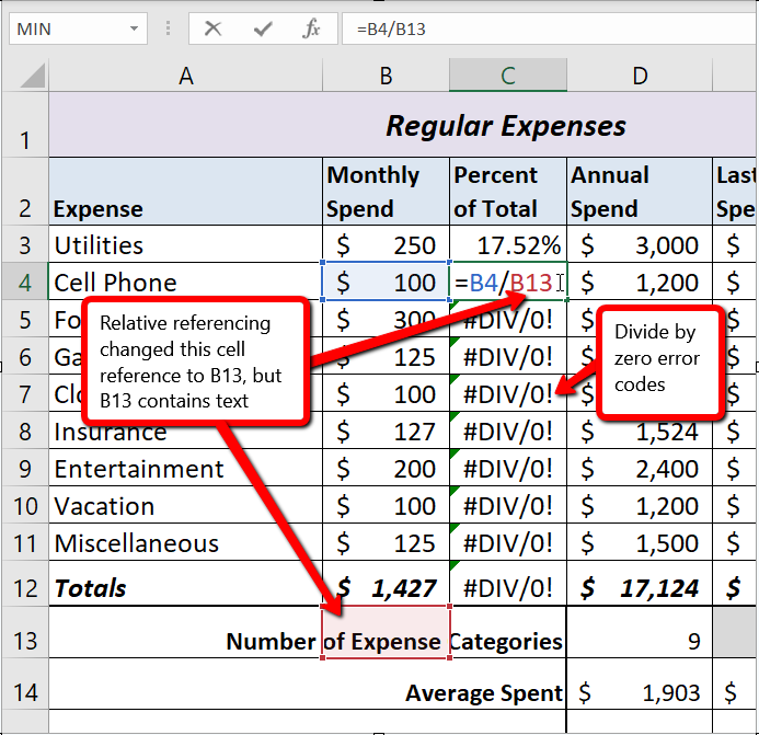
To eliminate the divide-by-zero error shown in Figure 2.27 we must add an absolute reference to cell B12 in the formula. An absolute reference prevents relative referencing from changing a cell reference in a formula. This is also referred to as locking a cell. No matter where you copy a formula with an absolute reference, it will always refer back to the locked cell. An absolute reference is indicated by a $ sign in front of both the column letter and the row number. For example, $A$15 is an absolute reference to cell A15.
$A$15 is an example of
an absolute reference
We are going to modify the existing formula in C3 to make the reference to cell B12 an absolute reference. The following explains how this is accomplished:
Figure 2.28 shows the percent of total formula with an absolute reference added to B12. Notice that in cell C4, the cell reference remains B12 instead of changing to B13. Also, you will see that the percentages are being calculated in the rest of the cells in the column, and the divide-by-zero error is now eliminated.
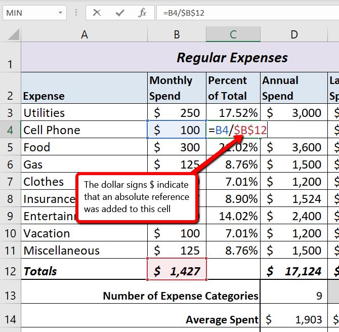
Absolute References
Data file: Continue with CH2 Personal Budget.
The Budget Detail worksheet shown in Figure 2.28 is now producing several mathematical outputs through formulas and functions. The outputs allow you to analyze the details and identify trends as to how money is being budgeted and spent. Before we draw some conclusions from this worksheet, we will sort the data based on the Percent of Total column. Sorting is a powerful tool that enables you to analyze key trends in any data set. Sorting will be covered thoroughly in a later chapter, but will be briefly introduced here.
For the purposes of the Budget Detail worksheet, we want to set multiple levels for the sort order. We are going to sort first by the Percent of Total, and then by the Last Year Spend amount. Excel will first sort the items by the Percent of Total, and any items with the same Percent of Total will then be sorted by Last Year Spend. This is accomplished through the following steps:
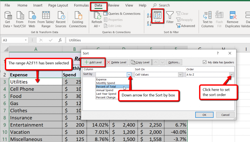
Figure 2.30 shows the Budget Detail worksheet after it has been sorted. Notice that there are three identical values in the Percent of Total column. This is why a second sort level had to be created for this worksheet. The second sort level arranges the values of 7.01% based on the values in the Last Year Spend column in ascending order. Excel gives you the option to set as many sort levels as necessary for the data contained in a worksheet.
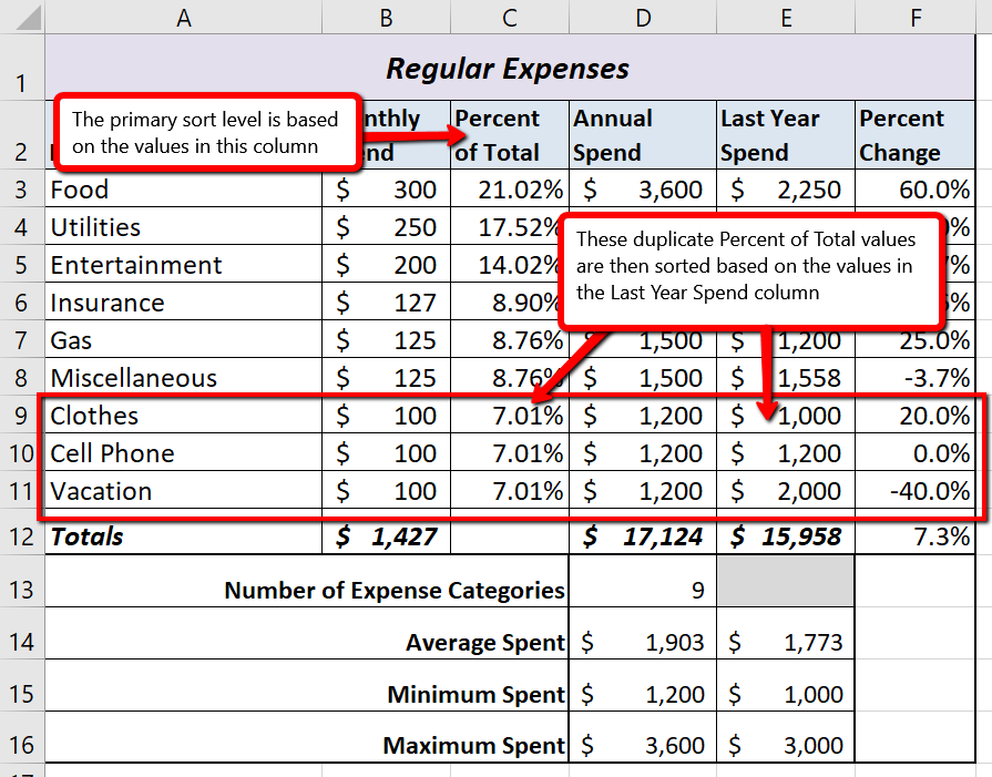
Sorting Data (Multiple Levels)
Adapted by Mary Schatz from How to Use Microsoft Excel: The Careers in Practice Series, adapted by The Saylor Foundation without attribution as requested by the work’s original creator or licensee, and licensed under CC BY-NC-SA 3.0.
In this section, we continue to develop the Personal Budget workbook. Notable items that are missing from the Budget Detail worksheet are the payments you might make for a car or a home. This section demonstrates Excel functions used to calculate loan payments for a car and to calculate mortgage payments for a house.
One of the functions we will add to the Personal Budget workbook is the PMT function. This function calculates the payments required for loan repayment. However, before demonstrating this function, it is important to cover a few fundamental concepts on loans.
A loan is a contractual agreement in which money is borrowed from a lender and paid back over a specific period of time. The amount of money that is borrowed from the lender is called the principal of the loan. The borrower is usually required to pay the principal of the loan plus interest. When you borrow money to buy a house, the loan is referred to as a mortgage. This is because the house being purchased also serves as collateral to ensure payment. In other words, the bank can take possession of your house if you fail to make loan payments. As shown in Table 2.5, there are several key terms related to loans.
Table 2.5 Key Terms for Loans
| Term | Definition |
| Collateral | Any item of value that is used to secure a loan to ensure payments to the lender |
| Down Payment | The amount of cash paid toward the purchase of a house. If you are paying 20% down, you are paying 20% of the cost of the house in cash and are borrowing the rest from a lender. |
| Interest Rate | The interest that is charged to the borrower as a cost for borrowing money |
| Mortgage | A loan where property is put up for collateral |
| Principal | The amount of money that has been borrowed |
| Residual Value | The estimated selling price of a vehicle at a future point in time |
| Length | The amount of time you have to repay a loan |
Figure 2.31 shows an example of an amortization table for a loan. A lender is required by law to provide borrowers with an amortization table when a loan contract is offered. The table in the figure shows how the payments of a loan would work if you borrowed $100,000 from a lender and agreed to pay it back over 10 years at an interest rate of 5%. You will notice that each time you make a payment, you are paying the bank an interest fee plus some of the loan principal. Each year the amount of interest paid to the bank decreases and the amount of money used to pay off the principal increases. This is because the bank is charging you interest on the amount of principal that has not been paid. As you pay off the principal, the interest rate is applied to a lower number, which reduces your interest charges. Finally, the figure shows that the sum of the values in the Interest Payment column is $29,505. This is how much it costs you to borrow this money over 10 years. Indeed, borrowing money is not free. It is important to note that to simplify this example, the payments were calculated on an annual basis. However, most loan payments are made on a monthly basis.
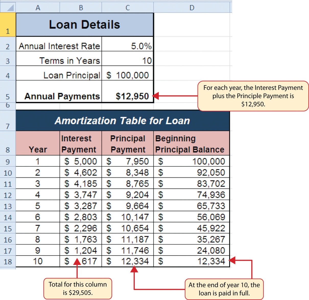
Data file: Continue with CH2 Personal Budget.
If you own a home, your mortgage payments are a major component of your household budget. If you are planning to buy a home, having a clear understanding of your monthly payments is critical for maintaining strong financial health. In Excel, mortgage payments are conveniently calculated through the PMT (payment) function. This function is more complex than the statistical functions covered in Section 2.2 “Statistical Functions”. With statistical functions, you are required to add only a range of cells or selected cells within the parentheses of the function, also known as the argument. With the PMT function, you must accurately define a series of arguments in order for the function to produce a reliable output. Table 2.6 lists the arguments for the PMT function. It is helpful to review the key loan terms in Table 2.5 before reviewing the PMT function arguments.
Table 2.6 Arguments for the PMT Function
| Argument | Definition |
| Rate | This is the interest rate the lender is charging the borrower. The interest rate is usually quoted in annual terms, so you have to divide this rate by 12 if you are calculating monthly payments. |
| Nper | The argument letters stand for number of periods. This is the term of the loan, which is the amount of time you have to repay the bank. This is usually quoted in years, so you have to multiply the years by 12 if you are calculating monthly payments. |
| Pv | The argument letters stand for present value. This is the principal of the loan or the amount of money that is borrowed. |
| [Fv] | The argument letters stand for future value. The brackets around the argument indicate that it is not always necessary to define it. It is used if there is a lump-sum payment that will be made at the end of the loan terms. This is also used for the residual value of a lease. If it is not defined, Excel will assume that it is zero. |
| [Type] | This argument can be defined with either a 1 or a 0. The number 1 is used if payments are made at the beginning of each period. A 0 is used if payments are made at the end of each period. The argument is in brackets because it does not have to be defined if payments are made at the end of each period. Excel assumes that this argument is 0 if it is not defined. |
By default, the result of the PMT function in Excel is shown as a negative number. This is because it represents an outgoing payment. When making a mortgage or car payment, you are paying money out of your pocket or bank account. Depending on the type of work that you do, your employer may want you to leave your payments negative or they may ask you to format them as positive numbers. In the following assignments, the payments calculated using the PMT function will be made positive to make them easier to work with. To do this, you will place a negative sign between the equal sign and the function name PMT.
We will first use the PMT function in the Personal Budget workbook to calculate the monthly loan payments for a car. These calculations will be made in the Loan Payments worksheet and then displayed in the Budget Summary worksheet through a cell reference link. So far we have demonstrated several methods for adding functions to a worksheet. When working with more complex functions such as the PMT, it is easiest to use the Function Dialog box.
Remember to use cell references for the arguments of the PMT function whenever possible. This will allow you the flexibility to change aspects of the loan, such as a lower interest rate or more expensive car, and have the payment automatically recalculate.
Using cell references for the arguments provides greater flexibility in trying different scenarios.
The following steps use the Insert Function command covered in Section 2.2 to add the PMT function:
Figure 2.31 shows the completed Function Arguments dialog box for the PMT function. Notice that the dialog box shows the values for the Rate and Nper arguments. The Rate is divided by 12 to convert the annual interest rate to a monthly interest rate. The Nper argument is multiplied by 12 to convert the terms of the loan from years to months. Finally, the dialog box provides you with a definition for each argument. The definition appears when you click in the input box for the argument.
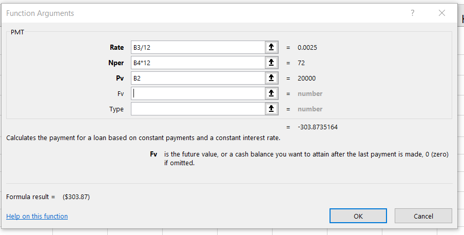
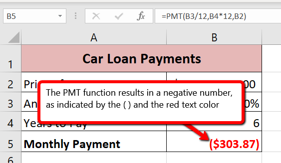
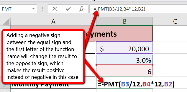
Insert Function
Function Arguments Dialog Box
Comparable Arguments for PMT Function
When using functions such as PMT, make sure the arguments are defined in comparable terms. For example, if you are calculating the monthly payments of a loan, make sure both the Rate and Nper argument are expressed in terms of months. The function will produce an erroneous result if one argument is expressed in years while the other is expressed in months.
In addition to calculating the loan payments for a car, the PMT function will be used in the Personal Budget workbook to calculate the mortgage payments for a home. The details for the mortgage payments are also found in the Loan Payments worksheet. Unlike the car loan, there is a down payment with the mortgage. A down payment on a mortgage is usually a percentage of the price of the home, which is paid up front and reduces the amount of the loan itself. The down payment amount and amount of the loan will both need to be calculated using formulas. While we did not use a down payment in the car loan example, it is fairly common to have a down payment when purchasing a car too.
Write the formulas to calculate the Down Payment Amount and new Loan Amount by following these steps:
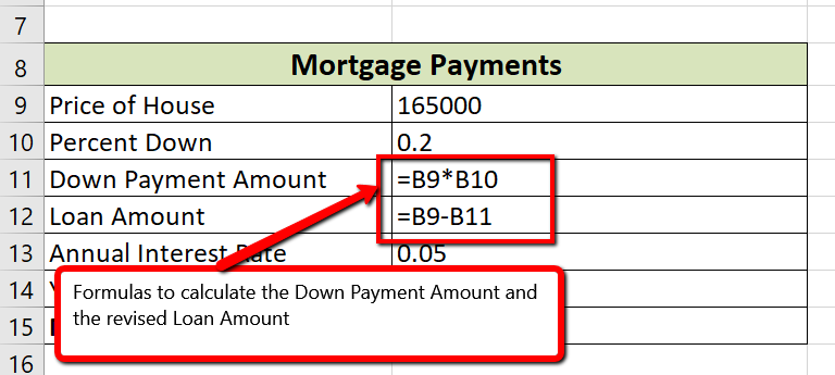
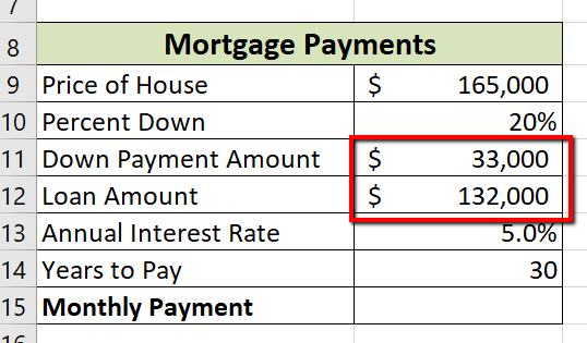
Now that we have the revised Loan Amount in cell B12, we can write the PMT function following the same process we did for the car loan.
Figure 2.36 shows how the the completed Function Arguments dialog box for the PMT function for the mortgage should appear before pressing the OK button.
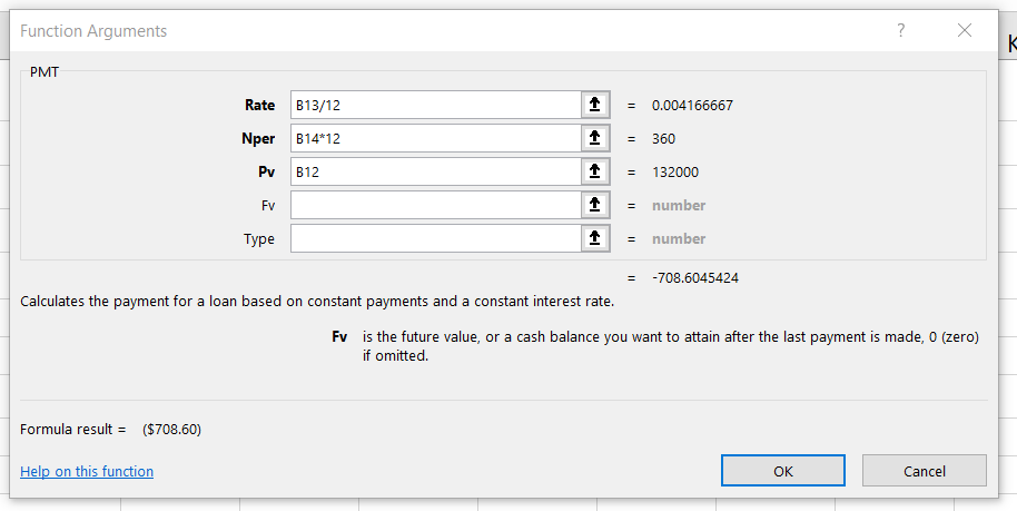
Figure 2.37 shows the result of the PMT function for the mortgage. The monthly payments for this mortgage are $708.60. This monthly payment will be displayed in the Budget Summary worksheet.
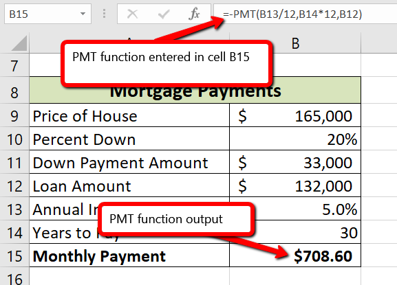
PMT Function
So far we have used cell references in formulas and functions, which allow Excel to produce new outputs when the values in the cell references are changed. Cell references can also be used to display values or the outputs of formulas and functions in cell locations on other worksheets. This is how we will complete the Budget Summary worksheet using values from both the Budget Detail and Loan Payments worksheets.
Outputs from the formulas and functions that were entered into the Budget Detail will be displayed on the Budget Summary worksheet through the use of cell references.
Figure 2.38 shows how the cell reference appears in the Budget Summary worksheet. Notice that the cell reference D12 is preceded by the Budget Detail worksheet name enclosed in apostrophes followed by an exclamation point (‘Budget Detail’!) This indicates that the value displayed in the cell is referencing a cell location in the Budget Detail worksheet.
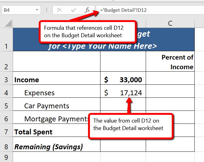
We will use a similar process to enter in the annual car payments and mortgage payments from the Loan Payments worksheet. The payments on the Loan Payments worksheet are monthly payments though, so we will need to multiply each one by 12 to get the annual amount to display in the Budget Summary worksheet.
Figure 2.39 shows the results of creating formulas that reference cell locations in the Loan Payments worksheet.
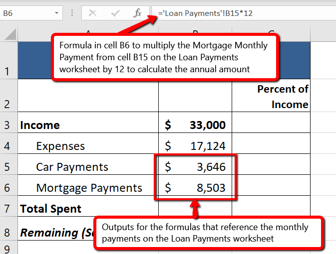
We can now add other formulas and functions to the Budget Summary worksheet that can calculate the difference between the total spend dollars vs. the total net income in cell B3. The following steps explain how this is accomplished:
Figure 2.40 shows the results of the formulas that were added to the Budget Summary worksheet. Overall, having your income exceed your total expenses is a good thing because it allows you to save money for future spending needs or unexpected events.
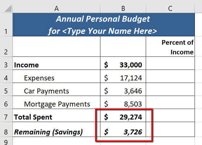
We can now add a few formulas that calculate both the spending rate and the savings rate as a percentage of net income. These formulas require the use of absolute references, which we covered earlier in this chapter. The following steps explain how to add these formulas:
Figure 2.41a shows the completed Budget Summary worksheet
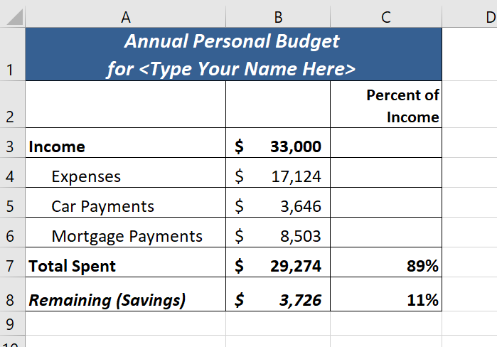
Figure 2.41b shows the completed Budget Detail worksheet
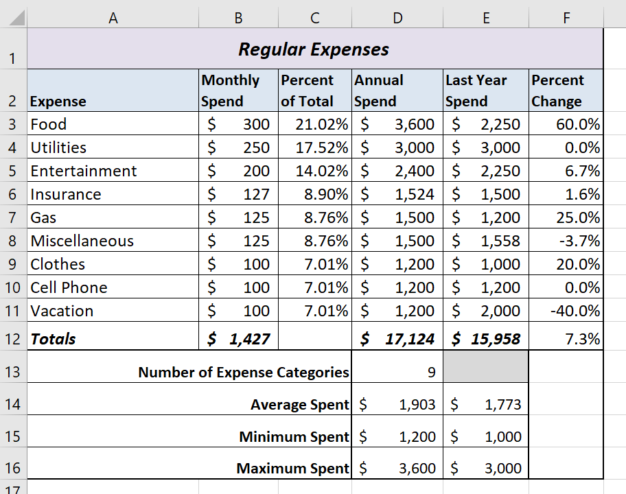
Figure 2.41c shows the completed Loan Payments worksheet
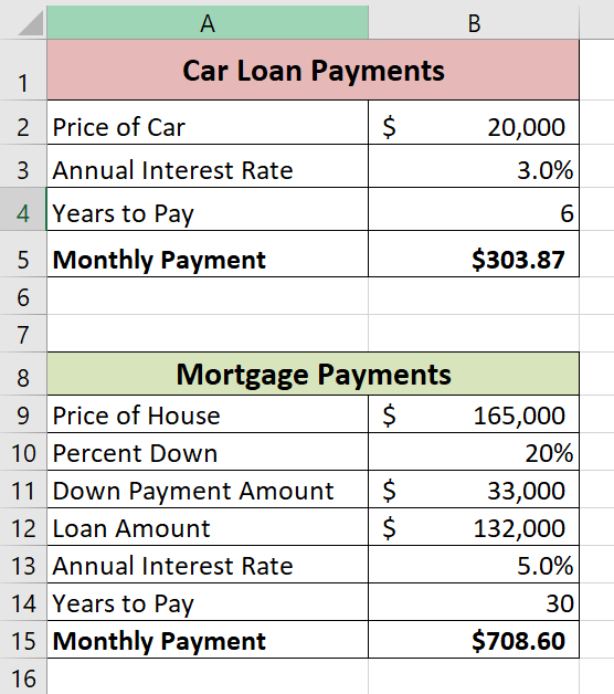
Adapted by Mary Schatz from How to Use Microsoft Excel: The Careers in Practice Series, adapted by The Saylor Foundation without attribution as requested by the work’s original creator or licensee, and licensed under CC BY-NC-SA 3.0.
In this section, we will review some of the formatting techniques covered in Chapter 1, as well as learn some new techniques. We will also preview a two-page worksheet and set page setup options to present the data in a professional manner. A new data file will be used in this section.
Data File: Continue working with CH2 Personal Budget
You have been given sales data that needs to be formatted in a professional manner. This worksheet will be printed and presented to investors, so it needs to be prepared for printing as well. Figure 2.42 shows how the finished worksheet will appear in Print Preview.
Once the worksheet is professionally formatted, you need to look in Print Preview to see how the pages will print.

Now that the entire worksheet is printing on one page, you need to add a footer with information about the date the file was printed along with the filename. In Chapter 1 you learned how to create headers and footers using the Insert ribbon. You can also create headers and footers using the Custom Header/Footer dialog box.
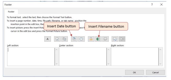
![Completed Custom Footer dialog box. Left section contains "Printed on &[Date]", Center section empty, Right section contains "Filename: &[File]".](https://openoregon.pressbooks.pub/app/uploads/sites/7/2016/10/7-Completed-Footer-Box.jpg)
“2.4 Preparing to Print” by Julie Romey, Portland Community College is licensed under CC BY 4.0
Download Data File: PR2-Data
Running your own lawn care business can be an excellent way to make money over the summer while on break from college. It can also be a way to supplement your existing income for the purpose of saving money for retirement or for a college fund. However, managing the costs of the business will be critical in order for it to be a profitable venture. In this exercise you will create a simple financial plan for a lawn care business by using the skills covered in this chapter.
There are two worksheets in the workbook you will be using.
Annual Plan Worksheet
Equipment Loans Worksheet
Complete the Annual Plan Worksheet
Compare both worksheets with the answer keys below.
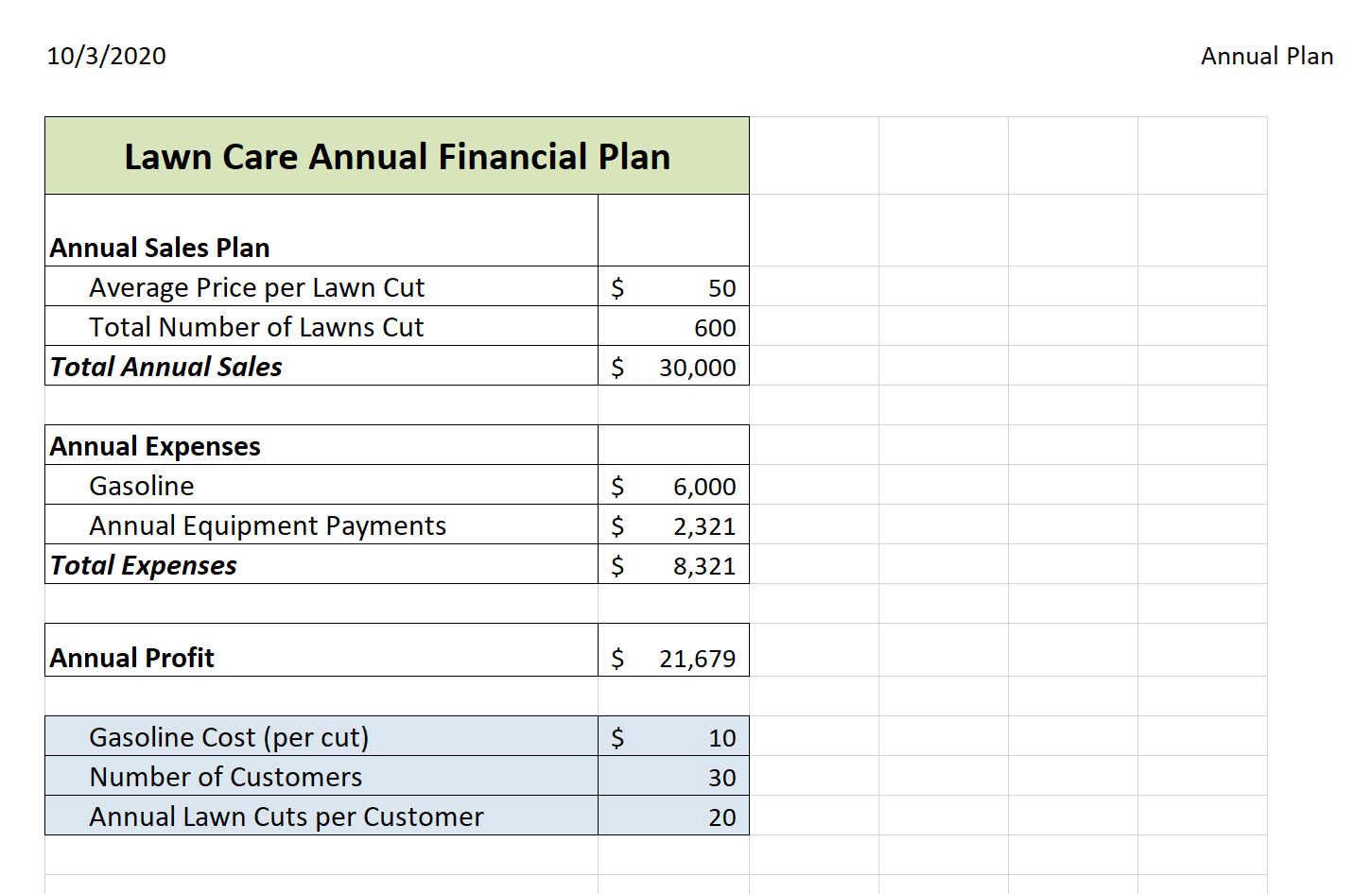
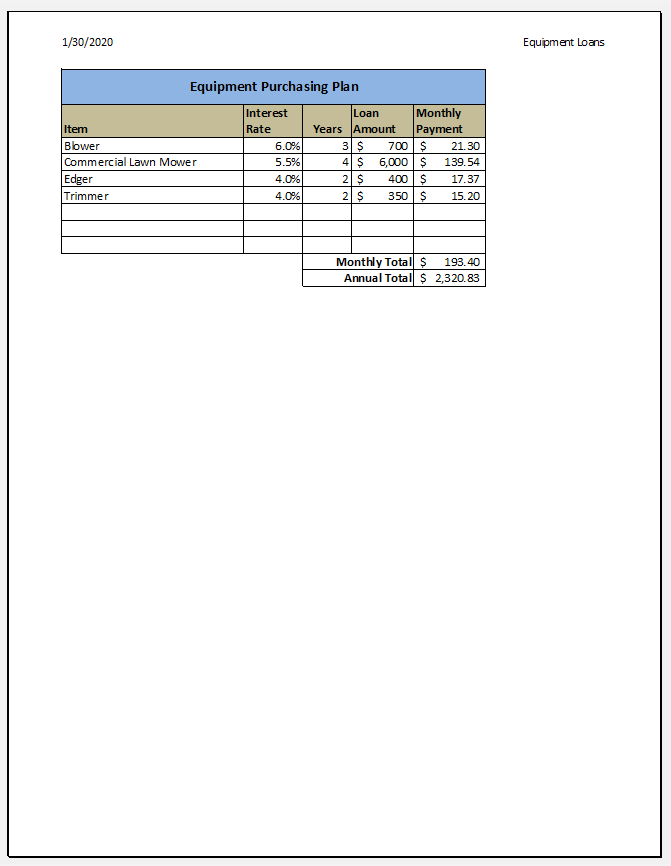
Adapted by Mary Schatz from How to Use Microsoft Excel: The Careers in Practice Series, adapted by The Saylor Foundation without attribution as requested by the work’s original creator or licensee, and licensed under CC BY-NC-SA 3.0.
Download Data File: SC2-Data
The hotel management industry presents a wide variety of career opportunities. These range from running a bed and breakfast to a management position at a large hotel. No matter what hotel management career you choose to pursue, understanding hotel occupancy and costs are critical to running a successful operation. This exercise examines the occupancy rate and expenses of a small hotel.
There are three worksheets in the workbook for this assignment.
Occupancy Worksheet
Statistics Worksheet
Shuttle Purchase Worksheet
The hotel is considering buying a car to shuttle customers to and from the airport. You need to decide how much of a down payment to make, so you are going to calculate the monthly payment based on three different down payment percentages. The number of years to pay off the loan will vary for each of the down payment percentage options. Remember, the down payment amount is found by multiplying the price of the car by the down payment percentage. This amount is then subtracted from the price of the car to find the amount of the loan.
Adapted by Mary Schatz from How to Use Microsoft Excel: The Careers in Practice Series, adapted by The Saylor Foundation without attribution as requested by the work’s original creator or licensee, and licensed under CC BY-NC-SA 3.0.
VIII
The term central tendency relates to the way in which quantitative data tend to cluster around some value.
Define the average and distinguish between arithmetic, geometric, and harmonic means.
Example
The arithmetic mean, often simply called the mean, of two numbers, such as 2 and 8, is obtained by finding a value A such that. One may find that  . Switching the order of 2 and 8 to read 8 and 2 does not change the resulting value obtained for A. The mean 5 is not less than the minimum 2 nor greater than the maximum 8. If we increase the number of terms in the list for which we want an average, we get, for example, that the arithmetic mean of 2, 8, and 11 is found by solving for the value of A in the equation
  . One finds that A=7.
The term central tendency relates to the way in which quantitative data tend to cluster around some value. A measure of central tendency is any of a variety of ways of specifying this “central value”. Central tendency is contrasted with statistical dispersion (spread), and together these are the most used properties of distributions. Statistics that measure central tendency can be used in descriptive statistics as a summary statistic for a data set, or as estimators of location parameters of a statistical model.
In the simplest cases, the measure of central tendency is an average of a set of measurements, the word average being variously construed as mean, median, or other measure of location, depending on the context. An average is a measure of the “middle” or “typical” value of a data set. In the most common case, the data set is a list of numbers. The average of a list of numbers is a single number intended to typify the numbers in the list. If all the numbers in the list are the same, then this number should be used. If the numbers are not the same, the average is calculated by combining the numbers from the list in a specific way and computing a single number as being the average of the list.
The term mean has three related meanings:
The three most common averages are the Pythagorean means – the arithmetic mean, the geometric mean, and the harmonic mean.

Comparison of Pythagorean Means
Comparison of the arithmetic, geometric and harmonic means of a pair of numbers. The vertical dashed lines are asymptotes for the harmonic means.
When we think of means, or averages, we are typically thinking of the arithmetic mean. It is the sum of a collection of numbers divided by the number of numbers in the collection. The collection is often a set of results of an experiment, or a set of results from a survey of a subset of the public. In addition to mathematics and statistics, the arithmetic mean is used frequently in fields such as economics, sociology, and history, and it is used in almost every academic field to some extent. For example, per capita income is the arithmetic average income of a nation’s population.
Suppose we have a data set containing the values a1, …, an. The arithmetic mean is defined via the expression:
A=1n∑i=1nai">
If the data set is a statistical population (i.e., consists of every possible observation and not just a subset of them), then the mean of that population is called the population mean. If the data set is a statistical sample (a subset of the population) we call the statistic resulting from this calculation a sample mean. If it is required to use a single number as an estimate for the values of numbers, then the arithmetic mean does this best. This is because it minimizes the sum of squared deviations from the estimate.
The geometric mean is a type of mean or average which indicates the central tendency, or typical value, of a set of numbers by using the product of their values (as opposed to the arithmetic mean which uses their sum). The geometric mean applies only to positive numbers. The geometric mean is defined as the n">th root (where n">is the count of numbers) of the product of the numbers.
For instance, the geometric mean of two numbers, say 2 and 8, is just the square root of their product; that is 2⋅8=4">. As another example, the geometric mean of the three numbers 4, 1, and 1/32 is the cube root of their product (1/8), which is 1/2; that is ![\sqrt[3]{4\cdot 1\cdot \frac{1}{32}}=\frac{1}{2}](https://open.ocolearnok.org/app/uploads/quicklatex/quicklatex.com-5605c9445a8cd1228d03bd755c6d3d8d_l3.svg "Rendered by QuickLaTeX.com") .4⋅1⋅1323=12">
.4⋅1⋅1323=12">
A geometric mean is often used when comparing different items – finding a single “figure of merit” for these items – when each item has multiple properties that have different numeric ranges. The use of a geometric mean “normalizes” the ranges being averaged, so that no range dominates the weighting, and a given percentage change in any of the properties has the same effect on the geometric mean.
For example, the geometric mean can give a meaningful “average” to compare two companies which are each rated at 0 to 5 for their environmental sustainability, and are rated at 0 to 100 for their financial viability. If an arithmetic mean was used instead of a geometric mean, the financial viability is given more weight because its numeric range is larger – so a small percentage change in the financial rating (e.g. going from 80 to 90) makes a much larger difference in the arithmetic mean than a large percentage change in environmental sustainability (e.g. going from 2 to 5).
The harmonic mean is typically appropriate for situations when the average of rates is desired. It may (compared to the arithmetic mean) mitigate the influence of large outliers and increase the influence of small values.
The harmonic mean H">of the positive real numbers x1,x2,…,xn"> is defined to be the reciprocal of the arithmetic mean of the reciprocals of x1,x2,…,xn">. For example, the harmonic mean of 1, 2, and 4 is:
311+12+14=113(11+12+14)=127≈1.7143">
The harmonic mean is the preferable method for averaging multiples, such as the price/earning ratio in Finance, in which price is in the numerator. If these ratios are averaged using an arithmetic mean (a common error), high data points are given greater weights than low data points. The harmonic mean, on the other hand, gives equal weight to each data point.
The shape of a histogram can assist with identifying other descriptive statistics, such as which measure of central tendency is appropriate to use.
Demonstrate the effect that the shape of a distribution has on measures of central tendency.
As discussed, a histogram is a bar graph displaying tabulated frequencies. Histograms tend to form shapes, which when measured can describe the distribution of data within a dataset. The shape of the distribution can assist with identifying other descriptive statistics, such as which measure of central tendency is appropriate to use.
The distribution of data item values may be symmetrical or asymmetrical. Two common examples of symmetry and asymmetry are the “normal distribution” and the “skewed distribution. ”
In a symmetrical distribution the two sides of the distribution are a mirror image of each other. A normal distribution is a true symmetric distribution of data item values. When a histogram is constructed on values that are normally distributed, the shape of columns form a symmetrical bell shape. This is why this distribution is also known as a “normal curve” or “bell curve. ” is an example of a normal distribution:
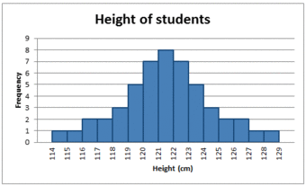
The Normal Distribution
A histogram showing a normal distribution, or bell curve.
If represented as a ‘normal curve’ (or bell curve) the graph would take the following shape (where μ"> is the mean and σ"> is the standard deviation):
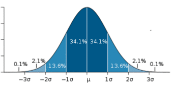
The Bell Curve
The shape of a normally distributed histogram.
A key feature of the normal distribution is that the mode, median and mean are the same and are together in the center of the curve.
Also, there can only be one mode (i.e. there is only one value which is most frequently observed). Moreover, most of the data are clustered around the center, while the more extreme values on either side of the center become less rare as the distance from the center increases (i.e. about 68% of values lie within one standard deviation (σ">) away from the mean; about 95% of the values lie within two standard deviations; and about 99.7% are within three standard deviations. This is known as the empirical rule or the 3-sigma rule).
In an asymmetrical distribution the two sides will not be mirror images of each other. Skewness is the tendency for the values to be more frequent around the high or low ends of the x">-axis. When a histogram is constructed for skewed data it is possible to identify skewness by looking at the shape of the distribution. For example, a distribution is said to be positively skewed when the tail on the right side of the histogram is longer than the left side. Most of the values tend to cluster toward the left side of the x">-axis (i.e, the smaller values) with increasingly fewer values at the right side of the x">-axis (i.e. the larger values).
A distribution is said to be negatively skewed when the tail on the left side of the histogram is longer than the right side. Most of the values tend to cluster toward the right side of the x">-axis (i.e. the larger values), with increasingly less values on the left side of the x">-axis (i.e. the smaller values).
A key feature of the skewed distribution is that the mean and median have different values and do not all lie at the center of the curve.
There can also be more than one mode in a skewed distribution. Distributions with two or more modes are known as bi-modal or multimodal, respectively. The distribution shape of the data in is bi-modal because there are two modes (two values that occur more frequently than any other) for the data item (variable).
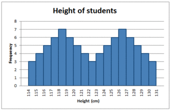
Bi-modal Distribution
Some skewed distributions have two or more modes.
The root-mean-square, also known as the quadratic mean, is a statistical measure of the magnitude of a varying quantity, or set of numbers.
Compute the root-mean-square and express its usefulness.
The root-mean-square, also known as the quadratic mean, is a statistical measure of the magnitude of a varying quantity, or set of numbers. It can be calculated for a series of discrete values or for a continuously varying function. Its name comes from its definition as the square root of the mean of the squares of the values.
This measure is especially useful when a data set includes both positive and negative numbers. For example, consider the set of numbers [−2,5,−8,9,−4]">. Computing the average of this set of numbers wouldn’t tell us much because the negative numbers cancel out the positive numbers, resulting in an average of zero. This gives us the “middle value” but not a sense of the average magnitude.
One possible method of assigning an average to this set would be to simply erase all of the negative signs. This would lead us to compute an average of 5.6. However, using the RMS method, we would square every number (making them all positive) and take the square root of the average. Explicitly, the process is to:
In our example:

The root-mean-square is always greater than or equal to the average of the unsigned values. Physical scientists often use the term “root-mean-square” as a synonym for standard deviation when referring to the square root of the mean squared deviation of a signal from a given baseline or fit. This is useful for electrical engineers in calculating the “AC only” RMS of an electrical signal. Standard deviation being the root-mean-square of a signal’s variation about the mean, rather than about 0, the DC component is removed (i.e. the RMS of the signal is the same as the standard deviation of the signal if the mean signal is zero).

Mathematical Means
This is a geometrical representation of common mathematical means. a">, b"> are scalars. A"> is the arithmetic mean of scalars a"> and b">. G"> is the geometric mean, H"> is the harmonic mean, Q"> is the quadratic mean (also known as root-mean-square).
Depending on the characteristic distribution of a data set, the mean, median or mode may be the more appropriate metric for understanding.
Assess various situations and determine whether the mean, median, or mode would be the appropriate measure of central tendency.
The mode is the value that appears most often in a set of data. For example, the mode of the sample [1,3,6,6,6,6,7,7,12,12,17]">is 6. Like the statistical mean and median, the mode is a way of expressing, in a single number, important information about a random variable or a population.
The mode is not necessarily unique, since the same maximum frequency may be attained at different values. Given the list of data [1,1,2,4,4]">the mode is not unique – the dataset may be said to be bimodal, while a set with more than two modes may be described as multimodal. The most extreme case occurs in uniform distributions, where all values occur equally frequently.
For a sample from a continuous distribution, the concept is unusable in its raw form. No two values will be exactly the same, so each value will occur precisely once. In order to estimate the mode, the usual practice is to discretize the data by assigning frequency values to intervals of equal distance, as with making a histogram, effectively replacing the values with the midpoints of the intervals they are assigned to. The mode is then the value where the histogram reaches its peak.
The median is the numerical value separating the higher half of a data sample, a population, or a probability distribution, from the lower half. The median of a finite list of numbers can be found by arranging all the observations from lowest value to highest value and picking the middle one (e.g., the median of {3,5,9}">is 5). If there is an even number of observations, then there is no single middle value. In this case, the median is usually defined to be the mean of the two middle values.
The median can be used as a measure of location when a distribution is skewed, when end-values are not known, or when one requires reduced importance to be attached to outliers (e.g., because there may be measurement errors).
In symmetrical, unimodal distributions, such as the normal distribution (the distribution whose density function, when graphed, gives the famous “bell curve”), the mean (if defined), median and mode all coincide. For samples, if it is known that they are drawn from a symmetric distribution, the sample mean can be used as an estimate of the population mode.
If elements in a sample data set increase arithmetically, when placed in some order, then the median and arithmetic mean are equal. For example, consider the data sample {1,2,3,4}">. The mean is 2.5, as is the median. However, when we consider a sample that cannot be arranged so as to increase arithmetically, such as {1,2,4,8,16}">, the median and arithmetic mean can differ significantly. In this case, the arithmetic mean is 6.2 and the median is 4. In general the average value can vary significantly from most values in the sample, and can be larger or smaller than most of them.
While the arithmetic mean is often used to report central tendencies, it is not a robust statistic, meaning that it is greatly influenced by outliers (values that are very much larger or smaller than most of the values). Notably, for skewed distributions, such as the distribution of income for which a few people’s incomes are substantially greater than most people’s, the arithmetic mean may not be consistent with one’s notion of “middle,” and robust statistics such as the median may be a better description of central tendency.
The median is of central importance in robust statistics, as it is the most resistant statistic, having a breakdown point of 50%: so long as no more than half the data is contaminated, the median will not give an arbitrarily large result. Robust statistics are statistics with good performance for data drawn from a wide range of probability distributions, especially for distributions that are not normally distributed. One motivation is to produce statistical methods that are not unduly affected by outliers. Another motivation is to provide methods with good performance when there are small departures from parametric distributions.
Unlike median, the concept of mean makes sense for any random variable assuming values from a vector space. For example, a distribution of points in the plane will typically have a mean and a mode, but the concept of median does not apply.

Unlike mean and median, the concept of mode also makes sense for “nominal data” (i.e., not consisting of numerical values in the case of mean, or even of ordered values in the case of median). For example, taking a sample of Korean family names, one might find that “Kim” occurs more often than any other name. Then “Kim” would be the mode of the sample. In any voting system where a plurality determines victory, a single modal value determines the victor, while a multi-modal outcome would require some tie-breaking procedure to take place.
Vector Space
Vector addition and scalar multiplication: a vector v"> (blue) is added to another vector w"> (red, upper illustration). Below, w"> is stretched by a factor of 2, yielding the sum v+2w">.

Comparison of the Mean, Mode & Median
Comparison of mean, median and mode of two log-normal distributions with different skewness.
The central tendency for qualitative data can be described via the median or the mode, but not the mean.
Categorize levels of measurement and identify the appropriate measures of central tendency.
In order to address the process for finding averages of qualitative data, we must first introduce the concept of levels of measurement. In statistics, levels of measurement, or scales of measure, are types of data that arise in the theory of scale types developed by the psychologist Stanley Smith Stevens. Stevens proposed his typology in a 1946 Science article entitled “On the Theory of Scales of Measurement. ” In that article, Stevens claimed that all measurement in science was conducted using four different types of scales that he called “nominal”, “ordinal”, “interval” and “ratio”, unifying both qualitative (which are described by his “nominal” type) and quantitative (to a different degree, all the rest of his scales).
The nominal scale differentiates between items or subjects based only on their names and/or categories and other qualitative classifications they belong to. Examples include gender, nationality, ethnicity, language, genre, style, biological species, visual pattern, and form.
The mode, i.e. the most common item, is allowed as the measure of central tendency for the nominal type. On the other hand, the median, i.e. the middle-ranked item, makes no sense for the nominal type of data since ranking is not allowed for the nominal type.
The ordinal scale allows for rank order (1st, 2nd, 3rd, et cetera) by which data can be sorted, but still does not allow for relative degree of difference between them. Examples include, on one hand, dichotomous data with dichotomous (or dichotomized) values such as “sick” versus “healthy” when measuring health, “guilty” versus “innocent” when making judgments in courts, or “wrong/false” versus “right/true” when measuring truth value. On the other hand, non-dichotomous data consisting of a spectrum of values is also included, such as “completely agree,” “mostly agree,” “mostly disagree,” and “completely disagree” when measuring opinion .
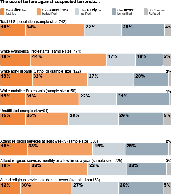
Ordinal Scale Surveys
An opinion survey on religiosity and torture. An opinion survey is an example of a non-dichotomous data set on the ordinal scale for which the central tendency can be described by the median or the mode.
The median, i.e. middle-ranked, item is allowed as the measure of central tendency; however, the mean (or average) as the measure of central tendency is not allowed. The mode is also allowed.
In 1946, Stevens observed that psychological measurement, such as measurement of opinions, usually operates on ordinal scales; thus means and standard deviations have no validity, but they can be used to get ideas for how to improve operationalization of variables used in questionnaires.
Measures of relative standing can be used to compare values from different data sets, or to compare values within the same data set.
Outline how percentiles and quartiles measure relative standing within a data set.
For runners in a race, a low time means a faster run. The winners in a race have the shortest running times. Is it more desirable to have a finish time with a high or a low percentile when running a race? b. The 20th percentile of run times in a particular race is 5.2 minutes. Write a sentence interpreting the 20th percentile in the context of the situation. c. A bicyclist in the 90th percentile of a bicycle race between two towns completed the race in 1 hour and 12 minutes. Is he among the fastest or slowest cyclists in the race? Write a sentence interpreting the 90th percentile in the context of the situation. SOLUTION a. For runners in a race it is more desirable to have a low percentile for finish time. A low percentile means a short time, which is faster. b. INTERPRETATION: 20% of runners finished the race in 5.2 minutes or less. 80% of runners finished the race in 5.2 minutes or longer. c. He is among the slowest cyclists (90% of cyclists were faster than him. ) INTERPRETATION: 90% of cyclists had a finish time of 1 hour, 12 minutes or less.Only 10% of cyclists had a finish time of 1 hour, 12 minutes or longer.
Measures of relative standing, in the statistical sense, can be defined as measures that can be used to compare values from different data sets, or to compare values within the same data set.
The common measures of relative standing or location are quartiles and percentiles. A percentile is a measure used in statistics indicating the value below which a given percentage of observations in a group of observations fall. For example, the 20th percentile is the value (or score) below which 20 percent of the observations may be found. The term percentile and the related term, percentile rank, are often used in the reporting of scores from norm-referenced tests. For example, if a score is in the 86th percentile, it is higher than 86% of the other scores. The 25th percentile is also known as the first quartile (Q1), the 50th percentile as the median or second quartile (Q2), and the 75th percentile as the third quartile (Q3).
To calculate quartiles and percentiles, the data must be ordered from smallest to largest. Recall that quartiles divide ordered data into quarters. Percentiles divide ordered data into hundredths. To score in the 90th percentile of an exam does not mean, necessarily, that you received 90% on a test. It means that 90% of test scores are the same or less than your score and 10% of the test scores are the same or greater than your test score.
Percentiles are useful for comparing values. For this reason, universities and colleges use percentiles extensively. Percentiles are mostly used with very large populations. Therefore, if you were to say that 90% of the test scores are less (and not the same or less) than your score, it would be acceptable because removing one particular data value is not significant.
For very large populations following a normal distribution, percentiles may often be represented by reference to a normal curve plot. The normal distribution is plotted along an axis scaled to standard deviations, or sigma units. Percentiles represent the area under the normal curve, increasing from left to right. Each standard deviation represents a fixed percentile. Thus, rounding to two decimal places, −3">
is the 0.13th percentile, −2"> the 2.28th percentile, −1"> the 15.87th percentile, 0 the 50th percentile (both the mean and median of the distribution), +1"> the 84.13th percentile, +2"> the 97.72nd percentile, and +3"> the 99.87th percentile. This is known as the 68–95–99.7 rule or the three-sigma rule.

Percentile Diagram
Representation of the 68–95–99.7 rule. The dark blue zone represents observations within one standard deviation (σ">) to either side of the mean (μ">), which accounts for about 68.2% of the population. Two standard deviations from the mean (dark and medium blue) account for about 95.4%, and three standard deviations (dark, medium, and light blue) for about 99.7%.
Note that in theory the 0th percentile falls at negative infinity and the 100th percentile at positive infinity; although, in many practical applications, such as test results, natural lower and/or upper limits are enforced.
A percentile indicates the relative standing of a data value when data are sorted into numerical order, from smallest to largest. p">% of data values are less than or equal to the p">th percentile. For example, 15% of data values are less than or equal to the 15th percentile. Low percentiles always correspond to lower data values. High percentiles always correspond to higher data values.
A percentile may or may not correspond to a value judgment about whether it is “good” or “bad”. The interpretation of whether a certain percentile is good or bad depends on the context of the situation to which the data applies. In some situations, a low percentile would be considered “good’; in other contexts a high percentile might be considered “good”. In many situations, there is no value judgment that applies.
Understanding how to properly interpret percentiles is important not only when describing data, but is also important when calculating probabilities.
When writing the interpretation of a percentile in the context of the given data, the sentence should contain the following information:
The median is the middle value in distribution when the values are arranged in ascending or descending order.
Identify the median in a data set and distinguish it’s properties from other measures of central tendency.
A measure of central tendency (also referred to as measures of center or central location) is a summary measure that attempts to describe a whole set of data with a single value that represents the middle or center of its distribution. There are three main measures of central tendency: the mode, the median and the mean . Each of these measures describes a different indication of the typical or central value in the distribution.
Central tendency
Comparison of mean, median and mode of two log-normal distributions with different skewness.
The median is the middle value in distribution when the values are arranged in ascending or descending order. The median divides the distribution in half (there are 50% of observations on either side of the median value). In a distribution with an odd number of observations, the median value is the middle value.
Looking at the retirement age distribution (which has 11 observations), the median is the middle value, which is 57 years:
54, 54, 54, 55, 56, 57, 57, 58, 58, 60, 60
When the distribution has an even number of observations, the median value is the mean of the two middle values. In the following distribution, the two middle values are 56 and 57, therefore the median equals 56.5 years:
52, 54, 54, 54, 55, 56, 57, 57, 58, 58, 60, 60
The median is less affected by outliers and skewed data than the mean, and is usually the preferred measure of central tendency when the distribution is not symmetrical. The median cannot be identified for categorical nominal data, as it cannot be logically ordered.
The mode is the most commonly occurring value in a distribution.
Define the mode and explain its limitations.
A measure of central tendency (also referred to as measures of center or central location) is a summary measure that attempts to describe a whole set of data with a single value that represents the middle or center of its distribution. There are three main measures of central tendency: the mode, the median and the mean . Each of these measures describes a different indication of the typical skewness in the distribution.
The mode is the most commonly occurring value in a distribution. Consider this dataset showing the retirement age of 11 people, in whole years:
54, 54, 54, 55, 56, 57, 57, 58, 58, 60, 60
The most commonly occurring value is 54, therefore the mode of this distribution is 54 years. The mode has an advantage over the median and the mean as it can be found for both numerical and categorical (non-numerical) data.
There are some limitations to using the mode. In some distributions, the mode may not reflect the center of the distribution very well. When the distribution of retirement age is ordered from lowest to highest value, it is easy to see that the center of the distribution is 57 years, but the mode is lower, at 54 years. It is also possible for there to be more than one mode for the same distribution of data, (bi-modal, or multi-modal). The presence of more than one mode can limit the ability of the mode in describing the center or typical value of the distribution because a single value to describe the center cannot be identified. In some cases, particularly where the data are continuous, the distribution may have no mode at all (i.e. if all values are different). In cases such as these, it may be better to consider using the median or mean, or group the data in to appropriate intervals, and find the modal class.
The law of averages is a lay term used to express a belief that outcomes of a random event will “even out” within a small sample.
Evaluate the law of averages and distinguish it from the law of large numbers.
The law of averages is a lay term used to express a belief that outcomes of a random event will “even out” within a small sample. As invoked in everyday life, the “law” usually reflects bad statistics or wishful thinking rather than any mathematical principle. While there is a real theorem that a random variable will reflect its underlying probability over a very large sample (the law of large numbers), the law of averages typically assumes that unnatural short-term “balance” must occur.
The law of averages is sometimes known as “Gambler’s Fallacy. ” It evokes the idea that an event is “due” to happen. For example, “The roulette wheel has landed on red in three consecutive spins. The law of averages says it’s due to land on black! ” Of course, the wheel has no memory and its probabilities do not change according to past results. So even if the wheel has landed on red in ten consecutive spins, the probability that the next spin will be black is still 48.6% (assuming a fair European wheel with only one green zero: it would be exactly 50% if there were no green zero and the wheel were fair, and 47.4% for a fair American wheel with one green “0” and one green “00”). (In fact, if the wheel has landed on red in ten consecutive spins, that is strong evidence that the wheel is not fair – that it is biased toward red. Thus, the wise course on the eleventh spin would be to bet on red, not on black: exactly the opposite of the layman’s analysis.) Similarly, there is no statistical basis for the belief that lottery numbers which haven’t appeared recently are due to appear soon.
Some people interchange the law of averages with the law of large numbers, but they are different. The law of averages is not a mathematical principle, whereas the law of large numbers is. In probability theory, the law of large numbers is a theorem that describes the result of performing the same experiment a large number of times. According to the law, the average of the results obtained from a large number of trials should be close to the expected value, and will tend to become closer as more trials are performed.
The law of large numbers is important because it “guarantees” stable long-term results for the averages of random events. For example, while a casino may lose money in a single spin of the roulette wheel, its earnings will tend towards a predictable percentage over a large number of spins. Any winning streak by a player will eventually be overcome by the parameters of the game. It is important to remember that the law of large numbers only applies (as the name indicates) when a large number of observations are considered. There is no principle that a small number of observations will coincide with the expected value or that a streak of one value will immediately be “balanced” by the others.
Another good example comes from the expected value of rolling a six-sided die. A single roll produces one of the numbers 1, 2, 3, 4, 5, or 6, each with an equal probability (16">
) of occurring. The expected value of a roll is 3.5, which comes from the following equation:
1+2+3+4+5+66=3.5">
According to the law of large numbers, if a large number of six-sided dice are rolled, the average of their values (sometimes called the sample mean ) is likely to be close to 3.5, with the accuracy increasing as more dice are rolled. However, in a small number of rolls, just because ten 6’s are rolled in a row, it doesn’t mean a 1 is more likely the next roll. Each individual outcome still has a probability of 16">
.

A stochastic process is a collection of random variables that is often used to represent the evolution of some random value over time.
Summarize the stochastic process and state its relationship to random walks.
Example
Familiar examples of processes modeled as stochastic time series include stock market and exchange rate fluctuations; signals such as speech, audio and video; medical data such as a patient’s EKG, EEG, blood pressure or temperature; and random movement such as Brownian motion or random walks.
In probability theory, a stochastic process–sometimes called a random process– is a collection of random variables that is often used to represent the evolution of some random value, or system, over time. It is the probabilistic counterpart to a deterministic process (or deterministic system). Instead of describing a process which can only evolve in one way (as in the case, for example, of solutions of an ordinary differential equation), in a stochastic or random process there is some indeterminacy. Even if the initial condition (or starting point) is known, there are several (often infinitely many) directions in which the process may evolve.
In the simple case of discrete time, a stochastic process amounts to a sequence of random variables known as a time series–for example, a Markov chain. Another basic type of a stochastic process is a random field, whose domain is a region of space. In other words, a stochastic process is a random function whose arguments are drawn from a range of continuously changing values.
One approach to stochastic processes treats them as functions of one or several deterministic arguments (inputs, in most cases regarded as time) whose values (outputs) are random variables. Random variables are non-deterministic (single) quantities which have certain probability distributions. Random variables corresponding to various times (or points, in the case of random fields) may be completely different. Although the random values of a stochastic process at different times may be independent random variables, in most commonly considered situations they exhibit complicated statistical correlations.
Familiar examples of processes modeled as stochastic time series include stock market and exchange rate fluctuations; signals such as speech, audio, and video; medical data such as a patient’s EKG, EEG, blood pressure, or temperature; and random movement such as Brownian motion or random walks.
The law of a stochastic process is the measure that the process induces on the collection of functions from the index set into the state space. The law encodes a lot of information about the process. In the case of a random walk, for example, the law is the probability distribution of the possible trajectories of the walk.
A random walk is a mathematical formalization of a path that consists of a succession of random steps. For example, the path traced by a molecule as it travels in a liquid or a gas, the search path of a foraging animal, the price of a fluctuating stock, and the financial status of a gambler can all be modeled as random walks, although they may not be truly random in reality. Random walks explain the observed behaviors of processes in such fields as ecology, economics, psychology, computer science, physics, chemistry, biology and, of course, statistics. Thus, the random walk serves as a fundamental model for recorded stochastic activity.

Random Walk
Example of eight random walks in one dimension starting at 0. The plot shows the current position on the line (vertical axis) versus the time steps (horizontal axis).
The sum of draws is the process of drawing randomly, with replacement, from a set of data and adding up the results.
Describe how chance variation affects sums of draws.
The sum of draws can be illustrated by the following process. Imagine there is a box of tickets, each having a number 1, 2, 3, 4, 5, or 6 written on it.
The sum of draws can be represented by a process in which tickets are drawn at random from the box, with the ticket being replaced to the box after each draw. Then, the numbers on these tickets are added up. By replacing the tickets after each draw, you are able to draw over and over under the same conditions.
Say you draw twice from the box at random with replacement. To find the sum of draws, you simply add the first number you drew to the second number you drew. For instance, if first you draw a 4 and second you draw a 6, your sum of draws would be 4+6=10">. You could also first draw a 4 and then draw 4 again. In this case your sum of draws would be 4+4=8">. Your sum of draws is, therefore, subject to a force known as chance variation.
This example can be seen in practical terms when imagining a turn of Monopoly. A player rolls a pair of dice, adds the two numbers on the die, and moves his or her piece that many squares. Rolling a die is the same as drawing a ticket from a box containing six options.

Sum of Draws In Practice
Rolling a die is the same as drawing a ticket from a box containing six options.
To better see the affects of chance variation, let us take 25 draws from the box. These draws result in the following values:
3 2 4 6 3 3 5 4 4 1 3 6 4 1 3 4 1 5 5 5 2 2 2 5 6
The sum of these 25 draws is 89. Obviously this sum would have been different had the draws been different.
A box plot (also called a box-and-whisker diagram) is a simple visual representation of key features of a univariate sample.
Produce a box plot that is representative of a data set.
A single statistic tells only part of a dataset’s story. The mean is one perspective; the median yet another. When we explore relationships between multiple variables, even more statistics arise, such as the coefficient estimates in a regression model or the Cochran-Maentel-Haenszel test statistic in partial contingency tables. A multitude of statistics are available to summarize and test data.
Our ultimate goal in statistics is not to summarize the data, it is to fully understand their complex relationships. A well designed statistical graphic helps us explore, and perhaps understand, these relationships. A box plot (also called a box and whisker diagram) is a simple visual representation of key features of a univariate sample.
The box lies on a vertical axis in the range of the sample. Typically, a top to the box is placed at the first quartile, the bottom at the third quartile. The width of the box is arbitrary, as there is no x-axis. In between the top and bottom of the box is some representation of central tendency. A common version is to place a horizontal line at the median, dividing the box into two. Additionally, a star or asterisk is placed at the mean value, centered in the box in the horizontal direction.
Another common extension of the box model is the ‘box-and-whisker’ plot , which adds vertical lines extending from the top and bottom of the plot to, for example, the maximum and minimum values. Alternatively, the whiskers could extend to the 2.5 and 97.5 percentiles. Finally, it is common in the box-and-whisker plot to show outliers (however defined) with asterisks at the individual values beyond the ends of the whiskers.
Box-and-Whisker Plot
Box plot of data from the Michelson-Morley Experiment, which attempted to detect the relative motion of matter through the stationary luminiferous aether.
The sample average/mean can be calculated taking the sum of every piece of data and dividing that sum by the total number of data points.
Distinguish the sample mean from the population mean.
The sample average (also called the sample mean) is often referred to as the arithmetic mean of a sample, or simply, x¯"> (pronounced “x bar”). The mean of a population is denoted μ">, known as the population mean. The sample mean makes a good estimator of the population mean, as its expected value is equal to the population mean. The sample mean of a population is a random variable, not a constant, and consequently it will have its own distribution. For a random sample of n"> observations from a normally distributed population, the sample mean distribution is:

For a finite population, the population mean of a property is equal to the arithmetic mean of the given property while considering every member of the population. For example, the population mean height is equal to the sum of the heights of every individual divided by the total number of individuals.The sample mean may differ from the population mean, especially for small samples. The law of large numbers dictates that the larger the size of the sample, the more likely it is that the sample mean will be close to the population mean.
The arithmetic mean is the “standard” average, often simply called the “mean”. It can be calculated taking the sum of every piece of data and dividing that sum by the total number of data points:
x¯=1n⋅∑i=1nxi">
For example, the arithmetic mean of five values: 4, 36, 45, 50, 75 is:
4+36+45+50+755=2105=42">
The mean may often be confused with the median, mode or range. The mean is the arithmetic average of a set of values, or distribution; however, for skewed distributions, the mean is not necessarily the same as the middle value (median), or the most likely (mode). For example, mean income is skewed upwards by a small number of people with very large incomes, so that the majority have an income lower than the mean. By contrast, the median income is the level at which half the population is below and half is above. The mode income is the most likely income, and favors the larger number of people with lower incomes. The median or mode are often more intuitive measures of such data.
Although they are often used interchangeably, the standard deviation and the standard error are slightly different.
Differentiate between standard deviation and standard error.
The standard error is the standard deviation of the sampling distribution of a statistic. The term may also be used to refer to an estimate of that standard deviation, derived from a particular sample used to compute the estimate.
For example, the sample mean is the usual estimator of a population mean. However, different samples drawn from that same population would in general have different values of the sample mean. The standard error of the mean (i.e., of using the sample mean as a method of estimating the population mean) is the standard deviation of those sample means over all possible samples (of a given size) drawn from the population. Secondly, the standard error of the mean can refer to an estimate of that standard deviation, computed from the sample of data being analyzed at the time.
In scientific and technical literature, experimental data is often summarized either using the mean and standard deviation or the mean with the standard error. This often leads to confusion about their interchangeability. However, the mean and standard deviation are descriptive statistics, whereas the mean and standard error describes bounds on a random sampling process. Despite the small difference in equations for the standard deviation and the standard error, this small difference changes the meaning of what is being reported from a description of the variation in measurements to a probabilistic statement about how the number of samples will provide a better bound on estimates of the population mean, in light of the central limit theorem. Put simply, standard error is an estimate of how close to the population mean your sample mean is likely to be, whereas standard deviation is the degree to which individuals within the sample differ from the sample mean. Standard error should decrease with larger sample sizes, as the estimate of the population mean improves. Standard deviation will be unaffected by sample size.

Standard Deviation
This is an example of two sample populations with the same mean and different standard deviations. The red population has mean 100 and SD 10; the blue population has mean 100 and SD 50.
The standard error of the mean is the standard deviation of the sample mean’s estimate of a population mean.
Evaluate the accuracy of an average by finding the standard error of the mean.
Any measurement is subject to error by chance, meaning that if the measurement was taken again, it could possibly show a different value. We calculate the standard deviation in order to estimate the chance error for a single measurement. Taken further, we can calculate the chance error of the sample mean to estimate its accuracy in relation to the overall population mean.
Standard Deviation as Standard Error
For a value that is sampled with an unbiased normally distributed error, the graph depicts the proportion of samples that would fall between 0, 1, 2, and 3 standard deviations above and below the actual value.
In general terms, the standard error is the standard deviation of the sampling distribution of a statistic. The term may also be used to refer to an estimate of that standard deviation, derived from a particular sample used to compute the estimate. For example, the sample mean is the standard estimator of a population mean. However, different samples drawn from that same population would, in general, have different values of the sample mean.
The standard error of the mean (i.e., standard error of using the sample mean as a method of estimating the population mean) is the standard deviation of those sample means over all possible samples (of a given size) drawn from the population. Secondly, the standard error of the mean can refer to an estimate of that standard deviation, computed from the sample of data being analyzed at the time.
In practical applications, the true value of the standard deviation (of the error) is usually unknown. As a result, the term standard error is often used to refer to an estimate of this unknown quantity. In such cases, it is important to clarify one’s calculations, and take proper account of the fact that the standard error is only an estimate.
As mentioned, the standard error of the mean (SEM) is the standard deviation of the sample-mean’s estimate of a population mean. It can also be viewed as the standard deviation of the error in the sample mean relative to the true mean, since the sample mean is an unbiased estimator. Generally, the SEM is the sample estimate of the population standard deviation (sample standard deviation) divided by the square root of the sample size:
SEx¯=sn">
Where s is the sample standard deviation (i.e., the sample-based estimate of the standard deviation of the population), and n">is the size (number of observations) of the sample. This estimate may be compared with the formula for the true standard deviation of the sample mean:
SDx¯=σn">
Where σ">is the standard deviation of the population. Note that the standard error and the standard deviation of small samples tend to systematically underestimate the population standard error and deviations because the standard error of the mean is a biased estimator of the population standard error. For example, with n=2">, the underestimate is about 25%, but for n=6">, the underestimate is only 5%. As a practical result, decreasing the uncertainty in a mean value estimate by a factor of two requires acquiring four times as many observations in the sample. Decreasing standard error by a factor of ten requires a hundred times as many observations.
If the data are assumed to be normally distributed, quantiles of the normal distribution and the sample mean and standard error can be used to calculate approximate confidence intervals for the mean. In particular, the standard error of a sample statistic (such as sample mean) is the estimated standard deviation of the error in the process by which it was generated. In other words, it is the standard deviation of the sampling distribution of the sample statistic.
Standard errors provide simple measures of uncertainty in a value and are often used for the following reasons:
A stochastic model is used to estimate probability distributions of potential outcomes by allowing for random variation in one or more inputs over time.
Support the idea that stochastic modeling provides a better representation of real life by building randomness into a simulation.
The calculation of the standard error of the mean for repeated measurements is easily carried out on a data set; however, this method for determining error is only viable when the data varies as if drawing a name out of a hat. In other words, the data should be completely random, and should not show a trend or pattern over time. Therefore, accurately determining the standard error of the mean depends on the presence of chance.
“Stochastic” means being or having a random variable. A stochastic model is a tool for estimating probability distributions of potential outcomes by allowing for random variation in one or more inputs over time. The random variation is usually based on fluctuations observed in historical data for a selected period using standard time-series techniques. Distributions of potential outcomes are derived from a large number of simulations (stochastic projections) which reflect the random variation in the input(s).
In order to understand stochastic modeling, consider the example of an insurance company projecting potential claims. Like any other company, an insurer has to show that its assets exceed its liabilities to be solvent. In the insurance industry, however, assets and liabilities are not known entities. They depend on how many policies result in claims, inflation from now until the claim, investment returns during that period, and so on. So the valuation of an insurer involves a set of projections, looking at what is expected to happen, and thus coming up with the best estimate for assets and liabilities.
A stochastic model, in the case of the insurance company, would be to set up a projection model which looks at a single policy, an entire portfolio, or an entire company. But rather than setting investment returns according to their most likely estimate, for example, the model uses random variations to look at what investment conditions might be like. Based on a set of random outcomes, the experience of the policy/portfolio/company is projected, and the outcome is noted. This is done again with a new set of random variables. In fact, this process is repeated thousands of times.
At the end, a distribution of outcomes is available which shows not only the most likely estimate but what ranges are reasonable, too. The most likely estimate is given by the center of mass of the distribution curve (formally known as the probability density function), which is typically also the mode of the curve. Stochastic modeling builds volatility and variability (randomness) into a simulation and, therefore, provides a better representation of real life from more angles.
Stochastic models help to assess the interactions between variables and are useful tools to numerically evaluate quantities, as they are usually implemented using Monte Carlo simulation techniques .

Monte Carlo Simulation
Monte Carlo simulation (10,000 points) of the distribution of the sample mean of a circular normal distribution for 3 measurements.
While there is an advantage here, in estimating quantities that would otherwise be difficult to obtain using analytical methods, a disadvantage is that such methods are limited by computing resources as well as simulation error. Below are some examples:
Using statistical notation, it is a well-known result that the mean of a function, f">, of a random variable, x">, is not necessarily the function of the mean of x">. For example, in finance, applying the best estimate (defined as the mean) of investment returns to discount a set of cash flows will not necessarily give the same result as assessing the best estimate to the discounted cash flows. A stochastic model would be able to assess this latter quantity with simulations.
This idea is seen again when one considers percentiles. When assessing risks at specific percentiles, the factors that contribute to these levels are rarely at these percentiles themselves. Stochastic models can be simulated to assess the percentiles of the aggregated distributions.
Truncating and censoring of data can also be estimated using stochastic models. For instance, applying a non-proportional reinsurance layer to the best estimate losses will not necessarily give us the best estimate of the losses after the reinsurance layer. In a simulated stochastic model, the simulated losses can be made to “pass through” the layer and the resulting losses are assessed appropriately.
The normal (Gaussian) distribution is a commonly used distribution that can be used to display the data in many real life scenarios.
Explain the importance of the Gauss model in terms of the central limit theorem.
In probability theory, the normal (or Gaussian) distribution is a continuous probability distribution, defined by the formula:
f(x)=1σ2πe−(x−μ)22σ2">
The parameter μ"> in this formula is the mean or expectation of the distribution (and also its median and mode). The parameter σ"> is its standard deviation; its variance is therefore σ2">. A random variable with a Gaussian distribution is said to be normally distributed and is called a normal deviate.
If μ=0">and σ=1">, the distribution is called the standard normal distribution or the unit normal distribution, and a random variable with that distribution is a standard normal deviate.
Normal distributions are extremely important in statistics, and are often used in the natural and social sciences for real-valued random variables whose distributions are not known. One reason for their popularity is the central limit theorem, which states that, under mild conditions, the mean of a large number of random variables independently drawn from the same distribution is distributed approximately normally, irrespective of the form of the original distribution. Thus, physical quantities that are expected to be the sum of many independent processes (such as measurement errors) often have a distribution very close to normal. Another reason is that a large number of results and methods (such as propagation of uncertainty and least squares parameter fitting) can be derived analytically, in explicit form, when the relevant variables are normally distributed.
The normal distribution is symmetric about its mean, and is non-zero over the entire real line. As such it may not be a suitable model for variables that are inherently positive or strongly skewed, such as the weight of a person or the price of a share. Such variables may be better described by other distributions, such as the log-normal distribution or the Pareto distribution.
The normal distribution is also practically zero once the value x">lies more than a few standard deviations away from the mean. Therefore, it may not be appropriate when one expects a significant fraction of outliers, values that lie many standard deviations away from the mean. Least-squares and other statistical inference methods which are optimal for normally distributed variables often become highly unreliable. In those cases, one assumes a more heavy-tailed distribution, and the appropriate robust statistical inference methods.
The Gaussian distribution is sometimes informally called the bell curve. However, there are many other distributions that are bell-shaped (such as Cauchy’s, Student’s, and logistic). The terms Gaussian function and Gaussian bell curve are also ambiguous since they sometimes refer to multiples of the normal distribution whose integral is not 1; that is, for arbitrary positive constants a">, b"> and c">.
The normal distribution f(x)">, with any mean μ"> and any positive deviation σ">, has the following properties:
The normal distribution is also often denoted by N(μ,σ2)">. Thus when a random variable x"> is distributed normally with mean μ"> and variance σ2">, we write X∼N(μ,σ2)">
Student’s t-test is used in order to compare two independent sample means.
Contrast two sample means by standardizing their difference to find a t-score test statistic.
The comparison of two sample means is very common. The difference between the two samples depends on both the means and the standard deviations. Very different means can occur by chance if there is great variation among the individual samples. In order to account for the variation, we take the difference of the sample means,
X1¯−X2¯">,
and divide by the standard error in order to standardize the difference. The result is a t-score test statistic.
Although the t-test will be explained in great detail later in this textbook, it is important for the reader to have a basic understanding of its function in regard to comparing two sample means. A t-test is any statistical hypothesis test in which the test statistic follows Student’s t distribution, as shown in , if the null hypothesis is supported. It can be used to determine if two sets of data are significantly different from each other.

Student t Distribution
This is a plot of the Student t Distribution for various degrees of freedom.
In the t-test comparing the means of two independent samples, the following assumptions should be met:
Two-sample t-tests for a difference in mean involve independent samples, paired samples and overlapping samples. The independent samples t-test is used when two separate sets of independent and identically distributed samples are obtained, one from each of the two populations being compared. For example, suppose we are evaluating the effects of a medical treatment. We enroll 100 subjects into our study, then randomize 50 subjects to the treatment group and 50 subjects to the control group. In this case, we have two independent samples and would use the unpaired form of the t-test.
Paired sample t-tests typically consist of a sample of matched pairs of similar units or one group of units that has been tested twice (a “repeated measures” t-test). A typical example of the repeated measures t-test would be where subjects are tested prior to a treatment (say, for high blood pressure) and the same subjects are tested again after treatment with a blood-pressure lowering medication. By comparing the same patient’s numbers before and after treatment, we are effectively using each patient as their own control.
An overlapping sample t-test is used when there are paired samples with data missing in one or the other samples. These tests are widely used in commercial survey research (e.g., by polling companies) and are available in many standard crosstab software packages.
The odds of an outcome is the ratio of the expected number of times the event will occur to the expected number of times the event will not occur.
Define the odds ratio and demonstrate its computation.
The odds of an outcome is the ratio of the expected number of times the event will occur to the expected number of times the event will not occur. Put simply, the odds are the ratio of the probability of an event occurring to the probability of no event.
An odds ratio is the ratio of two odds. Imagine each individual in a population either does or does not have a property A">, and also either does or does not have a property B">. For example, A"> might be “has high blood pressure,” and B"> might be “drinks more than one alcoholic drink a day.” The odds ratio is one way to quantify how strongly having or not having the property A"> is associated with having or not having the property B">in a population. In order to compute the odds ratio, one follows three steps:
If the odds ratio is greater than one, then having A">
is associated with having B"> in the sense that having B"> raises (relative to not having B">) the odds of having A">. Note that this is not enough to establish that B"> is a contributing cause of A">. It could be that the association is due to a third property, C">, which is a contributing cause of both A"> and B">.
In more technical language, the odds ratio is a measure of effect size, describing the strength of association or non-independence between two binary data values. It is used as a descriptive statistic and plays an important role in logistic regression.
Suppose that in a sample of 100"> men 90"> drank wine in the previous week, while in a sample of 100"> women only 20"> drank wine in the same period. The odds of a man drinking wine are 90"> to 10"> (or 9:1">) while the odds of a woman drinking wine are only 20"> to 80"> (or 1:4=0.25:1">). The odds ratio is thus 90.25"> (or 36">) showing that men are much more likely to drink wine than women. The detailed calculation is:
0.9/0.10.2/0.8=0.9⋅0.80.1⋅0.2=0.720.02=36">
This example also shows how odds ratios are sometimes sensitive in stating relative positions. In this sample men are 9020=4.5"> times more likely to have drunk wine than women, but have 36"> times the odds. The logarithm of the odds ratio—the difference of the logits of the probabilities—tempers this effect and also makes the measure symmetric with respect to the ordering of groups. For example, using natural logarithms, an odds ratio of 361"> maps to 3.584">, and an odds ratio of 136"> maps to −3.584">.

A z-test is a test for which the distribution of the test statistic under the null hypothesis can be approximated by a normal distribution.
Identify how sample size contributes to the appropriateness and accuracy of a z-test
 Z=X−μ0s">, we need to either know or have an approximate value for σ2"> z"> σ2, from which we can calculate s2=σ2n">.
A Z">-test is any statistical test for which the distribution of the test statistic under the null hypothesis can be approximated by a normal distribution. Because of the central limit theorem, many test statistics are approximately normally distributed for large samples. For each significance level, the Z">-test has a single critical value (for example, 1.96"> for 5% two tailed) which makes it more convenient than the Student’s t-test which has separate critical values for each sample size. Therefore, many statistical tests can be conveniently performed as approximate Z">-tests if the sample size is large or the population variance known. If the population variance is unknown (and therefore has to be estimated from the sample itself) and the sample size is not large (n<30">), the Student t">-test may be more appropriate.
If T">is a statistic that is approximately normally distributed under the null hypothesis, the next step in performing a Z">-test is to estimate the expected value θ"> of T"> under the null hypothesis, and then obtain an estimate s"> of the standard deviation of T">. We then calculate the standard score Z=(T−θ)s">, from which one-tailed and two-tailed p">-values can be calculated as φ(−Z)"> (for upper-tailed tests), φ(Z)"> (for lower-tailed tests) and 2φ(|−Z|)"> (for two-tailed tests) where φ"> is the standard normal cumulative distribution function.
The term Z">-test is often used to refer specifically to the one-sample location test comparing the mean of a set of measurements to a given constant. If the observed data X1,⋯,Xn"> are uncorrelated, have a common mean μ">, and have a common variance σ2">, then the sample average  X¯"> has mean μ"> and variance σ2n">. If our null hypothesis is that the mean value of the population is a given number μ0">, we can use X¯−μ0"> as a test-statistic, rejecting the null hypothesis if X¯−μ0">
Z=X−μσ">
For the Z-test to be applicable, certain conditions must be met:
IX
Excel workbooks are designed to allow you to create useful and complex calculations. In addition to doing arithmetic, you can use Excel to look up data, and to display results based on logical conditions. We will also look at ways to highlight specific results. These skills will be demonstrated in the context of a typical gradebook spreadsheet that contains the results for an imaginary Excel class.
In this chapter, we will:
Figure 3-1 shows the completed workbook that will be demonstrated in this chapter. Notice the techniques used in columns O and R that highlight the results of your calculations. Notice, also that there are more numbers on this version of the file than you will see in your original data file. These are all completed using Excel calculations.
Figure 3.1 Completed Gradebook Worksheet
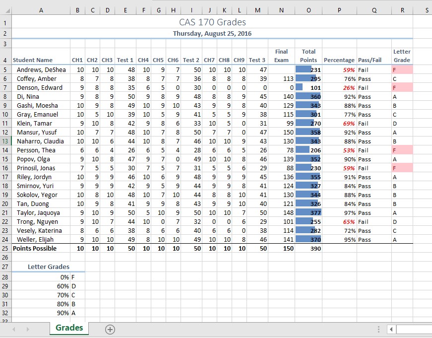
Chapter 3 – Formulas, Functions, Logical and Lookup Functions by Noreen Brown, Mary Schatz, and Art Schneider, Portland Community College, is licensed under CC BY 4.0
Before we move on to the more interesting calculations we will be discussing in this chapter, we need to determine how many points it is possible for each student to earn for each of the assignments. This information will go into Row 25. The =MAX function is our tool of choice.
Download Data File: CH3 Data
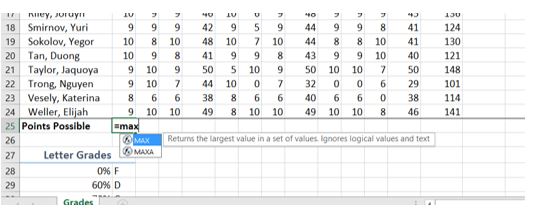
By default, the calculations that Excel copies change their cell references relative to the row or column you copy them to. That makes sense. You wouldn’t want column N to display an answer that uses the values in column L.
Want to see all the calculations you have just created? Press Ctrl ~ (See Figure 3.3.) Ctrl ~ displays your calculations (formulas). Pressing Ctrl ~ a second time will display your calculations in the default view – as values.
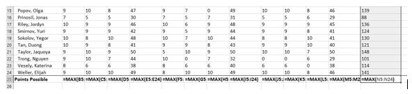
The Quick Analysis Tool allows you to create standard calculations, formatting, and charts very quickly. In this exercise we will use it to insert the Total Points for each student in Column O.
![]() Mac Users: the Quick Analysis Tool is not available with Excel for Mac. We have alternate steps for Mac Users below. Skip down below Figure 3.5 to continue.)
Mac Users: the Quick Analysis Tool is not available with Excel for Mac. We have alternate steps for Mac Users below. Skip down below Figure 3.5 to continue.)
Be sure to press Ctrl ~ to return your spreadsheet to the normal view (the formula results should display, not the formulas themselves).
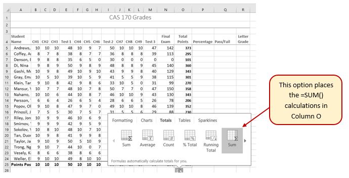
![]() Alternate steps for Mac Users:
Alternate steps for Mac Users:
Column P requires a Percentage calculation. Before we launch into creating a calculation for this, it might be handy to know precisely what it is we are looking for. If you are connected to the internet and are using Excel 365, you can use the Smart Lookup tool to get some more information about calculating percentages.
In general, the Smart Lookup tool allows you to get more information and definitions about unfamiliar terms or features. This tool is available in all of the Microsoft Office applications.
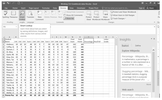
Now that we know what is needed for the Percentage calculation, we can have Excel do the calculation for us. We need to divide the Total Points for each student by the Total Points of all the Points Possible. Notice that there is a different number on each row – for each student. But, there is only one Total Points Possible – the value that is in cell O25.
Before copying the calculation, we have to make the second reference (O25) an absolute cell reference. That way, when we copy the formula down, the cell reference for O25 will be locked and will not change.
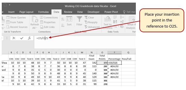
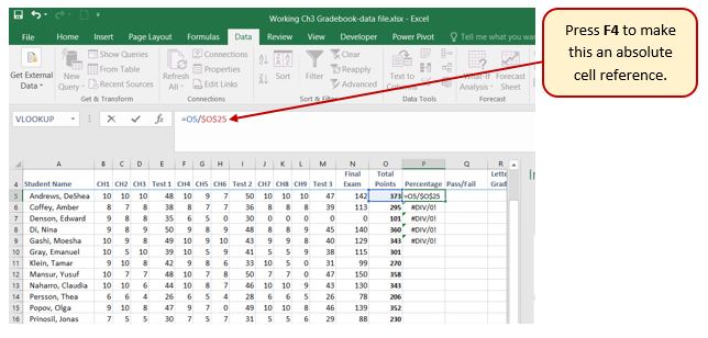
Those long decimals are a bit nonstandard. Let’s change them to % by applying cell formatting.
Absolute References
Smart Lookup Tool
This section uses a sample worksheet to illustrate Excel built-in functions. Consider the example of referencing a name from column A and returning the age of that person from column C. To create this worksheet, enter the following data into a blank Excel worksheet.
You will type the value that you want to find into cell E2. You can type the formula in any blank cell in the same worksheet.
| A | B | C | D | E | ||
| 1 | Name | Dept | Age | Find Value | ||
| 2 | Henry | 501 | 28 | Mary | ||
| 3 | Stan | 201 | 19 | |||
| 4 | Mary | 101 | 22 | |||
| 5 | Larry | 301 | 29 |
| Term | Definition | Example |
| Table Array | The whole lookup table | A2:C5 |
| Lookup_Value | The value to be found in the first column of Table_Array. | E2 |
| Lookup_Array -or- Lookup_Vector | The range of cells that contains possible lookup values. | A2:A5 |
| Col_Index_Num | The column number in Table_Array the matching value should be returned for. | 3 (third column in Table_Array) |
| Result_Array -or- Result_Vector | A range that contains only one row or column. It must be the same size as Lookup_Array or Lookup_Vector. | C2:C5 |
| Range_Lookup | A logical value (TRUE or FALSE). If TRUE or omitted, an approximate match is returned. If FALSE, it will look for an exact match. | FALSE |
| Top_cell | This is the reference from which you want to base the offset. Top_Cell must refer to a cell or range of adjacent cells. Otherwise, OFFSET returns the #VALUE! error value. | |
| Offset_Col CONCAT | This is the number of columns, to the left or right, that you want the upper-left cell of the result to refer to. For example, “5” as the Offset_Col argument specifies that the upper-left cell in the reference is five columns to the right of reference. Offset_Col can be positive (which means to the right of the starting reference) or negative (which means to the left of the starting reference). This is used for text that needs to be merged into one cell. You can type data into cells, then by using the CONCAT function and the range or cells you want to use, the data will be merged into the cell reference. For example, if you have the words “Red” in cell C2 and “Cat” in cell C3, by using CONCAT in cell C4, you can have the words Red Cat appear in that cell. |
In addition to doing arithmetic, Excel can do other kinds of functions based on the data in your spreadsheet. In this section, we will use an =IF function to determine whether a student is passing or failing the class. Then, we will use a =VLOOKUP function to determine what grade each student has earned.
The IF function is one of the most popular functions in Excel. It allows you to make logical comparisons between a value and what you expect. In its simplest form, the IF function says something like:
If the value in a cell is what you expect (true) – do this. If not – do that.
The IF function has three arguments:
In column Q we would like Excel to tell us whether a student is passing – or failing the class. If the student scores 70% or better, he/she will pass the class. But, if he/she scores less than 70%, he/she is failing.
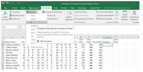
Now you will see the IF Function dialog box, with a place to enter each of the three arguments.
![]() Mac Users: There is no “dialog box”. The “Formula Builder” pane will display at the right side of the Excel window. It has the same layout as Figure 3.10 below.
Mac Users: There is no “dialog box”. The “Formula Builder” pane will display at the right side of the Excel window. It has the same layout as Figure 3.10 below.
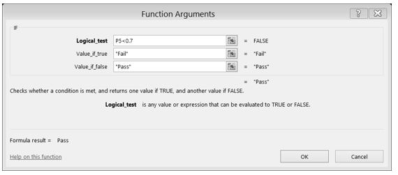
While we are here, let’s take a look at the dialog box. Notice that as you click in each box, Excel gives you a brief explanation of the contents (in the middle below the boxes.) In the lower left-hand corner, you can see the results of the calculation. In this case, DeShae is passing the class. Below that is a link to Help on this function. Selecting this link will take you to the Excel help for this function – with detailed information on how it works.
<img class=”wp-image-179 size-full” src=”https://spscc.pressbooks.pub/app/uploads/sites/50/2021/05/Figure-3-11.jpg” alt=”Formula bar shows IF function (=IF(PS Figure 3.11 IF Function Results
You need to use a VLOOKUP function to look up information in a table. Sometimes that table is on a different sheet in your workbook. Sometimes it is in another file entirely. In this case, we need to know what grade each student is getting based on their percentage score. You will find the table that defines the scores and the grades in A28:B32.
There are four pieces of information that you will need in order to build the VLOOKUP syntax. These are the four arguments of a VLOOKUP function:
Let’s create the VLOOKUP to display the correct Letter Grade in column R.
 to find the VLOOKUP function.
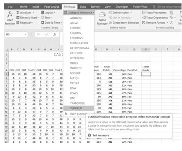
![]() Mac Users will use the “Formula Builder” pane at the right side of the Excel Window.
Mac Users will use the “Formula Builder” pane at the right side of the Excel Window.

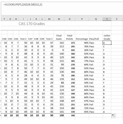
Note: What if it didn’t work? What if you get a result different from the one predicted? In this case, either you have made a previous error, resulting in different % scores than this exercise anticipated, or you made a mistake entering your VLOOKUP function.
To make repairs in the function, make sure that R5 is your active cell. On the Formula bar, press the Insert Function button (see Figure 3.15). That will reopen the dialog box so you can make your repairs. Did you forget to make the cell references for the Table_array absolute? Did you use the wrong cell for the Lookup_value? Press OK when you are done and recopy the corrected function.
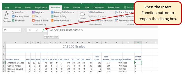
Sometimes Excel notices that you have made errors in your calculations before you do. In those cases Excel alerts you with some slightly mysterious error messages. A list of common error messages can be found in Table 3.1 below.
Table 3.1 – Common Error Messages
| Message | What Went Wrong |
| #DIV/0! | You tried to divide a number by a zero (0) or an empty cell. |
| #NAME | You used a cell range name in the formula, but the name isn’t defined. Sometimes this error occurs because you type the name incorrectly. |
| #N/A | The formula refers to an empty cell, so no data is available for computing the formula. Sometimes people enter N/A in a cell as a placeholder to signal the fact that data isn’t entered yet. Revise the formula or enter a number or formula in the empty cells. |
| #NULL | The formula refers to a cell range that Excel can’t understand. Make sure that the range is entered correctly. |
| #NUM | An argument you use in your formula is invalid. |
| #REF | The cell or range of cells that the formula refers to aren’t there. |
| #VALUE | The formula includes a function that was used incorrectly, takes an invalid argument, or is misspelled. Make sure that the function uses the right argument and is spelled correctly. |
This table was copied from the internet. Look here for additional information.
http://www.dummies.com/software/microsoft-office/excel/how-to-detect-and-correct-formula-errors-in-excel-2016/
Very often dates and times are an important part of Excel data. Numbers that are correct today may not be accurate tomorrow. So, it is frequently useful to include dates and times on your spreadsheets.
These dates and times fall into two categories – ones that:
Take a look at the list of Date and Time functions offered in the Function Library on the Formulas tab (see Figure 3.16).
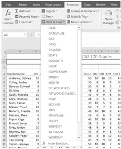
For our gradebook, we want the date and time to be displayed in A2, and it needs to update whenever the workbook file is opened.
Excel will update this field independently whenever you save and re-open the file, or print it. It may happen more frequently than that – depending on how you have set this up in your installation of Excel.
Another variation of the current date is the TODAY function. Let’s try that one next.
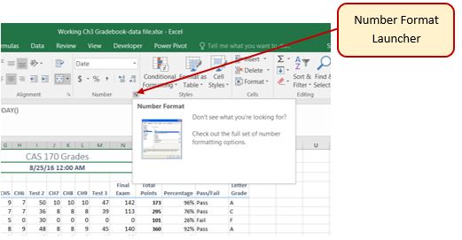
Sometimes you want the date or the time to show up in your spreadsheet, but you don’t want it to change. You can simply type in the date or time. Or, you can use shortcut keys.
3.2 Logical and Lookup Functions by Noreen Brown and Mary Schatz, and Art Schneider, Portland Community College, is licensed under CC BY 4.0
You now have all the calculations you need in your CAS 170 Grades spreadsheet. There is a lot of data here. To make it easier to pick out the most important pieces of data, Excel provides Conditional Formatting. The best thing about Conditional Formatting is that it is flexible, applying specified formatting only when certain conditions are met.
Excel places blue bars on top of your values; long blue bars for larger numbers, shorter ones for smaller numbers. This makes it easier to see how well each student did in the class – without having to look at the specific numbers.
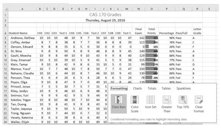
Another way to apply Data Bars is to:
![]() Mac Users: Alternate Steps:
Mac Users: Alternate Steps:
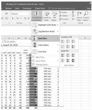
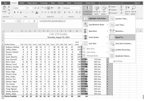
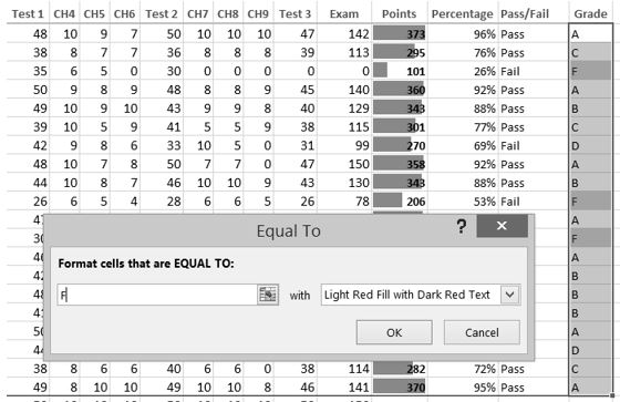
Let’s try that one more time – to highlight those students who are passing the class. This time we will use the Pass/Fail text in the Pass/Fail column. If the text for a student is Pass we want the cell to be formatted with a yellow fill with dark yellow text.
You do not have to use the default styles to make your data stand out. You can set any formatting you want. When you do, it is probably a good idea to include other styling in addition to color. Your spreadsheet might be printed in black and white. You would hate to lose your Conditional formatting. Now we are going to use conditional formatting to display any Percentages that are less than 60% with red text formatted in bold and italic.
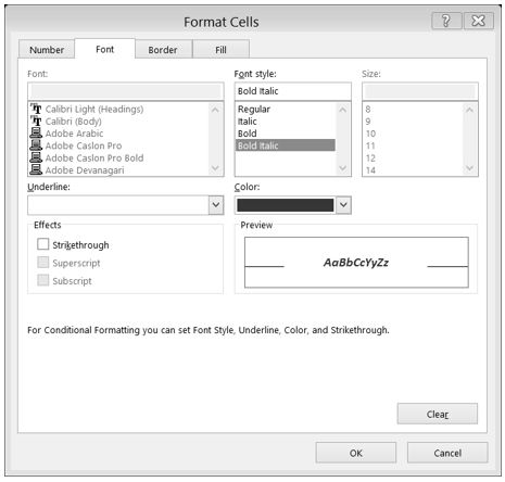
Conditional Formatting is valuable in that it reflects the current data. It changes to reflect changes in the data. To test this, delete DeShea’s final exam score. (Select N5. Press Delete on your keyboard.) Suddenly, DeShae is failing the course and the Conditional Formatting reflects that. This is a little unfair to DeShae – who has worked so hard this quarter. Let’s give him back his grade. Press CTRL Z (Undo). His test score reappears and the Conditional formatting reflects that as well.
What if you have made a mistake with your Conditional Formatting? Or, you want to delete it altogether? You can use the Conditional Formatting Manage Rules tool. In our example, we want to remove the conditional formatting rule that formats the Pass text with yellow. We are also going to modify the minimum passing percentage for the conditional formatting rule that is applied to the percentages.
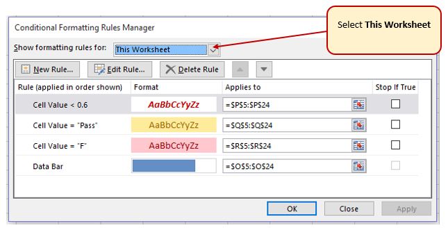
In a previous exercise (the IF function), we decided that students were failing if they got a percentage score of less than 70%, so the Conditional Formatting rule in the Percentage column needs repair.
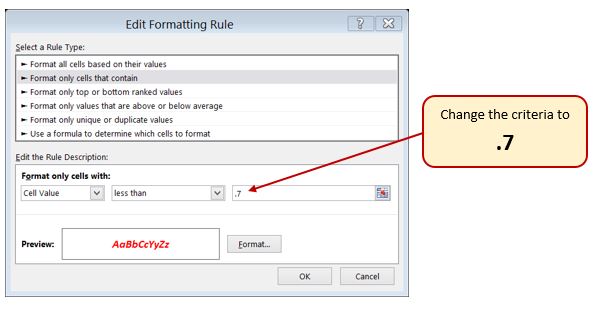
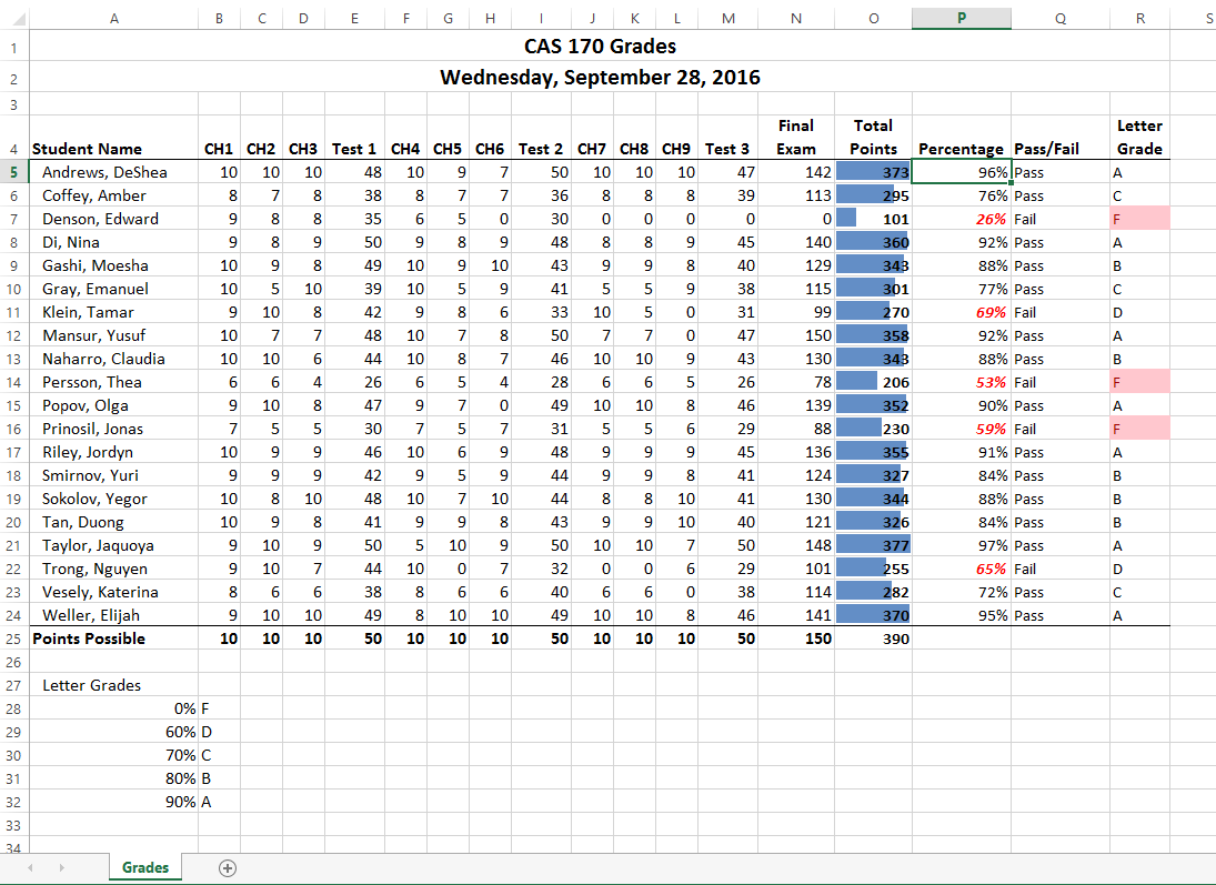
Before you consider this workbook finished, you need to prepare it for printing. The first thing you will do is set the Print Area so that the table of Letter Grades in A27:B32 does not print.
Next you will preview the worksheet in Print Preview to check that the print area setting worked, as well as make sure it is printing on one page.
3.3 Conditional Formatting by Noreen Brown, Mary Schatz, and Art Schneider, Portland Community College, is licensed under CC BY 4.0
In this section, we will review a worksheet for formatting consistency, as well as learn two new formatting techniques. This worksheet currently prints on four pages, so we will learn new page setup options to control how these pages print. A new data file will be used for this section.
Open the “CH3-Gradebook and Parks” workbook if it isn’t already open.
Click on the “Park Size” sheet tab within your “CH3-Gradebook and Parks” workbook ![]() .
.
You have been given a spreadsheet with data about the national parks in the western United States. Your coworker formatted the workbook and has asked you to review it for consistency. You also need to prepare it for printing. Figure 3.26 shows how the second page of the finished worksheet will appear in Print Preview.
The first thing you are going to do is review the worksheet for formatting inconsistencies.
Now that you have fixed the inconsistencies in the formatting, you decide to apply some formatting techniques to make the worksheet look even better. You are going to start by vertically aligning the names of the states within the cells.
The next new formatting skill is to change the label in E3 from Size (km2) to Size (km2) with the 2 after km formatted with superscript.
 then continue with Steps 4 and 5
Now that you have fixed the cell and text formatting, you are ready to review the worksheet in Print Preview. You will notice that the worksheet is printing on multiple pages, and you cannot tell what each column of data represents on some of the pages.
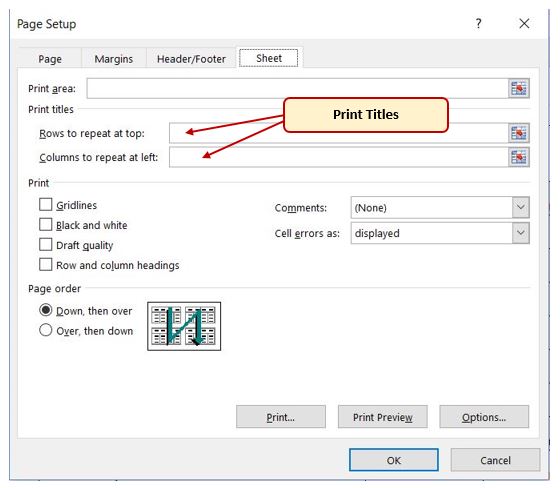
You will not see a change to the worksheet in Normal view, so you will need to return to Print Preview. While looking in Print Preview, you will notice that the pages are breaking in inconvenient places.
Creating Print Titles
Notice that the data for California is split between the first and second pages. You want all of the data for each state to be together on the same page, so you need to control the page breaks. You are going to start by inserting a page break before the California data to force it to start on the second page, then you will move the page break for the third page if needed. To make these changes you are going to work in Page Break Preview.
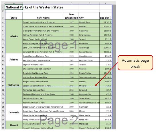
![]() Mac Users: in the next paragraph below, the location of the automatic page breaks may be in different locations. That’s ok.
Mac Users: in the next paragraph below, the location of the automatic page breaks may be in different locations. That’s ok.
In Page Break Preview, automatic page breaks are displayed as dotted blue lines. Notice the dotted blue lines after rows 13 and 28. These lines indicate where Excel will start a new page. For this worksheet, you want the first page to break before the California data, so you are going to insert a manual page break.
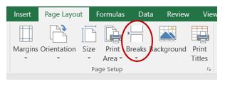
While looking at each page in Print Preview you decide that the third page should start with Montana. To make this change you are going to move the automatic page break that appears after Nevada.
While evaluating the pages in Print Preview you decide that there is too much white space at the bottom of the pages. To fix this, you are going to center the contents vertically on the pages.
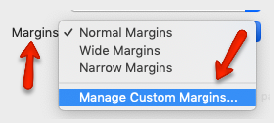
Now that the worksheet is printing on three pages, with page breaks in appropriate places, you are ready to add a header with the current date and filename. You will also add a footer with the page number and the total number of pages that will appear as Page 1 of 3. You are going to edit the header and footer in Page Layout View.
Download Data File: PR3 Data
Etta and Lucian Redding are a recently married couple living in Portland, Oregon. Lucian works part time and attends the local community college. Etta works as a marketing manager at a clothing company in North Portland. They are trying to decide if they can afford to move to a better apartment, one that is closer to work and school. They want to use Excel to examine their household budget. They have started their budget spreadsheet, but they need your help with it.
A2 Category
B2 Item
C2 January
O2 Yearly Total (adjust column width as needed to fit this text)
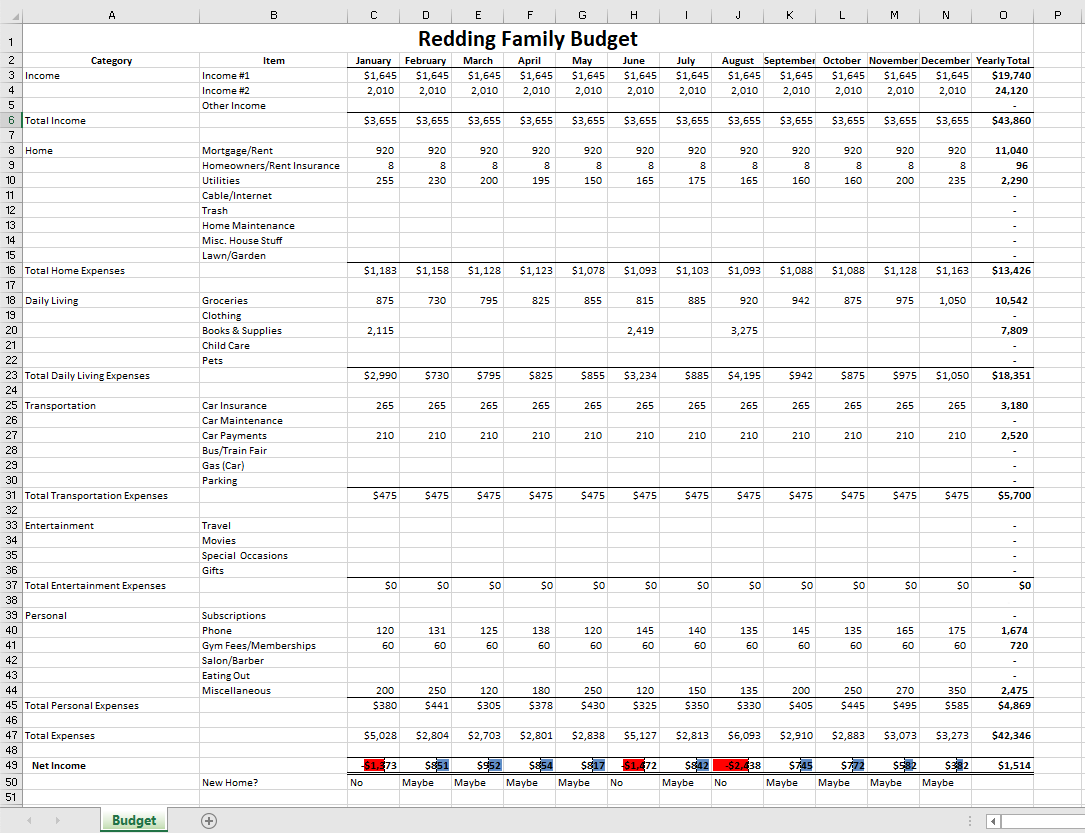
“3.5 Chapter Practice” by Diane Shingledecker, Portland Community College is licensed under CC BY 4.0, It is adapted from Personal Budget Project by Matt Goff, CC BY-SA 4.0.
Download Data File: SC3 data
MidasCoffee: Ruth Kobran owns a coffee supply company named MidasCoffee. She needs some help writing the formulas for the order form she uses to invoice customers. You will need to write the formulas for all of the calculations on the form. Some of the more complex parts are determining if the customer will get a discount (based on the customer status) as well as the shipping charge (orders over $199 get free shipping). You will use IF functions for both of those calculations.
| Item # | Description | Qty | Unit Price |
| K56 | Dark Mocha K-Cups (12 pack) | 1 | 11.99 |
| G03 | Decaf Dark Roast – Ground (1 lb.) | 3 | 12.99 |
| B07 | Organic Dark Roast – Whole Bean (1 lb.) | 2 | 14.99 |
| K52 | Chai Latte K-Cups (12 pack) | 3 | 10.99 |
“3.6 Chapter Scored” by Noreen Brown, Art Schneider and Mary Schatz and Jennifer Evans, Portland Community College is licensed under CC BY 4.0
X
The range is a measure of the total spread of values in a quantitative dataset.
Interpret the range as the overall dispersion of values in a dataset
In statistics, the range is a measure of the total spread of values in a quantitative dataset. Unlike other more popular measures of dispersion, the range actually measures total dispersion (between the smallest and largest values) rather than relative dispersion around a measure of central tendency.
The range is interpreted as the overall dispersion of values in a dataset or, more literally, as the difference between the largest and the smallest value in a dataset. The range is measured in the same units as the variable of reference and, thus, has a direct interpretation as such. This can be useful when comparing similar variables but of little use when comparing variables measured in different units. However, because the information the range provides is rather limited, it is seldom used in statistical analyses.
For example, if you read that the age range of two groups of students is 3 in one group and 7 in another, then you know that the second group is more spread out (there is a difference of seven years between the youngest and the oldest student) than the first (which only sports a difference of three years between the youngest and the oldest student).
The mid-range of a set of statistical data values is the arithmetic mean of the maximum and minimum values in a data set, defined as:
M=xmax+xmin2">
The mid-range is the midpoint of the range; as such, it is a measure of central tendency. The mid-range is rarely used in practical statistical analysis, as it lacks efficiency as an estimator for most distributions of interest because it ignores all intermediate points. The mid-range also lacks robustness, as outliers change it significantly. Indeed, it is one of the least efficient and least robust statistics.
However, it finds some use in special cases:
Variance is the sum of the probabilities that various outcomes will occur multiplied by the squared deviations from the average of the random variable.
Calculate variance to describe a population
When describing data, it is helpful (and in some cases necessary) to determine the spread of a distribution. In describing a complete population, the data represents all the elements of the population. When determining the spread of the population, we want to know a measure of the possible distances between the data and the population mean. These distances are known as deviations.
The variance of a data set measures the average square of these deviations. More specifically, the variance is the sum of the probabilities that various outcomes will occur multiplied by the squared deviations from the average of the random variable. When trying to determine the risk associated with a given set of options, the variance is a very useful tool.
Calculating the variance begins with finding the mean. Once the mean is known, the variance is calculated by finding the average squared deviation of each number in the sample from the mean. For the numbers 1, 2, 3, 4, and 5, the mean is 3. The calculation for finding the mean is as follows:
1+2+3+4+55=155=3">
Once the mean is known, the variance can be calculated. The variance for the above set of numbers is:
σ2=(1−3)2+(2−3)2+(3−3)2+(4−3)2+(5−3)25">
σ2=(−2)2+(−1)2+(0)2+(1)2+(2)25">
σ2=4+1+0+1+45">
σ2=105=2">
A clear distinction should be made between dealing with the population or with a sample from it. When dealing with the complete population the (population) variance is a constant, a parameter which helps to describe the population. When dealing with a sample from the population the (sample) variance is actually a random variable, whose value differs from sample to sample.

Population of Cheetahs
The population variance can be very helpful in analyzing data of various wildlife populations.
Standard deviation is a measure of the average distance between the values of the data in the set and the mean.
Contrast the usefulness of variance and standard deviation
Example
The average height for adult men in the United States is about 70 inches, with a standard deviation of around 3 inches. This means that most men (about 68%, assuming a normal distribution) have a height within 3 inches of the mean (67–73 inches) – one standard deviation – and almost all men (about 95%) have a height within 6 inches of the mean (64–76 inches) – two standard deviations. If the standard deviation were zero, then all men would be exactly 70 inches tall. If the standard deviation were 20 inches, then men would have much more variable heights, with a typical range of about 50–90 inches. Three standard deviations account for 99.7% of the sample population being studied, assuming the distribution is normal (bell-shaped).
Since the variance is a squared quantity, it cannot be directly compared to the data values or the mean value of a data set. It is therefore more useful to have a quantity that is the square root of the variance. The standard error is an estimate of how close to the population mean your sample mean is likely to be, whereas the standard deviation is the degree to which individuals within the sample differ from the sample mean. This quantity is known as the standard deviation.
Standard deviation (represented by the symbol sigma, σ">) shows how much variation or dispersion exists from the average (mean), or expected value. More precisely, it is a measure of the average distance between the values of the data in the set and the mean. A low standard deviation indicates that the data points tend to be very close to the mean; a high standard deviation indicates that the data points are spread out over a large range of values. A useful property of standard deviation is that, unlike variance, it is expressed in the same units as the data.
In statistics, the standard deviation is the most common measure of statistical dispersion. However, in addition to expressing the variability of a population, standard deviation is commonly used to measure confidence in statistical conclusions. For example, the margin of error in polling data is determined by calculating the expected standard deviation in the results if the same poll were to be conducted multiple times.
Consider a population consisting of the following eight values:
2, 4, 4, 4, 5, 5, 7, 9
These eight data points have a mean (average) of 5:
2+4+4+4+5+5+7+98=5">
To calculate the population standard deviation, first compute the difference of each data point from the mean, and square the result of each:
(2−5)2=9(4−5)2=1(4−5)2=1(4−5)2=1(5−5)2=0(5−5)2=0(7−5)2=4(9−5)2=16">
(2−5)2=9(4−5)2=1(4−5)2=1(4−5)2=1(5−5)2=0(5−5)2=0(7−5)2=4(9−5)2=16">
(2−5)2=9(4−5)2=1(4−5)2=1(4−5)2=1(5−5)2=0(5−5)2=0(7−5)2=4(9−5)2=16">
(2−5)2=9(4−5)2=1(4−5)2=1(4−5)2=1(5−5)2=0(5−5)2=0(7−5)2=4(9−5)2=16">
(2−5)2=9(4−5)2=1(4−5)2=1(4−5)2=1(5−5)2=0(5−5)2=0(7−5)2=4(9−5)2=16">
(2−5)2=9(4−5)2=1(4−5)2=1(4−5)2=1(5−5)2=0(5−5)2=0(7−5)2=4(9−5)2=16">
(2−5)2=9(4−5)2=1(4−5)2=1(4−5)2=1(5−5)2=0(5−5)2=0(7−5)2=4(9−5)2=16">
(2−5)2=9(4−5)2=1(4−5)2=1(4−5)2=1(5−5)2=0(5−5)2=0(7−5)2=4(9−5)2=16">
Next, compute the average of these values, and take the square root:
9+1+1+1+0+0+4+168=2">
This quantity is the population standard deviation, and is equal to the square root of the variance. The formula is valid only if the eight values we began with form the complete population. If the values instead were a random sample drawn from some larger parent population, then we would have divided by 7 (which is n−1">) instead of 8 (which is n">) in the denominator of the last formula, and then the quantity thus obtained would be called the sample standard deviation.
The sample standard deviation, s">, is a statistic known as an estimator. In cases where the standard deviation of an entire population cannot be found, it is estimated by examining a random sample taken from the population and computing a statistic of the sample. Unlike the estimation of the population mean, for which the sample mean is a simple estimator with many desirable properties ( unbiased, efficient, maximum likelihood), there is no single estimator for the standard deviation with all these properties. Therefore, unbiased estimation of standard deviation is a very technically involved problem.
As mentioned above, most often the standard deviation is estimated using the corrected sample standard deviation (using N−1">). However, other estimators are better in other respects:
The mean and the standard deviation of a set of data are usually reported together. In a certain sense, the standard deviation is a “natural” measure of statistical dispersion if the center of the data is measured about the mean. This is because the standard deviation from the mean is smaller than from any other point. Variability can also be measured by the coefficient of variation, which is the ratio of the standard deviation to the mean.
Often, we want some information about the precision of the mean we obtained. We can obtain this by determining the standard deviation of the sample mean, which is the standard deviation divided by the square root of the total amount of numbers in a data set:
σmean=σN">
Standard Deviation Diagram
Dark blue is one standard deviation on either side of the mean. For the normal distribution, this accounts for 68.27 percent of the set; while two standard deviations from the mean (medium and dark blue) account for 95.45 percent; three standard deviations (light, medium, and dark blue) account for 99.73 percent; and four standard deviations account for 99.994 percent.
The practical value of understanding the standard deviation of a set of values is in appreciating how much variation there is from the mean.
Derive standard deviation to measure the uncertainty in daily life examples
Example
In finance, standard deviation is often used as a measure of the risk associated with price-fluctuations of a given asset (stocks, bonds, property, etc.), or the risk of a portfolio of assets. Risk is an important factor in determining how to efficiently manage a portfolio of investments because it determines the variation in returns on the asset and/or portfolio and gives investors a mathematical basis for investment decisions. When evaluating investments, investors should estimate both the expected return and the uncertainty of future returns. Standard deviation provides a quantified estimate of the uncertainty of future returns.
A large standard deviation, which is the square root of the variance, indicates that the data points are far from the mean, and a small standard deviation indicates that they are clustered closely around the mean. For example, each of the three populations {0,0,14,14}">, {0,6,8,14}">, and {6,6,8,8}"> has a mean of 7. Their standard deviations are 7, 5, and 1, respectively. The third population has a much smaller standard deviation than the other two because its values are all close to 7.
Standard deviation may serve as a measure of uncertainty. In physical science, for example, the reported standard deviation of a group of repeated measurements gives the precision of those measurements. When deciding whether measurements agree with a theoretical prediction, the standard deviation of those measurements is of crucial importance. If the mean of the measurements is too far away from the prediction (with the distance measured in standard deviations), then the theory being tested probably needs to be revised. This makes sense since they fall outside the range of values that could reasonably be expected to occur, if the prediction were correct and the standard deviation appropriately quantified.
The practical value of understanding the standard deviation of a set of values is in appreciating how much variation there is from the average (mean).
As a simple example, consider the average daily maximum temperatures for two cities, one inland and one on the coast. It is helpful to understand that the range of daily maximum temperatures for cities near the coast is smaller than for cities inland. Thus, while these two cities may each have the same average maximum temperature, the standard deviation of the daily maximum temperature for the coastal city will be less than that of the inland city as, on any particular day, the actual maximum temperature is more likely to be farther from the average maximum temperature for the inland city than for the coastal one.
Another way of seeing it is to consider sports teams. In any set of categories, there will be teams that rate highly at some things and poorly at others. Chances are, the teams that lead in the standings will not show such disparity but will perform well in most categories. The lower the standard deviation of their ratings in each category, the more balanced and consistent they will tend to be. Teams with a higher standard deviation, however, will be more unpredictable.
Comparison of Standard Deviations
Example of two samples with the same mean and different standard deviations. The red sample has a mean of 100 and a SD of 10; the blue sample has a mean of 100 and a SD of 50. Each sample has 1,000 values drawn at random from a Gaussian distribution with the specified parameters.
For advanced calculating and graphing, it is often very helpful for students and statisticians to have access to statistical calculators.
Analyze the use of R statistical software and TI-83 graphing calculators
For many advanced calculations and/or graphical representations, statistical calculators are often quite helpful for statisticians and students of statistics. Two of the most common calculators in use are the TI-83 series and the R statistical software environment.
The TI-83 series of graphing calculators, shown in , is manufactured by Texas Instruments. Released in 1996, it was one of the most popular graphing calculators for students. In addition to the functions present on normal scientific calculators, the TI-83 includes many andvanced features, including function graphing, polar/parametric/sequence graphing modes, statistics, trigonometric, and algebraic functions, along with many useful applications.
TI-83
The TI-83 series of graphing calculators is one of the most popular calculators for statistics students.
The TI-83 has a handy statistics mode (accessed via the “STAT” button) that will perform such functions as manipulation of one-variable statistics, drawing of histograms and box plots, linear regression, and even distribution tests.
R is a free software programming language and a software environment for statistical computing and graphics. The R language is widely used among statisticians and data miners for developing statistical software and data analysis. Polls and surveys of data miners are showing R’s popularity has increased substantially in recent years.
R is an implementation of the S programming language, which was created by John Chambers while he was at Bell Labs. R was created by Ross Ihaka and Robert Gentleman at the University of Auckland, New Zealand, and is currently developed by the R Development Core Team, of which Chambers is a member. R is a GNU project, which means it’s source code is freely available under the GNU General Public License.
R provides a wide variety of statistical and graphical techniques, including linear and nonlinear modeling, classical statistical tests, time-series analysis, classification, and clustering. Another strength of R is static graphics, which can produce publication-quality graphs, including mathematical symbols. Dynamic and interactive graphics are available through additional packages.
R is easily extensible through functions and extensions, and the R community is noted for its active contributions in terms of packages. These packagers allow specialized statistical techniques, graphical devices, import/export capabilities, reporting tools, et cetera. Due to its S heritage, R has stronger object-oriented programming facilities than most statistical computing languages.
The number of degrees of freedom is the number of values in the final calculation of a statistic that are free to vary.
Outline an example of “degrees of freedom”
The number of independent ways by which a dynamical system can move without violating any constraint imposed on it is known as “degree of freedom. ” The degree of freedom can be defined as the minimum number of independent coordinates that completely specify the position of the system.
Consider this example: To compute the variance, first sum the square deviations from the mean. The mean is a parameter, a characteristic of the variable under examination as a whole, and a part of describing the overall distribution of values. Knowing all the parameters, you can accurately describe the data. The more known (fixed) parameters you know, the fewer samples fit this model of the data. If you know only the mean, there will be many possible sets of data that are consistent with this model. However, if you know the mean and the standard deviation, fewer possible sets of data fit this model.
In computing the variance, first calculate the mean, then you can vary any of the scores in the data except one. This one score left unexamined can always be calculated accurately from the rest of the data and the mean itself.
As an example, take the ages of a class of students and find the mean. With a fixed mean, how many of the other scores (there are N of them remember) could still vary? The answer is N-1 independent pieces of information (degrees of freedom) that could vary while the mean is known. One piece of information cannot vary because its value is fully determined by the parameter (in this case the mean) and the other scores. Each parameter that is fixed during our computations constitutes the loss of a degree of freedom.
Imagine starting with a small number of data points and then fixing a relatively large number of parameters as we compute some statistic. We see that as more degrees of freedom are lost, fewer and fewer different situations are accounted for by our model since fewer and fewer pieces of information could, in principle, be different from what is actually observed.
Put informally, the “interest” in our data is determined by the degrees of freedom. If there is nothing that can vary once our parameter is fixed (because we have so very few data points, maybe just one) then there is nothing to investigate. Degrees of freedom can be seen as linking sample size to explanatory power.
The degrees of freedom are also commonly associated with the squared lengths (or “sum of squares” of the coordinates) of random vectors and the parameters of chi-squared and other distributions that arise in associated statistical testing problems.
In equations, the typical symbol for degrees of freedom is ν"> (lowercase Greek letter nu). In text and tables, the abbreviation “d.f. ” is commonly used.
In fitting statistical models to data, the random vectors of residuals are constrained to lie in a space of smaller dimension than the number of components in the vector. That smaller dimension is the number of degrees of freedom for error. In statistical terms, a random vector is a list of mathematical variables each of whose value is unknown, either because the value has not yet occurred or because there is imperfect knowledge of its value. The individual variables in a random vector are grouped together because there may be correlations among them. Often they represent different properties of an individual statistical unit (e.g., a particular person, event, etc.).
A residual is an observable estimate of the unobservable statistical error. Consider an example with men’s heights and suppose we have a random sample of n people. The sample mean could serve as a good estimator of the population mean. The difference between the height of each man in the sample and the observable sample mean is a residual. Note that the sum of the residuals within a random sample is necessarily zero, and thus the residuals are necessarily not independent.
Perhaps the simplest example is this. Suppose X1,…,Xn are random variables each with expected value μ, and let

be the “sample mean. ” Then the quantities
Xi−Xn¯">
are residuals that may be considered estimates of the errors Xi − μ. The sum of the residuals is necessarily 0. If one knows the values of any n − 1 of the residuals, one can thus find the last one. That means they are constrained to lie in a space of dimension n − 1, and we say that “there are n − 1 degrees of freedom for error. ”
Degrees of Freedom
This image illustrates the difference (or distance) between the cumulative distribution functions of the standard normal distribution (Φ) and a hypothetical distribution of a standardized sample mean (Fn). Specifically, the plotted hypothetical distribution is a t distribution with 3 degrees of freedom.
The interquartile range (IQR) is a measure of statistical dispersion, or variability, based on dividing a data set into quartiles.
Calculate interquartile range based on a given data set
The interquartile range (IQR) is a measure of statistical dispersion, or variability, based on dividing a data set into quartiles. Quartiles divide an ordered data set into four equal parts. The values that divide these parts are known as the first quartile, second quartile and third quartile (Q1, Q2, Q3). The interquartile range is equal to the difference between the upper and lower quartiles:
IQR = Q3 − Q1
It is a trimmed estimator, defined as the 25% trimmed mid-range, and is the most significant basic robust measure of scale. As an example, consider the following numbers:
1, 13, 6, 21, 19, 2, 137
Put the data in numerical order: 1, 2, 6, 13, 19, 21, 137
Find the median of the data: 13
Divide the data into four quartiles by finding the median of all the numbers below the median of the full set, and then find the median of all the numbers above the median of the full set.
To find the lower quartile, take all of the numbers below the median: 1, 2, 6
Find the median of these numbers: take the first and last number in the subset and add their positions (not values) and divide by two. This will give you the position of your median:
1+3 = 4/2 = 2
The median of the subset is the second position, which is two. Repeat with numbers above the median of the full set: 19, 21, 137. Median is 1+3 = 4/2 = 2nd position, which is 21. This median separates the third and fourth quartiles.
Subtract the lower quartile from the upper quartile: 21-2=19. This is the Interquartile range, or IQR.
If there is an even number of values, then the position of the median will be in between two numbers. In that case, take the average of the two numbers that the median is between. Example: 1, 3, 7, 12. Median is 1+4=5/2=2.5th position, so it is the average of the second and third positions, which is 3+7=10/2=5. This median separates the first and second quartiles.
Unlike (total) range, the interquartile range has a breakdown point of 25%. Thus, it is often preferred to the total range. In other words, since this process excludes outliers, the interquartile range is a more accurate representation of the “spread” of the data than range.
The IQR is used to build box plots, which are simple graphical representations of a probability distribution. A box plot separates the quartiles of the data. All outliers are displayed as regular points on the graph. The vertical line in the box indicates the location of the median of the data. The box starts at the lower quartile and ends at the upper quartile, so the difference, or length of the boxplot, is the IQR.
On this boxplot in , the IQR is about 300, because Q1 starts at about 300 and Q3 ends at 600, and 600 – 300 = 300.
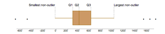
Interquartile Range
The IQR is used to build box plots, which are simple graphical representations of a probability distribution.
In a boxplot, if the median (Q2 vertical line) is in the center of the box, the distribution is symmetrical. If the median is to the left of the data (such as in the graph above), then the distribution is considered to be skewed right because there is more data on the right side of the median. Similarly, if the median is on the right side of the box, the distribution is skewed left because there is more data on the left side.
The range of this data is 1,700 (biggest outlier) – 500 (smallest outlier) = 2,200. If you wanted to leave out the outliers for a more accurate reading, you would subtract the values at the ends of both “whiskers:”
1,000 – 0 = 1,000
To calculate whether something is truly an outlier or not you use the formula 1.5 x IQR. Once you get that number, the range that includes numbers that are not outliers is [Q1 – 1.5(IQR), Q3 + 1.5(IQR)]. Anything lying outside those numbers are true outliers.
Variability for qualitative data is measured in terms of how often observations differ from one another.
Assess the use of IQV in measuring statistical dispersion in nominal distributions
The study of statistics generally places considerable focus upon the distribution and measure of variability of quantitative variables. A discussion of the variability of qualitative–or categorical– data can sometimes be absent. In such a discussion, we would consider the variability of qualitative data in terms of unlikeability. Unlikeability can be defined as the frequency with which observations differ from one another. Consider this in contrast to the variability of quantitative data, which ican be defined as the extent to which the values differ from the mean. In other words, the notion of “how far apart” does not make sense when evaluating qualitative data. Instead, we should focus on the unlikeability.
In qualitative research, two responses differ if they are in different categories and are the same if they are in the same category. Consider two polls with the simple parameters of “agree” or “disagree. ” These polls question 100 respondents. The first poll results in 75 “agrees” while the second poll only results in 50 “agrees. ” The first poll has less variability since more respondents answered similarly.
An index of qualitative variation (IQV) is a measure of statistical dispersion in nominal distributions–or those dealing with qualitative data. The following standardization properties are required to be satisfied:
In particular, the value of these standardized indices does not depend on the number of categories or number of samples. For any index, the closer to uniform the distribution, the larger the variance, and the larger the differences in frequencies across categories, the smaller the variance.
The variation ratio is a simple measure of statistical dispersion in nominal distributions. It is the simplest measure of qualitative variation. It is defined as the proportion of cases which are not the mode:
v=1−fmN">
Just as with the range or standard deviation, the larger the variation ratio, the more differentiated or dispersed the data are; and the smaller the variation ratio, the more concentrated and similar the data are.
For example, a group which is 55% female and 45% male has a proportion of 0.55 females and, therefore, a variation ratio of:
1.0−0.55=0.45">
This group is more dispersed in terms of gender than a group which is 95% female and has a variation ratio of only 0.05. Similarly, a group which is 25% Catholic (where Catholic is the modal religious preference) has a variation ratio of 0.75. This group is much more dispersed, religiously, than a group which is 85% Catholic and has a variation ratio of only 0.15.
Descriptive statistics can be manipulated in many ways that can be misleading, including the changing of scale and statistical bias.
Descriptive statistics can be manipulated in many ways that can be misleading. Graphs need to be carefully analyzed, and questions must always be asked about “the story behind the figures. ” Potential manipulations include:
As an example of changing the scale of a graph, consider the following two figures, and .
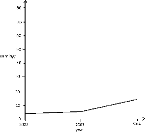
Effects of Changing Scale
In this graph, the earnings scale is greater.
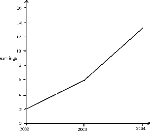
Effects of Changing Scale
This is a graph plotting yearly earnings.
Both graphs plot the years 2002, 2003, and 2004 along the x-axis. However, the y-axis of the first graph presents earnings from “0 to 10,” while the y-axis of the second graph presents earnings from “0 to 30. ” Therefore, there is a distortion between the two of the rate of increased earnings.
Bias is another common distortion in the field of descriptive statistics. A statistic is biased if it is calculated in such a way that is systematically different from the population parameter of interest. The following are examples of statistical bias.
Descriptive statistics is a powerful form of research because it collects and summarizes vast amounts of data and information in a manageable and organized manner. Moreover, it establishes the standard deviation and can lay the groundwork for more complex statistical analysis.
However, what descriptive statistics lacks is the ability to:
To illustrate you can use descriptive statistics to calculate a raw GPA score, but a raw GPA does not reflect:
In other words, every time you try to describe a large set of observations with a single descriptive statistics indicator, you run the risk of distorting the original data or losing important detail.
Exploratory data analysis is an approach to analyzing data sets in order to summarize their main characteristics, often with visual methods.
Exploratory data analysis (EDA) is an approach to analyzing data sets in order to summarize their main characteristics, often with visual methods. It is a statistical practice concerned with (among other things):
Primarily, EDA is for seeing what the data can tell us beyond the formal modeling or hypothesis testing task. EDA is different from initial data analysis (IDA), which focuses more narrowly on checking assumptions required for model fitting and hypothesis testing, handling missing values, and making transformations of variables as needed. EDA encompasses IDA.
Exploratory data analysis was promoted by John Tukey to encourage statisticians to explore the data and possibly formulate hypotheses that could lead to new data collection and experiments. Tukey’s EDA was related to two other developments in statistical theory: robust statistics and nonparametric statistics. Both of these try to reduce the sensitivity of statistical inferences to errors in formulating statistical models. Tukey promoted the use of the five number summary of numerical data:
His reasoning was that the median and quartiles, being functions of the empirical distribution, are defined for all distributions, unlike the mean and standard deviation. Moreover, the quartiles and median are more robust to skewed or heavy-tailed distributions than traditional summaries (the mean and standard deviation).
Exploratory data analysis, robust statistics, and nonparametric statistics facilitated statisticians’ work on scientific and engineering problems. Such problems included the fabrication of semiconductors and the understanding of communications networks. These statistical developments, all championed by Tukey, were designed to complement the analytic theory of testing statistical hypotheses.
Tukey held that too much emphasis in statistics was placed on statistical hypothesis testing (confirmatory data analysis) and more emphasis needed to be placed on using data to suggest hypotheses to test. In particular, he held that confusing the two types of analyses and employing them on the same set of data can lead to systematic bias owing to the issues inherent in testing hypotheses suggested by the data.
Subsequently, the objectives of EDA are to:
Although EDA is characterized more by the attitude taken than by particular techniques, there are a number of tools that are useful. Many EDA techniques have been adopted into data mining and are being taught to young students as a way to introduce them to statistical thinking. Typical graphical techniques used in EDA are:
These EDA techniques aim to position these plots so as to maximize our natural pattern-recognition abilities. A clear picture is worth a thousand words!
Scatter Plots
A scatter plot is one visual statistical technique developed from EDA.
XI
In statistics, a population includes all members of a defined group that we are studying for data driven decisions.
When we hear the word population, we typically think of all the people living in a town, state, or country. This is one type of population. In statistics, the word takes on a slightly different meaning.

Census
This is the logo for the Bureau of the Census in the United States.
A statistical population is a set of entities from which statistical inferences are to be drawn, often based on a random sample taken from the population. For example, if we are interested in making generalizations about all crows, then the statistical population is the set of all crows that exist now, ever existed, or will exist in the future. Since in this case and many others it is impossible to observe the entire statistical population, due to time constraints, constraints of geographical accessibility, and constraints on the researcher’s resources, a researcher would instead observe a statistical sample from the population in order to attempt to learn something about the population as a whole.
Sometimes a government wishes to try to gain information about all the people living within an area with regard to gender, race, income, and religion. This type of information gathering over a whole population is called a census.
A subset of a population is called a sub-population. If different sub-populations have different properties, so that the overall population is heterogeneous, the properties and responses of the overall population can often be better understood if the population is first separated into distinct sub-populations. For instance, a particular medicine may have different effects on different sub-populations, and these effects may be obscured or dismissed if such special sub-populations are not identified and examined in isolation.
Similarly, one can often estimate parameters more accurately if one separates out sub-populations. For example, the distribution of heights among people is better modeled by considering men and women as separate sub-populations.
A sample is a set of data collected and/or selected from a population by a defined procedure.
Differentiate between a sample and a population
In statistics and quantitative research methodology, a data sample is a set of data collected and/or selected from a population by a defined procedure.
Typically, the population is very large, making a census or a complete enumeration of all the values in the population impractical or impossible. The sample represents a subset of manageable size. Samples are collected and statistics are calculated from the samples so that one can make inferences or extrapolations from the sample to the population. This process of collecting information from a sample is referred to as sampling.
A complete sample is a set of objects from a parent population that includes all such objects that satisfy a set of well-defined selection criteria. For example, a complete sample of Australian men taller than 2 meters would consist of a list of every Australian male taller than 2 meters. It wouldn’t include German males, or tall Australian females, or people shorter than 2 meters. To compile such a complete sample requires a complete list of the parent population, including data on height, gender, and nationality for each member of that parent population. In the case of human populations, such a complete list is unlikely to exist, but such complete samples are often available in other disciplines, such as complete magnitude-limited samples of astronomical objects.

Samples
Online and phone-in polls produce biased samples because the respondents are self-selected. In self-selection bias, those individuals who are highly motivated to respond– typically individuals who have strong opinions– are over-represented, and individuals who are indifferent or apathetic are less likely to respond.
An unbiased (representative) sample is a set of objects chosen from a complete sample using a selection process that does not depend on the properties of the objects. For example, an unbiased sample of Australian men taller than 2 meters might consist of a randomly sampled subset of 1% of Australian males taller than 2 meters. However, one chosen from the electoral register might not be unbiased since, for example, males aged under 18 will not be on the electoral register. In an astronomical context, an unbiased sample might consist of that fraction of a complete sample for which data are available, provided the data availability is not biased by individual source properties.
The best way to avoid a biased or unrepresentative sample is to select a random sample, also known as a probability sample. A random sample is defined as a sample wherein each individual member of the population has a known, non-zero chance of being selected as part of the sample. Several types of random samples are simple random samples, systematic samples, stratified random samples, and cluster random samples.
A sample that is not random is called a non-random sample, or a non-probability sampling. Some examples of nonrandom samples are convenience samples, judgment samples, and quota samples.
A random sample, also called a probability sample, is taken when each individual has an equal probability of being chosen for the sample.
Categorize a random sample as a simple random sample, a stratified random sample, a cluster sample, or a systematic sample
There is a variety of ways in which one could choose a sample from a population. A simple random sample (SRS) is one of the most typical ways. Also commonly referred to as a probability sample, a simple random sample of size n consists of n individuals from the population chosen in such a way that every set of n individuals has an equal chance of being in the selected sample. An example of an SRS would be drawing names from a hat. An online poll in which a person is asked to given their opinion about something is not random because only those people with strong opinions, either positive or negative, are likely to respond. This type of poll doesn’t reflect the opinions of the apathetic .
Simple random samples are not perfect and should not always be used. They can be vulnerable to sampling error because the randomness of the selection may result in a sample that doesn’t reflect the makeup of the population. For instance, a simple random sample of ten people from a given country will on average produce five men and five women, but any given trial is likely to over-represent one sex and under-represent the other. Systematic and stratified techniques, discussed below, attempt to overcome this problem by using information about the population to choose a more representative sample.
In addition, SRS may also be cumbersome and tedious when sampling from an unusually large target population. In some cases, investigators are interested in research questions specific to subgroups of the population. For example, researchers might be interested in examining whether cognitive ability as a predictor of job performance is equally applicable across racial groups. SRS cannot accommodate the needs of researchers in this situation because it does not provide sub-samples of the population. Stratified sampling, which is discussed below, addresses this weakness of SRS.
When a population embraces a number of distinct categories, it can be beneficial to divide the population in sub-populations called strata. These strata must be in some way important to the response the researcher is studying. At this stage, a simple random sample would be chosen from each stratum and combined to form the full sample.
For example, let’s say we want to sample the students of a high school to see what type of music they like to listen to, and we want the sample to be representative of all grade levels. It would make sense to divide the students into their distinct grade levels and then choose an SRS from each grade level. Each sample would be combined to form the full sample.
Cluster sampling divides the population into groups, or clusters. Some of these clusters are randomly selected. Then, all the individuals in the chosen cluster are selected to be in the sample. This process is often used because it can be cheaper and more time-efficient.
For example, while surveying households within a city, we might choose to select 100 city blocks and then interview every household within the selected blocks, rather than interview random households spread out over the entire city.
Systematic sampling relies on arranging the target population according to some ordering scheme and then selecting elements at regular intervals through that ordered list. Systematic sampling involves a random start and then proceeds with the selection of every th element from then onward. In this case,
. It is important that the starting point is not automatically the first in the list, but is instead randomly chosen from within the first to the th element in the list. A simple example would be to select every 10th name from the telephone directory (an ‘every 10th‘ sample, also referred to as ‘sampling with a skip of 10’).
Random assignment helps eliminate the differences between the experimental group and the control group.
Discover the importance of random assignment of subjects in experiments
When designing controlled experiments, such as testing the effects of a new drug, statisticians often employ an experimental design, which by definition involves random assignment. Random assignment, or random placement, assigns subjects to treatment and control (no treatment) group(s) on the basis of chance rather than any selection criteria. The aim is to produce experimental groups with no statistically significant characteristics prior to the experiment so that any changes between groups observed after experimental activities have been completed can be attributed to the treatment effect rather than to other, pre-existing differences among individuals between the groups.

Control Group
Take identical growing plants, randomly assign them to two groups, and give fertilizer to one of the groups. If there are differences between the fertilized plant group and the unfertilized “control” group, these differences may be due to the fertilizer.
In experimental design, random assignment of participants in experiments or treatment and control groups help to ensure that any differences between or within the groups are not systematic at the outset of the experiment. Random assignment does not guarantee that the groups are “matched” or equivalent; only that any differences are due to chance.
Random assignment is the desired assignment method because it provides control for all attributes of the members of the samples—in contrast to matching on only one or more variables—and provides the mathematical basis for estimating the likelihood of group equivalence for characteristics one is interested in, both for pre-treatment checks on equivalence and the evaluation of post treatment results using inferential statistics.
Consider an experiment with one treatment group and one control group. Suppose the experimenter has recruited a population of 50 people for the experiment—25 with blue eyes and 25 with brown eyes. If the experimenter were to assign all of the blue-eyed people to the treatment group and the brown-eyed people to the control group, the results may turn out to be biased. When analyzing the results, one might question whether an observed effect was due to the application of the experimental condition or was in fact due to eye color.
With random assignment, one would randomly assign individuals to either the treatment or control group, and therefore have a better chance at detecting if an observed change were due to chance or due to the experimental treatment itself.
If a randomly assigned group is compared to the mean, it may be discovered that they differ statistically, even though they were assigned from the same group. To express this same idea statistically–if a test of statistical significance is applied to randomly assigned groups to test the difference between sample means against the null hypothesis that they are equal to the same population mean (i.e., population mean of differences = 0), given the probability distribution, the null hypothesis will sometimes be “rejected”–that is, deemed implausible. In other words, the groups would be sufficiently different on the variable tested to conclude statistically that they did not come from the same population, even though they were assigned from the same total group. In the example above, using random assignment may create groups that result in 20 blue-eyed people and 5 brown-eyed people in the same group. This is a rare event under random assignment, but it could happen, and when it does, it might add some doubt to the causal agent in the experimental hypothesis.
Randomization was emphasized in the theory of statistical inference of Charles S. Peirce in “Illustrations of the Logic of Science” (1877–1878) and “A Theory of Probable Inference” (1883). Peirce applied randomization in the Peirce-Jastrow experiment on weight perception. Peirce randomly assigned volunteers to a blinded, repeated-measures design to evaluate their ability to discriminate weights. His experiment inspired other researchers in psychology and education, and led to a research tradition of randomized experiments in laboratories and specialized textbooks in the nineteenth century.
Surveys and experiments are both statistical techniques used to gather data, but they are used in different types of studies.
Distinguish between when to use surveys and when to use experiments
Survey methodology involves the study of the sampling of individual units from a population and the associated survey data collection techniques, such as questionnaire construction and methods for improving the number and accuracy of responses to surveys.
Statistical surveys are undertaken with a view towards making statistical inferences about the population being studied, and this depends strongly on the survey questions used. Polls about public opinion, public health surveys, market research surveys, government surveys, and censuses are all examples of quantitative research that use contemporary survey methodology to answers questions about a population. Although censuses do not include a “sample,” they do include other aspects of survey methodology, like questionnaires, interviewers, and nonresponse follow-up techniques. Surveys provide important information for all kinds of public information and research fields, like marketing research, psychology, health, and sociology.
Since survey research is almost always based on a sample of the population, the success of the research is dependent on the representativeness of the sample with respect to a target population of interest to the researcher.
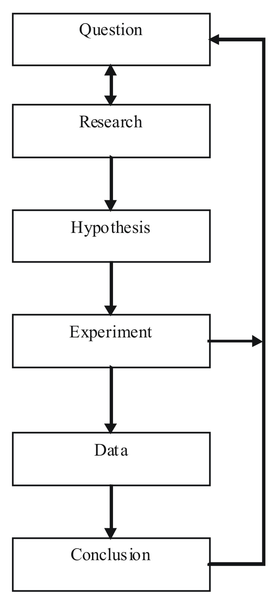
Scientific Method
This flow chart shows the steps of the scientific method.
An experiment is an orderly procedure carried out with the goal of verifying, falsifying, or establishing the validity of a hypothesis. Experiments provide insight into cause-and-effect by demonstrating what outcome occurs when a particular factor is manipulated. Experiments vary greatly in their goal and scale, but always rely on repeatable procedure and logical analysis of the results in a method called the scientific method . A child may carry out basic experiments to understand the nature of gravity, while teams of scientists may take years of systematic investigation to advance the understanding of a phenomenon. Experiments can vary from personal and informal (e.g. tasting a range of chocolates to find a favorite), to highly controlled (e.g. tests requiring a complex apparatus overseen by many scientists that hope to discover information about subatomic particles). Uses of experiments vary considerably between the natural and social sciences.
In statistics, controlled experiments are often used. A controlled experiment generally compares the results obtained from an experimental sample against a control sample, which is practically identical to the experimental sample except for the one aspect whose effect is being tested (the independent variable). A good example of this would be a drug trial, where the effects of the actual drug are tested against a placebo.
Surveys and experiments are both techniques used in statistics. They have similarities, but an in depth look into these two techniques will reveal how different they are. When a businessman wants to market his products, it’s a survey he will need and not an experiment. On the other hand, a scientist who has discovered a new element or drug will need an experiment, and not a survey, to prove its usefulness. A survey involves asking different people about their opinion on a particular product or about a particular issue, whereas an experiment is a comprehensive study about something with the aim of proving it scientifically. They both have their place in different types of studies.
Incorrect polling techniques used during the 1936 presidential election led to the demise of the popular magazine, The Literary Digest.
Critique the problems with the techniques used by the Literary Digest Poll
The Literary Digest was an influential general interest weekly magazine published by Funk & Wagnalls. Founded by Isaac Kaufmann Funk in 1890, it eventually merged with two similar weekly magazines, Public Opinion and Current Opinion.

The Literary Digest
Cover of the February 19, 1921 edition of The Literary Digest.
Beginning with early issues, the emphasis of The Literary Digest was on opinion articles and an analysis of news events. Established as a weekly news magazine, it offered condensations of articles from American, Canadian, and European publications. Type-only covers gave way to illustrated covers during the early 1900s. After Isaac Funk’s death in 1912, Robert Joseph Cuddihy became the editor. In the 1920s, the covers carried full-color reproductions of famous paintings . By 1927, The Literary Digest climbed to a circulation of over one million. Covers of the final issues displayed various photographic and photo-montage techniques. In 1938, it merged with the Review of Reviews, only to fail soon after. Its subscriber list was bought by Time.
The Literary Digest is best-remembered today for the circumstances surrounding its demise. As it had done in 1920, 1924, 1928 and 1932, it conducted a straw poll regarding the likely outcome of the 1936 presidential election. Before 1936, it had always correctly predicted the winner.
The 1936 poll showed that the Republican candidate, Governor Alfred Landon of Kansas, was likely to be the overwhelming winner. This seemed possible to some, as the Republicans had fared well in Maine, where the congressional and gubernatorial elections were then held in September, as opposed to the rest of the nation, where these elections were held in November along with the presidential election, as they are today. This outcome seemed especially likely in light of the conventional wisdom, “As Maine goes, so goes the nation,” a saying coined because Maine was regarded as a “bellwether” state which usually supported the winning candidate’s party.
In November, Landon carried only Vermont and Maine; President Franklin Delano Roosevelt carried the 46 other states . Landon’s electoral vote total of eight is a tie for the record low for a major-party nominee since the American political paradigm of the Democratic and Republican parties began in the 1850s. The Democrats joked, “As goes Maine, so goes Vermont,” and the magazine was completely discredited because of the poll, folding soon thereafter.

1936 Presidential Election
This map shows the results of the 1936 presidential election. Red denotes states won by Landon/Knox, blue denotes those won by Roosevelt/Garner. Numbers indicate the number of electoral votes allotted to each state.
In retrospect, the polling techniques employed by the magazine were to blame. Although it had polled ten million individuals (of whom about 2.4 million responded, an astronomical total for any opinion poll), it had surveyed firstly its own readers, a group with disposable incomes well above the national average of the time, shown in part by their ability still to afford a magazine subscription during the depths of the Great Depression, and then two other readily available lists: that of registered automobile owners and that of telephone users. While such lists might come close to providing a statistically accurate cross-section of Americans today, this assumption was manifestly incorrect in the 1930s. Both groups had incomes well above the national average of the day, which resulted in lists of voters far more likely to support Republicans than a truly typical voter of the time. In addition, although 2.4 million responses is an astronomical number, it is only 24% of those surveyed, and the low response rate to the poll is probably a factor in the debacle. It is erroneous to assume that the responders and the non-responders had the same views and merely to extrapolate the former on to the latter. Further, as subsequent statistical analysis and study have shown, it is not necessary to poll ten million people when conducting a scientific survey . A much lower number, such as 1,500 persons, is adequate in most cases so long as they are appropriately chosen.
George Gallup’s American Institute of Public Opinion achieved national recognition by correctly predicting the result of the 1936 election and by also correctly predicting the quite different results of the Literary Digest poll to within about 1%, using a smaller sample size of 50,000. This debacle led to a considerable refinement of public opinion polling techniques and later came to be regarded as ushering in the era of modern scientific public opinion research.
In the 1948 presidential election, the use of quota sampling led the polls to inaccurately predict that Dewey would defeat Truman.
Criticize the polling methods used in 1948 that incorrectly predicted that Dewey would win the presidency
The United States presidential election of 1948 was the 41stquadrennial presidential election, held on Tuesday, November 2, 1948. Incumbent President Harry S. Truman, the Democratic nominee, successfully ran for election against Thomas E. Dewey, the Republican nominee.
This election is considered to be the greatest election upset in American history. Virtually every prediction (with or without public opinion polls) indicated that Truman would be defeated by Dewey. Both parties had severe ideological splits, with the far left and far right of the Democratic Party running third-party campaigns. Truman’s surprise victory was the fifth consecutive presidential win for the Democratic Party, a record never surpassed since contests against the Republican Party began in the 1850s. Truman’s feisty campaign style energized his base of traditional Democrats, most of the white South, Catholic and Jewish voters, and—in a surprise—Midwestern farmers. Thus, Truman’s election confirmed the Democratic Party’s status as the nation’s majority party, a status it would retain until the conservative realignment in 1968.
As the campaign drew to a close, the polls showed Truman was gaining. Though Truman lost all nine of the Gallup Poll’s post-convention surveys, Dewey’s Gallup lead dropped from 17 points in late September to 9% in mid-October to just 5 points by the end of the month, just above the poll’s margin of error. Although Truman was gaining momentum, most political analysts were reluctant to break with the conventional wisdom and say that a Truman victory was a serious possibility. The Roper Poll had suspended its presidential polling at the end of September, barring “some development of outstanding importance,” which, in their subsequent view, never occurred. Dewey was not unaware of his slippage, but he had been convinced by his advisers and family not to counterattack the Truman campaign.
Let’s take a closer look at the polls. The Gallup, Roper, and Crossley polls all predicted a Dewey win. The actual results are shown in the following table: . How did this happen?
| Candidate | Crossley Poll | Gallup Poll | Roper Poll | Election Results |
|---|---|---|---|---|
| Truman | 45 | 44 | 38 | 50 |
| Dewey | 50 | 50 | 53 | 45 |
| Others | 5 | 6 | 9 | 5 |
1948 Election
The table shows the results of three polls against the actual results in the 1948 presidential election. Notice that Dewey was ahead in all three polls, but ended up losing the election.
The Crossley, Gallup, and Roper organizations all used quota sampling. Each interviewer was assigned a specified number of subjects to interview. Moreover, the interviewer was required to interview specified numbers of subjects in various categories, based on residential area, sex, age, race, economic status, and other variables. The intent of quota sampling is to ensure that the sample represents the population in all essential respects.
This seems like a good method on the surface, but where does one stop? What if a significant criterion was left out–something that deeply affected the way in which people vote? This would cause significant error in the results of the poll. In addition, quota sampling involves a human element. Pollsters, in reality, were left to poll whomever they chose. Research shows that the polls tended to overestimate the Republican vote. In earlier years, the margin of error was large enough that most polls still accurately predicted the winner, but in 1948, their luck ran out. Quota sampling had to go.
One of the most famous blunders came when the Chicago Tribune wrongfully printed the inaccurate headline, “Dewey Defeats Truman” on November 3, 1948, the day after incumbent United States President Harry S. Truman beat Republican challenger and Governor of New York Thomas E. Dewey.
The paper’s erroneous headline became notorious after a jubilant Truman was photographed holding a copy of the paper during a stop at St. Louis Union Station while returning by train from his home in Independence, Missouri to Washington, D.C .

Dewey Defeats Truman
President Truman holds up the newspaper that wrongfully reported his defeat.
Truman, as it turned out, won the electoral vote by a 303-189 majority over Dewey, although a swing of just a few thousand votes in Ohio, Illinois, and California would have produced a Dewey victory.
When conducting a survey, a sample can be chosen by chance or by more methodical methods.
Distinguish between probability samples and non-probability samples for surveys
In order to conduct a survey, a sample from the population must be chosen. This sample can be chosen using chance, or it can be chosen more systematically.
A probability sampling is one in which every unit in the population has a chance (greater than zero) of being selected in the sample, and this probability can be accurately determined. The combination of these traits makes it possible to produce unbiased estimates of population totals, by weighting sampled units according to their probability of selection.
Let’s say we want to estimate the total income of adults living in a given street by using a survey with questions. We visit each household in that street, identify all adults living there, and randomly select one adult from each household. (For example, we can allocate each person a random number, generated from a uniform distribution between 0 and 1, and select the person with the highest number in each household). We then interview the selected person and find their income. People living on their own are certain to be selected, so we simply add their income to our estimate of the total. But a person living in a household of two adults has only a one-in-two chance of selection. To reflect this, when we come to such a household, we would count the selected person’s income twice towards the total. (The person who is selected from that household can be loosely viewed as also representing the person who isn’t selected. )

Income in the United States
Graph of United States income distribution from 1947 through 2007 inclusive, normalized to 2007 dollars. The data is from the US Census, which is a survey over the entire population, not just a sample.
In the above example, not everybody has the same probability of selection; what makes it a probability sample is the fact that each person’s probability is known. When every element in the population does have the same probability of selection, this is known as an ‘equal probability of selection’ (EPS) design. Such designs are also referred to as ‘self-weighting’ because all sampled units are given the same weight.
Probability sampling includes: Simple Random Sampling, Systematic Sampling, Stratified Sampling, Probability Proportional to Size Sampling, and Cluster or Multistage Sampling. These various ways of probability sampling have two things in common: every element has a known nonzero probability of being sampled, and random selection is involved at some point.
Non-probability sampling is any sampling method wherein some elements of the population have no chance of selection (these are sometimes referred to as ‘out of coverage’/’undercovered’), or where the probability of selection can’t be accurately determined. It involves the selection of elements based on assumptions regarding the population of interest, which forms the criteria for selection. Hence, because the selection of elements is nonrandom, non-probability sampling does not allow the estimation of sampling errors. These conditions give rise to exclusion bias, placing limits on how much information a sample can provide about the population. Information about the relationship between sample and population is limited, making it difficult to extrapolate from the sample to the population.
Let’s say we visit every household in a given street and interview the first person to answer the door. In any household with more than one occupant, this is a non-probability sample, because some people are more likely to answer the door (e.g. an unemployed person who spends most of their time at home is more likely to answer than an employed housemate who might be at work when the interviewer calls) and it’s not practical to calculate these probabilities.
Non-probability sampling methods include accidental sampling, quota sampling, and purposive sampling. In addition, nonresponse effects may turn any probability design into a non-probability design if the characteristics of nonresponse are not well understood, since nonresponse effectively modifies each element’s probability of being sampled.
Even when using probability sampling methods, bias can still occur.
Analyze the problems associated with probability sampling
In earlier sections, we discussed how samples can be chosen. Failure to use probability sampling may result in bias or systematic errors in the way the sample represents the population. This is especially true of voluntary response samples–in which the respondents choose themselves if they want to be part of a survey– and convenience samples–in which individuals easiest to reach are chosen.
However, even probability sampling methods that use chance to select a sample are prone to some problems. Recall some of the methods used in probability sampling: simple random samples, stratified samples, cluster samples, and systematic samples. In these methods, each member of the population has a chance of being chosen for the sample, and that chance is a known probability.
Random sampling eliminates some of the bias that presents itself in sampling, but when a sample is chosen by human beings, there are always going to be some unavoidable problems. When a sample is chosen, we first need an accurate and complete list of the population. This type of list is often not available, causing most samples to suffer from undercoverage. For example, if we chose a sample from a list of households, we will miss those who are homeless, in prison, or living in a college dorm. In another example, a telephone survey calling landline phones will potentially miss those who are unlisted, those who only use a cell phone, and those who do not have a phone at all. Both of these examples will cause a biased sample in which poor people, whose opinions may very well differ from those of the rest of the population, are underrepresented.
Another source of bias is nonresponse, which occurs when a selected individual cannot be contacted or refuses to participate in the survey. Many people do not pick up the phone when they do not know the person who is calling . Nonresponse is often higher in urban areas, so most researchers conducting surveys will substitute other people in the same area to avoid favoring rural areas. However, if the people eventually contacted differ from those who are rarely at home or refuse to answer questions for one reason or another, some bias will still be present.

Ringing Phone
A third example of bias is called response bias. Respondents may not answer questions truthfully, especially if the survey asks about illegal or unpopular behavior. The race and sex of the interviewer may influence people to respond in a way that is more extreme than their true beliefs. Careful training of pollsters can greatly reduce response bias.
Finally, another source of bias can come in the wording of questions. Confusing or leading questions can strongly influence the way a respondent answers questions.
When reading the results of a survey, it is important to know the exact questions asked, the rate of non-response, and the method of survey before you trust a poll. In addition, remember that a larger sample size will provide more accurate results.
The Gallup Poll is a public opinion poll that conducts surveys in 140 countries around the world.
Examine the pros and cons of the way in which the Gallup Poll is conducted

The Gallup Organization
Gallup, Inc. is a research-based performance-management consulting company. Originally founded by George Gallup in 1935, the company became famous for its public opinion polls, which were conducted in the United States and other countries. Today, Gallup has more than 40 offices in 27 countries. The world headquarters are located in Washington, D.C. , while the operational headquarters are in Omaha, Nebraska. Its current Chairman and CEO is Jim Clifton.
George Gallup founded the American Institute of Public Opinion, the precursor to the Gallup Organization, in Princeton, New Jersey in 1935. He wished to objectively determine the opinions held by the people. To ensure his independence and objectivity, Dr. Gallup resolved that he would undertake no polling that was paid for or sponsored in any way by special interest groups such as the Republican and Democratic parties, a commitment that Gallup upholds to this day.
In 1936, Gallup successfully predicted that Franklin Roosevelt would defeat Alfred Landon for the U.S. presidency; this event quickly popularized the company. In 1938, Dr. Gallup and Gallup Vice President David Ogilvy began conducting market research for advertising companies and the film industry. In 1958, the modern Gallup Organization was formed when George Gallup grouped all of his polling operations into one organization. Since then, Gallup has seen huge expansion into several other areas.
The Gallup Poll is the division of Gallup that regularly conducts public opinion polls in more than 140 countries around the world. Gallup Polls are often referenced in the mass media as a reliable and objective audience measurement of public opinion. Gallup Poll results, analyses, and videos are published daily on Gallup.com in the form of data-driven news. The poll loses about $10 million a year but gives the company the visibility of a very well-known brand.
Historically, the Gallup Poll has measured and tracked the public’s attitudes concerning virtually every political, social, and economic issue of the day, including highly sensitive and controversial subjects. In 2005, Gallup began its World Poll, which continually surveys citizens in more than 140 countries, representing 95% of the world’s adult population. General and regional-specific questions, developed in collaboration with the world’s leading behavioral economists, are organized into powerful indexes and topic areas that correlate with real-world outcomes.
The Gallup Polls have been recognized in the past for their accuracy in predicting the outcome of United States presidential elections, though they have come under criticism more recently. From 1936 to 2008, Gallup correctly predicted the winner of each election–with the notable exceptions of the 1948 Thomas Dewey-Harry S. Truman election, when nearly all pollsters predicted a Dewey victory, and the 1976 election, when they inaccurately projected a slim victory by Gerald Ford over Jimmy Carter. For the 2008 U.S. presidential election, Gallup correctly predicted the winner, but was rated 17th out of 23 polling organizations in terms of the precision of its pre-election polls relative to the final results. In 2012, Gallup’s final election survey had Mitt Romney 49% and Barack Obama 48%, compared to the election results showing Obama with 51.1% to Romney’s 47.2%. Poll analyst Nate Silver found that Gallup’s results were the least accurate of the 23 major polling firms Silver analyzed, having the highest incorrect average of being 7.2 points away from the final result. Frank Newport, the Editor-in-Chief of Gallup, responded to the criticism by stating that Gallup simply makes an estimate of the national popular vote rather than predicting the winner, and that their final poll was within the statistical margin of error.
In addition to the poor results of the poll in 2012, many people are criticizing Gallup on their sampling techniques. Gallup conducts 1,000 interviews per day, 350 days out of the year, among both landline and cell phones across the U.S., for its health and well-being survey. Though Gallup surveys both landline and cell phones, they conduct only 150 cell phone samples out of 1000, making up 15%. The population of the U.S. that relies only on cell phones (owning no landline connections) makes up more than double that number, at 34%. This fact has been a major criticism in recent times of the reliability Gallup polling, compared to other polls, in its failure to compensate accurately for the quick adoption of “cell phone only” Americans.
Telephone surveys can reach a wide range of people very quickly and very inexpensively.
Identify the advantages and disadvantages of telephone surveys
A telephone survey is a type of opinion poll used by researchers. As with other methods of polling, their are advantages and disadvantages to utilizing telephone surveys.
Chance error and bias are two different forms of error associated with sampling.
Differentiate between random, or chance, error and bias
In statistics, a sampling error is the error caused by observing a sample instead of the whole population. The sampling error can be found by subtracting the value of a parameter from the value of a statistic. The variations in the possible sample values of a statistic can theoretically be expressed as sampling errors, although in practice the exact sampling error is typically unknown.
In sampling, there are two main types of error: systematic errors (or biases) and random errors (or chance errors).
Random sampling is used to ensure that a sample is truly representative of the entire population. If we were to select a perfect sample (which does not exist), we would reach the same exact conclusions that we would have reached if we had surveyed the entire population. Of course, this is not possible, and the error that is associated with the unpredictable variation in the sample is called random, or chance, error. This is only an “error” in the sense that it would automatically be corrected if we could survey the entire population rather than just a sample taken from it. It is not a mistake made by the researcher.
Random error always exists. The size of the random error, however, can generally be controlled by taking a large enough random sample from the population. Unfortunately, the high cost of doing so can be prohibitive. If the observations are collected from a random sample, statistical theory provides probabilistic estimates of the likely size of the error for a particular statistic or estimator. These are often expressed in terms of its standard error:
SEx¯=sn">
In statistics, sampling bias is a bias in which a sample is collected in such a way that some members of the intended population are less likely to be included than others. It results in a biased sample, a non-random sample of a population in which all individuals, or instances, were not equally likely to have been selected. If this is not accounted for, results can be erroneously attributed to the phenomenon under study rather than to the method of sampling.
There are various types of sampling bias:
The sampling distribution of a statistic is the distribution of the statistic for all possible samples from the same population of a given size.
Recognize the characteristics of a sampling distribution
Suppose you randomly sampled 10 women between the ages of 21 and 35 years from the population of women in Houston, Texas, and then computed the mean height of your sample. You would not expect your sample mean to be equal to the mean of all women in Houston. It might be somewhat lower or higher, but it would not equal the population mean exactly. Similarly, if you took a second sample of 10 women from the same population, you would not expect the mean of this second sample to equal the mean of the first sample.

Houston Skyline
Suppose you randomly sampled 10 people from the population of women in Houston, Texas between the ages of 21 and 35 years and computed the mean height of your sample. You would not expect your sample mean to be equal to the mean of all women in Houston.
Inferential statistics involves generalizing from a sample to a population. A critical part of inferential statistics involves determining how far sample statistics are likely to vary from each other and from the population parameter. These determinations are based on sampling distributions. The sampling distribution of a statistic is the distribution of that statistic, considered as a random variable, when derived from a random sample of size n">. It may be considered as the distribution of the statistic for all possible samples from the same population of a given size. Sampling distributions allow analytical considerations to be based on the sampling distribution of a statistic rather than on the joint probability distribution of all the individual sample values.
The sampling distribution depends on: the underlying distribution of the population, the statistic being considered, the sampling procedure employed, and the sample size used. For example, consider a normal population with mean μ">and variance σ">. Assume we repeatedly take samples of a given size from this population and calculate the arithmetic mean for each sample. This statistic is then called the sample mean. Each sample has its own average value, and the distribution of these averages is called the “sampling distribution of the sample mean. ” This distribution is normal since the underlying population is normal, although sampling distributions may also often be close to normal even when the population distribution is not.
An alternative to the sample mean is the sample median. When calculated from the same population, it has a different sampling distribution to that of the mean and is generally not normal (but it may be close for large sample sizes).
Knowledge of the sampling distribution can be very useful in making inferences about the overall population.
Describe the general properties of sampling distributions and the use of standard error in analyzing them
Sampling distributions are important for inferential statistics. In practice, one will collect sample data and, from these data, estimate parameters of the population distribution. Thus, knowledge of the sampling distribution can be very useful in making inferences about the overall population.
For example, knowing the degree to which means from different samples differ from each other and from the population mean would give you a sense of how close your particular sample mean is likely to be to the population mean. Fortunately, this information is directly available from a sampling distribution. The most common measure of how much sample means differ from each other is the standard deviation of the sampling distribution of the mean. This standard deviation is called the standard error of the mean.
The standard deviation of the sampling distribution of a statistic is referred to as the standard error of that quantity. For the case where the statistic is the sample mean, and samples are uncorrelated, the standard error is:
SEx¯=sn">
Where S is the sample standard deviation and n is the size (number of items) in the sample. An important implication of this formula is that the sample size must be quadrupled (multiplied by 4) to achieve half the measurement error. When designing statistical studies where cost is a factor, this may have a role in understanding cost-benefit tradeoffs.
If all the sample means were very close to the population mean, then the standard error of the mean would be small. On the other hand, if the sample means varied considerably, then the standard error of the mean would be large. To be specific, assume your sample mean is 125 and you estimated that the standard error of the mean is 5. If you had a normal distribution, then it would be likely that your sample mean would be within 10 units of the population mean since most of a normal distribution is within two standard deviations of the mean.
A statistical study can be said to be biased when one outcome is systematically favored over another. However, the study can be said to be unbiased if the mean of its sampling distribution is equal to the true value of the parameter being estimated.
Finally, the variability of a statistic is described by the spread of its sampling distribution. This spread is determined by the sampling design and the size of the sample. Larger samples give smaller spread. As long as the population is much larger than the sample (at least 10 times as large), the spread of the sampling distribution is approximately the same for any population size
Learn to create a sampling distribution from a discrete set of data.
Differentiate between a frequency distribution and a sampling distribution
We will illustrate the concept of sampling distributions with a simple example. Consider three pool balls, each with a number on it. Two of the balls are selected randomly (with replacement), and the average of their numbers is computed. All possible outcomes are shown below.
| Outcome | Ball 1 | Ball 2 | Mean |
|---|---|---|---|
| 1 | 1 | 1 | 1.0 |
| 2 | 1 | 2 | 1.5 |
| 3 | 1 | 3 | 2.0 |
| 4 | 2 | 1 | 1.5 |
| 5 | 2 | 2 | 2.0 |
| 6 | 2 | 3 | 2.5 |
| 7 | 3 | 1 | 2.0 |
| 8 | 3 | 2 | 2.5 |
| 9 | 3 | 3 | 3.0 |
Pool Ball Example 1
This table shows all the possible outcome of selecting two pool balls randomly from a population of three.
Notice that all the means are either 1.0, 1.5, 2.0, 2.5, or 3.0. The frequencies of these means are shown below. The relative frequencies are equal to the frequencies divided by nine because there are nine possible outcomes.
Pool Ball Example 2
This table shows the frequency of means for N=2.
The figure below shows a relative frequency distribution of the means. This distribution is also a probability distribution since the y-axis is the probability of obtaining a given mean from a sample of two balls in addition to being the relative frequency.
Relative Frequency Distribution
Relative frequency distribution of our pool ball example.
The distribution shown in the above figure is called the sampling distribution of the mean. Specifically, it is the sampling distribution of the mean for a sample size of 2 (N=2">). For this simple example, the distribution of pool balls and the sampling distribution are both discrete distributions. The pool balls have only the numbers 1, 2, and 3, and a sample mean can have one of only five possible values.
There is an alternative way of conceptualizing a sampling distribution that will be useful for more complex distributions. Imagine that two balls are sampled (with replacement), and the mean of the two balls is computed and recorded. This process is repeated for a second sample, a third sample, and eventually thousands of samples. After thousands of samples are taken and the mean is computed for each, a relative frequency distribution is drawn. The more samples, the closer the relative frequency distribution will come to the sampling distribution shown in the above figure. As the number of samples approaches infinity , the frequency distribution will approach the sampling distribution. This means that you can conceive of a sampling distribution as being a frequency distribution based on a very large number of samples. To be strictly correct, the sampling distribution only equals the frequency distribution exactly when there is an infinite number of samples.
When we have a truly continuous distribution, it is not only impractical but actually impossible to enumerate all possible outcomes.
Differentiate between discrete and continuous sampling distributions
In the previous section, we created a sampling distribution out of a population consisting of three pool balls. This distribution was discrete, since there were a finite number of possible observations. Now we will consider sampling distributions when the population distribution is continuous.
What if we had a thousand pool balls with numbers ranging from 0.001 to 1.000 in equal steps? Note that although this distribution is not really continuous, it is close enough to be considered continuous for practical purposes. As before, we are interested in the distribution of the means we would get if we sampled two balls and computed the mean of these two. In the previous example, we started by computing the mean for each of the nine possible outcomes. This would get a bit tedious for our current example since there are 1,000,000 possible outcomes (1,000 for the first ball multiplied by 1,000 for the second.) Therefore, it is more convenient to use our second conceptualization of sampling distributions, which conceives of sampling distributions in terms of relative frequency distributions– specifically, the relative frequency distribution that would occur if samples of two balls were repeatedly taken and the mean of each sample computed.
When we have a truly continuous distribution, it is not only impractical but actually impossible to enumerate all possible outcomes. Moreover, in continuous distributions, the probability of obtaining any single value is zero. Therefore, these values are called probability densities rather than probabilities.
A probability density function, or density of a continuous random variable, is a function that describes the relative likelihood for this random variable to take on a given value. The probability for the random variable to fall within a particular region is given by the integral of this variable’s density over the region .
Probability Density Function
Boxplot and probability density function of a normal distribution N(0, 2).
The mean of the distribution of differences between sample means is equal to the difference between population means.
Discover that the mean of the distribution of differences between sample means is equal to the difference between population means
Statistical analyses are, very often, concerned with the difference between means. A typical example is an experiment designed to compare the mean of a control group with the mean of an experimental group. Inferential statistics used in the analysis of this type of experiment depend on the sampling distribution of the difference between means.
The sampling distribution of the difference between means can be thought of as the distribution that would result if we repeated the following three steps over and over again:
The mean of the sampling distribution of the mean is:
μM1−M2 = μ1−2,
which says that the mean of the distribution of differences between sample means is equal to the difference between population means. For example, say that mean test score of all 12-year olds in a population is 34 and the mean of 10-year olds is 25. If numerous samples were taken from each age group and the mean difference computed each time, the mean of these numerous differences between sample means would be 34 – 25 = 9.
The variance sum law states that the variance of the sampling distribution of the difference between means is equal to the variance of the sampling distribution of the mean for Population 1 plus the variance of the sampling distribution of the mean for Population 2. The formula for the variance of the sampling distribution of the difference between means is as follows:
σM1−M22=σM12n1+σM22n2">
Recall that the standard error of a sampling distribution is the standard deviation of the sampling distribution, which is the square root of the above variance.
Let’s look at an application of this formula to build a sampling distribution of the difference between means. Assume there are two species of green beings on Mars. The mean height of Species 1 is 32, while the mean height of Species 2 is 22. The variances of the two species are 60 and 70, respectively, and the heights of both species are normally distributed. You randomly sample 10 members of Species 1 and 14 members of Species 2.
The difference between means comes out to be 10, and the standard error comes out to be 3.317.
μM1−M2 = 32 – 22 = 10
Standard error equals the square root of (60 / 10) + (70 / 14) = 3.317.
The resulting sampling distribution as diagramed in , is normally distributed with a mean of 10 and a standard deviation of 3.317.
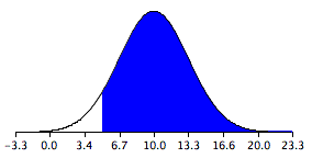
Sampling Distribution of the Difference Between Means
The distribution is normally distributed with a mean of 10 and a standard deviation of 3.317.
The overall shape of a sampling distribution is expected to be symmetric and approximately normal.
Give examples of the various shapes a sampling distribution can take on
The “shape of a distribution” refers to the shape of a probability distribution. It most often arises in questions of finding an appropriate distribution to use in order to model the statistical properties of a population, given a sample from that population. The shape of a distribution will fall somewhere in a continuum where a flat distribution might be considered central; and where types of departure from this include:
The shape of a distribution is sometimes characterized by the behaviors of the tails (as in a long or short tail). For example, a flat distribution can be said either to have no tails or to have short tails. A normal distribution is usually regarded as having short tails, while a Pareto distribution has long tails. Even in the relatively simple case of a mounded distribution, the distribution may be skewed to the left or skewed to the right (with symmetric corresponding to no skew).
As previously mentioned, the overall shape of a sampling distribution is expected to be symmetric and approximately normal. This is due to the fact, or assumption, that there are no outliers or other important deviations from the overall pattern. This fact holds true when we repeatedly take samples of a given size from a population and calculate the arithmetic mean for each sample.
An alternative to the sample mean is the sample median. When calculated from the same population, it has a different sampling distribution to that of the mean and is generally not normal; although, it may be close for large sample sizes.
The Normal Distribution
Sample distributions, when the sampling statistic is the mean, are generally expected to display a normal distribution.
The central limit theorem for sample means states that as larger samples are drawn, the sample means form their own normal distribution.
Illustrate that as the sample size gets larger, the sampling distribution approaches normality
Example
Imagine rolling a large number of identical, unbiased dice. The distribution of the sum (or average) of the rolled numbers will be well approximated by a normal distribution. Since real-world quantities are often the balanced sum of many unobserved random events, the central limit theorem also provides a partial explanation for the prevalence of the normal probability distribution. It also justifies the approximation of large-sample statistics to the normal distribution in controlled experiments.
The central limit theorem states that, given certain conditions, the mean of a sufficiently large number of independent random variables, each with a well-defined mean and well-defined variance, will be (approximately) normally distributed. The central limit theorem has a number of variants. In its common form, the random variables must be identically distributed. In variants, convergence of the mean to the normal distribution also occurs for non-identical distributions, given that they comply with certain conditions.
The central limit theorem for sample means specifically says that if you keep drawing larger and larger samples (like rolling 1, 2, 5, and, finally, 10 dice) and calculating their means the sample means form their own normal distribution (the sampling distribution). The normal distribution has the same mean as the original distribution and a variance that equals the original variance divided by n">, the sample size. n"> is the number of values that are averaged together not the number of times the experiment is done.
Consider a sequence of independent and identically distributed random variables drawn from distributions of expected values given by μ"> and finite variances given by σ2">. Suppose we are interested in the sample average of these random variables. By the law of large numbers, the sample averages converge in probability and almost surely to the expected value μ"> as n→∞">. The classical central limit theorem describes the size and the distributional form of the stochastic fluctuations around the deterministic number μ"> during this convergence. More precisely, it states that as n"> gets larger, the distribution of the difference between the sample average Sn"> and its limit μ"> approximates the normal distribution with mean 0 and variance σ2">. For large enough n">, the distribution of Sn"> is close to the normal distribution with mean μ">and variance
σ2n">
The upshot is that the sampling distribution of the mean approaches a normal distribution as n">, the sample size, increases. The usefulness of the theorem is that the sampling distribution approaches normality regardless of the shape of the population distribution.
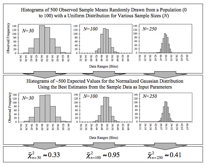
Empirical Central Limit Theorem
This figure demonstrates the central limit theorem. The sample means are generated using a random number generator, which draws numbers between 1 and 100 from a uniform probability distribution. It illustrates that increasing sample sizes result in the 500 measured sample means being more closely distributed about the population mean (50 in this case).
Expected value and standard error can provide useful information about the data recorded in an experiment.
Solve for the standard error of a sum and the expected value of a random variable
In probability theory, the expected value (or expectation, mathematical expectation, EV, mean, or first moment) of a random variable is the weighted average of all possible values that this random variable can take on. The weights used in computing this average are probabilities in the case of a discrete random variable, or values of a probability density function in the case of a continuous random variable.
The expected value may be intuitively understood by the law of large numbers: the expected value, when it exists, is almost surely the limit of the sample mean as sample size grows to infinity. More informally, it can be interpreted as the long-run average of the results of many independent repetitions of an experiment (e.g. a dice roll). The value may not be expected in the ordinary sense—the “expected value” itself may be unlikely or even impossible (such as having 2.5 children), as is also the case with the sample mean.
The expected value of a random variable can be calculated by summing together all the possible values with their weights (probabilities):
E[X]=x1p1+x2p2+…+xkpk">
where x">represents a possible value and p"> represents the probability of that possible value.
The standard error is the standard deviation of the sampling distribution of a statistic. For example, the sample mean s the usual estimator of a population mean. However, different samples drawn from that same population would in general have different values of the sample mean. The standard error of the mean (i.e., of using the sample mean as a method of estimating the population mean) is the standard deviation of those sample means over all possible samples of a given size drawn from the population.
Standard Deviation
This is a normal distribution curve that illustrates standard deviations. The likelihood of being further away from the mean diminishes quickly on both ends.
Suppose there are five numbers in a box: 1, 1, 2, 3, and 4. If we were to selected one number from the box, the expected value would be:
E[X]=1⋅15+1⋅15+2⋅15+3⋅15+4⋅15=2.2">
Now, let’s say we draw a number from the box 25 times (with replacement). The new expected value of the sum of the numbers can be calculated by the number of draws multiplied by the expected value of the box: 25⋅2.2=55">. The standard error of the sum can be calculated by the square root of number of draws multiplied by the standard deviation of the box: 25⋅SD of box=5⋅1.17=5.8">. This means that if this experiment were to be repeated many times, we could expect the sum of 25 numbers chosen to be within 5.8 of the expected value of 55, either higher or lower.
The normal curve is used to find the probability that a value falls within a certain standard deviation away from the mean.
Calculate the probability that a variable is within a certain range by finding its z-value and using the Normal curve
The functional form for a normal distribution is a bit complicated. It can also be difficult to compare two variables if their mean and or standard deviations are different. For example, heights in centimeters and weights in kilograms, even if both variables can be described by a normal distribution. To get around both of these conflicts, we can define a new variable:
z=x−μσ">
This variable gives a measure of how far the variable is from the mean (x−μ">), then “normalizes” it by dividing by the standard deviation (σ">). This new variable gives us a way of comparing different variables. The z">-value tells us how many standard deviations, or “how many sigmas”, the variable is from its respective mean.
To calculate the probability that a variable is within a range, we have to find the area under the curve. Normally, this would mean we’d need to use calculus. However, statisticians have figured out an easier method, using tables, that can typically be found in your textbook or even on your calculator.
| z | 0 | 0.01 | 0.02 | 0.03 | 0.04 | 0.05 | 0.06 | 0.07 | 0.08 | 0.09 |
|---|---|---|---|---|---|---|---|---|---|---|
| 0 | 0.5 | 0.50399 | 0.50798 | 0.51197 | 0.51595 | 0.51994 | 0.52392 | 0.5279 | 0.53188 | 0.53586 |
| 0.1 | 0.53983 | 0.5438 | 0.54776 | 0.55172 | 0.55567 | 0.55962 | 0.5636 | 0.56749 | 0.57142 | 0.57535 |
| 0.2 | 0.57926 | 0.58317 | 0.58706 | 0.59095 | 0.59483 | 0.59871 | 0.60257 | 0.60642 | 0.61026 | 0.61409 |
| 0.3 | 0.61791 | 0.62172 | 0.62552 | 0.6293 | 0.63307 | 0.63683 | 0.64058 | 0.64431 | 0.64803 | 0.65173 |
| 0.4 | 0.65542 | 0.6591 | 0.66276 | 0.6664 | 0.67003 | 0.67364 | 0.67724 | 0.68082 | 0.68439 | 0.68793 |
| 0.5 | 0.69146 | 0.69497 | 0.69847 | 0.70194 | 0.7054 | 0.70884 | 0.71226 | 0.71566 | 0.71904 | 0.7224 |
| 0.6 | 0.72575 | 0.72907 | 0.73237 | 0.73565 | 0.73891 | 0.74215 | 0.74537 | 0.74857 | 0.75175 | 0.7549 |
| 0.7 | 0.75804 | 0.76115 | 0.76424 | 0.7673 | 0.77035 | 0.77337 | 0.77637 | 0.77935 | 0.7823 | 0.78524 |
| 0.8 | 0.78814 | 0.79103 | 0.79389 | 0.79673 | 0.79955 | 0.80234 | 0.80511 | 0.80785 | 0.81057 | 0.81327 |
| 0.9 | 0.81594 | 0.81859 | 0.82121 | 0.82381 | 0.82639 | 0.82894 | 0.83147 | 0.83398 | 0.83646 | 0.83891 |
| 1 | 0.84134 | 0.84375 | 0.84614 | 0.84849 | 0.85083 | 0.85314 | 0.85543 | 0.85769 | 0.85993 | 0.86214 |
| 1.1 | 0.86433 | 0.8665 | 0.86864 | 0.87076 | 0.87286 | 0.87493 | 0.87698 | 0.879 | 0.881 | 0.88298 |
| 1.2 | 0.88493 | 0.88686 | 0.88877 | 0.89065 | 0.89251 | 0.89435 | 0.89617 | 0.89796 | 0.89973 | 0.90147 |
| 1.3 | 0.9032 | 0.9049 | 0.90658 | 0.90824 | 0.90988 | 0.91149 | 0.91308 | 0.91466 | 0.91621 | 0.91774 |
| 1.4 | 0.91924 | 0.92073 | 0.9222 | 0.92364 | 0.92507 | 0.92647 | 0.92785 | 0.92922 | 0.93056 | 0.93189 |
| 1.5 | 0.93319 | 0.93448 | 0.93574 | 0.93699 | 0.93822 | 0.93943 | 0.94062 | 0.94179 | 0.94295 | 0.94408 |
| 1.6 | 0.9452 | 0.9463 | 0.94738 | 0.94845 | 0.9495 | 0.95053 | 0.95154 | 0.95254 | 0.95352 | 0.95449 |
| 1.7 | 0.95543 | 0.95637 | 0.95728 | 0.95818 | 0.95907 | 0.95994 | 0.9608 | 0.96164 | 0.96246 | 0.96327 |
| 1.8 | 0.96407 | 0.96485 | 0.96562 | 0.96638 | 0.96712 | 0.96784 | 0.96856 | 0.96926 | 0.96995 | 0.97062 |
| 1.9 | 0.97128 | 0.97193 | 0.97257 | 0.9732 | 0.97381 | 0.97441 | 0.975 | 0.97558 | 0.97615 | 0.9767 |
| 2 | 0.97725 | 0.97778 | 0.97831 | 0.97882 | 0.97932 | 0.97982 | 0.9803 | 0.98077 | 0.98124 | 0.98169 |
| 2.1 | 0.98214 | 0.98257 | 0.983 | 0.98341 | 0.98382 | 0.98422 | 0.98461 | 0.985 | 0.98537 | 0.98574 |
| 2.2 | 0.9861 | 0.98645 | 0.98679 | 0.98713 | 0.98745 | 0.98778 | 0.98809 | 0.9884 | 0.9887 | 0.98899 |
| 2.3 | 0.98928 | 0.98956 | 0.98983 | 0.9901 | 0.99036 | 0.99061 | 0.99086 | 0.99111 | 0.99134 | 0.99158 |
| 2.4 | 0.9918 | 0.99202 | 0.99224 | 0.99245 | 0.99266 | 0.99286 | 0.99305 | 0.99324 | 0.99343 | 0.99361 |
| 2.5 | 0.99379 | 0.99396 | 0.99413 | 0.9943 | 0.99446 | 0.99461 | 0.99477 | 0.99492 | 0.99506 | 0.9952 |
| 2.6 | 0.99534 | 0.99547 | 0.9956 | 0.99573 | 0.99585 | 0.99598 | 0.99609 | 0.99621 | 0.99632 | 0.99643 |
| 2.7 | 0.99653 | 0.99664 | 0.99674 | 0.99683 | 0.99693 | 0.99702 | 0.99711 | 0.9972 | 0.99728 | 0.99736 |
| 2.8 | 0.99744 | 0.99752 | 0.9976 | 0.99767 | 0.99774 | 0.99781 | 0.99788 | 0.99795 | 0.99801 | 0.99807 |
| 2.9 | 0.99813 | 0.99819 | 0.99825 | 0.99831 | 0.99836 | 0.99841 | 0.99846 | 0.99851 | 0.99856 | 0.99861 |
| 3 | 0.99865 | 0.99869 | 0.99874 | 0.99878 | 0.99882 | 0.99886 | 0.99889 | 0.99893 | 0.99896 | 0.999 |
| 3.1 | 0.99903 | 0.99906 | 0.9991 | 0.99913 | 0.99916 | 0.99918 | 0.99921 | 0.99924 | 0.99926 | 0.99929 |
| 3.2 | 0.99931 | 0.99934 | 0.99936 | 0.99938 | 0.9994 | 0.99942 | 0.99944 | 0.99946 | 0.99948 | 0.9995 |
| 3.3 | 0.99952 | 0.99953 | 0.99955 | 0.99957 | 0.99958 | 0.9996 | 0.99961 | 0.99962 | 0.99964 | 0.99965 |
| 3.4 | 0.99966 | 0.99968 | 0.99969 | 0.9997 | 0.99971 | 0.99972 | 0.99973 | 0.99974 | 0.99975 | 0.99976 |
| 3.5 | 0.99977 | 0.99978 | 0.99978 | 0.99979 | 0.9998 | 0.99981 | 0.99981 | 0.99982 | 0.99983 | 0.99983 |
| 3.6 | 0.99984 | 0.99985 | 0.99985 | 0.99986 | 0.99986 | 0.99987 | 0.99987 | 0.99988 | 0.99988 | 0.99989 |
| 3.7 | 0.99989 | 0.9999 | 0.9999 | 0.9999 | 0.99991 | 0.99991 | 0.99992 | 0.99992 | 0.99992 | 0.99992 |
| 3.8 | 0.99993 | 0.99993 | 0.99993 | 0.99994 | 0.99994 | 0.99994 | 0.99994 | 0.99995 | 0.99995 | 0.99995 |
| 3.9 | 0.99995 | 0.99995 | 0.99996 | 0.99996 | 0.99996 | 0.99996 | 0.99996 | 0.99996 | 0.99997 | 0.99997 |
| 4 | 0.99997 | 0.99997 | 0.99997 | 0.99997 | 0.99997 | 0.99997 | 0.99998 | 0.99998 | 0.99998 | 0.99998 |
Standard Normal Table
This table can be used to find the cumulative probability up to the standardized normal value z. You can use common search engines to find Z-score tables as needed.
These tables can be a bit intimidating, but you simply need to know how to read them. The leftmost column tells you how many sigmas above the the mean to one decimal place (the tenths place).The top row gives the second decimal place (the hundredths).The intersection of a row and column gives the probability.
For example, if we want to know the probability that a variable is no more than 0.51 sigmas above the mean, P(z<0.51)">, we look at the 6th row down (corresponding to 0.5) and the 2nd column (corresponding to 0.01). The intersection of the 6th row and 2nd column is 0.6950, which tells us that there is a 69.50% percent chance that a variable is less than 0.51 sigmas (or standard deviations) above the mean.
A common mistake is to look up a z">-value in the table and simply report the corresponding entry, regardless of whether the problem asks for the area to the left or to the right of the z">-value. The table only gives the probabilities to the left of the z">-value. Since the total area under the curve is 1, all we need to do is subtract the value found in the table from 1. For example, if we wanted to find out the probability that a variable is more than 0.51 sigmas above the mean, P(z>0.51)">, we just need to calculate 1−P(z<0.51)=1−0.6950=0.3050">, or 30.5%.
There is another note of caution to take into consideration when using the table: The table provided only gives values for positive z">-values, which correspond to values above the mean. What if we wished instead to find out the probability that a value falls below a z">-value of −0.51">, or 0.51 standard deviations below the mean? We must remember that the standard normal curve is symmetrical, meaning that P(z<−0.51)=P(z>0.51)">, which we calculated above to be 30.5%.
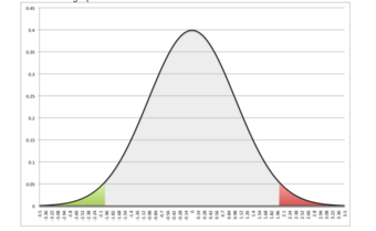
Symmetrical Normal Curve
This images shows the symmetry of the normal curve. In this case, P(z2.01).
We may even wish to find the probability that a variable is between two z-values, such as between 0.50 and 1.50, or P(0.50).
Although we can always use the z">-score table to find probabilities, the 68-95-99.7 rule helps for quick calculations. In a normal distribution, approximately 68% of values fall within one standard deviation of the mean, approximately 95% of values fall with two standard deviations of the mean, and approximately 99.7% of values fall within three standard deviations of the mean.
68-95-99.7 Rule
Dark blue is less than one standard deviation away from the mean. For the normal distribution, this accounts for about 68% of the set, while two standard deviations from the mean (medium and dark blue) account for about 95%, and three standard deviations (light, medium, and dark blue) account for about 99.7%.
The expected value is a weighted average of all possible values in a data set.
Recognize when the correction factor should be utilized when sampling
In probability theory, the expected value refers, intuitively, to the value of a random variable one would “expect” to find if one could repeat the random variable process an infinite number of times and take the average of the values obtained. More formally, the expected value is a weighted average of all possible values. In other words, each possible value the random variable can assume is multiplied by its assigned weight, and the resulting products are then added together to find the expected value.
The weights used in computing this average are the probabilities in the case of a discrete random variable (that is, a random variable that can only take on a finite number of values, such as a roll of a pair of dice), or the values of a probability density function in the case of a continuous random variable (that is, a random variable that can assume a theoretically infinite number of values, such as the height of a person).
From a rigorous theoretical standpoint, the expected value of a continuous variable is the integral of the random variable with respect to its probability measure. Since probability can never be negative (although it can be zero), one can intuitively understand this as the area under the curve of the graph of the values of a random variable multiplied by the probability of that value. Thus, for a continuous random variable the expected value is the limit of the weighted sum, i.e. the integral.
Suppose we have a random variable X, which represents the number of girls in a family of three children. Without too much effort, you can compute the following probabilities:
P[X=0]=0.125P[X=1]=0.375P[X=2]=0.375P[X=3]=0.125">
P[X=0]=0.125P[X=1]=0.375P[X=2]=0.375P[X=3]=0.125">
P[X=0]=0.125P[X=1]=0.375P[X=2]=0.375P[X=3]=0.125">
P[X=0]=0.125P[X=1]=0.375P[X=2]=0.375P[X=3]=0.125">
The expected value of X, E[X], is computed as:
E[X]=∑x=03xP[X=x]">
=0⋅0.125+1⋅0.375+2⋅0.375+3⋅0.125">
=1.5">
This calculation can be easily generalized to more complicated situations. Suppose that a rich uncle plans to give you $2,000 for each child in your family, with a bonus of $500 for each girl. The formula for the bonus is:
Y=1,000+500X">
What is your expected bonus?
E[1000+500X]=∑x=03(1000+500x)P[X=x]">
=1000⋅0.125+1500⋅0.375+2000⋅0.375+2500⋅0.125">
=1750">
We could have calculated the same value by taking the expected number of children and plugging it into the equation:
E[1,000+500X]=1,000+500E[X]">
The intuitive explanation of the expected value above is a consequence of the law of large numbers: the expected value, when it exists, is almost surely the limit of the sample mean as the sample size grows to infinity. More informally, it can be interpreted as the long-run average of the results of many independent repetitions of an experiment (e.g. a dice roll). The value may not be expected in the ordinary sense—the “expected value” itself may be unlikely or even impossible (such as having 2.5 children), as is also the case with the sample mean.
To empirically estimate the expected value of a random variable, one repeatedly measures observations of the variable and computes the arithmetic mean of the results. If the expected value exists, this procedure estimates the true expected value in an unbiased manner and has the property of minimizing the sum of the squares of the residuals (the sum of the squared differences between the observations and the estimate). The law of large numbers demonstrates (under fairly mild conditions) that, as the size of the sample gets larger, the variance of this estimate gets smaller.
This property is often exploited in a wide variety of applications, including general problems of statistical estimation and machine learning, to estimate (probabilistic) quantities of interest via Monte Carlo methods.
The expected value plays important roles in a variety of contexts. In regression analysis, one desires a formula in terms of observed data that will give a “good” estimate of the parameter giving the effect of some explanatory variable upon a dependent variable. The formula will give different estimates using different samples of data, so the estimate it gives is itself a random variable. A formula is typically considered good in this context if it is an unbiased estimator—that is, if the expected value of the estimate (the average value it would give over an arbitrarily large number of separate samples) can be shown to equal the true value of the desired parameter.
In decision theory, and in particular in choice under uncertainty, an agent is described as making an optimal choice in the context of incomplete information. For risk neutral agents, the choice involves using the expected values of uncertain quantities, while for risk averse agents it involves maximizing the expected value of some objective function such as a von Neumann-Morgenstern utility function.
The Gallup Poll is an opinion poll that uses probability samples to try to accurately represent the attitudes and beliefs of a population.
Examine the errors that can still arise in the probability samples chosen by Gallup
The Gallup Poll is the division of Gallup, Inc. that regularly conducts public opinion polls in more than 140 countries around the world. Historically, the Gallup Poll has measured and tracked the public’s attitudes concerning virtually every political, social, and economic issue of the day, including highly sensitive or controversial subjects. It is very well known when it comes to presidential election polls and is often referenced in the mass media as a reliable and objective audience measurement of public opinion. Its results, analyses, and videos are published daily on Gallup.com in the form of data-driven news. The poll has been around since 1935.
The Gallup Poll is an opinion poll that uses probability sampling. In a probability sample, each individual has an equal opportunity of being selected. This helps generate a sample that can represent the attitudes, opinions, and behaviors of the entire population.
In the United States, from 1935 to the mid-1980s, Gallup typically selected its sample by selecting residences from all geographic locations. Interviewers would go to the selected houses and ask whatever questions were included in that poll, such as who the interviewee was planning to vote for in an upcoming election .
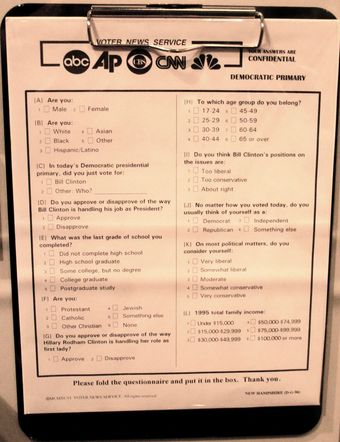
Voter Polling Questionnaire
This questionnaire asks voters about their gender, income, religion, age, and political beliefs.
There were a number of problems associated with this method. First of all, it was expensive and inefficient. Over time, Gallup realized that it needed to come up with a more effective way to collect data rapidly. In addition, there was the problem of non-response. Certain people did not wish to answer the door to a stranger, or simply declined to answer the questions the interviewer asked.
In 1986, Gallup shifted most of its polling to the telephone. This provided a much quicker way to poll many people. In addition, it was less expensive because interviewers no longer had to travel all over the nation to go to someone’s house. They simply had to make phone calls. To make sure that every person had an equal opportunity of being selected, Gallup used a technique called random digit dialing. A computer would randomly generate phone numbers found from telephone exchanges for the sample. This method prevented problems such as under-coverage, which could occur if Gallup had chosen to select numbers from a phone book (since not all numbers are listed). When a house was called, the person over eighteen with the most recent birthday would be the one to respond to the questions.
A major problem with this method arose in the mid-late 2000s, when the use of cell phones spiked. More and more people in the United States were switching to using only their cell phones over landline telephones. Now, Gallup polls people using a mix of landlines and cell phones. Some people claim that the ratio they use is incorrect, which could result in a higher percentage of error.
A lot of people incorrectly assume that in order for a poll to be accurate, the sample size must be huge. In actuality, small sample sizes that are chosen well can accurately represent the entire population, with, of course, a margin of error. Gallup typically uses a sample size of 1,000 people for its polls. This results in a margin of error of about 4%. To make sure that the sample is representative of the whole population, each respondent is assigned a weight so that demographic characteristics of the weighted sample match those of the entire population (based on information from the US Census Bureau). Gallup weighs for gender, race, age, education, and region.
Despite all the work done to make sure a poll is accurate, there is room for error. Gallup still has to deal with the effects of nonresponse bias, because people may not answer their cell phones. Because of this selection bias, the characteristics of those who agree to be interviewed may be markedly different from those who decline. Response bias may also be a problem, which occurs when the answers given by respondents do not reflect their true beliefs. In addition, it is well established that the wording of the questions, the order in which they are asked, and the number and form of alternative answers offered can influence results of polls. Finally, there is still the problem of coverage bias. Although most people in the United States either own a home phone or a cell phone, some people do not (such as the homeless). These people can still vote, but their opinions would not be taken into account in the polls.
Labor force surveys are the most preferred method of measuring unemployment due to their comprehensive results and categories such as race and gender.
Analyze how the United States measures unemployment
Unemployment, for the purposes of this atom, occurs when people are without work and actively seeking work. The unemployment rate is a measure of the prevalence of unemployment. It is calculated as a percentage by dividing the number of unemployed individuals by all individuals currently in the labor force.
Though many people care about the number of unemployed individuals, economists typically focus on the unemployment rate. This corrects for the normal increase in the number of people employed due to increases in population and increases in the labor force relative to the population.
As defined by the International Labour Organization (ILO), “unemployed workers” are those who are currently not working but willing and able to work for pay, those who are currently available to work, and those who have actively searched for work. Individuals who are actively seeking job placement must make the following efforts:
There are different ways national statistical agencies measure unemployment. These differences may limit the validity of international comparisons of unemployment data. To some degree, these differences remain despite national statistical agencies increasingly adopting the definition of unemployment by the International Labor Organization. To facilitate international comparisons, some organizations, such as the OECD, Eurostat, and International Labor Comparisons Program, adjust data on unemployment for comparability across countries.
The ILO describes 4 different methods to calculate the unemployment rate:
The Bureau of Labor Statistics measures employment and unemployment (of those over 15 years of age) using two different labor force surveys conducted by the United States Census Bureau (within the United States Department of Commerce) and/or the Bureau of Labor Statistics (within the United States Department of Labor). These surveys gather employment statistics monthly. The Current Population Survey (CPS), or “Household Survey,” conducts a survey based on a sample of 60,000 households. This survey measures the unemployment rate based on the ILO definition.
The Current Employment Statistics survey (CES), or “Payroll Survey”, conducts a survey based on a sample of 160,000 businesses and government agencies that represent 400,000 individual employers. This survey measures only civilian nonagricultural employment; thus, it does not calculate an unemployment rate, and it differs from the ILO unemployment rate definition.
These two sources have different classification criteria and usually produce differing results. Additional data are also available from the government, such as the unemployment insurance weekly claims report available from the Office of Workforce Security, within the U.S. Department of Labor Employment & Training Administration.
The Bureau of Labor Statistics also calculates six alternate measures of unemployment, U1 through U6 (as diagramed in the following images), that measure different aspects of unemployment:

U.S. Unemployment Measures
U1–U6 from 1950–2010, as reported by the Bureau of Labor Statistics.
Gregor Mendel’s work on genetics acted as a proof that application of statistics to inheritance could be highly useful.
Examine the presence of chance models in genetics
Gregor Mendel is known as the “father of modern genetics. ” In breeding experiments between 1856 and 1865, Gregor Mendel first traced inheritance patterns of certain traits in pea plants and showed that they obeyed simple statistical rules. Although not all features show these patterns of “Mendelian Inheritance,” his work served as a proof that application of statistics to inheritance could be highly useful. Since that time, many more complex forms of inheritance have been demonstrated.
In 1865, Mendel wrote the paper Experiments on Plant Hybridization. Mendel read his paper to the Natural History Society of Brünn on February 8 and March 8, 1865. It was published in the Proceedings of the Natural History Society of Brünn the following year. In his paper, Mendel compared seven discrete characters (as diagramed in ):

Mendel’s Seven Characters
This diagram shows the seven genetic “characters” observed by Mendel.
Mendel’s work received little attention from the scientific community and was largely forgotten. It was not until the early 20th century that Mendel’s work was rediscovered, and his ideas used to help form the modern synthesis.
Mendel discovered that when crossing purebred white flower and purple flower plants, the result is not a blend. Rather than being a mixture of the two plants, the offspring was purple-flowered. He then conceived the idea of heredity units, which he called “factors”, one of which is a recessive characteristic and the other of which is dominant. Mendel said that factors, later called genes, normally occur in pairs in ordinary body cells, yet segregate during the formation of sex cells. Each member of the pair becomes part of the separate sex cell. The dominant gene, such as the purple flower in Mendel’s plants, will hide the recessive gene, the white flower.
When Mendel grew his first generation hybrid seeds into first generation hybrid plants, he proceeded to cross these hybrid plants with themselves, creating second generation hybrid seeds. He found that recessive traits not visible in the first generation reappeared in the second, but the dominant traits outnumbered the recessive by a ratio of 3:1.
After Mendel self-fertilized the F1 generation and obtained the 3:1 ratio, he correctly theorized that genes can be paired in three different ways for each trait: AA, aa, and Aa. The capital “A” represents the dominant factor and lowercase “a” represents the recessive. Mendel stated that each individual has two factors for each trait, one from each parent. The two factors may or may not contain the same information. If the two factors are identical, the individual is called homozygous for the trait. If the two factors have different information, the individual is called heterozygous. The alternative forms of a factor are called alleles. The genotype of an individual is made up of the many alleles it possesses.
An individual possesses two alleles for each trait; one allele is given by the female parent and the other by the male parent. They are passed on when an individual matures and produces gametes: egg and sperm. When gametes form, the paired alleles separate randomly so that each gamete receives a copy of one of the two alleles. The presence of an allele does not mean that the trait will be expressed in the individual that possesses it. In heterozygous individuals, the allele that is expressed is the dominant. The recessive allele is present but its expression is hidden
The upshot is that Mendel observed the presence of chance in relation to which gene-pairs a seed would get. Because the number of pollen grains is large in comparison to the number of seeds, the selection of gene-pairs is essentially independent. Therefore, the second generation hybrid seeds are determined in a way similar to a series of draws from a data set, with replacement. Mendel’s interpretation of the hereditary chain was based on this sort of statistical evidence.
In 1936, the statistician R.A. Fisher used a chi-squared test to analyze Mendel’s data, and concluded that Mendel’s results with the predicted ratios were far too perfect; this indicated that adjustments (intentional or unconscious) had been made to the data to make the observations fit the hypothesis. However, later authors have claimed Fisher’s analysis was flawed, proposing various statistical and botanical explanations for Mendel’s numbers. It is also possible that Mendel’s results were “too good” merely because he reported the best subset of his data — Mendel mentioned in his paper that the data was from a subset of his experiments.
In summary, the field of genetics has become one of the most fulfilling arenas in which to apply statistical methods. Genetical theory has developed largely due to the use of chance models featuring randomized draws, such as pairs of chromosomes.
XII
Excel is the leading application for storing, managing and analyzing data. In Chapter 5, you will explore how to import, organize, and analyze data effectively. To manage and analyze a group of related data, users can turn a range of cells into an Excel table.
A table, also called a database, is an organized structure of rows and columns of related data in a worksheet; for example, a list of employee information. In a table of employees, each employee would have a separate record; as shown below, each record might include several fields, such as the Employee ID Number, their Last Name, and First Name, etc. Each row of a table stores records, and each column stores one field for the record. A record also can include fields that contain references, formulas, and functions. Additionally, a row of column headings at the top of the table stores field names that identify the data being collected and stored.
Excel has a vast collection of database and tabling tools that allow users to import, clean, sort, filter, total, subtotal, analyze, visualize, and report. This chapter explores how to import, insert, edit, and examine data with Excel table and PivotTable tools. Demonstrate skills by studying the provided 2017-2018 employee database. Examine employee relations, payroll, benefits, and training options.
Chapter 5 – Tables by Hallie Puncochar, Portland Community College is licensed under CC BY 4.0
Organizing, maintaining, analyzing, and reporting human resources data is essentials across industries. In this chapter, we will import data, and demonstrate tabling skills by examining employee relations, payroll, benefits, and training options.
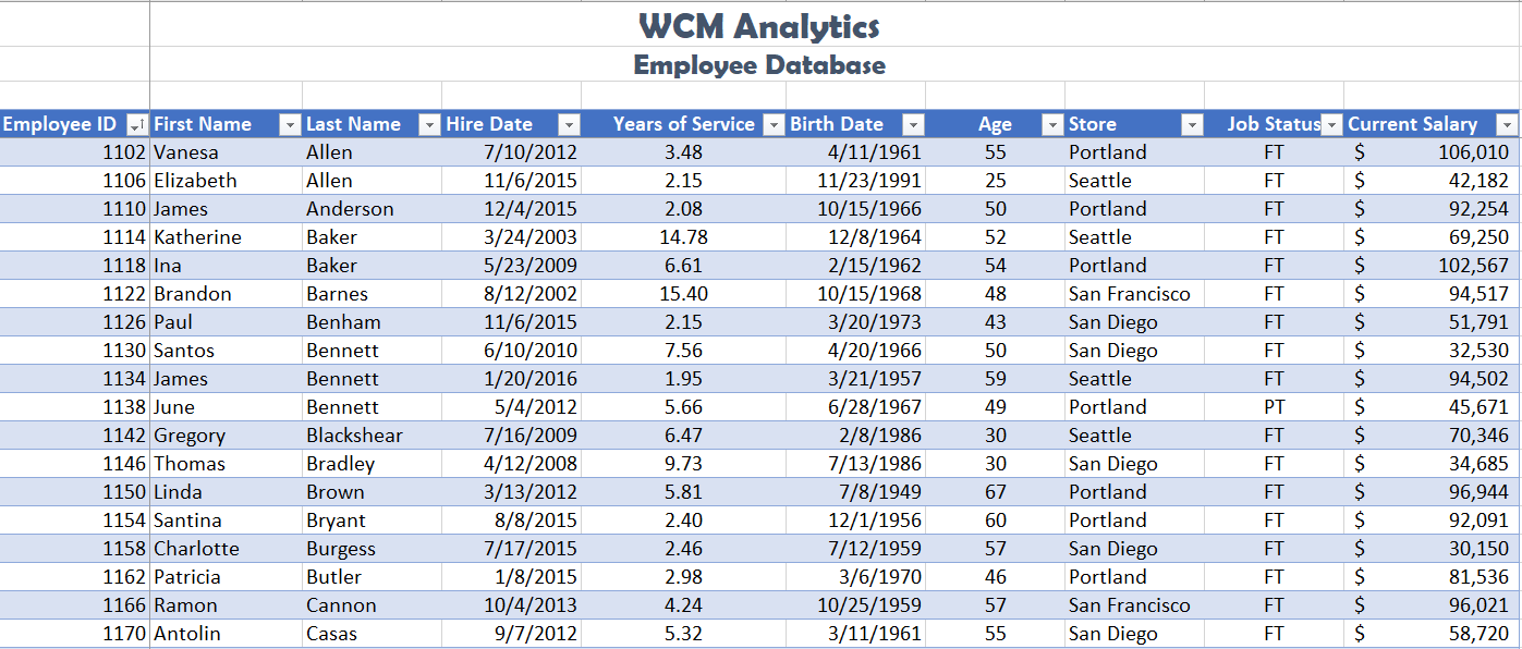
TABLE PROPERTIES & STRUCTURE
Turning a range of cells into an Excel table makes related data easier to analyze, visualize, and report. Structuring and planning table layouts are vital for data integrity. Below are guidelines to consider when designing and building a table from scratch:
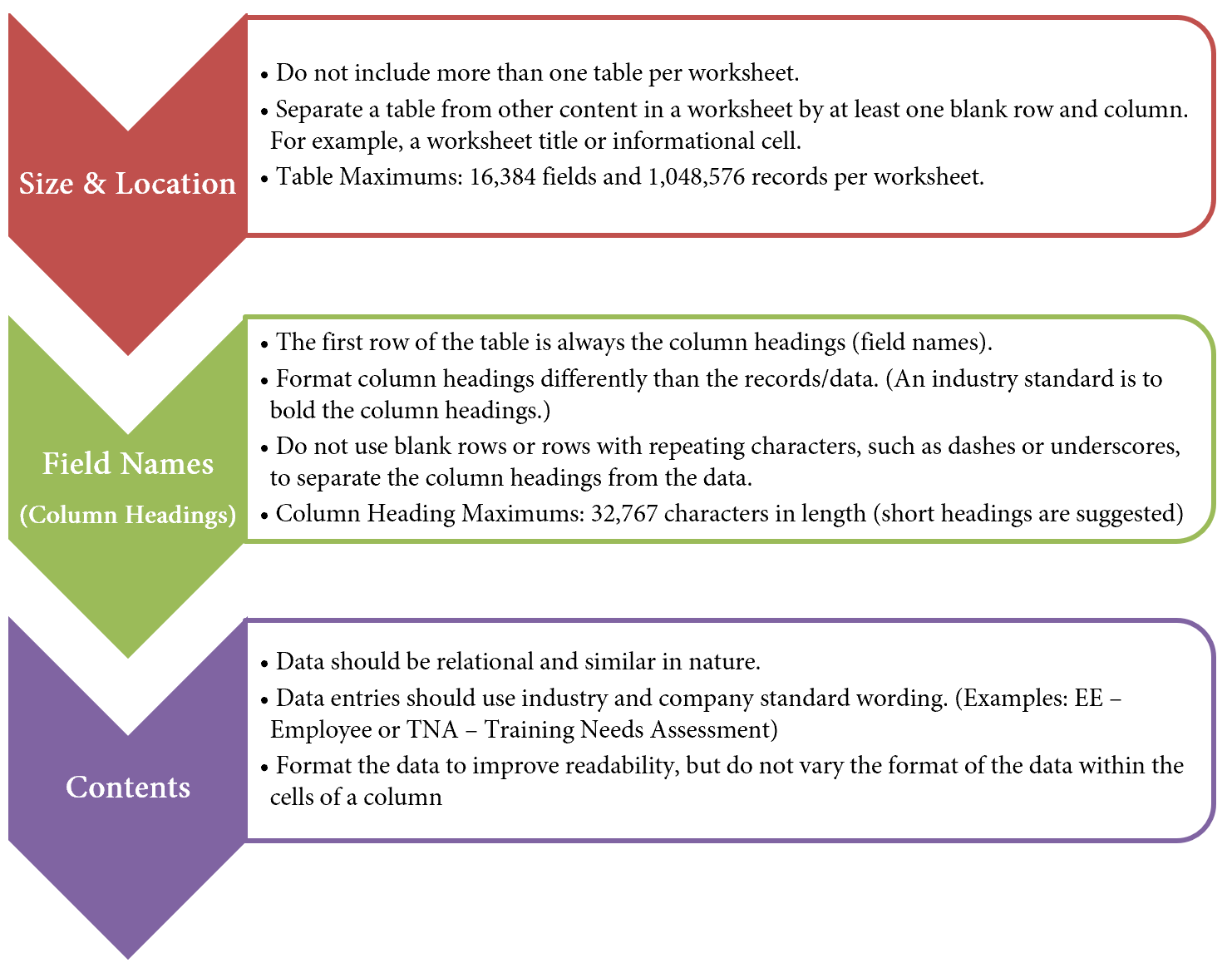
OVERVIEW
Excel tables behave independently from the rest of the information on the worksheet. Excel treats the table area as a database locking the record entries together. There are several advantages of Excel treating the data independently. For example, using integrated filters and sort functions you can effortlessly drill down data based on questions and in return get results. Excel will also automatically expand the table to accommodate new data entries and allows for automatic formatting, such as recoloring of banded rows or columns.
You will also notice Excel treats formulas and calculations differently in a table, showing structured column names, along with automatically filling a calculated field to the entire table or offering quick and easy table totaling tools.
When graphing and charting table data you will also see Excel automatically adjusts of associated charts and ranges based on what the user is sorting or filtering at the time.
In industry, data is commonly stored in databases or multiple Excel files. Databases vary drastically, therefore in some cases, it is necessary to import data types into Excel. In our example, we will work with an Excel file that has imported data from a human resources database. The data downloaded from the database is stored in an Excel workbook, however, it’s in a Comma Separated Values (CSV) format. We will import the Excel file into our CH 5 Data file, turn the data into a table for further analysis.
IMPORT AND FORMAT DATA AS A TABLE
Download Data file: CH5 Data
Keeping the above table guidelines in mind, import human resource data into Excel, as a table. Demonstrate tabling skills by examining employee relations, payroll, and benefits. Note you will need to save the CH 5 HR file on your computer as you will import this file into the CH 5 Data file in the below steps.
1. Open data file CH 5 Data and save the file as CH5 HR Report.
2. In the EmployeeData sheet, click on cell A5.
![]() Mac Users: Excel for Mac does not have the tool for “Getting Data” from an Excel Workbook. You will set up this data using alternate steps. Please skip steps 3-11. The alternate steps can be found below after Step 11.
Mac Users: Excel for Mac does not have the tool for “Getting Data” from an Excel Workbook. You will set up this data using alternate steps. Please skip steps 3-11. The alternate steps can be found below after Step 11.
3. From the Data tab, choose Get Data.
4. From the Get Data menu, choose From File, then From Workbook.
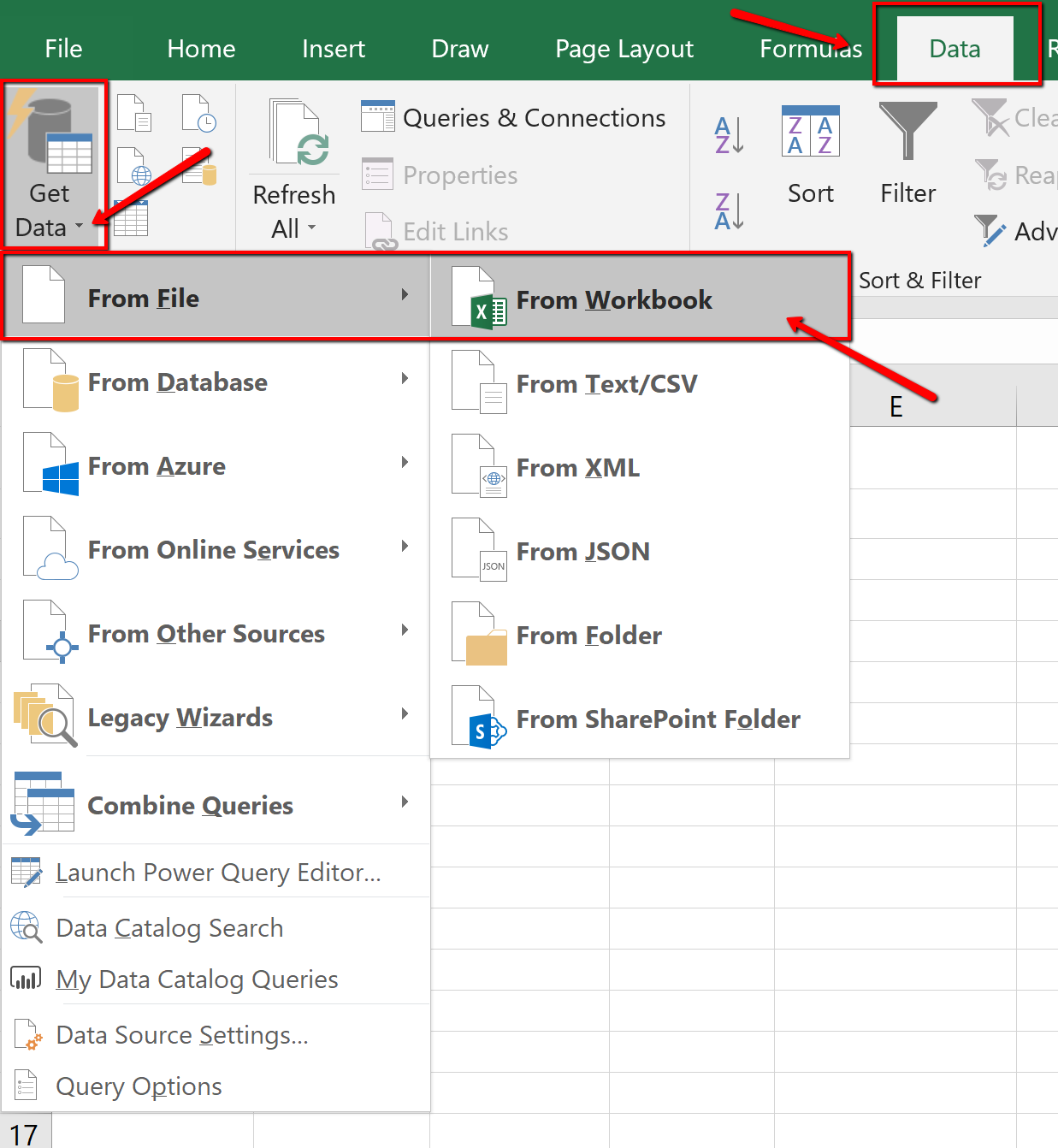
5. Navigate to the course data files. Find, and select the CH 5 HR file.
6. Click Import.
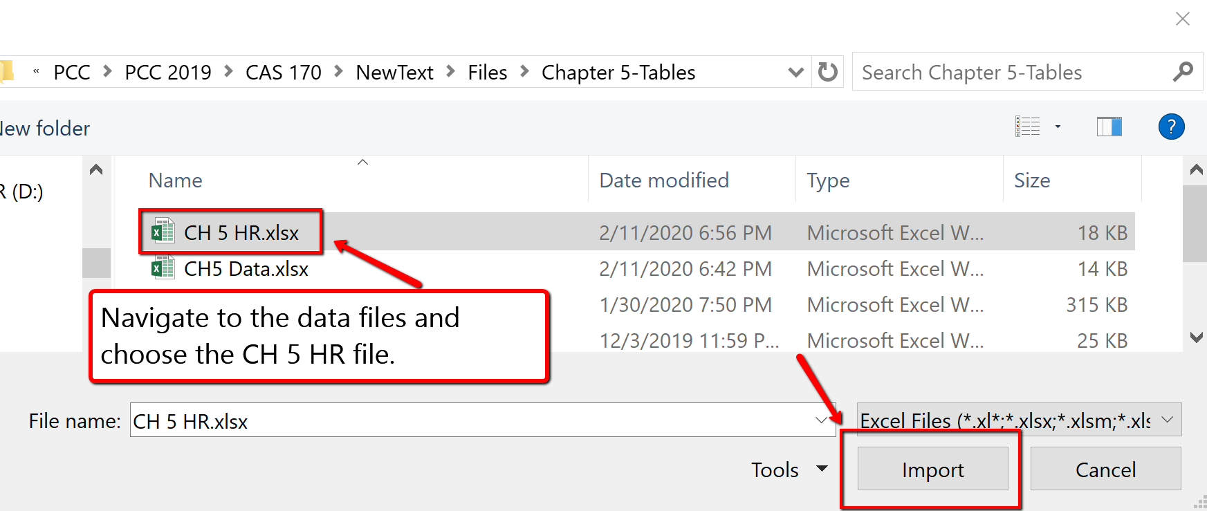
7. The Navigator dialogue box will open. Select the CH5 CSV File listed in the Display Options pane.
8. At the bottom of the Navigator dialogue box, select Load to expand the menu and choose Load To…
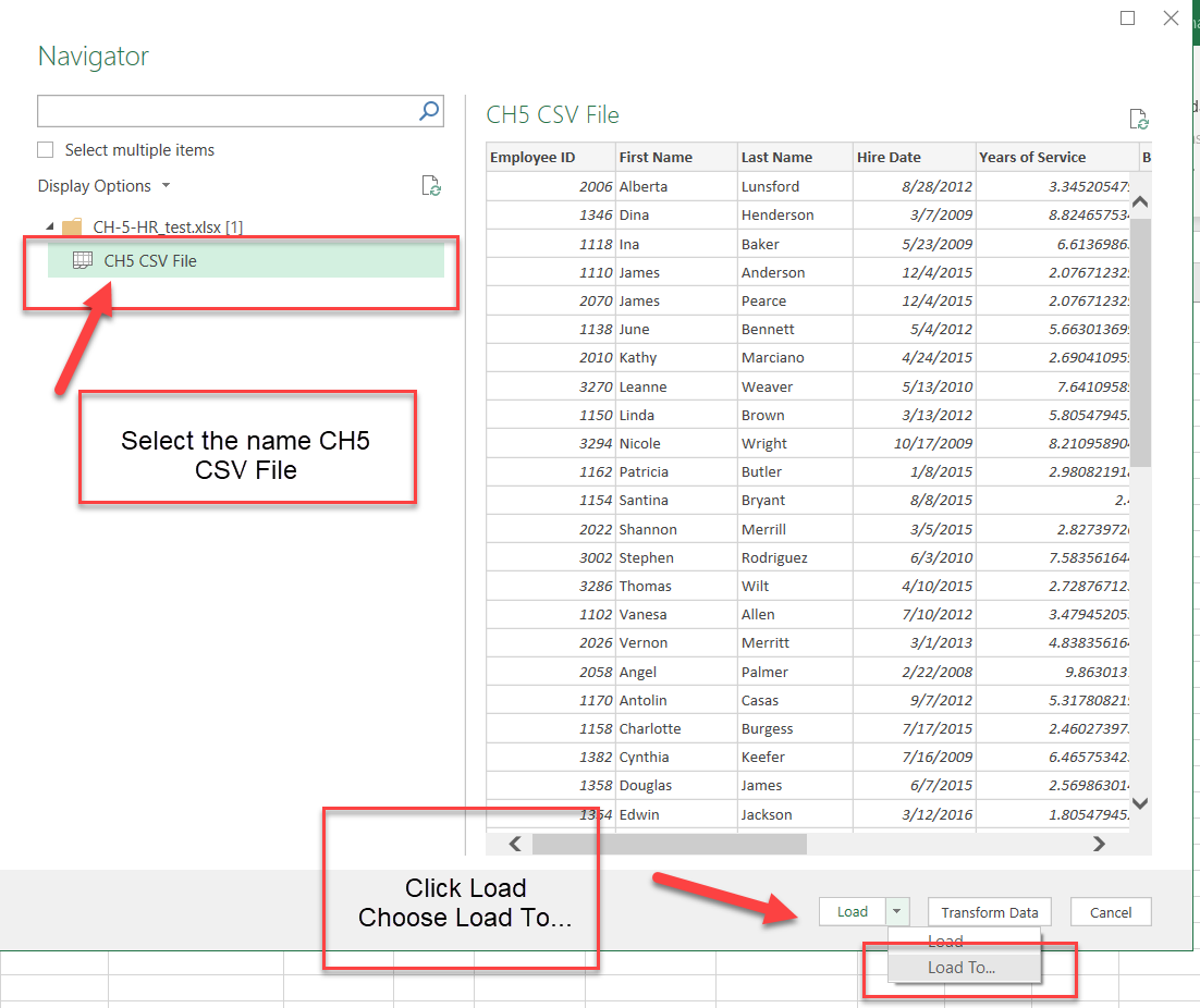
9. The Import dialogue box will open. In the “Where do you want to put the data?” section choose Existing worksheet:
10. In the above steps A5 was already selected when we started the import, so Excel will indicate we want the information to import and display starting at cell =$A$5. If you did not click cell A5, then select the cell now. Click OK.
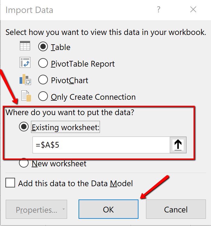
11. The data imports as a table. Close the Queries & Connections dialogue box.
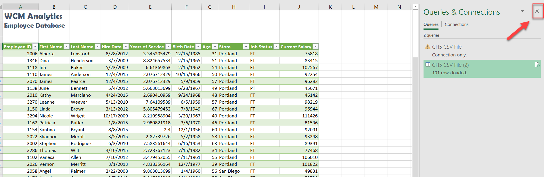
![]() These are the alternate steps for Mac Users Only. If you are using Excel for Windows, please continue with the “Table Tools Design Tab” section below these alternate steps.
These are the alternate steps for Mac Users Only. If you are using Excel for Windows, please continue with the “Table Tools Design Tab” section below these alternate steps.

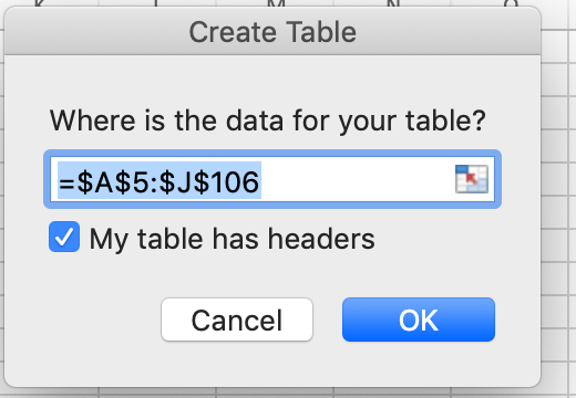
TABLE TOOLS DESIGN TAB
Excel tables require specific tools. The Table Tools Design tab houses these specific tools used for formatting and editing tables. The Table Tools tab is considered a contextual tab; meaning the tabs appear when you are clicked in a table area. When you click out of a table, the Table Tools disappear.
Explore the table tools now. Notice the specific checkboxes to turn on table options, for example, you can choose to display banded rows or banded columns, or a total row etc. We will explore table tools in the following steps.
When importing data as a table, Excel automatically applied table formatting. Follow the below steps to format and edit the table.
1. Click the Table Tools/Design tab on the ribbon.
![]() Mac Users: you don’t have a Table Tools/Design tab. Just make sure the Table tab is selected.
Mac Users: you don’t have a Table Tools/Design tab. Just make sure the Table tab is selected.
2. From the provided Table Styles, choose the Blue, Table Style Medium 2 option.
![]() Mac Users: the table you just created may already have the “Blue, Table Style Medium 2 option.
Mac Users: the table you just created may already have the “Blue, Table Style Medium 2 option.
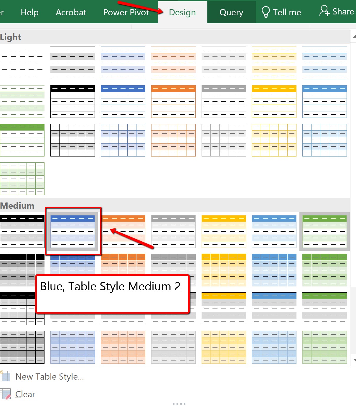
Another option for inserting a table is using the Insert button. The Insert Table button, located on the Insert tab will turn a range of information into an unformatted table. We will use the insert table option later on in the chapter.
Format Data as a Table
USING PANES
Data sets can bridge thousands of records with dozens of fields and extend beyond a workbook window. It can be difficult to compare fields and records in widely separated columns and rows. One way of dealing with this problem is by dividing the workbook window into viewing panes by using the Split view option. Excel can split the workbook window into four sections called panes with each pane offering a separate view into the worksheet. By scrolling through the contents of individual panes, you can compare cells from different sections of the worksheet side-by-side within the workbook window.
To split the workbook window into four panes, select any cell or range in the worksheet, and then on the View tab, in the Window group, click the Split button. Split bars divide the workbook window along the top and left border of the selected cell or range. To split the window into two vertical panes displayed side-by-side, select any cell in the first row of the worksheet and then click the Split button. To split the window into two stacked horizontal panes, select any cell in the first column and then click the Split button. To turn off the Spilt window option, simply click Split again on the View tab.
In our specific example the data set is manageable, however freezing the first column, and the top heading could be useful when scrolling through data.
FREEZE PANES
To keep an area of a worksheet visible while you scroll to another area of the worksheet use Freeze Panes. Follow the steps below to freeze, based on selection, the first column, and heading row.
1. If needed, adjust column widths so all heading names in row 5 are visible.
2. Click cell B6 in the table. (By selecting this specific cell, when we apply the freeze pane option, Excel will freeze the table where the first column ends and the heading row is viewable.)
3. Click the View tab.
4. Select Freeze Panes, and for the listed options choose Freeze Panes (See Figure 5.10 below). The column and rows will remain visible based on the cell that was selected above.
![]() Mac Users should just click the Freeze Panes button
Mac Users should just click the Freeze Panes button 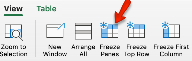 under the View tab.
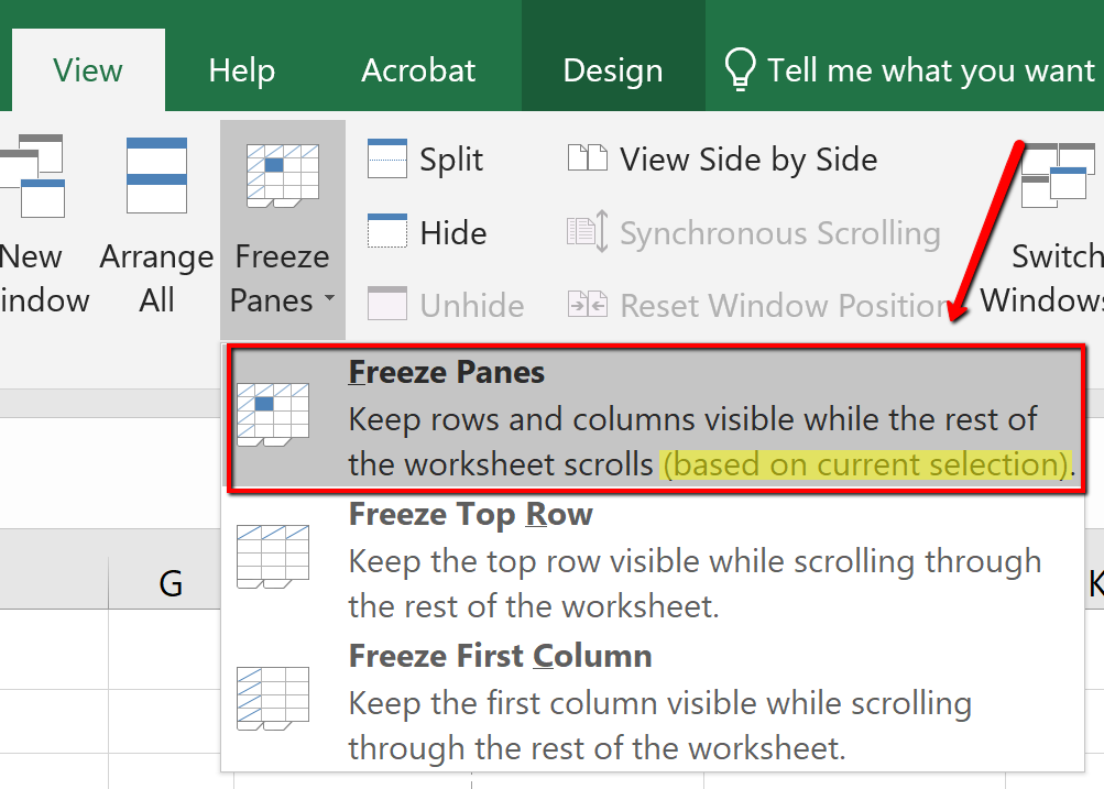
Formatting table Data
After reviewing the table, two columns have data that need to be formatted accordingly. In large data sets, it is useful to know data selection short cuts. In this example, we are going to use keyboard short cuts to select a column of information in the table and apply number formatting.
Format data by following the below steps:
1. In the EmployeeData sheet, click cell E6.
2. On the keyboard press and hold the CTRL and SHIFT and DOWN keys.
3. With the “Years of Service” data selected, click the Home tab. In the Numbers category, format the data as a Number. The number should automatically decrease the decimal to two decimal places.
![]() Mac Users: click the “list arrow” next to “General,
Mac Users: click the “list arrow” next to “General, ![]() and then choose “Number” from the list.
and then choose “Number” from the list.
4. Click in cell J6. (Be sure you have clicked J6 so that you are in the first cell in the Current Salary column). Using the same selection process, select the Current Salary column, and format the data as Currency, zero decimal place.
5. Using the non-adjacent selection method, select column headings E, G, and I, and center the data.
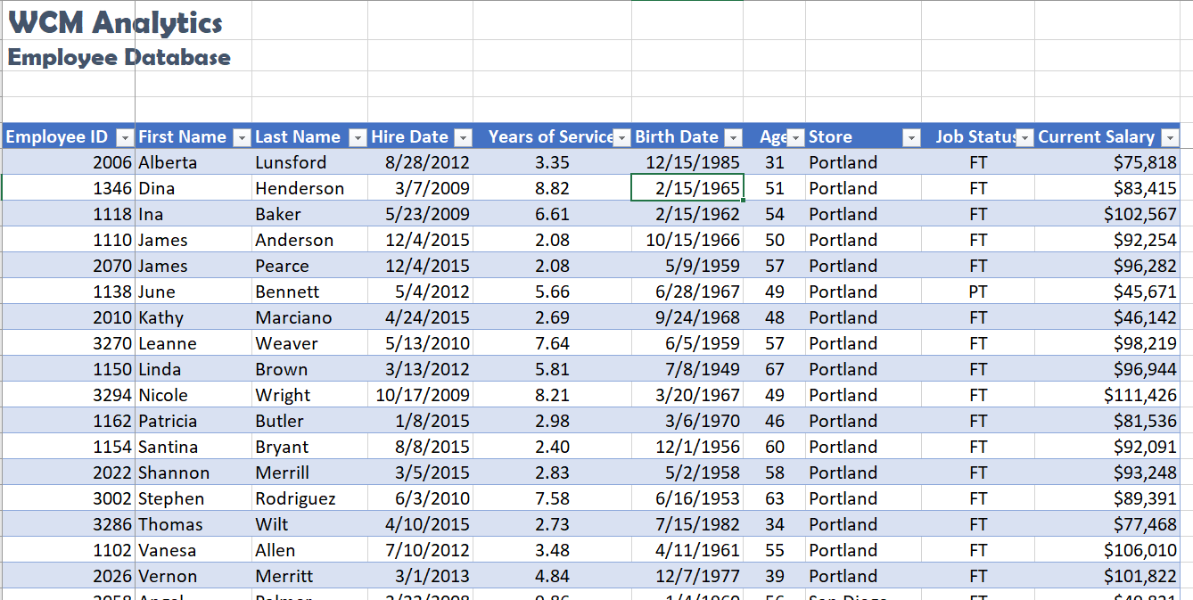
NAMING A TABLE
Each time a table is created, Excel assigns a default name. The default naming convention is similar to the way new workbooks are named (Book1, Book2, etc.), however in this case Excel recognizes the area as a table and will assign the name table instead of book: Table1, Table2, Table3, and so on.
Why name a table range? Referring to the table by name rather than by range will make it easier to refer to a table in the future, for example, in a workbook that contains many tables. Seeing tables named Jan or Feb is more informational then seeing Table1 or Table 2. You can custom name each table and in the future connect named tables for reporting purposes.
There are two rules to consider when naming tables. One, Excel does not allow spaces in table names, and two, Excel also requires that table names begin with a letter or underscore.
Follow the next step to assign a custom name to the table.
1. Click anywhere in the table and then display the Table Tools Design tab.
![]() Mac Users: there is no “Table Tools Design” tab in Excel for Mac. Simply click the Table tab and follow steps 2 and 3 below to give the table a new name.
Mac Users: there is no “Table Tools Design” tab in Excel for Mac. Simply click the Table tab and follow steps 2 and 3 below to give the table a new name.
2. Click the Table Name text box, in the Properties group.
3. Type Employee_DB and then press enter to name the table.
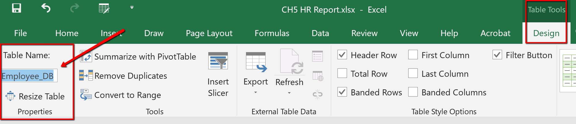
ENTERING & DELETING RECORDS
Tables require constant updating and may need calculations. When your table needs updating you can add/delete data, by adding/deleting rows, or columns. Excel adjusts the table automatically to the new content. The format applied to the banded rows updates to accommodate the new data set size.
When calculations are needed you can create a calculated column or use the built-in Total Row tool. Excel tables are a fantastic tool for entering formulas efficiently in a calculated column. Excel allows you to enter a single formula in one cell, and then that formula will automatically expand to the rest of the column by itself. There’s no need to use the Fill or Copy commands. This feature can be incredibly time-saving, especially if you have a lot of rows. And the same thing happens when you change a formula; the change will also expand to the rest of the calculated column. The Total Row tool, available on the Table Tools Design tab automatically adds a total row to the bottom of the table. To add a new row, uncheck the Total Row checkbox, add the row, and then recheck the Total Row checkbox. From the total row drop-down, you can select a function, like Average, Count, Count Numbers, Max, Min, Sum, StdDev, Var, and more.
Follow the steps below to update the employee table. You will insert new information just below the table. Data entered in rows or columns adjacent to the table becomes part of the table. Excel will format the new table data automatically.
1. Press and hold the Ctrl and End button to move to the last record in the table.
![]() Mac Users: there is no “End” key on most Mac keyboards. Press and hold the “Command” key and tap the right arrow key. Then press and hold the Command key, again, and tap the down arrow key. That should move to the last record in the table.
Mac Users: there is no “End” key on most Mac keyboards. Press and hold the “Command” key and tap the right arrow key. Then press and hold the Command key, again, and tap the down arrow key. That should move to the last record in the table.
2. Click tab to start a new record.
3. Type the new entries below. Click tab to move to the next column.
| 3297 | Alfred | Yelnats | 5/29/2015 | 2.59 | 2/19/1953 | 63 | Seattle | FT | $95,552 |
| 3299 | Jackson | Brown | 7/15/2013 | 4 | 3/16/1953 | 63 | Portland | FT | $98,655 |
As you enter the data, notice that Excel tries to complete your fields based on previous common entries.
REMOVE DUPLICATES
Duplicate entries may appear in tables. Why? Duplicates sometimes happen when data is entered incorrectly, by more than one person, or from more than one source. The following steps remove duplicate records in the table. In this particular table, Robert Griffin was entered twice by mistake. Delete the duplicate record by following the below steps:
1. Click anywhere in the table.
2. From the Table Tools Design tab click the Remove Duplicates button.
![]() Mac Users: Click the Table tab and click the Remove Duplicates button
Mac Users: Click the Table tab and click the Remove Duplicates button
3. The Remove Duplicates dialog box will open.
4. If necessary, click the Select All button to deselect all columns.
5. Click OK to remove duplicate records from the table.
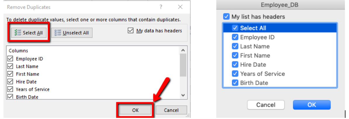
6. Excel notifies you that 1 duplicate record was removed.
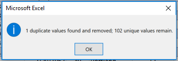
CREATE NEW COLUMNS
In this next exercise, we will explore how to add two new columns in the table. Take note, Excel automatically adds the column to the table’s range and copies the format of the existing table heading to the new column heading. The first new column will use the VLOOKUP function to determine what cost of living adjustment (COLA) the employee qualifies for based on the region the employee lives in. The second column added will calculate the projected salary increase based on the COLA. When you use a formula in a table it is considered a calculated column.
A calculated column uses a single formula that adjusts for each row and automatically expands to include additional rows in that column. The formula is immediately extended to those rows. You only need to enter a formula to have it automatically filled down to create a calculated column—there’s no need to use the Fill or Copy commands.
As mentioned in the previous section, Excel assigns a name to the table, and to each column header in the table. When you add formulas to an Excel table, those names can appear automatically as you enter the formula and select the cell references in the table instead of manually entering them.
As a visual reference compare the differences to a formula entered in a cell, compared to in a table:
| Formula – Cell References | Formula – Table: Excel shows field names |
| =SUM(J6:K6) | =SUM([Current Salary]:[COLA]) |
Excel displaying table and or field names in a formula is called a structured reference. The names in structured references adjust whenever you add or remove data from the table headings. Structured references also appear when you create a formula outside of an Excel table that references table data. The references can make it easier to locate tables in a large workbook. To include structured references in your formula, use point mode method to click the cells you want to reference instead of typing their cell reference in the formula.
Complete the following steps to enter two new columns to determine each employee’s COLA and their projected salaries.
1. Click cell K5, and type COLA. Autofit the column width.
2. Click cell L5, and type Projected Salary Increase. Autofit the column width.
3. Click cell K6. From the Formulas tab, choose the VLOOKUP function (it is located within the “Lookup and Reference” tool) to look up each employee’s Store location. Matching their store location to the COLA table, located on the COLA sheet, bring over their percentage of increase listed in the second (2) column of the col_index. Note this is an EXACT match, so eliminate all FALSE possibilities in the Range_lookup area:
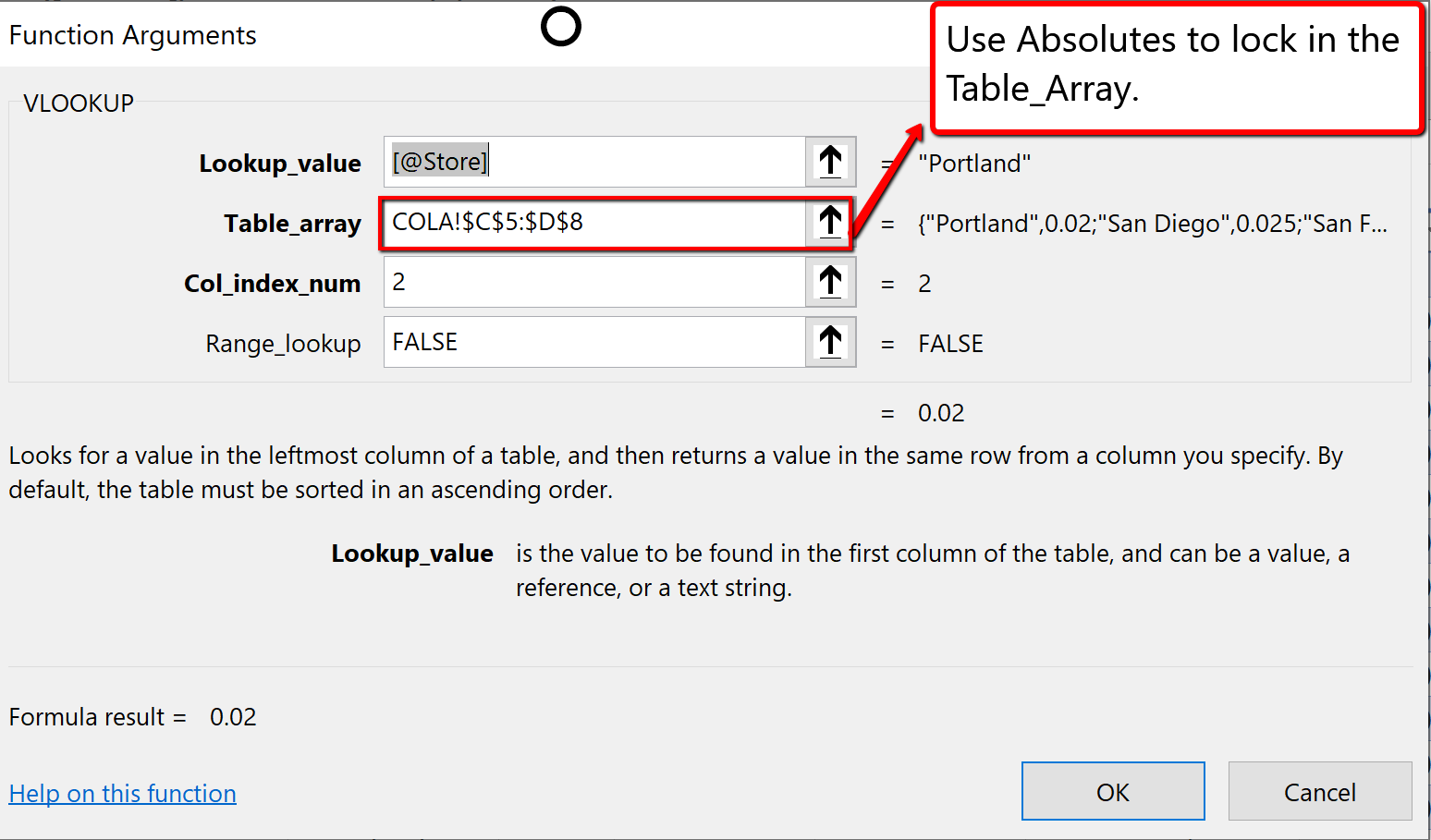
4. The Excel table will request you to overwrite all cells in the column with the formula. Click the icon, and choose the Overwrite command as shown below:
![]() Mac Users: Excel for Mac will automatically fill in the rest of the cells in the column. You do not have to click the icon. Close the Formula Builder pane.
Mac Users: Excel for Mac will automatically fill in the rest of the cells in the column. You do not have to click the icon. Close the Formula Builder pane.
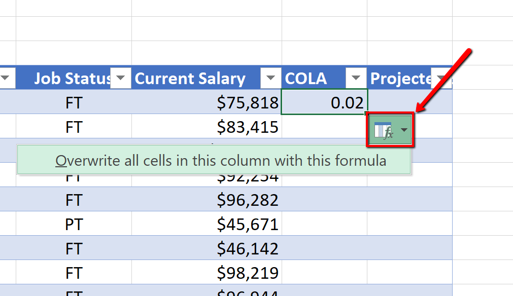
5. Using point mode method click the table cells to calculate the employees Projected Salary Increase by multiplying the Current Salary by the COLA increase:
=[@[Current Salary]]*[@COLA]
6. The Excel table will again request you to overwrite all cells in the column with the formula. Click the icon, and choose the Overwrite command.
![]() Mac Users: You do not have to click the icon. Excel for Mac will auto-fill the rest of the cells in the column.
Mac Users: You do not have to click the icon. Excel for Mac will auto-fill the rest of the cells in the column.
7. Format the COLA and Projected Salary Increase columns by selecting K6:K107, and applying the percentage number format, and increase the decimal to one place. Autofit the column widths.
(Suggestion: Use the short cut selection method; click in K6, press and hold the CTRL and SHIFT and DOWN arrow keys to select the column data.)
8. Select L6:L107, and apply the Currency number format.
(Suggestion: Use the short cut selection method; click in L6, press and hold the CTRL and SHIFT and DOWN arrow keys to select the column data.)
9. Select L5. Wrap, and right-align the text, then decrease the column width, and increase the row height to show the contents of the heading row wrapped on two lines.
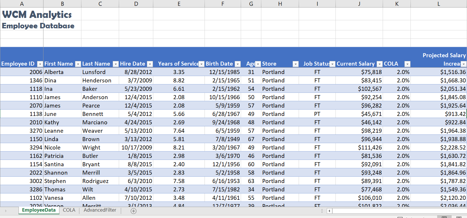
TOTAL ROW
A useful table tool for data analysis is the Total Row. You can quickly total data in an Excel table by enabling the Total Row option, and then use one of several built-in functions provided in a drop-down list, per column. The Total row, which is added to the end of the table after the last data record can calculate summary statistics, including the average, sum, minimum, and maximum of select fields within the table. The Total row is formatted with values displayed in bold, the double border line option is separating the data records from the Total row.
Apply a Total Row, and follow the below steps to sum three columns of data:
![]() Mac Users: just click the Table tab and click on the Total Row option
Mac Users: just click the Table tab and click on the Total Row option
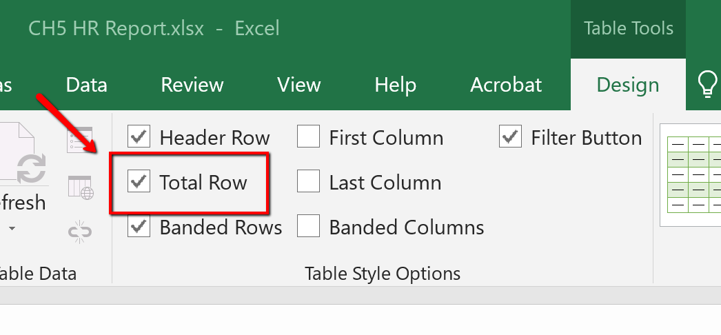
2. Excel redirects you to the bottom of the table to view the total row, where a SUM defaulted in the Projected Salary Increase column. Click cell J108, select choose the Total Row menu arrow. Choose SUM to total the Current Salary column.
<img class=” wp-image-1198″ src=”https://open.ocolearnok.org/app/uploads/sites/4/2021/09/Figure-5.19-Total-Row-Current-Salary-Column-SUM-Function.png” alt=”Screenshot of the Total Row” width=”1085″ height=”468″ /> Figure 5.19 Total Row, Current Salary Column, Sum Function
3. Click cell K108, from the total row menu select Average. The average COLA increase will display.
<img class=” wp-image-1199″ src=”https://open.ocolearnok.org/app/uploads/sites/4/2021/09/Figure-5.20-Total-Row-COLA-Column-Average-Function.png” alt=”Screenshot of the Total Row” width=”961″ height=”413″ /> Figure 5.20 Total Row, COLA Column, Average Function
CENTER ACROSS SELECTION
Follow the below steps to center the title in cell A1:L2 using the Center Across Selection tool located in the Format Cells dialog box. In prior chapters, we used the ‘Merge & Center’ button to center text across a range. The Merge & Center tool centers the title but removes access to individual cells. This restriction can present a problem when trying to autofit column widths in a table. The Center Across Selection format centers text across multiple cells but does not merge the selected cell range into one cell making it a better formatting choice when working with tables.
1. Select cell A1:L2, and right-click to access the short cut menu.
![]() Mac Users: hold down CTRL key and click the selected cells to access the short cut menu
Mac Users: hold down CTRL key and click the selected cells to access the short cut menu
2. Choose Format Cells.
3. In the Format Cells dialogue box, choose the Alignment tab.
4. From the Horizontal alignment menu, choose Center Across Selection. Click OK to return to the table.
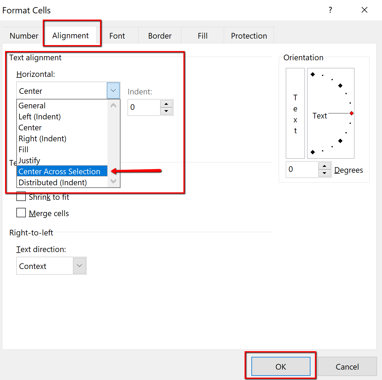
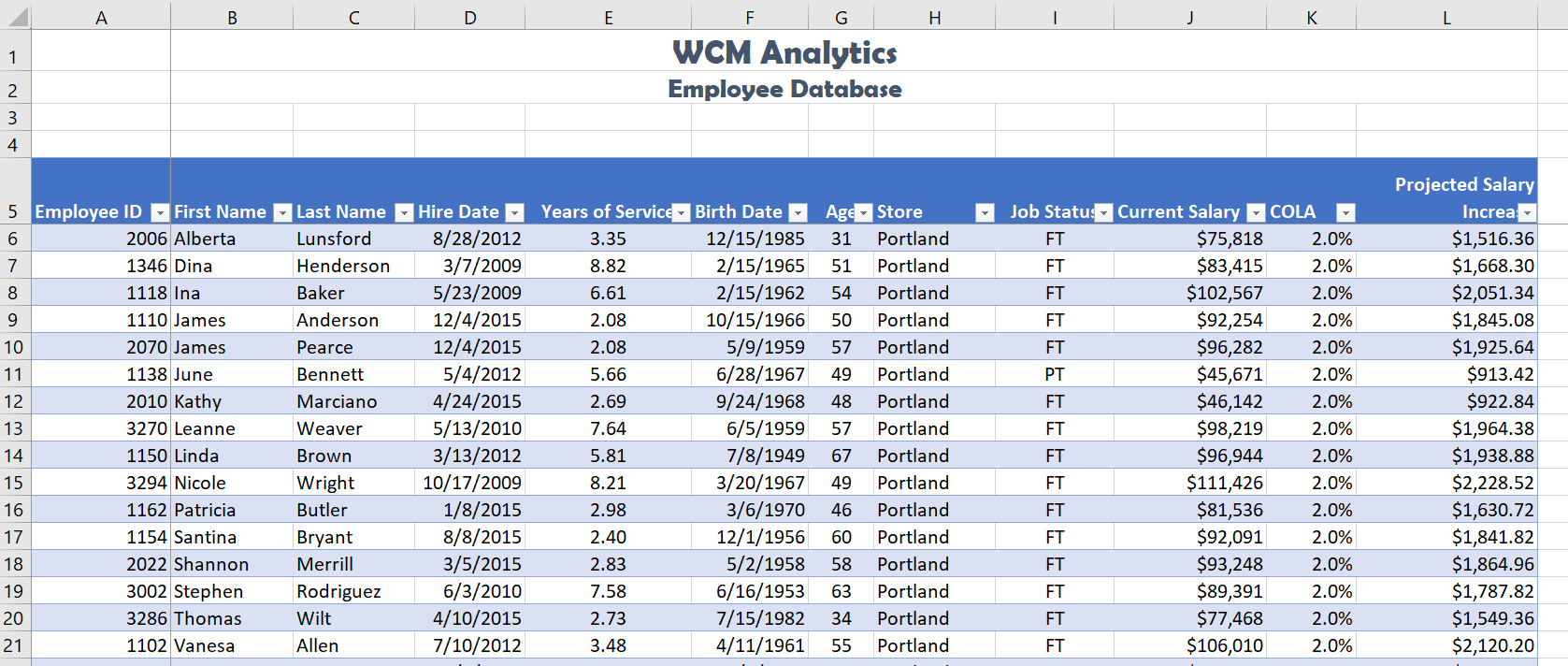
“5.1 Table Basics” by Hallie Puncochar, Portland Community College is licensed under CC BY 4.0
SORT, FILTER, AND ANALYZE DATA WITH PIVOT TABLES & SUBTOTALS
SORTING
Sorting is one of the most common tools for data management. By arranging data sequentially the information becomes more meaningful. Arranging records in a specific sequence is called sorting. If you sort by one column this is considered a single sort. If you need to sort by more than one column, this is considered a custom sort.
The field or fields you select to sort are called sort keys. In Excel, you can sort your table by ascending or descending order. Data in ascending order appears lowest to highest, earliest to most recent, or alphabetically from A to Z. Data in descending order in arranged by highest to lowest, most recent to earliest, or alphabetically from Z to A.
Excel will sort a range of data that is not in a table. However, when working with large sets of information it is wise to make the data a table for integrity. Excel locks the row of information creating a record, thus when sorted, the record remains intact, just reorganized. For example, when you sort the table by last name, all of the records in each row move together. It is always a good idea to save a copy of your worksheet before applying sorts.
There are multiple places you can find and use sorting tools:
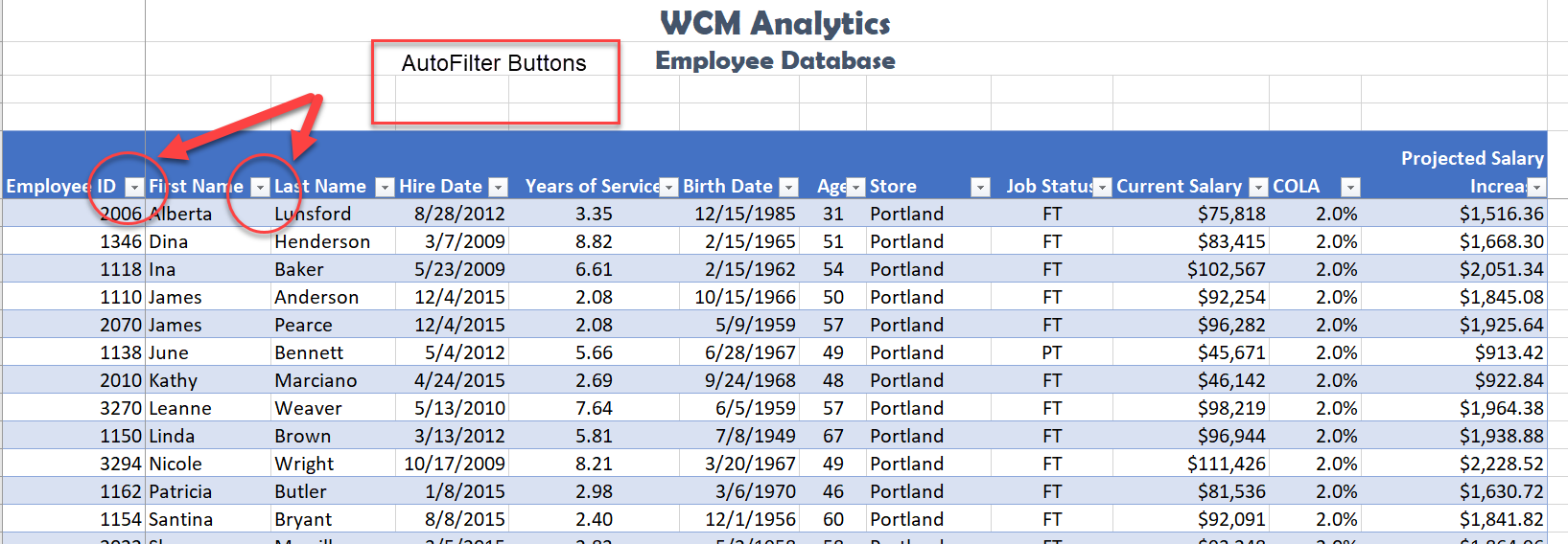
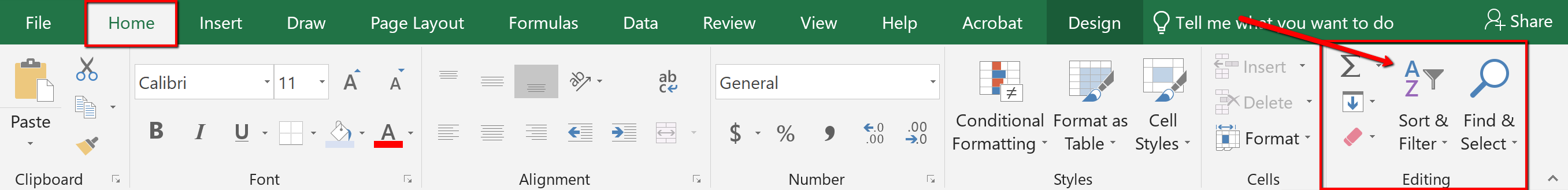

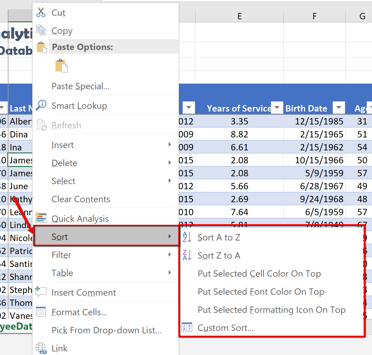
Complete a single level sort by following the steps:
1. In the EmployeeID heading, click the filter button.
2. Choose to Sort Smallest to Largest.
![]() Mac Users: Click the A-Z Ascending button
Mac Users: Click the A-Z Ascending button ![]()
Notice Excel arranges in chronological order all the employee data based on the EmployeeID number, however keeping each record together. You will also notice the filter button now displays an up arrow denoting an ascending sort.
<img class=” wp-image-1211″ src=”https://open.ocolearnok.org/app/uploads/sites/4/2021/09/Figure-5.27-EmployeeID-Sort.png” alt=”Sort Screenshot Solution” width=”1151″ height=”489″ /> Figure 5.27 EmployeeID Sort
The following steps will sort the records in descending order by Current Salary using the ‘Sort Largest to Smallest’ option form the filter button.
1. Click the filter button located in the Current Salary heading.
2. Choose Sort Largest to Smallest option from the menu.
![]() Mac Users: click the “Descending” button
Mac Users: click the “Descending” button
Notice the original sort has been overridden, and the information is now organized based on the largest Current Salary. You will see the small arrow on the EmployeeID filter is gone, and an arrow pointing down for Descending Order is visible on the Current Salary filter button.
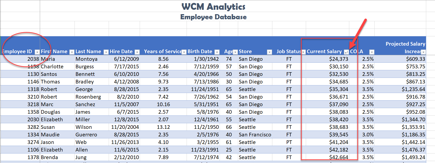
Sort a Column
CUSTOM SORT
When you need to sort by more than one level, you must use the Custom Sort option. Complete the following steps to organize the data by Store, Last Name, Current Salary, all in Ascending Order (A-Z).
1. Select the Data tab, and click the Sort button. Notice the last column sorted by is listed. Change the column heading name by dropping down the Sort by menu and select Store.
2. Click Add Level.
![]() Mac Users: click the + symbol
Mac Users: click the + symbol ![]()
3. Click the down arrow in the Then by section, and choose the column heading names as shown below in Figure 5.29. Note to click Add Level to add the next column heading. The order you select the headings will determine how the table information is sorted.
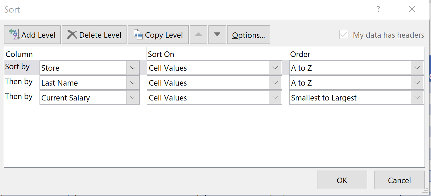
4. Once you select to Sort by column headings, choose the Order by selecting to sort in ascending order (A-Z) for the Store and Last name fields, and Smallest to Largest, for the Current Salary field.
5. Click OK.
Notice the information is now sorted by three levels, per Store, each employee is organized by Last Name, and Current Salary in ascending order (smallest to largest). Each of the filter buttons indicates the sort with the up arrow.
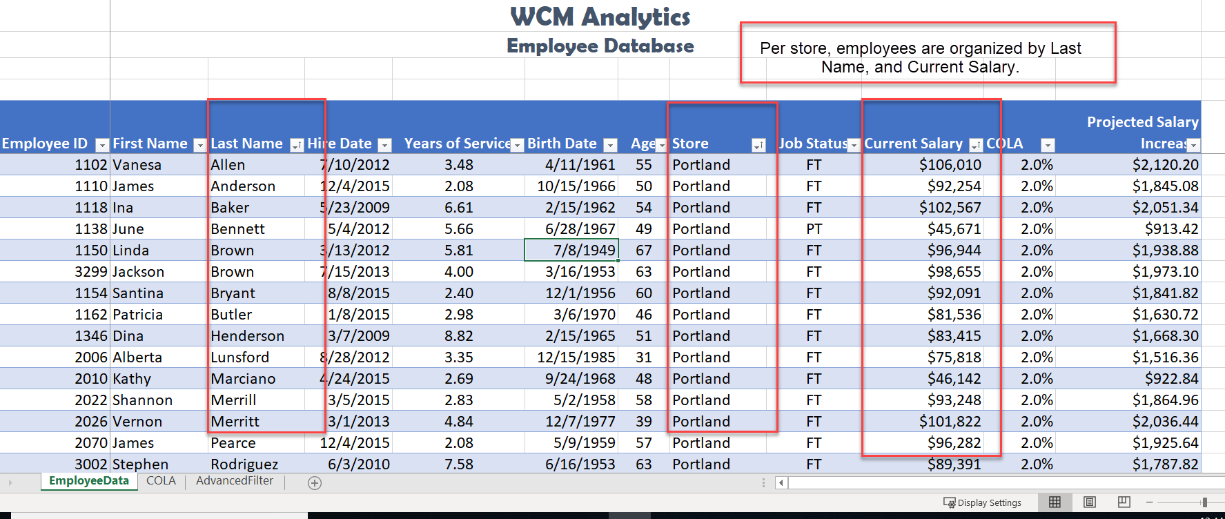
Custom Sort (Multiple Level Sort)
CUSTOM LIST SORT
When sorting you can create custom lists that allow sorting by characteristics that do not sort alphabetically. Example, text items such as high, medium, and low—or S, M, L, XL. Dates commonly require custom lists so you can vary in the way data is sorted by days of the week or months of the year.
In our case, we want to create a custom list that sorts our stores, which is not, in ascending or descending order. The human resources office likes to order the stores based on the location size. The company headquarters is in Seattle and employs the most people. The next biggest location is San Diego etc. Follow the below steps to create a custom list ordering the stores as shown below:
Seattle
San Diego
Portland
San Francisco
![]() Mac Users: The steps to create a custom sort list are different for Excel for Mac. Please skip the below steps and follow the alternate steps below Figure 5.34.
Mac Users: The steps to create a custom sort list are different for Excel for Mac. Please skip the below steps and follow the alternate steps below Figure 5.34.
Follow the below steps to create a custom list ordering:
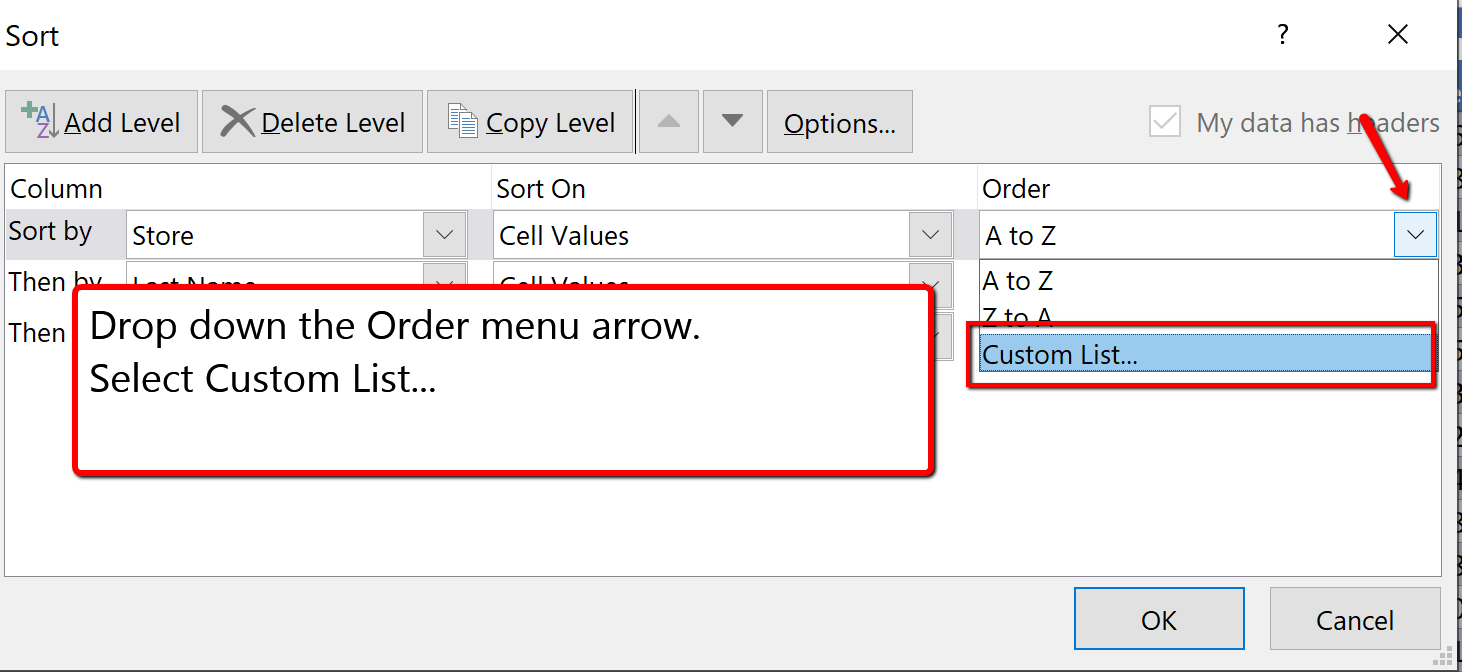
3. Click in the List entries: box and type Seattle, and press enter. Type the remainder of the locations shown in Figure 5.32, pressing enter after each store location typed. Once all locations are entered, click Add. Then choose Ok.
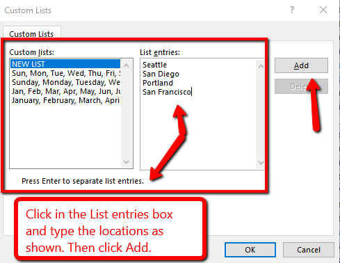
4. You will see the Order of the Store sort update. Click OK to close the Sort dialogue box.
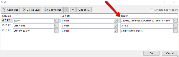
The custom sort is applied and the table is now sorted by Store, using the custom order, then the Last Name of the employee and then by the Current Salary column.
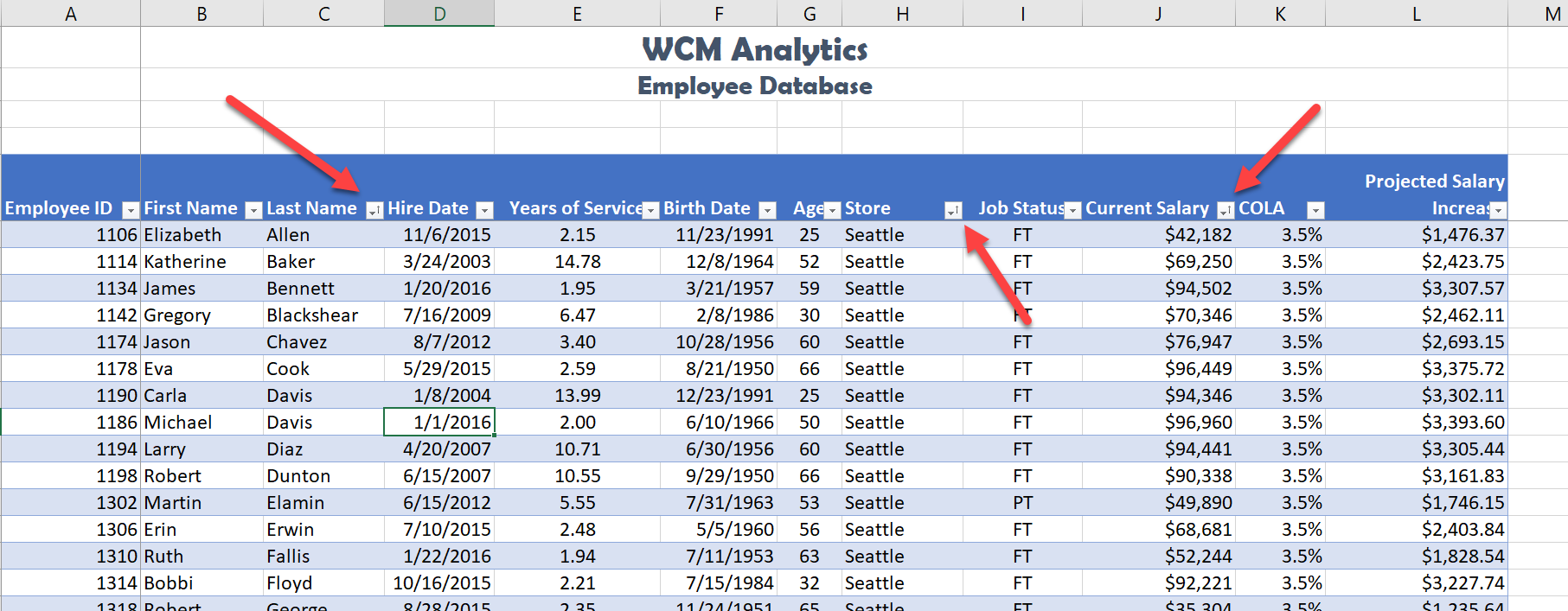
![]() Mac Users alternate steps for creating a custom sort list:
Mac Users alternate steps for creating a custom sort list:
Custom List Sort
FILTER DATA
If your worksheet contains a lot of data, it can be difficult to find information quickly. Applying Filters is an efficient and effective way to only show the information needed. Typically when filtering you are searching the data for specific information. Generally speaking, you are searching the data based on a question, or in other words, querying the data, and returning only the information that satisfies the question. The process of filtering records based on one or more filter criteria is called a query. Filtering data hides the rows whose values do not match the search criteria. The information that does not display is not deleted, it is just hidden, and will be redisplayed by removing the filter or applying a new filter.
Like sorting, Filter options are located in the filter button alongside each field name. By clicking the filter button, you can choose which values in that field to display, hiding the rows or records that do not match that value. The filter lets you choose to display only those records that meet specified criteria such as color, number, or text. In this situation, criteria is defined as; a logical rule by which data is tested and chosen.
For example, you can filter the table to display a specific name or item by typing it in a Search box. The name you selected acts as the criterion for filtering the table, which results in Excel displaying only those records that match the criterion. The selected checkboxes indicate which items will appear in the table. By default, all of the items are selected. If you deselect an item from the filter menu, it is removed from the filter criterion. Excel will not display any record that contains the unchecked item. As with the previous sort techniques, you can include more than one column when you filter by clicking a second filter button and making choices. After you filter data, you can copy, find, edit, format, chart, or print the filtered data without rearranging or moving it.
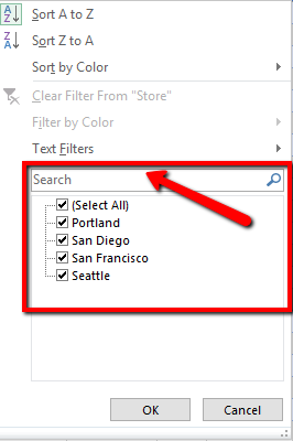
Complete the following steps and filter data according to each query.
How many employees are at a Part-Time (PT) status?
The answer to the question is there are currently are 11 employees at a PT time status. The total row will display the part-time total current salaries, and what the projected salary increase for part-time help will be after COLA adjustments.
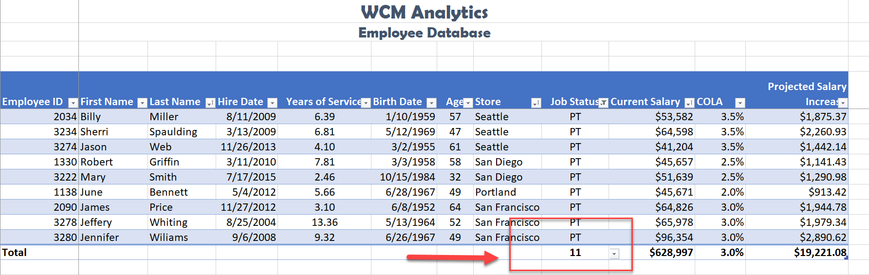
USING CRITERIA FILTERS
The filters created are limited to selecting records for fields matching a specific value or set of values. For more general criteria, you can use criteria filters, which are expression involving dates and times, numeric values, and text strings. Excel will identify what criteria filter to display based on the information in the column. For example, you can filter the employee data to show only those employees hired within a specific date range. Notice the criteria filter changes to Date Filters. If we were looking at the Current Salary column, the filter would be a Numbers Filter.
Using criteria filters, follow the below steps to search for employees who have been with the company for a specific time period.
Identify employees who have been with the company between 2013-2016.
1. While clicked in the table, clear any sort or filter applied by clicking the Data tab. In the Sort & Filter group choose the Clear button. ![]()
2. Click the Filter button in the Hire Date column. Select Date Filters, and choose the Between criteria.
![]() Mac Users: uncheck the Select All checkbox before choosing the Between option.
Mac Users: uncheck the Select All checkbox before choosing the Between option.
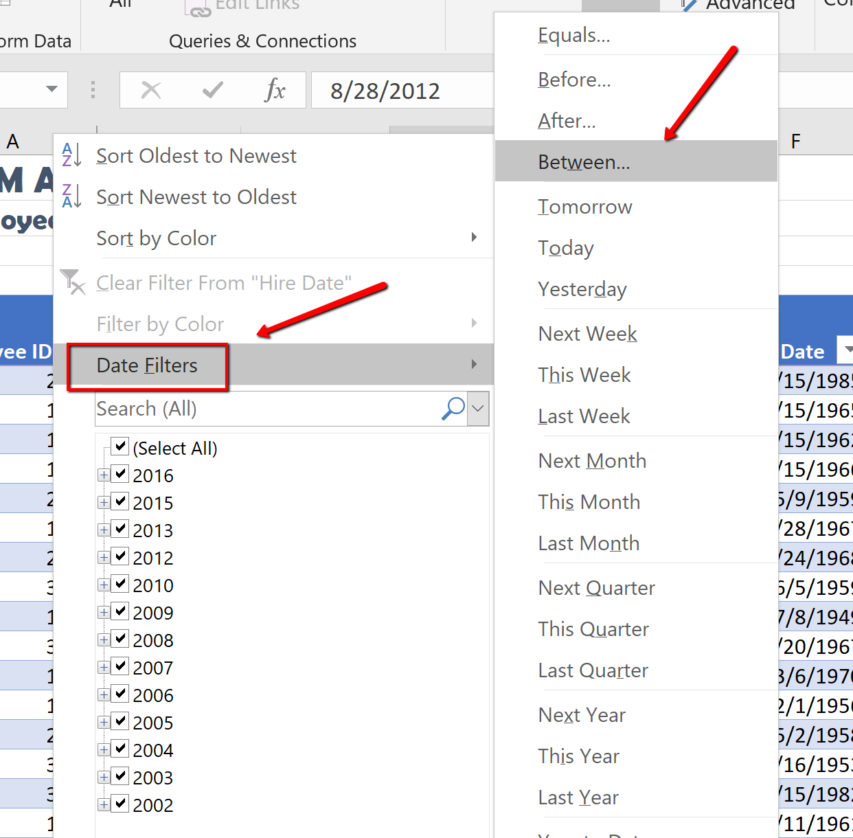
3. Search for employees with a hire date between 2013, and 2016. In the “is after or equal to” section type 1/01/2013, and typing in the “is before or equal to” section type 12/31/2016. Then click OK.
![]() Mac Users: Excel for Mac sections simply say “After” and “Before”
Mac Users: Excel for Mac sections simply say “After” and “Before”
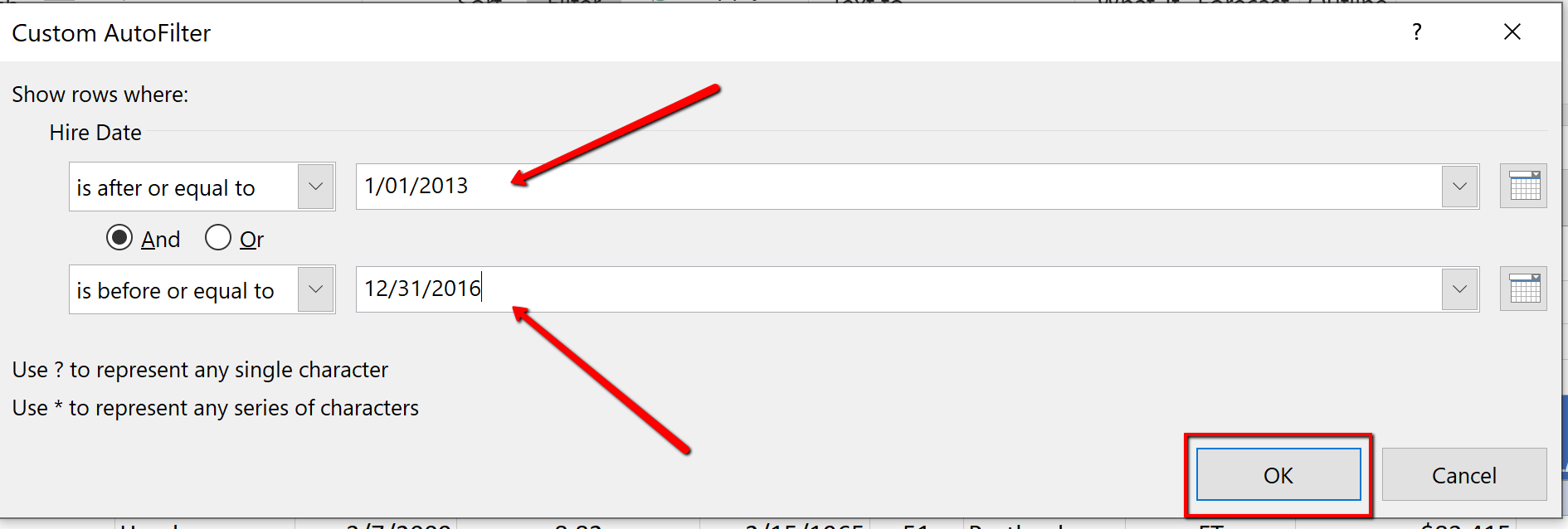
4. Sort the filtered table from Oldest to Newest by Date Hired.
5. In the total row section, count the last name names of the employees by applying the count function in cell B108.
6. In the total row, select cell I108, and choose None to turn off the count function in the Job Status Column.
Notice the table total row show 47 employees hired between the specified dates. These employees will be evaluated for a COLA adjustment.
Notice the filter button displays a filter symbol and an up arrow indicating the column is filtered and sorted in ascending order.
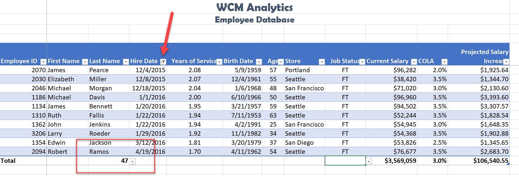
SLICERS
Another way to filter an Excel table is with slicers. Slicers, generally speaking, are visual filter buttons you can click to filter the table data. Slicers show the current filtered category, which makes it easy to understand what exactly is displayed. For example, a slicer for the Store field would have buttons for the Seattle, San Diego, Portland, and San Francisco locations.
When slicer buttons are selected, the data is filtered to show only those records that match the criteria. Multiple buttons can be selected at the same time, and a table can have multiple slicers, each linked to a different field. When multiple slicers are used, Excel uses the AND logical operator so filtered records must meet all of the criteria indicated in the slicer. When selecting multiple buttons in a Slicer, use the shift key to select adjacent field names. If the field names are not adjacent, use the non-adjacent selection method, pressing the CTL button, and selecting the field names needed.
Follow the below steps to filter the table using visual Slicer buttons.
1. Click in the table area. From the Data tab, choose Clear to remove the current sort and filter applied to the data.
2. To make room for the Slicer buttons at the top of the table, we will add 4 rows between the title and the table area. Right-click cell A3. Choose Insert. Select Entire Row. Repeat these steps until the table heading starts in row A9.
![]() Mac users should hold down CTRL key and click cell A3. Then repeat until the table heading starts in row A9.
Mac users should hold down CTRL key and click cell A3. Then repeat until the table heading starts in row A9.
<img class=” wp-image-1227″ src=”https://open.ocolearnok.org/app/uploads/sites/4/2021/09/Figure-5.40-Added-Rows.png” alt=”Added Rows Screenshot” width=”1164″ height=”465″ /> Figure 5.40 Added Rows
3. Click back into the table area. Choose the Insert tab. Click Slicer. When the Insert Slicers dialogue box opens, click the Store and Job Status field names to display as slicers. Click OK.
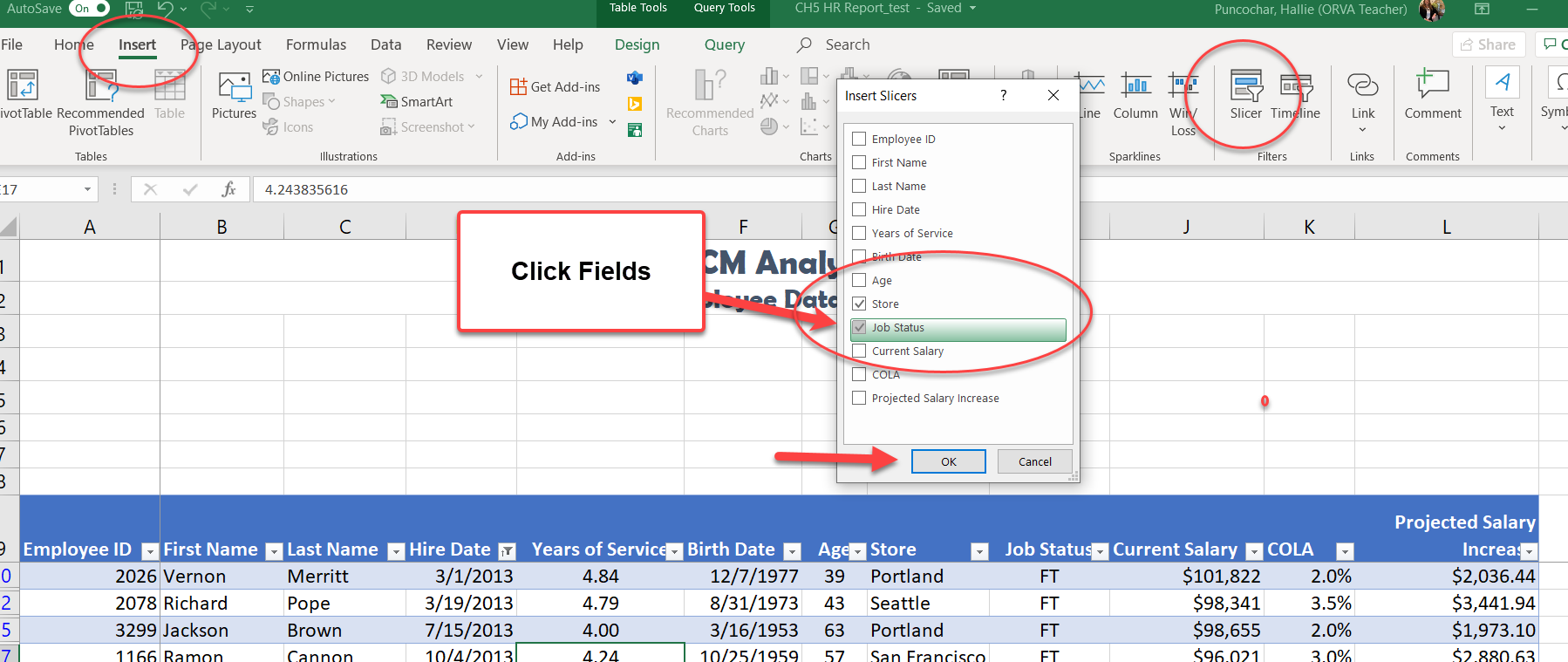
4. Move, and re-size the Slicer boxes to fit in the approximate area of I1:J8 and K1:L8. Make sure the buttons remain visible. Below is a visual example.
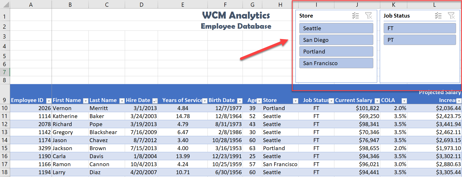
5. From the Store slicer, click the San Diego button. Notice the data filters to only show the data for San Diego.
6. From the Job Status slicer click PT. Notice the data filters to only show the data for PT employees in San Diego.
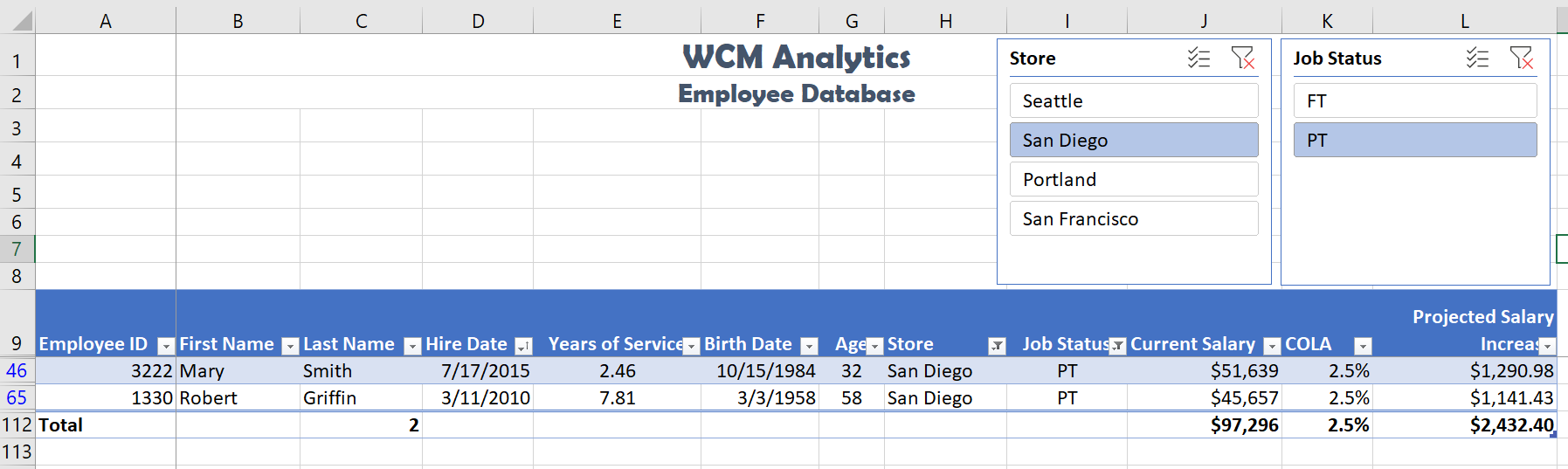
7. Return to the Store slicer and choose Seattle and Portland. Note the non-adjacent selection method is needed. Select Seattle first, then press and hold the Ctrl button on the keyboard, and then select Portland.
![]() Mac Users: hold down the Command key not the Ctrl key before you click on Portland.
Mac Users: hold down the Command key not the Ctrl key before you click on Portland.
8. Change the Job Status slicer selection to FT.
The table results show there are 61 FT employees in Seattle and Portland. The Projected Salary Increase after the COLA adjustment for the Northwest region is $150,465.80.
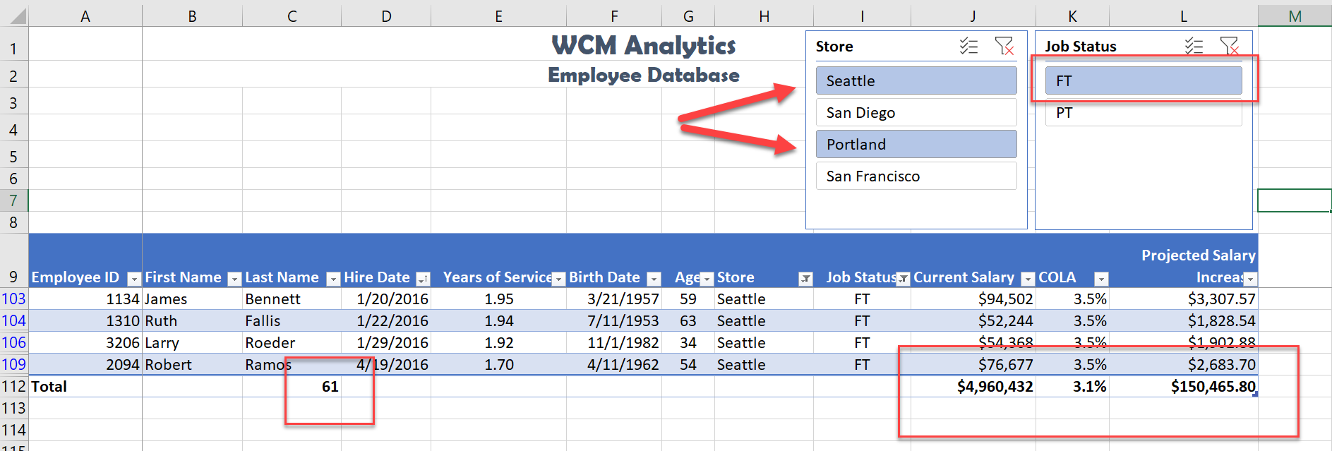
ADVANCED FILTERS
Filter buttons are limited to combining fields using advanced logic or complex criteria. If the data you want to filter requires complex criteria, you can use the Advanced Filter dialog box. The Advanced Filter works differently from the Filter command in several important ways:
For example, you searched records for employees in the Seattle and San Diego offices AND for employees working at full-time bases, AND have a base salary between the below Salary Ranges:
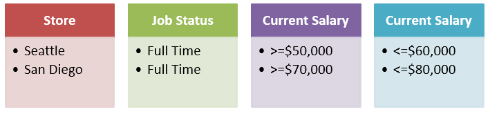
To run the above complex criteria mentioned above follow the below steps:
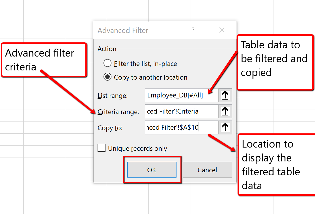
9. Click OK to copy the records that match the advanced filter criteria. Save your work.
The advanced search results list 7 employees that meet the criteria. Of these 7 employees, only 1 full-time employee in San Diego has a current salary between $70,000 and $80,000 dollars, and 6 full-time Seattle employees have a current salary between $50,000 and $60,000 dollars.
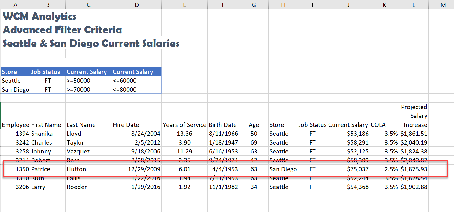
INSERT TABLE
Let’s review another away to turn a range of data into a table.
Excel turns the information into a table and sorts accordingly:
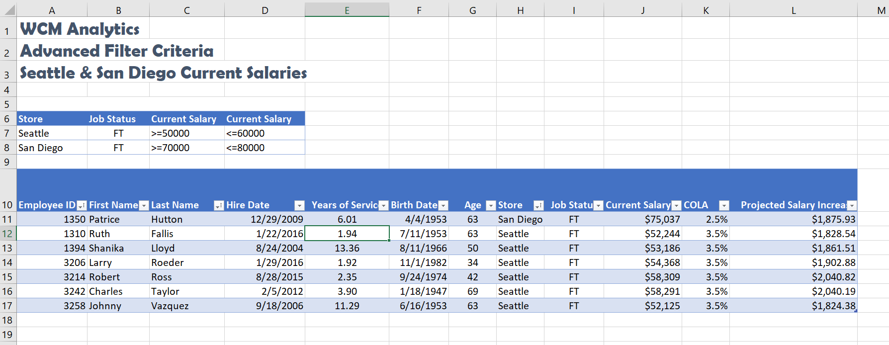
INTRODUCTION TO PIVOT TABLES
Another way to analyze table information is with PivotTables. A PivotTable is a powerful tool that calculates, summarizes, and analyzes table data to compare, patterns, and trends. PivotTables are inserted directly from a table, linking the table data. Generally speaking, when you pivot on the table data you are reorganizing the table information to reveal different levels of detail that allow you to analyze specific subgroups of information and summarize data quickly and easily without having to change the structure or layout of the original table area.
When you pull table data into a PivotTable there are four main area fields: Rows, Columns, Values, and Filters. The Rows and Columns fields can interchange quickly to summarize the data in different ways or to run new reports based on the question or criteria being asked. The Value field is data from the table that can be calculated, or that contain values that the PivotTable will summarize. The Values field has multiple settings to choose how you want to calculate the data; SUM, COUNT, AVERAGE, MIN, MAX, and can even show the displayed values as a percentage of the total, column total, grand total, and so on. Lastly, is the Filters area, which restricts the PivotTable to only show the values matching specified criteria.
Four Primary PivotTable Areas:
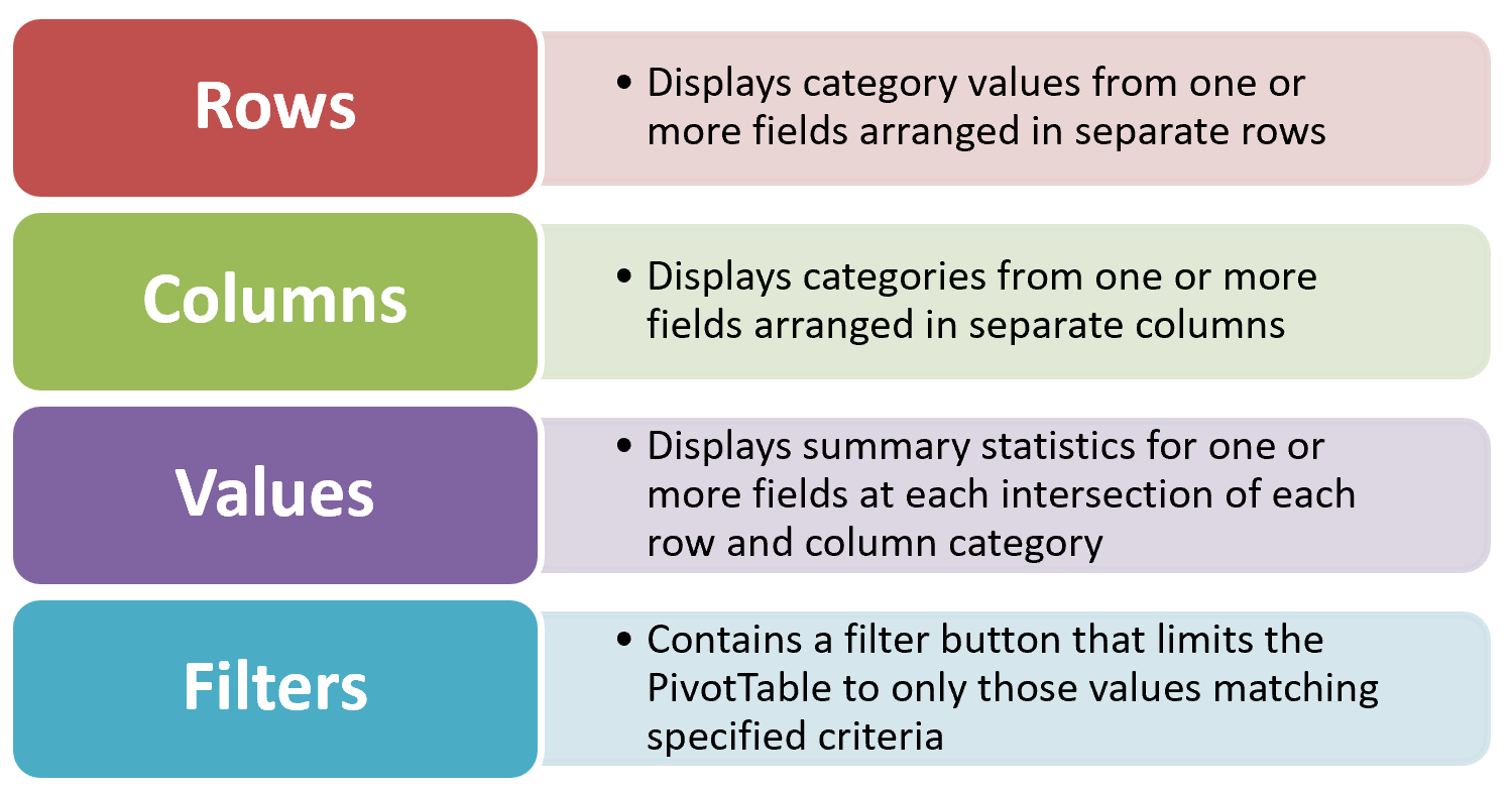
Figure 5.49 Four Primary PivotTable Areas
In our situation, shown below, we will create a PivotTable to summarize employee data to show Projected Salary Increases, for both Part-Time (PT) and Full -Time (FT) employees for all store locations.
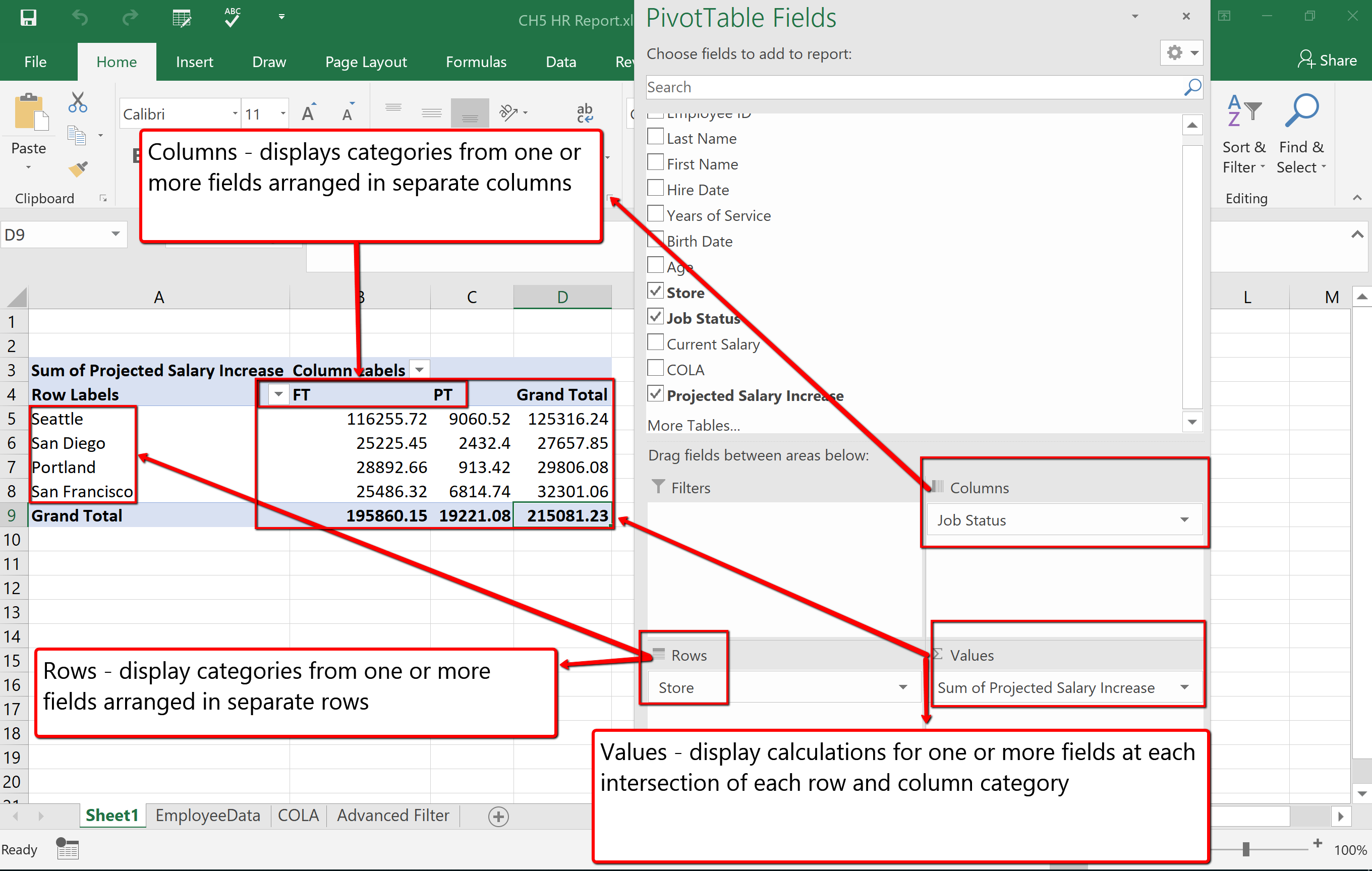
Follow the below steps to explore and build a PivotTable report.
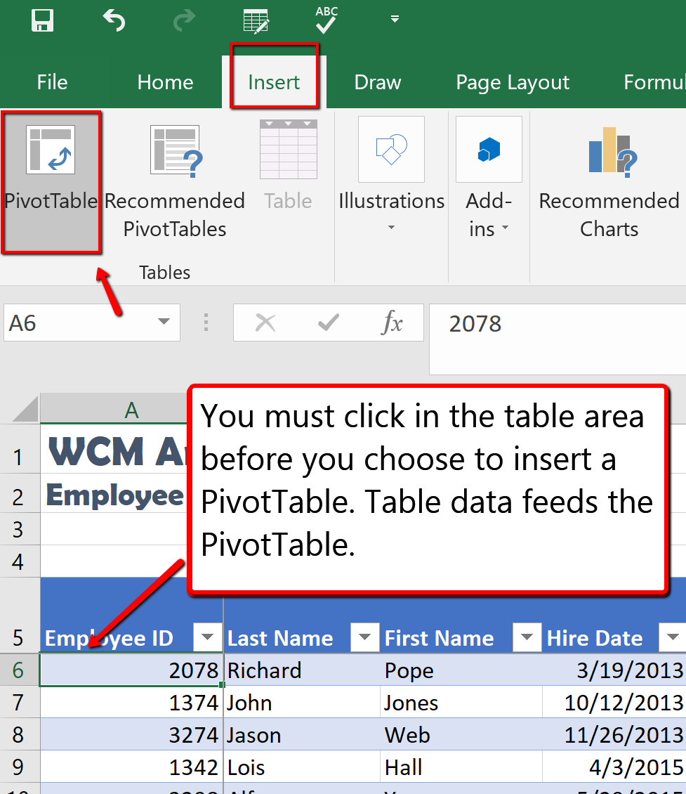
3. From the Create PivotTable dialogue box, make sure the PivotTable report will be placed in a New Worksheet, and click OK.
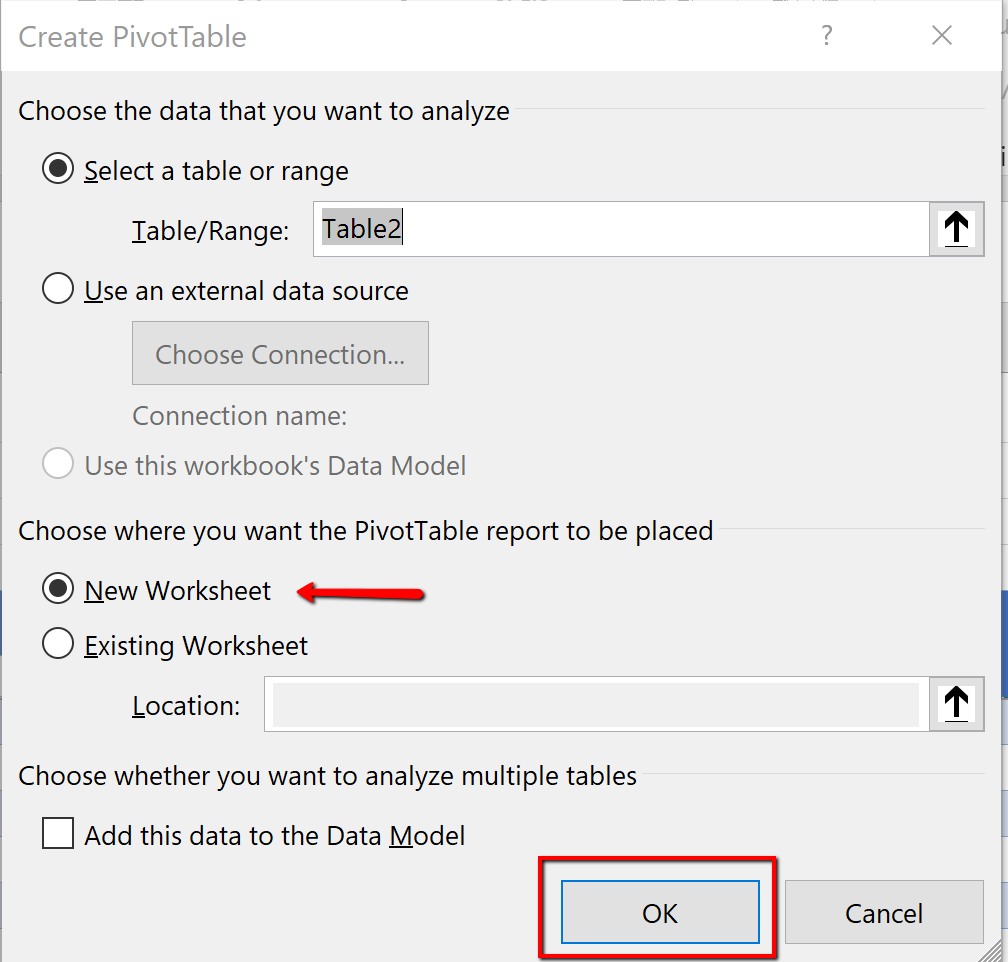
4. Notice a new sheet (Sheet1) is inserted, at the bottom of the workbook, that contains the PivotTable1 area and fields dialogue box. Rename the default name (Sheet 1) to StorePT.
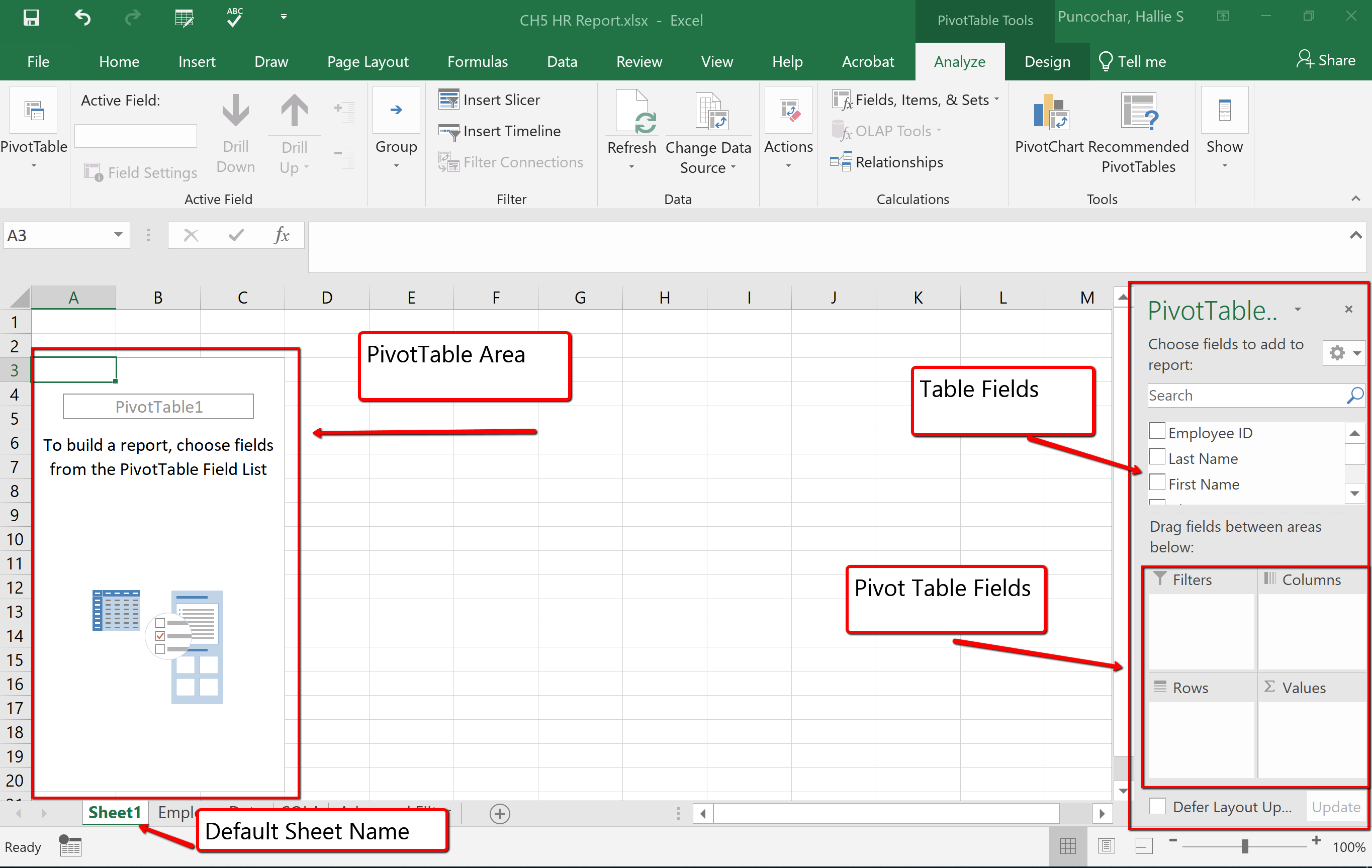
5. From the PivotTable pane, drag and drop the Store heading to the Rows section of PivotTable field area.
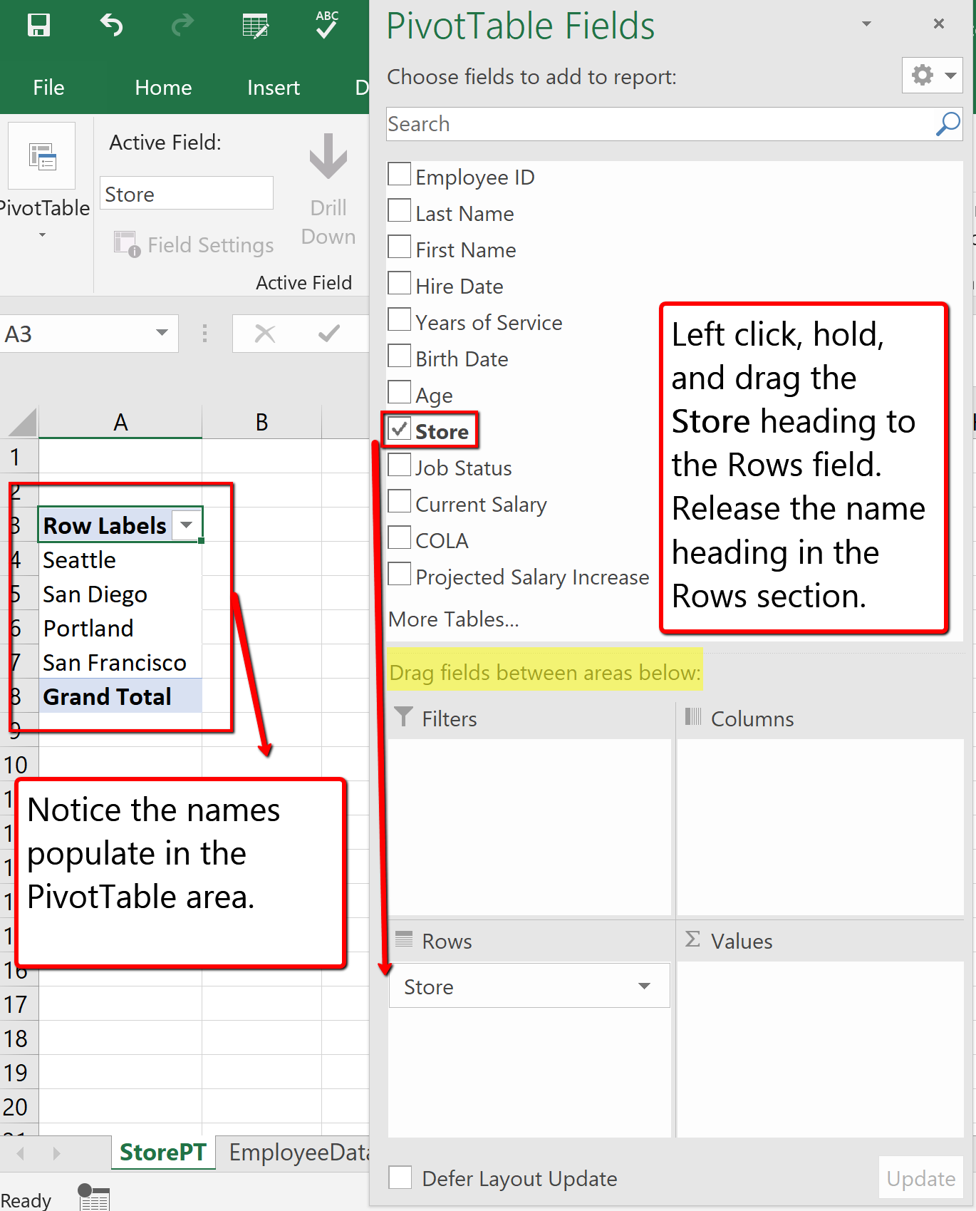
6. From the PivotTable fields list drag and drop the Projected Salary Increase heading to the Values section.
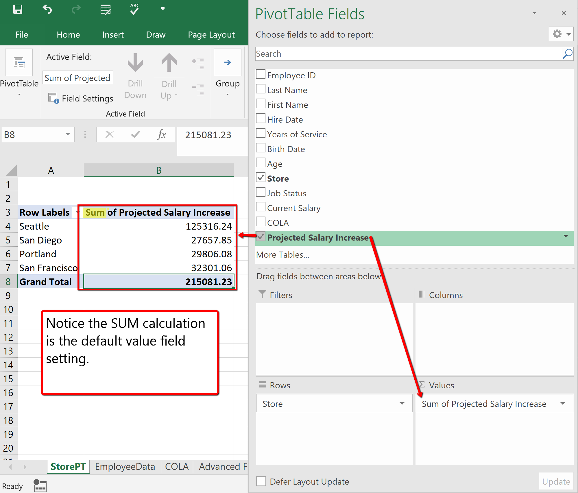
7. Drag and Drop the Job Status heading to the Columns field section. Notice the Job Status categories display. In this case, displaying Full-Time (FT) and Part-Time (PT) employees.
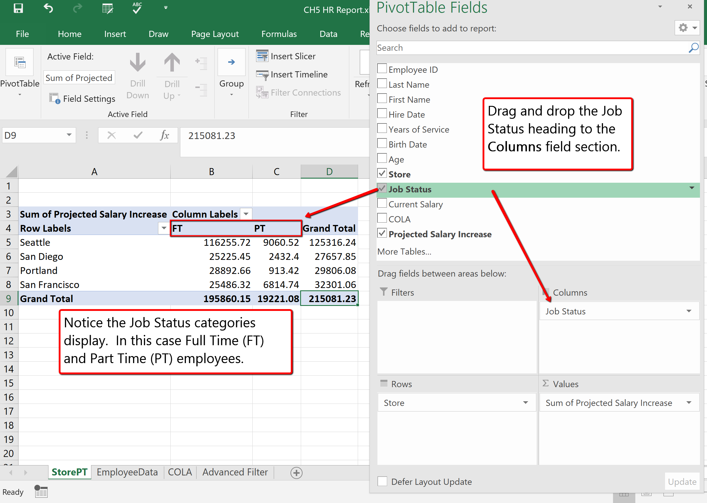
FORMATTING PIVOT TABLES
After creating a PivotTable and adding the fields that you want to analyze, you may want to enhance the report to include slicers, or graphs and or format the data to make it easier to read and scan for details. When clicked in the PivotTable area you will see a contextual tab appear on the ribbon, containing PivotTable Tools and two specific tabs; Analyze and Design. ![]() Mac Users: there is not a “PivotTable Tools” tab but you will see two tabs named: PivotTable Analyze and Design. They are only visible when you have clicked inside the PivotTable area.
Mac Users: there is not a “PivotTable Tools” tab but you will see two tabs named: PivotTable Analyze and Design. They are only visible when you have clicked inside the PivotTable area.
The Analyze tab contains tools specifically for examining data, for example, the ability to insert Slicers, or PivotCharts. The Design tab contains tools that specifically tie to how the table and data visibly display. For example, when you have a lot of data in your PivotTable, it may help to show banded rows or columns for easy scanning or to highlight important data to make it stand out.
Follow the below steps to add format the PivotTable, and add a PivotChart.
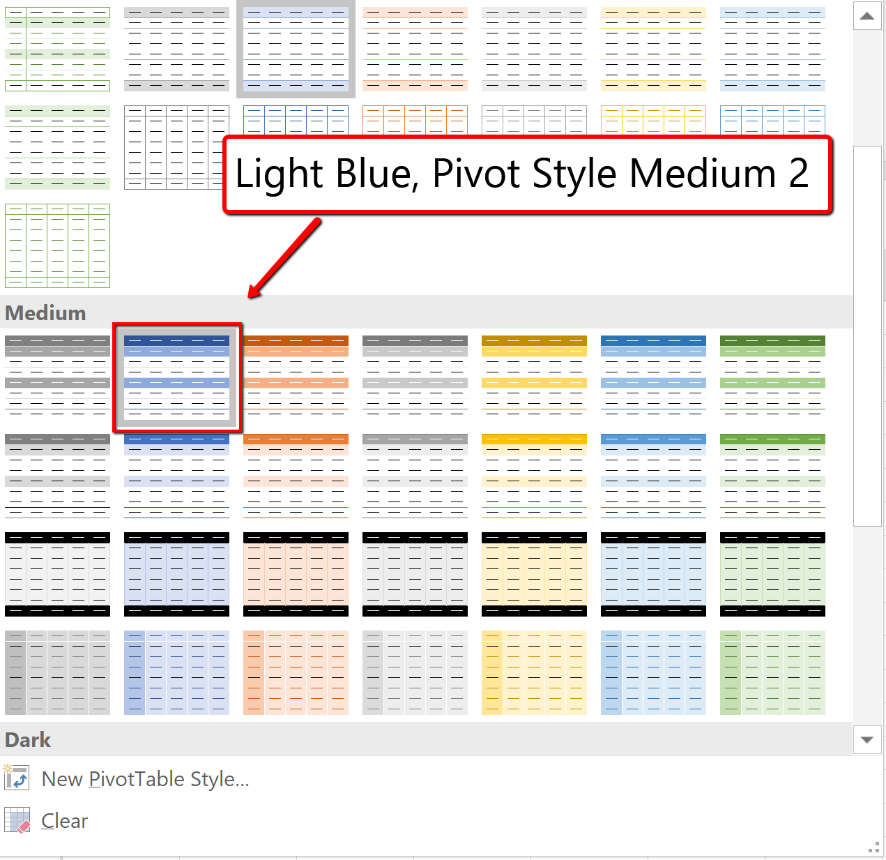
3. To format the PivotTable numbers, select B5: D9. Click the Home tab. Apply the Currency number format and decrease the decimal place to zero decimals.
(The alternative method to number formatting in a PivotTable is to expand the menu on value field; Sum of Projected Salary Increase. Click the Value Field Settings. Choose Number Format and apply the desired number format option. ![]() Mac Users should click the small circle with an “i” next to “Sum Projected Salary Increase” in the Values section then click the Number button to change the Number Format.
Mac Users should click the small circle with an “i” next to “Sum Projected Salary Increase” in the Values section then click the Number button to change the Number Format. ![]() )
)
NOW LET’S CREATE A PIVOTCHART!
4. Click in the PivotTable. Click the Analyze tab. Choose the PivotChart button on the Ribbon.
5. From the listed chart types, choose Column. And select the 3D Clustered Column option. Click OK.
![]() Mac Users: Only a basic, 2D column chart is available when clicking the Pivot Chart button. In order to select a different chart type, such as the 3D clustered column option, you must do the following:
Mac Users: Only a basic, 2D column chart is available when clicking the Pivot Chart button. In order to select a different chart type, such as the 3D clustered column option, you must do the following:
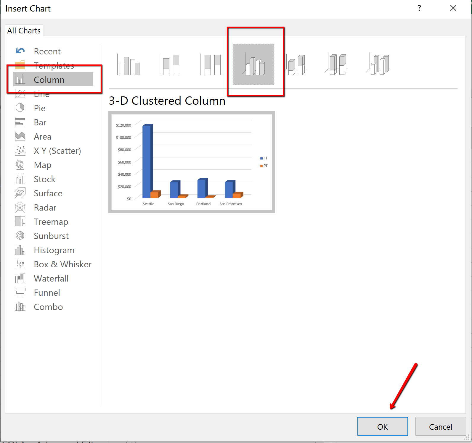
6. Move the PivotChart under the PivotTable area. Resize accordingly. Save your work.
Note the formatting changes in the new chart below. The “Job Status” and “Store” buttons are column and row “filters” for the Pivot Chart.
![]() Mac Users: Excel for Mac does not insert these formatting changes within a Pivot Chart. You can add a chart title by clicking the “Add Chart Element” button from the Design tab. It is not possible to add the “chart filter” buttons as shown in Figure 5.59. The filters on the pivot table can be used to also filter the columns and rows in the Pivot Chart.
Mac Users: Excel for Mac does not insert these formatting changes within a Pivot Chart. You can add a chart title by clicking the “Add Chart Element” button from the Design tab. It is not possible to add the “chart filter” buttons as shown in Figure 5.59. The filters on the pivot table can be used to also filter the columns and rows in the Pivot Chart.
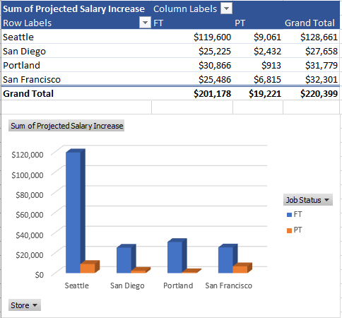
SUBTOTALS
Another way to summarize data is by using subtotals. Analyzing a large data range usually includes making calculations on the data. You can summarize the data by applying summary functions such as COUNT, SUM, and AVERAGE to the entire organized range of information. Subtotals, in general, are summary functions applied to parts of an organized data range.
For example, you can SUM Current Salaries for employees from each Store location. To subtotal the information the data must first be sorted by the Store field. For subtotals, the field that you sort is referred to as the control field. For example, if you choose the Store location as your control field, all of the Seattle, San Diego, Portland, and San Francisco entries will be grouped together within the data range. The SUM function then can be applied to SUM the Current Salary fields for each Store location. Excel calculates and displays the subtotal each time the Store location changes.
A new row containing a subtotal of that particular location will be inserted, and wherever the field changes a value will display; a subtotal group of records. Excel updates the subtotal automatically when the control field is changed. In theory, when subtotaling, you are adding a calculation row to the set of data. Adding rows that total information in the middle of a table would compromise the integrity of data in the table. The table tools would look at the total as a record, not a calculation. Therefore the Subtotal feature cannot be used in tabling, and can only be applied to a normal range of data. You must convert all tables to a range prior to subtotaling.
Multiple functions can be applied within the same Subtotal. For example, we will explore how you can SUM Current Salary’s and also provide the AVERAGE Current Salary for each Store location within the same Subtotal. Note Subtotal data can also be filtered.
The best practice when subtotaling is to follow four rules:
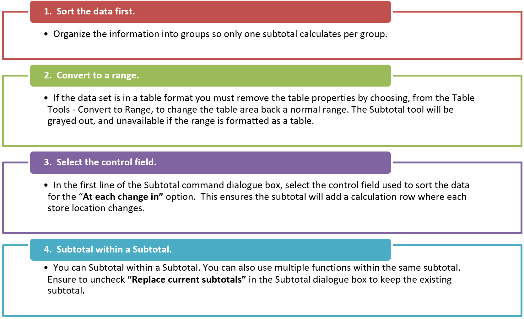
Follow the below steps to Subtotal the Employee Data and provide a total Current Salary per Store.
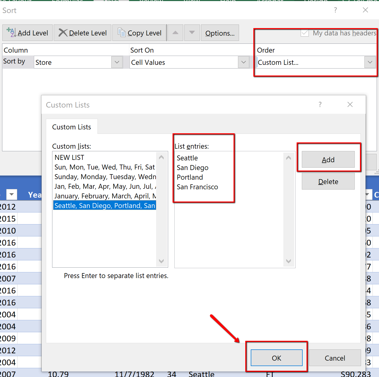
3. Choose the Table Tools Design tab. ![]() Mac Users: just click the “Table” tab.
Mac Users: just click the “Table” tab.
Select “Convert to Range.” Excel will display a message asking if you really want to convert the table back to a normal range. Choose Yes.
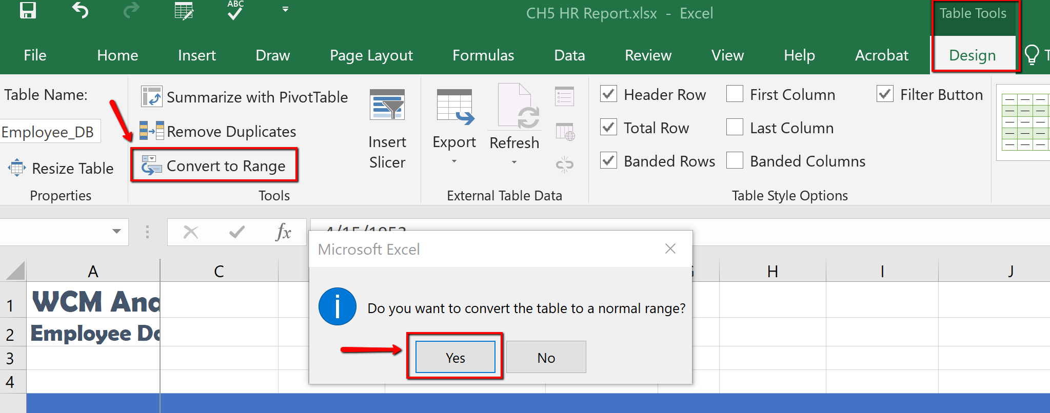
4. Click the Data tab, in the Outline group find and select the Subtotal Command. (Notice the heading row no longer has filters buttons. The data looks like a table but is not a table. The table tools are not active, and the information is a normal range.)
5. In the Subtotal dialogue box, choose the Store field in the “At each change in.” For the “Use Function,” choose Sum, and only check Current Salary. Click OK.
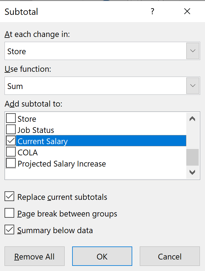
6. Notice the Current Salary column is totaled, per location. Save your work.
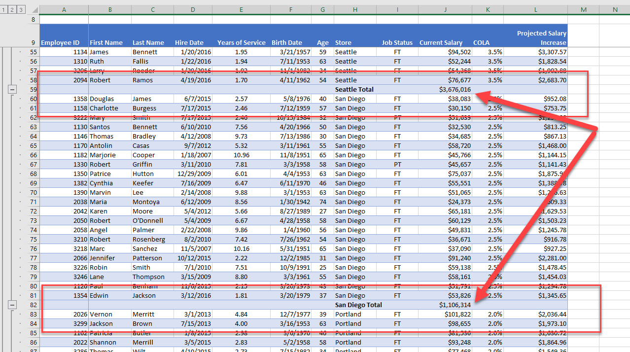
SUBTOTAL OUTLINE VIEW
The Outline views, located on the left side panel, show summary statistics. The Outline tool, with levels, allows you to control the expanse of detail displayed in the worksheet. The EmployeeData worksheet has three levels in the outline of its data range:
Figure 5.66 above shows the Level 3 Outline, all the employee detail per store location. Clicking the outline buttons located to the left of the row numbers lets you choose how much detail you want to see in the worksheet. (Note that the three level numbers are at the top left side of the worksheet, just below the Name box.)
You will use the outline buttons to expand and collapse different sections of the data range.
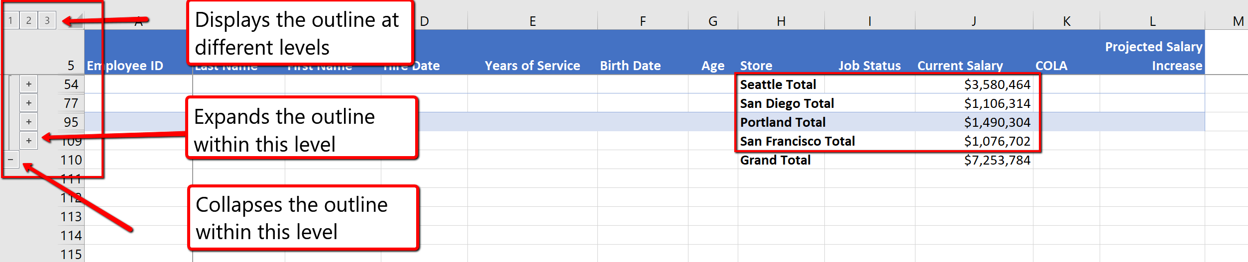
ADDING A SUBTOTAL WITHIN A SUBTOTAL
As mentioned at the beginning of the section, you can use multiple functions within the same subtotal. We will now explore how you can SUM Current Salary’s and also provide the Average Current Salary for each Store location within the same Subtotal.
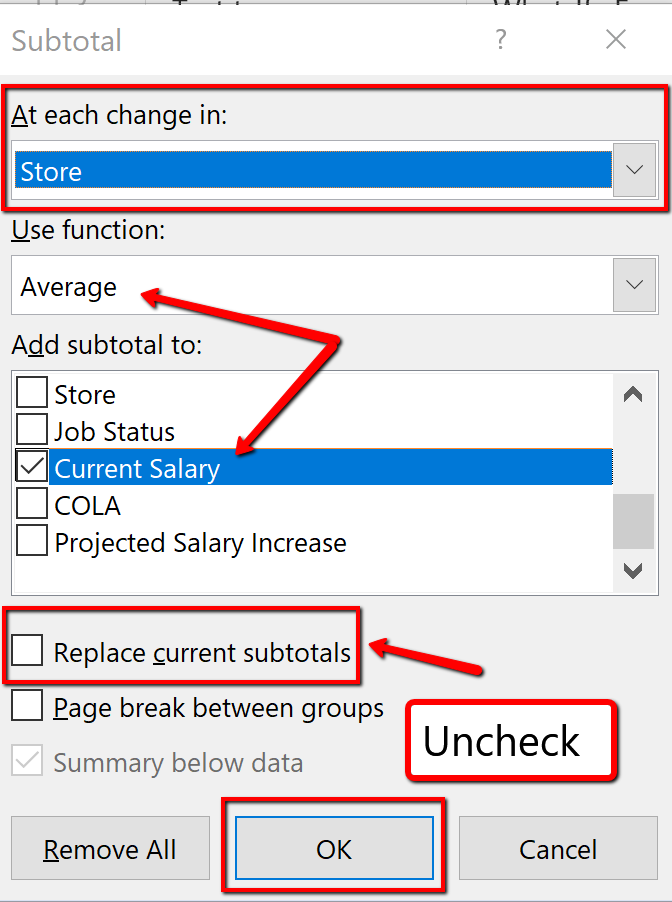
8. Notice each location is now subtotaled showing the Average and Total Current Salary. Excel has also added 4th level to the Outline, accounting for the Averages. Save your work.
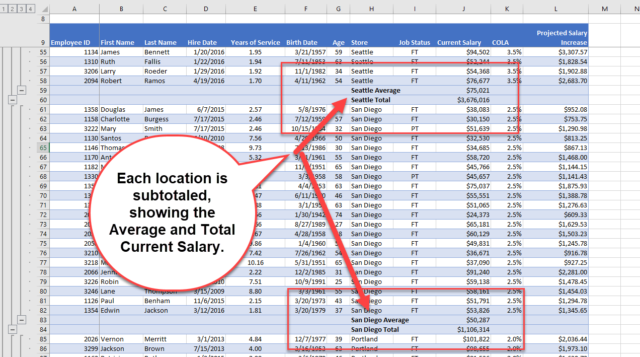
“5.2 Intermediate Table Skills” by Hallie Puncochar, Portland Community College is licensed under CC BY 4.0
Although printing large data sets is uncommon, it is an industry curiosity to set up Excel workbooks to print correctly, and to also add documentation as to when data was revised. Follow the below steps to prepare the worksheets to print.
1. Click on the AdvancedFilter worksheet. At the bottom of the screen choose the Page Layout option.
2. At the bottom of the page, click into the left section, of the Add Footer panel.

3. From the Header and Footer Design tab, choose to insert the Current Date field.

4. Click in the right panel section, insert the File Name field.
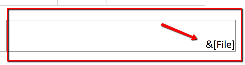
5. Click back into the spreadsheet to close the Header and Footer section, and choose the Normal page layout.
6. From the File tab, select Print. Change the Orientation to Landscape. In the Scaling section, choose Fit Sheet on One Page.
![]() Mac Users: click the “Scale to Fit” option
Mac Users: click the “Scale to Fit” option
7. Save your work. You don’t have to actually print this sheet. Go back to your worksheet.
Follow the below steps to add a footer to indicate when the last update was made and apply settings to the EmployeeData worksheet to ensure it will print correctly if needed.
1. Click the EmployeeData worksheet. At the bottom of the screen choose the Page Layout option. You may get a message telling you that Page Layout and Freeze Panes are not compatible. You should click OK to remove the Freeze Panes setting.
2. At the bottom of the page, click into the left section, of the Add Footer panel type Revision Date: add a space, then click the Current Date button from the Ribbon. Example: Revision Date: 1/01/2020.
3. Click in the center panel, add the page number field.
4. Click in the right panel section, type Revised by: then type Your Name. Example: Revised by: Jane Doe
5. Click back into the spreadsheet to close the Header and Footer section, and choose the Normal page layout.
6. From the File tab, select Print. Change the Margins to Narrow. In the Scaling section, choose Fit All Columns on One Page.
![]() Mac Users: set the “Scale to Fit” option to 1 page wide by 2 pages tall.
Mac Users: set the “Scale to Fit” option to 1 page wide by 2 pages tall. ![]()
7. Save your work. Again, you do not have to print this sheet. Go back to the worksheet.
Insert a 3D Model to the worksheet to enhance its appearance. In Excel, you can either insert Pictures, Shapes, Icons, SmartArt, Screenshots or 3D Models.

In this example, we will insert (from online) a 3D Model that looks like the Seattle Space Needle.
1. Click the Advanced Filter sheet tab, then click the Insert tab on the ribbon.
2. Click 3D Models button from the Illustrations group. (If necessary choose From Online Sources or Stock 3D Models.) 
![]() Mac Users: click the 3D Model icon button and then choose “Stock 3D Models…“.
Mac Users: click the 3D Model icon button and then choose “Stock 3D Models…“. 
3. In the Search box type Tower, and hit Enter from the keyboard.
4. From the results window, choose a model that looks like the Space Needle. And click Insert. Again, if the Space Needle is not available in the gallery, click the Back arrow and find an alternate building or tower from the 3D Model “Buildings” category.

5. Notice the model can be manipulated 360 degrees tilted up and down to show a specific feature of the object. Adjust based on your preference.

6. Place, and resize the image to the upper left-hand corner of the sheet, above the last column of data. Make sure it does not overlap on the table.
7. Check the spelling on all of the worksheets and make any necessary changes. Save your work. Submit CH5 HR Report as directed by your instructor.
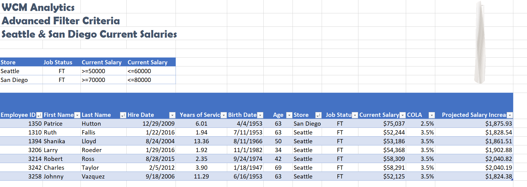
“5.3 Preparing to Print” by Hallie Puncochar, Portland Community College is licensed under CC BY 4.0
Download Data File: PR5 Data
Travel and tour companies need to keep track of client data, as well as, travel/tour options and tour guides. Keeping up-to-date, accurate records is essential to their bottom line. To run a tour company, employees must be able to manipulate their data quickly and easily. This exercise illustrates how to use the skills presented in this chapter to generate the data needed on a daily basis by a tourism company.
1. Open the data file PR5 Data and save the file to your computer as PR5 Canyon Trails.
2. Click Sheet 1. Choose cell B3.
3. From the Home tab, choose Format as Table. Choose the Orange, Table Style Medium 3.
4. In J4, calculate Total Cost (number of Guests *Per Person Cost). Note Excel will add the formula to the entire column. (If prompted, choose to overwrite the formula to the cells below.)
5. Format Columns I and J with Accounting format, no decimal places.
6. Center all headings in Row 3.
7. Adjust column widths within the table so that all the headings are completely visible.
8. Rename Sheet 1 Current Tours. Sort this sheet alphabetically (A to Z) by Last Name.

9. Make a copy of the Current Tours sheet and rename it Tours by Canyon. One way to make a copy of a worksheet is to right-click on the worksheet tab (![]() Mac Users: Ctrl+click) and select Move or Copy. Be sure to check the Create a Copy box. Place the Tours by Canyon sheet to the right of the Current Tours sheet.
Mac Users: Ctrl+click) and select Move or Copy. Be sure to check the Create a Copy box. Place the Tours by Canyon sheet to the right of the Current Tours sheet.
10. Sort the Tours by Canyon sheet by Tour Canyon, Home Country, and then Last Name all in Ascending order (A to Z).

11. Make another copy of the Current Tours sheet and rename it US Guests. Place the US Guests sheet to the right of the Tours by Canyon sheet.
12. Filter the US Guests sheet to display customers who live in the United States. Sort the filtered data alphabetically (A to Z) by Tour State. Add a Total Row that sums the Guests and Total Cost columns.
13. Make another copy of the Current Tours sheet and rename it, European Guests. Place the European Guests sheet to the right of the US Guests sheet.
14. Insert a slicer in the European Guests sheet for Home Country. Move the top left corner of the slicer to the top left-hand corner of cell L3. Resize the slicer so all buttons display. Format the slicer to match the table.
15. Using the slicer, filter the data to display customers from Germany and the United Kingdom.
16. Sort the filtered data by the Home Country, and Last Name fields displaying both in Ascending order (A to Z).
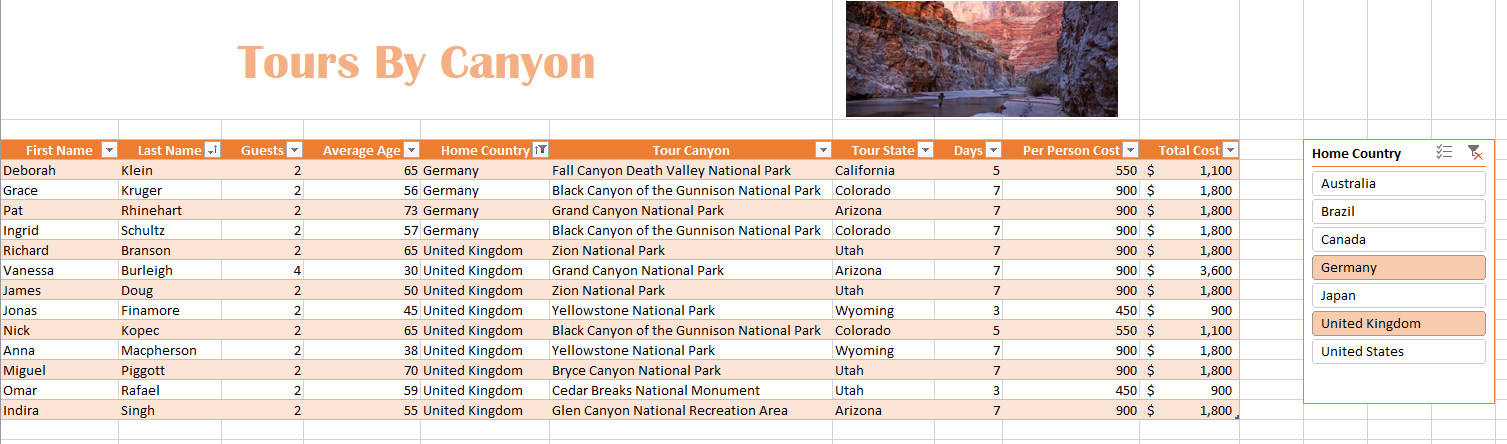
17. Click the Advanced Filter sheet. Using the Advanced Filter option, filter the Current Tours table based on the criteria given. Determine how many guests from Canada are taking tours in Arizona and Utah between the costs indicated in the criteria table. Place the results in A10.
18. Turn the results into a table. Format the table to match the criteria area. Turn on the total row and show the Sum of the Total Cost column.
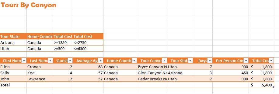
19. Select the Current Tours sheet. Click in the table area and insert a PivotTable as a new sheet. Name the sheet ToursPT. Run a report to show the Total Cost per Home Country, for each available Tour States. Format the numbers in currency format, zero decimal places. Choose a PivotStyle format to match the current orange theme.
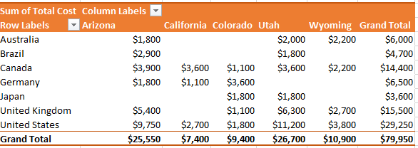
20. Make one more copy of the Current Tours sheet and rename it Tours by State. Place the Tours by State sheet to the right of the European Guests sheet. Go to the Table Tools and turn off the Banded Rows.
21. Subtotal the data by State, summing the Total Cost column. (Note: Remember to follow the four rules of subtotaling!)
22. After you subtotal, turn on filters and filter out 3-day tours in the table.

23. On each worksheet, make the following print setup changes:
a) Add a footer with the current date, worksheet name, and your name.
b) Change to Landscape Orientation
c) Set the scaling to Fit All Columns on One Page
d) For any worksheets that print on more than one page, add Print Titles to repeat the first three rows at the top of each page.
24. Check the spelling on all of the worksheets and make any necessary changes. Save the PR5 Canyon Trails workbook. Submit the PR5 Canyon Trails workbook as directed by your instructor.
“5.4 Chapter Practice” by Hallie Puncochar and Diane Shingledecker, Portland Community College is licensed under CC BY 4.0
“Canyon Trails Data File” by Matt Goff is licensed under CC BY 3.0
XIII
Probability is the branch of mathematics that deals with the likelihood that certain outcomes will occur. There are five basic rules, or axioms, that one must understand while studying the fundamentals of probability.
Explain the most basic and most important rules in determining the probability of an event
In discrete probability, we assume a well-defined experiment, such as flipping a coin or rolling a die. Each individual result which could occur is called an outcome. The set of all outcomes is called the sample space, and any subset of the sample space is called an event.
For example, consider the experiment of flipping a coin two times. There are four individual outcomes, namely HH,HT,TH,TT">. The sample space is thus {HH,HT,TH,TT}">. The event “at least one heads occurs” would be the set {HH,HT,TH}">. If the coin were a normal coin, we would assign the probability of 1/4 to each outcome.
In probability theory, the probability P">of some event E">, denoted P(E)">, is usually defined in such a way that P"> satisfies a number of axioms, or rules. The most basic and most important rules are listed below.
Probability is a number. It is always greater than or equal to zero, and less than or equal to one. This can be written as 0≤P(A)≥1">. An impossible event, or an event that never occurs, has a probability of 0">. An event that always occurs has a probability of 1">. An event with a probability of 0.5">will occur half of the time.
The sum of the probabilities of all possibilities must equal 1">. Some outcome must occur on every trial, and the sum of all probabilities is 100%, or in this case, 1">. This can be written as P(S)=1">, where S">represents the entire sample space.
If two events have no outcomes in common, the probability that one or the other occurs is the sum of their individual probabilities. If one event occurs in 30% of the trials, a different event occurs in 20% of the trials, and the two cannot occur together (if they are disjoint), then the probability that one or the other occurs is 30%+20%=50%. This is sometimes referred to as the addition rule, and can be simplified with the following: P(A or B)=P(A)+P(B)">. The word “or” means the same thing in mathematics as the union, which uses the following symbol: ∪">. Thus when A"> and B"> are disjoint, we have P(A∪B)=P(A)+P(B)">. The probability that an event does not occur is 1"> minus the probability that the event does occur. If an event occurs in 60% of all trials, it fails to occur in the other 40%, because 100%−60%=40%. The probability that an event occurs and the probability that it does not occur always add up to 100%, or 1">. These events are called complementary events, and this rule is sometimes called the complement rule. It can be simplified with P(Ac)=1−P(A)">, where Ac"> is the complement of A">.
Two events A">and B"> are independent if knowing that one occurs does not change the probability that the other occurs. This is often called the multiplication rule. If A"> and B"> are independent, then P(A and B)=P(A)P(B)">. The word “and” in mathematics means the same thing in mathematics as the intersection, which uses the following symbol: ∩">. Therefore when A"> and B"> are independent, we have P(A∩B)=P(A)P(B)">.

Die
Dice are often used when learning the rules of probability.
Elaborating on our example above of flipping two coins, assign the probability 1/4"> to each of the 4">outcomes. We consider each of the five rules above in the context of this example.
 .
.The conditional probability of an event is the probability that an event will occur given that another event has occurred.
Explain the significance of Bayes’ theorem in manipulating conditional probabilities
 , when P(A)>0">.
Our estimation of the likelihood of an event can change if we know that some other event has occurred. For example, the probability that a rolled die shows a 2"> is 1/6"> without any other information, but if someone looks at the die and tells you that is is an even number, the probability is now 1/3"> that it is a 2">. The notation P(B∣A)"> indicates a conditional probability, meaning it indicates the probability of one event under the condition that we know another event has happened. The bar “∣">” can be read as “given”, so that P(B∣A)"> is read as “the probability of B"> given that A">has occurred”.
The conditional probability P(B∣A)">of an event B">, given an event A">, is defined by:
P(B∣A)=P(A∩B)P(A)">
When P(A)>0">. Be sure to remember the distinct roles of B"> and A"> in this formula. The set after the bar is the one we are assuming has occurred, and its probability occurs in the denominator of the formula.
Example
Suppose that a coin is flipped 3 times giving the sample space:
S={HHH,HHT,HTH,THH,TTH,THT,HTT,TTT}">
Each individual outcome has probability 1/8">. Suppose that B"> is the event that at least one heads occurs and A"> is the event that all 3 coins are the same. Then the probability of B"> given A"> is 1/2">, since A∩B={HHH}"> which has probability 1/8"> and A={HHH,TTT}"> which has probability 2/8">, and 1/82/8=12">.
The conditional probability P(B∣A)"> is not always equal to the unconditional probability P(B)">. The reason behind this is that the occurrence of event A"> may provide extra information that can change the probability that event B"> occurs. If the knowledge that event A"> occurs does not change the probability that event B"> occurs, then A"> and B"> are independent events, and thus, P(B∣A)=P(B)">.
In probability theory and statistics, Bayes’ theorem (alternatively Bayes’ law or Bayes’ rule) is a result that is of importance in the mathematical manipulation of conditional probabilities. It can be derived from the basic axioms of probability.
Mathematically, Bayes’ theorem gives the relationship between the probabilities of A">and B">, P(A)"> and P(B)">, and the conditional probabilities of A"> given B"> and B"> given A">. In its most common form, it is:
P(A∣B)=P(B∣A)P(A)P(B)">
This may be easier to remember in this alternate symmetric form:
P(A∣B)P(B∣A)=P(A)P(B)">
Example
Suppose someone told you they had a nice conversation with someone on the train. Not knowing anything else about this conversation, the probability that they were speaking to a woman is 50%. Now suppose they also told you that this person had long hair. It is now more likely they were speaking to a woman, since women in in this city are more likely to have long hair than men. Bayes’s theorem can be used to calculate the probability that the person is a woman.
To see how this is done, let W">represent the event that the conversation was held with a woman, and L"> denote the event that the conversation was held with a long-haired person. It can be assumed that women constitute half the population for this example. So, not knowing anything else, the probability that W"> occurs is P(W)=0.5">.
Suppose it is also known that 75% of women in this city have long hair, which we denote as P(L∣W)=0.75">. Likewise, suppose it is known that 25% of men in this city have long hair, or P(L∣M)=0.25">, where M"> is the complementary event of W">, i.e., the event that the conversation was held with a man (assuming that every human is either a man or a woman).
Our goal is to calculate the probability that the conversation was held with a woman, given the fact that the person had long hair, or, in our notation, P(W∣L)">. Using the formula for Bayes’s theorem, we have:
P(W∣L)=P(L∣W)P(W)P(L)=P(L∣W)P(W)P(L∣W)P(W)+P(L∣M)P(M)=0.75⋅0.50.75⋅0.5+0.25⋅0.5=0.75">
Union and intersection are two key concepts in set theory and probability.
Give examples of the intersection and the union of two or more sets
Probability uses the mathematical ideas of sets, as we have seen in the definition of both the sample space of an experiment and in the definition of an event. In order to perform basic probability calculations, we need to review the ideas from set theory related to the set operations of union, intersection, and complement.
The union of two or more sets is the set that contains all the elements of each of the sets; an element is in the union if it belongs to at least one of the sets. The symbol for union is ∪">, and is associated with the word “or”, because A∪B"> is the set of all elements that are in A"> or B"> (or both.) To find the union of two sets, list the elements that are in either (or both) sets. In terms of a Venn Diagram, the union of sets A"> and B"> can be shown as two completely shaded interlocking circles.
Union of Two Sets: The shaded Venn Diagram shows the union of set A"> (the circle on left) with set B"> (the circle on the right). It can be written shorthand as A∪B">
In symbols, since the union of A"> and B"> contains all the points that are in A"> or B">or both, the definition of the union is:
A∪B={x:x∈A or x∈B}">
For example, if A={1,3,5,7}">and B={1,2,4,6}"> , then A∪B={1,2,3,4,5,6,7}">. Notice that the element 1 is not listed twice in the union, even though it appears in both sets A"> and B">. This leads us to the general addition rule for the union of two events:
P(A∪B)=P(A)+P(B)−P(A∩B)">
Where P(A∩B)">is the intersection of the two sets. We must subtract this out to avoid double counting of the inclusion of an element.
If sets A">and B"> are disjoint, however, the event A∩B">has no outcomes in it, and is an empty set denoted as ∅, which has a probability of zero. So, the above rule can be shortened for disjoint sets only:
P(A∪B)=P(A)+P(B)">
This can even be extended to more sets if they are all disjoint:
P(A∪B∪C)=P(A)+P(B)+P(C)">
The intersection of two or more sets is the set of elements that are common to each of the sets. An element is in the intersection if it belongs to all of the sets. The symbol for intersection is ∩">, and is associated with the word “and”, because A∩B"> is the set of elements that are in A"> and B"> simultaneously. To find the intersection of two (or more) sets, include only those elements that are listed in both (or all) of the sets. In terms of a Venn Diagram, the intersection of two sets A"> and B"> can be shown at the shaded region in the middle of two interlocking circles .

Intersection of Two Sets
Set A is the circle on the left, set B is the circle on the right, and the intersection of A and B, or A∩B">, is the shaded portion in the middle.
In mathematical notation, the intersection of A"> and B"> is written asA∩B={x:x∈A"> and x∈B}">. For example, if A={1,3,5,7}"> and B={1,2,4,6}">, then A∩B={1}"> because 1"> is the only element that appears in both sets A"> and B">.
When events are independent, meaning that the outcome of one event doesn’t affect the outcome of another event, we can use the multiplication rule for independent events, which states:
P(A∩B)=P(A)P(B)">
For example, let’s say we were tossing a coin twice, and we want to know the probability of tossing two heads. Since the first toss doesn’t affect the second toss, the events are independent. Say is the event that the first toss is a heads and B">is the event that the second toss is a heads, then  .
.
The complement of A is the event in which A does not occur.
Explain an example of a complementary event
 A¯">.
A¯">.In probability theory, the complement of any event A"> is the event [not A]">, i.e. the event in which A"> does not occur. The event A"> and its complement [not A]"> are mutually exclusive and exhaustive, meaning that if one occurs, the other does not, and that both groups cover all possibilities. Generally, there is only one event B"> such that A"> and B"> are both mutually exclusive and exhaustive; that event is the complement of A">. The complement of an event A"> is usually denoted as A′">, Ac"> or A¯">.
A common example used to demonstrate complementary events is the flip of a coin. Let’s say a coin is flipped and one assumes it cannot land on its edge. It can either land on heads or on tails. There are no other possibilities (exhaustive), and both events cannot occur at the same time (mutually exclusive). Because these two events are complementary, we know that P(heads) + P(tails)=1.

Coin Flip
Often in sports games, such as tennis, a coin flip is used to determine who will serve first because heads and tails are complementary events.
Another simple example of complementary events is picking a ball out of a bag. Let’s say there are three plastic balls in a bag. One is blue and two are red. Assuming that each ball has an equal chance of being pulled out of the bag, we know that P(blue)=13"> and P(red)=23">. Since we can only either chose blue or red (exhaustive) and we cannot choose both at the same time (mutually exclusive), choosing blue and choosing red are complementary events, and P(blue)+P(red)=1">.
Finally, let’s examine a non-example of complementary events. If you were asked to choose any number, you might think that that number could either be prime or composite. Clearly, a number cannot be both prime and composite, so that takes care of the mutually exclusive property. However, being prime or being composite are not exhaustive because the number 1 in mathematics is designated as “unique. ”
The addition rule states the probability of two events is the sum of the probability that either will happen minus the probability that both will happen.
Calculate the probability of an event using the addition rule
The addition law of probability (sometimes referred to as the addition rule or sum rule), states that the probability that A"> or B"> will occur is the sum of the probabilities that A"> will happen and that B"> will happen, minus the probability that both A"> and B">will happen. The addition rule is summarized by the formula:
P(A∪B)=P(A)+P(B)−P(A∩B)">
Consider the following example. When drawing one card out of a deck of 52">playing cards, what is the probability of getting heart or a face card (king, queen, or jack)? Let H"> denote drawing a heart and F"> denote drawing a face card. Since there are 13"> hearts and a total of 12"> face cards (3"> of each suit: spades, hearts, diamonds and clubs), but only 3"> face cards of hearts, we obtain:
P(H)=1352">
P(F)=1252">
P(F∩H)=352">
Using the addition rule, we get:
P(H∪F)=P(H)+P(F)−P(H∩F)=1352+1252−352">
P(H∪F)=P(H)+P(F)−P(H∩F)=1352+1252−352">
The reason for subtracting the last term is that otherwise we would be counting the middle section twice (since H">and F"> overlap).
Suppose A"> and B"> are disjoint, their intersection is empty. Then the probability of their intersection is zero. In symbols: P(A∩B)=0">. The addition law then simplifies to:
P(A∪B)=P(A)+P(B)whenA∩B=∅">
The symbol ∅">represents the empty set, which indicates that in this case A"> and B"> do not have any elements in common (they do not overlap).
Example
Suppose a card is drawn from a deck of 52 playing cards: what is the probability of getting a king or a queen? Let A"> represent the event that a king is drawn and B">represent the event that a queen is drawn. These two events are disjoint, since there are no kings that are also queens. Thus:
P(A∪B)=P(A)+P(B)=452+452=852=213">
P(A∪B)=P(A)+P(B)=452+452=852=213">
P(A∪B)=P(A)+P(B)=452+452=852=213">
P(A∪B)=P(A)+P(B)=452+452=852=213">
The multiplication rule states that the probability that A and B both occur is equal to the probability that B occurs times the conditional probability that A occurs given that B occurs.
Apply the multiplication rule to calculate the probability of both A and B occurring
In probability theory, the Multiplication Rule states that the probability that A"> and B"> occur is equal to the probability that A"> occurs times the conditional probability that B"> occurs, given that we know A">has already occurred. This rule can be written:
P(A∩B)=P(B)⋅P(A|B)">
Switching the role of A">and B">, we can also write the rule as:
P(A∩B)=P(A)⋅P(B|A)">
We obtain the general multiplication rule by multiplying both sides of the definition of conditional probability by the denominator. That is, in the equation  P(A|B)=P(A∩B)P(B)">, if we multiply both sides by P(B)">, we obtain the Multiplication Rule.
The rule is useful when we know both P(B)"> and P(A|B)">, or both P(A)"> and P(B|A).">
Example
Suppose that we draw two cards out of a deck of cards and let A"> be the event the the first card is an ace, and B"> be the event that the second card is an ace, then:
P(A)=452">
And:
P(B|A)=351">
The denominator in the second equation is 51">since we know a card has already been drawn. Therefore, there are 51">left in total. We also know the first card was an ace, therefore:
P(A∩B)=P(A)⋅P(B|A)=452⋅351=0.0045">
P(A∩B)=P(A)⋅P(B|A)=452⋅351=0.0045">
P(A∩B)=P(A)⋅P(B|A)=452⋅351=0.0045">
Note that when A"> and B"> are independent, we have that P(B|A)=P(B)">, so the formula becomes P(A∩B)=P(A)P(B)">, which we encountered in a previous section. As an example, consider the experiment of rolling a die and flipping a coin. The probability that we get a 2"> on the die and a tails on the coin is (16⋅12=112">, since the two events are independent.
To say that two events are independent means that the occurrence of one does not affect the probability of the other.
Explain the concept of independence in relation to probability theory
In probability theory, to say that two events are independent means that the occurrence of one does not affect the probability that the other will occur. In other words, if events A"> and B"> are independent, then the chance of A"> occurring does not affect the chance of B"> occurring and vice versa. The concept of independence extends to dealing with collections of more than two events.

Independent Events
Selecting two cards from a deck by first selecting one, then replacing it in the deck before selecting a second is an example of independent events.
Two events are independent if any of the following are true:
To show that two events are independent, you must show only one of the conditions listed above. If any one of these conditions is true, then all of them are true.
Translating the symbols into words, the first two mathematical statements listed above say that the probability for the event with the condition is the same as the probability for the event without the condition. For independent events, the condition does not change the probability for the event. The third statement says that the probability of both independent events A"> and B"> occurring is the same as the probability of A"> occurring, multiplied by the probability of B">occurring.
As an example, imagine you select two cards consecutively from a complete deck of playing cards. The two selections are not independent. The result of the first selection changes the remaining deck and affects the probabilities for the second selection. This is referred to as selecting “without replacement” because the first card has not been replaced into the deck before the second card is selected.
However, suppose you were to select two cards “with replacement” by returning your first card to the deck and shuffling the deck before selecting the second card. Because the deck of cards is complete for both selections, the first selection does not affect the probability of the second selection. When selecting cards with replacement, the selections are independent.
Consider a fair die role, which provides another example of independent events. If a person roles two die, the outcome of the first roll does not change the probability for the outcome of the second roll.
Example
Two friends are playing billiards, and decide to flip a coin to determine who will play first during each round. For the first two rounds, the coin lands on heads. They decide to play a third round, and flip the coin again. What is the probability that the coin will land on heads again?
First, note that each coin flip is an independent event. The side that a coin lands on does not depend on what occurred previously.
For any coin flip, there is a 1/2 chance that the coin will land on heads. Thus, the probability that the coin will land on heads during the third round is 1/2.
When flipping a coin, what is the probability of getting tails 5 times in a row?
Recall that each coin flip is independent, and the probability of getting tails is 1/2 for any flip. Also recall that the following statement holds true for any two independent events A and B:
P(A and B)=P(A)⋅P(B)">
Finally, the concept of independence extends to collections of more than 2 events.
Therefore, the probability of getting tails 4 times in a row is:
12⋅12⋅12⋅12=116">
Combinatorics is a branch of mathematics concerning the study of finite or countable discrete structures.
Describe the different rules and properties for combinatorics
Combinatorics is a branch of mathematics concerning the study of finite or countable discrete structures. Combinatorial techniques are applicable to many areas of mathematics, and a knowledge of combinatorics is necessary to build a solid command of statistics. It involves the enumeration, combination, and permutation of sets of elements and the mathematical relations that characterize their properties.
Aspects of combinatorics include: counting the structures of a given kind and size, deciding when certain criteria can be met, and constructing and analyzing objects meeting the criteria. Aspects also include finding “largest,” “smallest,” or “optimal” objects, studying combinatorial structures arising in an algebraic context, or applying algebraic techniques to combinatorial problems.
Several useful combinatorial rules or combinatorial principles are commonly recognized and used. Each of these principles is used for a specific purpose. The rule of sum (addition rule), rule of product (multiplication rule), and inclusion-exclusion principle are often used for enumerative purposes. Bijective proofs are utilized to demonstrate that two sets have the same number of elements. Double counting is a method of showing that two expressions are equal. The pigeonhole principle often ascertains the existence of something or is used to determine the minimum or maximum number of something in a discrete context. Generating functions and recurrence relations are powerful tools that can be used to manipulate sequences, and can describe if not resolve many combinatorial situations. Each of these techniques is described in greater detail below.
The rule of sum is an intuitive principle stating that if there are a"> possible ways to do something, and b"> possible ways to do another thing, and the two things can’t both be done, then there are a+b"> total possible ways to do one of the things. More formally, the sum of the sizes of two disjoint sets is equal to the size of the union of these sets.
The rule of product is another intuitive principle stating that if there are a"> ways to do something and b"> ways to do another thing, then there are a⋅b"> ways to do both things.
The inclusion-exclusion principle is a counting technique that is used to obtain the number of elements in a union of multiple sets. This counting method ensures that elements that are present in more than one set in the union are not counted more than once. It considers the size of each set and the size of the intersections of the sets. The smallest example is when there are two sets: the number of elements in the union of A"> and B"> is equal to the sum of the number of elements in A"> and B">, minus the number of elements in their intersection. See the diagram below for an example with three sets.
A bijective proof is a proof technique that finds a bijective function f:A→B"> between two finite sets A"> and B">, which proves that they have the same number of elements, |A|=|B|">. A bijective function is one in which there is a one-to-one correspondence between the elements of two sets. In other words, each element in set B"> is paired with exactly one element in set A">. This technique is useful if we wish to know the size of A">, but can find no direct way of counting its elements. If B"> is more easily countable, establishing a bijection from A"> to B"> solves the problem.
Double counting is a combinatorial proof technique for showing that two expressions are equal. This is done by demonstrating that the two expressions are two different ways of counting the size of one set. In this technique, a finite set X"> is described from two perspectives, leading to two distinct expressions for the size of the set. Since both expressions equal the size of the same set, they equal each other.
The pigeonhole principle states that if a"> items are each put into one of b"> boxes, where a>b">, then at least one of the boxes contains more than one item. This principle allows one to demonstrate the existence of some element in a set with some specific properties. For example, consider a set of three gloves. In such a set, there must be either two left gloves or two right gloves (or three of left or right). This is an application of the pigeonhole principle that yields information about the properties of the gloves in the set.
Generating functions can be thought of as polynomials with infinitely many terms whose coefficients correspond to the terms of a sequence. The (ordinary) generating function of a sequence an">is given by:
f(x)=∑n=0∞anxn">
whose coefficients give the sequence {a0,a1,a2,…}">.
A recurrence relation defines each term of a sequence in terms of the preceding terms. In other words, once one or more initial terms are given, each of the following terms of the sequence is a function of the preceding terms.
The Fibonacci sequence is one example of a recurrence relation. Each term of the Fibonacci sequence is given by Fn=Fn−1+Fn−2">, with initial values F0=0"> and F1=1">. Thus, the sequence of Fibonacci numbers begins:
0,1,1,2,3,5,8,13,21,34,55,89,…">
Bayes’ rule expresses how a subjective degree of belief should rationally change to account for evidence.
Explain the importance of Bayes’s theorem in mathematical manipulation of conditional probabilities
In probability theory and statistics, Bayes’ theorem (or Bayes’ rule ) is a result that is of importance in the mathematical manipulation of conditional probabilities. It is a result that derives from the more basic axioms of probability. When applied, the probabilities involved in Bayes’ theorem may have any of a number of probability interpretations. In one of these interpretations, the theorem is used directly as part of a particular approach to statistical inference. In particular, with the Bayesian interpretation of probability, the theorem expresses how a subjective degree of belief should rationally change to account for evidence. This is known as Bayesian inference, which is fundamental to Bayesian statistics.
Bayes’ rule relates the odds of event A1">to event A2">, before (prior to) and after (posterior to) conditioning on another event B">. The odds on A1"> to event A2"> is simply the ratio of the probabilities of the two events. The relationship is expressed in terms of the likelihood ratio, or Bayes’ factor. By definition, this is the ratio of the conditional probabilities of the event B"> given that A1"> is the case or that A2">is the case, respectively. The rule simply states:
Posterior odds equals prior odds times Bayes’ factor.
More specifically, given events A1">, A2"> and B">, Bayes’ rule states that the conditional odds of A1:A2"> given B"> are equal to the marginal odds A1:A2">multiplied by the Bayes factor or likelihood ratio. This is shown in the following formulas:
O(A1:A2|B)=Λ(A1:A2|B)⋅O(A1:A2)">
Where the likelihood ratio Λ"> is the ratio of the conditional probabilities of the event B"> given that A1"> is the case or that A2">is the case, respectively:
Λ(A1:A2|B)=P(B|A1)P(B|A2)">
Bayes’ rule is widely used in statistics, science and engineering, such as in: model selection, probabilistic expert systems based on Bayes’ networks, statistical proof in legal proceedings, email spam filters, etc. Bayes’ rule tells us how unconditional and conditional probabilities are related whether we work with a frequentist or a Bayesian interpretation of probability. Under the Bayesian interpretation it is frequently applied in the situation where A1">and A2"> are competing hypotheses, and B"> is some observed evidence. The rule shows how one’s judgement on whether A1"> or A2"> is true should be updated on observing the evidence.
Bayesian inference is a method of inference in which Bayes’ rule is used to update the probability estimate for a hypothesis as additional evidence is learned. Bayesian updating is an important technique throughout statistics, and especially in mathematical statistics. Bayesian updating is especially important in the dynamic analysis of a sequence of data. Bayesian inference has found application in a range of fields including science, engineering, philosophy, medicine, and law.
Rationally, Bayes’ rule makes a great deal of sense. If the evidence does not match up with a hypothesis, one should reject the hypothesis. But if a hypothesis is extremely unlikely a priori, one should also reject it, even if the evidence does appear to match up.
For example, imagine that we have various hypotheses about the nature of a newborn baby of a friend, including:
Then, consider two scenarios:
The critical point about Bayesian inference, then, is that it provides a principled way of combining new evidence with prior beliefs, through the application of Bayes’ rule. Furthermore, Bayes’ rule can be applied iteratively. After observing some evidence, the resulting posterior probability can then be treated as a prior probability, and a new posterior probability computed from new evidence. This allows for Bayesian principles to be applied to various kinds of evidence, whether viewed all at once or over time. This procedure is termed Bayesian updating.
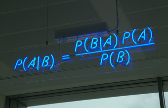
Bayes’ Theorem
A blue neon sign at the Autonomy Corporation in Cambridge, showing the simple statement of Bayes’ theorem.
The People of the State of California v. Collins was a 1968 jury trial in California that made notorious forensic use of statistics and probability.
Argue what causes prosecutor’s fallacy
The People of the State of California v. Collins was a 1968 jury trial in California. It made notorious forensic use of statistics and probability. Bystanders to a robbery in Los Angeles testified that the perpetrators had been a black male, with a beard and moustache, and a caucasian female with blonde hair tied in a ponytail. They had escaped in a yellow motor car.
The prosecutor called upon for testimony an instructor in mathematics from a local state college. The instructor explained the multiplication rule to the jury, but failed to give weight to independence, or the difference between conditional and unconditional probabilities. The prosecutor then suggested that the jury would be safe in estimating the following probabilities:
These probabilities, when considered together, result in a 1 in 12,000,000 chance that any other couple with similar characteristics had committed the crime – according to the prosecutor, that is. The jury returned a verdict of guilty.
As seen in , upon appeal, the Supreme Court of California set aside the conviction, criticizing the statistical reasoning and disallowing the way the decision was put to the jury. In their judgment, the justices observed that mathematics:

The Collins Case
The Collins case is a classic example of the prosecutor’s fallacy. The guilty verdict was reversed upon appeal to the Supreme Court of California in 1968.
… while assisting the trier of fact in the search of truth, must not cast a spell over him.
The Collins’ case is a prime example of a phenomenon known as the prosecutor’s fallacy—a fallacy of statistical reasoning when used as an argument in legal proceedings. At its heart, the fallacy involves assuming that the prior probability of a random match is equal to the probability that the defendant is innocent. For example, if a perpetrator is known to have the same blood type as a defendant (and 10% of the population share that blood type), to argue solely on that basis that the probability of the defendant being guilty is 90% makes the prosecutors’s fallacy (in a very simple form).
The basic fallacy results from misunderstanding conditional probability, and neglecting the prior odds of a defendant being guilty before that evidence was introduced. When a prosecutor has collected some evidence (for instance, a DNA match) and has an expert testify that the probability of finding this evidence if the accused were innocent is tiny, the fallacy occurs if it is concluded that the probability of the accused being innocent must be comparably tiny. If the DNA match is used to confirm guilt that is otherwise suspected, then it is indeed strong evidence. However, if the DNA evidence is the sole evidence against the accused, and the accused was picked out of a large database of DNA profiles, then the odds of the match being made at random may be reduced. Therefore, it is less damaging to the defendant. The odds in this scenario do not relate to the odds of being guilty; they relate to the odds of being picked at random.
de Méré observed that getting at least one 6 with 4 throws of a die was more probable than getting double 6’s with 24 throws of a pair of dice.
Explain Chevalier de Méré’s Paradox when rolling a die
 , which turns out to be just over 50%.
 , which turns out to be just under 50%.
Antoine Gombaud, Chevalier de Méré (1607 – 1684) was a French writer, born in Poitou. Although he was not a nobleman, he adopted the title Chevalier (Knight) for the character in his dialogues who represented his own views (Chevalier de Méré because he was educated at Méré). Later, his friends began calling him by that name.
Méré was an important Salon theorist. Like many 17th century liberal thinkers, he distrusted both hereditary power and democracy. He believed that questions are best resolved in open discussions among witty, fashionable, intelligent people.
He is most well known for his contribution to probability. One of the problems he was interested in was called the problem of points. Suppose two players agree to play a certain number of games — say, a best-of-seven series — and are interrupted before they can finish. How should the stake be divided among them if, say, one has won three games and the other has won one?
Another one of his problems has come to be called “De Méré’s Paradox,” and it is explained below.
Which of these two is more probable:
The self-styled Chevalier de Méré believed the two to be equiprobable, based on the following reasoning:
However, when betting on getting two sixes when rolling 24 times, Chevalier de Méré lost consistently. He posed this problem to his friend, mathematician Blaise Pascal, who solved it.
Throwing a die is an experiment with a finite number of equiprobable outcomes. There are 6 sides to a die, so there is
probability for a 6 to turn up in 1 throw. That is, there is a  probability for a 6 not to turn up. When you throw a die 4 times, the probability of a 6 not turning up at all is
  . So, there is a probability of
  of getting at least one 6 with 4 rolls of a die. If you do the arithmetic, this gives you a probability of approximately 0.5177, or a favorable probability of a 6 appearing in 4 rolls.
Now, when you throw a pair of dice, from the definition of independent events, there is a  probability of a pair of 6’s appearing. That is the same as saying the probability for a pair of 6’s not showing is 35/36. Therefore, there is a probability of
  of getting at least one pair of 6’s with 24 rolls of a pair of dice. If you do the arithmetic, this gives you a probability of approximately 0.4914, or a favorable probability of a pair of 6’s not appearing in 24 rolls.
This is a veridical paradox. Counter-intuitively, the odds are distributed differently from how they would be expected to be.

de Méré’s Paradox
de Méré observed that getting at least one 6 with 4 throws of a die was more probable than getting double 6’s with 24 throws of a pair of dice.
A fair die has an equal probability of landing face-up on each number.
Infer how dice act as a random number generator
A die (plural dice) is a small throw-able object with multiple resting positions, used for generating random numbers. This makes dice suitable as gambling devices for games like craps, or for use in non-gambling tabletop games.
An example of a traditional die is a rounded cube, with each of its six faces showing a different number of dots (pips) from one to six. When thrown or rolled, the die comes to rest showing on its upper surface a random integer from one to six, each value being equally likely. A variety of similar devices are also described as dice; such specialized dice may have polyhedral or irregular shapes and may have faces marked with symbols instead of numbers. They may be used to produce results other than one through six. Loaded and crooked dice are designed to favor some results over others for purposes of cheating or amusement.
A fair die is a shape that is labelled so that each side has an equal probability of facing upwards when rolled onto a flat surface, regardless of what it is made out of, the angle at which the sides connect, and the spin and speed of the roll. Every side must be equal, and every set of sides must be equal.
The result of a die roll is determined by the way it is thrown, according to the laws of classical mechanics; they are made random by uncertainty due to factors like movements in the thrower’s hand. Thus, they are a type of hardware random number generator. Perhaps to mitigate concerns that the pips on the faces of certain styles of dice cause a small bias, casinos use precision dice with flush markings.
Precision casino dice may have a polished or sand finish, making them transparent or translucent, respectively. Casino dice have their pips drilled, then filled flush with a paint of the same density as the material used for the dice, such that the center of gravity of the dice is as close to the geometric center as possible. All such dice are stamped with a serial number to prevent potential cheaters from substituting a die.
The most common fair die used is the cube, but there are many other types of fair dice. The other four Platonic solids are the most common non-cubical dice; these can make for 4, 8, 12, and 20 faces . The only other common non-cubical die is the 10-sided die.

Platonic Solids as Dice
A Platonic solids set of five dice; tetrahedron (four faces), cube/hexahedron (six faces), octahedron (eight faces), dodecahedron (twelve faces), and icosahedron (twenty faces).
A loaded, weighted, or crooked die is one that has been tampered with to land with a specific side facing upwards more often than it normally would. There are several methods for creating loaded dice; these include round and off-square faces and (if not transparent) weights. Tappers have a mercury drop in a reservoir at the center, with a capillary tube leading to another reservoir at a side; the load is activated by tapping the die so that the mercury travels to the side.
XIV
Microsoft Excel is just one of many programs you will need to communicate your data analysis findings. Additional applications from the Office suite of products, including PowePoint and Word, are not only necessary, but can integrate easily with Excel (and vice-versa). With the newest version of Microsoft’s Office, 365, you can even hyperlink spreadsheets into your documents and presentations so that they can update automatically when the source file is changed. The following lessons and quiz will help you understand how these programs work together.
Before we can work with our data, we need to make sure it’s valid, accurate, and reliable. In the age of Big Data, companies may spend just as much or more on maintaining the health and cleaning their data as they spend on collecting or purchasing it in the first place. Consider the issues that can stem from missing or wrong values, duplicates, and typos. The validity, accuracy, and reliability of your calculations depend on your ability to keep your data up-to-date. Many estimates show that about 30% of your data may become inaccurate over time (JD Supra, 2019; Strategic DB, 2019) and even small data sets can be costly to clean, let alone files that are tens or hundreds of thousands of records deep – or much more if you are using large scale databases.
There are many data cleaning solutions out there for a wide range of file formats, data volumes, or budgets. However, there are many things we can accomplish using Excel functions and features so that you can process our data quickly and effectively. Instead of purchasing an application, assigning data cleaning to an employee, or hiring a service to scrub your data, for records under a million per sheet, Excel can save you a great deal of time and funds using a variety of functions and features. Table 10.1 shows you some important functions that can help you clean up your data.
| CLEAN | Removes all nonprintable characters from text. |
| TRIM | Removes all spaces from text except for single spaces between words. |
| CONCATENATE | Join two or more text strings into one string. |
| LEFT | Returns a string containing a specified number of characters from the left side of a string. |
| RIGHT | Returns a string containing a specified number of characters from the right side of a string. |
| MID | Returns a specific number of characters from a text string. |
| SEARCH | SEARCH returns the number of the character at which a specific character or text string is first found. |
| FIND and FINDB | Locate one text string within a second text string. |
| UPPER | Converts text to uppercase. |
| LOWER | Converts text to lowercase. |
| PROPER | Capitalizes the first letter in a text string and any other letters in text that follow any character other than a letter. Converts all other letters to lowercase letters. |
| TEXT | Change the way a number appears by applying formatting to it with format codes. |
| VALUE | Converts a text string that represents a number to a number. |
Table 10.1 A sample of text and data cleaning functions in Excel.
The following sections show the functions above in action. The Ch10_Data_File contains four sheets. The Documentation sheet notes the sources of our data. Text_FUNC sheet features a variety of common errors you may see in a data set, including line breaks in the wrong place, extra spaces or no spaces in between words, non-printing characters, improperly capitalized or all upper case, all lower case text, ill-formatted data values. The DataGen_Companies sheet contains a set of “dummy” (plausible, but not real) data about companies generated at https://www.generatedata.com/ that the author of this chapter intentionally injected with common errors seen in data in order to unfold and process it for the sake of practicing Excel functions for the Chapter Practice section. The Mockaroo_Cars sheet is a “dummy” dataset about consumers and their addresses generated at https://mockaroo.com/, this data set will be used for the Mail Merge section. Both of these “dummy” data sets are archived here for educational purposes.
Figure 10.1.1 below shows the Text_FUNC sheet with a variety of common errors seen in data you import from other sources. The CONCATENATE & TRIM range is an example of how a single line of text can be created from the contents of three rows by nesting two Excel functions. CONCATENATE on its own will merge the three cells into one, but alone, it does nothing about the extra spaces we see in the text. TRIM will remove all spaces, which means we need to add ” ” in order for Excel to add the needed blank cells in between words.
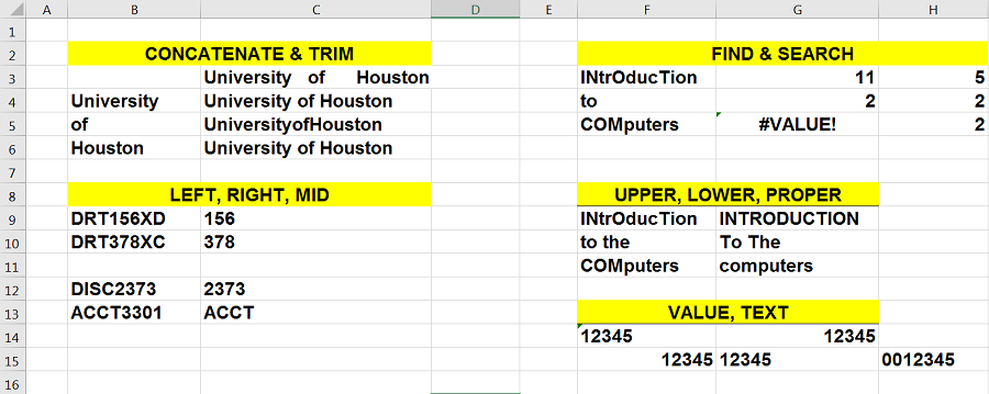
The LEFT, RIGHT, MID range in columns A:C illustrate another common set of functions used to process data. Oftentimes data comes in large chunks merged together. While we can use the Data > Text to Columns feature with delimiters to tell Excel where we want our data split, the LEFT, RIGHT, MID functions will process data from certain directions depending on where in the string is the text or number we wish to extract. B9 and B10 show a part number we can extract portions of using the MID function into C9, C10. B12 and B13 show course numbers we can extract portions of using the RIGHT and LEFT functions into C12, C13.
Figure 10.1.2 shows the formulas in columns A:C to illustrate the combination of CONCATENATE and TRIM nested in a variety of ways to find the best configuration to output the way we want our text to appear with the syntax for LEFT, RIGHT, and MID showing underneath.
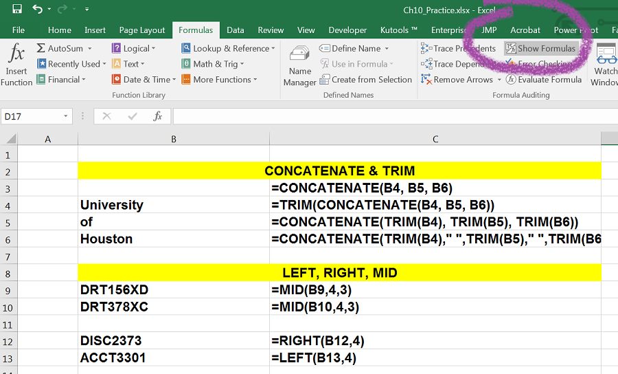
Figure 10.1.3 below shows the formulas in columns F:H to illustrate the different between FIND and SEARCH, as well as show the UPPER, LOWER, PROPER, VALUE and TEXT functions used to produce the contents for data in those ranges.
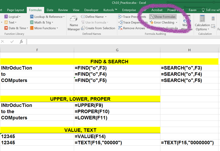
More Examples
Visit the Official Microsoft site for a list of common text functions in Excel.
Observe the variety of tasks you can achieve by using relatively simple formulas and nested alternatives.
“Note: Although you can use the TEXT function to change formatting, it’s not the only way. You can change the format without a formula by pressing CTRL+1 (or
+1 on the Mac), then pick the format you want from the Format Cells > Number dialog (Source).”
Consider possible uses of these functions in order to clean your data. We will revisit these functions and the use of delimiters in the Chapter Practice.
Chapter by Emese Felvégi. CC BY-NC-SA 3.0. Dummy data sets from https://www.generatedata.com/ and from https://mockaroo.com archived here for educational purposes.
Everyday communications between colleagues, business partners, a business and a customer, a non-profit and its donors can take many shapes or forms. Thank you notes, reminders, product updates, invoices, and many other topics may require an individual to send identical documents with small changes to each document such as the recipient’s name, address, donation amount, product number, purchase date, or more. Mail merge automates the tedious task of copy-pasting a large number of data from one application to another one field at a time a hundred or a thousand times over. We can use mail merge in Word or Outlook while depending on a data source from Excel or Access and allow employees to process hundreds or thousands (or more, depending on your processing speed or patience) of records to populate fields (name, address, donation amount, etc.) in a pre-written document or email.
“With the combination of your letter or email and a mailing list, you can create a mail merge document that sends out bulk mail to specific people or to all people on your mailing list. You also can create and print mailing labels and envelopes by using mail merge (support.office.com).”
We will use the Mockaroo_Cars sheet in the Ch10_Data_File in combination with a Word document to create a letter to mail to our clients regarding an extended warranty offer for their vehicle. The Mockaroo_Cars sheet is a “dummy” dataset about fictional consumers, their addresses, and their vehicles generated at https://mockaroo.com/. The data set generated online is archived here for educational purposes.

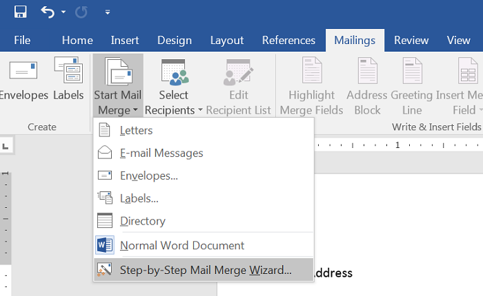

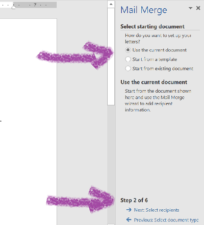
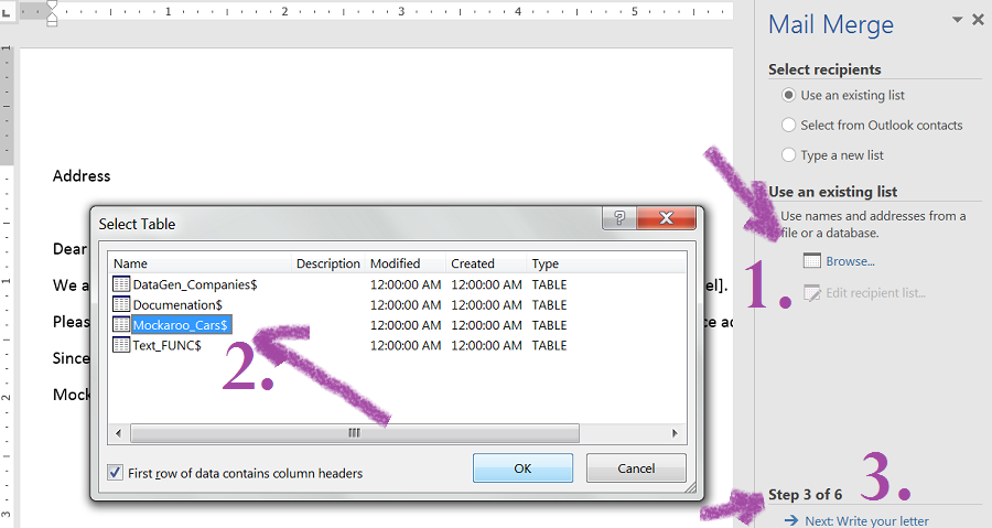
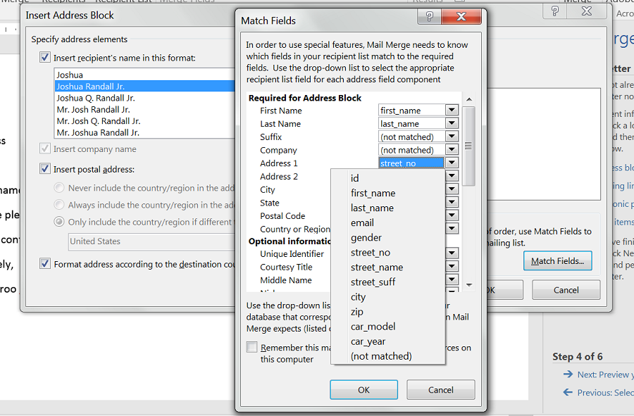
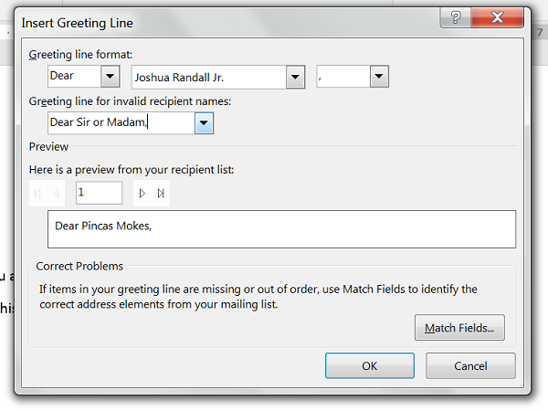

 Figure 10.2.8 Preview of your fields inserted into your Word document.
Mail Merge e-Mail Exercise
Complete this 10-minute training on support.office.com to practice other forms of mail merge at the official Microsoft Office website.

Chapter by Emese Felvégi. CC BY-NC-SA 3.0. Dummy data set from https://mockaroo.com archived here for educational purposes.
Charts that are created in Excel are commonly used in Microsoft Word documents or for presentations that use Microsoft PowerPoint slides. Excel provides options for pasting an image of a chart into either a Word document or a PowerPoint slide. You can also establish a link to your Excel charts so that if you change the data in your Excel file, it is automatically reflected in your Word or PowerPoint files. We will demonstrate both methods in this section.
For this exercise you will need two files:
Excel charts can be valuable tools for explaining quantitative data in a written report. Reports that address business plans, public policies, budgets, and so on all involve quantitative data. For this example, we will assume that the Change in Enrollment Statistics Spend Source stacked column chart is being used in a student’s written report (see Figure 10.3.1).
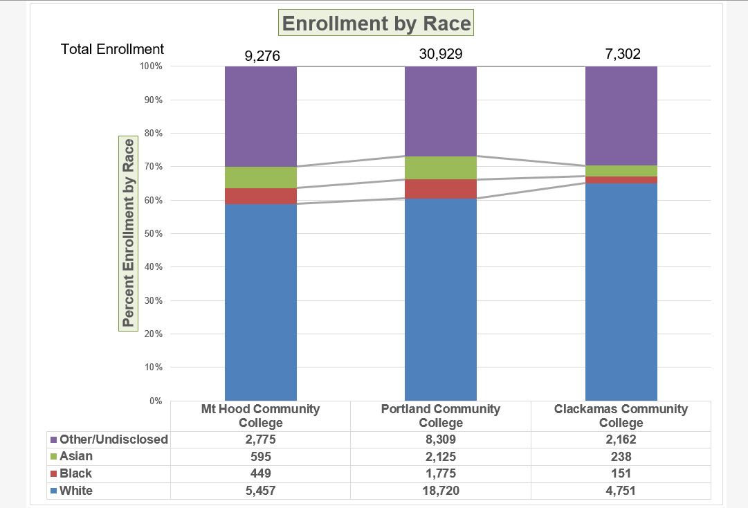
The following steps demonstrate how to paste an image, or picture, of this chart into a Word document:
Oh no!! The picture is so big that it falls on to the next page. We will need to change its size.
Figure 10.3.4 shows the final appearance of the Enrollment by Race Source chart pasted into a Word document. It is best to use either the Shape Width or Shape Height buttons to reduce the size of the chart. Using either button automatically reduces the height and width of the chart in proper proportion. If you choose to use the sizing handles to resize the chart, holding the SHIFT key while clicking and dragging on a corner sizing handle will also keep the chart in proper proportion.

Pasting a Chart Image into Word
For this exercise you will need two files:
Microsoft PowerPoint is perhaps the most commonly used tool for delivering live presentations. The charts used in a live presentation are critical for efficiently delivering your ideas to an audience. Similar to written documents, a wide range of presentations may require the explanation of quantitative data. This demonstration includes a PowerPoint slide that could be used in a presentation. We will paste the Enrollment by Race chart into this PowerPoint slide. However, instead of pasting an image, as demonstrated in the Word document, we will establish a link to the Excel file. As a result, if we change the chart in the Excel file, the change will be reflected in the PowerPoint file. The following steps explain how to accomplish this:

Next we need to make some changes to clean up the chart a bit. First, we are going to apply a different chart style.
Paste linking this chart caused trouble with the text boxes we added, so next, we are going to delete them.
The benefit of adding this chart to the presentation as a link is that it will automatically update when you change the data in the linked spreadsheet file.
Figure 10.3.7 shows the appearance of the column chart after the change was made in the Enrollment Statistics worksheet in the Excel file. Note that the Data Chart at the bottom reflects the new number, too. The change that was made in the Excel file will appear in the PowerPoint file after clicking the Refresh Data button.
Refreshing Linked Charts in PowerPoint and Word
When creating a link to a chart in Word or PowerPoint, you must refresh the data if you make any changes in the Excel workbook. This is especially true if you make changes in the Excel file prior to opening the Word or PowerPoint file that contains a link to a chart. To refresh the chart, make sure it is activated, then click the Refresh Data button in the Design tab of the ribbon. Forgetting this step can result in old or erroneous data being displayed on the chart.
Severed Link?
When creating a link to an Excel chart in Word or PowerPoint, you must keep the Excel workbook in its original location on your computer or network. If you move or delete the Excel workbook, you will get an error message when you try to update the link in your Word or PowerPoint file. You will also get an error if the Excel workbook is saved on a network drive that your computer cannot access. These errors occur because the link to the Excel workbook has been severed. Therefore, if you know in advance that you will be using a USB drive to pull up your documents or presentation, move the Excel workbook to your USB drive before you establish the link in your Word or PowerPoint file.
Pasting a Linked Chart Image into PowerPoint
Adapted by Noreen Brown from How to Use Microsoft Excel: The Careers in Practice Series, adapted by The Saylor Foundation without attribution as requested by the work’s original creator or licensee, and licensed under CC BY-NC-SA 3.0.
To expand your understanding of the material covered in the chapter, complete the following assignment. You will be working with the DataGen_Companies sheet in your Ch10_Data_File workbook. As noted before, the DataGen_Companies sheet contains a set of “dummy” (plausible, but not real) data about companies generated at https://www.generatedata.com/ that the author of this chapter intentionally injected with common errors seen in data in order to unfold and process it for the sake of practicing Excel functions for the Chapter Practice section. Our goal is to clean and restructure that data using functions and features discussed earlier in this chapter.
Mail Merge: Printing Mailing Labels Exercise
“One of the most popular Avery label sizes is 2.625in x 1in which is the white label 5160. It is available as 30 labels per page and is used for addressing and mailing purposes. It is one of the most important mailing labels and its layout has been copied by many other manufacturers (Streetdirectory.com). ”

Chapter by Emese Felvégi. CC BY-NC-SA 3.0. Dummy data set from https://mockaroo.com archived here for educational purposes.
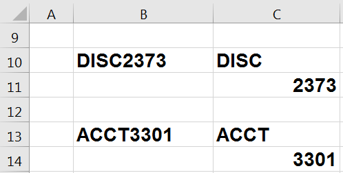
https://quizlet.com/414448350/flashcards/embed?i=24veoc&x=1jj1[/embed]
Practice problems by Emese Felvégi & Kathy Cossick based on chapter contents and chapter practice. CC BY-NC-SA 3.0.
1
a mass, assemblage, or sum of particulars; something consisting of elements but considered as a whole
the measure of central tendency of a set of values computed by dividing the sum of the values by their number; commonly called the mean or the average
any measure of central tendency, especially any mean, the median, or the mode
The ratio of the conditional probabilities of the event $B$ given that $A_1$ is the case or that $A_2$ is the case, respectively.
In mathematics, the bell-shaped curve that is typical of the normal distribution. A symmetrical bell-shaped curve that represents the distribution of values, frequencies, or probabilities of a set of data. It slopes downward from a point in the middle corresponding to the mean value, or the maximum probability. Data that reflect the aggregate outcome of large numbers of unrelated events tend to result in bell curve distributions. (Dictionary.com, 2021)
anything that indicates future trends
(Uncountable) Inclination towards something; predisposition, partiality, prejudice, preference, predilection.
Having or involving exactly two variables.
A graphical summary of a numerical data sample through five statistics: median, lower quartile, upper quartile, and some indication of more extreme upper and lower values.
a convenient way of graphically depicting groups of numerical data through their quartiles
the number or proportion of arbitrarily large or small extreme values that must be introduced into a batch or sample to cause the estimator to yield an arbitrarily large result
the process through which propagation, growth, or development occurs
the relationship between an event (the cause) and a second event (the effect), where the second event is understood as a consequence of the first
an official count of members of a population (not necessarily human), usually residents or citizens in a particular region, often done at regular intervals
The theorem that states: If the sum of independent identically distributed random variables has a finite variance, then it will be (approximately) normally distributed.
a term that relates the way in which quantitative data tend to cluster around some value
the presence of chance in determining the variation in experimental results
In probability theory and statistics, refers to a test in which the chi-squared distribution (also chi-square or χ-distribution) with k degrees of freedom is the distribution of a sum of the squares of k independent standard normal random variables.
A structure in the cell nucleus that contains DNA, histone protein, and other structural proteins.
a significant subset within a population
The ratio of the standard deviation to the mean.
A branch of mathematics that studies (usually finite) collections of objects that satisfy specified criteria.
The probability that an event will take place given the restrictive assumption that another event has taken place, or that a combination of other events has taken place
A type of interval estimate of a population parameter used to indicate the reliability of an estimate.
an extraneous variable in a statistical model that correlates (positively or negatively) with both the dependent variable and the independent variable
a table presenting the joint distribution of two categorical variables
obtained from data that can take infinitely many values
a variable that has a continuous distribution function, such as temperature
a separate group or subject in an experiment against which the results are compared where the primary variable is low or nonexistence
the group of test subjects left untreated or unexposed to some procedure and then compared with treated subjects in order to validate the results of the test
One of the several measures of the linear statistical relationship between two random variables, indicating both the strength and direction of the relationship.
the application of logical principles, rigorous standards of evidence, and careful reasoning to the analysis and discussion of claims, beliefs, and issues
a presentation of data in a tabular form to aid in identifying a relationship between variables
the accumulation of the previous relative frequencies
a technique for searching large-scale databases for patterns; used mainly to find previously unknown correlations between variables that may be commercially useful
the probability that an event will occur, as a function of some observed variable
in an equation, the variable whose value depends on one or more variables in the equation
A branch of mathematics dealing with summarization and description of collections of data sets, including the concepts of arithmetic mean, median, and mode.
For interval variables and ratio variables, a measure of difference between the observed value and the mean.
dividing or branching into two pieces
obtained by counting values for which there are no in-between values, such as the integers 0, 1, 2, ….
a variable that takes values from a finite or countable set, such as the number of legs of an animal
Having no members in common; having an intersection equal to the empty set.
the state of being unequal; difference
the degree of scatter of data
the set of relative likelihoods that a variable will have a value in a given interval
a mark consisting of three periods, historically with spaces in between, before, and after them “… “, nowadays a single character ” (used in printing to indicate an omission)
verifiable by means of scientific experimentation
That a normal distribution has 68% of its observations within one standard deviation of the mean, 95% within two, and 99.7% within three.
having an equal chance of occurring mathematically
A subset of the sample space.
a gradual directional change, especially one leading to a more advanced or complex form; growth; development
including every possible element
of a discrete random variable, the sum of the probability of each possible outcome of the experiment multiplied by the value itself
A test under controlled conditions made to either demonstrate a known truth, examine the validity of a hypothesis, or determine the efficacy of something previously untried.
an approach to analyzing data sets that is concerned with uncovering underlying structure, extracting important variables, detecting outliers and anomalies, testing underlying assumptions, and developing models
limited, constrained by bounds, having an end
number of times an event occurred in an experiment (absolute frequency)
a representation, either in a graphical or tabular format, which displays the number of observations within a given interval
a unit of heredity; a segment of DNA or RNA that is transmitted from one generation to the next, and that carries genetic information such as the sequence of amino acids for a protein
of a function y = f(x) or the graph of such a function, the rate of change of y with respect to x, that is, the amount by which y changes for a certain (often unit) change in x
A diagram displaying data; in particular one showing the relationship between two or more quantities, measurements or indicative numbers that may or may not have a specific mathematical formula relating them to each other.
diverse in kind or nature; composed of diverse parts
a representation of tabulated frequencies, shown as adjacent rectangles, erected over discrete intervals (bins), with an area equal to the frequency of the observations in the interval
The occurrence of one event does not affect the probability of the occurrence of another.
Not dependent; not contingent or depending on something else; free.
the fact that $A$ occurs does not affect the probability that $B$ occurs
in an equation, any variable whose value is not dependent on any other in the equation
A branch of mathematics that involves drawing conclusions about a population based on sample data drawn from it.
the limit of the sums computed in a process in which the domain of a function is divided into small subsets and a possibly nominal value of the function on each subset is multiplied by the measure of that subset, all these products then being summed
the coordinate of the point at which a curve intersects an axis
The difference between the first and third quartiles; a robust measure of sample dispersion.
The collective group of people who are available for employment, whether currently employed or unemployed (though sometimes only those unemployed people who are seeking work are included).
a path through two or more points (compare ‘segment’); a continuous mark, including as made by a pen; any path, curved or straight
an approach to modeling the relationship between a scalar dependent variable $y$ and one or more explanatory variables denoted $x$.
for a number $x$, the power to which a given base number must be raised in order to obtain $x$
An expression of the lack of precision in the results obtained from a sample.
A measure of the average of the squares of the “errors”; the amount by which the value implied by the estimator differs from the quantity to be estimated.
the numerical value separating the higher half of a data sample, a population, or a probability distribution, from the lower half
the most frequently occurring value in a distribution
a broad class of computational algorithms that rely on repeated random sampling to obtain numerical results–i.e., by running simulations many times over in order to calculate those same probabilities
The probability that A and B occur is equal to the probability that A occurs times the probability that B occurs, given that we know A has already occurred.
describing multiple events or states of being such that the occurrence of any one implies the non-occurrence of all the others
Having values whose order is insignificant.
the absence of a response
Occurs when the sample becomes biased because some of those initially selected refuse to respond.
A family of continuous probability distributions such that the probability density function is the normal (or Gaussian) function.
any parameter that is not of immediate interest but which must be accounted for in the analysis of those parameters which are of interest; the classic example of a nuisance parameter is the variance $sigma^2$, of a normal distribution, when the mean, $mu$, is of primary interest
A hypothesis set up to be refuted in order to support an alternative hypothesis; presumed true until statistical evidence in the form of a hypothesis test indicates otherwise.
not influenced by the emotions or prejudices
a study drawing inferences about the possible effect of a treatment on subjects, where the assignment of subjects into a treated group versus a control group is outside the control of the investigator
the ratio of the probabilities of an event happening to that of it not happening
Of a number, indicating position in a sequence.
One of the individual results that can occur in an experiment.
a value in a statistical sample which does not fit a pattern that describes most other data points; specifically, a value that lies 1.5 IQR beyond the upper or lower quartile
a type of bar graph where where the bars are drawn in decreasing order of frequency or relative frequency
The Pareto distribution, named after the Italian economist Vilfredo Pareto, is a power law probability distribution that is used in description of social, scientific, geophysical, actuarial, and many other types of observable phenomena.
a part of something that had been divided, each of its results
the scholarly process whereby manuscripts intended to be published in an academic journal are reviewed by independent researchers (referees) to evaluate the contribution, i.e. the importance, novelty and accuracy of the manuscript’s contents
any of the ninety-nine points that divide an ordered distribution into one hundred parts, each containing one per cent of the population
a picture that represents a word or an idea by illustration; used often in graphs
one of the spots or symbols on a playing card, domino, die, etc.
an inactive substance or preparation used as a control in an experiment or test to determine the effectiveness of a medicinal drug
the tendency of any medication or treatment, even an inert or ineffective one, to exhibit results simply because the recipient believes that it will work
any one of the following five polyhedra: the regular tetrahedron, the cube, the regular octahedron, the regular dodecahedron and the regular icosahedron
a graph or diagram drawn by hand or produced by a mechanical or electronic device
An expression consisting of a sum of a finite number of terms: each term being the product of a constant coefficient and one or more variables raised to a non-negative integer power.
a group of units (persons, objects, or other items) enumerated in a census or from which a sample is drawn
The relative likelihood of an event happening.
any function whose integral over a set gives the probability that a random variable has a value in that set
A function of a discrete random variable yielding the probability that the variable will have a given value.
a sample in which every unit in the population has a chance (greater than zero) of being selected in the sample, and this probability can be accurately determined
The mathematical study of probability (the likelihood of occurrence of random events in order to predict the behavior of defined systems).
a sign by which a future event may be known or foretold
A fallacy of statistical reasoning when used as an argument in legal proceedings.
surveys designed to represent the beliefs of a population by conducting a series of questions and then extrapolating generalities in ratio or within confidence intervals
occurs when the researchers choose the sample based on who they think would be appropriate for the study; used primarily when there is a limited number of people that have expertise in the area being researched
happening every four years
of descriptions or distinctions based on some quality rather than on some quantity
The numerical examination and interpretation of observations for the purpose of discovering underlying meanings and patterns of relationships.
data centered around descriptions or distinctions based on some quality or characteristic rather than on some quantity or measured value
of a measurement based on some quantity or number rather than on some quality
of a measurement based on some quantity or number rather than on some quality
any of the three points that divide an ordered distribution into four parts, each containing a quarter of the population
a sampling method that chooses a representative cross-section of the population by taking into consideration each important characteristic of the population proportionally, such as income, sex, race, age, etc.
A free software programming language and a software environment for statistical computing and graphics.
an experimental technique for assigning subjects to different treatments (or no treatment)
number allotted randomly using suitable generator (electronic machine or as simple “generator” as die)
a sample randomly taken from an investigated population
a quantity whose value is random and to which a probability distribution is assigned, such as the possible outcome of a roll of a die
a stochastic path consisting of a series of sequential movements, the direction (and sometime length) of which is chosen at random
the length of the smallest interval which contains all the data in a sample; the difference between the largest and smallest observations in the sample
an original observation that has not been transformed to a $z$-score
An analytic method to measure the association of one or more independent variables with a dependent variable.
the phenomenon by which extreme examples from any set of data are likely to be followed by examples which are less extreme; a tendency towards the average of any sample
the fraction or proportion of times a value occurs
a representation, either in graphical or tabular format, which displays the fraction of observations in a certain category
The difference between the observed value and the estimated function value.
Occurs when the answers given by respondents do not reflect their true beliefs.
the square root of the arithmetic mean of the squares
a subset of a population selected for measurement, observation, or questioning to provide statistical information about the population
the mean of a sample of random variables taken from the entire population of those variables
The set of all outcomes of an experiment.
the process or technique of obtaining a representative sample
The probability distribution of a given statistic based on a random sample.
A type of display using Cartesian coordinates to display values for two variables for a set of data.
an experiment or observation designed to minimize the effects of variables other than the single independent variable
a passage between body channels constructed surgically as a bypass
a paradox in which a trend that appears in different groups of data disappears when these groups are combined, and the reverse trend appears for the aggregate data
Biased or distorted (pertaining to statistics or information).
A measure of the asymmetry of the probability distribution of a real-valued random variable; is the third standardized moment, defined as where is the third moment about the mean and is the standard deviation.
the ratio of the vertical and horizontal distances between two points on a line; zero if the line is horizontal, undefined if it is vertical.
A numerical difference.
a measure of how spread out data values are around the mean, defined as the square root of the variance
A measure of how spread out data values are around the mean, defined as the square root of the variance.
the ability to understand statistics, necessary for citizens to understand material presented in publications such as newspapers, television, and the Internet
a mathematical science concerned with data collection, presentation, analysis, and interpretation
a means of displaying data used especially in exploratory data analysis; another name for stemplot
a means of displaying data used especially in exploratory data analysis; another name for stem-and-leaf display
random; randomly determined
a category composed of people with certain similarities, such as gender, race, religion, or even grade level
a survey of opinion which is unofficial, casual, or ad hoc
A distribution that arises when the population standard deviation is unknown and has to be estimated from the data; originally derived by William Sealy Gosset (who wrote under the pseudonym “Student”).
a ratio of the departure of an estimated parameter from its notional value and its standard error
a notation, given by the Greek letter sigma, that denotes the operation of adding a sequence of numbers
A calculator manufactured by Texas Instruments that is one of the most popular graphing calculators for statistical purposes.
To shorten something as if by cutting off part of it.
impartial or without prejudice
Occurs when a survey fails to reach a certain portion of the population.
The level of joblessness in an economy, often measured as a percentage of the workforce.
a quantity that may assume any one of a set of values
the proportion of cases not in the mode
in statistics, a set of real-valued random variables that may be correlated
a situation in which a result appears absurd but is demonstrated to be true nevertheless
the state of sharp and regular fluctuation
an arithmetic mean of values biased according to agreed weightings
The standardized value of observation $x$ from a distribution that has mean $mu$ and standard deviation $sigma$.
the standardized value of an observation found by subtracting the mean from the observed value, and then dividing that value by the standard deviation; also called $z$-score


![\bar{X}-\mu _{0}[/latex</span></span></span>] </span></span></span></span></span></span></span>is large. To calculate the standardized statistic <span id="MathJax-Element-148-Frame" class="mjx-chtml MathJax_CHTML" tabindex="0" role="presentation" data-mathml="<math xmlns="http://www.w3.org/1998/Math/MathML"><mtext>Z</mtext><mo>=</mo><mfrac><mrow><mo stretchy="false">(</mo><mtext>X</mtext><mo>−</mo><msub><mrow class="MJX-TeXAtom-ORD"><mo>μ</mo></mrow><mn>0</mn></msub><mo stretchy="false">)</mo></mrow><mtext>s</mtext></mfrac></math>"><span id="MJXc-Node-798" class="mjx-math" aria-hidden="true"><span id="MJXc-Node-799" class="mjx-mrow"><span id="MJXc-Node-800" class="mjx-mtext"><span class="mjx-char MJXc-TeX-main-R">[latex]Z=\frac{(X-\mu _{0})}{s}](https://open.ocolearnok.org/app/uploads/quicklatex/quicklatex.com-97813872eb764abfa7b023c5d6f02760_l3.svg "Rendered by QuickLaTeX.com")


![E[X]=X_1P_1+X_2P_2+...+X_kP_k](https://open.ocolearnok.org/app/uploads/quicklatex/quicklatex.com-71bb4def706886486f4ccd78a9957fad_l3.svg "Rendered by QuickLaTeX.com")
![E[X]=1\cdot \frac{1}{5}+1\cdot \frac{1}{5}+2\cdot \frac{1}{5}+3\cdot \frac{1}{5}+4\cdot \frac{1}{5}=2.2](https://open.ocolearnok.org/app/uploads/quicklatex/quicklatex.com-b2cd3101b2d822f38829a33d5e3201ba_l3.svg "Rendered by QuickLaTeX.com")


![E[X]=\sum_{x=0}^{3}xP[X=x]](https://open.ocolearnok.org/app/uploads/quicklatex/quicklatex.com-658caf3de24bf49c08d94aaeff11385e_l3.svg "Rendered by QuickLaTeX.com")
![E[1000+500X]=\sum_{x=0}^{3}(1000+500x)P[X=x]](https://open.ocolearnok.org/app/uploads/quicklatex/quicklatex.com-d84fc5111f8de6b96a3c779c8b435272_l3.svg "Rendered by QuickLaTeX.com")


.svg)
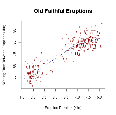
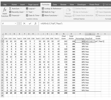