16 Correlation
Learning Outcomes
In this chapter, you will learn how to:
- Describe the concept of the correlation coefficient and its interpretation
- Conduct a hypothesis test for a correlation between two continuous variables
- Compute the Pearson correlation as a test statistic
- Evaluate effect size for a Pearson correlation
- Identify type of correlation based on the data (Pearson vs Spearman)
- Describe the effect of outlier data points and how to address them
Hypothesis testing beyond t-tests and ANOVAs
Correlations or relationships are measured by correlation coefficients. A correlation coefficient is a measure that varies from -1 to 1, where a value of 1 represents a perfect positive relationship between the variables, 0 represents no relationship, and -1 represents a perfect negative relationship.
In this chapter we will focus on Pearson’s r, which is a measure of the strength of the linear relationship between two continuous variables. Pearson's r was developed by Karl Pearson in the early 1900s.
Figure 1 shows examples of various levels of correlation using randomly generated data for two continuous variables (reporting Pearson's rs). We will learn more about interpreting a correlation coefficient when we discuss direction and magnitude later in the chapter.
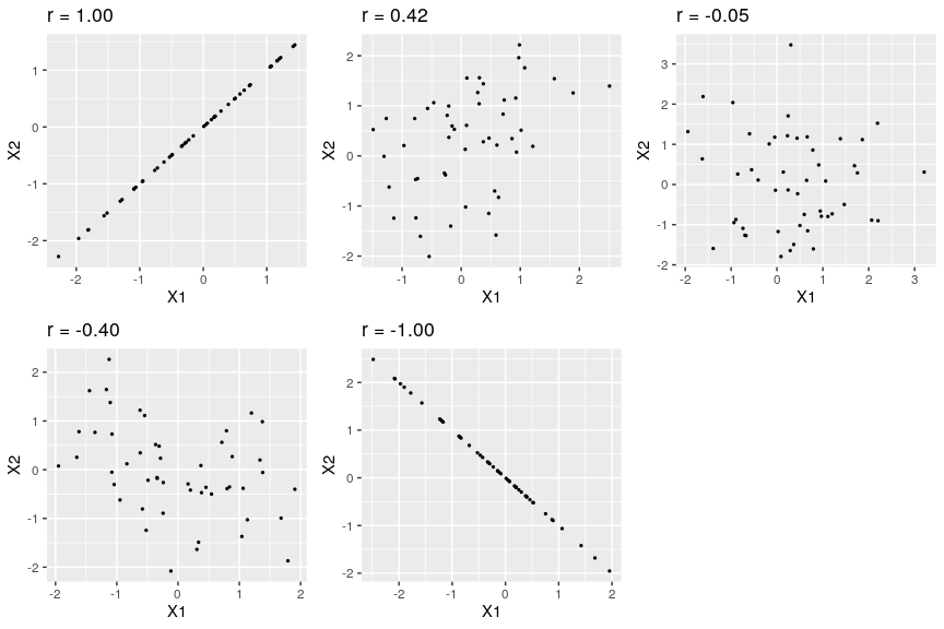
Figure 1. Examples of various levels of Pearson’s r.
Variability and Covariance
A common theme throughout statistics is the notion that individuals will differ on different characteristics and traits, which we call variance. In inferential statistics and hypothesis testing, our goal is to find systematic reasons for differences and rule out random chance as the cause. By doing this, we are using information from a different variable – which so far has been group membership like in ANOVA – to explain this variance. In correlations, we will instead use a continuous variable to account for the variance. Because we have two continuous variables, we will have two characteristics or scores on which people will vary. What we want to know is do people vary on the scores together. That is, as one score changes, does the other score also change in a predictable or consistent way? This notion of variables differing together is called covariance (the prefix “co” meaning “together”).
To be able to understand the covariance between two variables, we must first remember how we get to the variance of a single variable.
Variance
[latex]s^2=\frac{SS}{df}=\frac{SS}{n-1}[/latex]
We should also review our two formulas for SS. The first formula is our definitional formula, and the second is our computational formula.
[latex]SS=\Sigma(X-M)^2=\Sigma(X^2)-\frac{(\Sigma X)^2}{n}[/latex]
Covariance
[latex]cov_{XY}=\frac{SP}{df}=\frac{SP}{n-1}[/latex]
Notice that we now have an SP in the numerator rather than an SS. We won't be squaring our deviation scores anymore. Rather, we will now be multiplying the deviation scores for X by the deviation scores for Y and summing them up. Thus, this is the sum of the products of deviation scores. Or the sum of products of deviations (SP). And, just like the sum of squared deviation scores, we have a definitional formula and a computational version of the formula available for us to use.
Definitional Formula for SP
[latex]SP=\Sigma(X-M_X)(Y-M_Y)[/latex]
Computational Formula for SP
[latex]SP=\Sigma(XY)-\frac{(\Sigma X)(\Sigma Y)}{n}[/latex]
|
X |
(X −MX) |
(X − MX)2 |
Y |
(Y −MY) |
(Y − MY)2 |
(X −MX)(Y −MY) |
|
|
|
(if need s2) |
|
|
(if need s2) |
|
|
... |
... |
... |
... |
... |
... |
... |
|
|
|
∑ (total up for SSX) |
|
|
∑ (total up for SSY) |
∑ (total up for SP) |
Table 1. Example for calculating Sum of Products
The previous paragraph brings us to an important definition about relations between variables. What we are looking for in a relationship is a consistent or predictable pattern. That is, the variables change together, either in the same direction or opposite directions, in the same way each time. It doesn’t matter if this relationship is positive or negative, only that it is not zero. If there is no consistency in how the variables change within a person, then the relationship is zero and does not exist. We will revisit this notion of direction versus zero relationship later on.
Visualizing Relations
Chapter 3 covered many different forms of data visualization, and visualizing data remains an important first step in understanding and describing our data before we move into inferential statistics. Nowhere is this more important than in correlation. Correlations are visualized by a scatterplot, where our X variable values are plotted on the X-axis, the Y variable values are plotted on the Y-axis, and each point or marker in the plot represents a single person’s score on X and Y. Figure 2 shows a scatterplot for hypothetical scores on job satisfaction (X) and worker well-being (Y). We can see from the axes that each of these variables is measured on a 10- point scale, with 10 being the highest on both variables (high satisfaction and good health and well-being) and 1 being the lowest (dissatisfaction and poor health). When we look at this plot, we can see that the variables do seem to be related. The higher scores on job satisfaction tend to also be the higher scores on well-being, and the same is true of the lower scores.
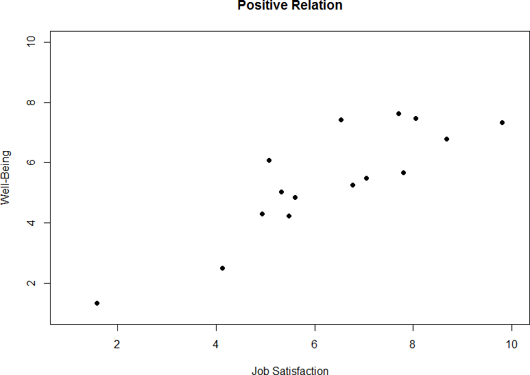
Figure 2. Plotting satisfaction and well-being scores.
Figure 2 demonstrates a positive relation. As scores on X increase, scores on Y also tend to increase. Although this is not a perfect relationship (if it were, the points would form a single straight line), it is nonetheless very clearly positive. This is one of the key benefits to scatterplots: they make it very easy to see the direction of the relationship. As another example, figure 3 shows a negative relationship between job satisfaction (X) and burnout (Y). As we can see from this plot, higher scores on job satisfaction tend to correspond to lower scores on burnout, which is how stressed, unenergetic, and unhappy someone is at their job. As with figure 2, this is not a perfect relationship, but it is still a clear one. As these figures show, points in a positive relationship move from the bottom left of the plot to the top right, and points in a negative relationship move from the top left to the bottom right.
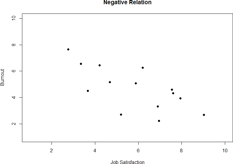
Figure 3. Plotting satisfaction and burnout scores.
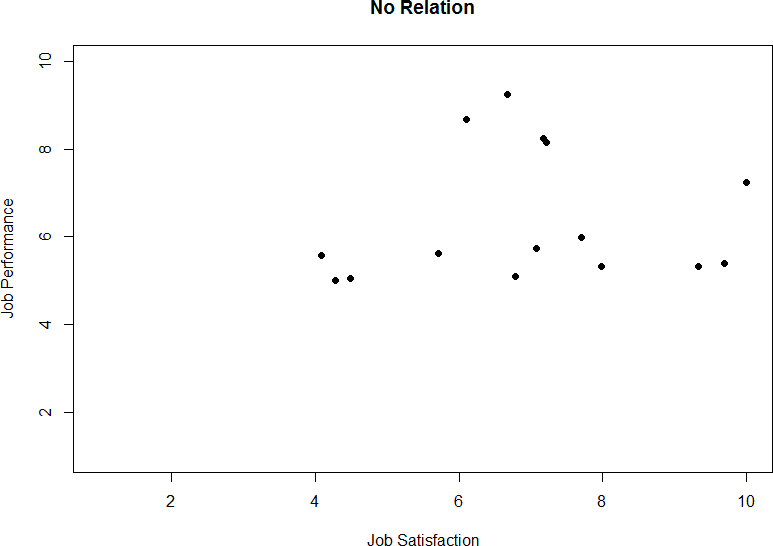
Figure 4. Plotting no relation between satisfaction and job performance.
As we can see, scatterplots are very useful for giving us an approximate idea of whether or not there is a relationship between the two variables and, if there is, if that relation is positive or negative. They are also useful for another reason: they are the only way to determine one of the characteristics of correlations that are discussed next: form.
Three Characteristics
When we talk about correlations, there are three characteristics that we need to know in order to truly understand the relationship (or lack of relationship) between X and Y: form, direction, and magnitude. We will discuss each of them in turn.
Form
The first characteristic of relationship between variables is their form. The form of a relationship is the shape it takes in a scatterplot, and a scatterplot is the only way it is possible to assess the form of a relationship. there are three forms we look for: linear, curvilinear, or no relationship. A linear relationship is what we saw in figures 1, 2, and 3. If we drew a line through the middle points in the any of the scatterplots, we would be best suited with a straight line. The term “linear” comes from the word “line”. A linear relationship is what we will always assume when we calculate correlations. All of the correlations presented here are only valid for linear relationships. Thus, it is important to plot our data to make sure we meet this assumption.
The relationship between two variables can also be curvilinear. As the name suggests, a curvilinear relationship is one in which a line through the middle of the points in a scatterplot will be curved rather than straight. Two examples are presented in figures 5 and 6.
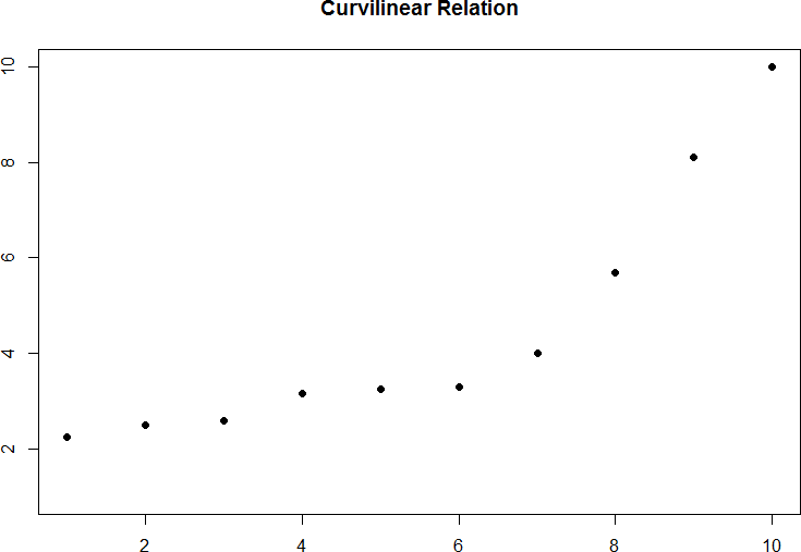
Figure 5. Exponentially increasing curvilinear relationship.
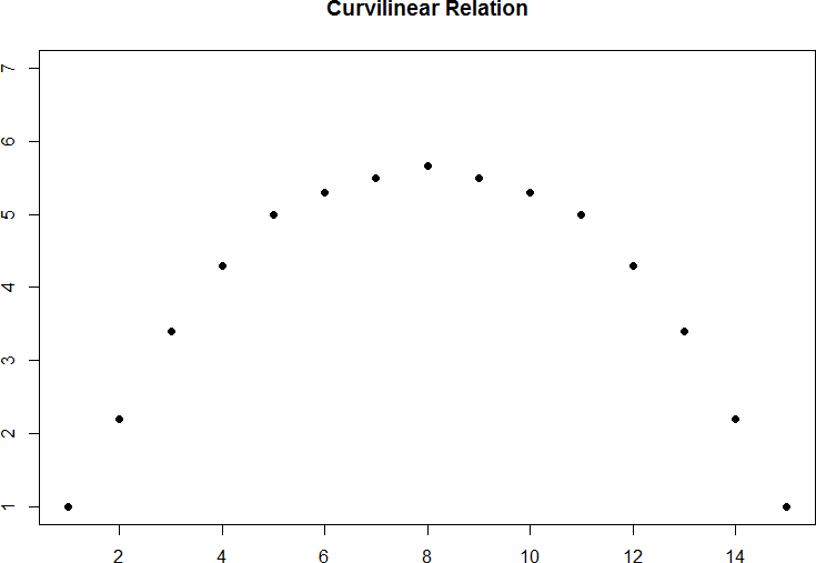
Figure 6. Inverted-U curvilinear relationship.
Curvilinear relationships can take many shapes, and the two examples above are only a small sample of the possibilities. What they have in common is that they both have a very clear pattern but that pattern is not a straight line. If we try to draw a straight line through them, we would get a result similar to what is shown in figure 7.
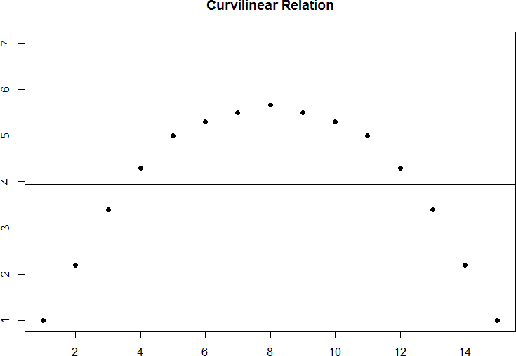
Figure 7. Overlaying a straight line on a curvilinear relationship.
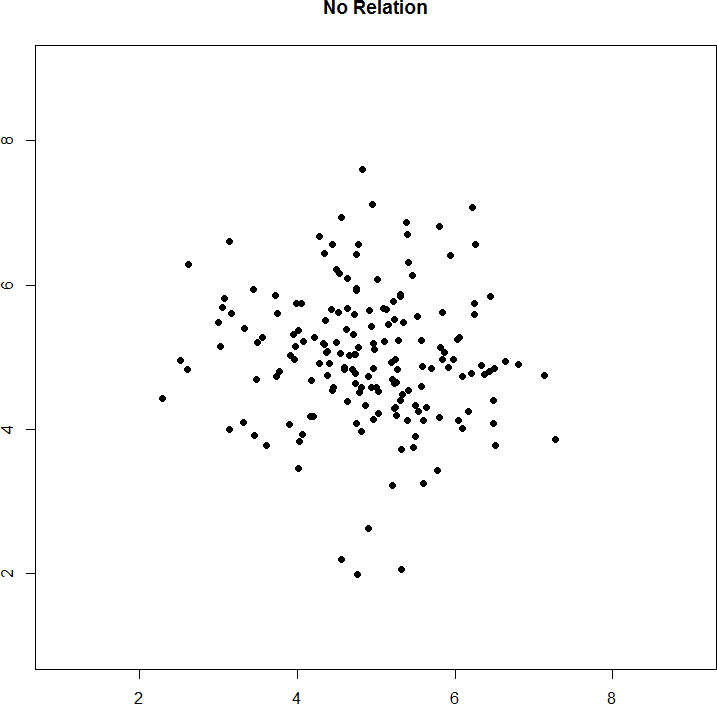
Figure 8. No relation
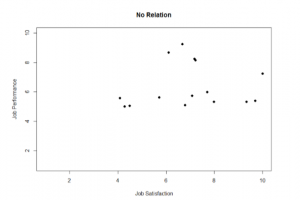
Figure 9. No relationship fictional data scatterplot between job satisfaction and job performance
Sometimes when we look at scatterplots, it is tempting to get biased by a few points that fall far away from the rest of the points and seem to imply that there may be some sort of relation. These points are called outliers, and we will discuss them in more detail later in the chapter. These can be common, so it is important to formally test for a relationship between our variables, not just rely on visualization. This is the point of hypothesis testing with correlations, and we will go in depth on it soon. First, however, we need to describe the other two characteristics of relationships: direction and magnitude.
Direction
The direction of the relationship between two variables tells us whether the variables change in the same way at the same time or in opposite ways at the same time. We saw this concept earlier when first discussing scatterplots, and we used the terms positive and negative. A positive relationship is one in which X and Y change in the same direction: as X goes up, Y goes up, and as X goes down, Y also goes down. A negative relationship is just the opposite: X and Y change together in opposite directions: as X goes up, Y goes down, and vice versa.
As we will see soon, when we calculate a correlation coefficient, we are quantifying the relationship demonstrated in a scatterplot. That is, we are putting a number to it. That number will be either positive, negative, or zero, and we interpret the sign of the number as our direction. If the number is positive, it is a positive relationship, and if it is negative, it is a negative relationship. If it is zero, then there is no relationship. The direction of the relationship corresponds directly to the slope of the hypothetical line we draw through scatterplots when assessing the form of the relation. If the line has a positive slope that moves from bottom left to top right, it is positive. If it has a line that goes from top left to bottom right it is considered negative. If the line it flat, that means it has no slope, and there is no relationship, which will in turn yield a zero for our correlation coefficient.
Magnitude
The number we calculate for our correlation coefficient, which we will describe in detail below, corresponds to the magnitude of the relationship between the two variables. The magnitude is how strong or how consistent the relationship between the variables is. Higher numbers mean greater magnitude, which means a stronger relationship. Our correlation coefficients will take on any value between -1.00 and 1.00, with 0.00 in the middle, which again represents no relationship. A correlation of -1.00 is a perfect negative relationship; as X goes up by some amount, Y goes down by the same amount, consistently. Likewise, a correlation of 1.00 indicates a perfect positive relationship; as X goes up by some amount, Y also goes up by the same amount. Finally, a correlation of 0.00, which indicates no relationship, means that as X goes up by some amount, Y may or may not change by any amount, and it does so inconsistently.
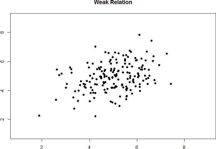
Figure 10. Weak positive correlation.
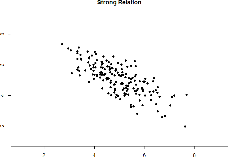
Figure 11. Strong negative correlation.
Pearson’s r
There are several different types of correlation coefficients, but we will only focus on the most common: Pearson’s r. Pearson's r is a very popular correlation coefficient for assessing linear relationships between two continuous variables, and it serves as both a descriptive statistic (like M) and as a test statistic (like t). It is descriptive because it describes what is happening in the scatterplot; r will have both a sign (+/–) for the direction and a number (0 – 1 in absolute value) for the magnitude. As noted above, to use r we assume a linear relation, so nothing about r will suggest what the form is – it will only tell what the direction and magnitude would be if the form is linear. (Remember: always make a scatterplot first!) Pearson's r also works as a test statistic because the magnitude of r will correspond directly to a t value as the specific degrees of freedom, which can then be compared to a critical value. Luckily, we do not need to do this conversion by hand. Instead, we will have a table of r critical values that looks very similar to our t table, and we can compare our r directly to those. We calculate Pearson's r using equations we've already established earlier in this chapter.
Pearson's r
[latex]r=\frac{cov_{XY}}{(s_X)(s_Y)}[/latex]
Because of the duplication of information found in the denominators of the formulas for covariance and standard deviations for X and Y, we can simplify this formula a bit.
[latex]r=\frac{SP}{\sqrt{(SS_X)(SS_Y)}}[/latex]
Now, let's look at an example.
Example: Anxiety and Depression
Anxiety and depression are often reported to be highly linked (or “comorbid”) psychological disorders. In this example we will ask the question: is there a significant positive relationship between anxiety and depression? That is, as symptoms of anxiety increase, do symptoms of depression also increase? We will see in this example that our hypothesis testing procedure follows the same four-step process as before, starting with our null and alternative hypotheses.
Step 1: State the Hypotheses
First, we need to decide if we are looking for directional or non-directional hypotheses. Remember that the null hypothesis is the idea that there is nothing interesting, notable, or impactful represented in our dataset. In a correlation, that takes the form of ‘no relationship’. Thus, our null hypothesis for can take one of three forms:
H0: There is no relationship
H0: ρ = 0
H0: There is not a positive relationship
H0: ρ < 0
H0: There is not a negative relationship
H0: ρ > 0
As with our other null hypotheses, we express the null hypothesis for a Pearson correlation in both words and mathematical notation. The exact wording of the written-out version should be changed to match whatever research question we are addressing (e.g. “ There is no relationship between anxiety and depression”). However, the mathematical version of the null hypothesis is always exactly the same: the lack of relationship is equal to zero. Our population parameter for the correlation is represented by ρ ("rho"), the Greek letter for lower case r. Obviously, correlational values can go up or down, but the null hypothesis states that these positive or negative values are just random chance and that the true correlation across all people is 0. Remember that if there is no relation between variables, the magnitude will be 0, which is where we get the null and alternative hypothesis values.
Our alternative hypotheses will also follow the same format that they did before: they can be directional if we suspect a relationship in a specific direction, or we can use an inequality sign to test for a relationship in any direction. Thus, our alternative hypothesis could take one of these three forms:
HA: There is a relationship
HA: ρ ≠ 0
HA: There is a positive relationship
HA: ρ > 0
HA: There is a negative relationship
HA: ρ < 0
As before, your choice of which alternative hypothesis to use should be specified before you collect data based on your research question and any evidence you might have that would indicate a specific directional (or non-directional) relationship. For our example, based on our research question, our null and alternative hypotheses would be:
H0: There is not a positive relationship between anxiety and depression
H0: ρ < 0
HA: There is a positive relationship between anxiety and depression
HA: ρ > 0
Step 2: Find the Critical Values
The critical values for correlations come from a critical value table just like before, some look very similar to a t-table (see figure 12). Just like a t-table, in the correlation table below, the column of critical values is based on our significance level (α) and the directionality of our test. The row is determined by our degrees of freedom. For correlations, we have n– 2 degrees of freedom, rather than n – 1 (why this is the case is not important at the moment). For our example, we have 10 people, so our degrees of freedom = 10 – 2 = 8. Some correlation tables use n instead of df so make sure you are paying attention to what information is required to find a critical value on the table that you are using.
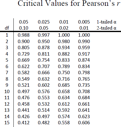
Figure 12. Example Correlation Critical Value Table
We were not given any information about the level of significance at which we should test our hypothesis, so we will assume α = 0.05 as default. From our table, we can see that a one-tailed test (because we expect only a positive relationship) at the α = 0.05 level with df = 8 has a critical value of rcrit= 0.549. Thus, if our rtest is greater than 0.549, it will be statistically significant. This is a rather high bar (remember, the guideline for a strong relationship is r = 0.50); this is because we have so few people. Larger samples make it much easier to find significant relationships (remember the law of large numbers?).
Step 3: Calculate the Test Statistic
We have laid out our hypotheses and the criteria we will use to assess them, so now we can move on to our test statistic. Before we do that, we must first create a scatterplot of the data to make sure that the most likely form of our relationship is in fact linear. Figure 13 below shows our data plotted out, and it looks like they are, in fact, linearly related, so Pearson’s r is appropriate.
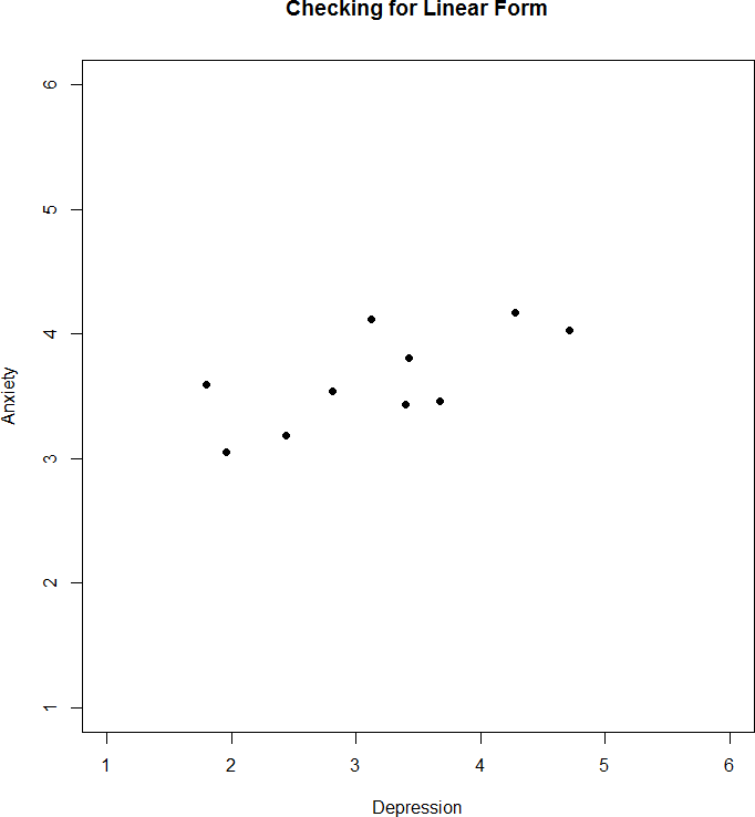
Figure 13. Scatterplot of anxiety and depression
The data we gather from our participants (n = 10) is as follows:
|
Dep (X) |
2.81 |
1.96 |
3.43 |
3.40 |
4.71 |
1.80 |
4.27 |
3.68 |
2.44 |
3.13 |
M = 3.16 |
s =0.89 |
SSX = 7.97 |
|
Anx (Y) |
3.54 |
3.05 |
3.81 |
3.43 |
4.03 |
3.59 |
4.17 |
3.46 |
3.19 |
4.12 |
M = 3.64 |
s = 0.37 |
SSY =1.33 |
Table 2. Data for step 3 to calculate r.
We will need to put these values into our Sum of Products table to calculate the standard deviation and covariance of our variables. We will use X for depression and Y for anxiety to keep track of our data, but be aware that this choice is arbitrary and the math will work out the same if we decided to do the opposite. Our table is thus:
|
X |
(X −MX) |
(X − MX)2 |
Y |
(Y − MY) |
(Y − MY)2 |
(X − MX)(Y − MY) |
|
2.81 |
-0.35 |
0.12 |
3.54 |
-0.10 |
0.01 |
0.04 |
|
1.96 |
-1.20 |
1.44 |
3.05 |
-0.59 |
0.35 |
0.71 |
|
3.43 |
0.27 |
0.07 |
3.81 |
0.17 |
0.03 |
0.05 |
|
3.40 |
0.24 |
0.06 |
3.43 |
-0.21 |
0.04 |
-0.05 |
|
4.71 |
1.55 |
2.40 |
4.03 |
0.39 |
0.15 |
0.60 |
|
1.80 |
-1.36 |
1.85 |
3.59 |
-0.05 |
0.00 |
0.07 |
|
4.27 |
1.11 |
1.23 |
4.17 |
0.53 |
0.28 |
0.59 |
|
3.68 |
0.52 |
0.27 |
3.46 |
-0.18 |
0.03 |
-0.09 |
|
2.44 |
-0.72 |
0.52 |
3.19 |
-0.45 |
0.20 |
0.32 |
|
3.13 |
-0.03 |
0.00 |
4.12 |
0.48 |
0.23 |
-0.01 |
|
31.63 |
0.03 |
SSX = 7.97 |
36.39 |
-0.01 |
SSY = 1.33 |
SP = 2.22 |
Table 3. Data for step 3 to calculate r using the definitional formula.
The bottom row is the sum of each column. We can see from this that the sum of the X observations is 31.63, which makes the mean of the X variable MX = 3.16. The deviation scores for X sum to 0.03, which is very close to 0, given rounding error, so everything looks right so far. The next column is the squared deviations for X, so we can see that the sum of squares for X is SSX = 7.97. The same is true of the Y columns, with an average of MY = 3.64, deviations that sum to zero within rounding error, and a sum of squares as SSY = 1.33. The final column is the product of our deviation scores (NOT of our squared deviations), which gives us a sum of products of SP = 2.22.
If we were to instead use the computational formula we would have the following table instead:
|
X |
X2 |
Y |
Y2 |
X*Y |
|
2.81 |
7.90 |
3.54 |
12.53 |
9.95 |
|
1.96 |
3.84 |
3.05 |
9.30 |
5.98 |
|
3.43 |
11.76 |
3.81 |
14.52 |
13.07 |
|
3.40 |
11.56 |
3.43 |
11.76 |
11.66 |
|
4.71 |
22.18 |
4.03 |
16.24 |
18.98 |
|
1.80 |
3.24 |
3.59 |
12.89 |
6.47 |
|
4.27 |
18.23 |
4.17 |
17.39 |
17.81 |
|
3.68 |
13.54 |
3.46 |
11.97 |
12.73 |
|
2.44 |
5.95 |
3.19 |
10.18 |
7.78 |
|
3.13 |
9.80 |
4.12 |
16.97 |
12.90 |
|
31.63 |
108.00 |
36.39 |
133.75 |
117.32 |
Table 4. Data for step 3 to calculate r using the computational formula.
To find the sum of product deviations using the computational formula we would now do the following:
[latex]SP=\Sigma(XY)-\frac{(\Sigma X)(\Sigma Y)}{n}=117.32-\frac{(31.63)(36.39)}{10}[/latex]
[latex]SP=117.32-\frac{1151.02}{10}=117.32-115.10=2.22[/latex]
We can also calculate our SSX and SSY computationally using this single table.
[latex]SS_X=\Sigma(X^2)-\frac{(\Sigma X)^2}{n}=108.00-\frac{(31.63)^2}{10}[/latex]
[latex]SS_X=108.00-\frac{1000.46}{10}=108.00-100.05=7.95[/latex]
[latex]SS_Y=\Sigma(Y^2)-\frac{(\Sigma Y)^2}{n}=133.75-\frac{(36.39)^2}{10}[/latex]
[latex]SS_Y=133.75-\frac{1324.23}{10}=133.75-132.42=1.33[/latex]
As stated before and shown here, you will get the same (or at least really close to depending on rounding differences) answer for SP, SSX, and SSY using the definitional or computational formulas.
We now have the three pieces of information we need to calculate our correlation coefficient, r: the covariance of X and Y and the variability of X and Y separately.
[latex]r=\frac{SP}{\sqrt{(SS_X)(SS_Y)}}=\frac{2.22}{\sqrt{(7.97)(1.33)}}[/latex]
[latex]r=\frac{2.22}{\sqrt{10.60}}=\frac{2.22}{3.26}=0.68[/latex]
So our observed correlation between anxiety and depression is rtest = 0.68, which, based on sign and magnitude, is a strong, positive correlation. Now we need to compare it to our critical value to see if it is also statistically significant.
Step 4: Make a Decision
Our critical value was rcrit = 0.549 and our obtained value was r = 0.68. Our test statistic value was larger than our critical value placing it in the critical region, so we can reject the null hypothesis.
Notice in our interpretation that, because we already know the magnitude and direction of our correlation, we can interpret that. We also report the degrees of freedom, just like with t, and we know that p < α because we rejected the null hypothesis. As we can see, even though we are dealing with a very different type of data, our process of hypothesis testing has remained unchanged.
Effect Size
Pearson’s r is an incredibly flexible and useful statistic. Not only is it both descriptive and inferential, as we saw above, but because it is on a standardized metric (always between -1.00 and 1.00), it can also serve as its own effect size. In general, we use r = 0.10, r = 0.30, and r = 0.50 as our guidelines for small, medium, and large effects. Just like with Cohen’s d, these guidelines are not absolutes, but they do serve as useful indicators in most situations. Notice as well that these are the same guidelines we used earlier to interpret the magnitude of the relation based on the correlation coefficient.
The similarities between η2 and r2 in interpretation and magnitude should clue you in to the fact that they are similar analyses, even if they look nothing alike. That is because, behind the scenes, they actually are! In the next chapter, we will learn a technique called Linear Regression, which will formally link the two analyses together.
Correlation versus Causation
We cover a great deal of material in introductory statistics and, as mentioned chapter 1, many of the principles underlying what we do in statistics can be used in your day-to-day life to help you interpret information objectively and make better decisions. We now come to what may be the most important lesson in introductory statistics: the difference between correlation and causation.
A Reminder about Experimental Design
When we say that one thing causes another, what do we mean? There is a long history in philosophy of discussion about the meaning of causality, but in statistics one way that we commonly think of causation is in terms of experimental control. That is, if we think that factor X causes factor Y, then manipulating the value of X should also change the value of Y.
Often we would like to test causal hypotheses but we can’t actually do an experiment, either because it’s impossible (“What is the relationship between human carbon emissions and the earth’s climate?”) or unethical (“What are the effects of severe abuse on child brain development?”). However, we can still collect data that might be relevant to those questions. For example, we can potentially collect data from children who have been abused as well as those who have not, and we can then ask whether their brain development differs.
Let’s say that we did such an analysis, and we found that abused children had poorer brain development than non-abused children. Would this demonstrate that abuse causes poorer brain development? No. Whenever we observe a statistical association between two variables, it is certainly possible that one of those two variables causes the other. However, it is also possible that both of the variables are being influenced by a third variable; in this example, it could be that child abuse is associated with family stress, which could also cause poorer brain development through less intellectual engagement, food stress, or many other possible avenues. The point is that a correlation between two variables generally tells us that something is probably causing something else, but it doesn’t tell us what is causing what.
Final Considerations
Correlations, although simple to calculate, can be very complex, and there are many additional issues we should consider. We will look at two of the most common issues that affect our correlations, as well as discuss some other correlations and reporting methods you may encounter.
Range Restriction
The strength of a correlation depends on how much variability is in each of the variables X and Y. This is evident in the formula for Pearson’s r, which uses both covariance (based on the sum of products, which comes from deviation scores) and the standard deviation of both variables (which are based on the sums of squares, which also come from deviation scores). Thus, if we reduce the amount of variability in one or both variables, our correlation will go down. Failure to capture the full variability of a variable is called range restriction.
Take a look at figures 14 and 15 below. The first shows a strong relationship (r = 0.67) between two variables. The second shows the same data, but the bottom half of the X variable (all scores below 5) have been removed, which causes our relationship to become much weaker (r = 0.38). Thus range restriction has truncated (made smaller) our observed correlation.

Figure 14. Strong, positive correlation.
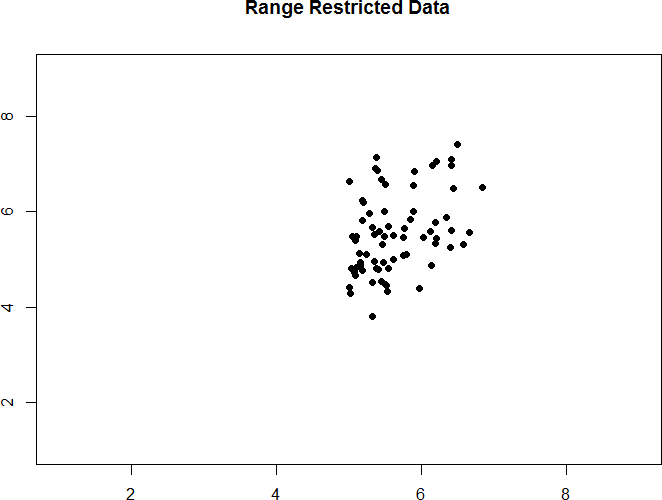
Figure 15. Effect of range restriction.
Sometimes range restriction happens by design. For example, we rarely hire people who do poorly on job applications, so we would not have the lower range of those predictor variables. Other times, we inadvertently cause range restriction by not properly sampling our population. Although there are ways to correct for range restriction, they are complicated and require much information that may not be known, so it is best to be very careful during the data collection process to avoid it.
Outliers
Another issue that can cause the observed size of our correlation to be inappropriately large or small is the presence of outliers. An outlier is a data point that falls far away from the rest of the observations in the dataset. Sometimes outliers are the result of incorrect data entry, poor or intentionally misleading responses, or simple random chance. Other times, however, they represent real people with meaningful values on our variables. The distinction between meaningful and accidental outliers is a difficult one that is based on the expert judgment of the researcher. Sometimes, we will remove the outlier (if we think it is an accident) or we may decide to keep it (if we find the scores to still be meaningful even though they are different).
Pearson's r is sensitive to outliers. For example, in Figure 16 we can see how a single outlying data point can cause a positive correlation value, even when the actual relationship between the other data points is negative.
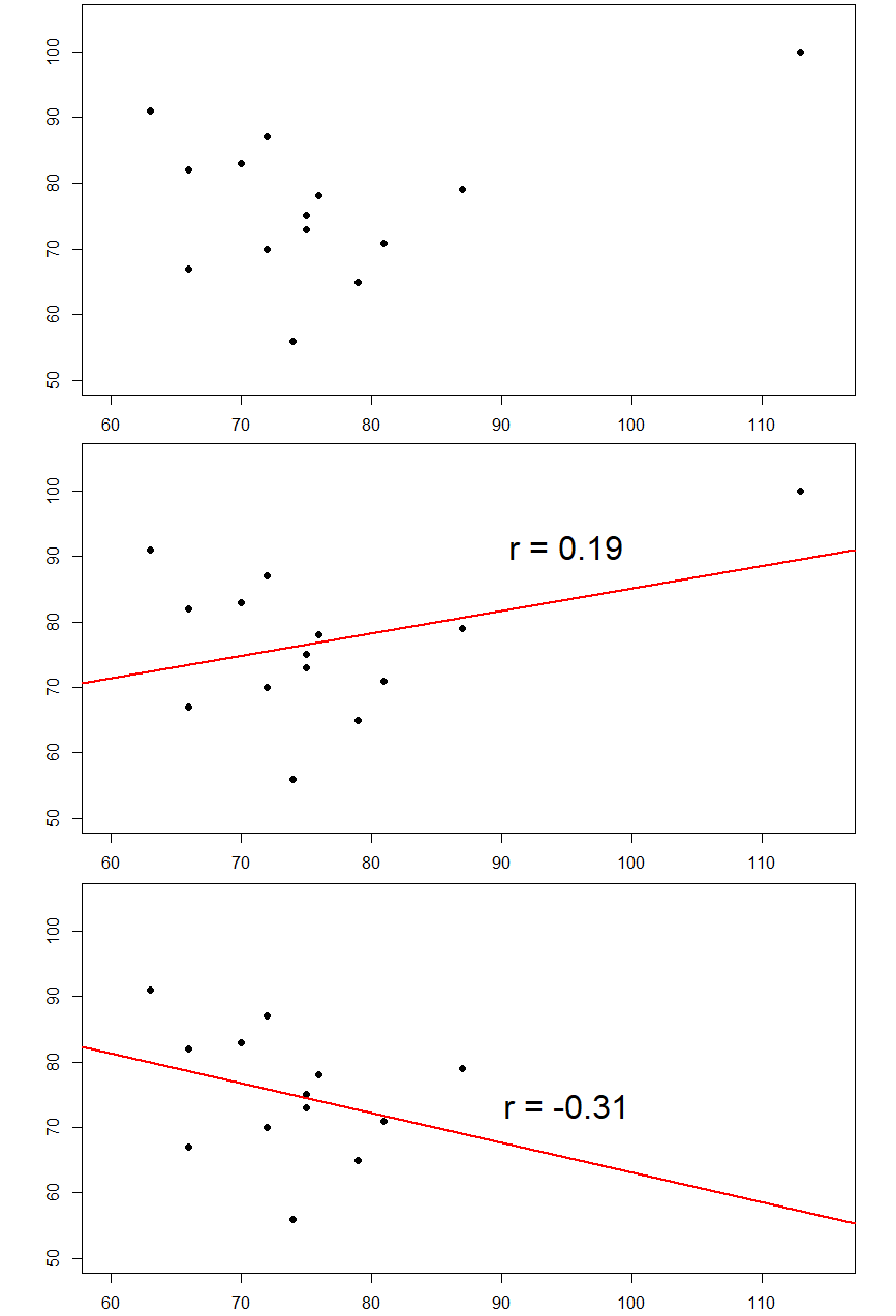
Figure 16. Three plots showing correlations with and without outliers.
In general, there are three effects that an outlier can have on a correlation: it can change the magnitude (make it stronger or weaker), it can change the significance (make a non-significant correlation significant or vice versa), and/or it can change the direction (make a positive relation negative or vice versa). Outliers are a big issue in small datasets where a single observation can have a strong weight compared to the rest. However, as our samples sizes get very large (into the hundreds), the effects of outliers diminishes because they are outweighed by the rest of the data. Nevertheless, no matter how large a dataset you have, it is always a good idea to screen for outliers, both statistically (using analyses that we do not cover here) and/or visually (using scatterplots).
Other Correlation Coefficients
In this chapter we have focused on Pearson’s r as our correlation coefficient because it very common and very useful. There are, however, many other correlations out there, each of which is designed for a different type of data. The most common of these is Spearman’s rho (ρ), which is designed to be used on ordinal data rather than continuous data. This is a very useful analysis if we have ranked data or our data. It can also be used when our continuous data do not conform to the normality assumption and our sample sizes are small. There are even more correlations for ordered categories, but they are much less common and beyond the scope of this chapter.
Additionally, the principles of correlations underlie many other advanced analyses. In the next chapter, we will learn about regression, which is a formal way of running and analyzing a correlation that can be extended to more than two variables. Regression is a very powerful technique that serves as the basis for even our most advanced statistical models, so what we have learned in this chapter will open the door to an entire world of possibilities in data analysis.
An misreported media example: Hate crimes and income inequality
In 2017, the web site Fivethirtyeight.com published a story titled Higher Rates Of Hate Crimes Are Tied To Income Inequality which discussed the relationship between the prevalence of hate crimes and income inequality in the wake of the 2016 Presidential election. The story reported an analysis of hate crime data from the FBI and the Southern Poverty Law Center, on the basis of which they report:
“we found that income inequality was the most significant determinant of population-adjusted hate crimes and hate incidents across the United States”.
The analysis reported in the story focused on the relationship between income inequality (defined by a quantity called the Gini index — see Appendix for more details) and the prevalence of hate crimes in each state.
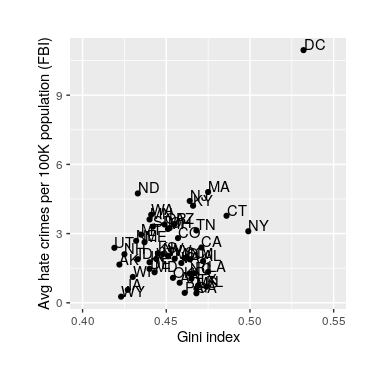
Figure 17: Plot of rates of hate crimes vs. Gini index.
The relationship between income inequality and rates of hate crimes is shown in Figure 17. Looking at the data, it seems that there may be a positive relationship between the two variables. The correlation value of 0.42 between hate crimes and income inequality seems to indicate a reasonably strong relationship between the two, but we can also imagine that this could occur by chance even if there is no relationship. We can test the null hypothesis that the correlation is zero using a statistical program (similar to our step 2). We get r(48) = .42, [.16,.63], p = .002. The numbers reported in the brackets are the 95% confidence interval for r. This test shows that the likelihood of an r value this extreme or more is quite low under the null hypothesis, so we would reject the null hypothesis that there is no relationship. Note that this test assumes that both variables are normally distributed. However, you may have noticed something a bit odd in Figure 17 – one of the datapoints (the one for the District of Columbia) seemed to be quite separate from the others. We refer to this as an outlier, and the standard correlation coefficient is very sensitive to outliers. When we calculate Spearman's rho (ρ) (less sensitive to outliers), ρ = .033, p = .08. Now we see that the correlation is no longer significant (and in fact is very near zero), suggesting that the claims of the FiveThirtyEight blog post may have been incorrect due to the effect of the outlier.
Correlation Matrices
Many research studies look at the relationships between more than two continuous variables. In such situations, we could simply list all of our correlations, but that would take up a lot of space and make it difficult to quickly find the relationships we are looking for. Instead, we create correlation matrices so that we can quickly and simply display our results. A matrix is like a grid that contains our values. There is one row and one column for each of our variables, and the intersections of the rows and columns for different variables contain the correlation for those two variables. At the beginning of the chapter, we saw scatterplots presenting data for correlations between job satisfaction, well-being, burnout, and job performance. We can create a correlation matrix to quickly display the numerical values of each. Such a matrix is shown below.
| Satisfaction | Well-Being | Burnout | Performance | |
| Satisfaction | 1.00 | |||
| Well-Being | 0.41 | 1.00 | ||
| Burnout | -0.54 | -0.87 | 1.00 | |
| Performance | 0.08 | 0.21 | -0.33 | 1.00 |
Table 5. Example Correlation Matrix
Notice that there are values of 1.00 where each row and column of the same variable intersect. This is because a variable correlates perfectly with itself, so the value is always exactly 1.00. Also notice that the upper cells are left blank and only the cells below the diagonal of 1s are filled in. This is because correlation matrices are symmetrical: they have the same values above the diagonal as below it. Filling in both sides would provide redundant information and make it a bit harder to read the matrix, so we leave the upper triangle blank. Correlation matrices are a very condensed way of presenting many results quickly, so they appear in almost all research studies that use continuous variables. Many matrices also include columns that show the variable means and standard deviations, as well as asterisks showing whether or not each correlation is statistically significant. Just remember that these can get quite big the more variables you have in your study.
Summary
Value of the correlation coefficient (r)
- The value of r is always between –1 and +1
- The size of the correlation r indicates the strength of the linear relationship between x and y and values close to –1 or to +1 indicate a stronger linear relationship between x and y.
- r = 1 represents a perfect positive correlation. A correlation of 1 indicates a perfect linear relationship.
- r = –1 represents a perfect negative correlation. A correlation of -1 indicates a perfect negative relationship.
- If r = 0 there is absolutely no linear relationship between x and y. A correlation of zero indicates no linear relationship.
Direction of the correlation coefficient (r)
- A positive value of r means that when X increases, Y tends to increase; and when X decreases, Y tends to decrease (positive correlation).
- A negative value of r means that when X increases, Y tends to decrease; and when X decreases, Y tends to increase (negative correlation).
Causality
If two variables have a significant linear correlation we normally might assume that there is something causing them to go together. However, we cannot know the direction of causality (what is causing what) just from the fact that the two variables are correlated.
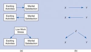
Consider this example, the relationship between doing exciting activities with your significant other and satisfaction with the relationship. There are three possible directions of causality for these two variables:
- X could be causing Y
- Y could be causing X
- Some third factor could be causing both X and Y
These three possible directions of causality are shown in the figure below (b).
- Correlation is a relationship that has established that X and Y are related - if we know one then the other can be predicted but we cannot conclude that one variable causes the other.
- Causation is a relationship for which we have to establish that X causes Y. To establish causation an experiment must demonstrate that Y can be controlled by presenting or removing X.
- For example, when we apply heat (X) the temperature of water (Y) increases and when we remove heat (X) the temperature of water (Y) decreases.
characterized by two variables or attributes
consisting of or otherwise involving a number of distinct variables.
the value obtained by multiplying each pair of numbers in a set and then adding the individual totals.
a graphical representation of the relationship between two continuously measured variables in which one variable is arrayed on each axis and a dot or other symbol is placed at each point where the values of the variables intersect. The overall pattern of dots provides an indication of the extent to which there is a linear relationship between variables.
an association between two variables that when subjected to regression analysis and plotted on a graph forms a straight line. In linear relationships, the direction and rate of change in one variable are constant with respect to changes in the other variable.
describing an association between variables that does not consistently follow an increasing or decreasing pattern but rather changes direction after a certain point (i.e., it involves a curve in the set of data points).
an association between two variables such that they rise and fall in value together.
an association in which one variable decreases as the other variable increases, or vice versa. Also called inverse relationship.
a regression analysis in which the predictor or independent variables (xs) are assumed to be related to the criterion or dependent variable (y) in such a manner that increases in an x variable result in consistent increases in the y variable. In other words, the direction and rate of change of one variable is constant with respect to changes in the other variable.
A confounding variable is a type of extraneous variable that will influence the outcome of the study. And so, researchers do their best to control these variables.
a situation in which variables are associated through their common relationship with one or more other variables but do not have a causal relationship with one another.
Observation or data point that does not fit the pattern of the rest of the data. Sometimes called an extreme value.
